T.F. Green Airport
When I say T.F. Green Airport, I of course mean the Commuter Rail station that corresponds to the airport itself. However, since I took pictures of the amazing modern terminal, I will also talk about as much of the airport as we were able to explore! This is gonna be a big one, so let’s do it!
 |
| The airport “busway.” |
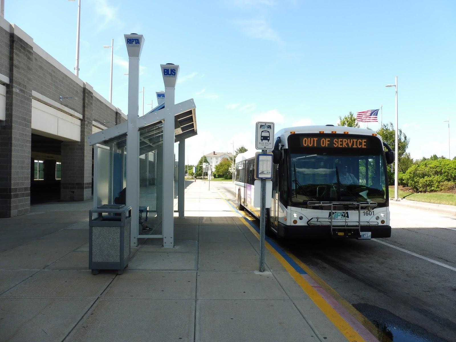
I honestly can’t tell if the busway doubles as an “arrivals” area or if it’s just for buses. Regardless, it’s suited for bus connections, with beautiful shelters, lots of benches, and great signage to each of the services to the airport. Three RIPTA routes service the busway: the 1 to Pawtucket, the 20 to Providence, and the 14 to Providence or points south.
 |
| Now that’s an arrival area! Or at least a taxi area. |
I do know that the road next to the busway is most certainly for arrivals. It doesn’t feel as nice as the busway, since its architecture is mostly concrete, but I guess it gets the job done. There are also taxi berths out here.
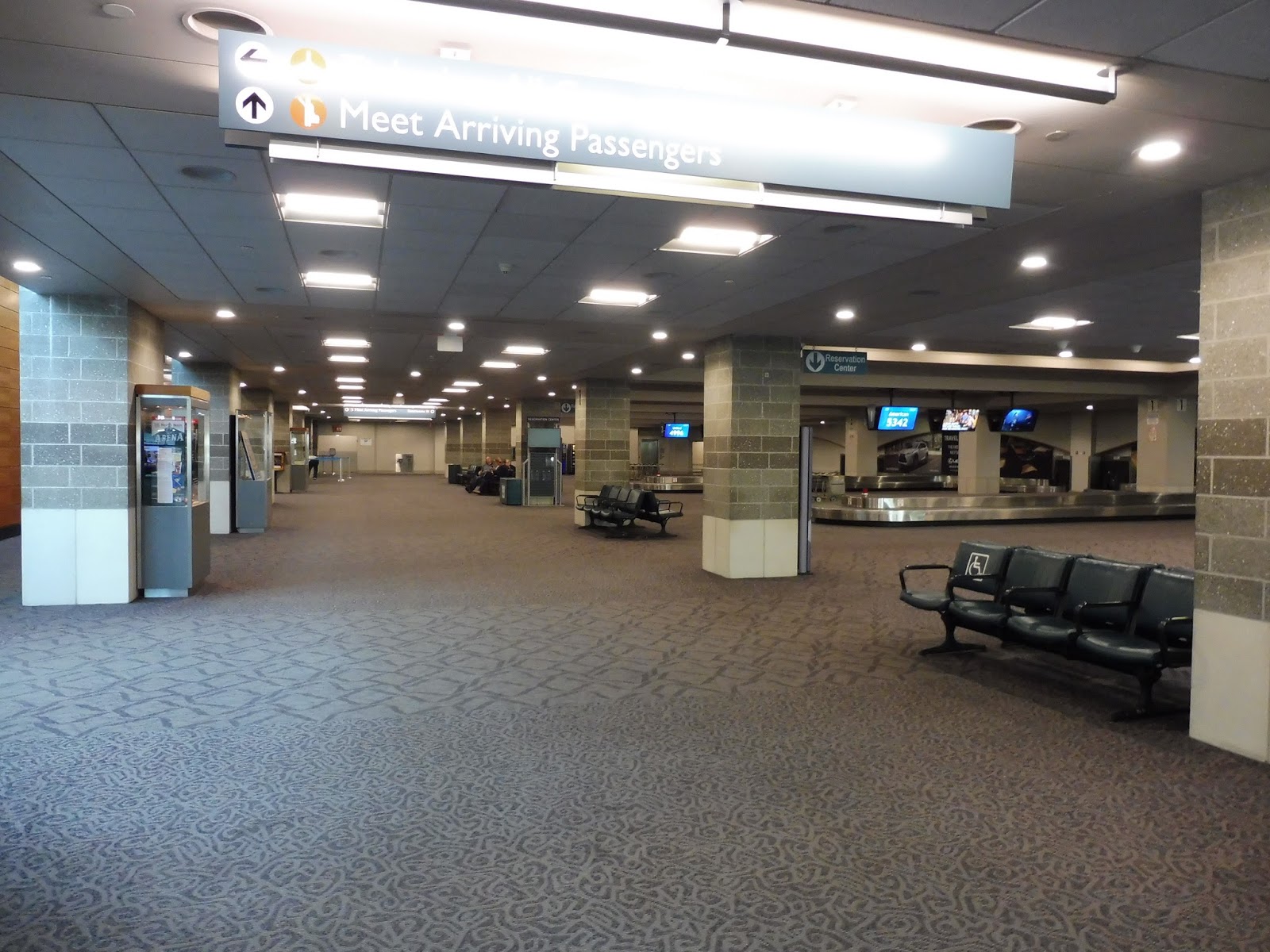 |
| This is pretty generic. |
The first thing you see when you step into the terminal is the baggage claim area, which is the lamest part of the airport. It has low ceilings and really dated architecture. Still, as a baggage claim area, it gets the job done fine, and there are lots of benches around, too. The wall-to-wall carpeting is abysmal, though.
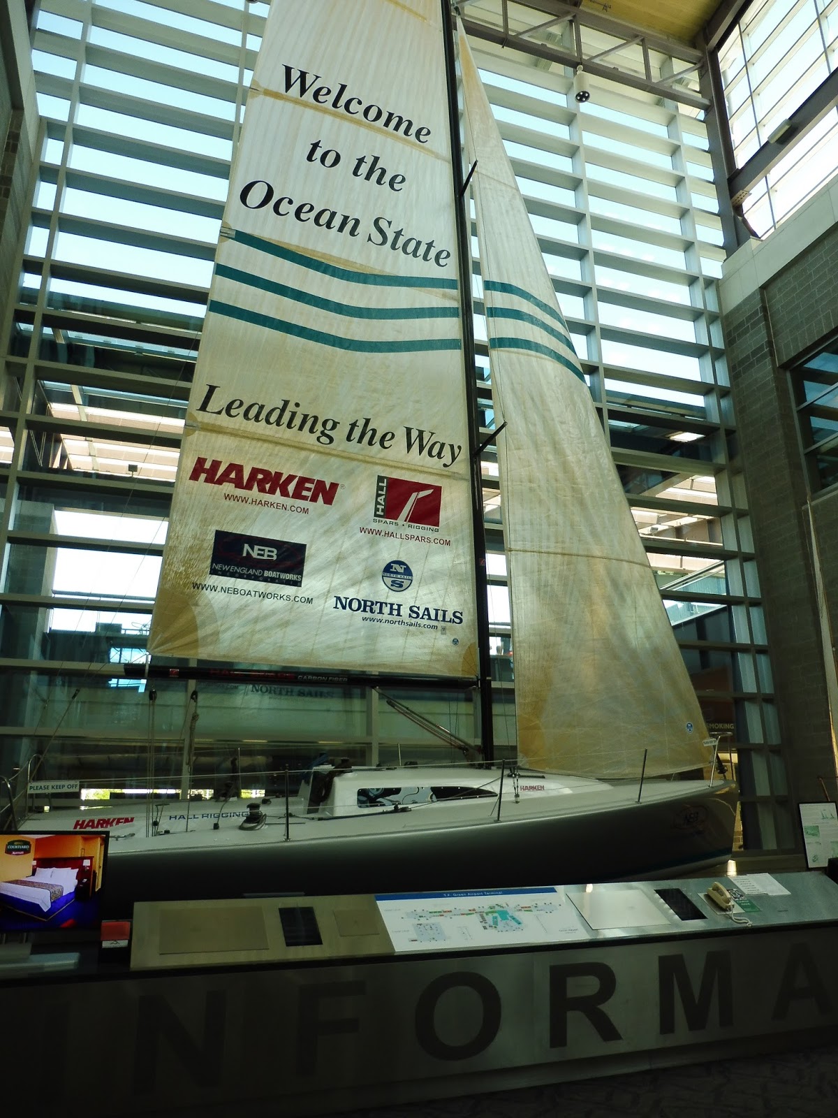 |
| Now that’s what I call an information booth! |
Information booths at airports are usually pretty boring, but T.F. Green has an amazing one with a huge sailboat welcoming tourists to Rhode Island. I mean, I wonder how many tourists actually use this airport, but it’s still pretty cool. The information given is just generic stuff for visitors like locations of hotels and attractions.
| I do need a ride! Thank you for asking! |
The information booth also has really well set-up “transportation corner.” It features a rack of schedules for all the RIPTA routes that serve the airport, as well as an updated Commuter Rail schedule. Strangely, though, the latter still says “MBCR” at the top, despite the conversion to Keolis happening two years ago. There are also some pamphlets and cards for various other shuttles here.
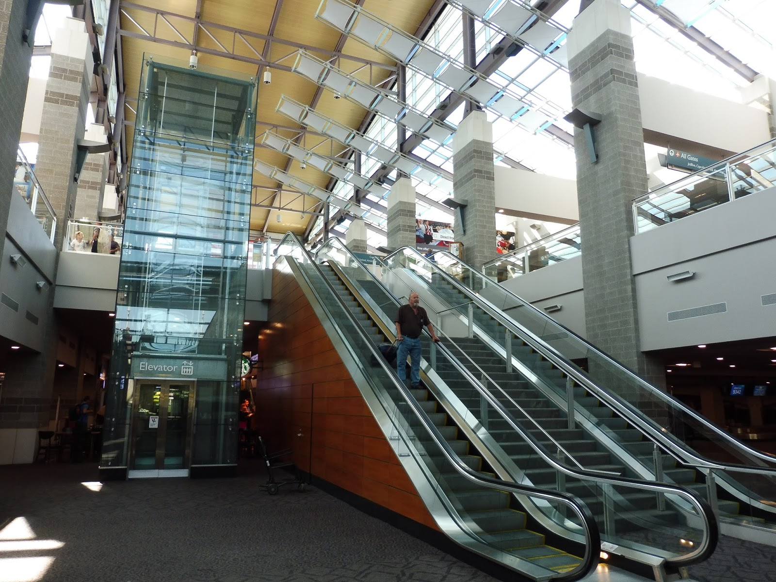 |
| Aww, yeah! |
Now we’re talking! The main terminal at T.F. Green Airport is very modern, and so it requires a very modern way of getting up there. You’ve got a beautiful glass elevator, a staircase, and two escalators! They weren’t skimping out when it came to ascending floors at this airport.
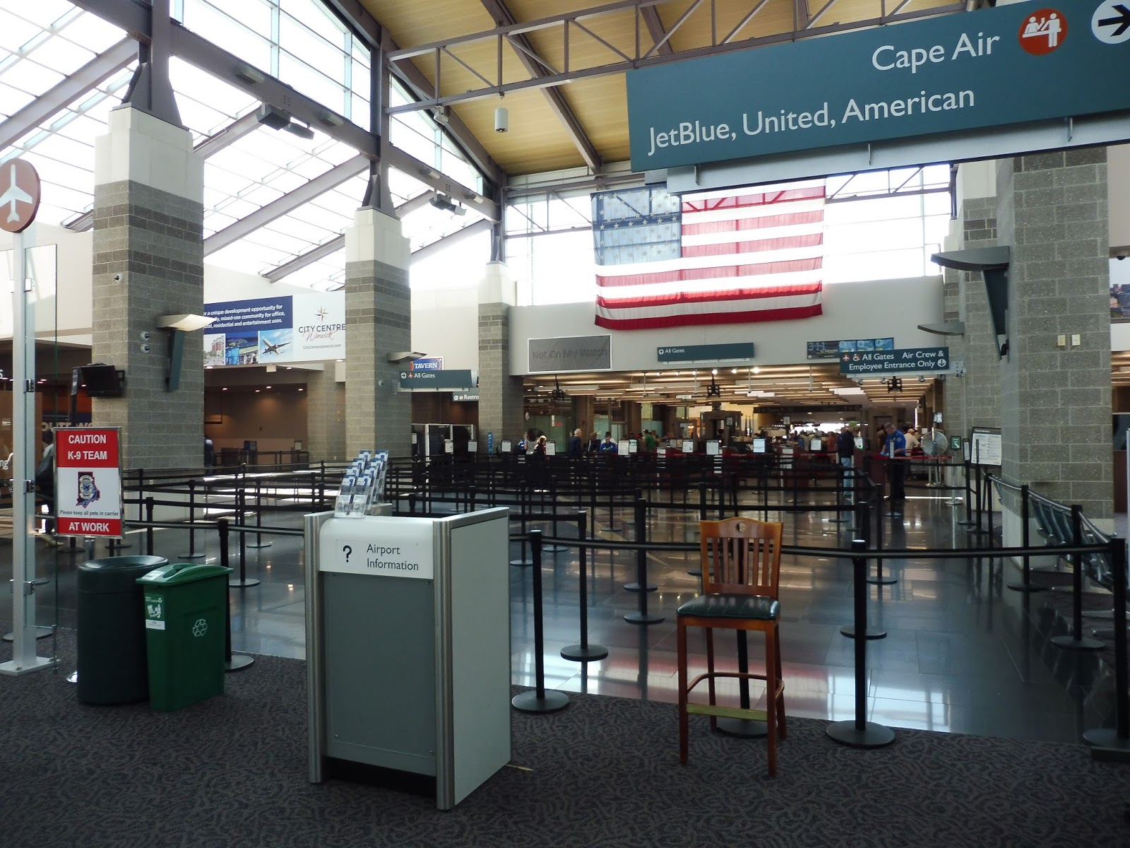 |
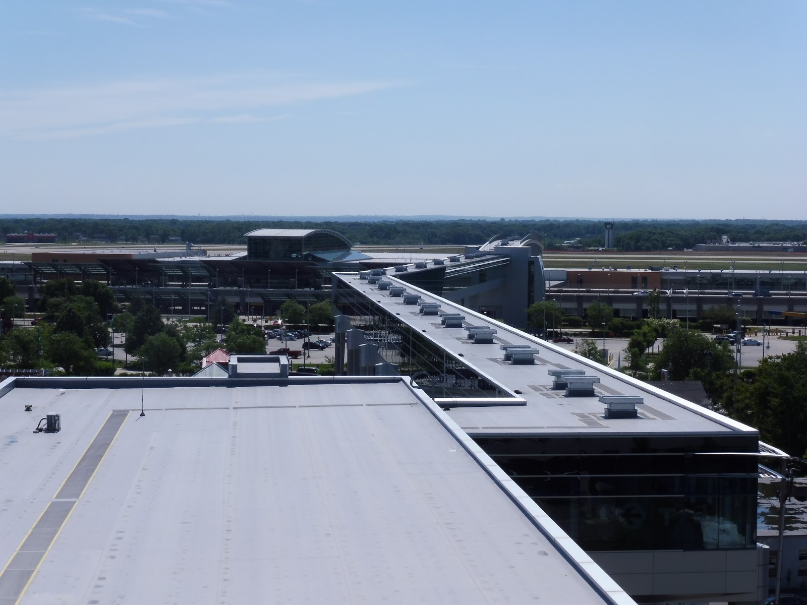
| The main terminal. |
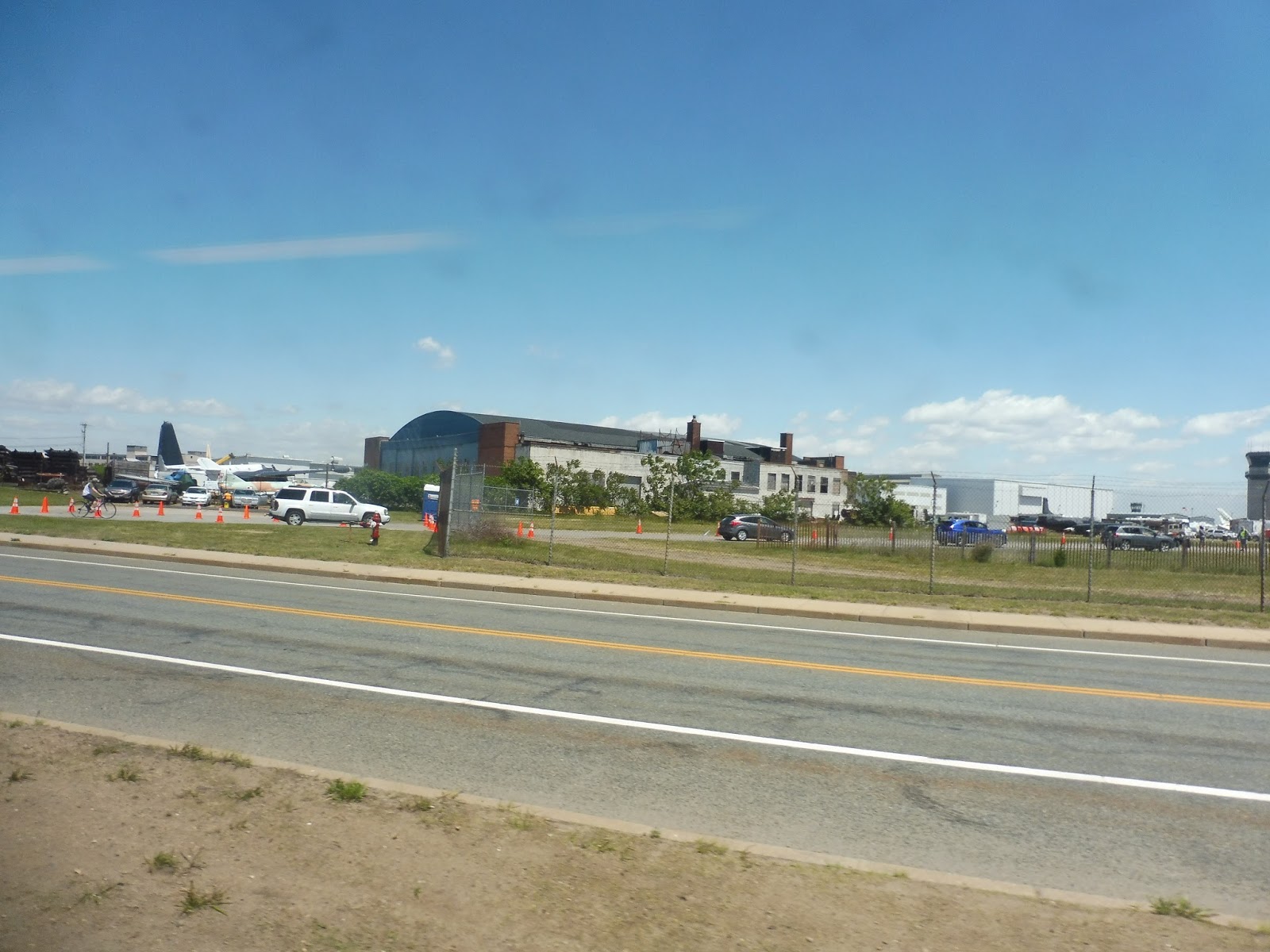
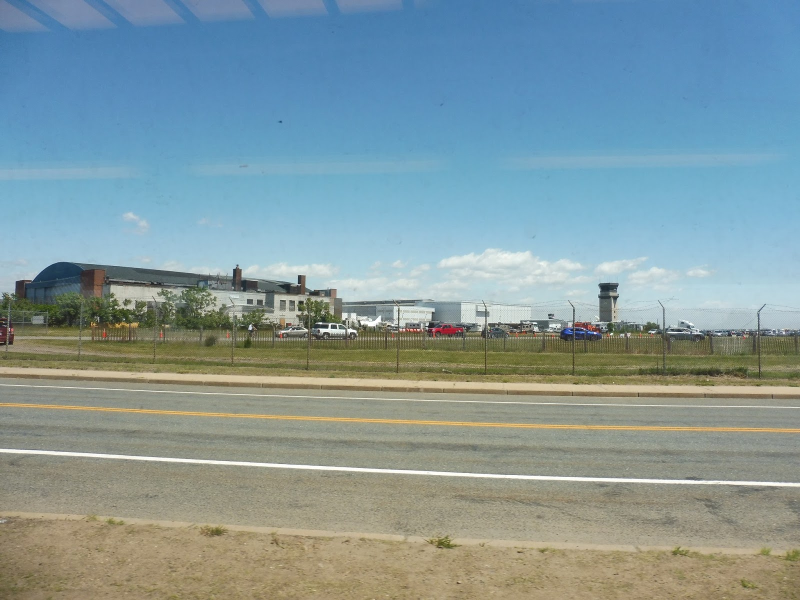
We weren’t able to get too far into the main terminal, but what we saw was amazing. It had huge high ceilings with lots of natural light coming in from the many windows. Everything was very modern and clean, and there was a lot of space set up for lines at security. It was still smaller than any Logan Airport terminal, but this is a much smaller airport.
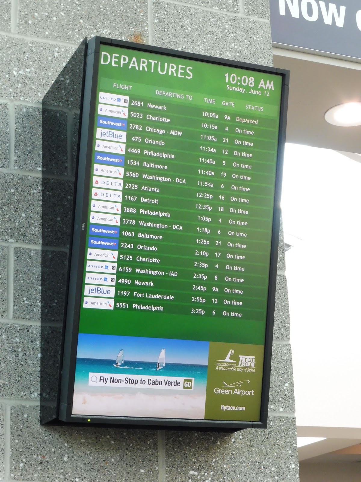 |
| Such interesting destinations… |
A quick glance at the departure board showed that only domestic flights were leaving on a Sunday. However, according to Wikipedia (and this timetable), international service has been announced for the airport, including a direct flight to Frankfurt! Will anyone use these flights? I guess time will tell.
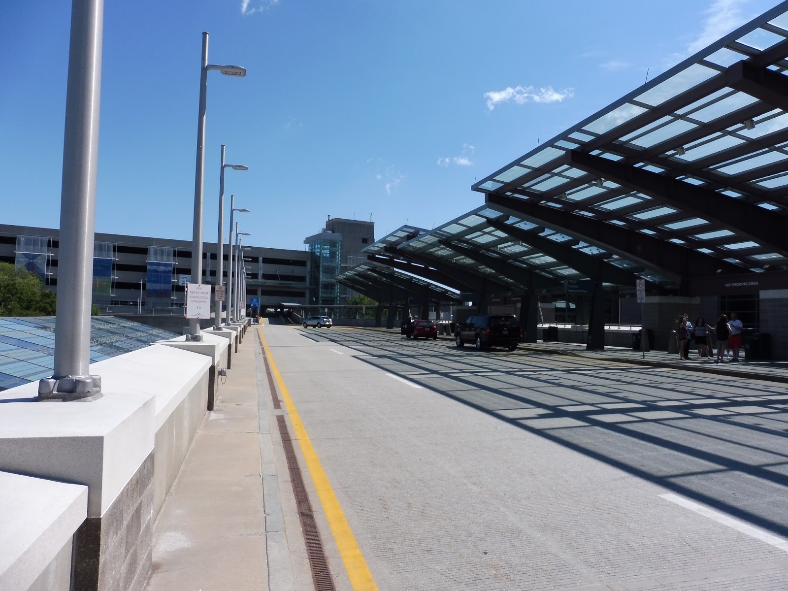 |
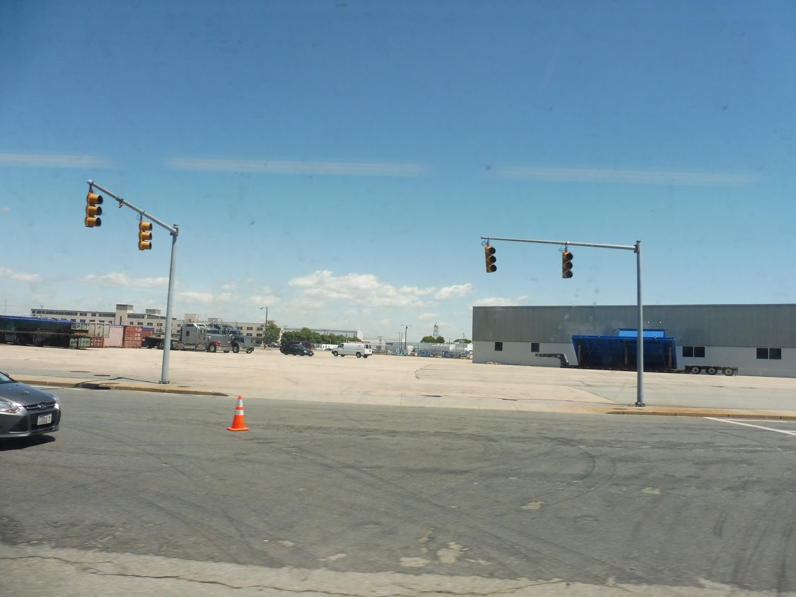
| The departure level. |
The departure level for drop-offs is pretty similar to the busway, with the same kind of modern glass shelter. Thus, it’s great! The airport also offers a bunch of parking in five different lots. I can’t give you an exact amount of spaces, but it’s most definitely a large number.
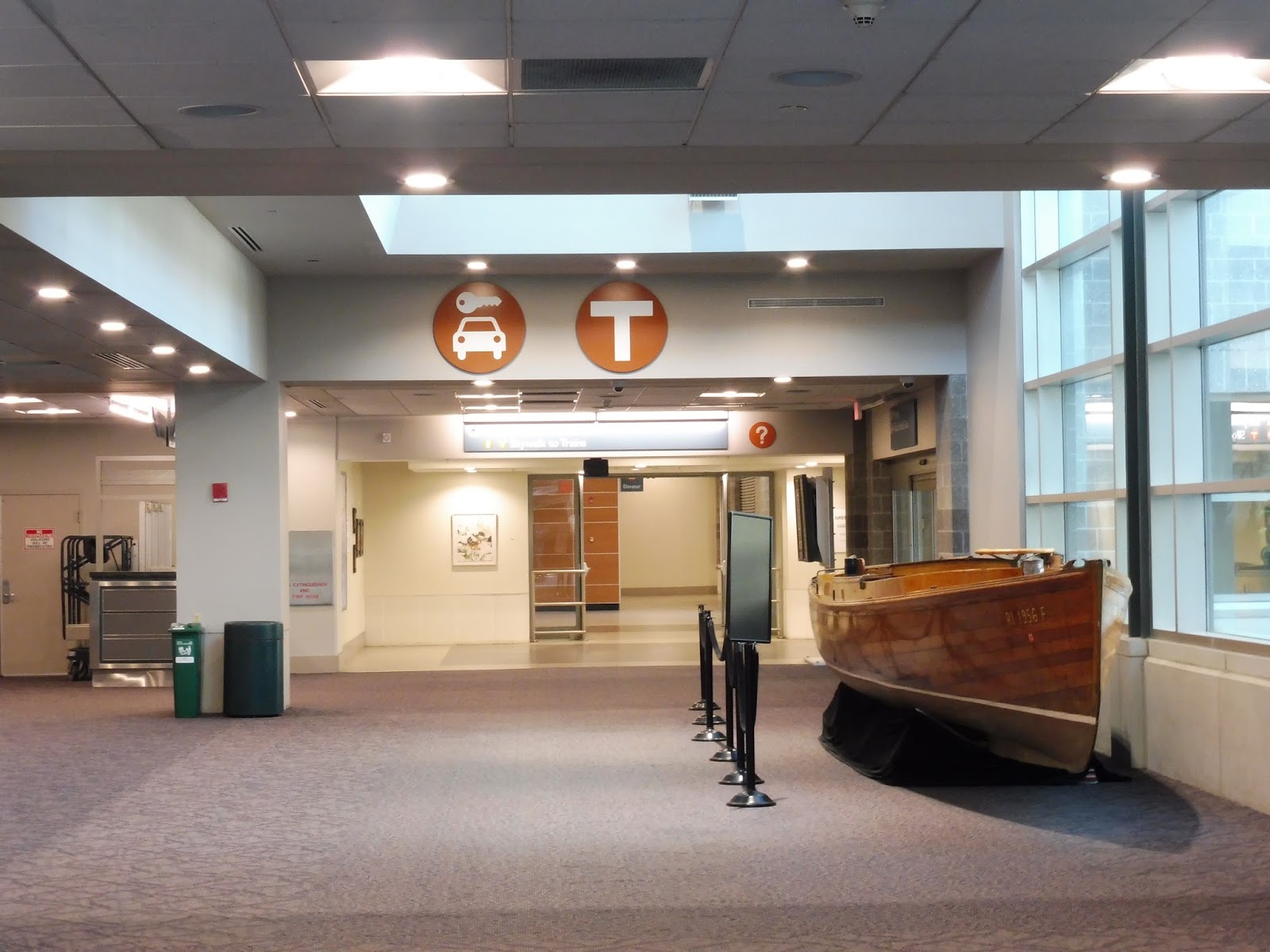 |
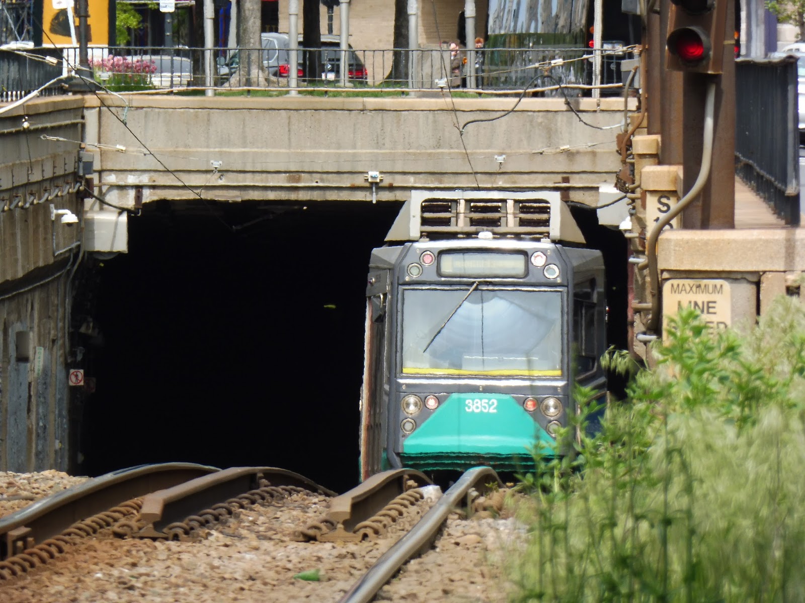
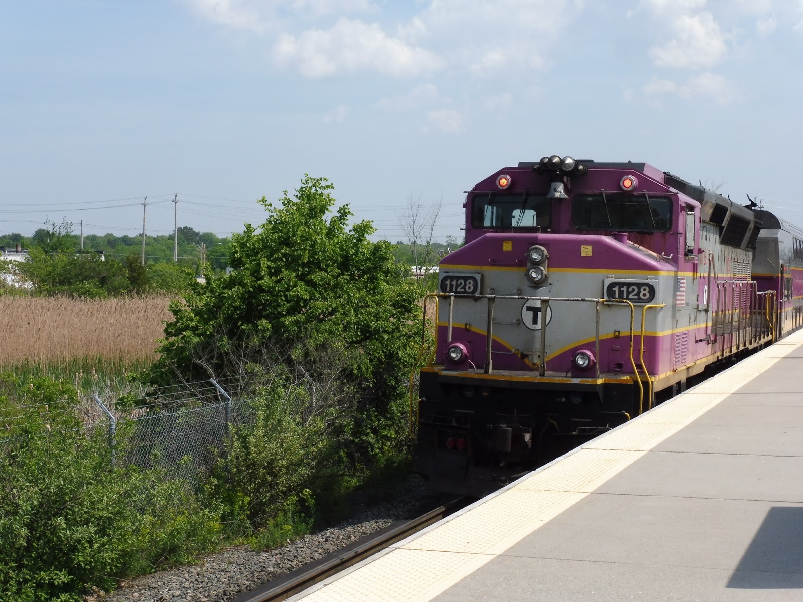
| Oh yeah…the Commuter Rail comes here, too. |
Heading back down to the lower level, it’s time to finally visit the Commuter Rail station! In order to get there, though, you have to use…the skywalk. But in order to get to the skywalk from the first floor, you have to go through the baggage claim area again and toward a nice T sign. You also go by a canoe in the process, which…sure, that’s cool!
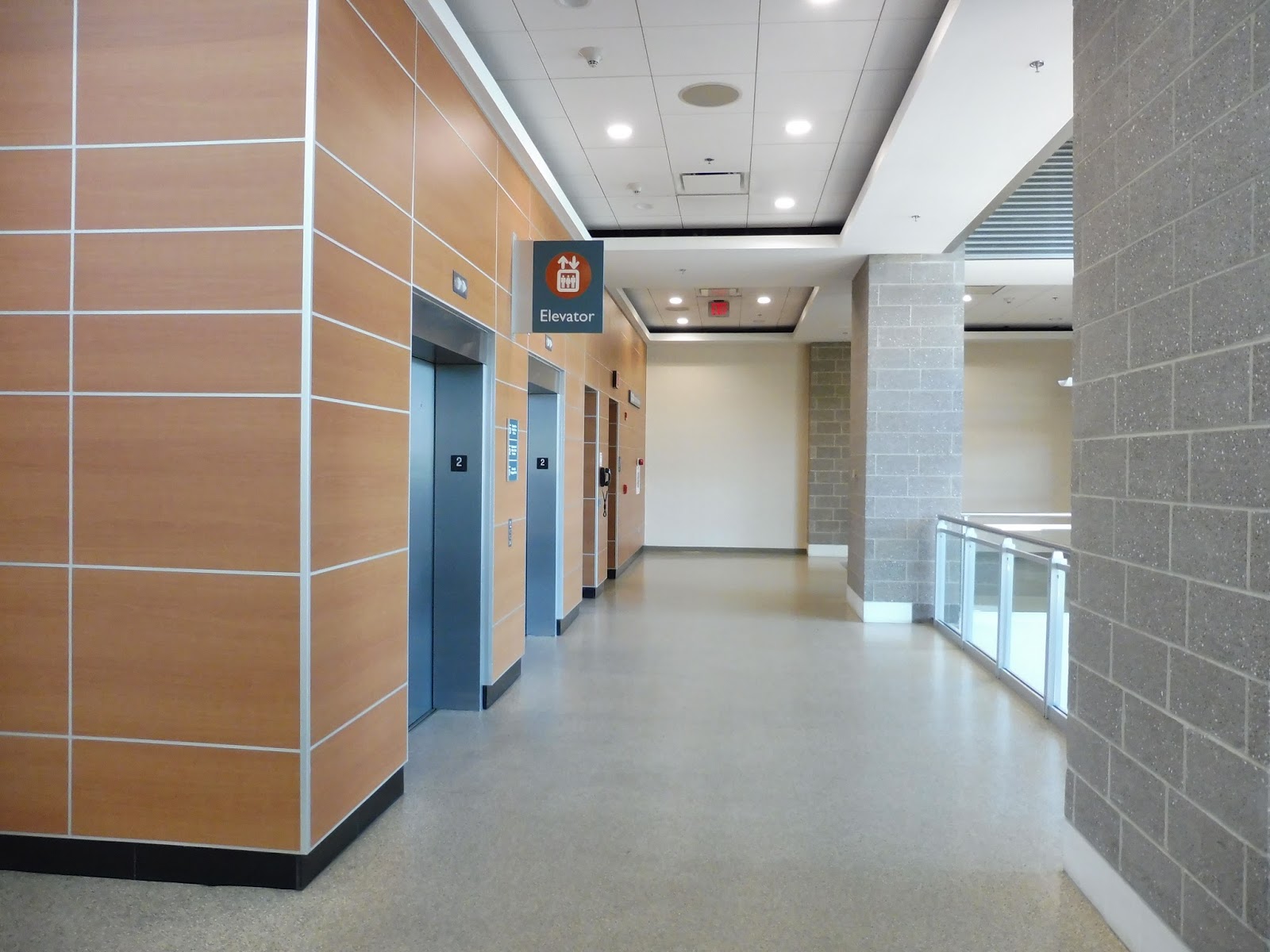 |
| The elevators up to the skywalk. |
Doesn’t the name “skywalk” just send tingles down your spine? I was so excited to get to it that I didn’t take any good pictures of its entrance area, which features an up escalator and a down escalator (no stairs). The room also has some interesting paintings on the walls.
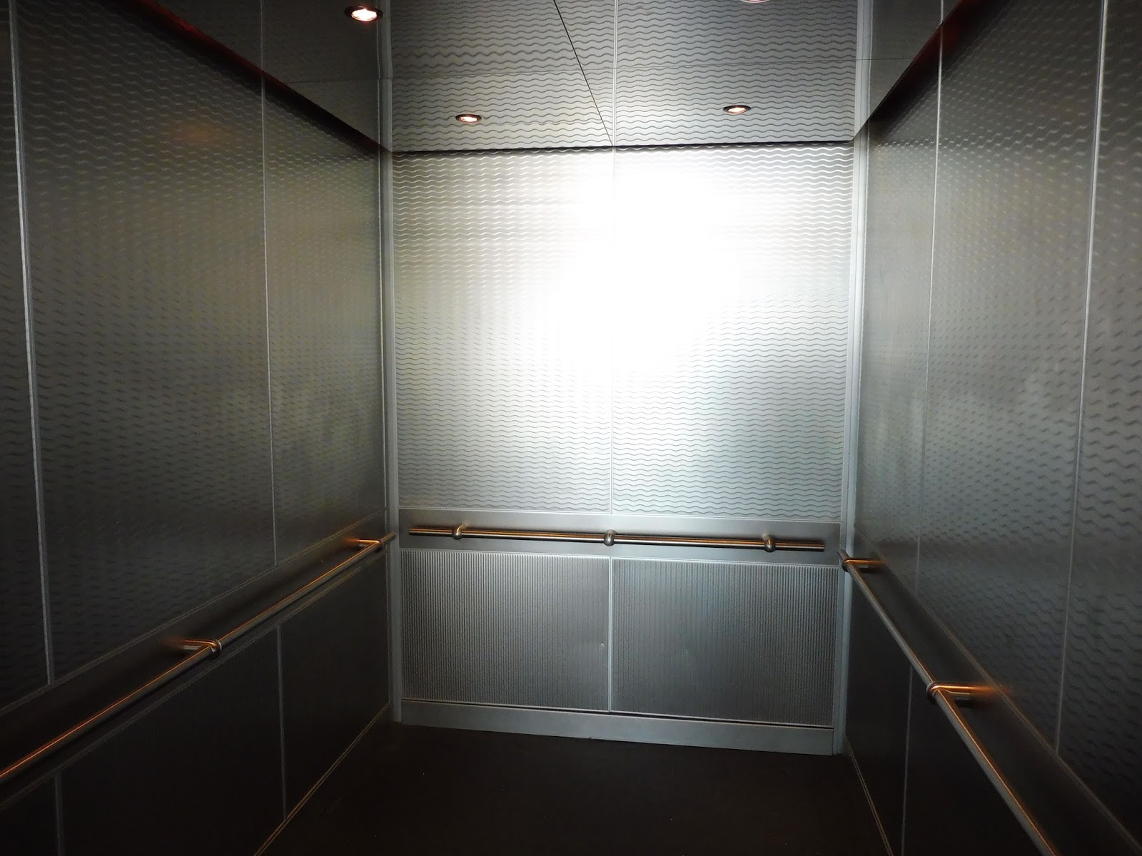 |
| The elevator was fancier than it looks! |
The elevators here are definitely worth a mention. Strangely, they had the exact same smell and feel as the newer Rotem Commuter Rail cars! Or, to put it in other terms, they were nice and modern and didn’t smell like urine. That’s what matters for a great elevator, right?
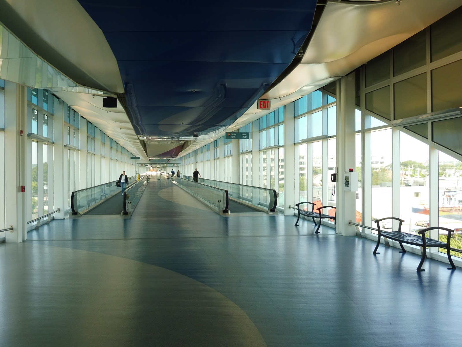 |
| Welcome to…the skywalk. |
The skywalk is pretty amazing. It has windows along its entire sides, and sweeping patterns along the floors and ceilings. There are a few benches sporadically placed in case people need a break, while moving sidewalks offer a faster way of getting through the long walkway.
 |
| The entire cart fleet of the skywalk. |
There is also a cart system that runs along the skywalk. I really wanted to ride one, but it was decided that it would be kind of embarrassing. Plus, the operator was quite busy, um, sitting there doing something on his phone. Sounds productive. The service is meant for people with baggage or disabilities, and can be called for whenever you want.
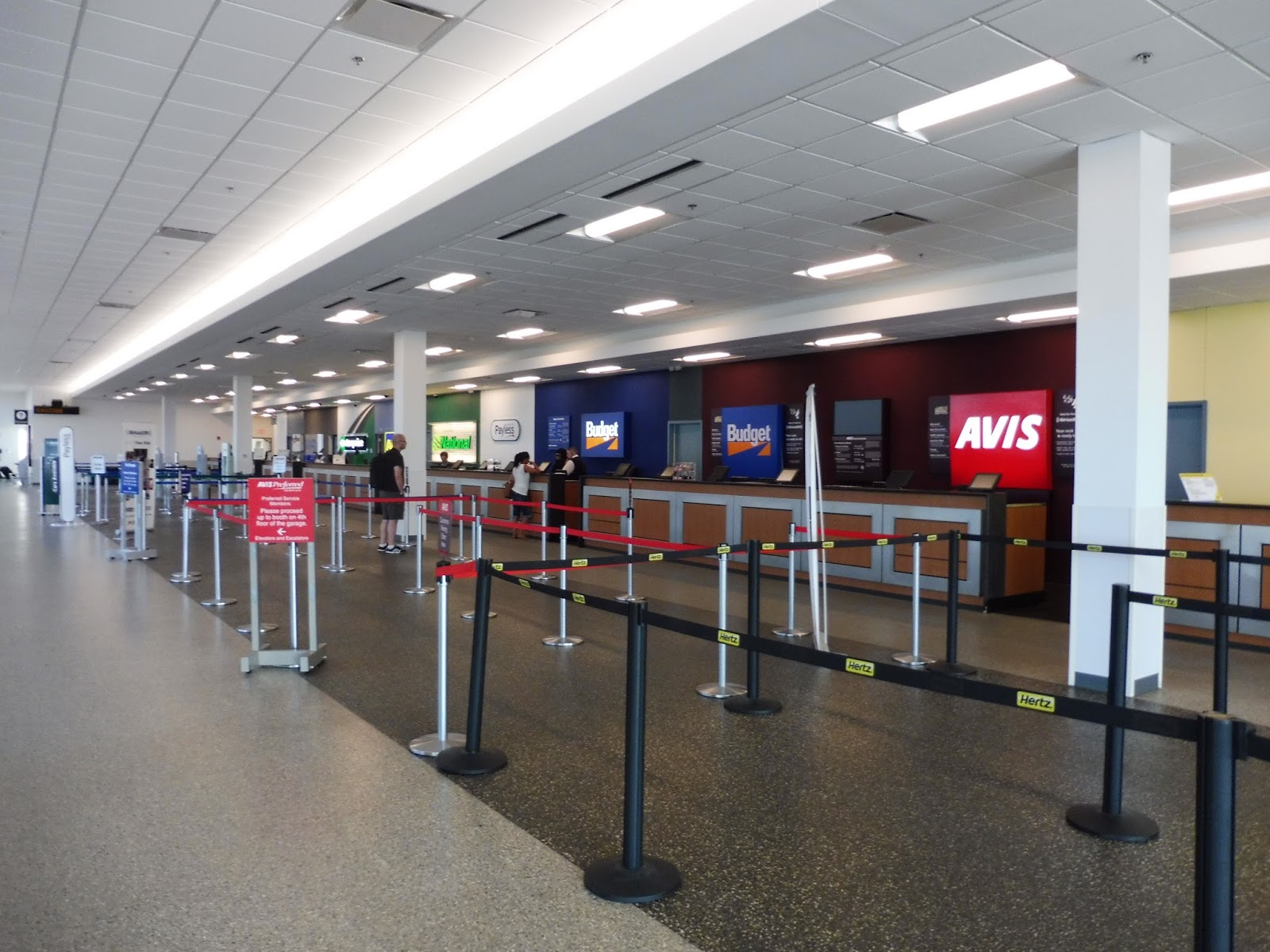 |
| Rental cars, anyone? |
Before the Commuter Rail station, you first reach the rental car area. It was pretty quiet when I was here, presumably because no planes had arrived yet, but the low-ceilinged, generic room seemed to be suited for a good amount of people. I’m not sure if it’s considered a “good” amount or not, but lots of rental car companies serve the airport.
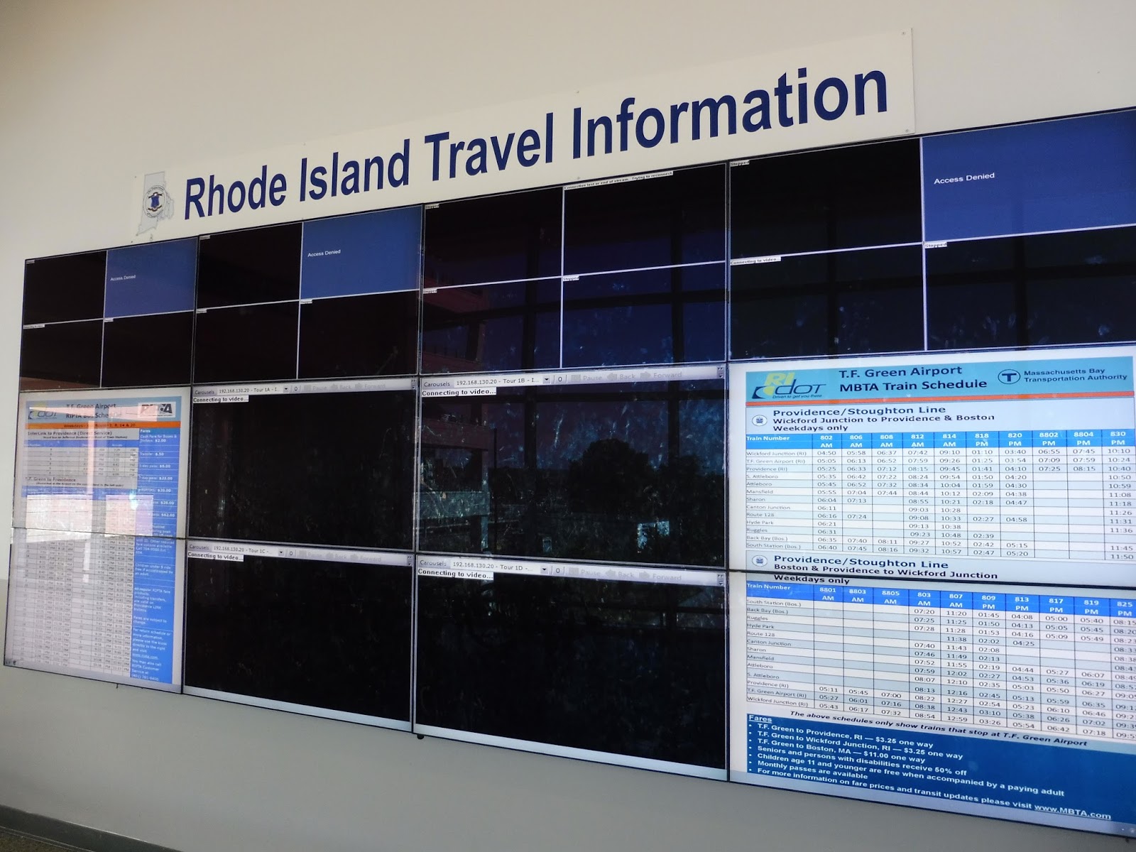 |
| EW EW EW. |
ALRIGHT, rant time! Heading along toward the Commuter Rail platform, we have this abysmal mess of a “travel information” area. Let’s see, well, the majority of the screens are blank and malfunctioning, so I guess we’ll skip past those! Alright, we’ve got times for all the RIPTA routes that serve TF Green…that would be nice, if they weren’t all outdated and incorrect! And a Commuter Rail schedule? Great! That’s also outdated! WOOOOOOHOOOOOWOWWOOOOOOO
 |
| Ahh, look at all the rental cars! |
Much of the big Interlink garage is dedicated to rental car parking, but there is also commuter parking here for MBTA passengers. In total, there are 650 spaces for commuters, but they come with a rather large fee of $6.50 per day (or $5.00 per day according to the T.F. Green website – not sure which one to trust). The garage does have an electric car charging station on the first floor, though, which is great!
 |
| Looking back toward the airport. |
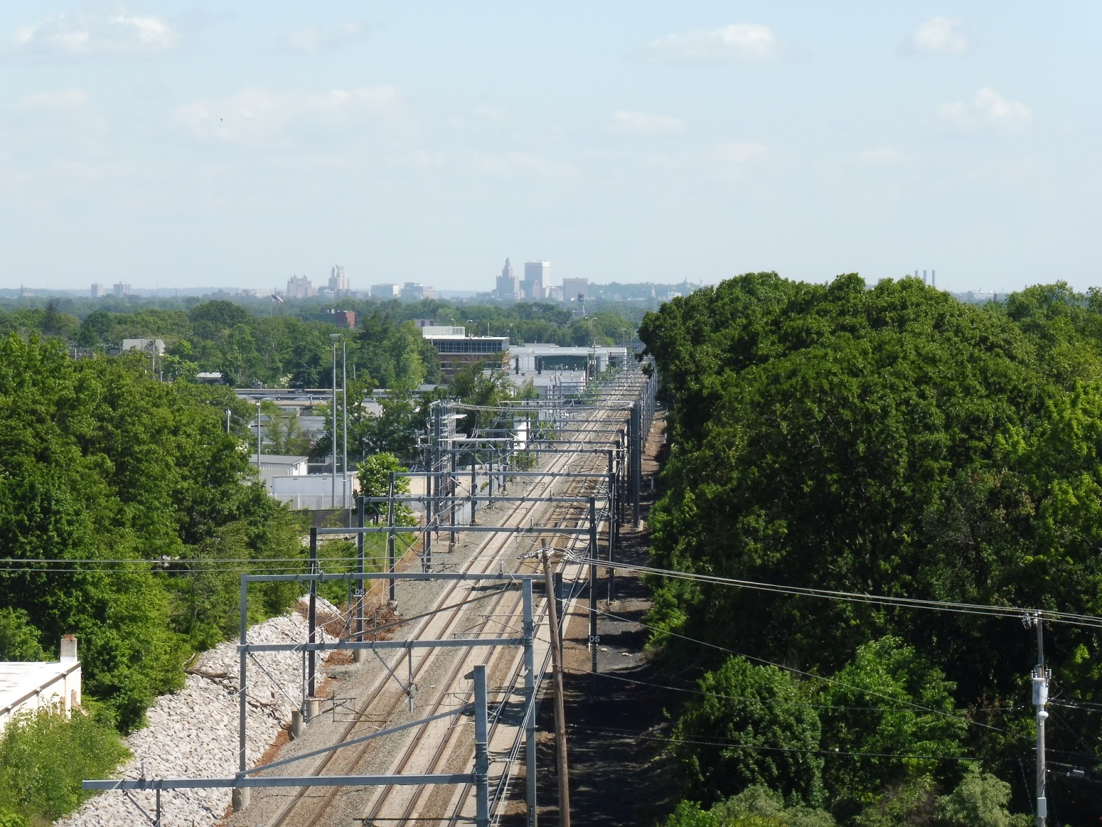 |
| Nice view! |
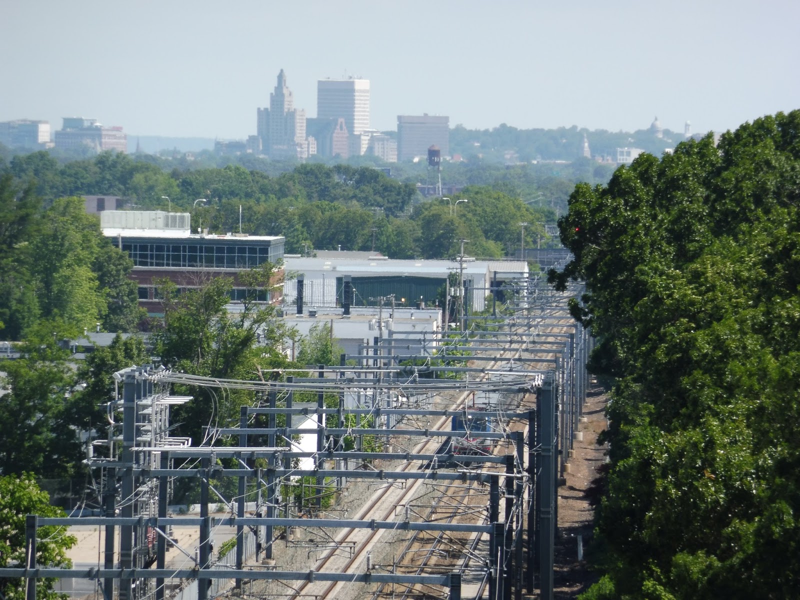
Gotta get those rooftop photos! The view from the roof of this parking lot is great, particularly looking along the tracks toward Providence. You can see the skyline from here, and it’s a little skyline I’ve always been a big fan of.
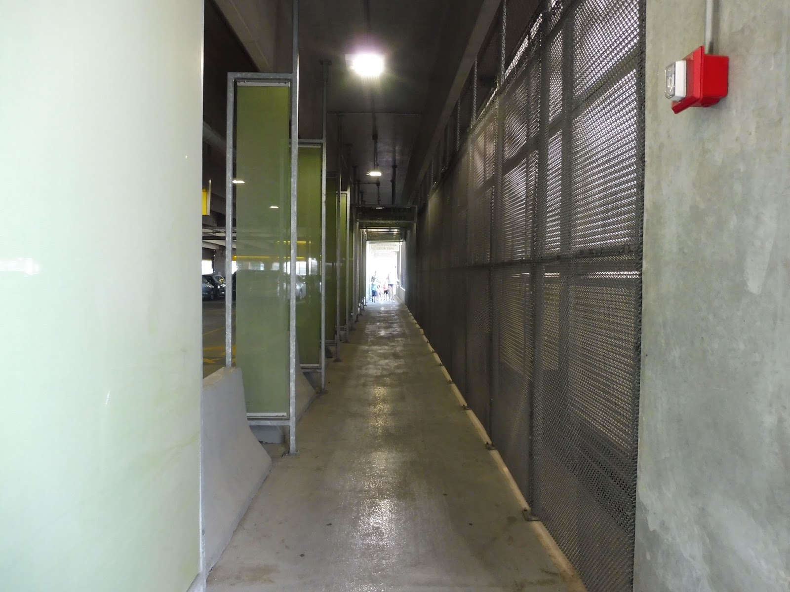 |
| Hmm…a bit dank. |
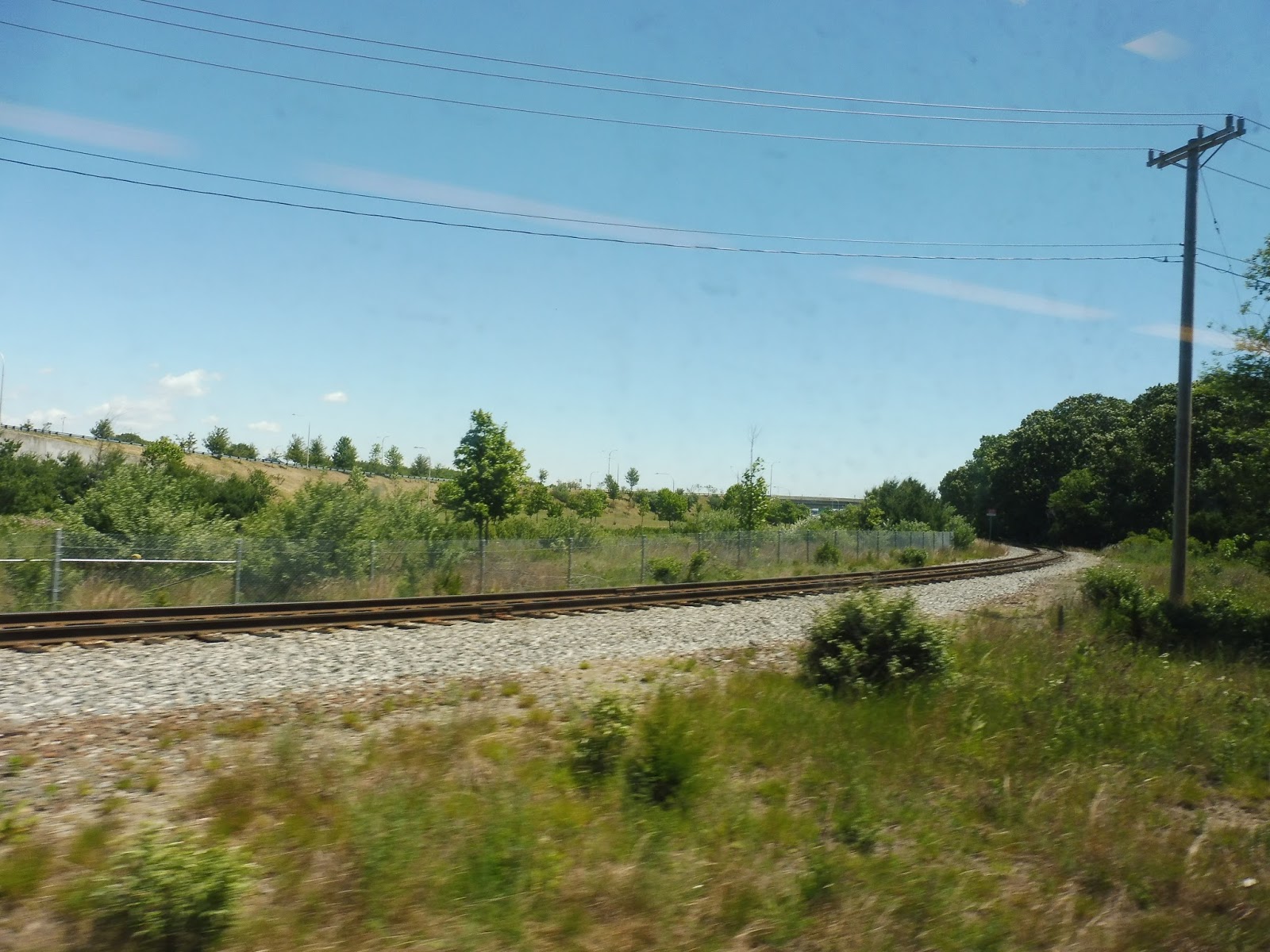
To get from the skywalk to the station, you have to pass through the parking lot. Luckily, a segregated pedestrian area is set up, but it’s a bit…gross. I mean, it’s quite dark and narrow. It’s certainly better than having to go through the lot, but the aesthetics of the walkway could be much nicer. The parking lot also has an alternative exit onto Jefferson Boulevard.
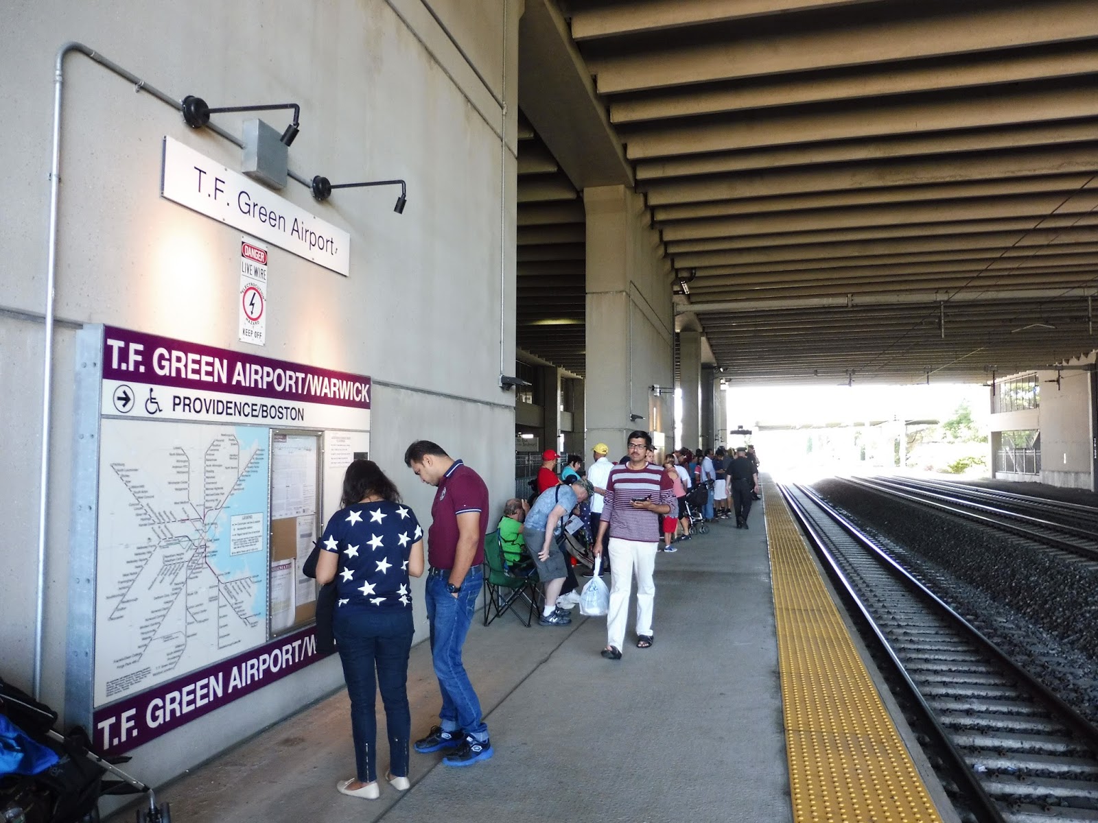 |
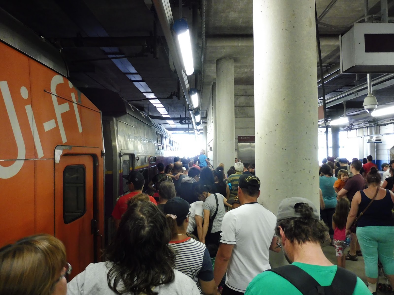
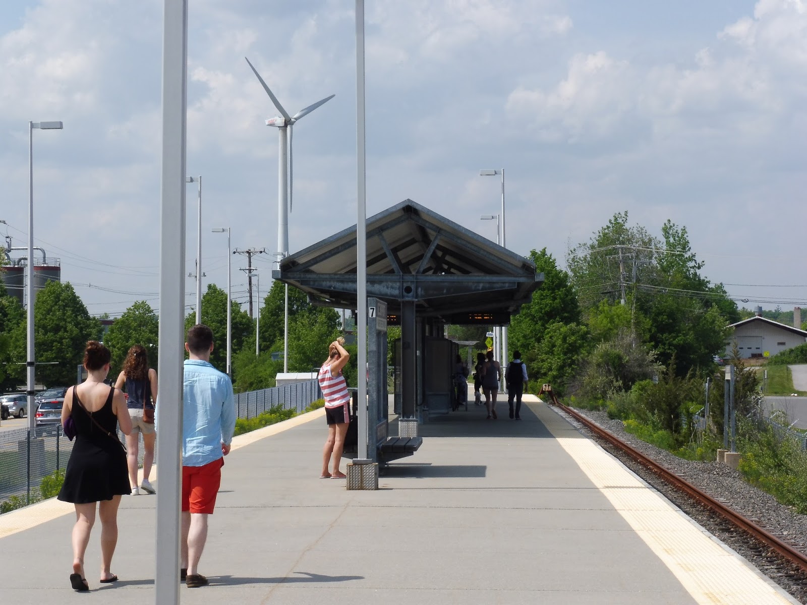
| The crowded platform. |
The station platform is…underwhelming. Sure, it’s sheltered, but it’s sheltered by a generic boring parking lot roof. This station is a fan of concrete, and it doesn’t lend itself to the most modern look. There are plenty of benches at which to sit, at least. However, one major problem is the white sign visible in the above picture. Why is the station name in Helvetica? That’s such a bad font choice for a sign! (For the record, I know this whole blog is written in Arial, but for some reason it shows up as Times New Roman in the post editor and I didn’t realize the whole thing was Arial until it was too late.) UPDATE: Dunno what I was thinking then – every MBTA sign is in Helvetica. It’s more that it’s in lowercase, unbolded Helvetica! Also, the blog is no longer in Arial. Anyway…
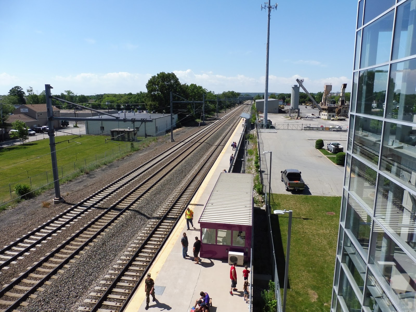 |
| The platform…from above. |
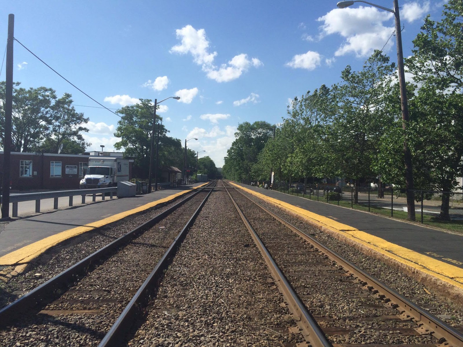
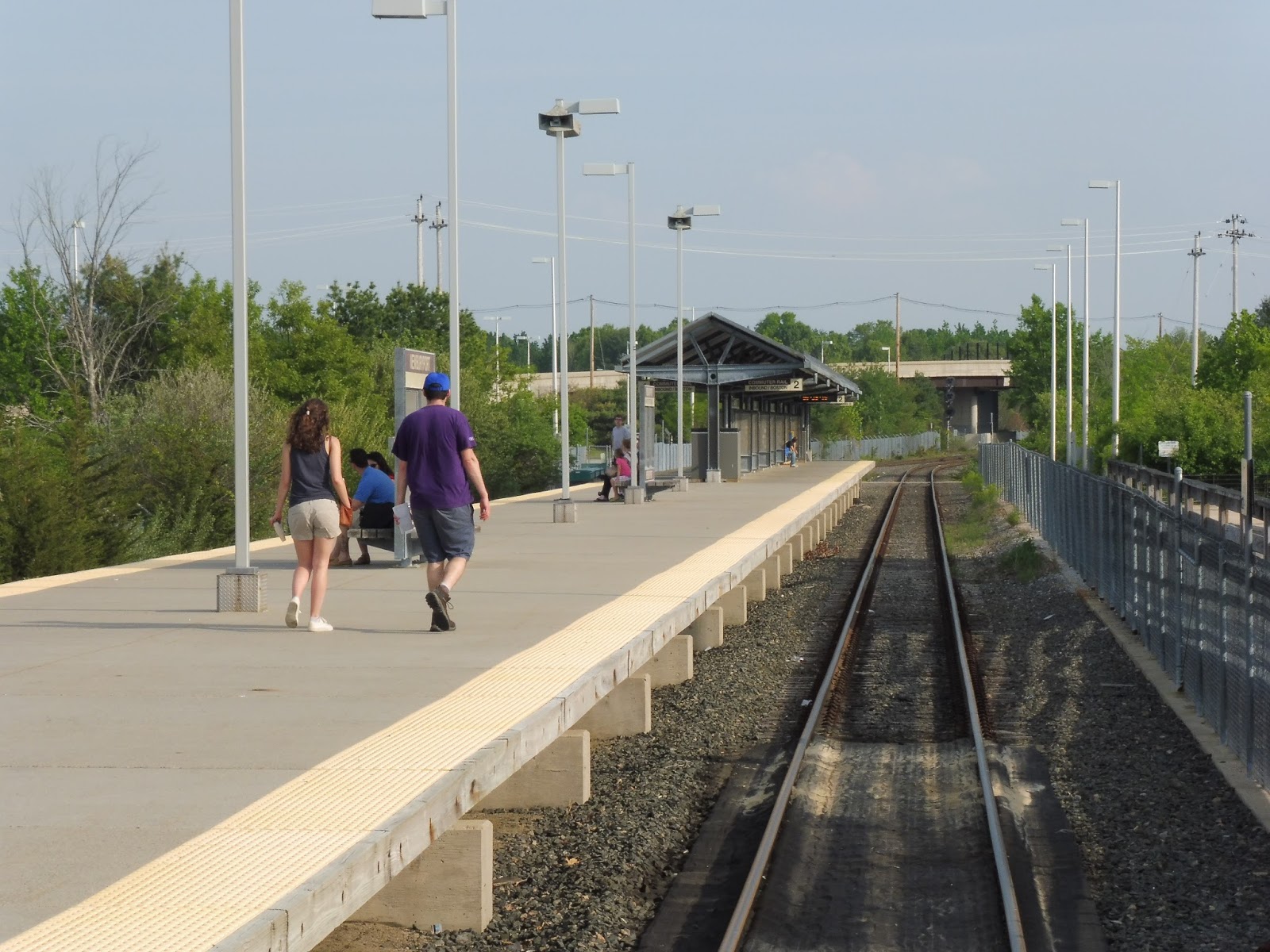
The outdoor section of the platform features a good amount of amenities. Closest to the part under the parking lot, there’s a interesting purple shelter, the likes of which don’t appear anywhere else on the Commuter Rail (to my knowledge). Meanwhile, if you go way far down, a generic modern Commuter Rail shelter awaits!
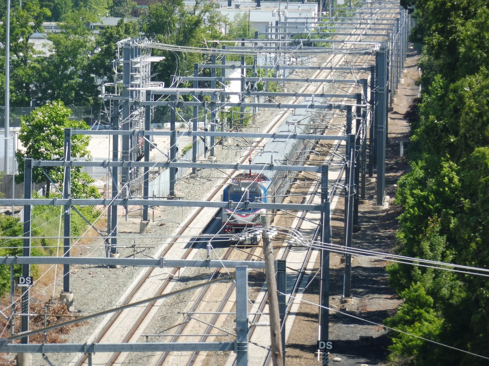 |
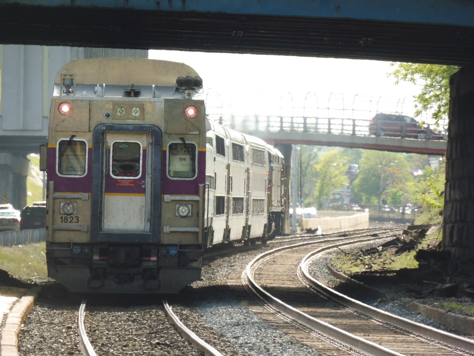
| An Amtrak train rushing past the station…from above. |
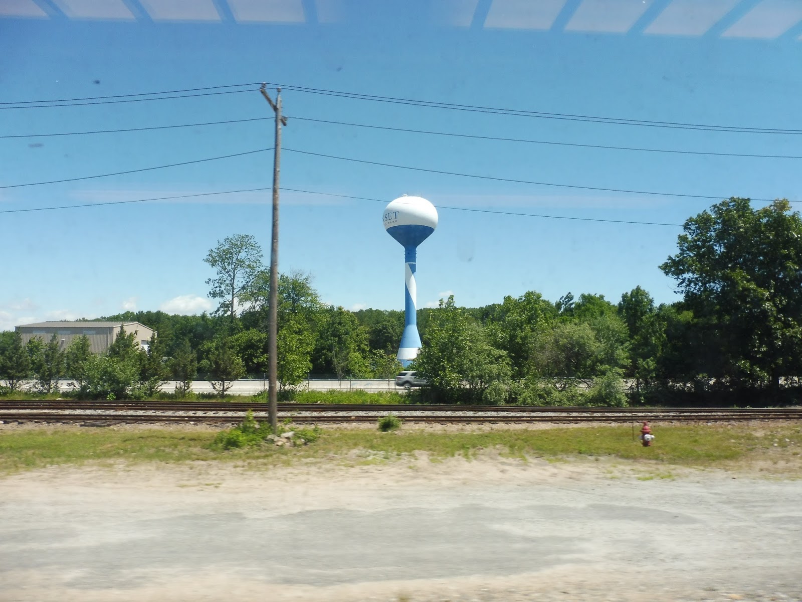
Station: T.F. Green Airport
Ridership: Although Providence is the busiest Commuter Rail station outside of Boston, T.F. Green Airport gets much much much lower ridership. On the average weekday, it only gets 227 riders, most of whom probably commute to Providence. That said, on the day I was here, there were huge crowds going to Quonset, but that was a special case.
Pros: For the record, I’m considering the “station” to be the skybridge and beyond. And if that’s the case, the skybridge is the best part of T.F. Green Airport by far. Not only does it give a direct pedestrian connection to the airport, but it also looks amazing! Other than that, the station offers a lot of parking (more than its ridership), and most of the platform is sheltered. As an aside, that airport terminal is great, isn’t it?
Cons: Once you get past the skybridge, everything is rather bland aesthetically. Additionally, if the MBTA website is to judge, the parking is pretty expensive for the Commuter Rail. Also, the fact that this station is only served by limited weekday trains means that hardly anyone takes the train to actually catch a flight at the airport. Finally, why is all the schedule information here so outdated? You guys have computer monitors, just update them!
Nearby and Noteworthy: Well…T.F. Green Airport, I guess. The rest of the surrounding area is industrial, so that’s nothing interesting.
Final Verdict: 7/10 (9/10 for the terminal)
Man, without that awesome skybridge, this station would be quite meh. I mean, it’s just a boring concrete Commuter Rail station. But hey, the skybridge makes it. Also, for the record, I really enjoyed reviewing an airport terminal! Maybe I could do the ones at Logan and call them “Silver Line stop reviews.” Hmm…
Latest MBTA News: Service Updates
Silver Line “Rant”
In English class, we had a short end-of-the-year assignment to write a “rant,” and I decided to make mine about the Silver Line Waterfront and its inefficiencies. It wasn’t supposed to be an evidence-based piece, so I don’t really back up my complaints, but I figured it would be fun to put up here. Enjoy!
My family had just gotten back from a week-long trip to Portugal. All we wanted to do was go home.
But the Silver Line had other ideas.
We always prefer using public transportation to get to the airport, mainly because it’s cheap. But the Silver Line, branded as a fast rapid transit service, is little more than a glorified bus with many problems. It seemed great when it was brand-new, but Boston soon realized that its fancy new line was just a phony.
At the cold, miserable Terminal E stop, the clock said the next bus was arriving in one minute—great! But that minute came and went. A crowd was starting to form with no sign of the bus. Finally, after ten minutes, the vehicle arrived, and it was packed.
We squeezed on with the other sardines, and our can started to head onto the highway. The crowded, trafficked highway. Did I mention it was the evening rush?
So after twenty minutes of crawling through the dark musty Ted Williams Tunnel, we finally managed to escape into the outside world. At least now it would be a smooth ride to South Station. Oh wait, we had to double back on ourselves first with the most inefficient loop ever. “Congress Street @ World Trade Center Station,” anyone?
At Silver Line Way, one poor rider struggled to escape the soul-crushing crowd to get out of the bus, then the bus failed to make the conversion to electric power (of course). After the driver got out to fix the problem, we were finally able to head to South Station at a heart-pounding 10 miles per hour. And what was that passing our sardine can on the left? Why, it was an SL2 to the Design Center, completely empty! Every 15 minute service to an industrial wasteland—great use of resources.
A few people were waiting at each of the overblown underground stations, but they were denied entry onto our bus because it was so crowded. I guess they would have to wait for the next empty SL2 to arrive. After several aching minutes of crawling through the bus tunnel, we finally pulled into the South Station bus stop, with a massive exodus of people leaving the bus to get to the Red Line. I’m sure the vehicle’s return run to the airport would be just as insane as our trip.
This is the state of the “rapid transit” Silver Line Waterfront.
Fix it.
RIPTA: 20 (Elmwood Ave)
You know it’s a smaller city when a bus route considered to be a “key corridor” runs every 45 minutes on weekends. Still, Nathan, Sam, and I had to get to T.F. Green Airport somehow on our way to Quonset, and the 20 was timed perfectly for our needs. Is the route interesting aside from its timeliness on a certain Sunday to help three people get to an air show? No, not really, but we’re looking at it anyway!
 |
| The bus at Kennedy Plaza. |
Leaving Kennedy Plaza in downtown Providence, we headed down Washington Street, which was lined with cute three-story buildings. Outside of a theater, we turned onto the wider Empire Street. After passing some offices, we turned again onto Broad Street, going over I-95 and running along with the R-Line and the 22.
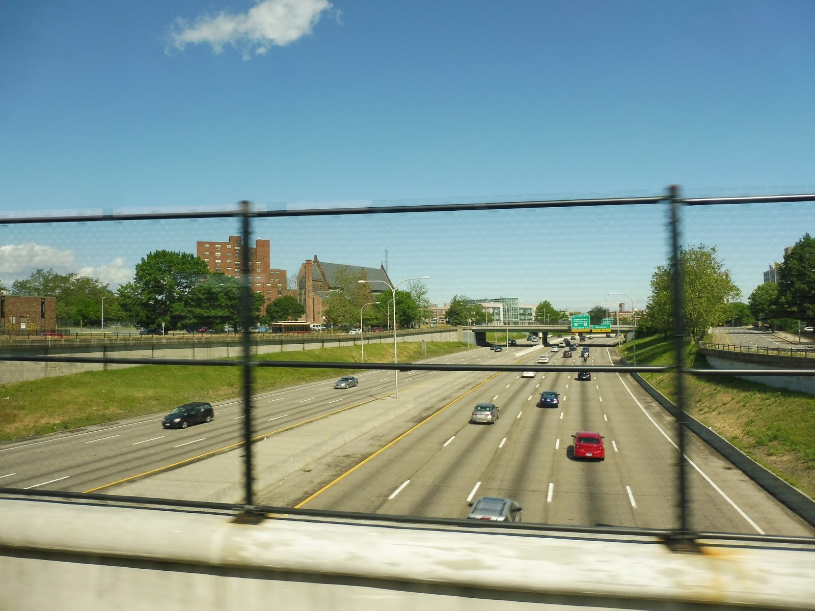 |
| Going over I-95. |
We went by a field and a high school, then there were a few businesses at Trinity Square. The street widened with a nice median for a bit as the R-Line continued down Broad Street; meanwhile, us and the 22 headed down Elmwood Ave. After a cemetery, the street became pretty industrial, but there were houses in view down the side streets.
 |
| This doesn’t seem to be the liveliest of areas. |
From there, it became a mix of houses, businesses, and industry, plus churches and a library. We passed another cemetery, and at nearby Columbus Square (basically just a plaza in the middle of an intersection), the 22 broke off onto Reservoir Ave. We were now on the 20’s independent section, running along the wide Elmwood Ave.
 |
| A bad picture of RIPTA’s main office! Woah, I’m freaking out!!! |
One of the more interesting aspects of this route is that it goes past RIPTA’s main office and yard. Unfortunately, I was sitting on the “office” side, so I didn’t get to see the buses stored on the other side of the street, but it was still pretty cool. It was industrial past there until we crossed I-95 again, going under the highway this time.
 |
| Beautiful scenery… |
We got a nice little break after the highway crossing, passing through a nice park. After we went under another highway, though (Huntington Expressway), the scenery became a mix of dense houses and industry. Around this time, we entered Cranston, and reached the big parking lot of an Ocean State Job Lot. On weekdays, every other trip terminates here.
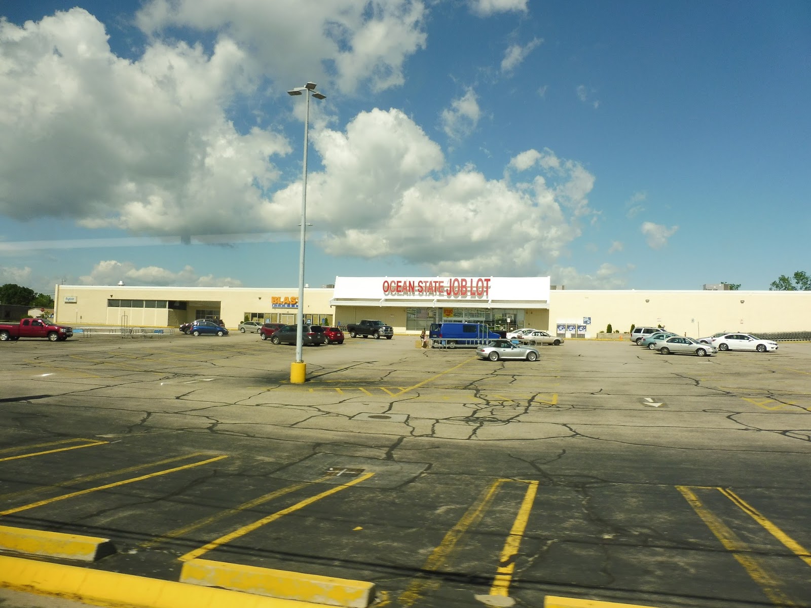 |
| Not the most official of terminals… |
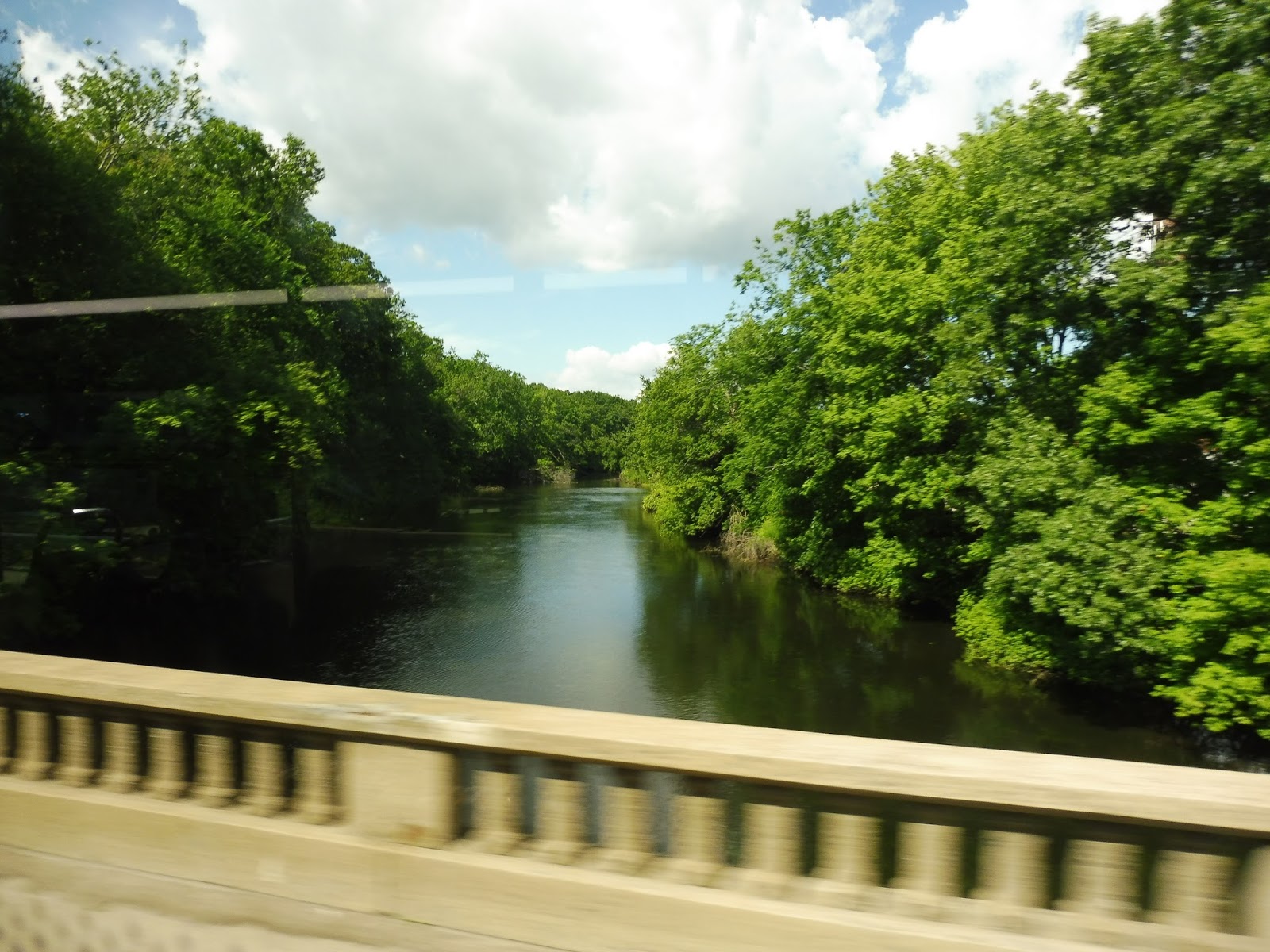
It was quite industrial from there, including some pretty big factories. We crossed over the Pawtuxet River, and the scenery went from factories to just plain warehouses and offices. Eventually, Elmwood Ave reached its end point and we turned onto Post Road, which was…also industrial! Wooooo!
 |
| Going over the river. |
Businesses with huge parking lots started to appear, which is an improvement, I guess. We went through another highway interchange, then passed a really deserted-looking mall. After another shopping plaza, airport-related businesses and hotels started popping up, and we merged onto T.F. Green Airport Connector Road. This took us up to the airport busway, where the bus went out of service.
 |
| The bus at the airport. |
RIPTA Route: 20 (Elmwood Ave)
Ridership: For a Sunday morning, my ride was surprisingly busy, with about 20 passengers in total. What’s more, 40% of those passengers got on at stops other than Kennedy Plaza, which shows that there’s good local ridership for the route as well. Overall, the 20 is RIPTA’s 5th-highest ridership route, with 2,464 passengers per weekday, 1,213 per Saturday, and 796 per Sunday.
Pros: This is a direct route that serves a lot of neighborhoods. It’s also very frequent on weekdays, running every 15 minutes with every other trip terminating at Ocean State Job Lot. And yes, I did ridicule the bus for its 45 minute weekend schedule, but 20 riders seems like the perfect amount for a Sunday morning, so the headways are fine as they are.
Cons: Nothing much, although some of the stops can be ridiculously close together. Also, and this is exclusive for my trip, the driver drove the bus at the same speed as the route number! It was torturously slow!
Nearby and Noteworthy: Unfortunately, the 20 doesn’t serve any areas that would be of note to visitors. The RIPTA bus garage is interesting, I guess.
Final Verdict: 9/10
This is definitely one of the best routes on the RIPTA! The 20 serves a lot along its run, and its schedule is perfect for the amount of ridership it gets. I like how every other trip terminates at Ocean State Job Lot on weekdays, since the outer section is quieter anyway. Plus, since the trunk route is every 15 minutes, that’s still every half hour service to T.F. Green!
Latest MBTA News: Service Updates
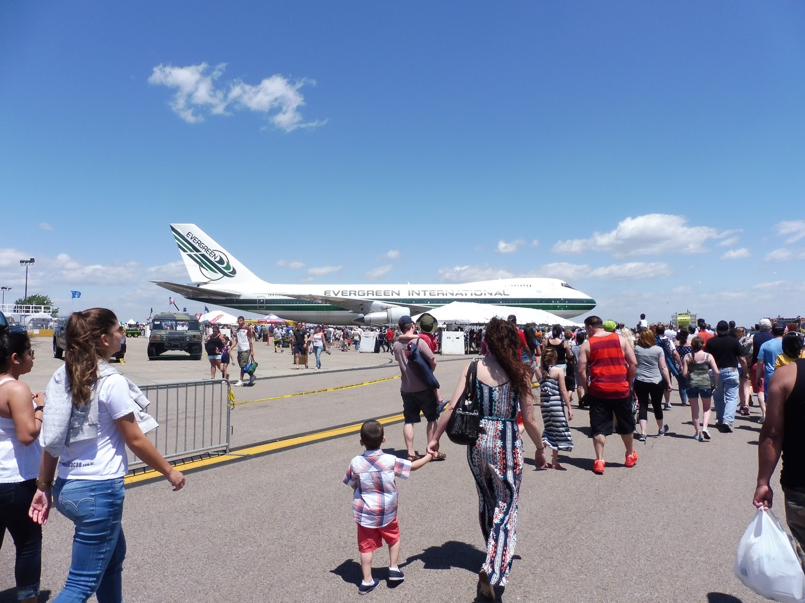
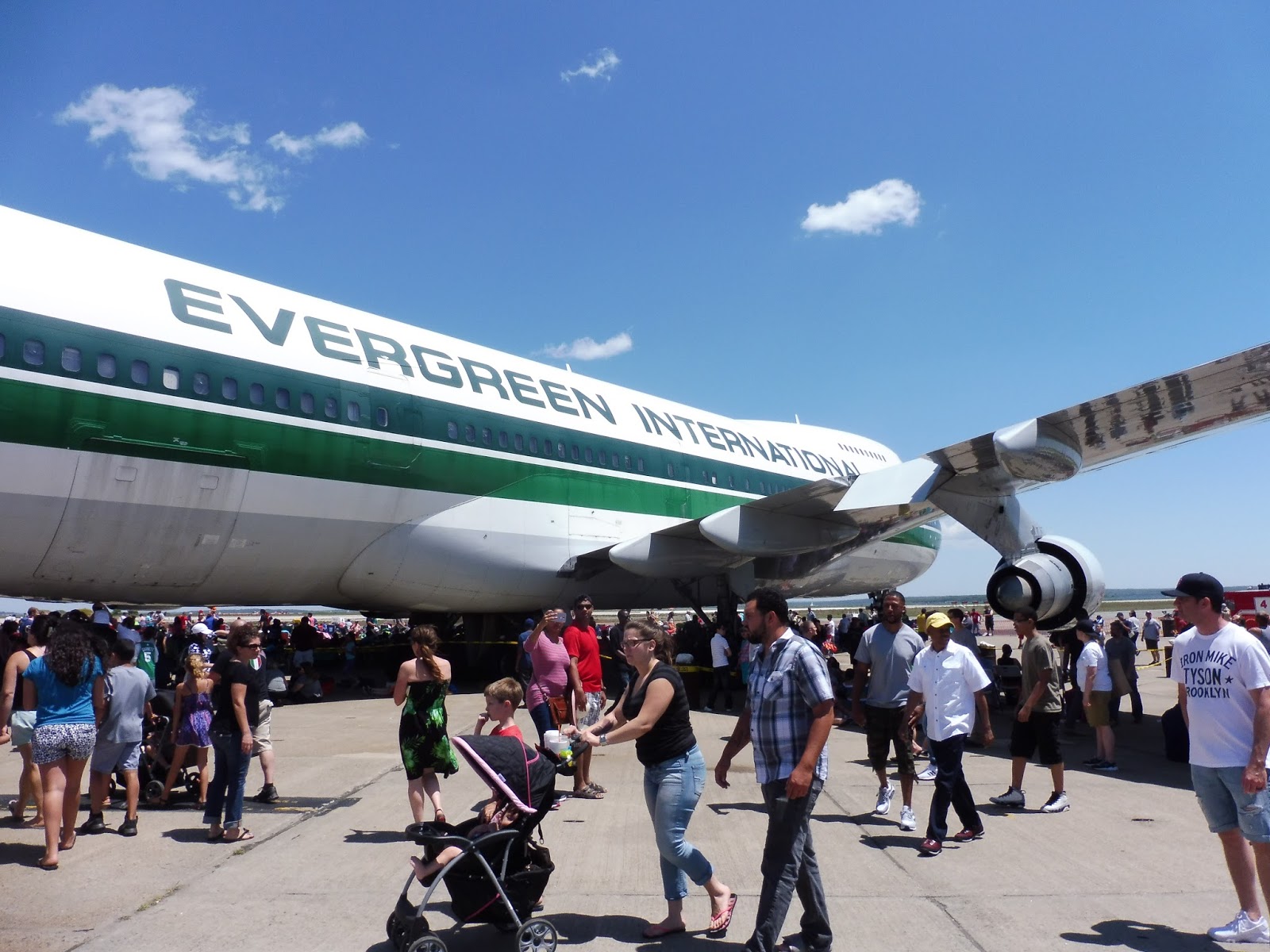
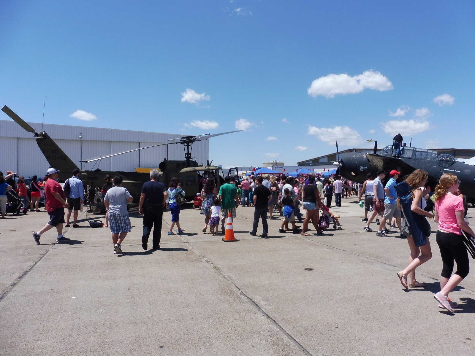
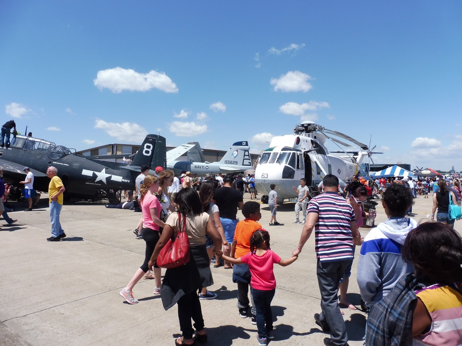
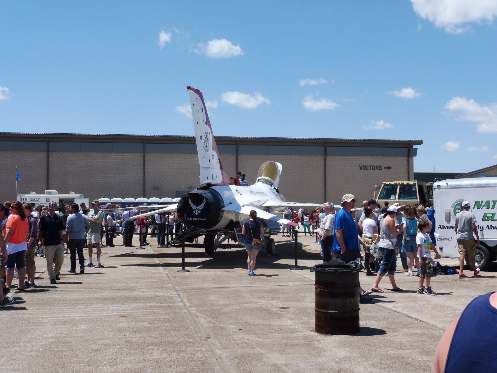
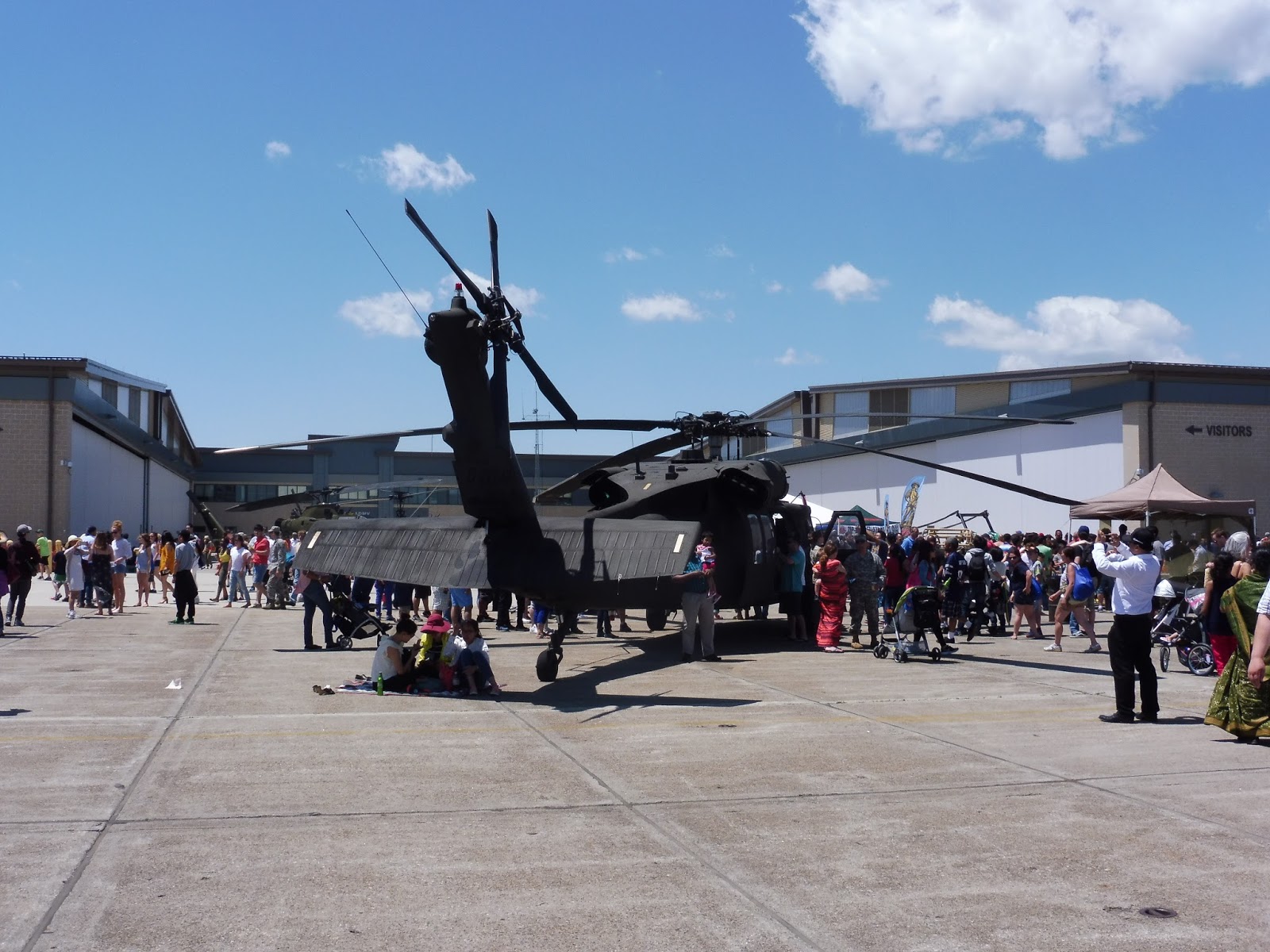
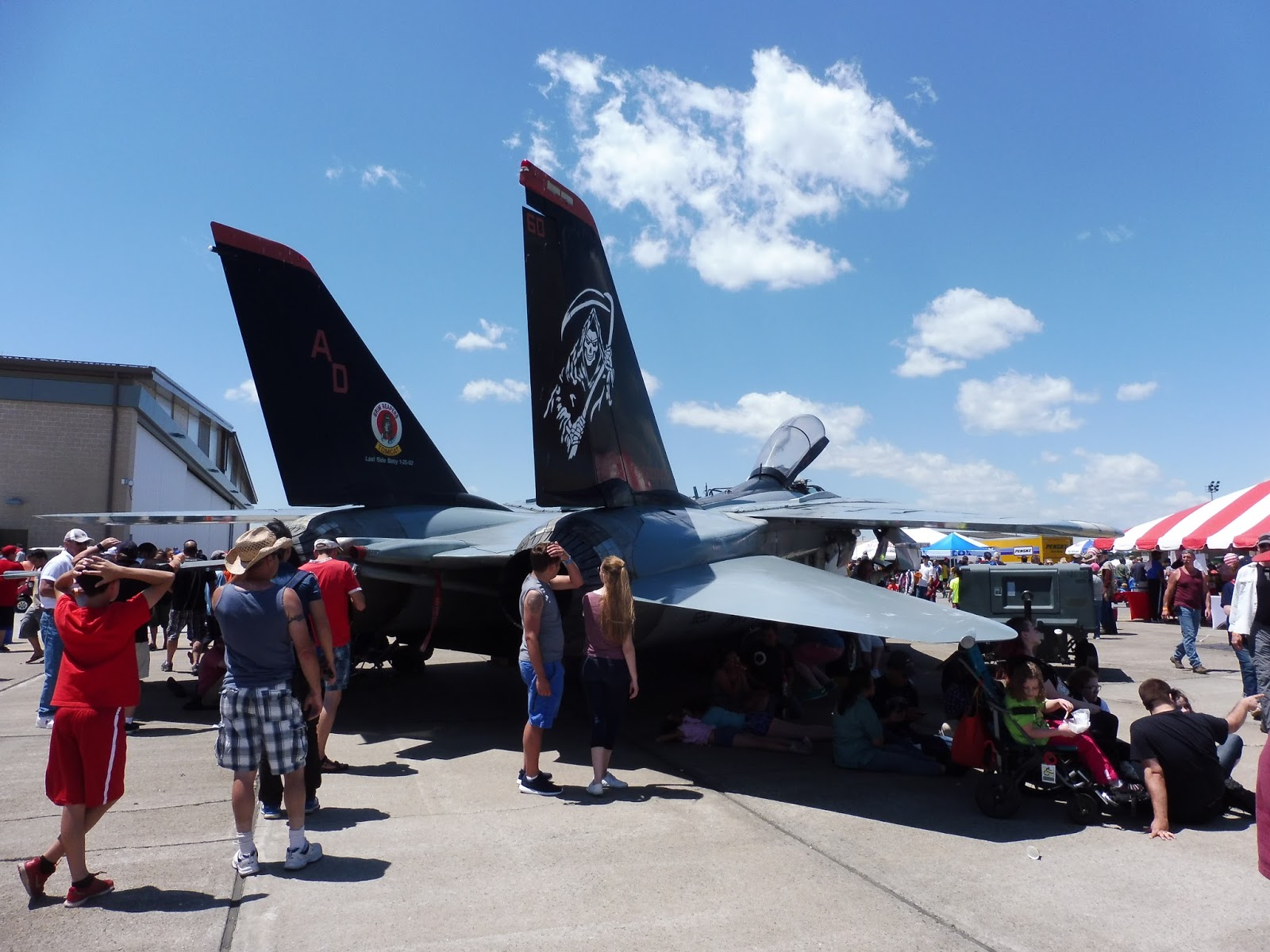
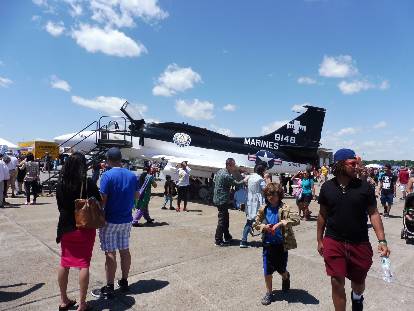
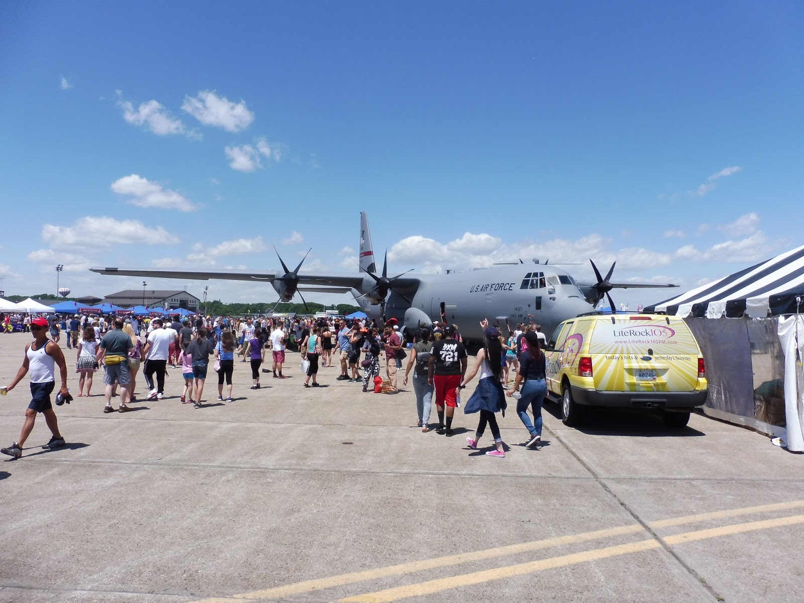
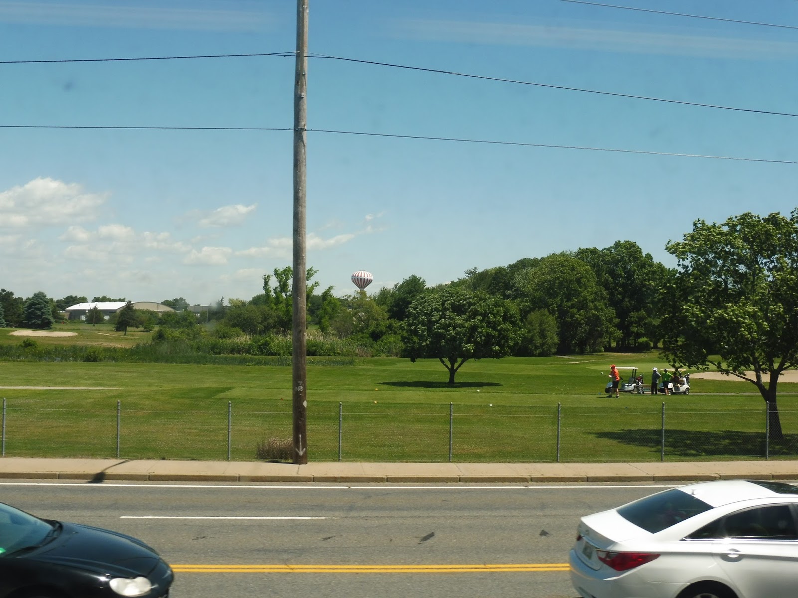
Random Photos: Quonset Air Show!
Here are a few shots from the Quonset Air Show, in case you’re interested.
Bonus Review: Commuter Rail to Quonset!
Last weekend was the Quonset Air Show in Rhode Island, a big event that draws in many people from around the state. This year, RIDOT decided to pilot a train service to the event, which included a section on track not used by passenger trains! My friends Nathan and Sam and I knew we had to take a trip down there.
 |
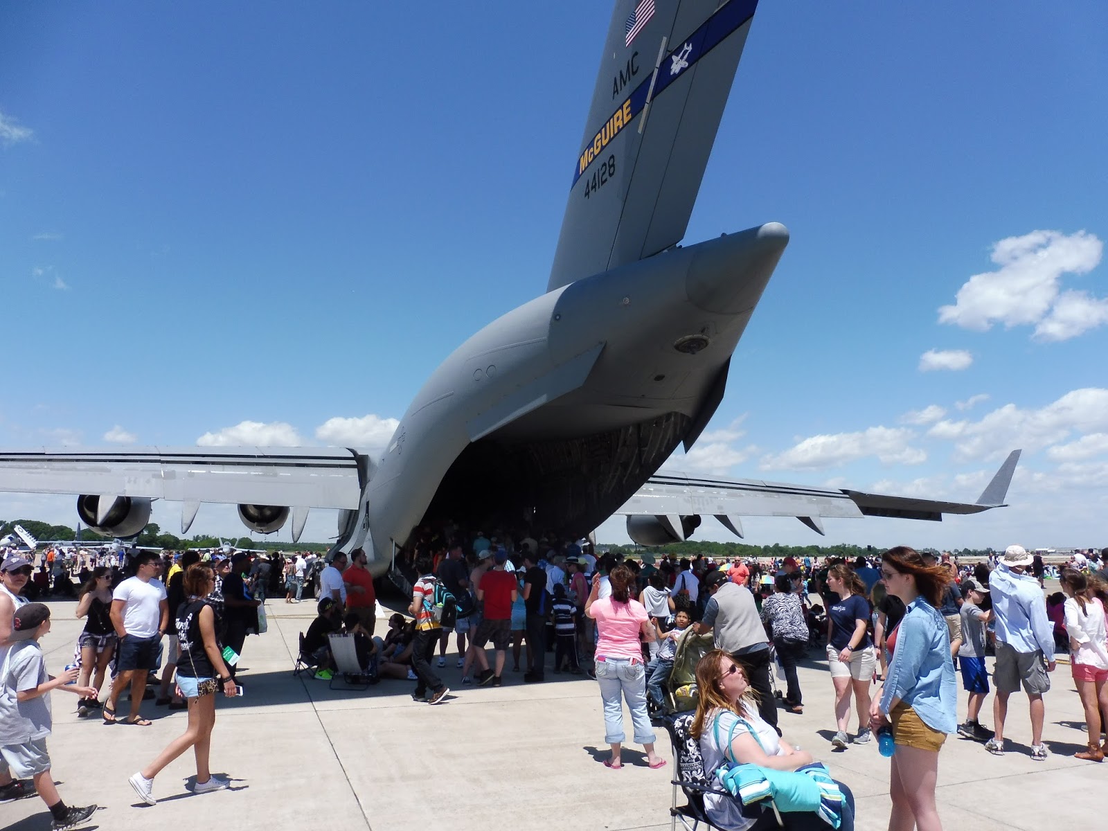
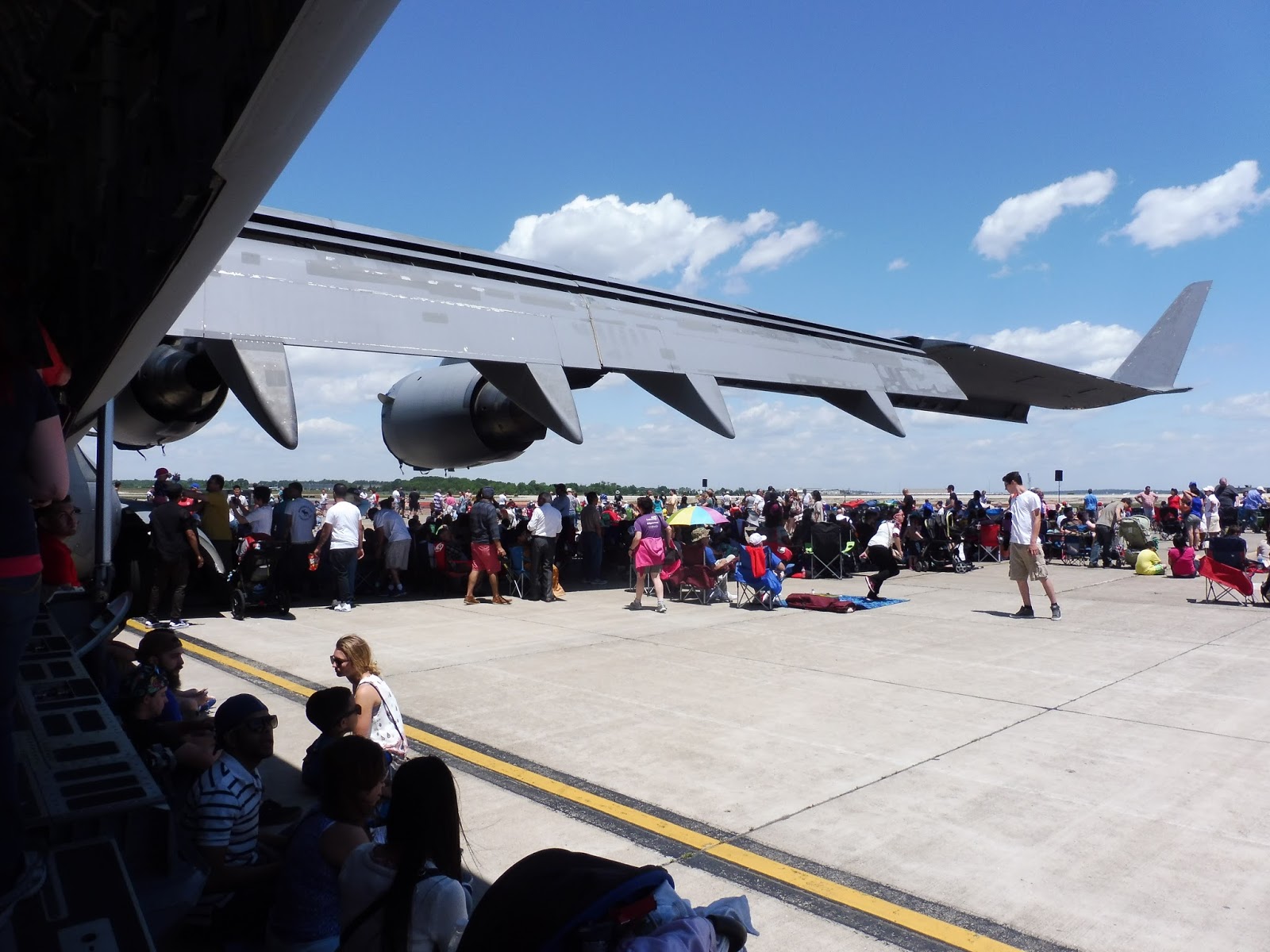
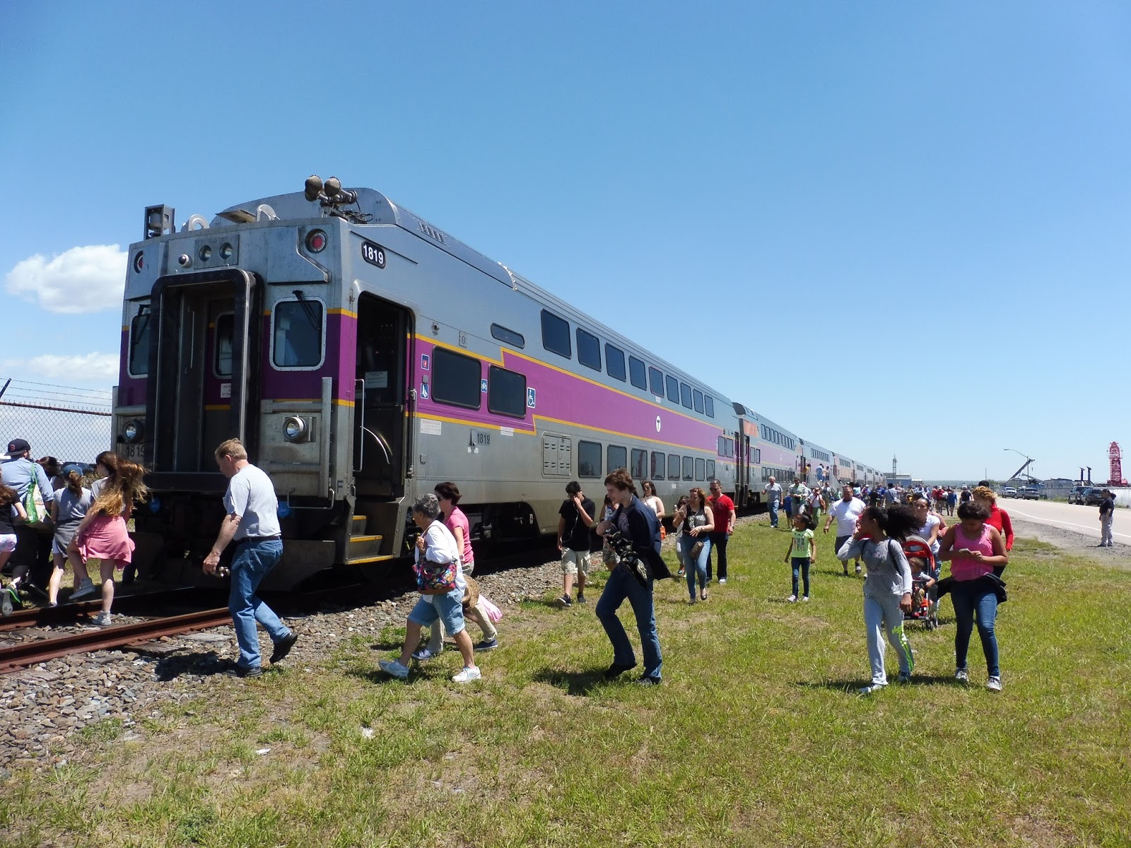
| SO MANY PEOPLE. We took the 11:15 short-turn trip from T.F. Green Airport to Quonset. |
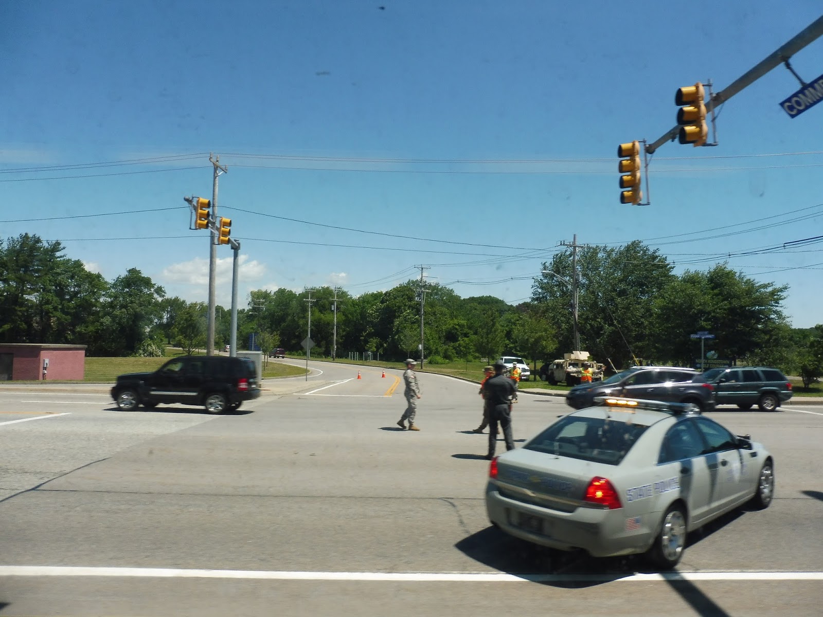
The crowds at T.F. Green Airport were absolutely insane! There were all these soldiers going around telling people to get off the yellow line (even if they arguably weren’t on it), and we all had to get our hands stamped when we entered the station. The train was eight bilevel cars, luckily, so it managed to fit everyone alright.
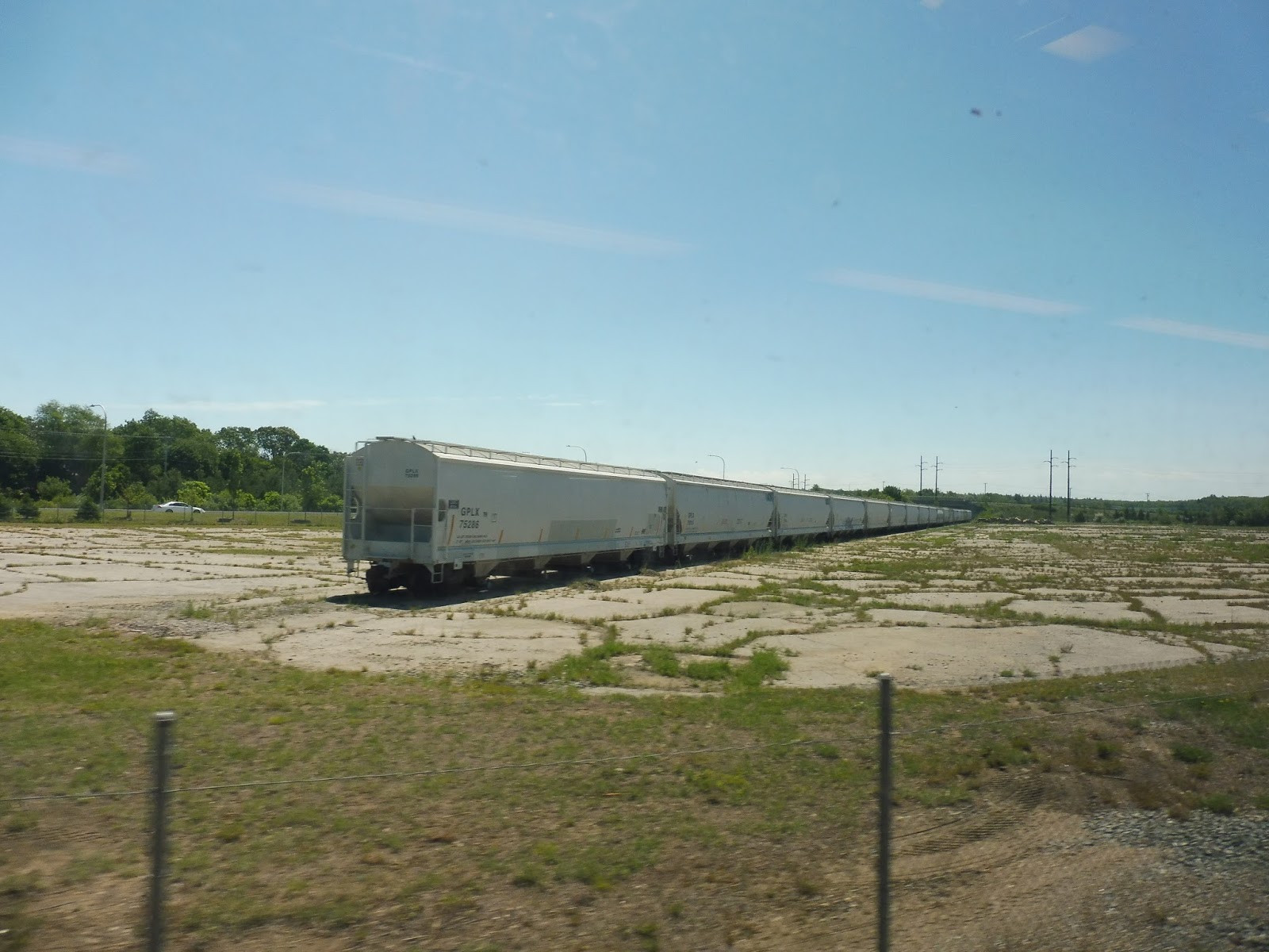 |
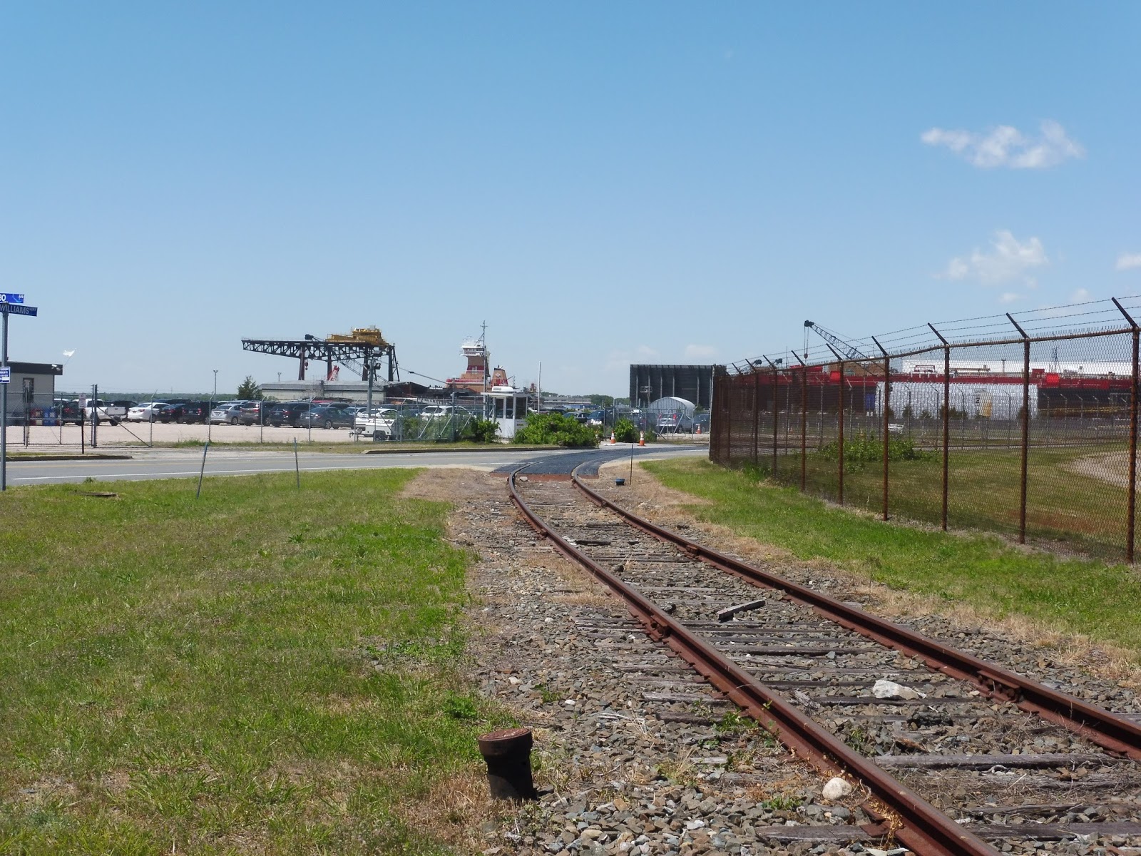
| This is the start of the unique section – the train breaks off from the Northeast Corridor between T.F. Green and Wickford Junction. |
 |
| Another view of this weird old freight yard. |
 |
| Some construction vehicles. |
 |
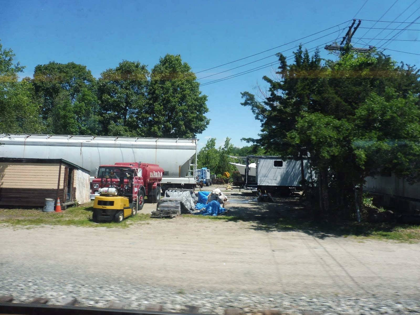
| A warehouse, I guess? |
 |
| That’s a huge…something! |
 |
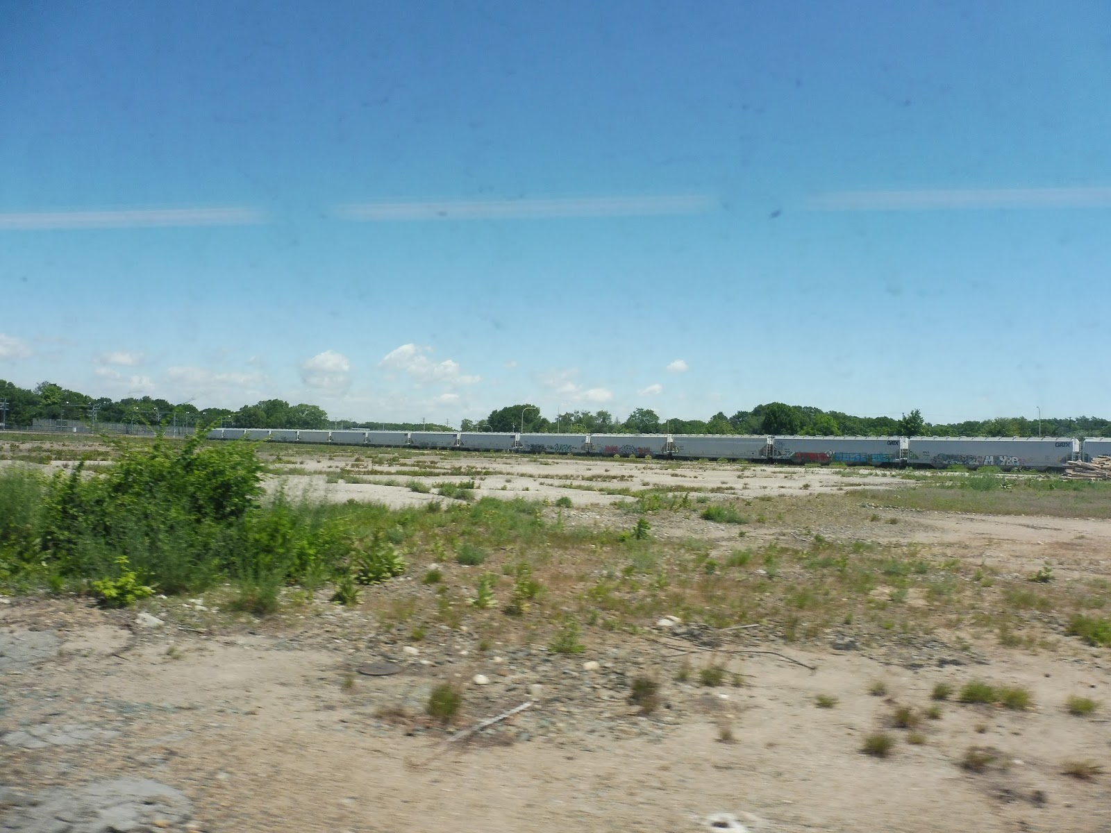
| Another spur line. |
 |
| Some magnificent grass. |
 |
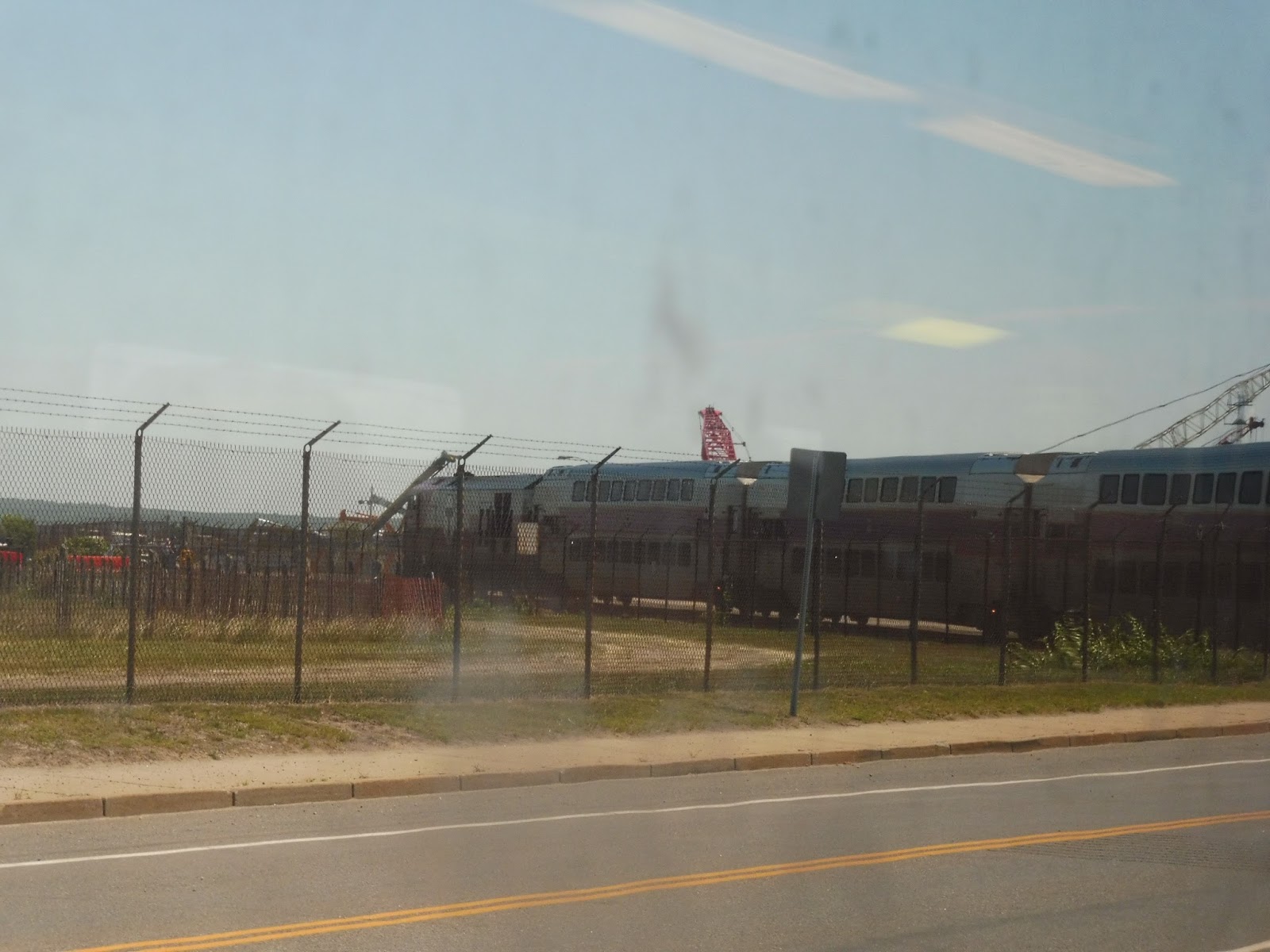
| There was a lot of security for car traffic, too. |
 |
| By this point we were running right alongside a road. |
 |
| A railroad crossing. |
 |
| That’s a large building… |
 |
| Some more buildings. |
 |
| And more. |
 |
| Some kind of scrapyard? |
 |
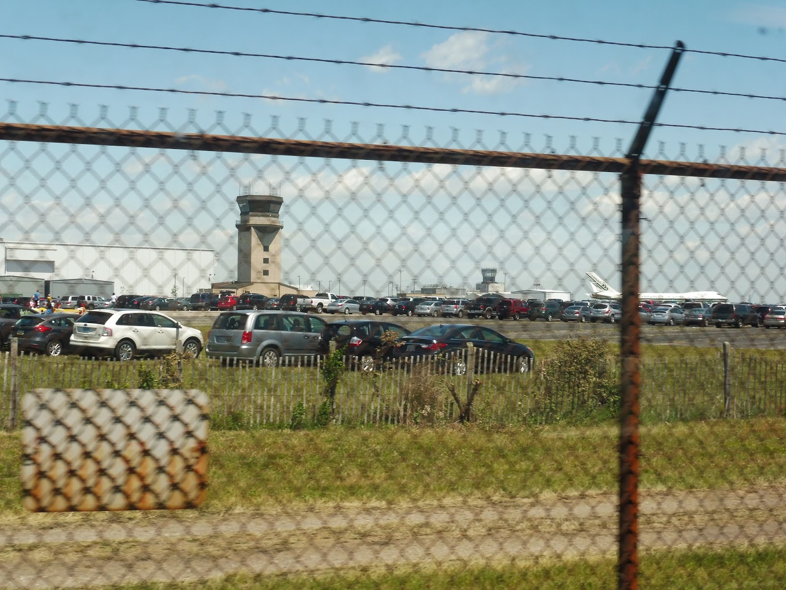
| We’re starting to see planes! |
 |
| Some airport scenery. |
 |
| The train rounding a curve. |
 |
| Right along a fence. |
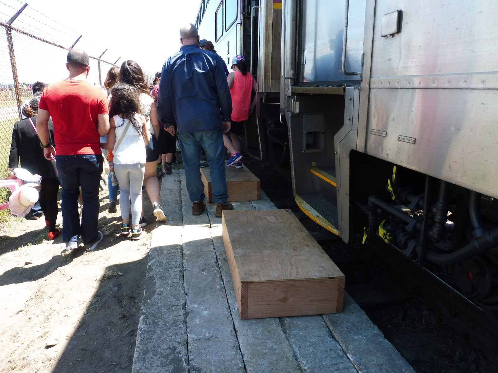
I was also impressed at the amount of infrastructure they set up at the makeshift Quonset station. On one side, they had driven concrete blocks into the ground and put stools on top of them to give people less of a step to the ground. On the other side, even though it was just for one car, they had installed a ramp to make a high-level entrance!
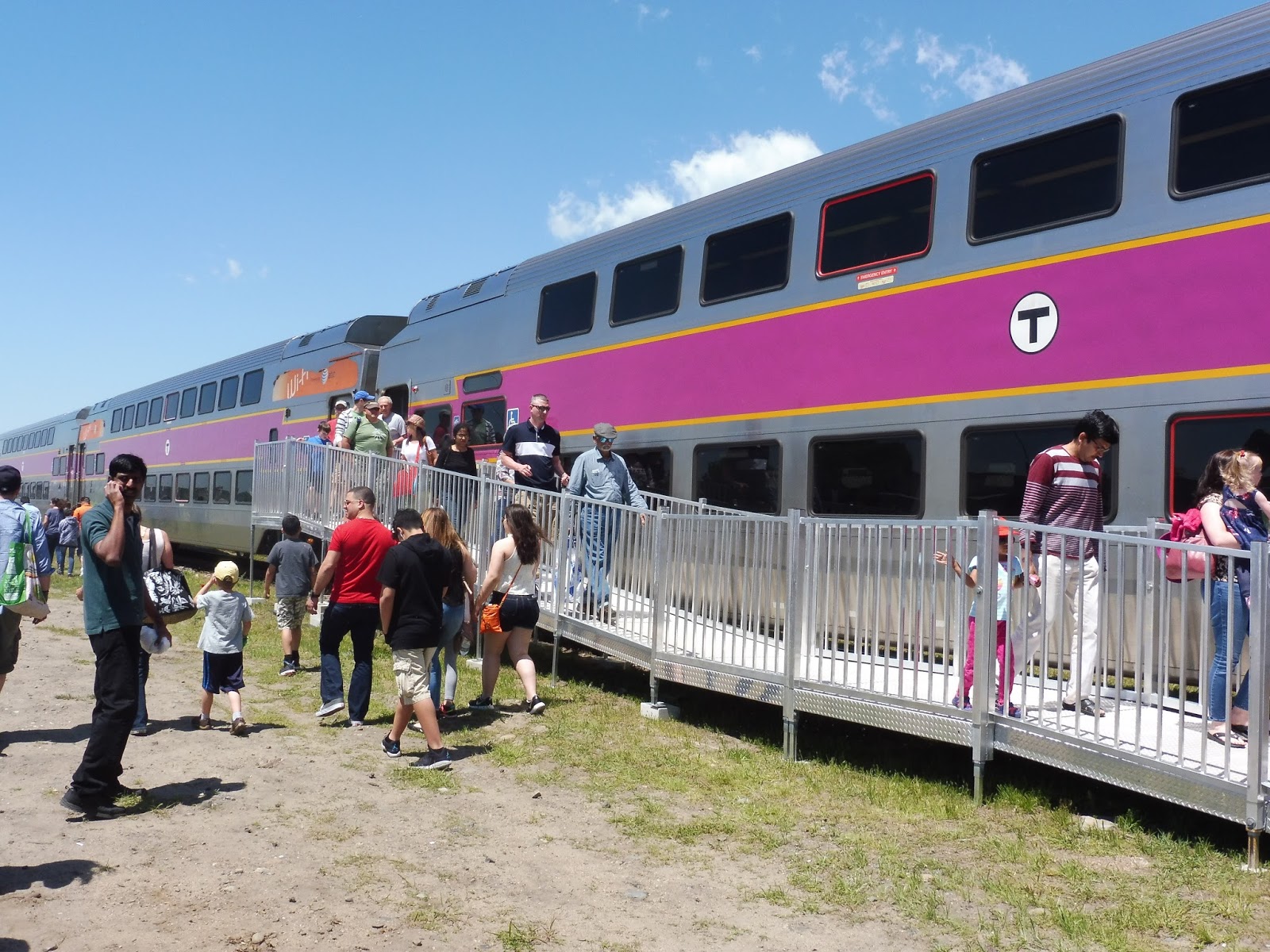 |
| People going down the ramp. |
 |
| The train looking out toward the water. |
 |
| People going around to the other side. |
 |
| Gosh, that track is decrepit. It was a slow speed limit, that’s for sure. |
 |
| People coming down the steps. |
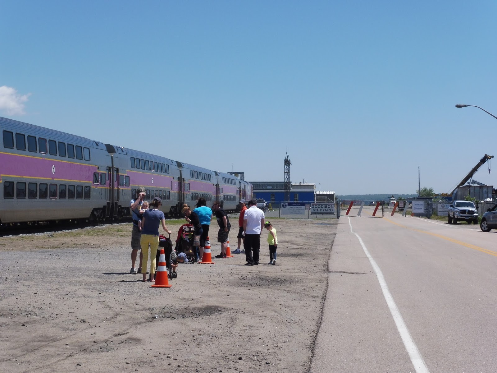
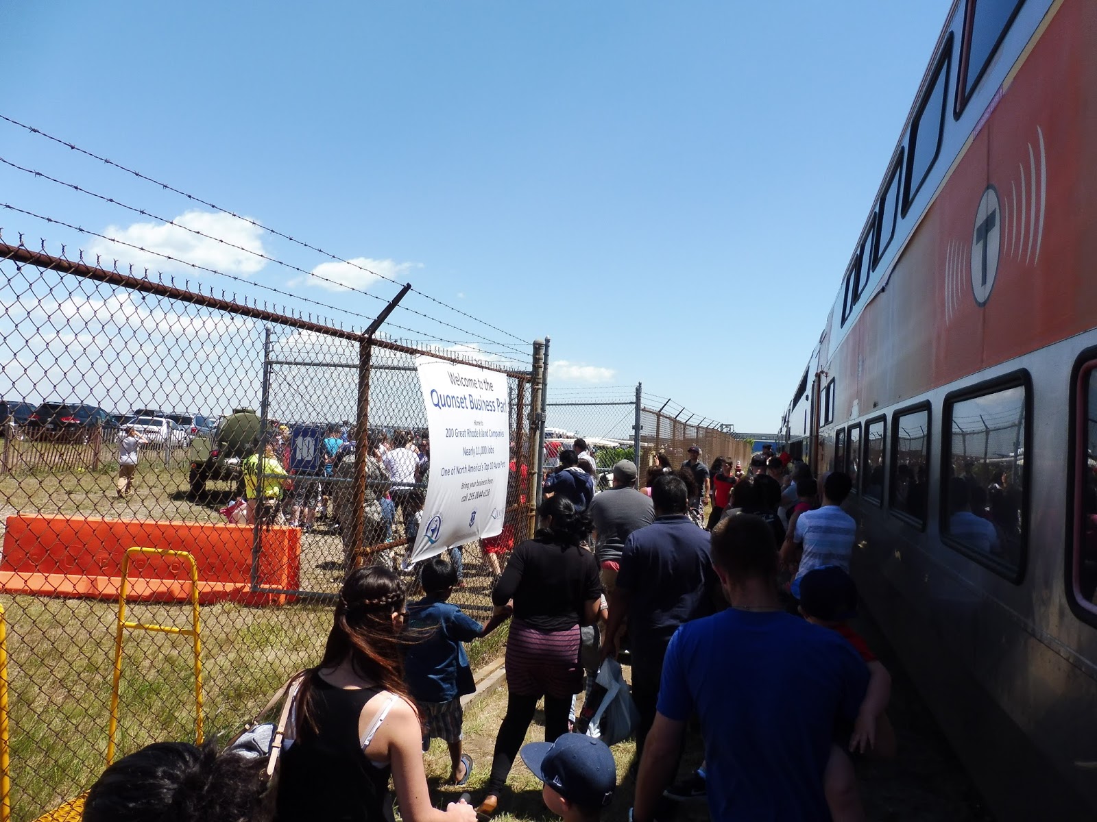
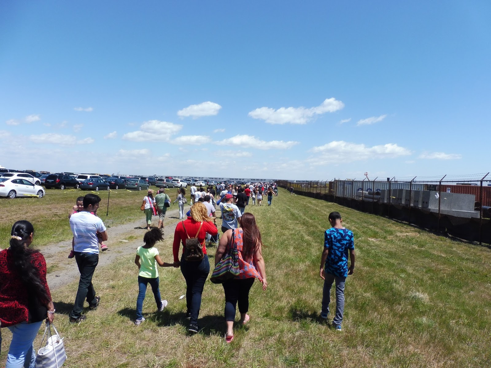
Unfortunately, the walk from the train to the show was pretty annoying. It took us about 15 minutes, and they had all these ropes everywhere to prevent people from cutting through a parking lot. Instead we had to go all the way around, and it took forever! Also, the signage here really could have been better, at least for people coming back to the train.
 |
| That’s a large crowd… |
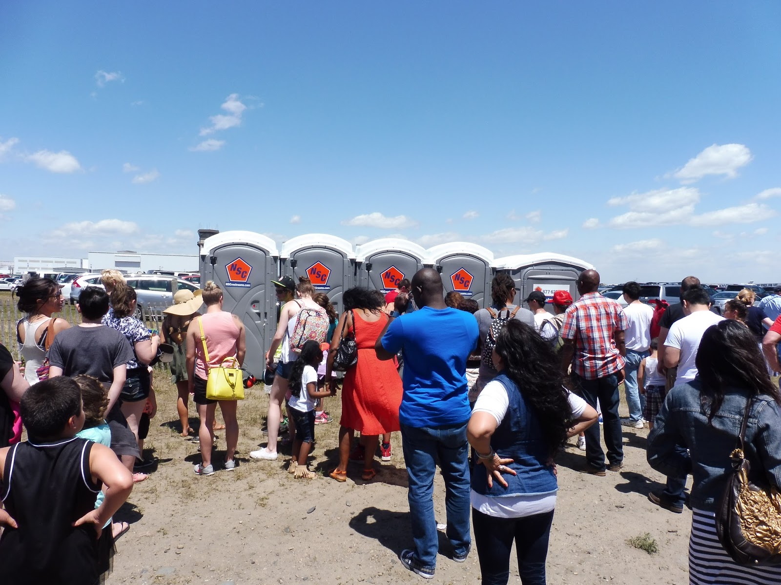 |
| The “mezzanine”? There most certainly were not enough porta-potties. This area also had some drinking water. |
 |
| The train again. |
 |
| Heading towards the show. |
 |
| Looking back towards the train. |
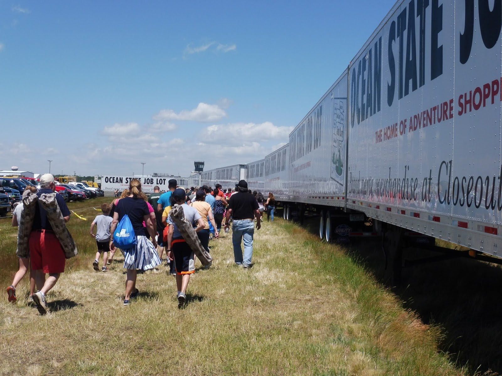 |
| There were a lot of Ocean State Job Lot trailers… |
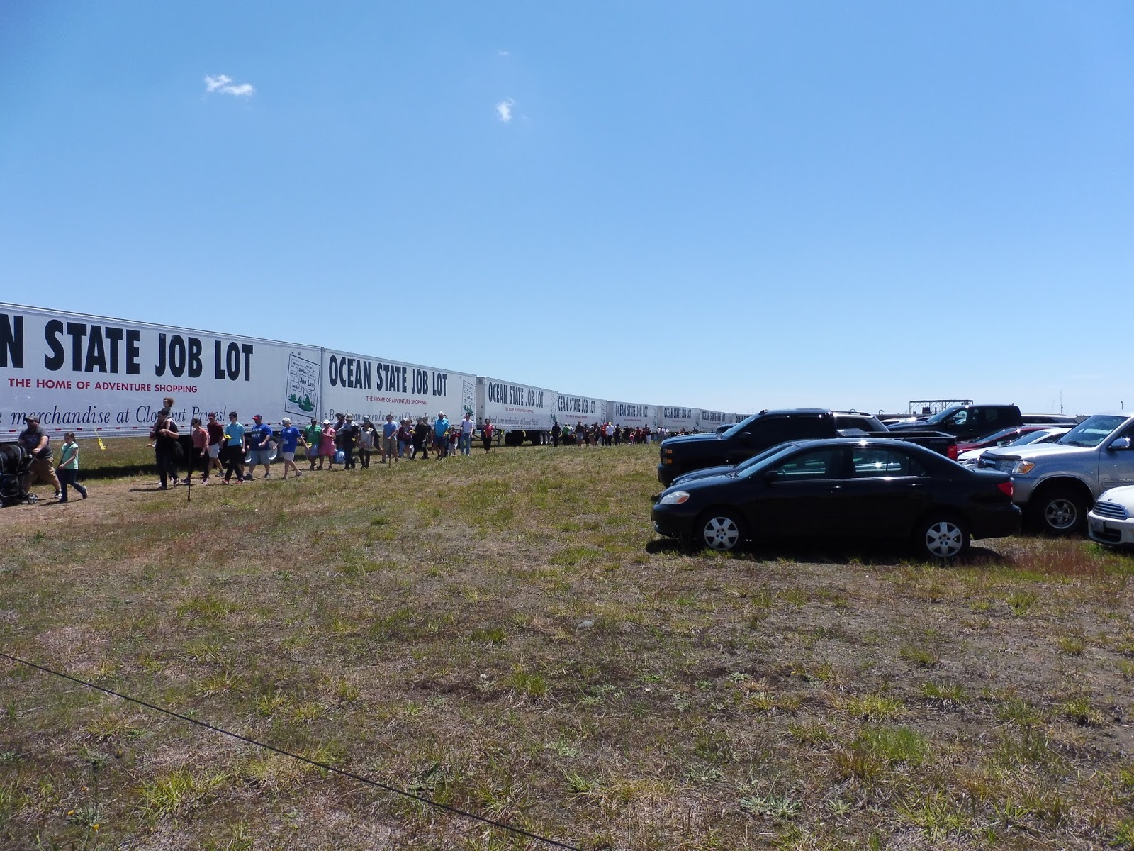 |
| A LOT. |
 |
| This sign is so bad! |
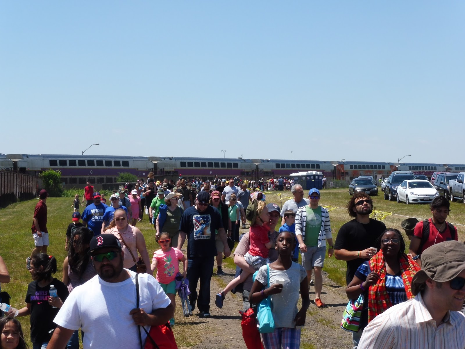
On the way back, however, we ran into some trouble. We left the show around 1:15, which felt pretty early, since we were getting the 2:00 train. But when we arrived at the boarding area, a huge crowd had already formed, and it was only getting bigger. Everyone was incredibly antsy, including many children who were digging around in the dirt in anticipation.
 |
| SO MANY PEOPLE. |
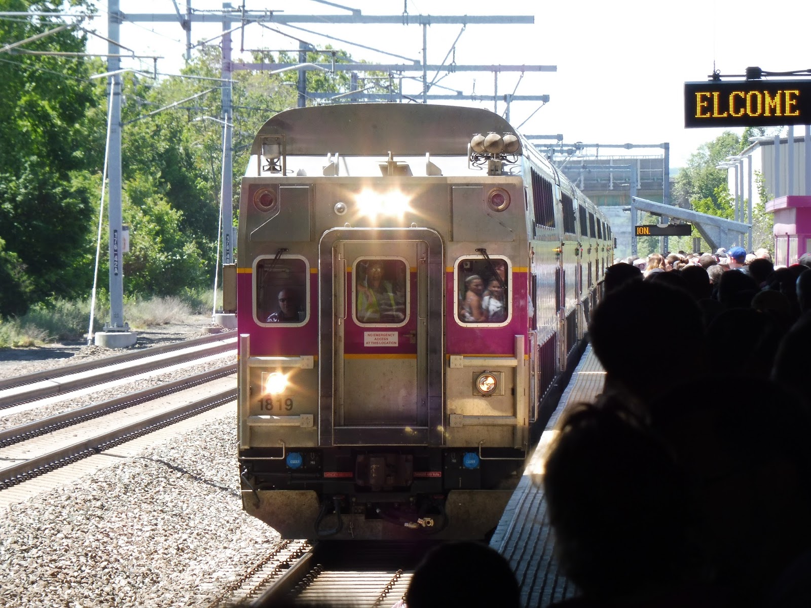
2:00 came and went. This was a problem, since we wanted to catch the 2:56 Commuter Rail train to Boston – 10 minutes after the Quonset trip was scheduled to arrive. By the time the train came in around 2:15, we knew we weren’t gonna make it. Oh well…at least we could get lunch during our two-hour wait in Providence.
 |
| Took you long enough! |
 |
| The crowd at Providence took another 20 minutes to feed out of the station. |
Route: Commuter Rail to Quonset
Ridership: HEAVY. There were a lot of people who used this train, but that was to be expected, since it was an event train, The eight bilevels seemed more than capable of handling the massive crowds. Apparently on Saturday, though, they used single-level cars, which must have been insane!
Pros: Offering free train service to the airshow was a great idea, and it seems like a bunch of people took advantage of it. The facilities at Quonset were better than expected, what with the steps and the makeshift mini-high. Also, the crowd control was generally pretty good on the way there, especially at Quonset. And of course, running on unique track was a blast.
Cons: The train being late was definitely an annoyance. I also wonder if they could run the service a bit more frequently to space out the crowds a bit, although that would require a second train. Signage at Quonset could have been a lot better, and generally the walk there could have been shortened by just cutting through the parking lot instead of going around.
Nearby and Noteworthy: The air show was pretty interesting! The crowds were huge, and it seemed to be catered more to little kids than to plane buffs, but it was still a fun experience. I can post pictures from the show if you guys are interested.
Final Verdict: 7/10
There were definitely a few hiccups here and there, but considering this was the first time they had run the service, they did a really good job. I really hope they run the train again next year, because it seemed to be a huge hit in terms of ridership. Hopefully signage and scheduling can be improved, but overall, the Quonset service was pretty good!
Latest MBTA News: Service Updates
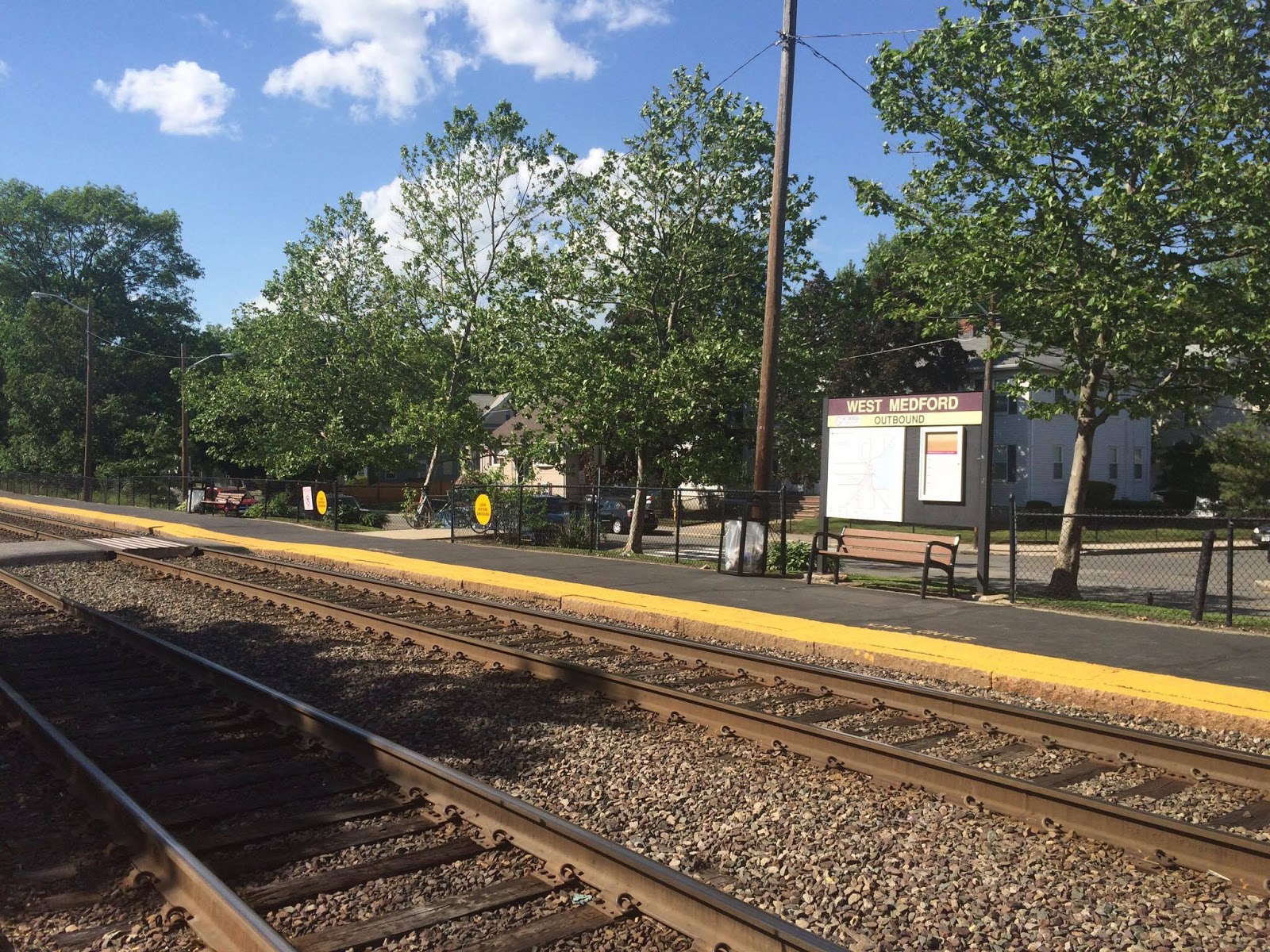
West Medford
I’m on a streak of awful Commuter Rail stations here. West Medford is a strange little Zone 1A stop with a weird location. Why are there no stations in the more urban part of Medford? I’m not sure, but until the Green Line extension gets built (if ever), this is the only station in Medford (except for Wellington). It’s terrible.
 |
| The trip here was impromptu, so I didn’t have my camera. Thus, all of the photos are courtesy of my friend Shuvom’s phone. |
There are a few entrances to the station. One of them is direct from the level crossing on High Street, and it’s as simple as stepping onto the platform. Meanwhile, on residential Playstead Road, a small staircase leads up to the station as well.
 |
| Hmm…”parking.” |
The third entrance is from the station parking lot, and it’s one of the lamest Commuter Rail lots I’ve ever seen. Relegated to a small corner of the parking for a Rite Aid, the Commuter Rail section only has 34 spaces. Yes, it’s an urban station, but that’s a miniscule amount! The station also has a few bike racks, although the MBTA website denies this.
 |
| The stark outbound platform. |
The whole station is low-level, and very much so – the step from the ground to the train is huge here. When our train arrived, a conductor had to hold an old lady’s hand to help her leave the train! The outbound side of West Medford is mostly asphalt, with a whole two benches. So much seating space!
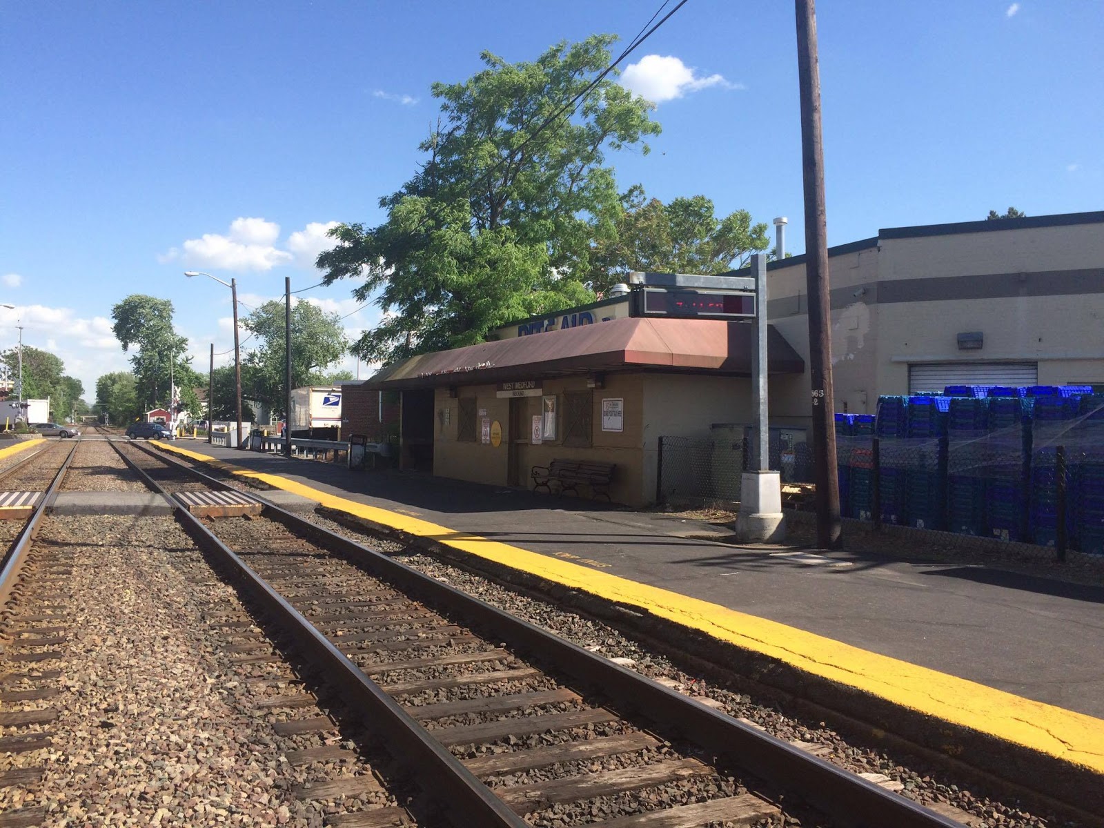 |
| The inbound side with its building. |
Luckily, the inbound platform offers much more, seating-wise. Near the parking lot entrance there’s a bench with some advertisements right next to it. Other than that, you’ve got a bench in the shelter of the station building, which is much more desirable than the seating inside the building…
 |
| AHHHHHHHHHHH! |
Well, it can hardly be considered “inside,” since it’s just a shelter. But oh my gosh, what a dingy shelter it is. The walls are bare, with peeling paint, and the single light under there is completely shattered. The benches look really uncomfortable, since they have holes all over them, and just look at the litter! No one in their right mind would ever want to wait for a train in here.
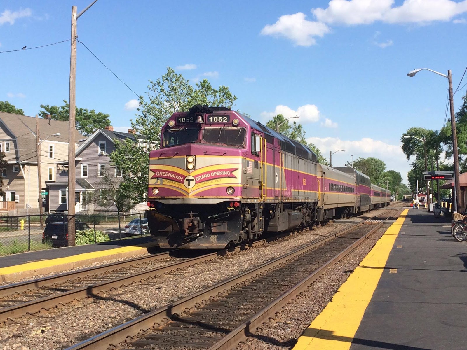 |
| Oh hey, it’s the Greenbush locomotive! This train ran express straight through the station. |
Station: West Medford
Ridership: I’ll admit, this place does get a lot of ridership. I think the quick ride from here to Boston (13 minutes) is what attracts so many commuters – 819 per weekday, to be exact. Even in the evening rush when I was here, there were still a few locals heading into the city.
Pros: Well, the quick ride is the main pro. This is a dense area with no other rail transit, and the 13 minute ride to Boston is better than the 94, 95, or even the express 326 (the buses that serve West Medford).
Cons: EVERYTHING ELSE. The low-level platform, the lack of parking, the disgustingly dingy building…you can basically name anything about this station and it will most likely be bad.
Nearby and Noteworthy: There are a good amount of businesses along High Street, and a few of its restaurants look intriguing.
Final Verdict: 2/10
The fact that commuters can get a fast ride from here to Boston is a wonderful thing. But the station they have to use is anything but wonderful. I mean, at least give it a mini-high for accessibility! That step up to the train is huge! Oh, and I forgot to mention that inbound trains stick out onto the level crossing, which seems to have a…person? Yeah, there was a guy who seemed to be doing SOMEthing related to that crossing, and I think he was residing in the “crossing shack” right next to it. Poor dude…he has to hang out at this awful station all day.
Latest MBTA News: Service Updates
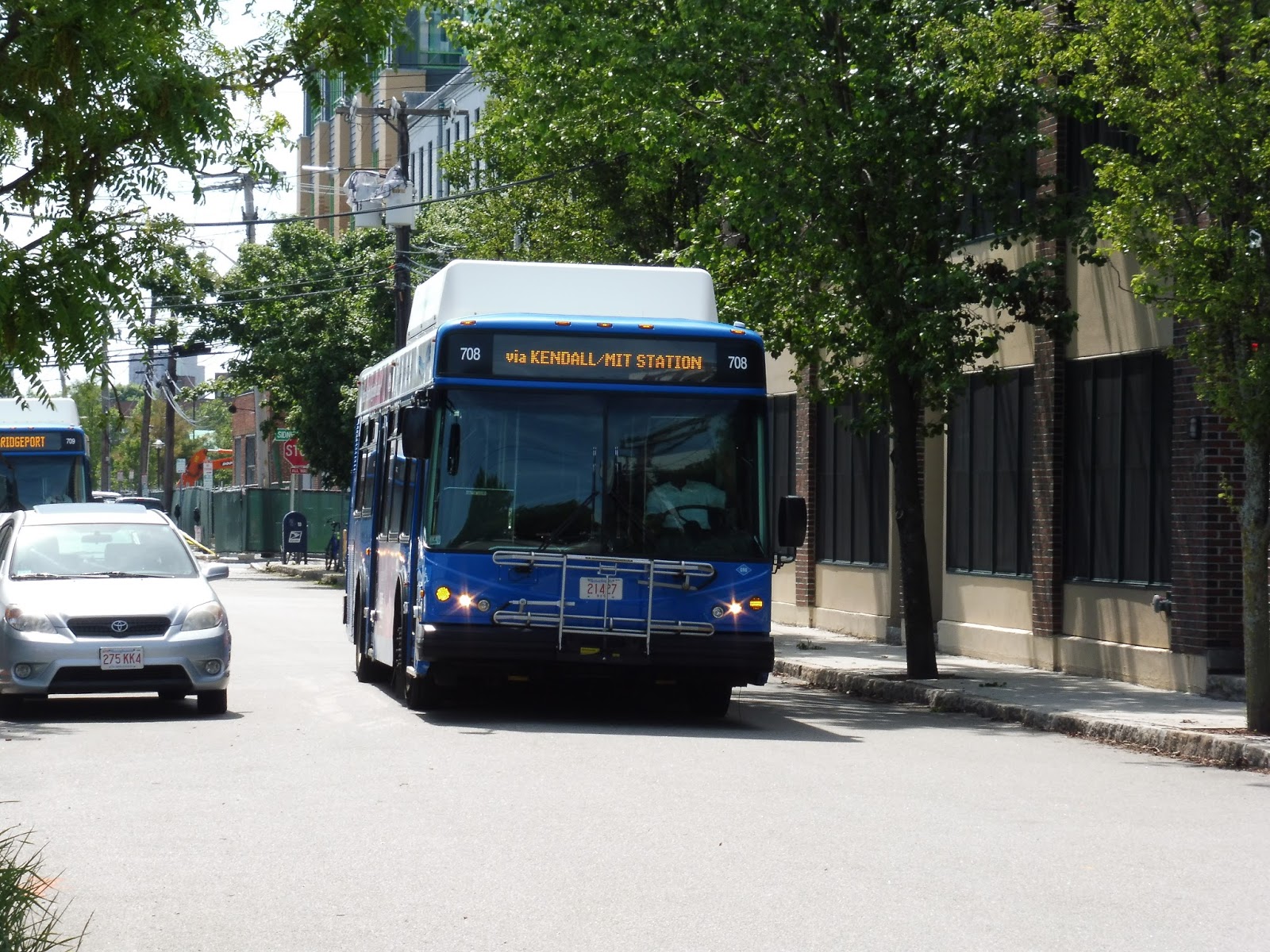
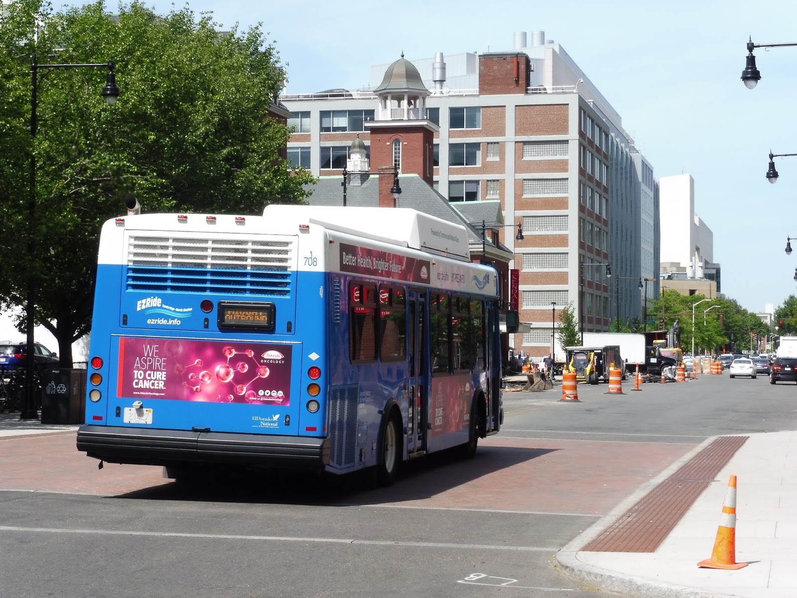
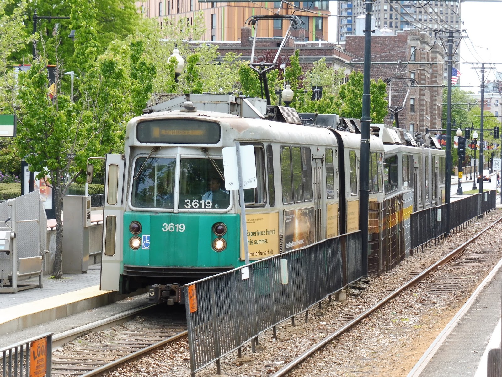
EZRide (Cambridgeport – North Station or Kendall Square)
Yes! I finally got a trip on the EZRide! I see these all the time whenever I’m in East Cambridge on a weekday, and I’ve always wondered what the heck they are. Well, the mysteries behind these strange blue buses plying the streets of Cambridge have finally been solved. Let’s see what this service is.
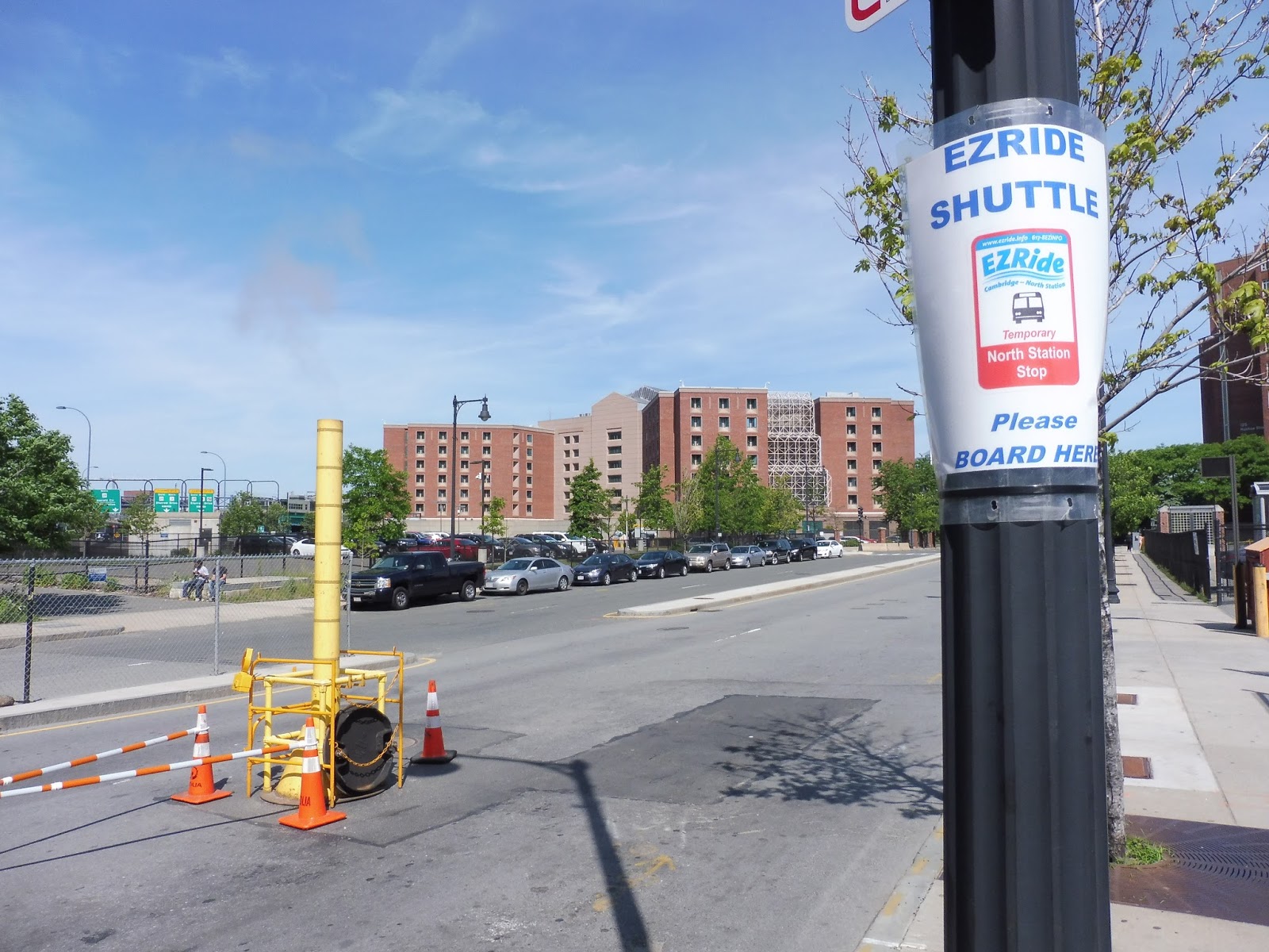 |
| The temporary stop at North Station, a few hundred feet away from the normal one. |
The EZRide’s main route is from North Station to Cambridgeport via Kendall. However, it changes pretty drastically based on the time of day. The morning and evening routes are different, while the bus operates as a shuttle loop from Cambridgeport to Kendall Square middays. I took the bus in the morning (thanks to a delayed opening at school), so that’s the route I’ll be covering. You can see the different variations here.
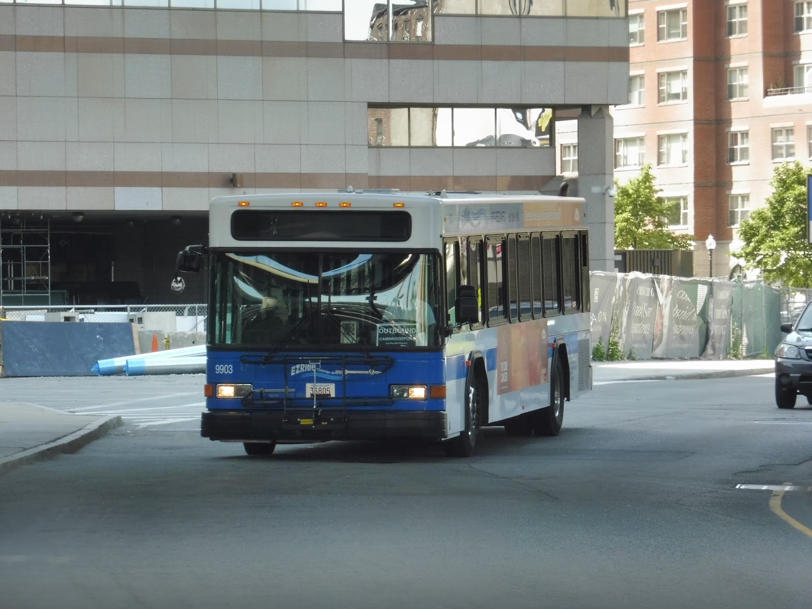 |
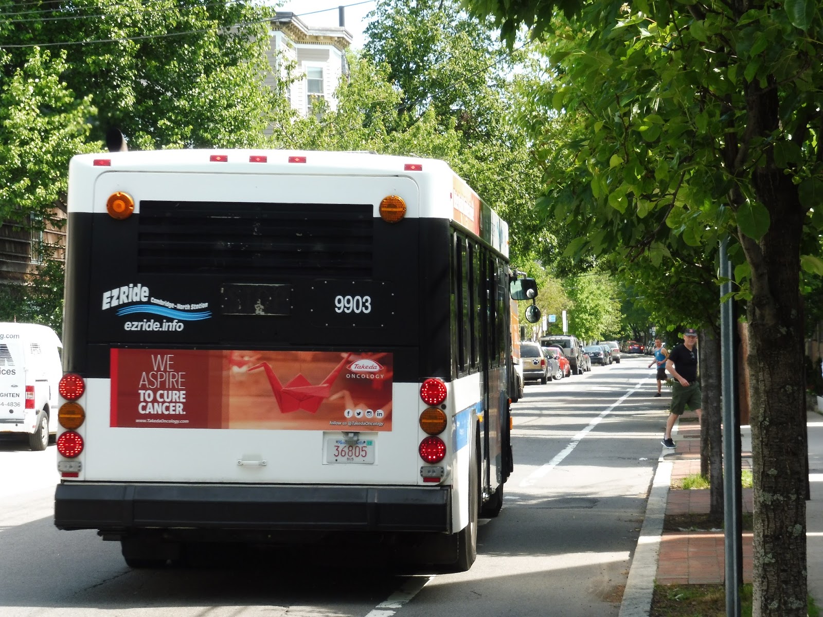
| The bus arriving at North Station. |
Okay, so the fares are a bit weird, too. The thing is, most EZRide passengers don’t have to pay at all. The majority of its ridership comes from either commuters or MIT students, both of which ride free (participating companies give free EZRide passes, while flashing an MIT ID gets you on the bus at no cost). For anyone else who may be riding, the fare is $2.00 for adults and $1.00 for students or seniors.
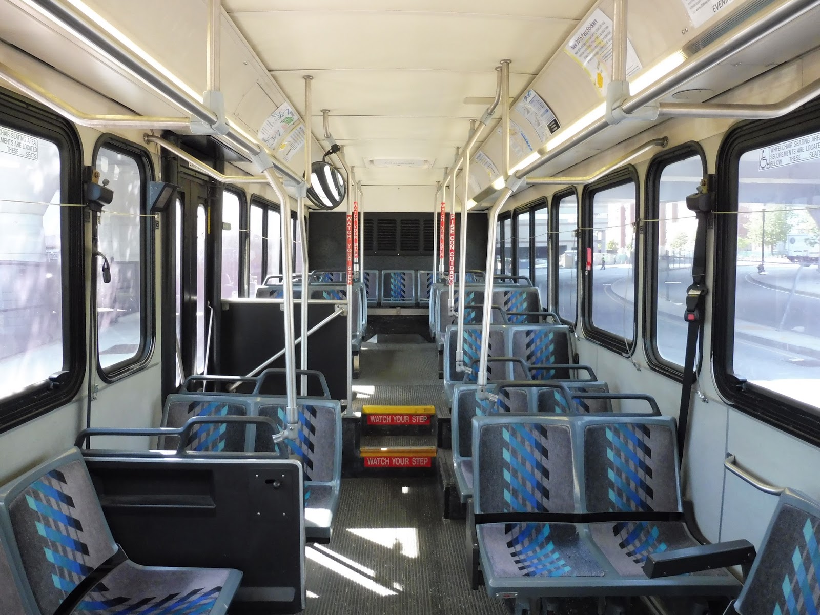 |
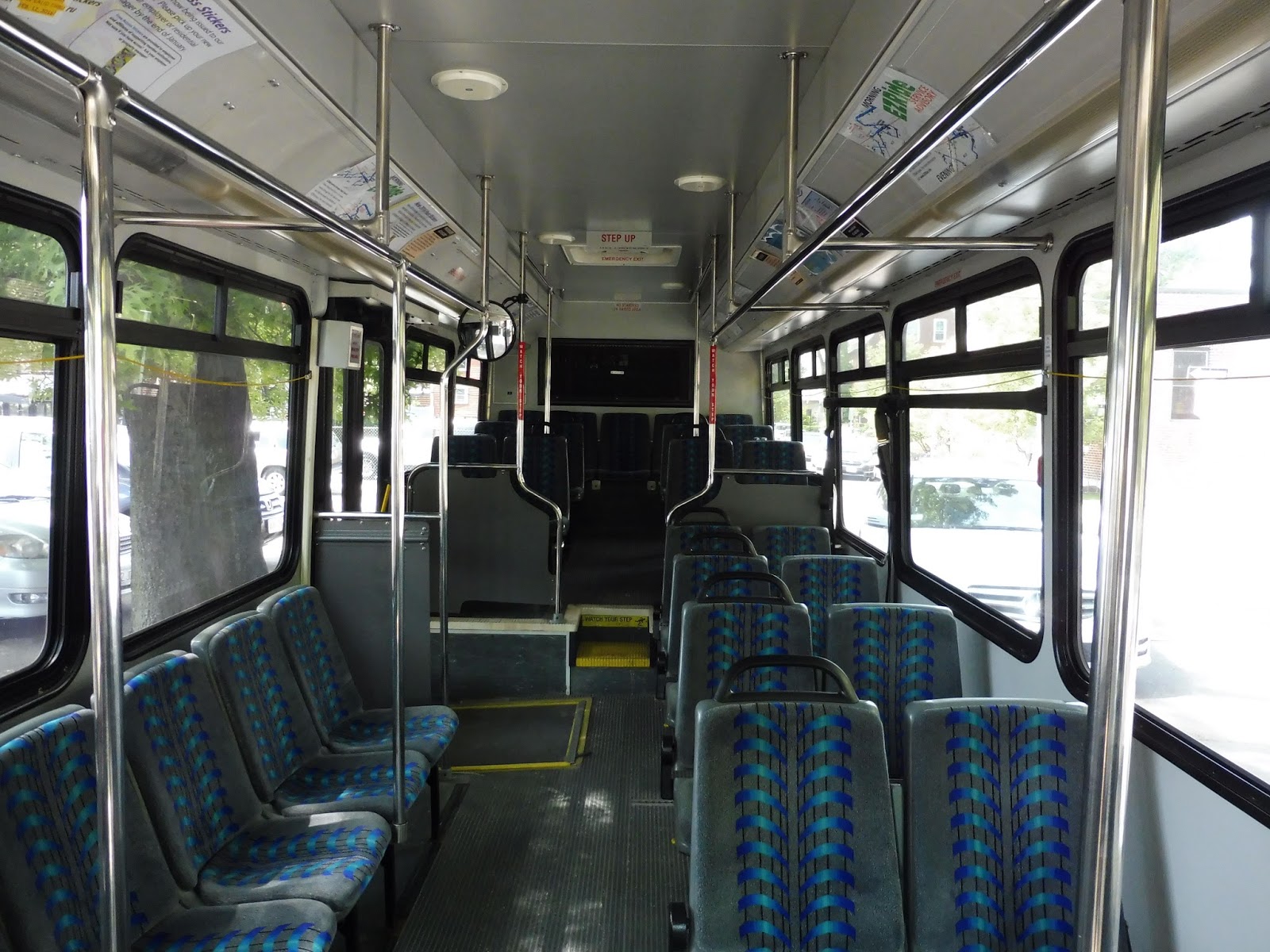
| The inside of the bus. |
The bus that came to North Station was one of the older ones, and it didn’t have the greatest interior. The seats had a pretty ugly design, and the general look was quite bland and utilitarian. Worst of all, though, was the destination sign – it was literally just a piece of paper at the front of the bus that the driver would flip around at either terminus! That’s pretty bad…
 |
| It’s weird being on a bus over here. |
Leaving the North Station stop on Nashua Street, we curved around alongside a park and the Charles River, then turned onto Monsignor O’Brien Highway at Science Park Station. Running alongside the Green Line’s elevated structure, we went by the Museum of Science on the other side. Eventually, we turned onto Museum Way, a strange narrow street lined with apartment buildings and offices.
 |
| Where the heck are we?? |
We then turned onto North Point Boulevard, with undeveloped industrial land on one side and more modern apartments on the other. After passing a park, we turned onto East Street and merged our way under the Green Line once more. We turned onto First Street, going by Lechmere on the right, but not actually going into the busway.
 |
| About to go under the Gilmore Bridge on North Point Boulevard. |
There were offices on either side, but they got replaced by various small businesses and the behemoth of the CambridgeSide Galleria mall. Weirdly, we made a two-block deviation from the route – it’s supposed to go right onto Binney from First, but instead we made this strange jog via Charles Street and Second Street, then Binney. As we got closer to Kendall Square, we were going by a lot of pharmaceutical companies and the like, because, you know, it’s Kendall Square.
 |
| Look! Photographic proof that we went onto Second Street! |
As the street curved south, it became Galileo Galilei Way, with still more offices lining it. We paralleled the Grand Junction Railroad for a bit, then turned onto Broadway, passing more – gasp! – offices. After that, we curved around onto Main Street, arriving at Kendall Square Station. However, no one was waiting, so we continued on to Cambridgeport.
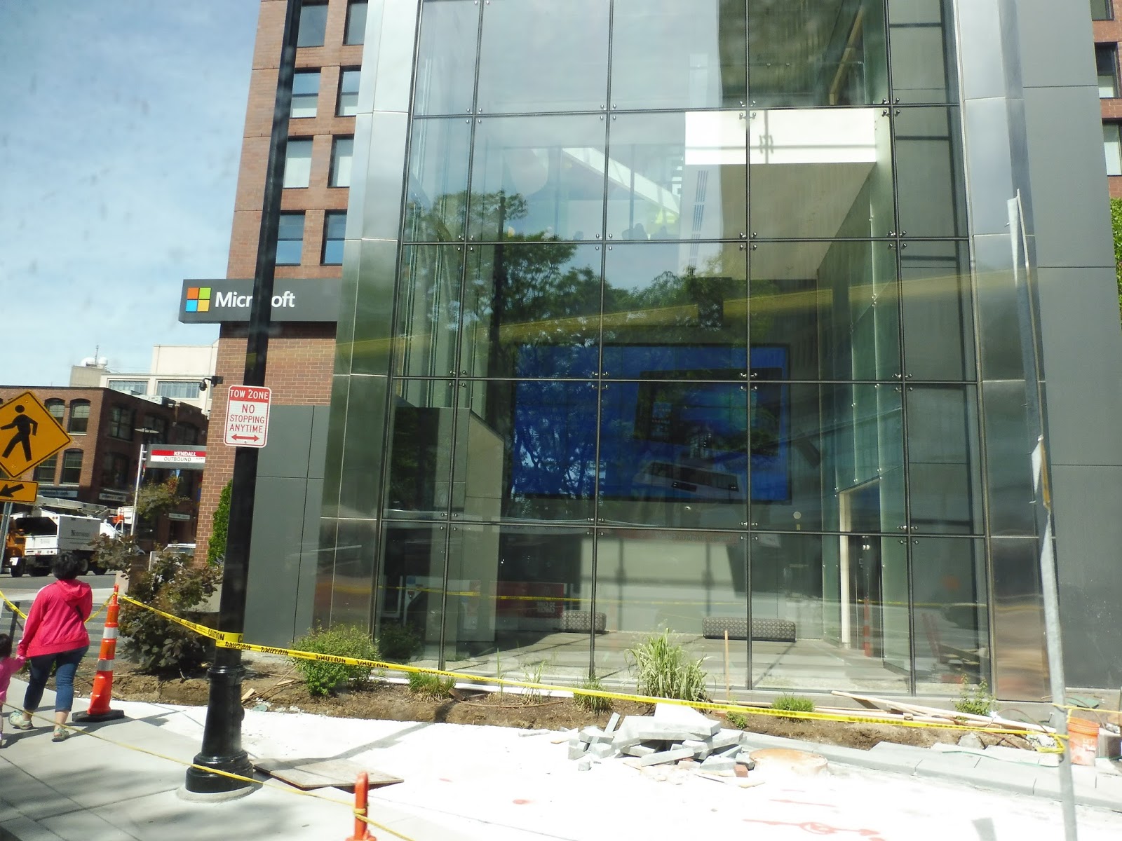 |
| The Microsoft building. |
We headed down Main Street once more, and with all those offices still lining the street. We crossed over the Grand Junction Railroad, then turned onto Portland Street, which merged onto Albany Street. After that, we turned onto Mass Ave, and it seemed like we were heading into Central Square, but we headed onto Landsdowne Street before that happened.
 |
| That building on the left is pretty cool. |
 |
| The bus heading down Brookline Street. |
 |
| The bus on Erie Street. |
 |
| Ehh… |
 |
| Going over the Grand Junction. |
 |
| The bus going back to Cambridgeport, now on its midday routing. |
Newtonville
Oh no, not a Worcester Line I-90 station! I already inhaled millions of fumes at Auburndale, now I have to review another one? Well, at the very least, Newtonville is slightly better than Auburndale. Slightly. That really isn’t saying much at all.
 |
| Ughhhhhhhhhh. |
Like Auburndale, Newtonville is right next to the wide Mass Turnpike. It offers two entrances at overpasses on either side of the platform: Walnut Street and Harvard Street. They’re both pretty much the same, with a sign, schedule, and a few newspaper boxes on the Walnut Street side. For the record, Newtonville apparently has 53 parking spaces, but I can’t for the life of me find them on Google Maps.
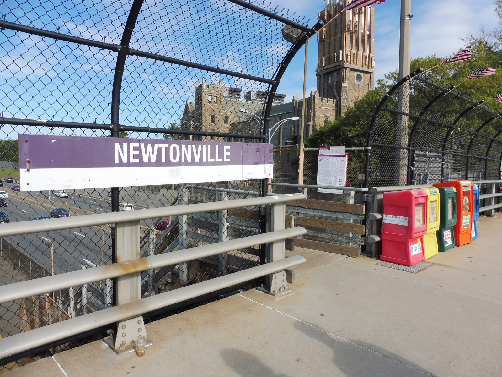 |
| The Walnut Street entrance. |
Okay, one perk that Newtonville has over Auburndale is that the stairs aren’t insanely scary. With the latter station, you can look right down as you’re traversing the staircase and see the ground way below. At least Newtonville’s stairs are wooden, so you can’t actually see through them. This also means that you don’t have to see the rusting going on below them! Yay…
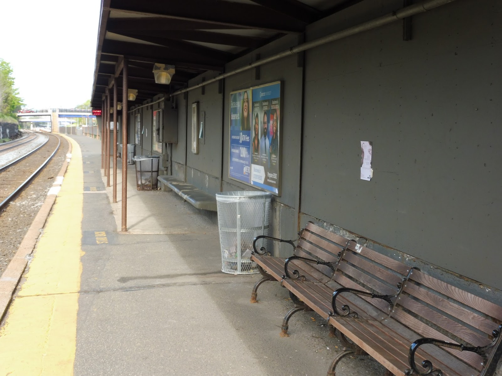 |
| On the platform. |
Newtonville has a typical shelter for an I-90 station, meaning it’s awful. It’s all concrete and wooden, with litter everywhere despite lots of wastebaskets being provided. The benches that stick out of the wall of the shelter are terrible, although Newtonville does provide one actual bench – another step up from Auburndale.
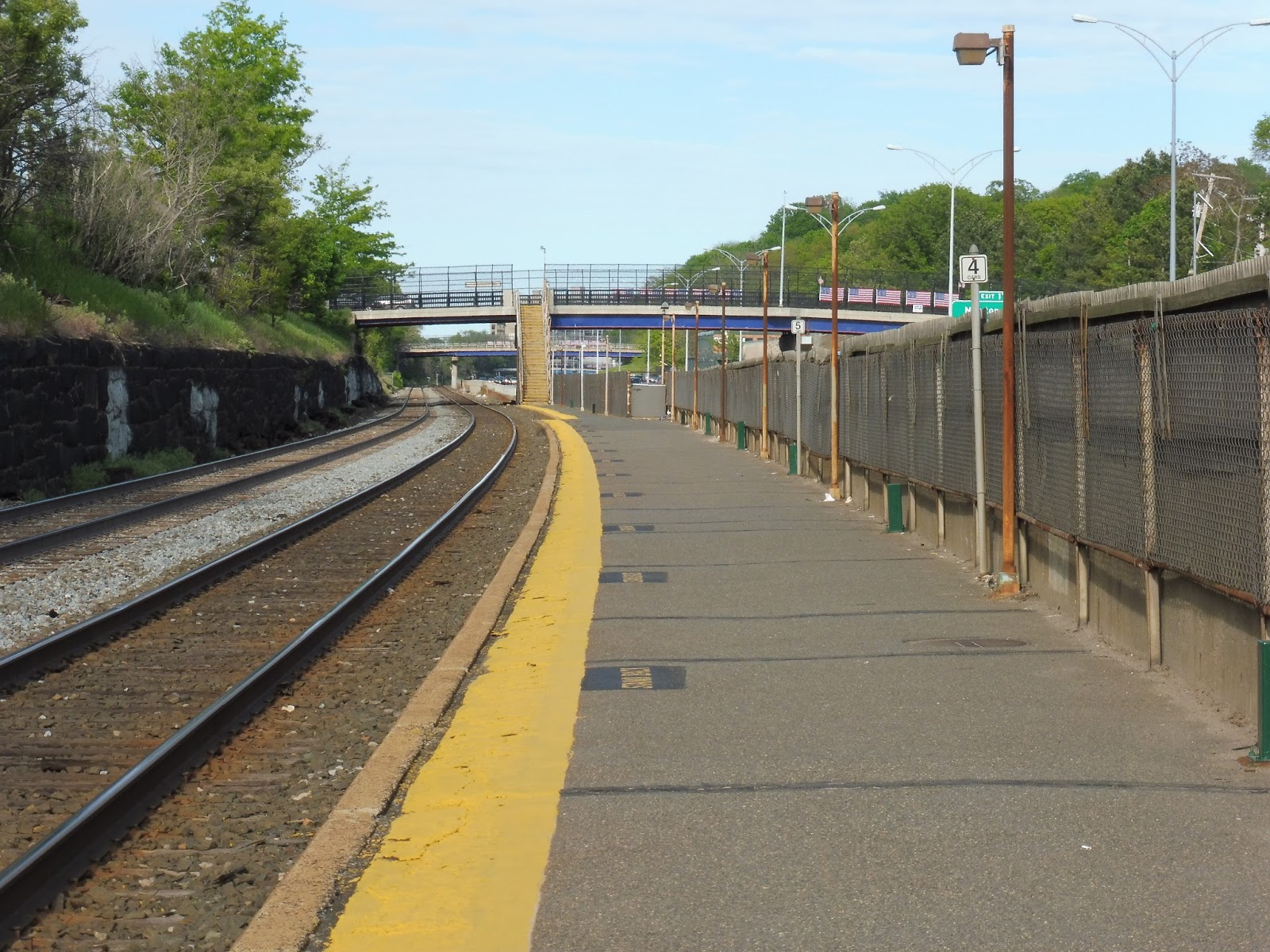 |
| Looking down the platform. |
The whole rest of the platform is bare. I mean, there’s not even any random highway trash in sight from this station! Yes, I suppose the bags of salt thrown around in certain places are a bit weird, but it’s somewhat clean overall. Just try to ignore the constant sound of thousands of cars hurdling past…
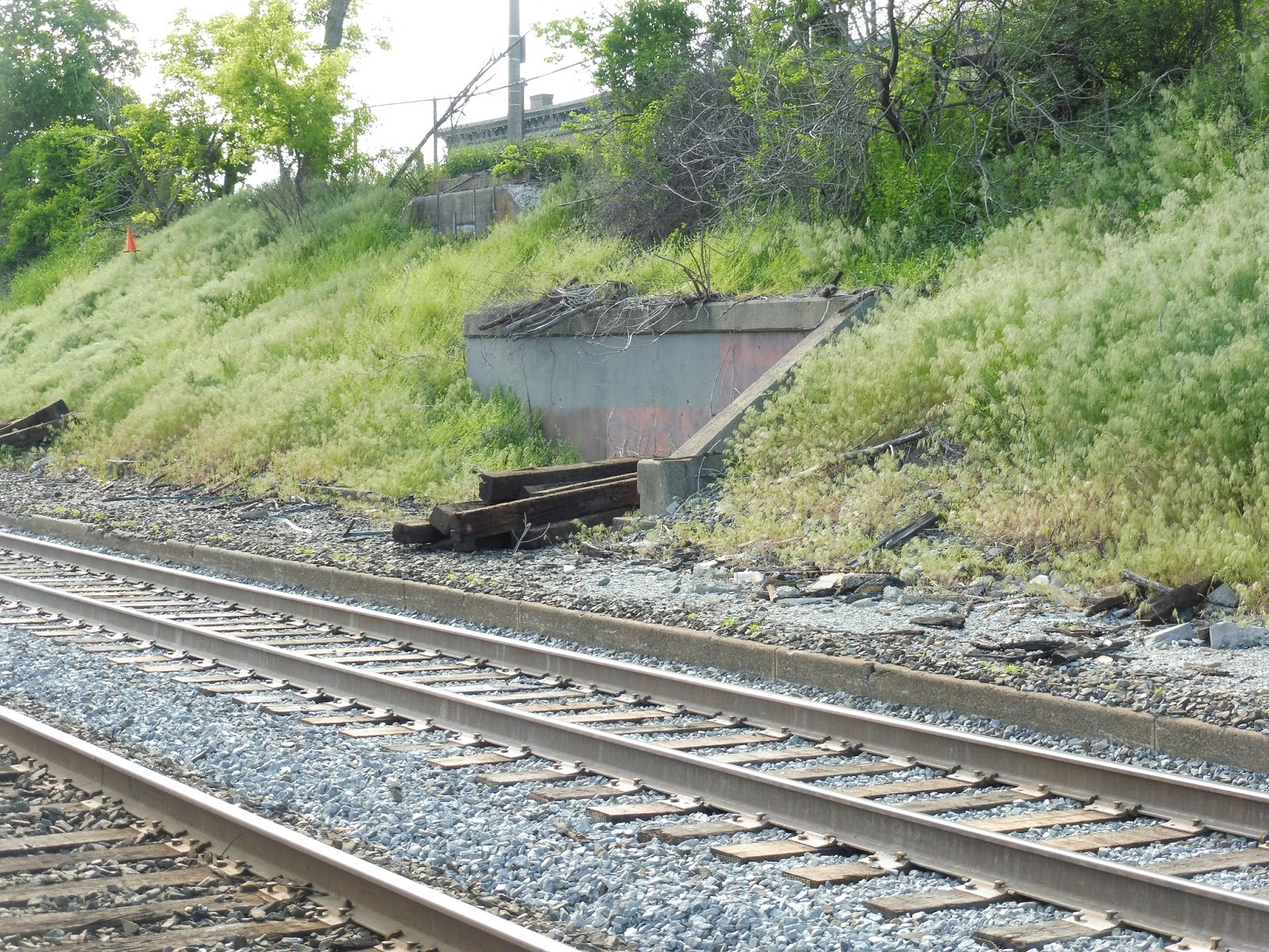 |
| The remains of an old platform. |
Now, one huge problem with Newtonville (and the other I-90 stations) is that it only has one platform. That makes this whole section of the line incredibly hard to schedule. But the worst part is that you can actually see the remains of the old second platform at Newtonville! If all the I-90 stations had two platforms, the MBTA could get a lot more flexibility when scheduling Worcester Line trains.
 |
| A train leaving around the curve. |
Station: Newtonville
Ridership: This is the the station with the second-worst ridership on the Worcester Line, just ahead of West Newton (another I-90 stop). However, although Newtonville only gets 293 inbound riders per weekday, perhaps it gets outbound ridership, too. It has a few bus connections, after all, and it’s still pretty urban and close to Boston.
Pros: Advantages over Auburndale: the stairs aren’t scary and there’s one nice bench. That is all.
Cons: Everything else that was wrong with Auburndale. Loud cars! Decrepit shelter! Not accessible! Only one platform! Strange litter everywhere (though to a lesser extent than Auburndale)! The list goes on and on! Does parking here even exist? Who knows?!
Nearby and Noteworthy: There’s a lovely downtown here with small businesses housed in old-looking buildings. Also, this station is right near that Star Market through which I-90 runs, which is interesting. I mean, I’m sure it’s just a generic supermarket, but the highway running under it is kinda cool!
Final Verdict: 2/10
Look! One point better than Auburndale! A 2/10? That’s almost a 3/10! Visit Newtonville, guys, it’s really worth it. Way better than Auburndale, lemme tell you. Honestly, though, the I-90 stations are so good that you should just visit them all! Especially if you like, um, litter. Or…cars. Or something.
Latest MBTA News: Service Updates
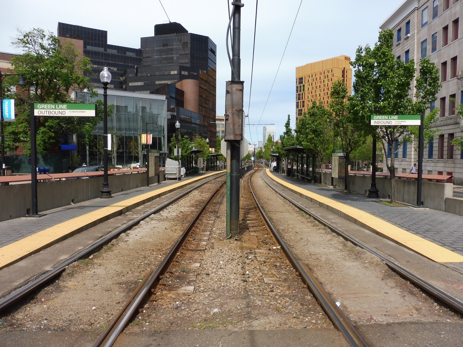
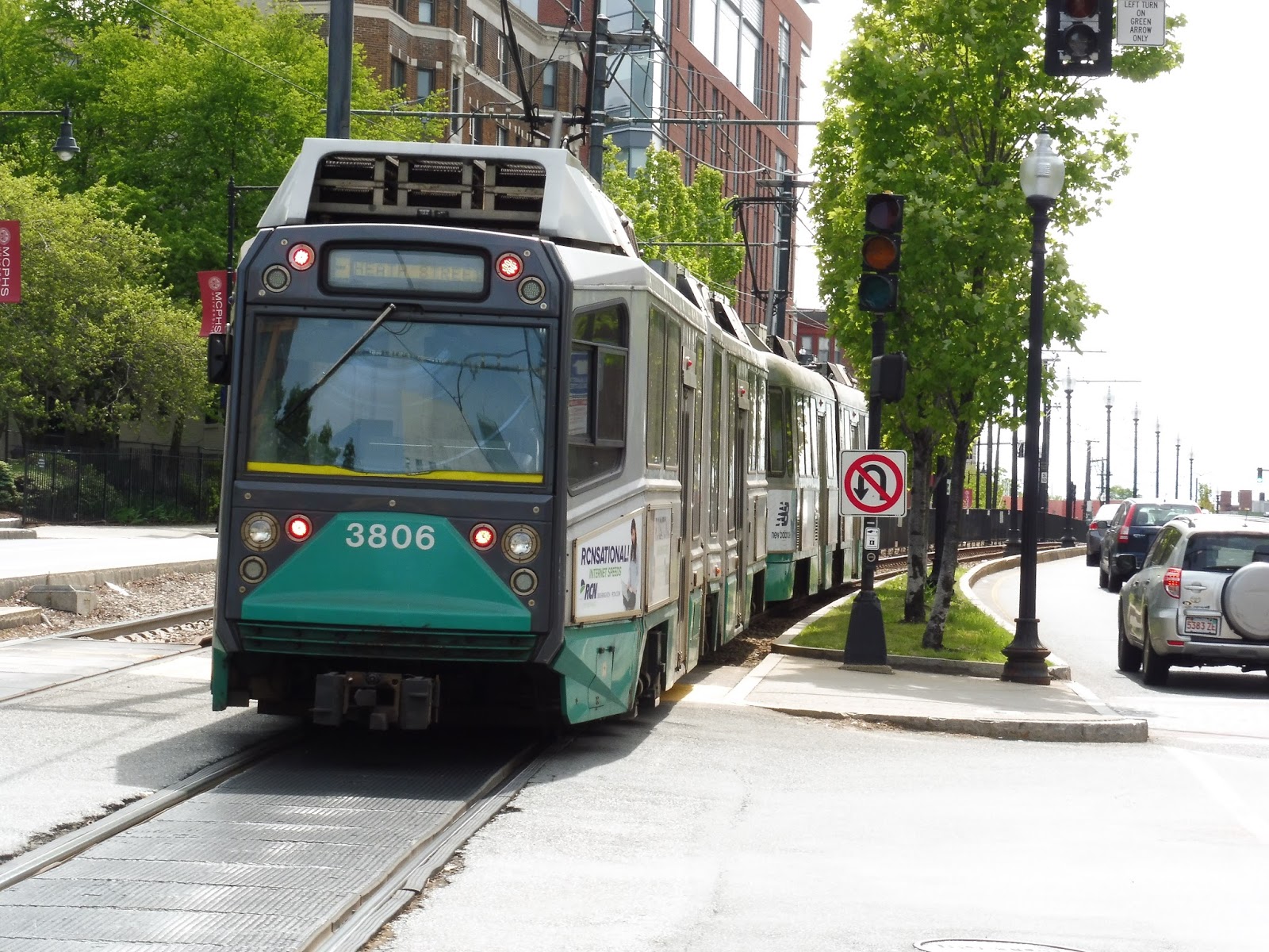
Heath Street
One line has Alewife. Another line has Wonderland. But none of those can compare to the might and power of…Heath Street? Heath Street, with its strange “V.A. Medical Center” subtitle that sounds like “D.A. Medical Center” on the trains? Not much of a terminus…
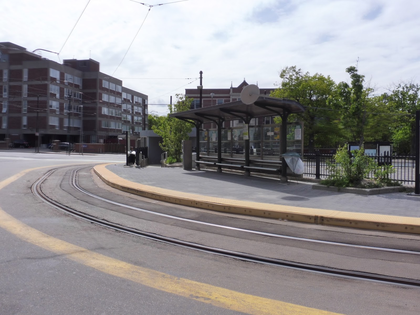 |
| The shelter along the inner loop. |
The train has a little loop here, and Heath Street is along the loop in a short right-of-way. One of the platforms feels like a typical median E Line station, and it’s great. It has a decent shelter, some wastebaskets, a bit of greenery, and a ticket validator! There’s just one problem…
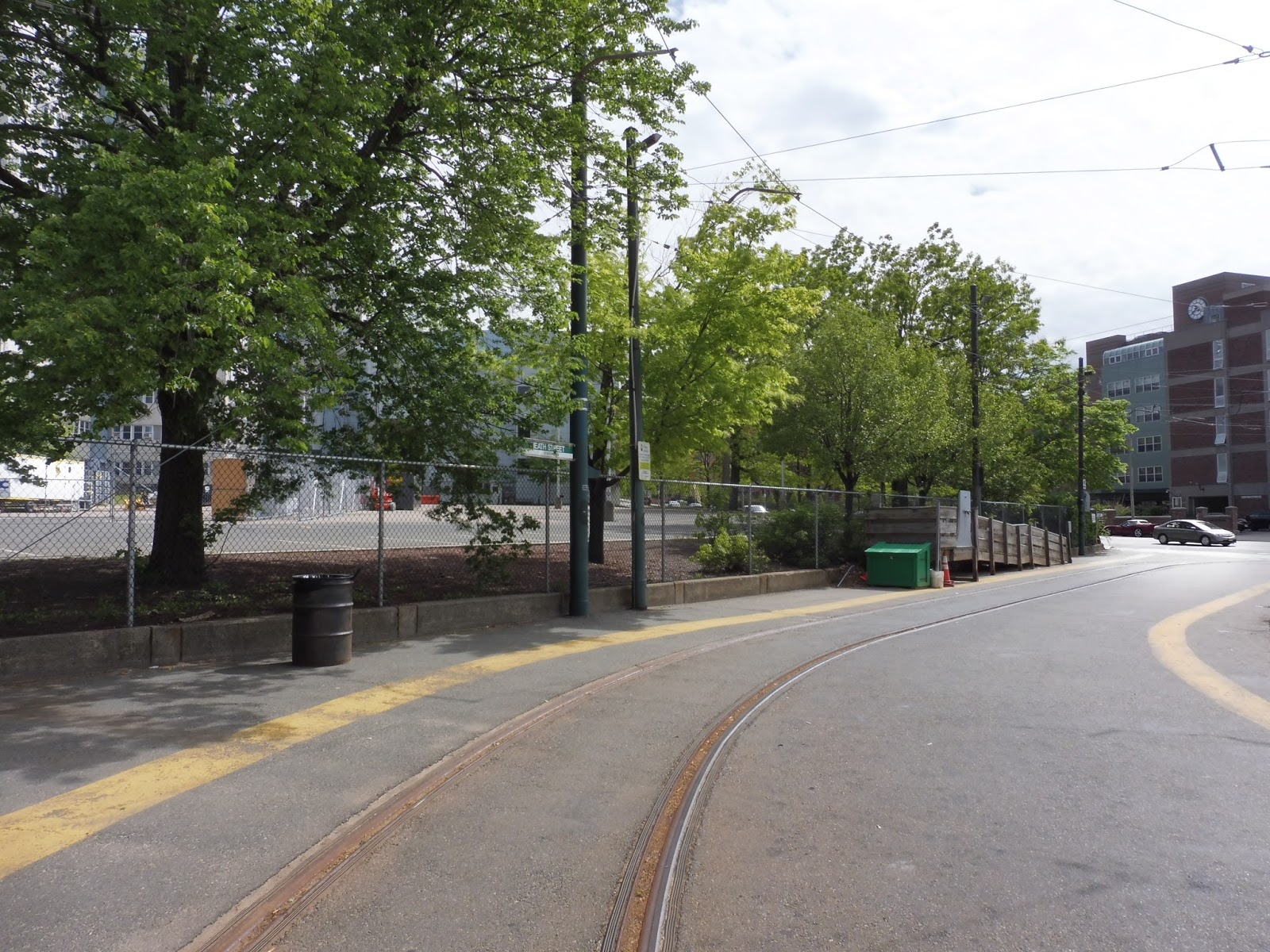 |
| This is where you ACTUALLY board. |
Trains don’t actually board on the platform with all the stuff on it! Instead, you have to use this asphalt strip that A) is further away from the train, since trains go on the inner track, and B) has nothing on it aside from a wastebasket and a pointless wheelchair ramp.
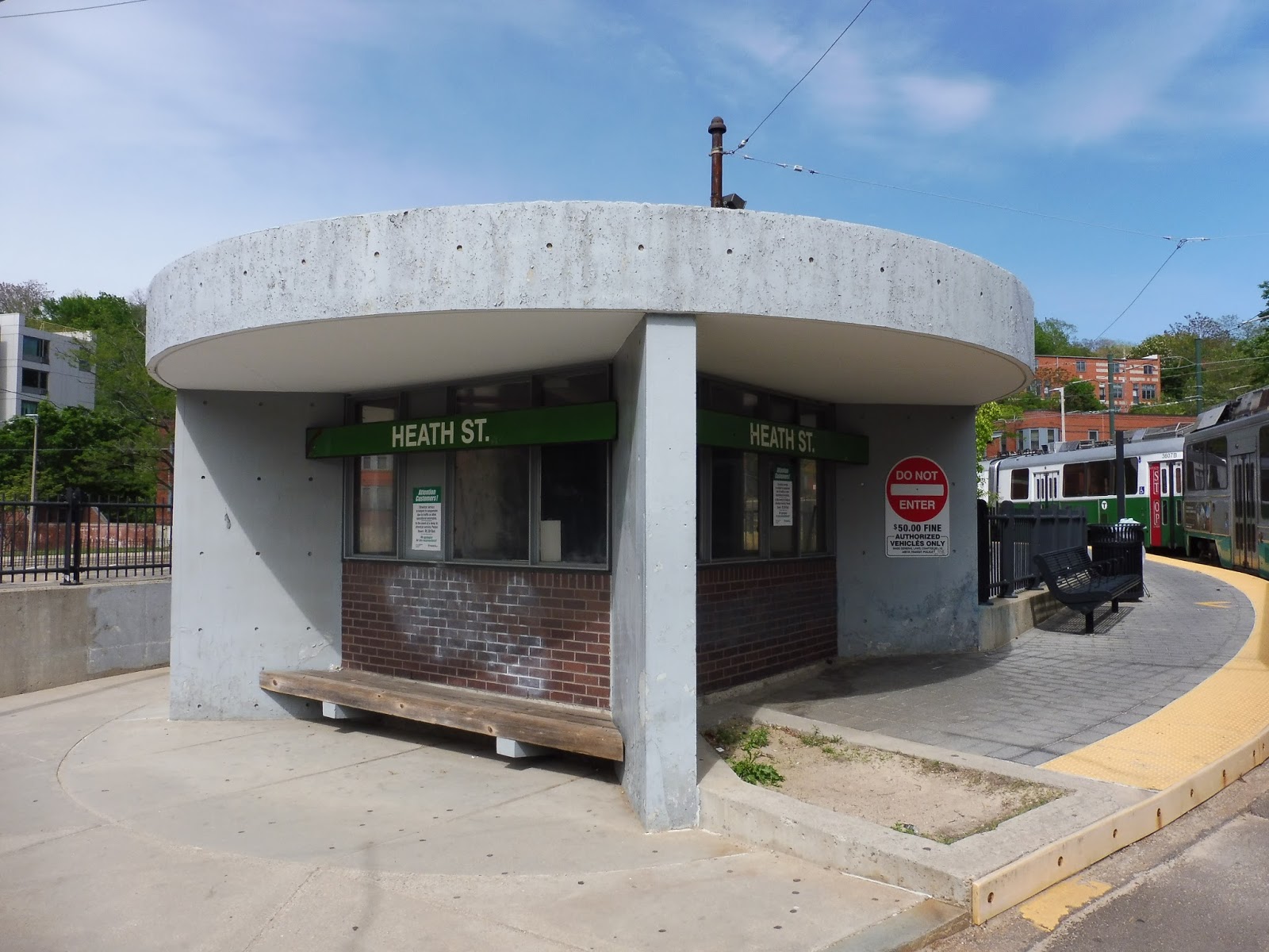 |
| A little building. |
The station also has a building that is used by workers. It seems to just be a little office, but there’s also a bench on the outside that could theoretically be used for waiting for the train or the 39 (but the latter has a shelter, too). The other bus connection here is the 14, which actually boards on the loop.
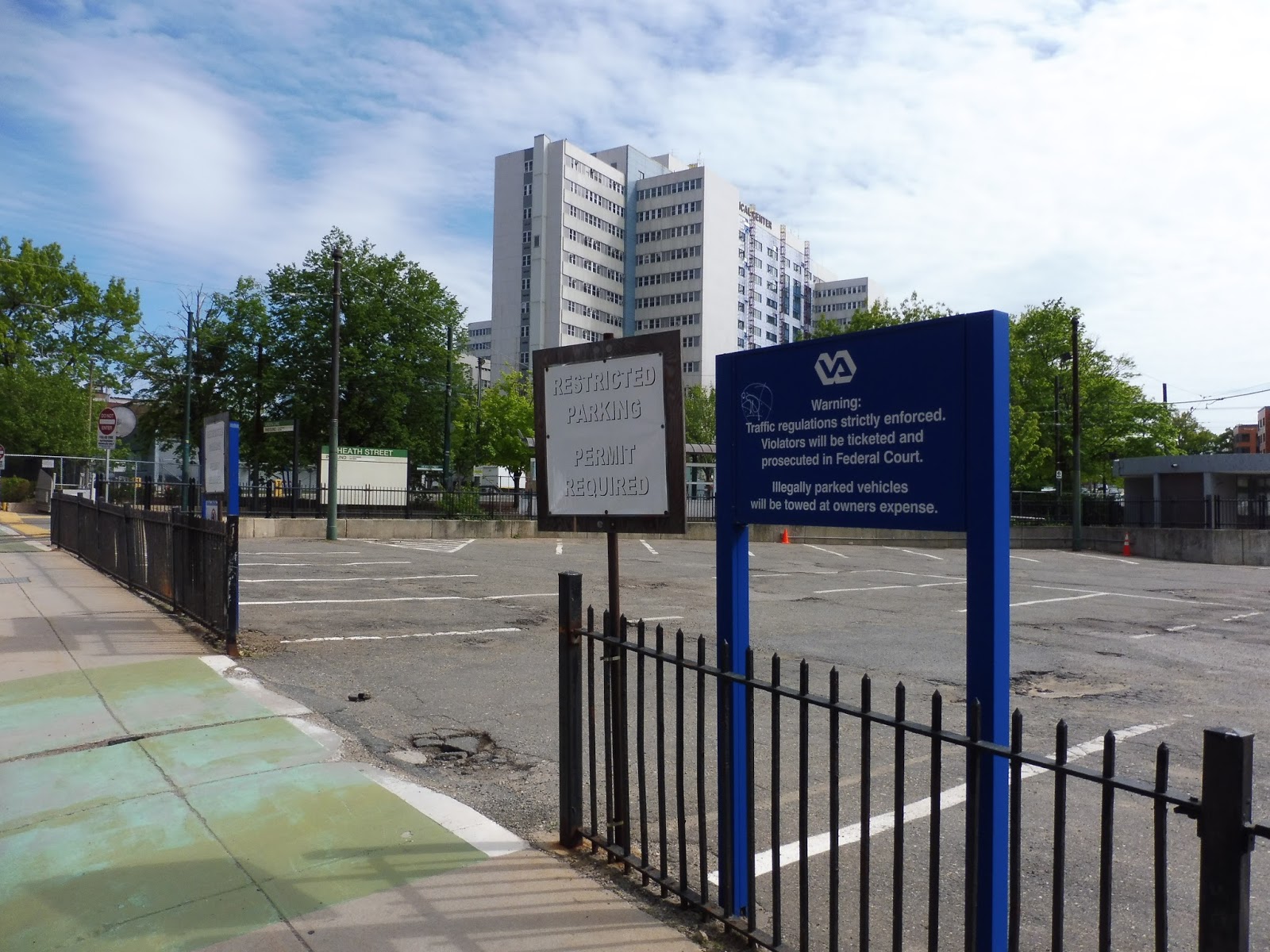 |
| Hey, parking! Wait… |
There’s a rather worn-down parking lot within the Heath Street loop, and at first glance, it seemed like a little station lot. However, it turns out it’s parking for V.A. Hospital employees – a hospital, keep in mind, with two parking garages and a few other lots. Does this little 20 space lot really need to be used for employee parking? I mean, Heath Street might benefit with at least a bit of space for cars, even though it’s quite urban.
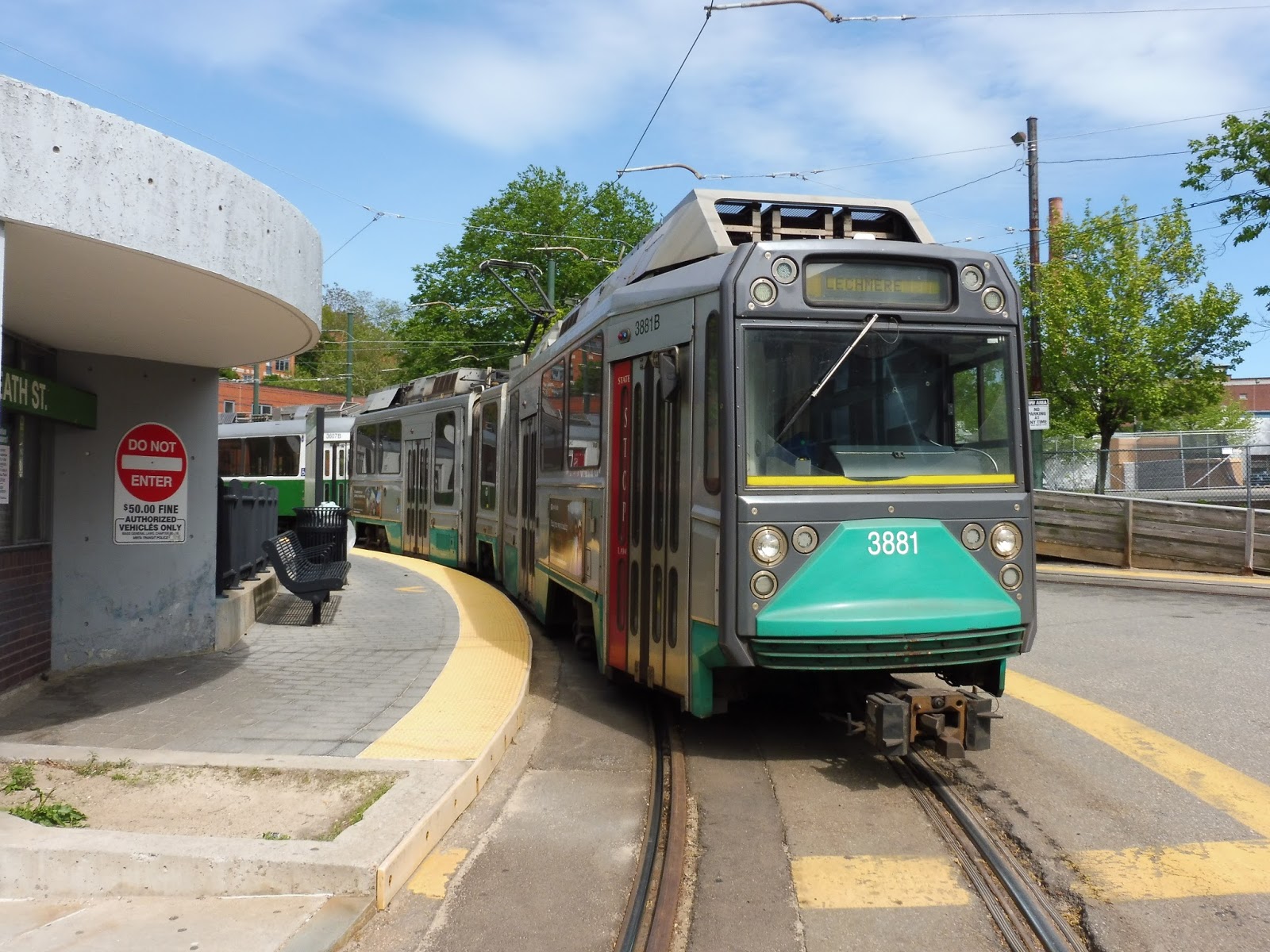 |
| A train on the loop… |
 |
| …and heading out towards Lechmere. |
Station: Heath Street
Ridership: Heath Street’s ridership isn’t particularly high, with an average of 820 riders per weekday – it’s in the bottom 20 for Green Line stations. This could be for a few reasons: for one thing, the Orange Line is reasonably close, and that offers a much faster ride downtown; also, I’m sure many people opt to take the 39, since the E is often delayed.
Pros: This station does have amenities, and where they exist, they’re pretty good. After all, the platform is nice and wide, with all the street stop necessities, plus a bit of greenery to make everything look nice!
Cons: But the platform is on the wrong side. I understand why the MBTA would want people to board on the right side of the train so that they can pay their fares at the front, but I don’t think this station ever gets crowded enough that a fare dodger wouldn’t be caught by the driver. I mean, they could always put a Customer Service Agent here during rush hour so people can actually use the shelter – I think there’s often someone in that building on weekdays, anyway. It just seems like a waste to have such a lovely platform that no one can use. Also, for the record, the E used to go all the way to Forest Hills, but it was cut back in the 80s. That service will probably never get restored, but it makes a bit of an “incomplete” feeling at Heath Street (the 39 covers the former service).
Nearby and Noteworthy: Apartments and the V.A. Hospital – and not much else.
Final Verdict: 5/10
What a strange little terminus. Honestly, if that platform were in use, the station would probably end up with a 7! But as it stands, people have to wait at the strange asphalt bit with only a wastebasket for company. Opening the left hand doors would make a world of difference for people’s waiting experiences here.
Latest MBTA News: Service Updates
Fenwood Road, Mission Park, Riverway, and Back of the Hill
Nathan and I got on the train at Brigham Circle heading outbound. The train pulled up to a light and waited about 45 seconds for it to change. Finally, we went through the intersection and arrived at the stop just on the other side (a few hundred feet), where Nathan and I ran out of the train as I yelled “THANK YOU!” to the very confused driver. This ride basically epitomizes the street-running section of the E. There really isn’t much to say about these stations – they’re only signs and sometimes a shelter, if you’re lucky – so just enjoy the photos!
 |
| Welcome to Fenwood Road. And what’s that platform in the background? Why, I do believe that’s Brigham Circle! Geez… |
 |
| The inbound Mission Park stop, with a 66 getting in the shot. |
 |
| Both sides of Riverway are visible here. Strangely, it’s the outbound that gets the shelter. |
 |
| The stop at Back of the Hill…with Heath Street about five feet away in the background. |
 |
| A train about to round the curve at Riverway. |
Stations: Fenwood Road, Mission Park, Riverway, and Back of the Hill
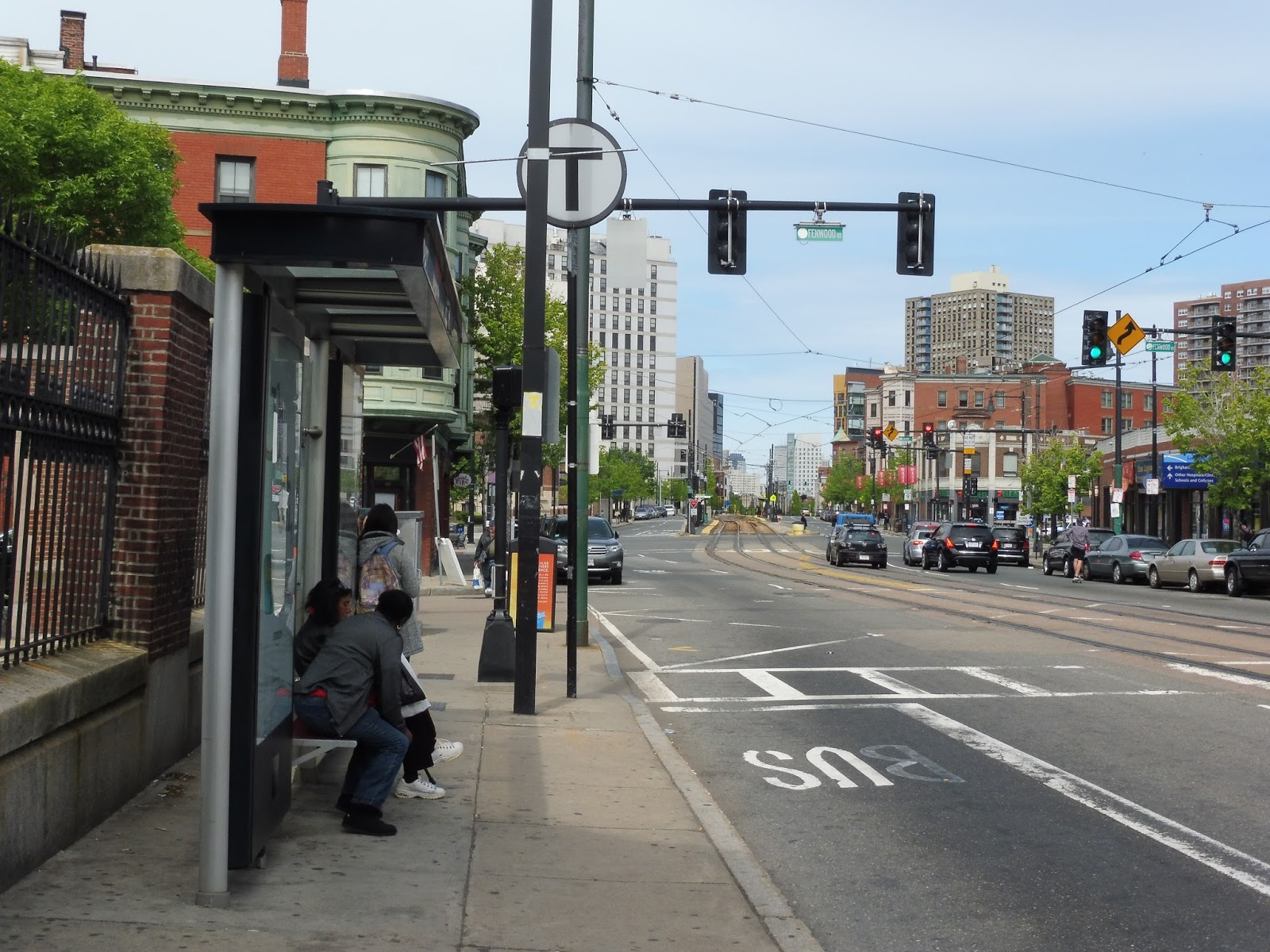
Brigham Circle
Ah…we’re starting to get to the sketchy part of the E. No longer do we have the gorgeous buildings of Northeastern University, the Museum of Fine Arts, or the Longwood Medical Area. No longer do we have super wide platforms. No longer do we have those lovely trees lining the median. No, by this point, all we have is Brigham Circle.
 |
| Not the nicest-looking platform in the world… |
Brigham Circle has staggered platforms, with the inbound side further east than the outbound. Presumably this is because of limited space in the median, which would certainly make sense – these platforms aren’t as wide as the other stations down the line. Other than that, though, they do have all of the necessities for street stops: two shelters (only one on the outbound, but that makes sense by this point), wastebaskets, accessibility, and a ticket validator.
 |
| This platform certainly feels…skinnier. |
In fact, it was the only working ticket validator we had come across the whole day! Well…sort of. Nathan and I decided to test it out, and it printed out tickets for us. But when we looked at them, they said they were valid for May 19th…and today was the 22nd! All I can say is that I really hope these things work during the height of the rush hour.
 |
| A train on its way to Lechmere. |
Station: Brigham Circle
Ridership: Each weekday, the station gets 2,547 riders – slightly below Northeastern. There are still a few hospitals and schools to generate ridership by this point of the line, but you’ve also got a lot of local riders from apartments to the east.
Pros: I feel like I’ve said this with every station, but Brigham Circle has all the necessities of a street stop: shelters, accessibility, wastebaskets, and a sort-of working validator (?).
Cons: Unfortunately, Brigham Circle is slightly worse than the other stations on the line. For one thing, the platforms are much narrower due to limited space on Huntington Ave. Also, the right-of-way is just kind of generic by this point, and downright ugly in certain spots.
Nearby and Noteworthy: There are a few parts of the Longwood Medical Area that this station is slightly closer to than the station of the same name. Other than that, small businesses abound to the east.
Final Verdict: 6/10
Brigham Circle is definitely the lesser of the in-median stations of the E Line. It still has all of the basic amenities you would want, but the platform isn’t as wide, and it’s not as pretty as the stations before it. Still, though…it’s better than the street section. Stay tuned!
Latest MBTA News: Service Updates
Longwood Medical Area
Ahh, Longwood Medical Area: the more convenient, but WAY less tranquil alternative to Longwood Station on the D. Oh wait, the D also has a decent schedule and can be reasonably trusted to be on time. As for the E? Yeah, I know I’m just reviewing the stations here, but I’m still gonna diss the E as much as I like!
 |
| Ooh, nice curve! |
 |
| That’s such a great-looking right-of-way! |
Pros: This is another good E Line in-median station! It has shelters, a wide platform, wastebaskets – basically all of the basic things to be expected at a street stop.
Cons: It does lack outdoor seating and ticket validators, but that’s about all that’s wrong with this place.
Nearby and Noteworthy: Do you like hospitals? Great! Longwood Medical Area is the place for you! Actually, though, if you don’t mind walking, the D is a much better way of getting here. The E is the closest station to colleges like MassArt, though.
Final Verdict: 7/10
Ultimately, I would say this station is just like Northeastern, minus the benches and ticket validator. It does make up for that by being on a rather nice curve, though! Okay, commuters probably don’t care about that, but it makes for great pictures.
Latest MBTA News: Service Updates
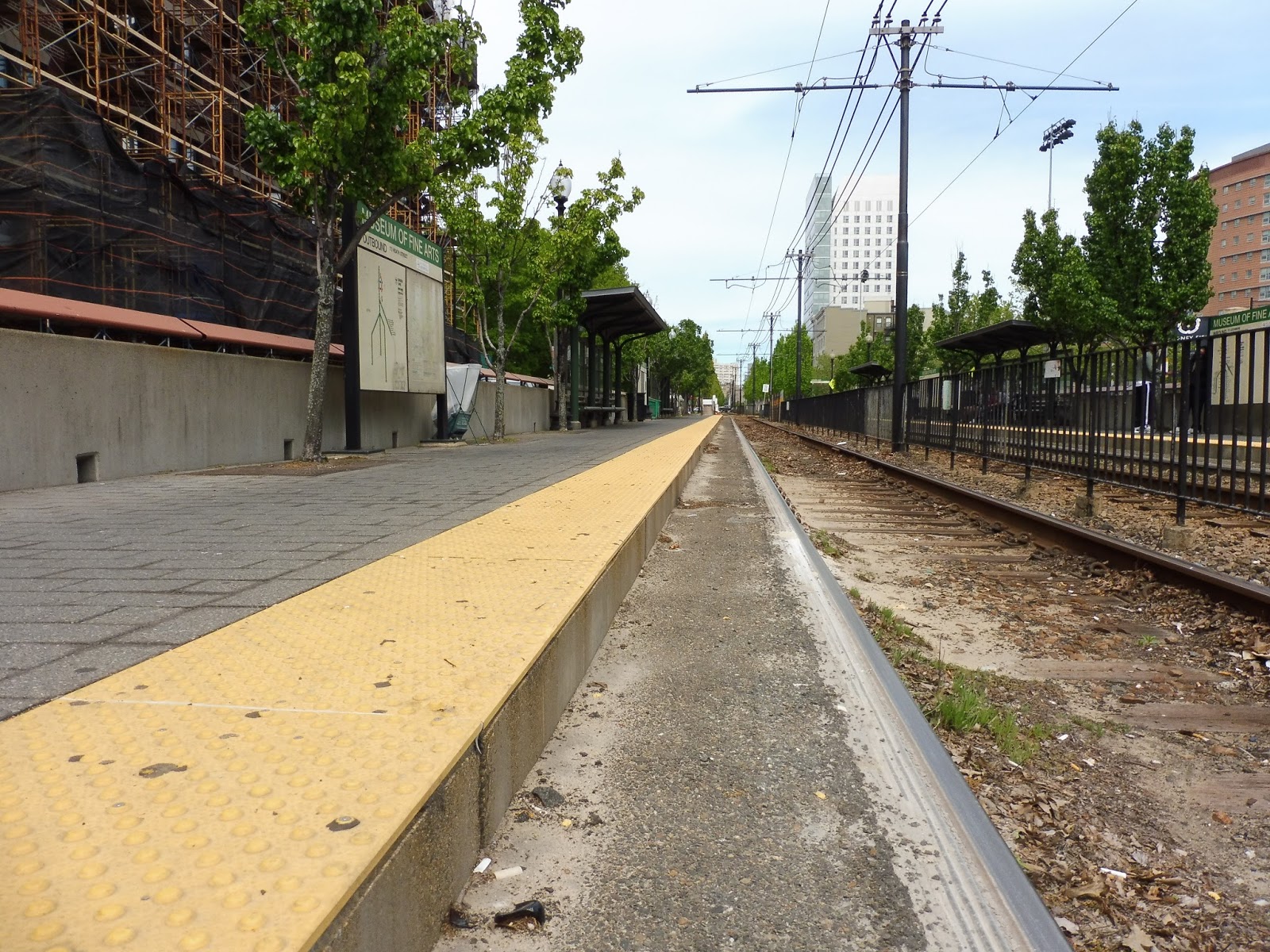
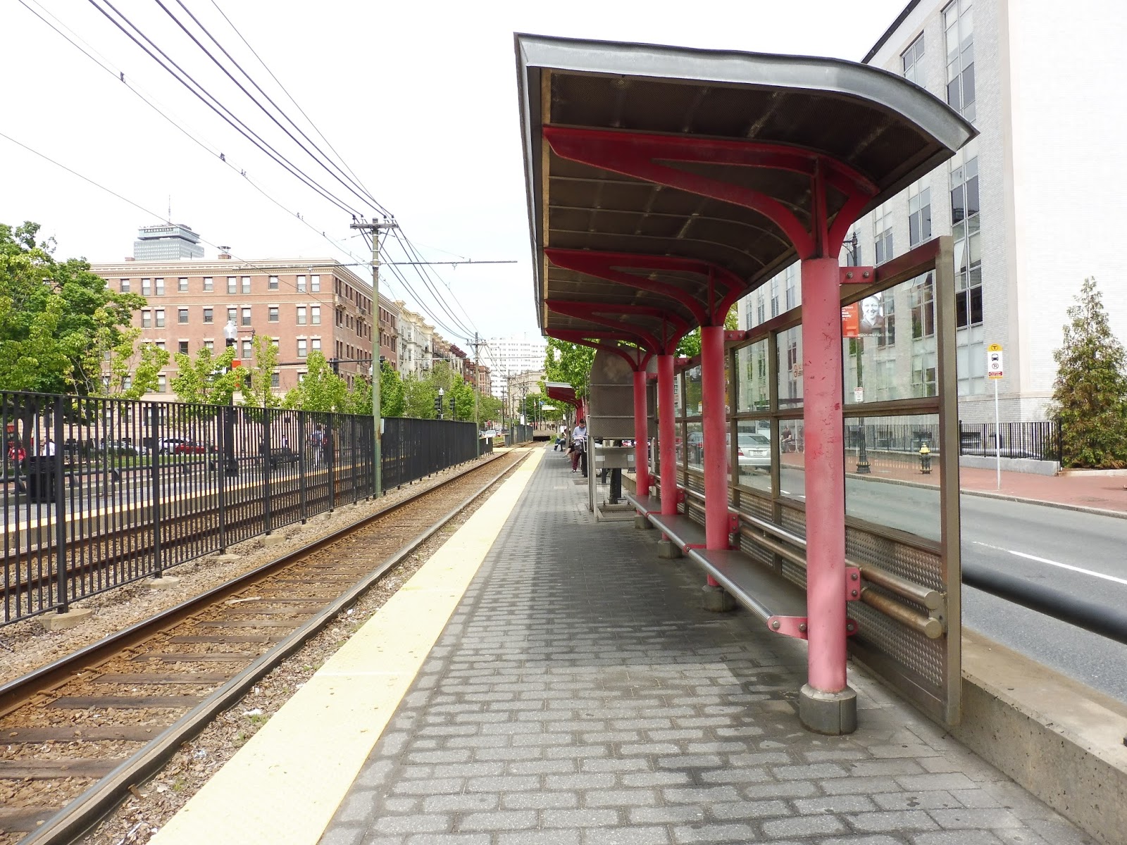
Museum of Fine Arts
This is by far the Green Line street stop I use the most, and it’s one of the nicest! Whenever my family goes to the Museum of Fine Arts, we put all our faith into the E (for better or for worse) and head out to the station of the same name. Let’s see what makes this place so great.
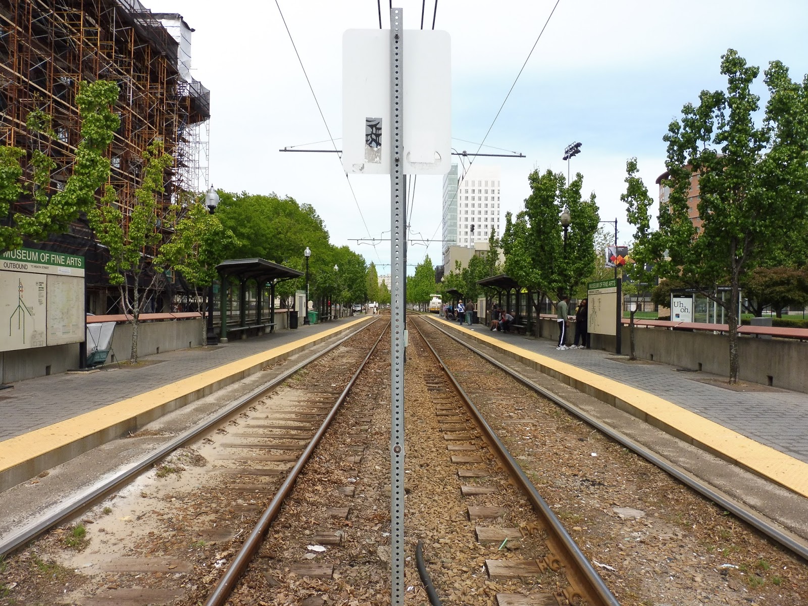 |
| Looking down the platform. |
I will say that Museum of Fine Arts is very similar to Northeastern in a lot of ways. They both have wide platforms with two shelters on each side, and lots of wastebaskets as well. Although MFA lacks extra outdoor seating, it makes up for it with nicer shelters, lacking the peeling paint that Northeastern’s had. Both stations even have broken CharlieCard validators!
 |
| A crossing. And…what’s that strange thing to the left? |
There are great pedestrian facilities here, with crosswalks on either end of the station. But what’s this on the outbound side, way at the end of the platform? A wheelchair ramp? What? Yes, Museum of Fine Arts features one of very few wheelchair ramps on the street-running sections of the Green Line. It’s also completely useless, since there are these newfangled things called low-floor trains. Don’t know if you’ve heard of them.
 |
| This is probably dangerous, but it’s a cool photo… |
All E Line stops connect with the 39, but MFA has a few more bus connections, as well; a plethora of bus routes run down Ruggles Street coming from the Longwood Medical Area or Ruggles Station (and points beyond). And although the routes (the 8, 19, 47, CT2, and CT3) only get a shelter, that’s still better than nothing.
 |
| A train stopped at the station. |
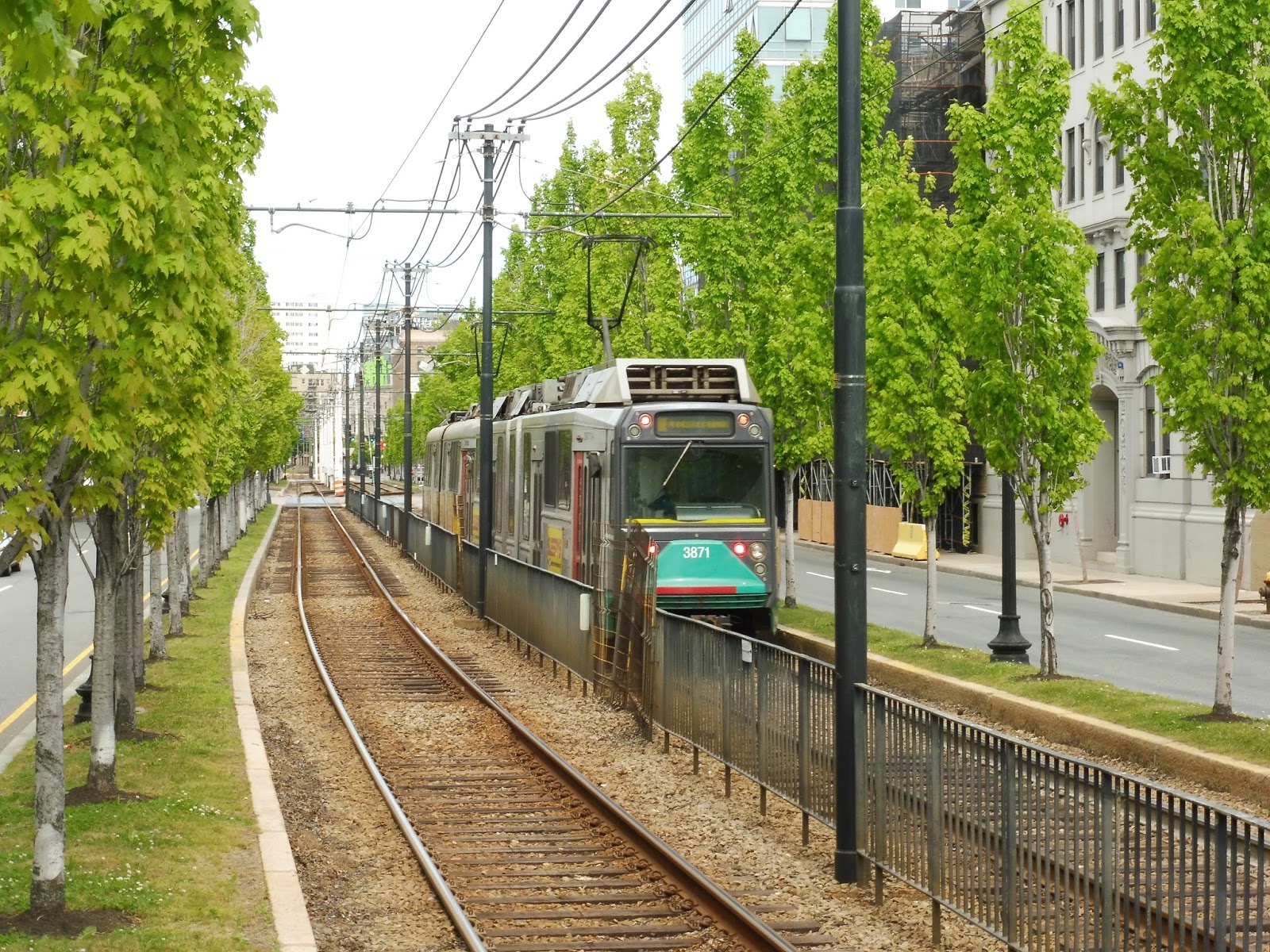 |
| Argh, this right-of-way is so pretty! |
Station: Museum of Fine Arts
Ridership: Surprisingly, this is the lowest-ridership station on the E’s in-median street section. It’s still pretty good for Green Line street stops, though, with 1,683 riders per weekday. Aside from museum-goers, there are also student riders, as we are still very much in college-land here.
Pros: I think this is the best station on the E. It has all the amenities you would want from a street stop, it’s very clean, and the right-of-way looks great! The station even has that strange wheelchair lift.
Cons: Not much! I guess the broken ticket validator and lack of outdoor benches are problems, but these are more annoyances than true issues.
Nearby and Noteworthy: It’s right in the name! The Isabella Stewart Gardner Museum, too.
Final Verdict: 8/10
Museum of Fine Arts is top-notch for a Green Line street stop. It has all the basic amenities you would expect from a street stop, plus the wheelchair lift! Yes, there could be a few more outdoor benches, but this is a great station overall.
Latest MBTA News: Service Updates
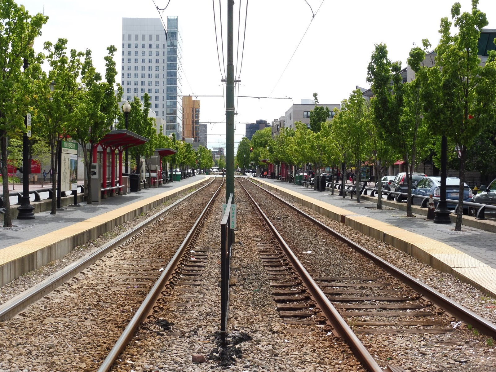
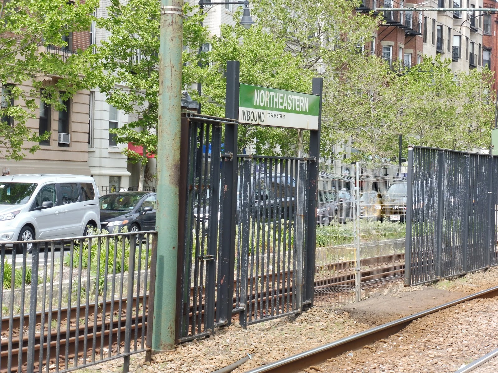
Northeastern University
The saga of reviewing Green Line street stops starts right now! The section of the E from Northeastern to Brigham Circle is one of the nicest street-running sections of the Green Line. Of course, it’s the E, so the likelihood of trains being on time is about 0.000001%, but hey! It looks great! Let’s start with the first station out of the portal, Northeastern University.
 |
| Looking down the platform. |
Northeastern is right at the heart of – you guessed it – Northeastern University, and thus many college buildings surround the station. There are crosswalks to the median of Huntington Ave on either side of the platform. The Green Line right-of-way is very picturesque along this section, with numerous trees lining the tracks.
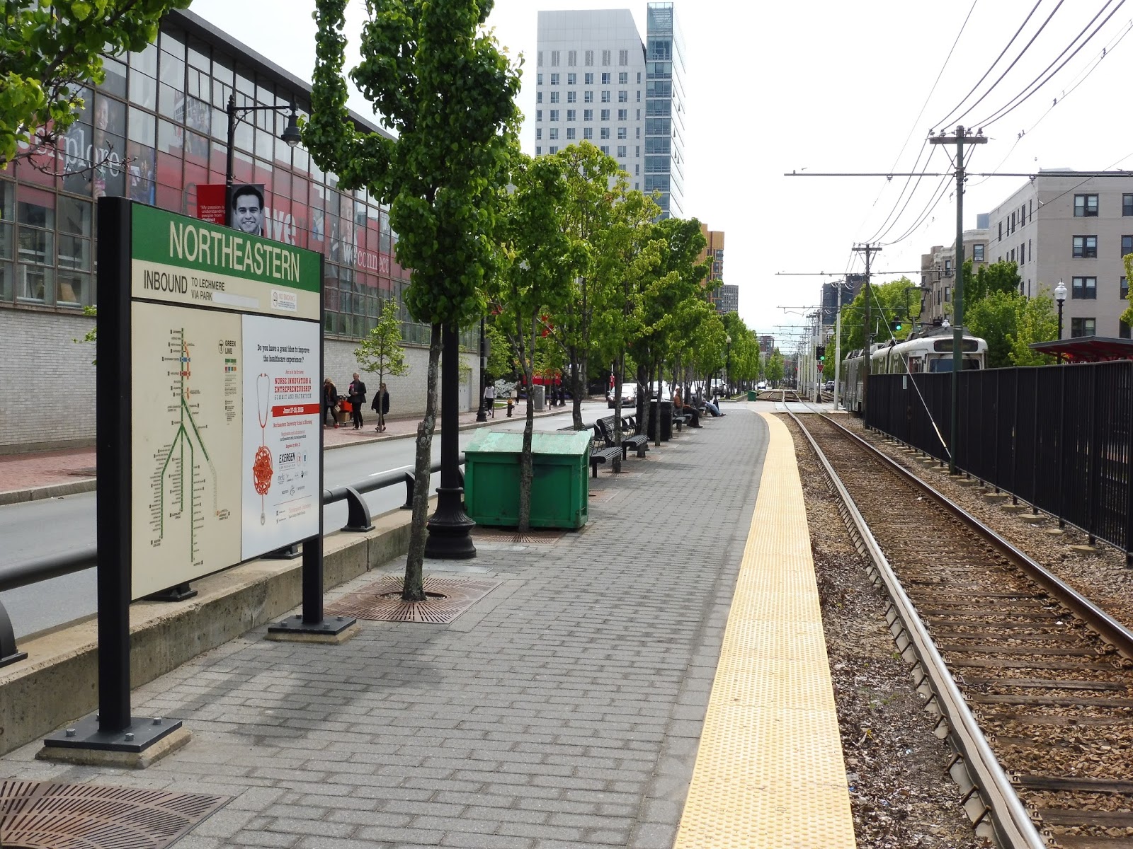 |
| On the inbound side. |
The majority of the platform is unsheltered, but there are still a lot of amenities. Wastebaskets and benches line the platform, interspersed with lovely trees. The station signs still have those old Green Line maps, though, with service to Arborway still considered “suspended” rather than “permanently obliterated.”
 |
| The shelters. |
Both platforms at Northeastern have two shelters, and since benches run along their whole length, it offers a bunch of protected seating. The station also has those strange CharlieCard validators that let you tap your card and get a paper ticket in return. The one here wasn’t working at the time, but…well, hopefully they work during rush hour.
 |
| Um…what? |
One strange anomaly about Northeastern is a station sign that’s located beyond the end of the platform heading toward the portal! I have no idea why it’s there – all that lies past the platform is dirt. Perhaps the earthworms residing there need to know which station they’re at…
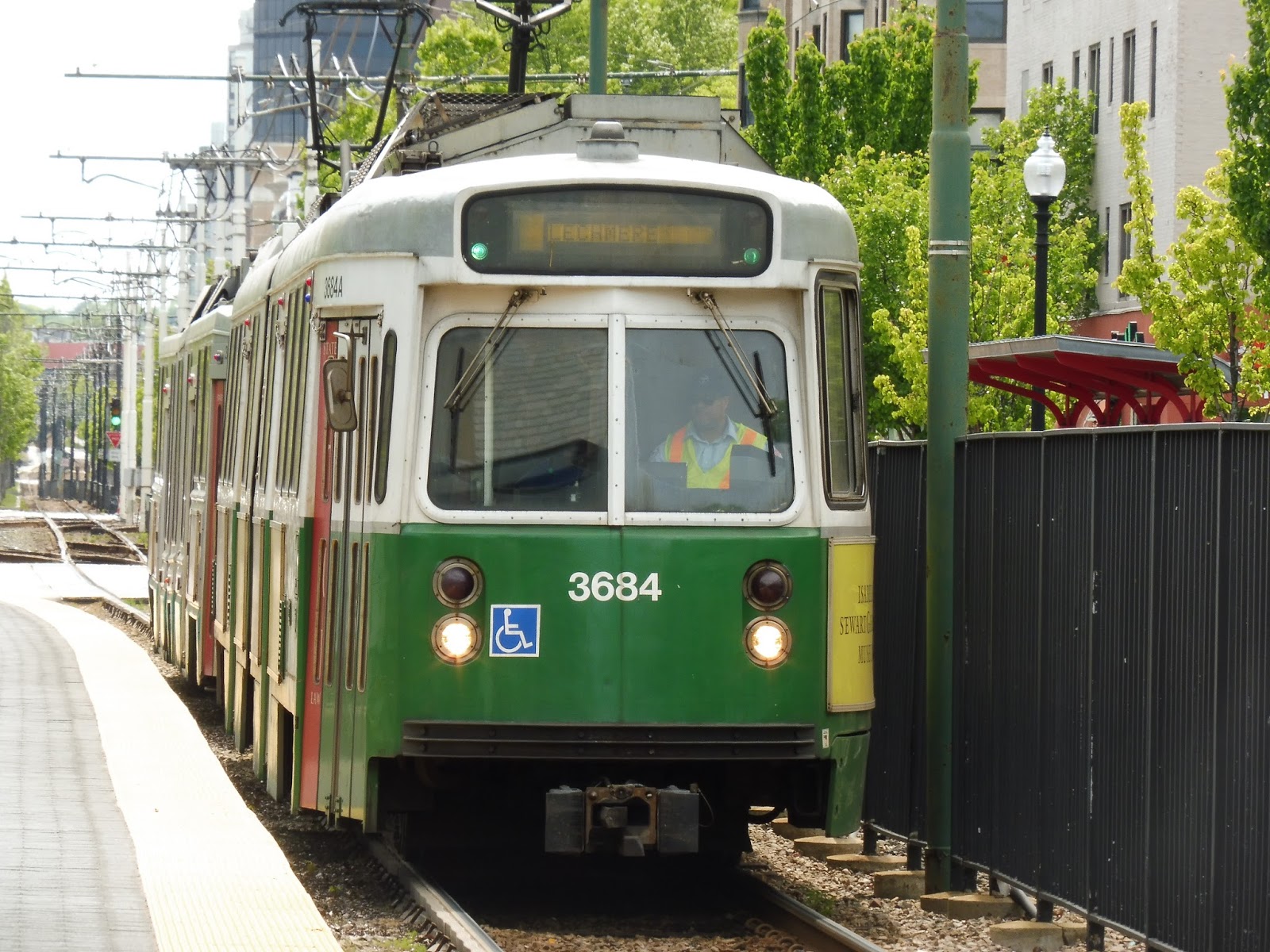 |
| A train coming into the station… |
 |
| …and heading into the portal. |
Station: Northeastern University
Ridership: With 2,650 riders per day, Northeastern is the 10th busiest Green Line branch stop. Most of this ridership comes from students (of course), and lots of ’em. It’s too bad they have to rely on the worst branch of the Green Line, but I digress.
Pros: In terms of street running stations, this one is great. It has a wide platform with a good amount of shelter and lots of benches, plus those trees really add a lot of character.
Cons: The shelters have a bit of peeling paint, and this station just isn’t as nice as Museum of Fine Arts a few blocks away. Also, the fact that Ruggles is located 0.2 miles from here is kind of insulting – that’s a much better station on a more reliable line that’s only 4 minutes of extra walking! Seriously, just don’t trust the E. Ever.
Nearby and Noteworthy: The surroundings are mostly college buildings, and the student-oriented businesses and restaurants usually associated with them. It’s a pretty busy place.
Final Verdict: 7/10
It may be simple, but Northeastern is definitely one of the better Green Line street stops. Its platform is a good width, with lots of shelter and seating, plus it’s accessible. Yes, it may be on the unreliable E, but the 39 stops right next to the station if you’d rather take that. Also, Ruggles is only a few minutes away. Basically, the E Line will always be terrible, but at least its stations are nice.
Latest MBTA News: Service Updates
Newburyport
I remember reading an article about the isolation of Newburyport Station. It talked about how the station is in the middle of nowhere, and it described how vacant the place is at night. I will agree that the station is a hallmark of parking over pedestrians, and I’m sure it can feel awfully foreboding at night, but for tourists coming in during the day? It’s really not that bad.
 |
| The platform. |
 |
| Another view looking the other way. |
Of course, Newburyport is the quintessential modern Commuter Rail station, having been built in 1998. This means that it has a pretty bland feeling. The platform is entirely high-level, with two identical metal shelters. One of them is completely useless, though, since it’s way on the north end of the platform where no trains stop! I mean, more shelter is always welcome, but it does mean you have to walk back a bit to get to the train. The rest of the platform is what you would expect, with a few benches and wastebaskets scattered here and there, but not much else.
 |
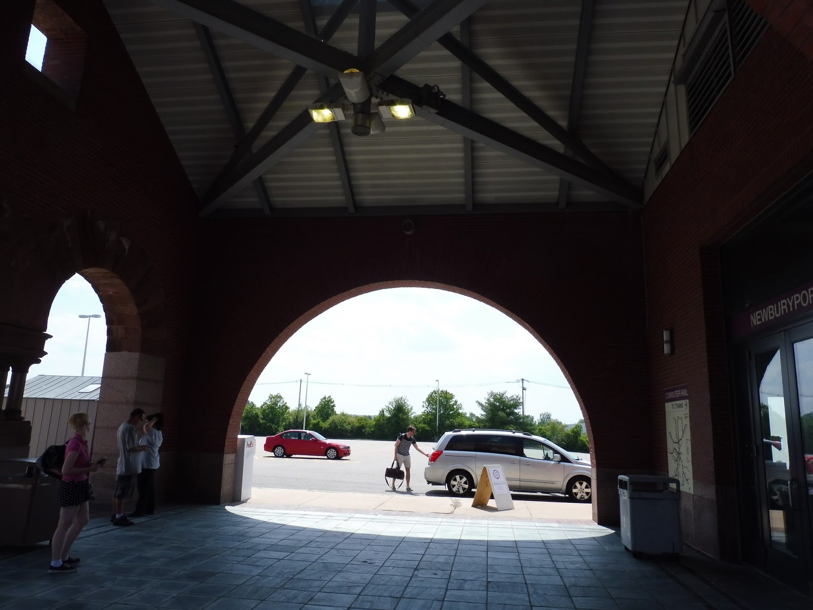
| Cool, a station building – ohhhhhhh… |
Newburyport has a building that could house something great! I mean, it used to have a restaurant in it, and it featured bathrooms and sheltered waiting and everything! But…as you can see, it’s been abandoned. Why can’t they at least open up the bathrooms and put some seating in there? It all looks intact!
 |
| Oh dear…I think the photographer is drunk. That’s quite crooked. |
Still, the building offers some form of shelter in its plaza outside the entrance. However, with no seating space, you’re forced to either stand or sit on the floor. Other points of interest in the “plaza” are a wastebasket, an outdated Commuter Rail map, and a broken payphone.
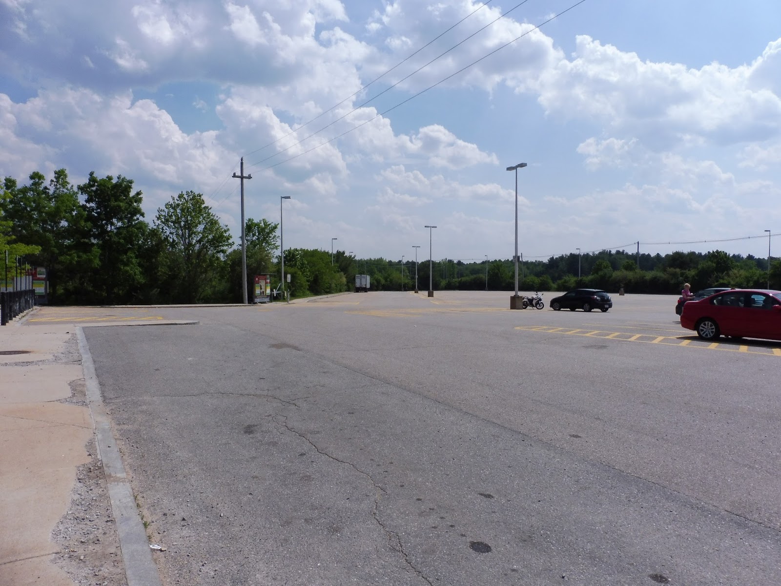 |
| Can you believe that there are two other lots? |
I mentioned that this is the quintessential modern Commuter Rail station, and you know what that means: lots of parking! In fact, way too much parking. The station has 814 spaces, yet they only get 21% occupied on weekdays. As for bike spaces, the station has 22 of ’em, with some by the parking lots and others right on the platform.
 |
| *gasp* What’s this? |
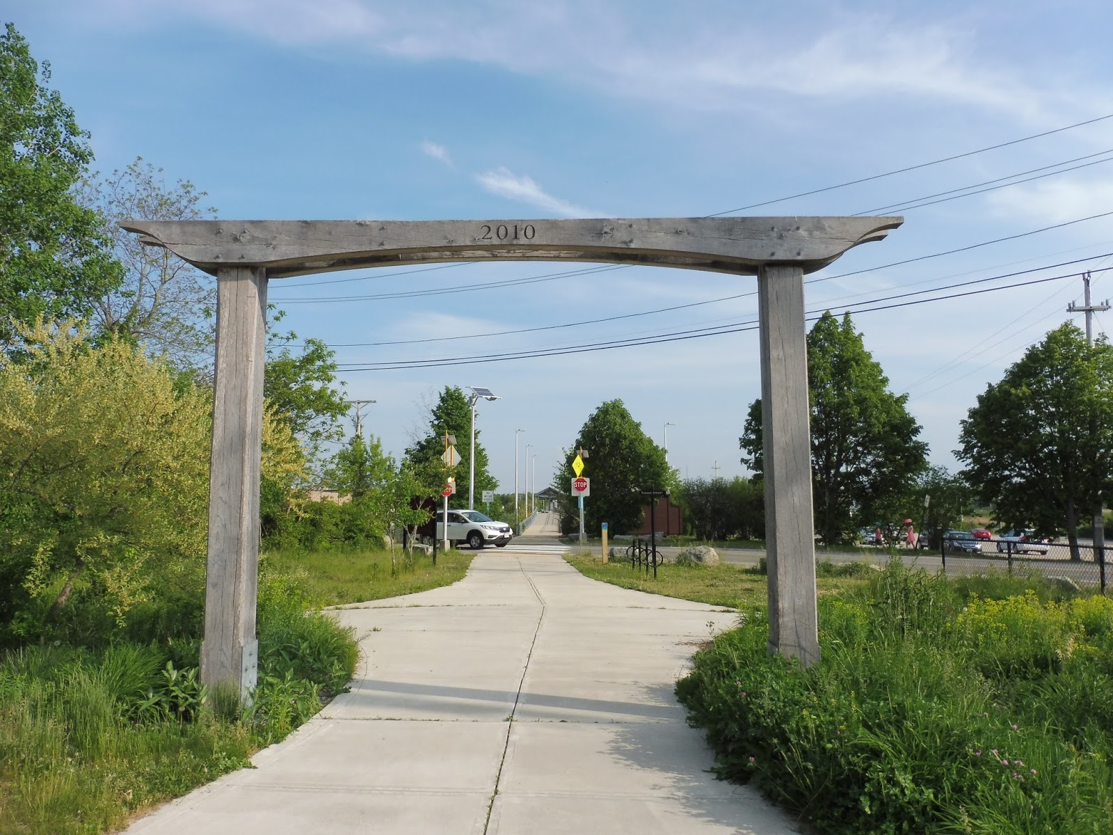
Another thing that article mentioned was that the walk to downtown Newburyport is long and on roads with no sidewalks. It is a reasonably long walk, at around 25 minutes, but there’s no need to walk along the roads when you have the Clipper City Rail Trail! This pedestrian path has lots of art along its length and starts literally right where the station platform ends. It takes you right downtown, and is a lovely walk.
 |
| Why didn’t I include this in my summer shuttle post? Oh well… |
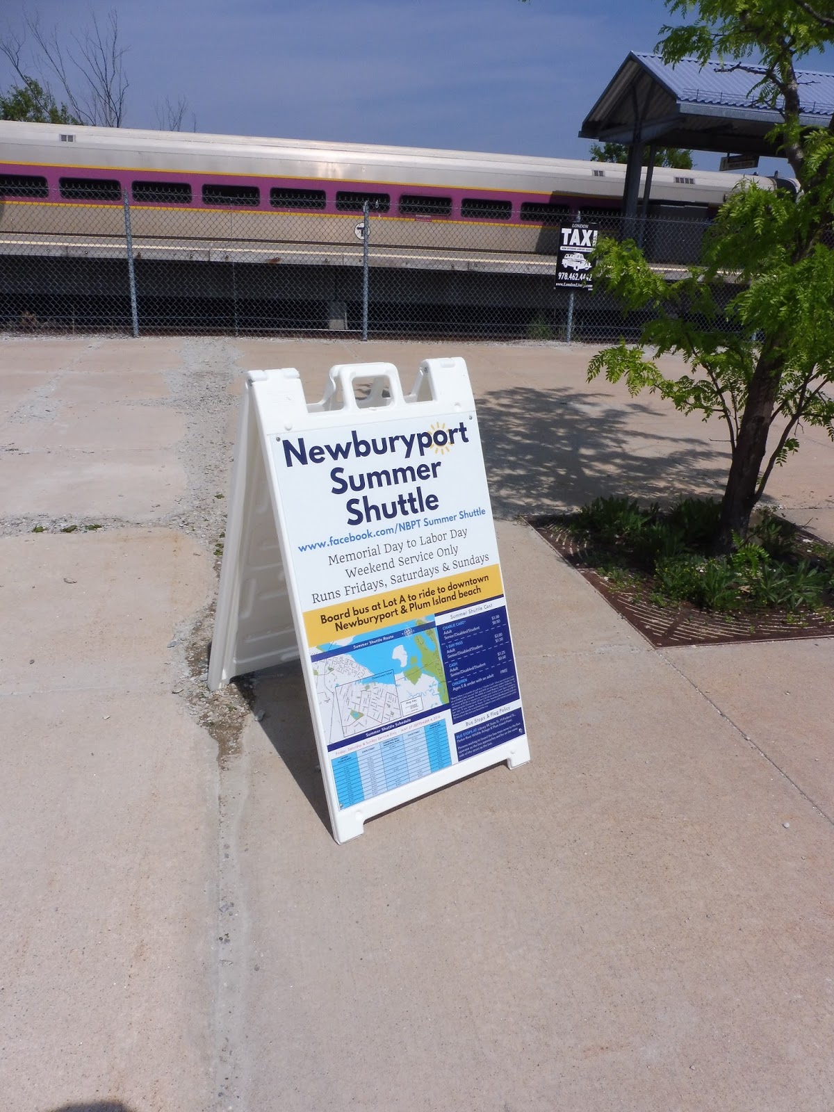
Of course, if you’re unable to walk downtown (or you’re just lazy), you can also use the MVRTA services that come to this station. I’ve already discussed the 53, as well as the strange shuttle that just runs downtown, but those are summer-only. Another option is the MVRTA’s year-round service here, the 54, which runs to Salisbury Beach one way (via downtown Newburyport), and to Amesbury the other way. It serves the station every 70 minutes weekdays and Saturdays.
 |
| A train with marshland in the background. |
Station: Newburyport
Ridership: Per weekday, the station gets two less riders than there are parking spaces – 812 – making it the busiest station on either branch of the Newburyport/Rockport Lines (but Salem, Beverly, and Swampscott get more ridership on the shared section). Still, I find it interesting that the lot only gets 20% full, which means that most people must commute here in other ways. I also wonder if the data is skewed a bit, since this station must get way more riders in the summer than in the winter.
Pros: The platform is fully high-level, which is always a plus, and the two shelters on the platform are welcome, despite being oddly placed. Newburyport certainly offers lots of parking, and it’s a LOT more than necessary, but at least you’ll always get a space! And yes, the station is far from downtown Newburyport, but the Clipper City Rail Trail is a really great walk.
Cons: Well, it’s a modern Commuter Rail station, so don’t expect a lot of character here. However, the Clipper City Rail Trail makes up for that department with its numerous art installations. Newburyport’s building just seems like a wasted opportunity, though. If no restaurant or café wants to occupy, then at least stick some seats in there and reopen the bathrooms! It would help make the station feel more hospitable, especially since it’s basically in the middle of nowhere.
Nearby and Noteworthy: There’s nothing in the immediate vicinity of the station, of course, but if you walk to downtown Newburyport, you’ll find an absolutely lovely historical place. It’s one of greater Boston’s most charming seaside towns.
Final Verdict: 7/10
If the rail trail didn’t exist, the score would be much lower. But since the trail is there, you can take a scenic trip to downtown Newburyport even though the station isn’t particularly close to it. As for the station itself, it’s boring, but it gets the job done fine. Really, its only main problem is that building that’s completely closed. Do something with that thing, MBTA!
UPDATE 9/30/2018: noahproblem in the comments has told me that a Mexican restaurant now occupies the previously empty building. That’s a good start! We can raise the score up to an 8 for that.
Latest MBTA News: Service Updates