Service Change: NYC, Part 1 – The M20 (NOT!)
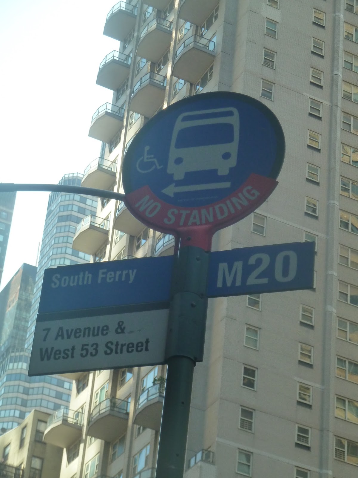
I went to New York over the weekend! And I took some trains! And buses! But not the M20. Let me explain: to get to Staten Island, the most obvious (and touristy) way is the Staten Island Ferry. And the most obvious way of getting to the ferry is by taking the 1 train down to South Ferry Station. But 1 trains weren’t running there this weekend – thus, we needed to find an alternate route. Let me just say that Manhattan buses are not at all reliable.
 |
| If only… |
It was a Sunday, when the M20 runs every 20 minutes. The one my father and I wanted was supposed to leave Lincoln Center (the northern terminus) at 9:19 and arrive South Ferry at 10:07 – plenty of time to transfer to the 10:30 ferry. Waiting at 57th Street, the bus was due to come a few minutes after it left its first stop. But “a few minutes after 9:19” came and went. By 9:30, I was starting to get a bit worried.
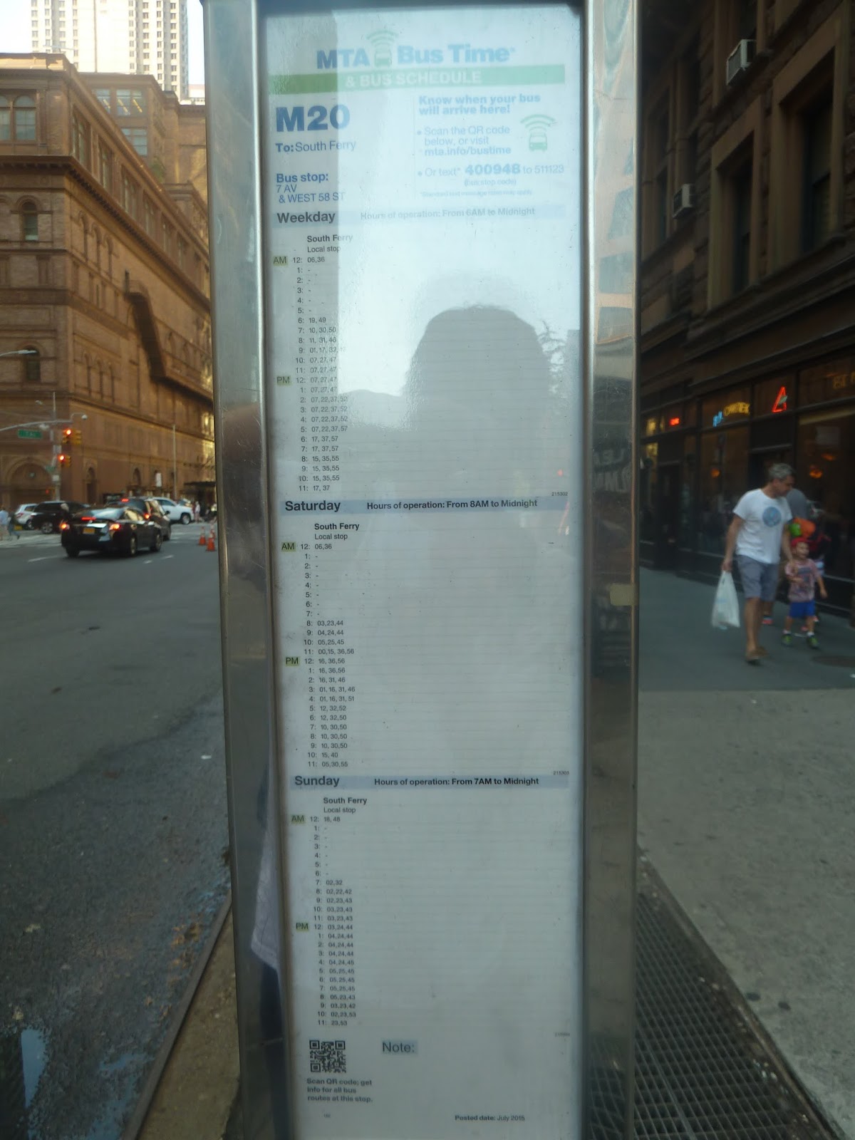 |
| This “schedule” says the bus arrives at 9:23! Balderdash! |
Luckily, the MTA has a nifty texting system, where you can text them the stop number and they’ll tell you when the next bus arrives. It took a while to get a response, but it said “0.5 miles away.” Well, after another 10 minutes of waiting, it was clear that the bus was in fact much further than half a mile away. Eventually we decided to just hoof it and take the subway instead.
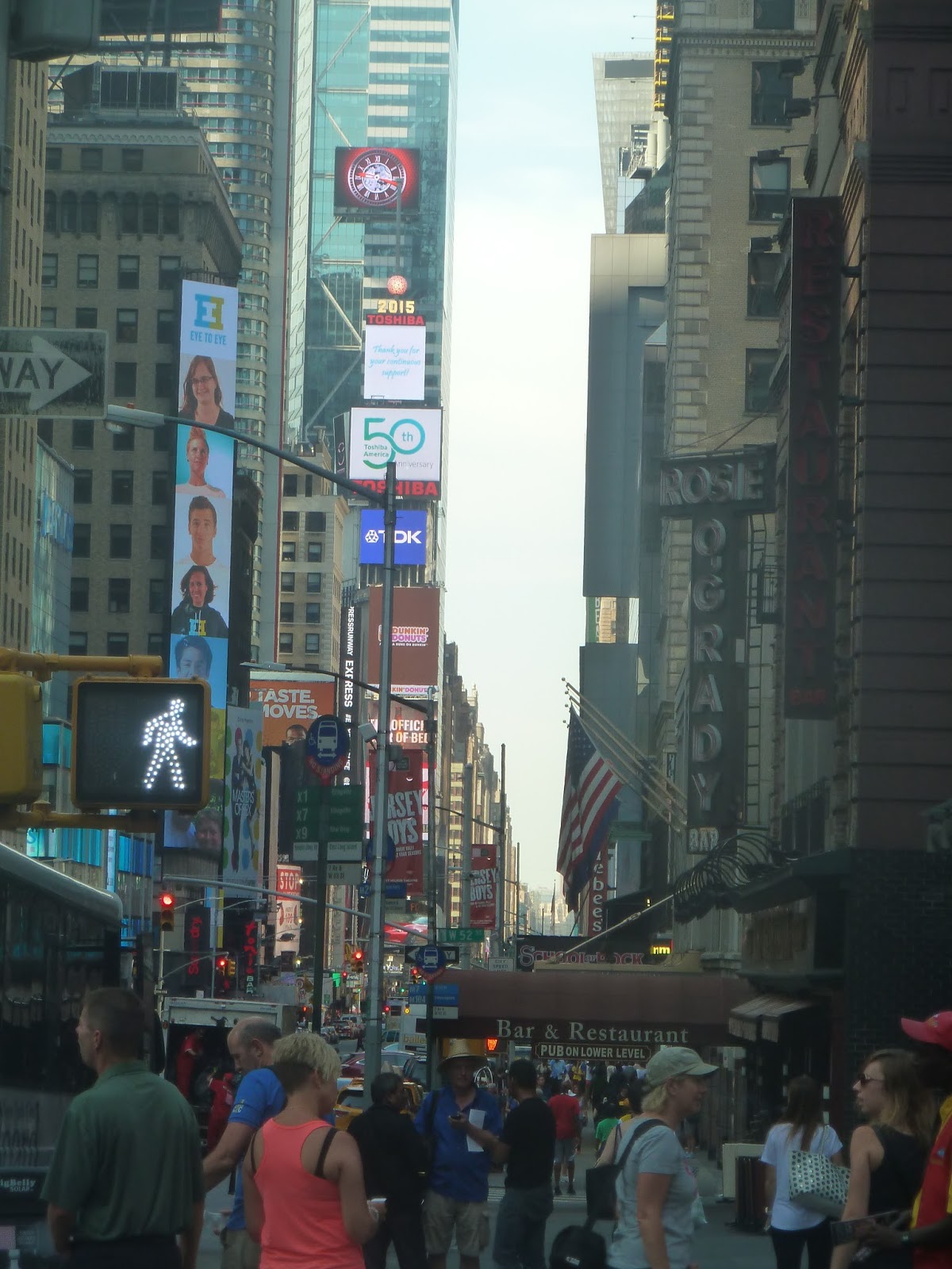 |
| Well, at least we avoided the Times Square traffic. |
 |
| Ah, the classic New York Subway entrance. |
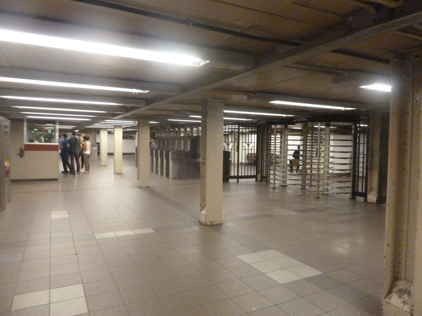
An alternative subway route to South Ferry is the R, which has a direct transfer to the 1 at Whitehall Street. You may remember my fun experience with the NQR lines from the last time I was in New York – and this one was just as fun (i.e. not fun at all)! The 57th Street station was pretty generic – nothing special about it.
 |
| The mezzanine. |
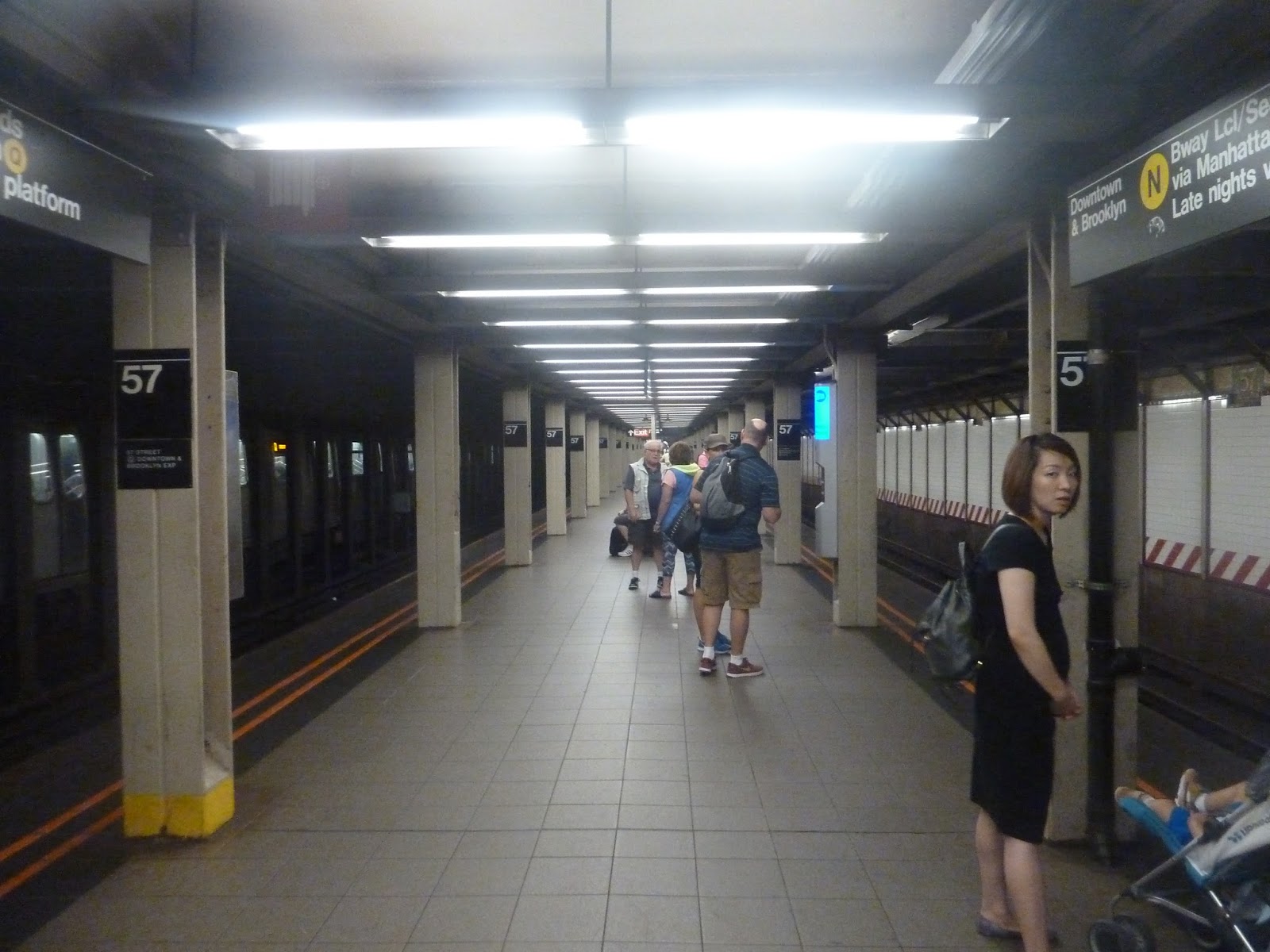 |
| And the platform – express trains stop on the left. |
 |
| Apparently not. |
 |
| I was so excited I didn’t even care that the picture was blurry. |
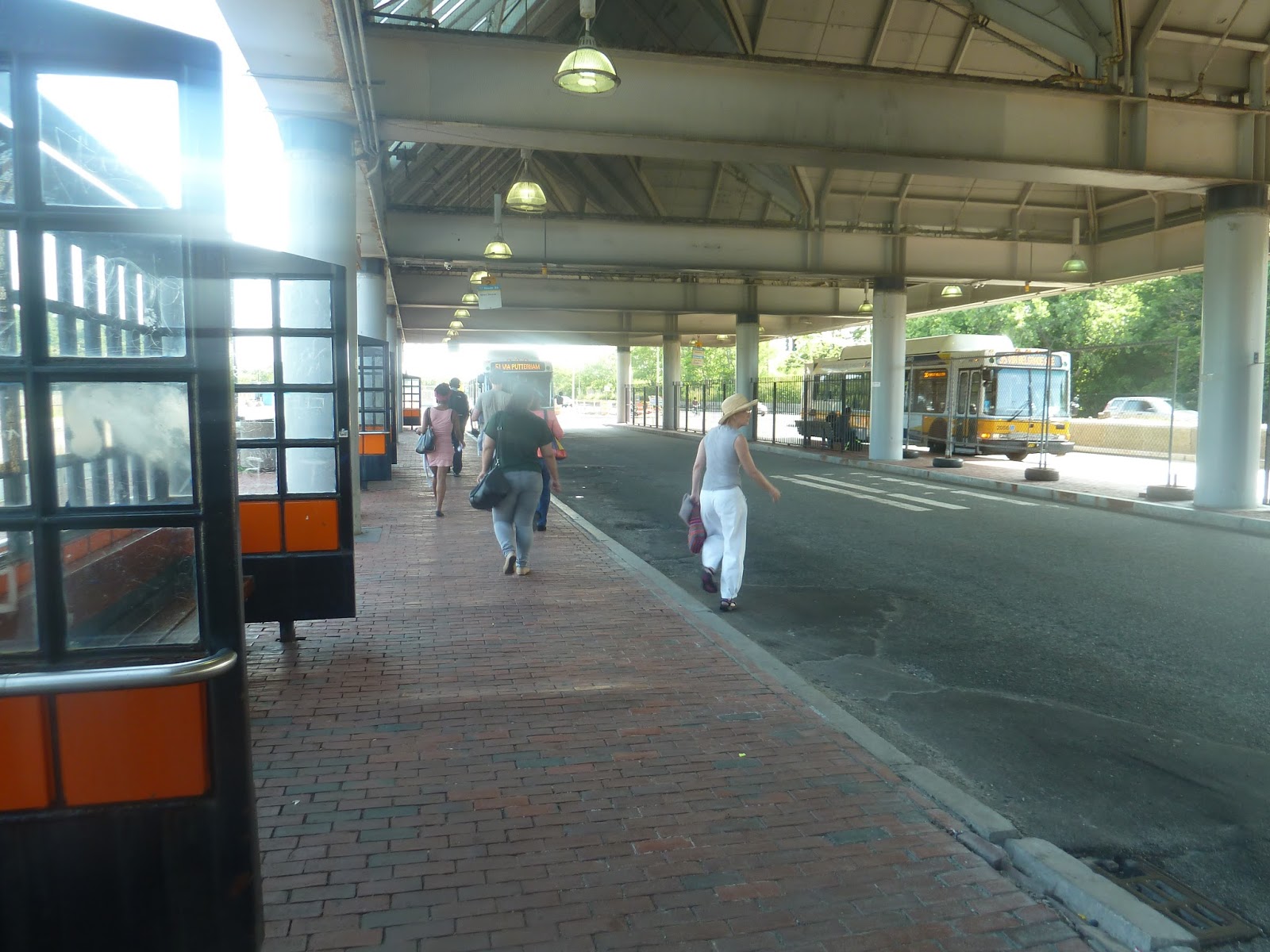
Forest Hills
Here we go. The big one. The huge Orange Line terminus featuring a bunch of bus connections on two different busways, a Commuter Rail platform, and even some retail inside the mezzanine. We shall wait no longer, and commence this review of the monster hub known as Forest Hills.
 |
| This exterior is almost iconic. |
I love the Forest Hills building! Made mostly of metal and glass, this huge structure looks great. And you can’t forget the clock tower that rises out of the center. There’s actually another clock in the mezzanine that corresponds with the one outside, which is really cool.
 |
| It’s a “secret” exit! |
The big building isn’t the only way to the platform, though. Well, yes it is, but there’s another exit from the platform. It’s similar to another exit at Back Bay, with doors and a turnstile leading out. It’s simple, but it can be useful for getting to places north of the station.
 |
| The 39’s bus stop, taken about a month ago. |
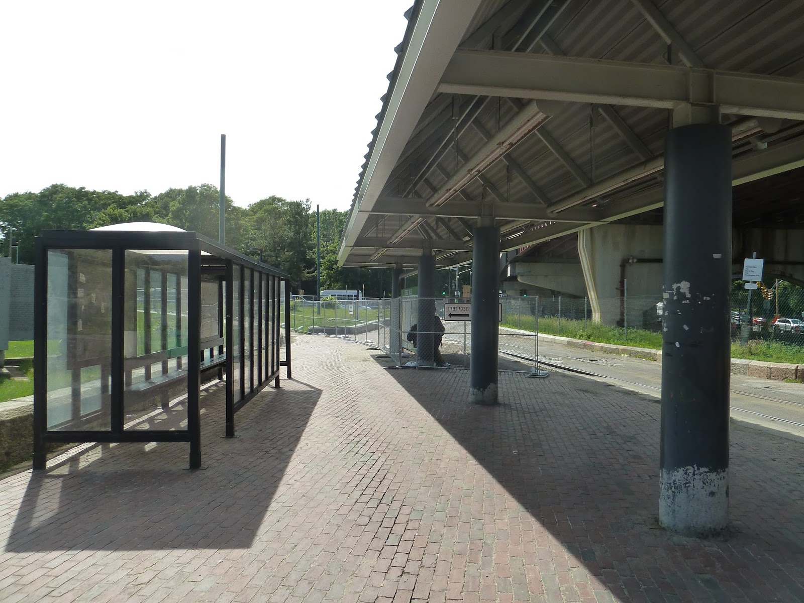
Annoyingly, the 39 is separated from the Forest Hills busway. It gets its own mini-busway, where the E Line would terminate if it still went down to Arborway. It has a few shelters, and the old streetcar tracks are cool, but its signage from the main building isn’t the best. Actually, I think the 39 uses one of the main busways now, thanks to construction on the Forest Hills overpass, but I’m not certain.
 |
| Pedal and Park! |
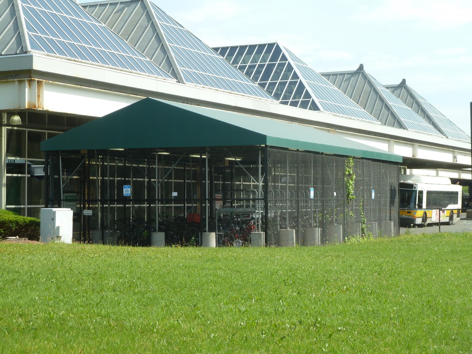
Around the side of the station, there’s a Pedal and Park with room for…x amount of bikes. I dunno how many exactly, but it’s probably a lot. Forest Hills also has a small parking lot along Hyde Park Ave – by small, I mean not big enough. With only a little over 200 spaces, it gets filled up quickly on the average weekday.
 |
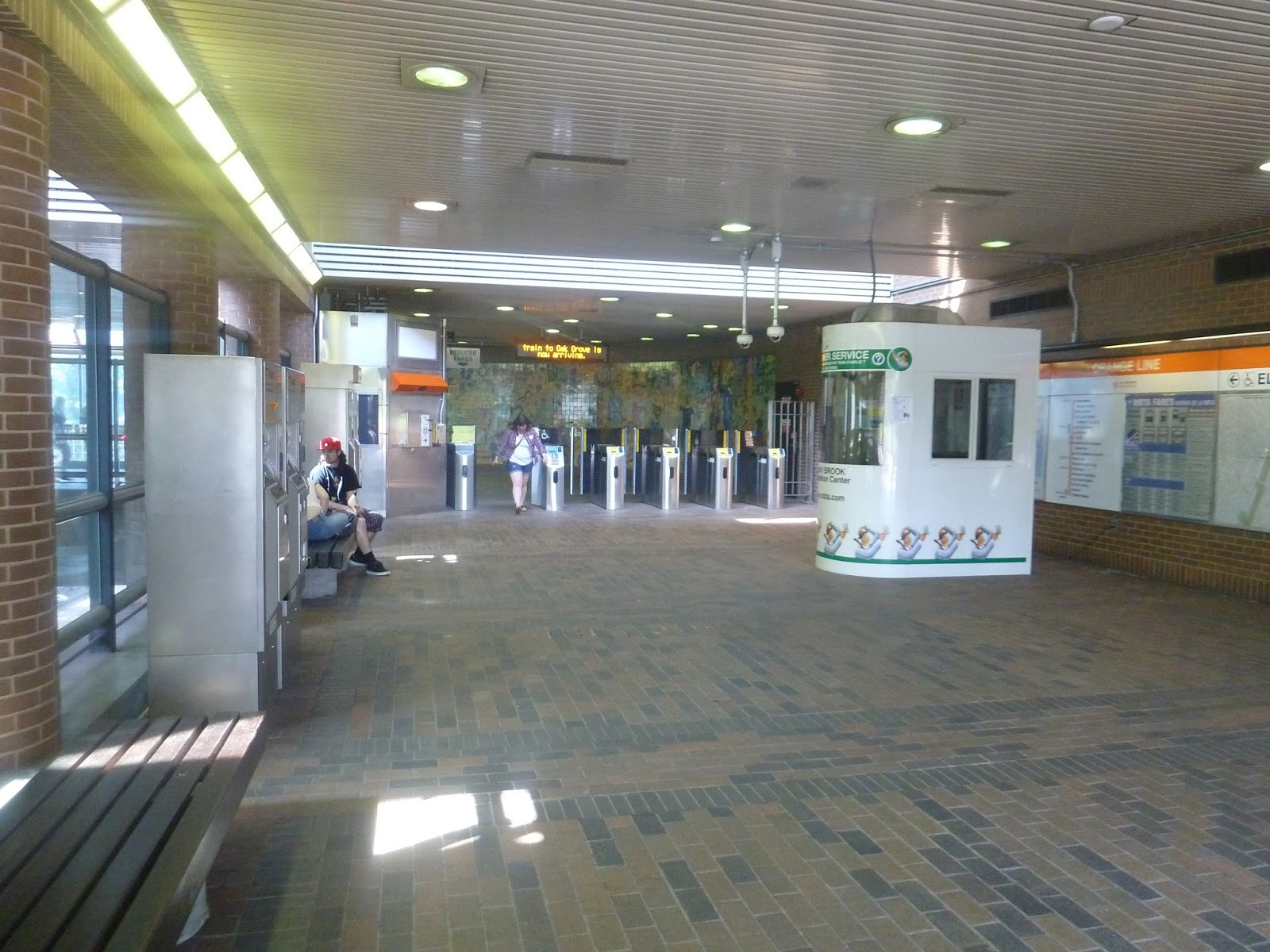
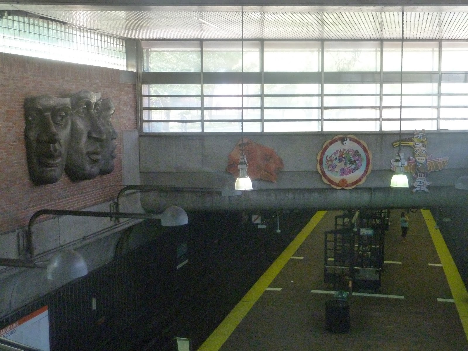
| Yes! I love this mezzanine so much! |
Forest Hills’ mezzanine is just amazing. With huge skylights covering most of it, there is so much light that gets in here. It has a huge clock right in the middle of it, and even a few shops to grab a quick (albeit not very good) bite. There’s even a bus countdown clock that shows when the next bus is leaving on every route that goes to Forest Hills. Amazing.
 |
| The upper busway. |
Forest Hills is divided into “upper” and “lower” busways, but I’m not really sure why they’re called that. I guess the lower busway is lower in elevation, but “east” and “west” would make more sense, I think. Anyway, this busway is totally sheltered, with a fair amount of benches to wait. It’s served by the clump of buses that go down Washington Street, as well as the 38. That’s a lot of routes, and it can be hard to find them, but it’s a fine busway aesthetically.
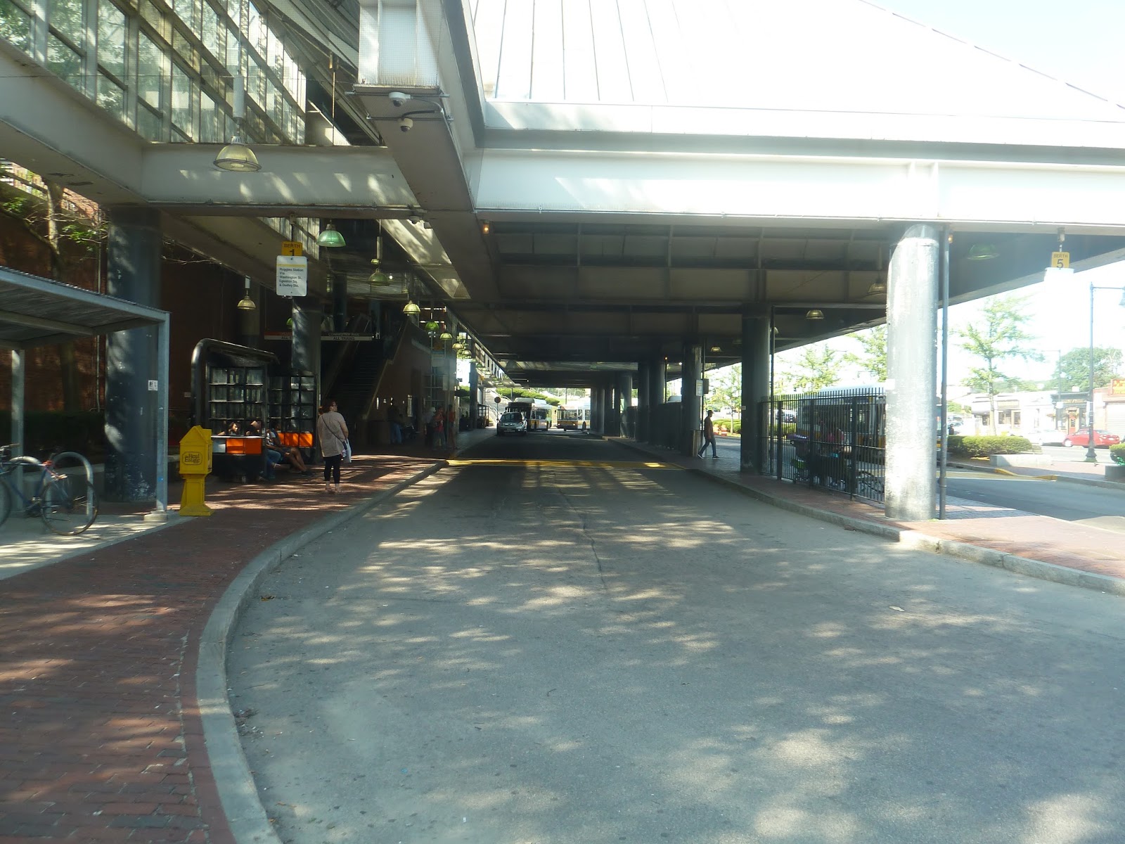 |
| And the lower busway. |
I find the lower busway to be slightly dingier than the upper one, probably because of its blander architecture. In order to get to it, you have to go down some stairs or an elevator. Despite only serving five routes, it’s still hard to find where buses pick up. There are plenty of benches, though, so at least there’s a place to wait after you miss a bus because you couldn’t find it.
 |
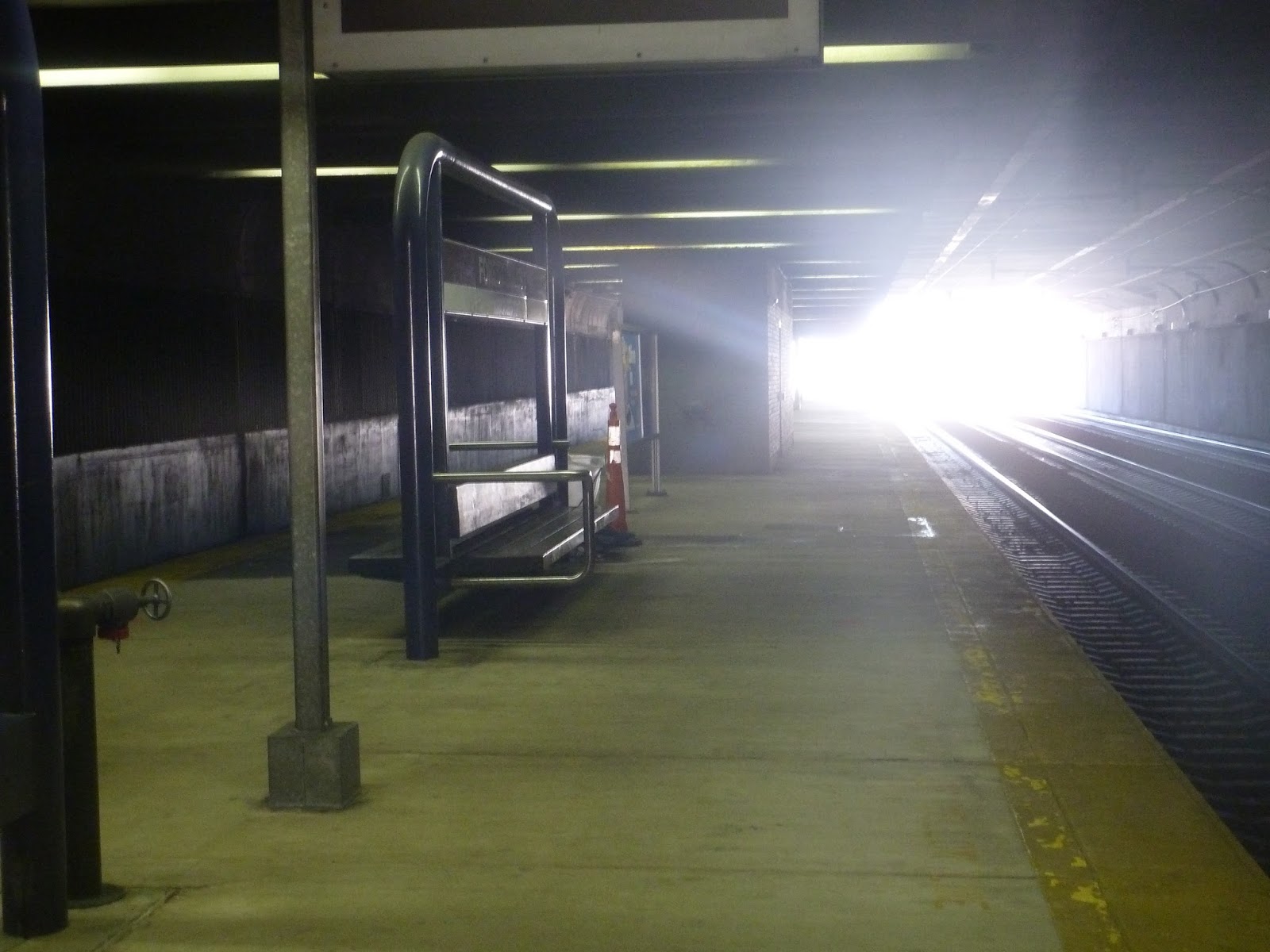
| The entrance to the Commuter Rail platform. |
The Commuter Rail even stops here! Admittedly, it’s only the Needham Line – the Providence and Franklin Lines go through here but don’t stop. To get down to the platform, there’s a set of stairs as well as an elevator, accessible from the mezzanine.
 |
| OH NO! I’M GETTING BACK BAY FLASHBACKS!!! |
Yes, Forest Hills’ Commuter Rail platform is pretty Back Bay-esque. It’s really, really dark, and really, really bland. It doesn’t even have any artwork like the steam train on the high-floor Back Bay platform. I mean, Forest Hills even has dripping water from the ceiling…just like Back Bay! Man, these underground Commuter Rail stations just can’t get it right, can they?
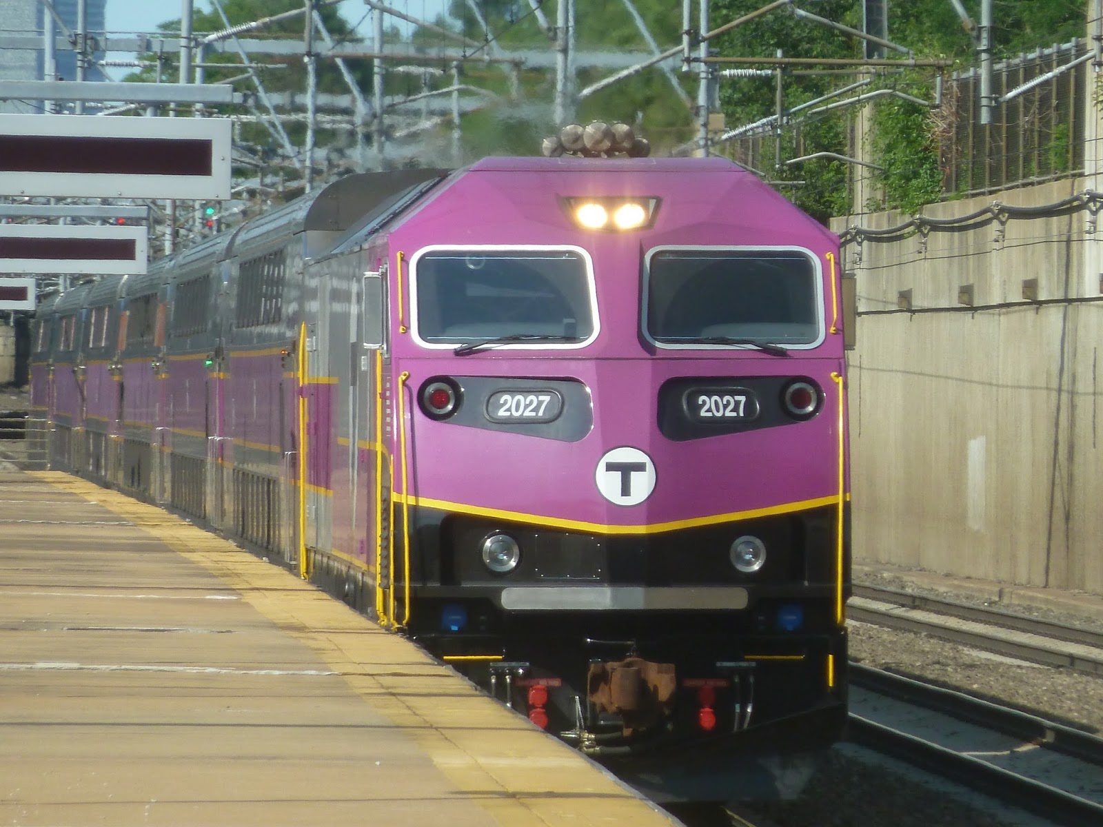 |
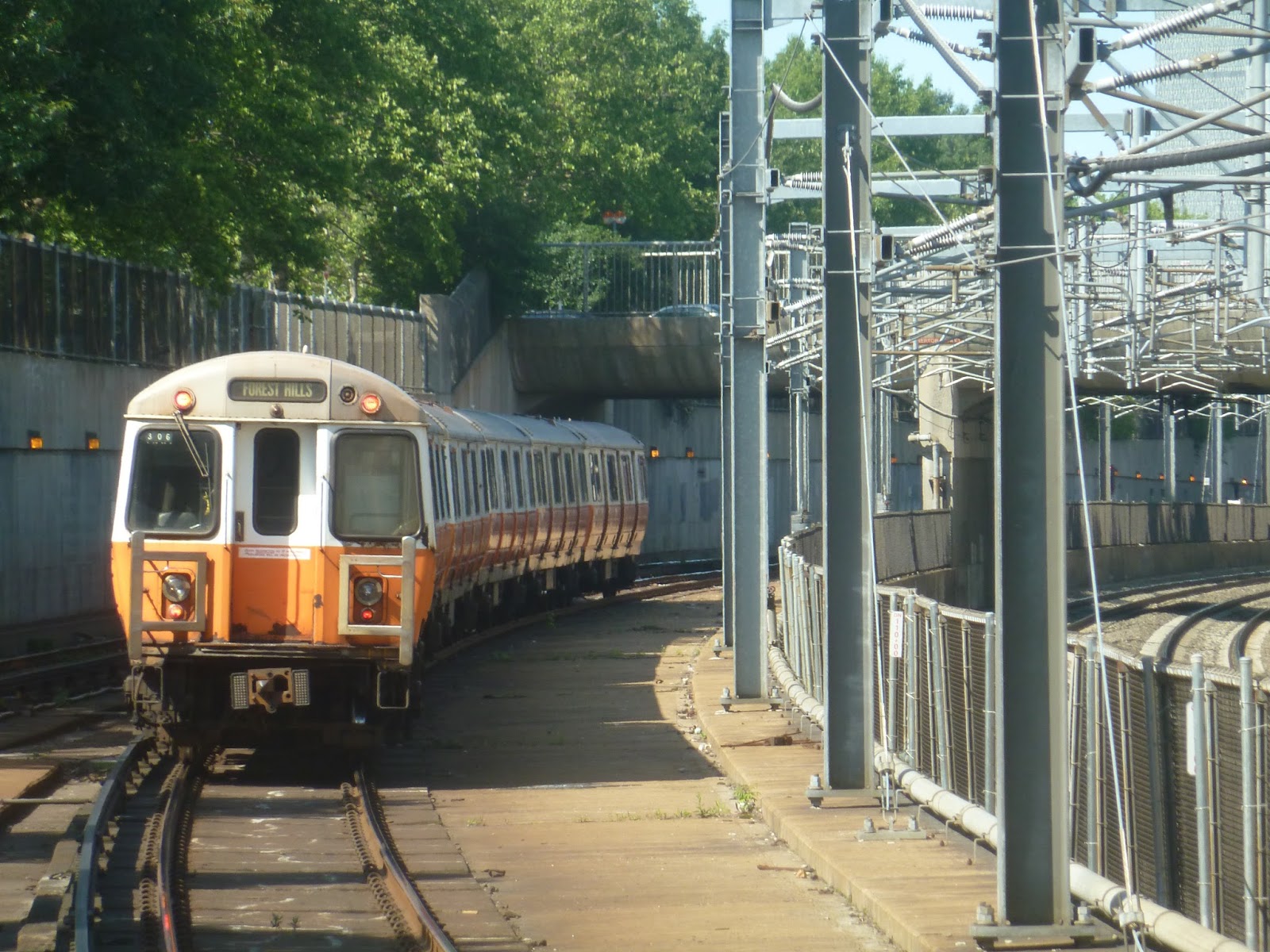
| A Commuter Rail train passing through the station. |
There’s also an unsheltered part of the platform that goes pretty far out. It literally has nothing on it except for some lights and some nonfunctional LED screens. I can’t see why anyone would ever wait there, unless they wanted to escape the gloom of the underground station…so yeah, actually, that’s a pretty good reason.
 |
| Okay, back to the mezzanine. |
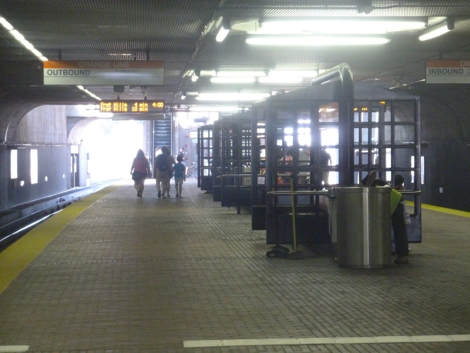
Finally, we’re heading down to the Orange Line platforms. Now, the mezzanine has a bunch of fare machines spread all over, and a fair amount of fare gates, as well. From there, there’s an elevator down to the platform, as well as two sets of stairs and escalators. Also, there’s some art in this area, but it’s kind of underwhelming and not as impressive as, say, Jackson Square.
 |
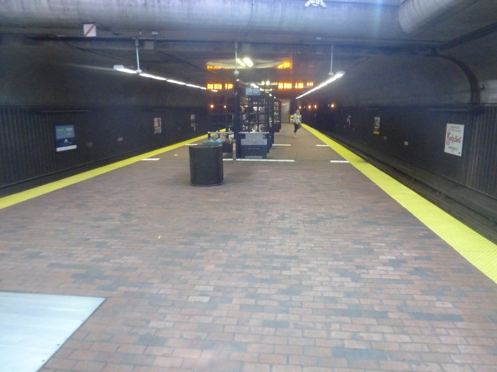
| The platform. |
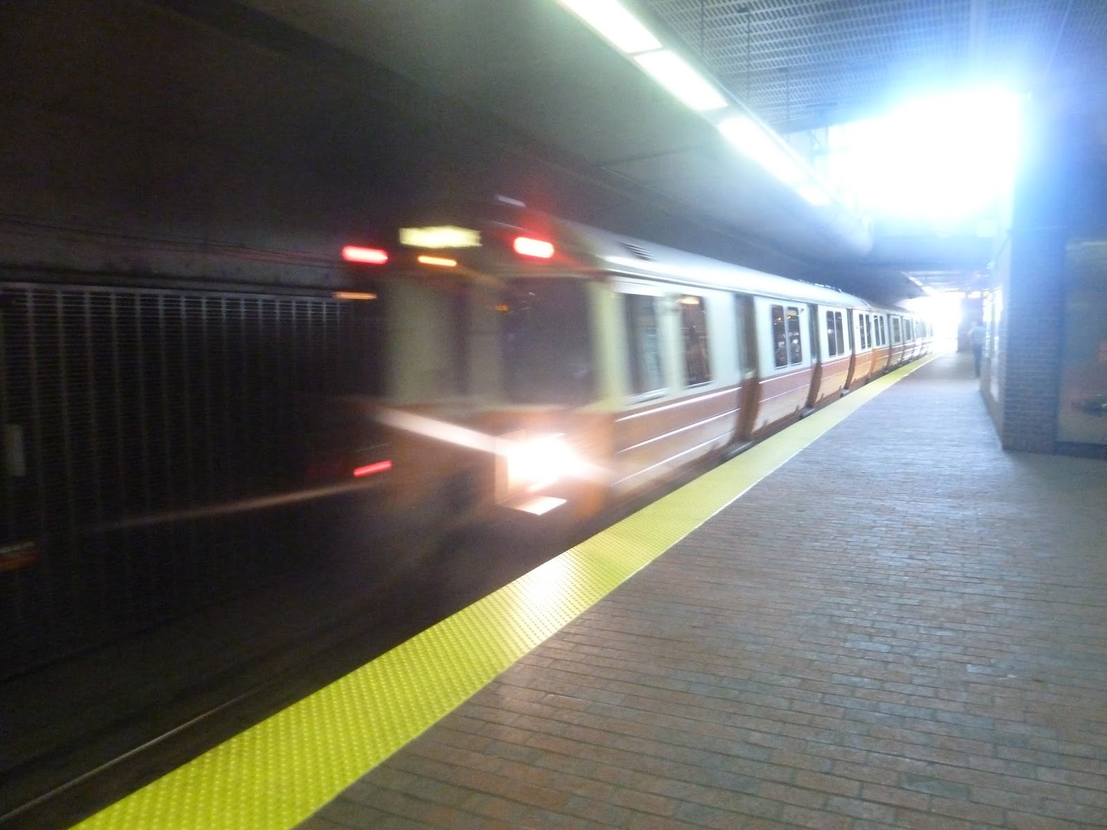
The platform is pretty much the same as the previous two stations I’ve reviewed. It’s kind of dark, despite natural light getting in from the entrance. However, there is a good amount of benches, but they’re those ugly Southwest Corridor benches. Since Forest Hills is a terminus, both platforms serve inbound trains. Thus, there’s a convenient “Next train” sign to let people know which train to board. Now let’s get out of here.
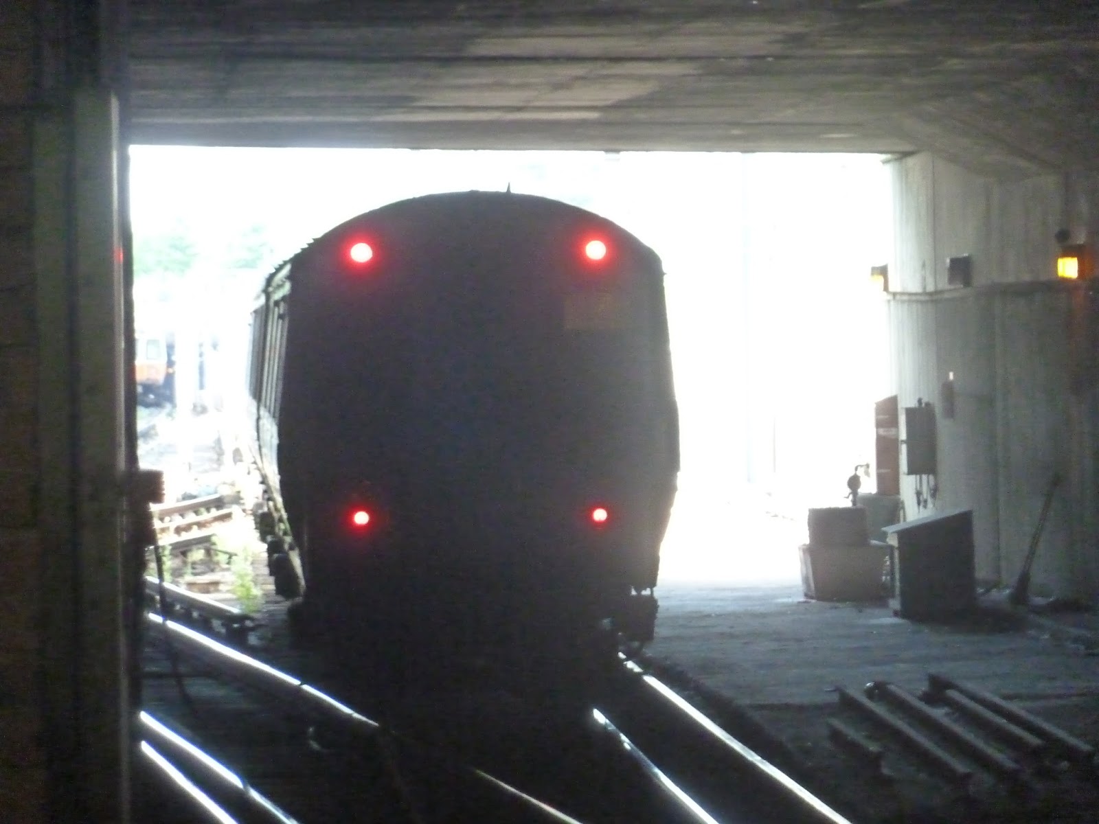 |
| It’s staring at me with…those tail lights… |
Station: Forest Hills
Ridership: Very, very high. As the 9th busiest station on the system, Forest Hills gets an average of 15,150 riders per weekday! And as for the Commuter Rail station? Well…112 inbound riders per weekday. Okay, well, that’s significantly less, and I doubt there are too many outbound riders, either. Hey, it’s just the Needham Line, what do you expect?
Pros: This station is a huge hub! With an Orange Line station, a Commuter Rail station, and over 15 bus routes, there’s a lot of stuff here. And they’re all connected by an excellent mezzanine. Seriously, that’s probably my favorite part of the station. In addition, the Pedal and Park is convenient, and although it’s kinda bland, the Orange Line platform is standard for the Southwest Corridor.
Cons: The busways are really confusing, but individual schedules and signage try to alleviate that. Something more important is that Forest Hills does not have nearly enough parking. It gets over 15,000 people a day! A measly 200 spaces isn’t gonna cut it. In addition, the Commuter Rail platform is pretty horrible. I mean, it’s not as bad as Back Bay, but it’s hard not to see the similarities between the two.
Nearby and Noteworthy: Surprisingly, the station is mostly surrounded by greenspace. Aside from a few businesses on Hyde Park Ave, the immediate surroundings of Forest Hills are mostly either houses or parkland. Well, I guess “Forest” is right in the station name.
Final Verdict: 8/10
Oh, how I wish I could convince myself to give this station a lower score. I mean, Forest Hills has so much wrong with it! Still, though, the MBTA does try to fix the busway problem, and hardly anyone uses the Commuter Rail station. That leaves the parking issue, which really is a major one, but there doesn’t seem to be much room for more parking. I’m not sure if there’s much that can be done about that. And come on, the mezzanine? Simply amazing.
UPDATE 12/27/18: This station has seen some huge upgrades since I last visited it on this blog. Check out this post to see them.
Latest MBTA News: Service Updates
Stony Brook
Heading south along the Orange Line, Jackson Square is kind of the “last frontier” before the big hub of Forest Hills. But in between those stations, there are two quiet, local stops with no bus connections. I’ve already done Green Street, but what about the other? Well, let’s take a look at Stony Brook.
 |
| The brick entrance. |
 |
| The mezzanine. |
My parents are always talking about feng shui, “a Chinese philosophical system of harmonizing everyone with the surrounding environment.” Basically, it’s how energy flows. And Stony Brook flows incredibly well into its mezzanine – it’s just a straight line. It may be a little bland, but functionally, this is a great mezzanine, with a good amount of fare machines/gates to boot.
 |
| The hallway from the mezzanine. |
 |
| The platform. |
 |
| A train leaving the station. |
Jackson Square
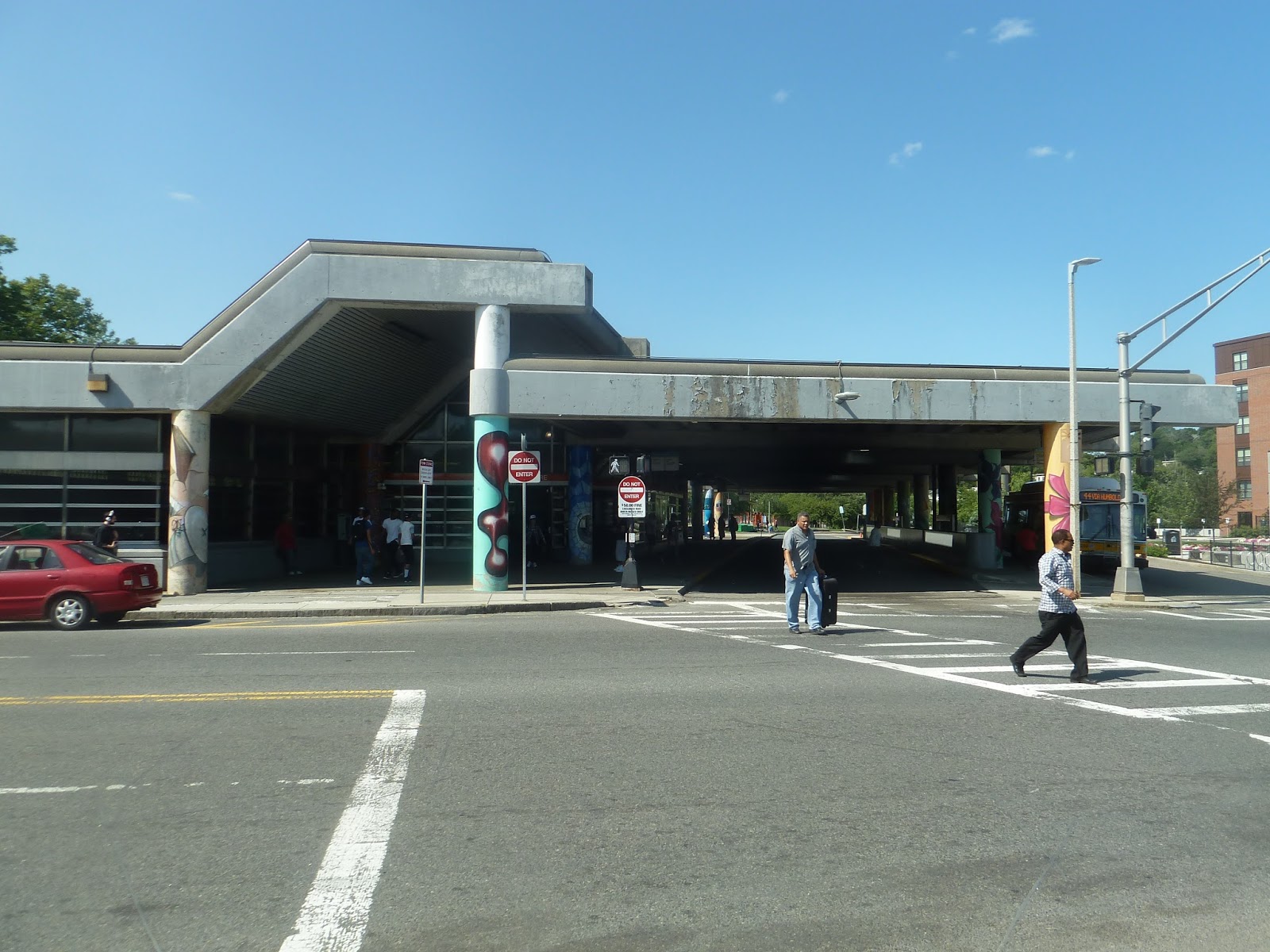
Man, the MBTA really pulled out all the stops with Jackson Square, at least in terms of artwork. There are so many art installations here, it’s really great. As for the architecture? Well, we’re in the Southwest Corridor, so expect lots o’ brutalism. Here we go.
 |
| Like I was saying… |
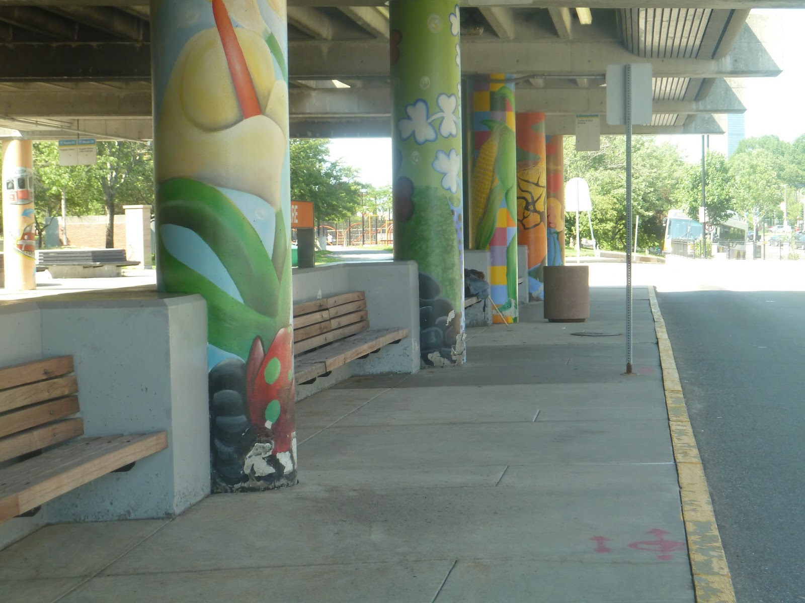
The main entrance to the station is on Centre Street. As you can see above, the station is made out of concrete. Lots of concrete. Lots of chipping, ugly concrete. Blech. There is, however, a fair amount of glass, so that’s good. Also, every pillar outside the station and in the busway has a different painting on it. I think that’s really cool, and it was fun to look around at the different ones.
 |
| Part of the busway. |
The station’s busway is split into two sections. The first one has a wider sidewalk on which to wait, but no benches – except for an unsheltered section on the end of the busway. Why put the benches there? I mean, they’re nice benches, in circles around trees, but really? I think sheltered places to sit are more important than sunlight getting to decorative trees.
 |
| And the other section. |
The other part of the busway is simpler, with a narrower sidewalk. It does have sheltered benches, though, which is great. The problem with this one is that you can only get to it on either end. There aren’t any gaps in the middle where you can cross over, which means you have to take a circuitous route from the entrance to get there.
 |
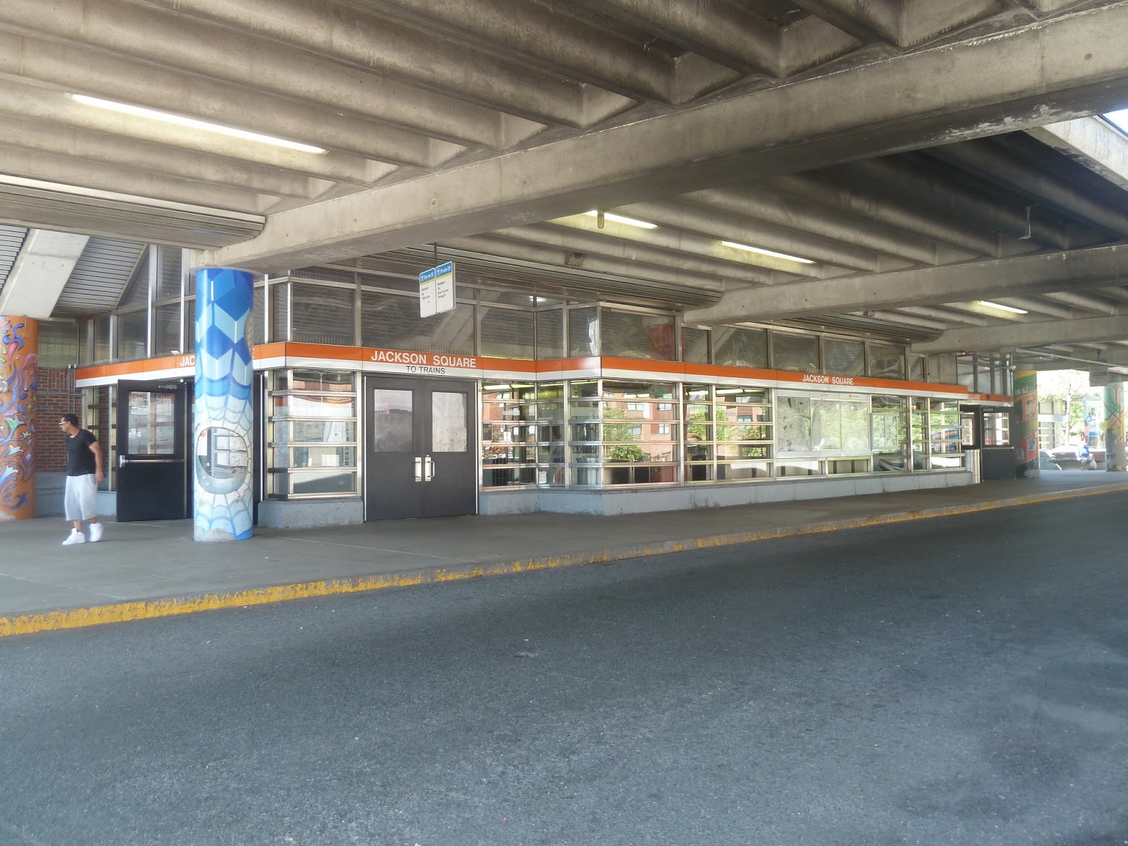
| The mezzanine. |
Jackson Square’s mezzanine is very spacious and bright. Lots of natural light gets in from big windows, making the unnatural light look a bit bland to be honest. And architecturally, there’s nothing special about the mezzanine aside from the windows. It has lots of fare machines and gates, so lots of people can come through here at a time.
 |
| So…much…art! |
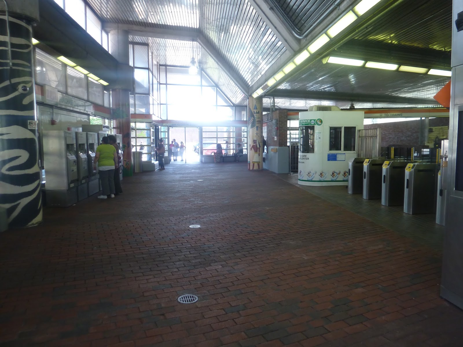
Past the mezzanine, there’s some sort of store that sells purses. Honestly, I didn’t even notice it when I was there, but I found it in the background of one of my pictures. Well, that’s a nice…amenity, I guess. Heading down the stairs, there’s a bunch of artwork, too. I think my favorite one is three massive heads all looking in different directions. Good stuff.
 |
| The fact that THIS was the best platform picture I could get fills me with dread and misery. |
Like all the other Southwest Corridor stations, Jackson Square has a center platform. The station is technically “underground”, but a bunch of natural light gets in from the mezzanine. Although the architecture here is bland, it’s still somewhat bright inside. The benches are standard for the Southwest Corridor (i.e. ugly, but that can’t be helped), and there are even a few wastebaskets down here! Hooray!
 |
| A train blurring its way into the station. |
Station: Jackson Square
Ridership: For the Southwest Corridor, Jackson Square has reasonably high ridership, but I have to say I was expecting more. On the average weekday, the station gets 5,828 riders. A fair amount of this probably comes from the infamous Heath Street Projects, which are right next door. Also, bus passengers presumably amount to a high portion of the ridership.
Pros: Speaking of buses, there are five of them that serve Jackson Square, making it a bit of a mini-hub. As for the station itself, I love how much art it has, as well as how much natural light it gets.
Cons: Some of the architecture here can be meh. Also, the busway is a bit of a mess, what with the unsheltered benches and the hard-to-get-to second section.
Nearby and Noteworthy: There are a few businesses around, but nothing seems especially interesting.
Final Verdict: 7/10
Ah, but the art calls out to me. No, seriously, I can’t help but like this station. Sure, a lot of its architecture is boring and brutalist, but the windows and artwork enhance it. I love the fact that natural light gets down to the underground platform, which would be really dark otherwise. The station also has a fair amount of buses serving it, and is a decently large hub.
Latest MBTA News: Service Updates
Woah! This is my 400th post! I didn’t realize I’ve written so much…
44 (Jackson Square Station – Ruggles Station via Seaver Street and Humboldt Ave)
Okay, important note: don’t take this route from beginning to end. It is incredibly circuitous, taking 20 minutes to get two stops down the Orange Line. Of course, the route is meant to serve the portions in between, particularly Humboldt Ave, its unique section. So let’s take a closer look at the 44.
 |
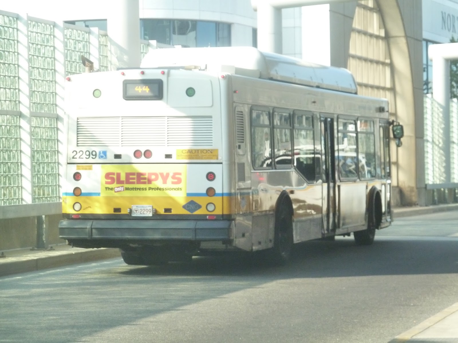
| This isn’t the bus I took, but it’s the 44 and it’s at Jackson Square, so that’s good enough for me. |
Leaving Jackson Square, we headed down Columbus Ave, going by mostly apartments. There were businesses and a big apartment tower at Egleston Square, where the street became Seaver Street. After passing more apartments from there, we turned onto Humboldt Ave, starting the 44’s unique portion.
The surroundings were mostly dense houses, with a few local businesses along the way. We then passed a school, which looked pretty boring from the bus, but really cool from above. Seriously, take a look at this. Anyway, from there, we went by more dense houses and another school.
Seaver Street became Walnut Street, and soon after we turned onto Warren Street. After a short time, we reached Dudley Square, navigating through the busway. We then joined the cavalcade of other bus routes that go down Malcolm X Boulevard. Going by a few schools, we turned onto Tremont Street at Roxbury Crossing, reaching Ruggles soon after.
 |
| This is the bus I took, but it’s a pretty bad picture. |
Route: 44 (Jackson Square Station – Ruggles Station via Seaver Street and Humboldt Ave)
Ridership: There were about 30 people on my ride in total. I didn’t keep tabs on the other passengers, but I can assure you that no one rode from beginning to end. The route gets good ridership overall: an average of 3,515 riders per weekday, 1,866 per Saturday, and 775 per Sunday.
Pros: The route serves Humboldt Ave, and despite the fact that it’s pretty close to other routes, people still use the 44. It’s convenient, I guess. It also runs quite often for the most part – every 12 minutes rush hour, every 25 minutes during the day, every 30 minutes at night, and every 20 minutes on Saturdays.
Cons: Why is it that so many MBTA buses have disproportionately bad Sunday schedules? The 44 runs every hour on Sunday, when it seems like it ought to run much more often. Seriously, it’s not a long route. I don’t think a second bus would hurt.
Nearby and Noteworthy: Along Humboldt Ave? No, there didn’t seem to be anything noteworthy. There was Egleston and Dudley Squares, though.
Final Verdict: 6/10
Sigh. The 44’s route is pretty good, as is its schedule…for the most part. But come on, every hour on Sundays? That’s so awful compared to the rest of the week! Man, this is the problem with so many buses. Oh, well…
Latest MBTA News: Service Updates
29 (Mattapan Station – Jackson Square Station via Seaver Street and Columbus Ave)
Of the four routes from Mattapan to the Orange Line, the 29 is probably the weirdest. It runs alongside other routes for almost its entire run, and has an odd scheduling quirk that I’ll get to later. I guess it’s just meant to supplement other routes, but my ride on it was pretty interesting…
 |
| Of course the driver decided to change the destination board after we left. |
As we were leaving Mattapan, I came to the horrifying realization that a hornet was on the bus. I had no idea how it got on, but it was at least an inch long and I was terrified. Trying to keep myself composed, I debated calling the trip off. After all, I had done a bunch of routes that day, and losing one wasn’t the end of the world. But no, I thought. It’s my duty to take the 29, hornet or not! That said, I was very tense, and WHY WAS NOBODY ELSE NOTICING THE BUG???
Well, someone finally did notice when we got to the next stop. A woman got on and was walking toward the back when she saw the hornet. Suddenly she SCREAMED at the top of her lungs and ran toward the last row. “I’m scared of bugs!” She shouted. No one really did anything, including the driver. The bus just kind of sat there while more oblivious people got on.
The hornet then decided to go to the back as well, which caused the woman to scream again and run for the front. “It’s following me, I swear!” She yelled. Finally, the driver did something about it. He grabbed a piece of paper, got up on the driver’s seat, and swatted the bug out the front door. It was very heroic, and I was silently thanking him.
After that scare, we continued up Blue Hill Ave, going by the businesses of Mattapan Square. Once we crossed over the Fairmount Line tracks, it got residential, with dense houses lining the street. There was the occasional business, though, and after we crossed Morton Street, there was lots of retail.
Eventually, we turned onto Westview Street. This is the 29’s only unique section, and it’s a diversion to serve the Franklin Field Housing. We went by Harambee Park, then turned onto Ames Street, going by lots of identical apartments. The street ended in a dead end, where the driver had to awkwardly turn the bus around. To add insult to injury, no one got on or off during this section.
 |
| Harambee Park, which will be a tennis venue should Boston 2024 happen. |
We headed back to Blue Hill Ave and continued going by more businesses. Eventually we reached Franklin Park, going by the zoo of the same name. After that, we turned onto Seaver Street, going by some fairly tall apartments. Well, tall as in three to four stories. There was an actually tall apartment building at Egleston Square, and it looked out of place.
There were a few businesses here as Seaver Street became Columbus Ave. However, it went back to apartments soon after. Eventually, we turned into the Jackson Square busway and the bus got ready to go back to Mattapan.
 |
| A different 29 at Jackson Square. |
Route: 29 (Mattapan Station – Jackson Square Station via Seaver Street and Columbus Ave)
Ridership: There were about 30 people on my ride. And one hornet. Most people just used the route for local service, though the hornet got kicked off the bus for causing trouble. Overall the 29 gets pretty good ridership, with 2,178 riders per weekday and 552 per Saturday. That second one may not seem like a lot, but it’s actually not bad, considering the route’s Saturday schedule. You’ll see.
Pros: The route is a good supplement to the 22 (from Jackson Square to Seaver Street) and the 28 (from Seaver Street to Mattapan). Both of those are Key Bus Routes, so the 29 is just kind of a combination of parts of their routes.
Cons: This route has a weird schedule, so I’ll just go through it here. It runs about every 15 minutes during rush hour (which is great), but then jumps to every 70 minutes during the day. It actually runs more frequently at night, every 25-35 minutes. And as for Saturday? Well, it has the same headways as the night schedule, but that’s because it only runs at night on Saturdays! That’s such a weird thing – I really don’t understand that.
Nearby and Noteworthy: Aside from the zoo, we went by a fair amount of businesses. As usual, I don’t know anything specific.
Final Verdict: 7/10
You know, I could get into a big rant about the mostly limited schedule. But honestly, this route is just a supplement – the 29 runs alongside Key Bus Routes for its entire duration. Well, except for the Franklin Field deviation, which honestly feels like a waste of time to me. It takes a really long time for buses to turn around there, and the housing is in close walking distance to two other bus routes. So, as a standalone route, the 29 isn’t the best. But as a supplement…well, it’s a fine supplement, indeed.
Latest MBTA News: Service Updates
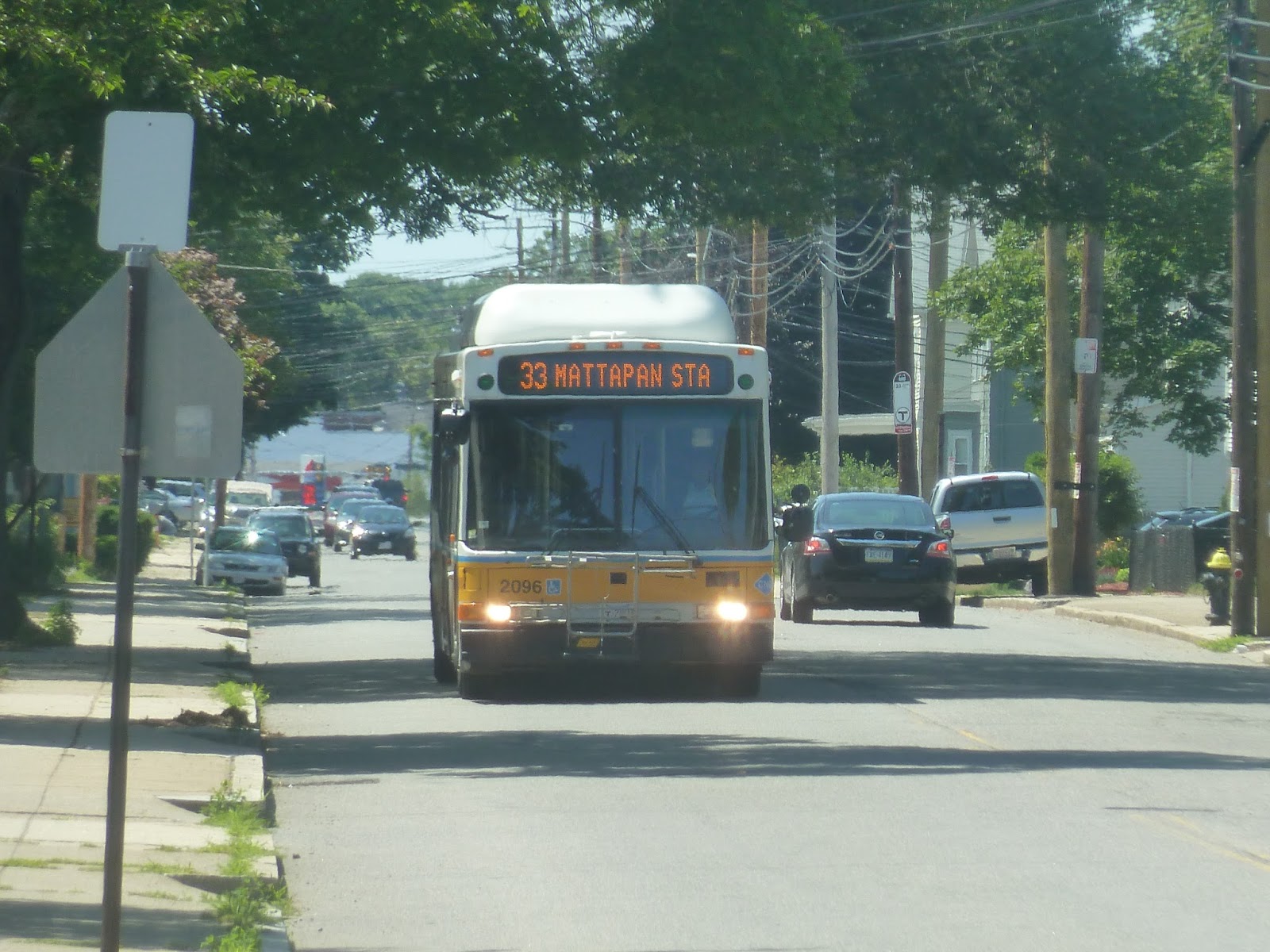
33 (Dedham Line – Mattapan Station via River Street)
I get the feeling the MBTA doesn’t like Dedham too much. Quite a few bus routes terminate either just before Dedham or just after crossing the border – the 34E is really the only route that serves it substantially. The town does have its own local bus run by our good friends at Joseph’s Transportation, which does look like an interesting ride. We’re not looking at that today, though – we’re taking a ride on one of those aforementioned routes that barely goes into Dedham. Yes, it’s the 33.
 |
| The bus coming down West Milton Street. |
There was about 10 minutes between when I left Readville (actually pronounced Reed-ville – thanks to those who commented) and when the 33 left its “Dedham Line” terminus. I was worried about missing the bus, so I only walked a little ways down West Milton Street. This means that I missed the route’s industrial origin and picked it up a few stops later, in a residential area.
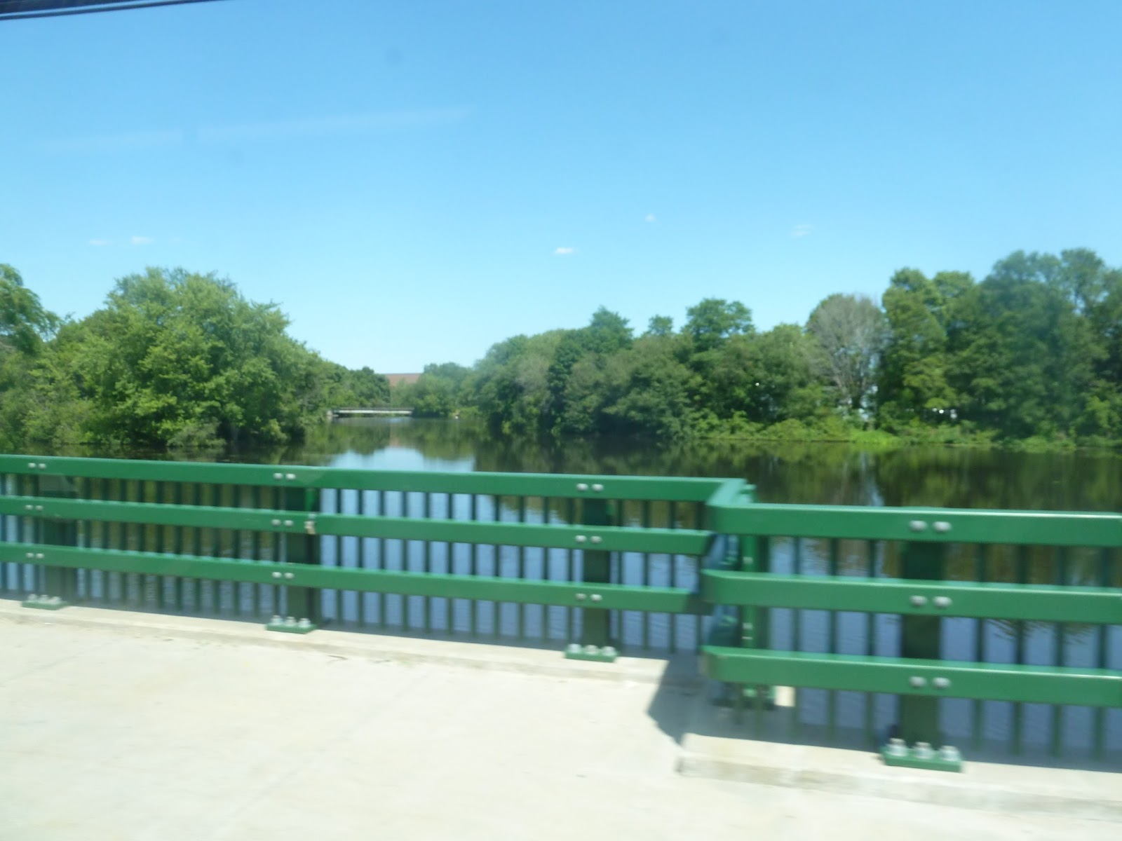 |
| A view of a river. |
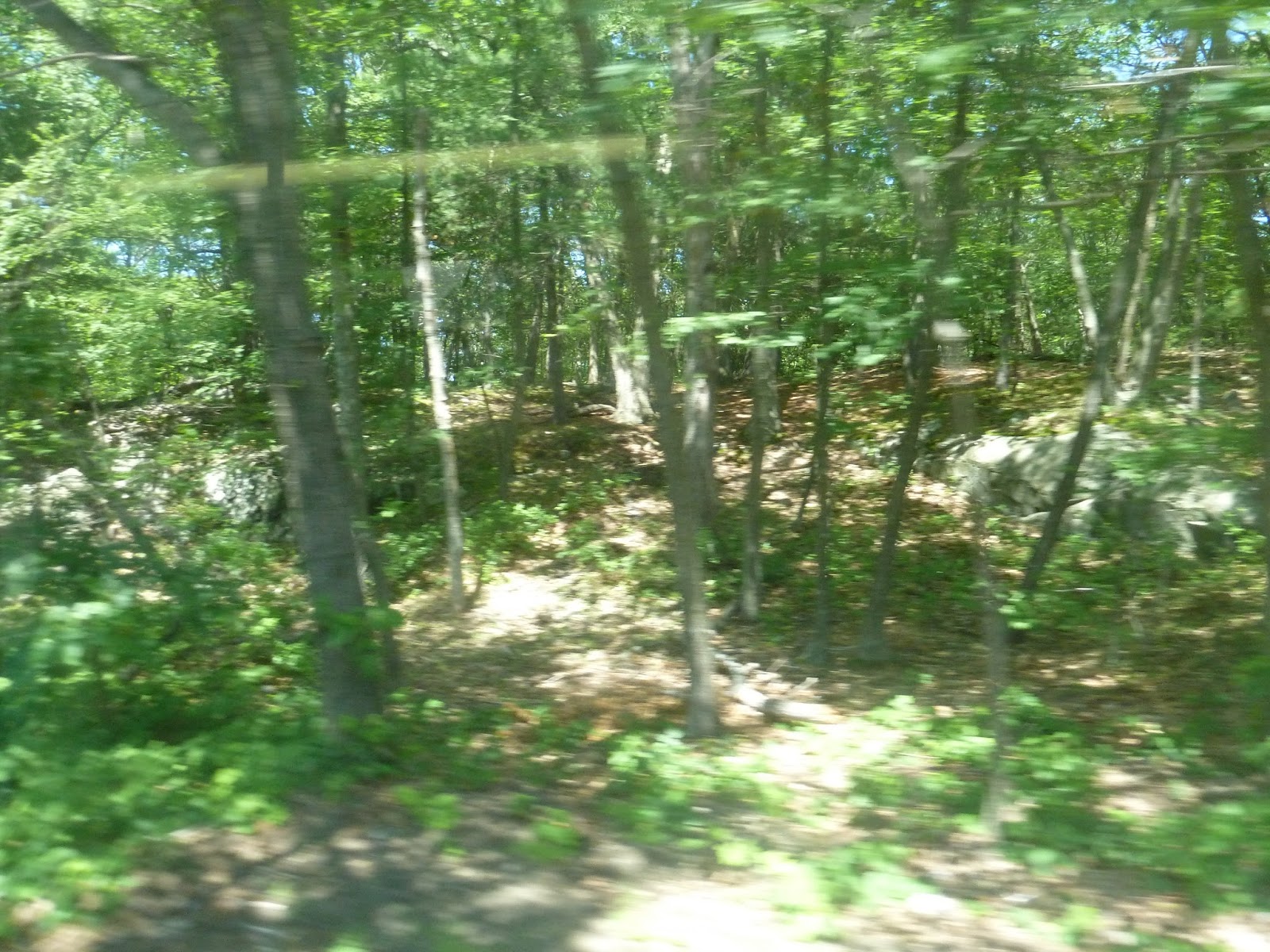
We came back to Readville, where we turned onto the street of the same name. We then turned onto Neponset Valley Parkway, then River Street, which crossed over a river. From there, we merged onto Turtle Pond Parkway and went by a pool and ice skating rink. It got very woodsey after that, and it was hard to believe we were still in Boston.
 |
| This is truly an urban center right here. |
Eventually, we turned onto Dedham Parkway, which came down to the Georgetowne housing development. It had an interesting wooden shelter, and a fair amount of people got on here. We then headed down Alwin Road, which was residential, then back into the woods on West Smithfield Road. Once it became Reservation Road, we were officially out of the forest, and the street was lined with houses.
We turned onto River Street, which was also residential. Soon, however, we crossed over the Commuter Rail tracks at Hyde Park Station and entered Cleary Square. The street was lined with businesses for a while, then turned to dense houses. Now we were joined by the 24, and bunching with it, unfortunately.
 |
| Huh. An abandoned factory, I guess. |
Eventually we came to a modern shopping plaza with a big parking lot outside. From there, we crossed over the Fairmount Line tracks, and the street became mostly residential again. Soon the businesses came back, signifying we were in Mattapan. However, we first turned onto Blue Hill Ave, entering Milton for a bit, just to make a u-turn and come back into Boston. We then pulled into the Mattapan busway.
 |
| The bus at Mattapan. |
Route: 33 (Dedham Line – Mattapan Station via River Street)
Ridership: On my ride, there were about 20 people in total. The large majority of them got on at Georgetown, and all but two people went all the way to Mattapan. Overall, the route gets an average of 1,246 riders per weekday and 462 on Saturdays.
Pros: The route serves some neighborhoods that are pretty much in the fringes of Boston and links them up to Mattapan Station. Georgetowne is a big ridership draw in particular, and so is Cleary Square to a much lesser extent.
Cons: The schedule of course! And the 33’s schedule is pretty bad – every 30-35 minutes rush hour, and every hour weekdays and Saturdays. On another note, its route near Georgetown is rather circuitous, but I don’t think there’s much that can be done about that. Finally, there’s the fact that we were bunching with the 24. Was this a fluke, or are the two routes not really coordinated? Based on the schedule, it looks like the latter.
Nearby and Noteworthy: Aside from Cleary Square, I didn’t see much of note along this journey. Cleary Square does have a bunch of businesses, though.
Final Verdict: 5/10
The 33 does serve a fair amount, but its schedule is pretty darn bad. I suppose Georgetowne still gets Sunday service from the 40/50 to Forest Hills, but it seems like there’s a certain amount of people who want to get to Mattapan from there. I mean, let’s face it, Georgetowne is really the main ridership producer for the 33. Finally, this route really should be better coordinated with the 24, at least so that they don’t bunch together.
Latest MBTA News: Service Updates
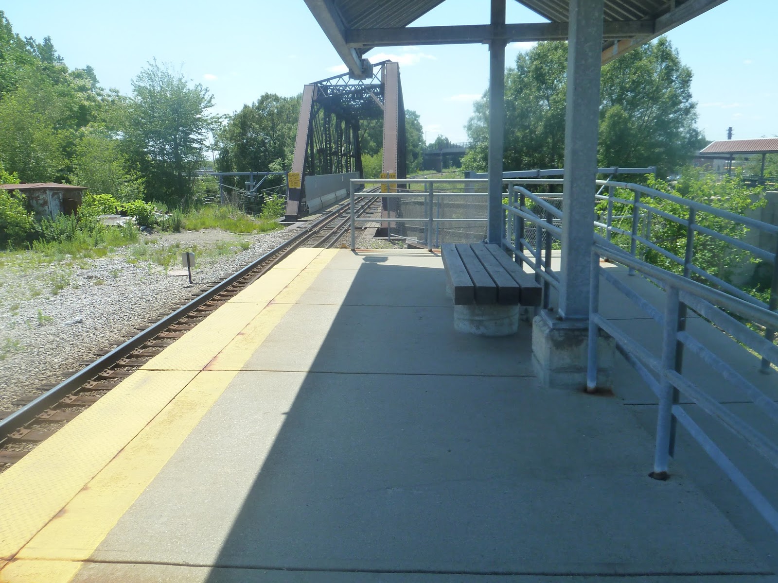
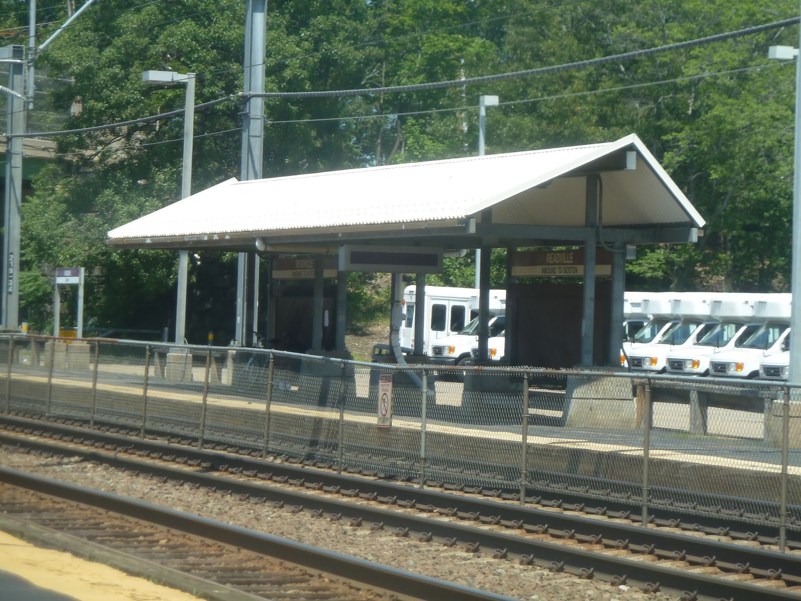
Readville
Okay, will someone please tell how “Readville” is pronounced? Because I’ve been pronouncing it the same way someone would pronounce the town “Reading” – “Red-ville”. The automatic announcements on the 32, however, pronounced it as “Read-ville”, which doesn’t roll off the tongue as well, in my opinion. Well, I’m gonna keep saying “Red-ville” until I get corrected.
 |
| Hmm…ah…well…um…there it is… |
Yeah, so, Readville is a bit of an ugly one. It has a complicated system of footbridges connecting between the station’s four platforms (this is the junction between three Commuter Rail lines). Though the footbridges do look kinda cool, they’re also rather ugly, made out of pure metal.
 |
| Continuing with that “ugly” theme… |
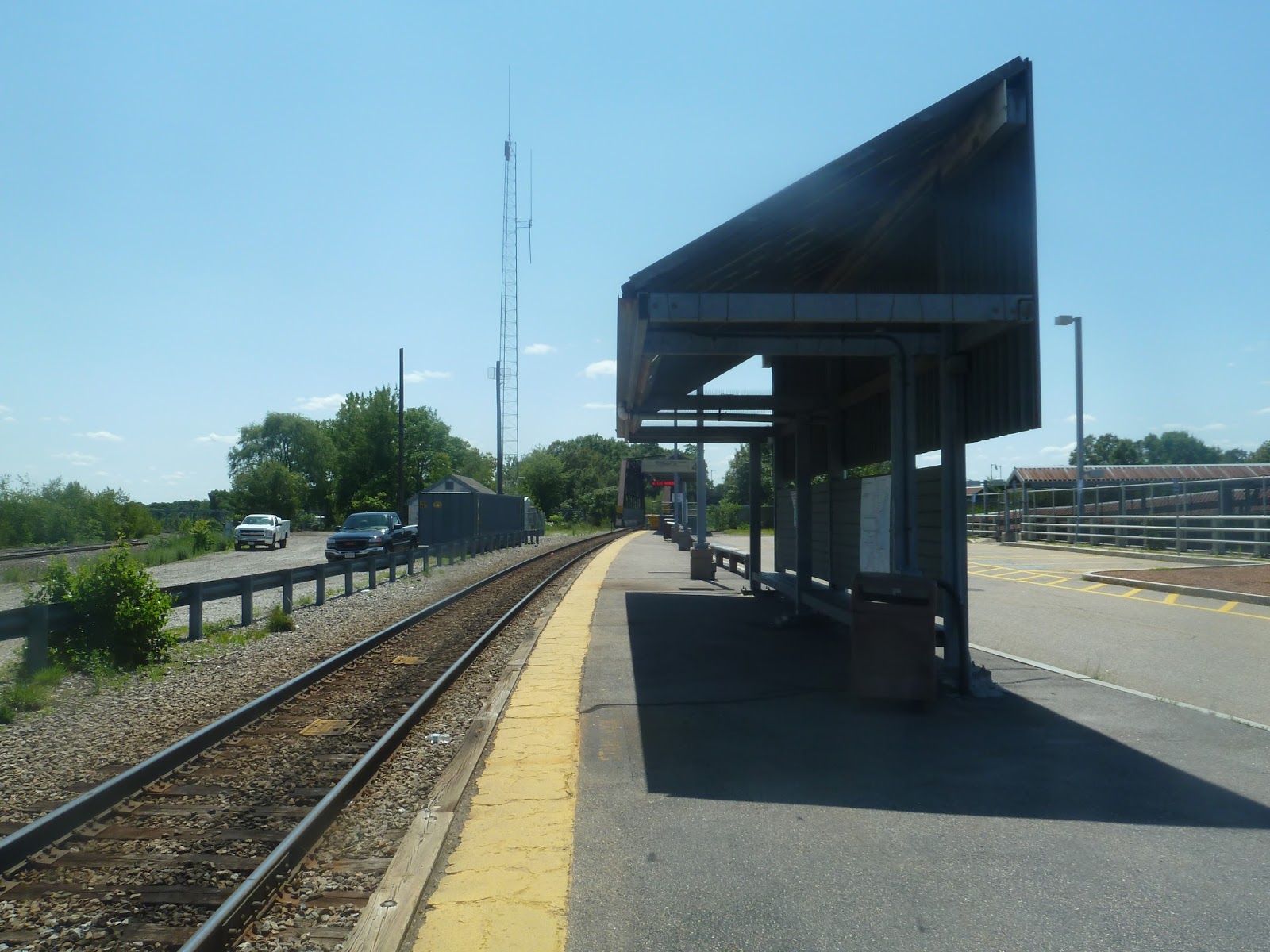
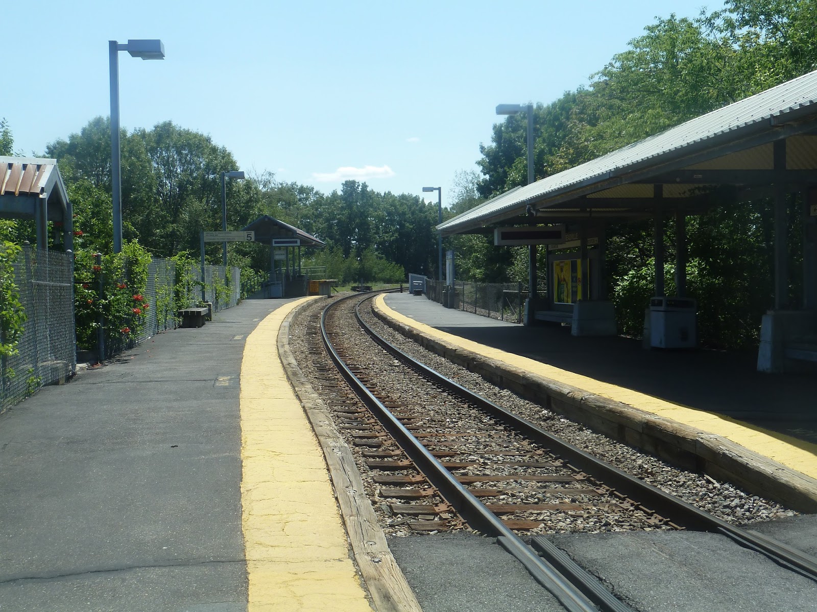
Let’s start with the Fairmount Line platform. It’s single-track, but that’s not really an issue since for the most part, trains terminate here. It has a bland shelter with a single bench and map, and an asphalt platform. There’s also a wastebasket here, so that’s, um, good.
 |
| The boarding platform. |
As usual for Commuter Rail stations, there’s a walk from the main shelter to the boarding platform. Man, I can’t stand when Commuter Rail stations do this. The least they could do is…wait! What’s that on the boarding platform? Is that a…bench? So you can wait at the same place where you board the train? So the legends are true…
 |
| The more or less unused Providence Line shelter. |
The Providence Line platforms are next, but trains don’t actually use them. They’re just kind of there in case of a line disruption or emergency that would make trains have to stop. The outbound side is basically just a low platform and a high-level boarding area like the Fairmount Line platform. (And again, the boarding area has a bench!) The inbound side has a slightly fancier shelter, with two benches instead of one. Ironic, because trains skip right past it.
 |
| The surprisingly nice Franklin Line platform. |
I wasn’t expecting this, but the Franklin Line platform is kind of tranquil. I mean, it’s a single track that curves slightly with trees for surroundings at the main part of the platform. There are even some overgrown flowers that poke through a fence, which is rather nice. That said, the platform’s shelter is still bland. And also, it’s on the opposite side of the tracks from the boarding area! What?? Why? That basically makes the shelter completely useless, unless you want to switch sides a few minutes before the train comes! Well, at least the boarding area has a bench again.
 |
| Look! It’s Boston! |
Readville has two bus connections, on either side of it. Hyde Park Ave has the extremely frequent 32 to Forest Hills, which I’ve already covered on this blog. Wolcott Square is also on this side, and that has a few small businesses. The western end of the station, meanwhile, has a connection to the 33 on West Milton Street, which goes to Mattapan. I’ll be reviewing that next, but let me just say that the 33 does not have nearly the same levels of service as the 32, trust me. This side of the station is pretty much entirely residential.
 |
| Some Amtrak work equipment that was just lying around. |
The station has three different parking lots, making things a little complicated. There are two on the Hyde Park Ave side, and one on the Milton Street side. In total, the lots add up to 354 spaces, which is more than enough for the station. The MBTA website says there’s no bike parking here, but I see a few bike racks in the picture above, so that’s something. That could be the extent of bikes here, though.
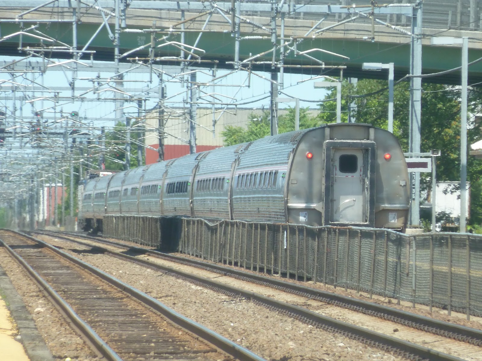 |
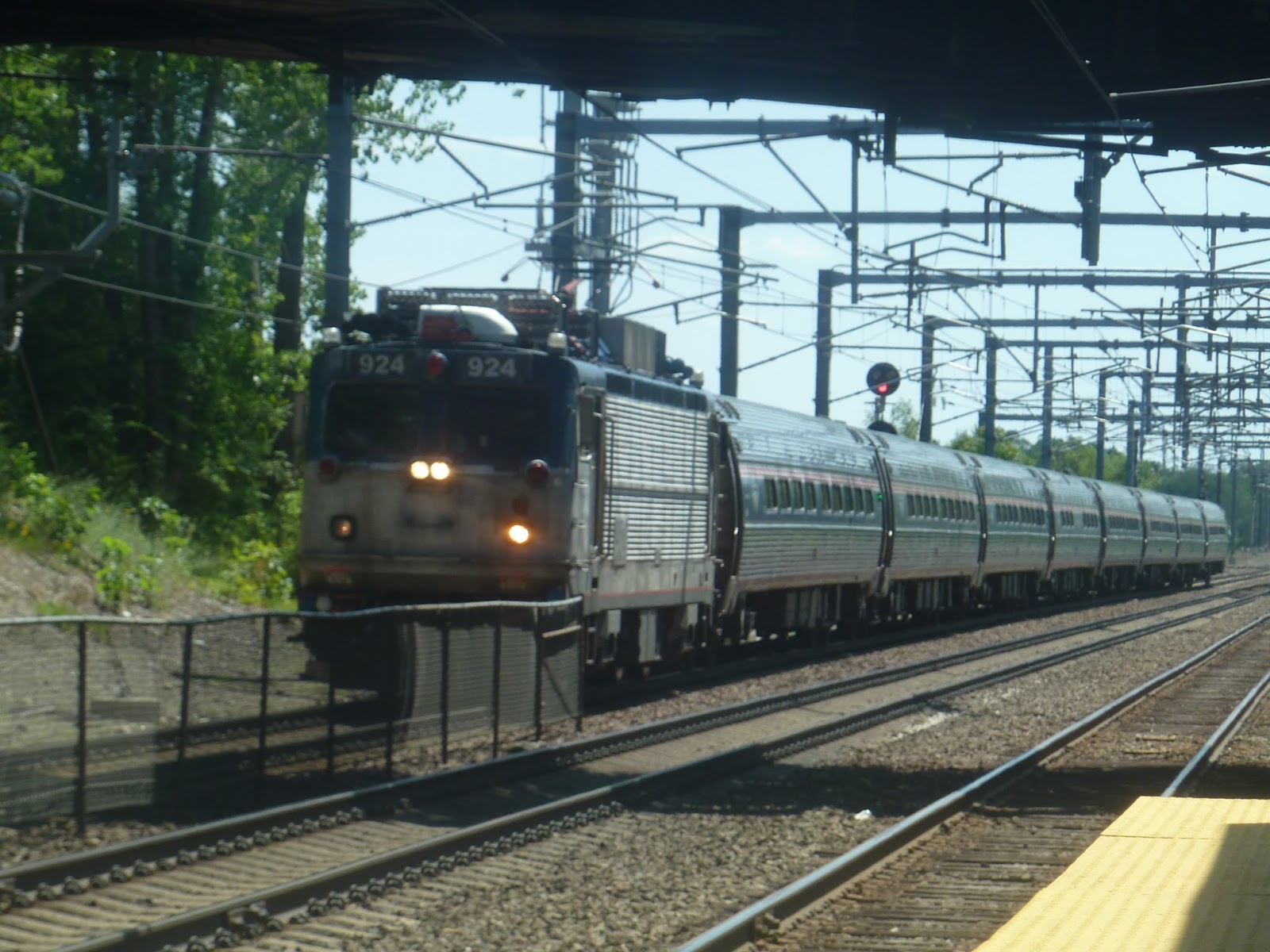
| Awww, yeah! I didn’t see any Commuter Rail trains, but this Amtrak train came whizzing through at top speed. |
Station: Readville
Ridership: The station gets an average of 621 inbound boardings per weekday, which isn’t too bad for the Commuter Rail. I can’t imagine too many of these boardings coming from buses, since both buses from here go further into the city – though perhaps people commute to Readville and transfer to buses.
Pros: This is one of the only “transfer points” between Commuter Rail lines outside of downtown. It has ample parking, decent bus connections (well, the 32, at least), and is fully accessible thanks to the footbridges. Oh, and the boarding areas have benches!
Cons: Let me reiterate that Readville is not a pretty station. The footbridges are ugly, and ditto for all the platforms (with maybe a slight exception for the Franklin Line one – love the overgrown flowers). Also, I feel like Providence Line trains should stop here. It would make this station an even bigger transfer point, and could allow residents here to head out to Providence.
Nearby and Noteworthy: Other than a few businesses in Wolcott Square, there isn’t much of note here.
Final Verdict: 6/10
Honestly, the aesthetics alone are just so…6-ish. They’re not horrible, but they’re bland, boring, and borderline ugly. Also, maybe Providence Line trains skip this station to speed up service on the Northeast Corridor, but that has three tracks! Amtrak trains could run in the middle and skip this station, while local Commuter Rail trains could stop. Well, functionally, Readville is pretty good, but it certainly has some flaws.
Latest MBTA News: Service Updates
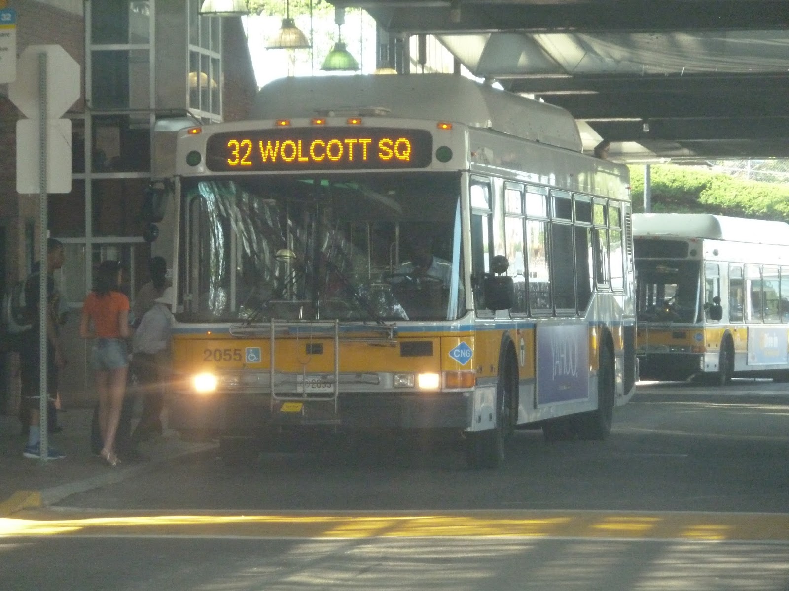
32 (Wolcott Square or Cleary Square – Forest Hills Station via Hyde Park Ave)
This is it. The last Key Bus Route I have to review. And honestly, the fact that it’s used so much baffles me a bit. I mean, it’s the most isolated one, for sure. Also, the places it serves are largely residential, and not exceptionally dense, either. But they’re dense enough to give the route insanely high ridership, evidently. Time for our last Key Bus Route ride, on the 32.
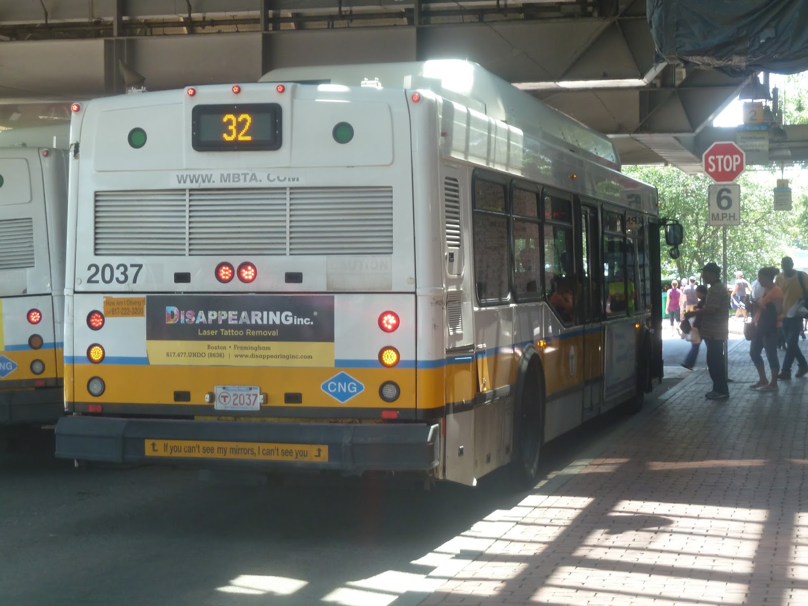 |
| The back of the bus at Forest Hills. |
We left the Forest Hills busway and headed down Hyde Park Ave, going by mostly houses and apartments. Passing some auto shops and a field, some businesses started to make their way into the mix. There was more retail at the intersection with Cummins Highway, but it went back to houses further south. After a light industrial section, we went by a shopping plaza, then it was back to houses.
 |
| A different 32 at Forest Hills. |
It was mostly residential for a bit, with houses that were slightly further apart than before. But as we came into Cleary Square, the retail came back with full force. The street was lined with businesses on either side as we went by Hyde Park Station. After going over a river, it was residential for a bit, then it became industrial.
The driver gunned the motor here, with just me and another person riding by this point. We zoomed by lots of ugly industrial buildings, then came to Readville Station. Hyde Park Ave curved under the Fairmount Line tracks, and there were a few businesses at Wolcott Square, where the bus terminated.
 |
| The bus going under the Commuter Rail tracks. |
Route: 32 (Wolcott Square or Cleary Square – Forest Hills Station via Hyde Park Ave)
Ridership: There were about 30 people on my ride, which wasn’t bad, considering it was a midday outbound trip. Most people got off at or before Cleary Square, and only me and one other person went all the way to Wolcott Square. The route gets very high ridership overall, with an average of over 11,000 riders per weekday, 4,741 on Saturdays, and 3,275 on Sundays.
Pros: It’s a simple route, cutting right down Hyde Park Ave and serving many underserved neighborhoods of Boston. Not only that, but it runs extremely frequently – as in every four minutes during rush hour. It then proceeds to run every 10-12 minutes during the day and on Saturdays, every 15-20 minutes at night (with a bit of late-night service on Fridays and Saturdays until 2:00 AM), and every 15 minutes on Sundays. Wow.
Cons: I can’t believe I’m saying this, but does the 32 route run too frequently? I mean, I came back to Forest Hills during rush hour, and the 32s just kept pouring in. It must be a horrible route for bunching!
Nearby and Noteworthy: There were some businesses at Cleary Square, but I don’t have anything specific.
Final Verdict: 8/10
Well, it’s the last Key Bus Route. I don’t have too many buses left now where the schedule isn’t a con. And even here, there’s a potential schedule issue. I’m wondering if every four minutes could be overkill. I’m not sure how crowded the route is during a normal rush hour (I took it on July 3rd), so I can only assume it gets packed. I mean, the 111 runs about every 5-7 minutes during rush hour, and that’s a sardine can. The 32 must be horrible. Either that or it runs too often.
Latest MBTA News: Service Updates
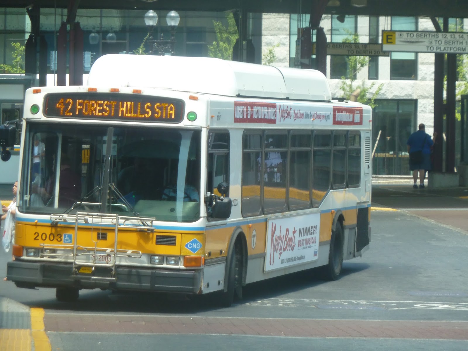
42 (Forest Hills Station – Dudley Station via Washington Street)
When the Orange Line EL was demolished, it left many people in need of an alternate form of transportation. The section of the former line from Dudley to downtown got the Silver Line, which although not perfect, is certainly better than an average bus. So what about the section from Dudley to Forest Hills? Weeeeellllll…you guys get the 42.
Leaving the Dudley Square busway, we headed down Washington Street. After a short industrial section, we went by a housing development, then a pool and community center. There were a few businesses after that, but also more developments (including a tall apartment tower).
Retail came back in full force once we reached Egleston Square – there were lots of businesses lining the street. This continued for a while before it became densely-spaced apartments. And honestly, the street was pretty narrow. I can see how the EL would’ve been intrusive around here.
There were more businesses at Green Street (only a few blocks away from the Orange Line station), then it got a bit industrial. We passed a field, where I actually played once when I used to play soccer. I specifically remember how it was right next to the Southwest Corridor and I would always get distracted whenever an Orange Line train went by. Memories…
 |
| The Arborway bus yard! |
After going by a high school and some more businesses, we then passed the Arborway bus yard! It was a really big complex, with lots and lots of buses. We went under what used to be the Forest Hills Overpass – it’s just some pillars now – and after that, we turned into the Forest Hills busway.
 |
| This was the best picture I could get, back at Dudley. |
Route: 42 (Forest Hills Station – Dudley Station via Washington Street)
Ridership: There were about 25 people on my ride, which is pretty good. Most of them got on at Dudley and got off at local stops, but a few people got on to go to Forest Hills, too. The route’s ridership is healthy overall – an average of 3,047 passengers per weekday, 1,438 per Saturday, and 769 per Sunday.
Pros: Well, it covers the southern half of the Orange Line, which is good. It does it in a fairly short time as well, scheduled to take about 15 minutes. Plus, it’s frequent for the most part – every 15 minutes rush hour, every 20 minutes during the day and on Saturdays, and every half hour during the night.
Cons: There’s a massive drop in frequency on Sundays – every 50 minutes. And consider that the northern half of the old EL got the Silver Line. Now, granted, the northern half is denser, and the 42 runs fairly close to the current Orange Line, but still! Every 50 minutes!
Nearby and Noteworthy: There was nothing of note that I saw, except for the Arborway bus yard, which was pretty cool.
Final Verdict: 6/10
Meeeeh. I guess I’m of two minds for this one, since it has to be said that the southern half of the old EL is the less important one. For one thing, it’s less dense than the northern half. Also, the Orange Line runs closer to Washington Street near Forest Hills, making the 42 borderline redundant. But still, that Sunday schedule is terrible.
Latest MBTA News: Service Updates
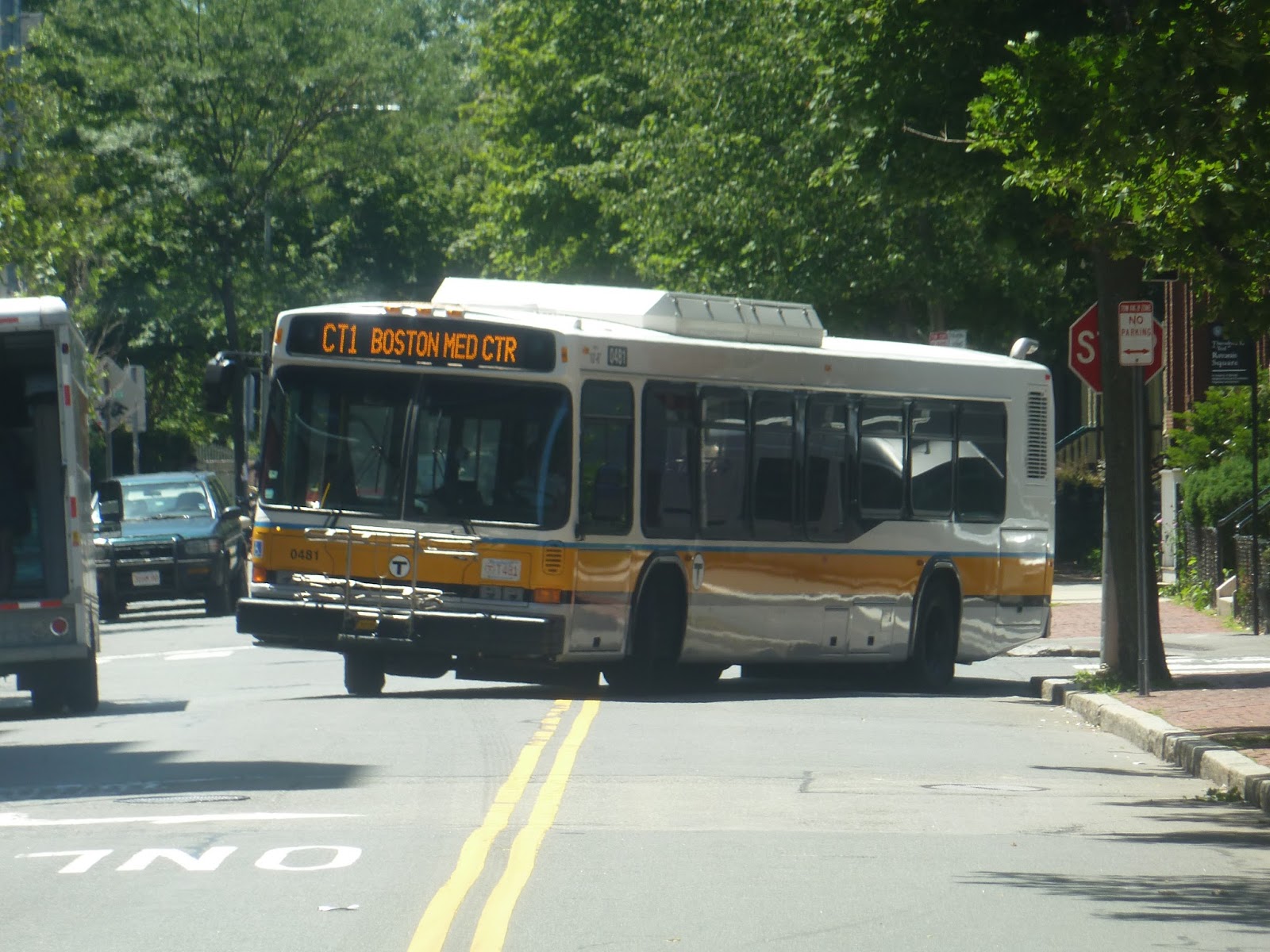
CT1 (Central Square, Cambridge – BU Medical Center/Boston Medical Center via MIT)
Ah, the crosstown routes. Famous for advertising themselves as “Limited stops”, when in fact, they’re not really all that limited. The CT1 epitomizes this by basically being the 1, except it doesn’t go all the way to Harvard and it doesn’t go all the way to Dudley. And I suppose it skips a few stops along the way.
 |
| The bus rounding the corner onto Magazine Street. |
The bus arrived at the Magazine Street stop in Central Square about 15 minutes early, so we were sitting there for a while – I was the only one on board. “Look at that guy!” the driver suddenly shouted. “He’s smoking two cigarettes at once! Oh my God!” Was she talking to me? Was I supposed to respond? I couldn’t see the guy myself. I just sat there and stayed quiet. The driver then went to the door and struck a pose for a while. It was all kind of odd. Finally, with a few more people on board now, we left the busway.
 |
| Ha! Barely. |
We instantly turned onto Mass Ave and made a stop at the rainbow shelter shared by the 1 and a few other routes. From there, we continued down Mass Ave, going by lots of businesses, some housed in multi-story buildings. The buildings got even taller as we went by industrial MIT facilities, then crossed over a single train track.
After that, it got more leafy, and we passed some more standard university buildings. We reached Memorial Drive, and then crossed over the Harvard bridge, which offered a fantastic view of Boston. Speaking of which, that was where the bridge took us, and we entered the Back Bay on the other side. Now we were surrounded by beautiful old brick buildings.
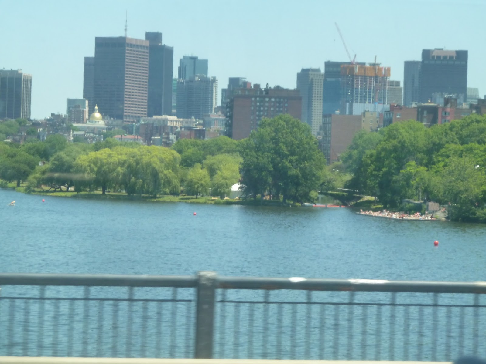 |
| Considering the city was on the left and I was sitting on the right, this picture isn’t too bad. |
After we crossed over the Mass Turnpike and went by Hynes Station, the architecture became more modern. We passed the Mary Baker Eddy Library and the Christian Science Center, then Symphony and Mass Ave stations in quick succession. Now in the South End, the architecture was once again nice and brick. And right when the buildings got taller and more modern, we entered the Boston Medical Center, and everyone got off at Harrison Ave.
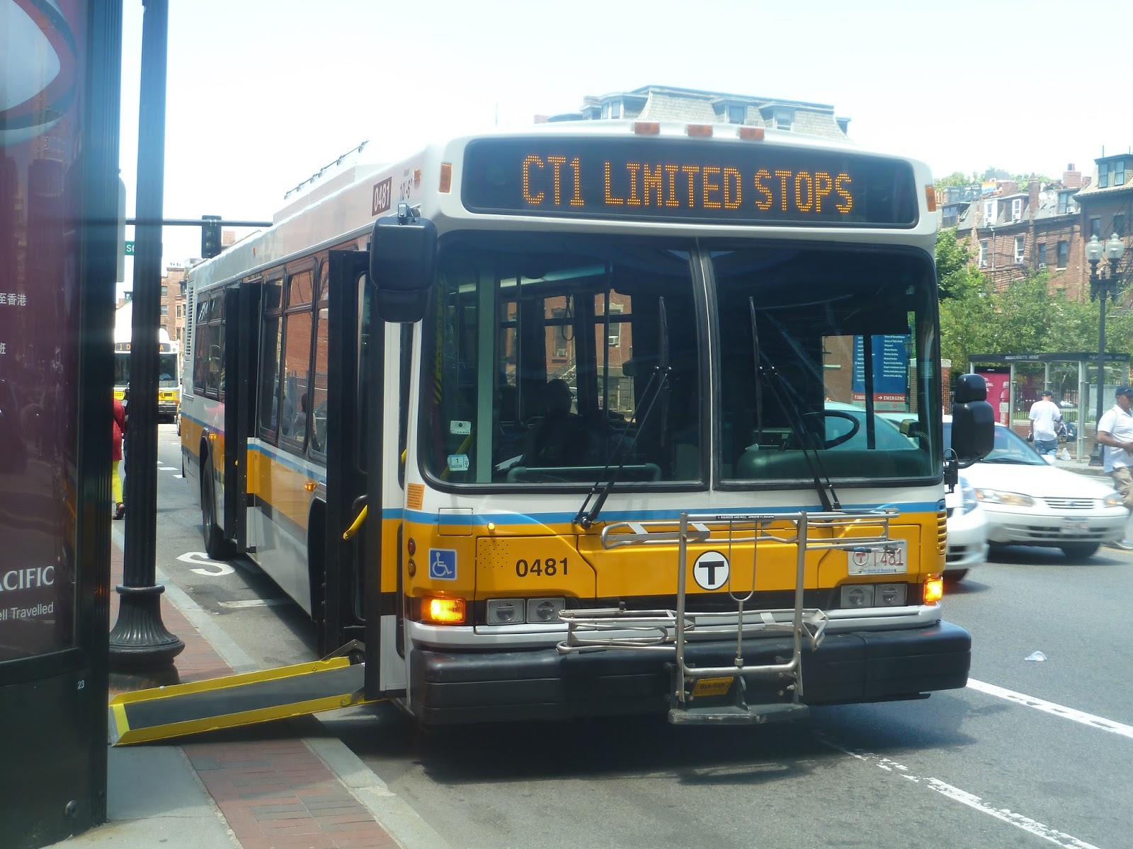 |
| You’re only kidding yourself, CT1! |
Route: CT1 (Central Square, Cambridge – BU Medical Center/Boston Medical Center via MIT)
Ridership: Well, in total there were about 25 people who rode, which is pretty good. But I’m pretty sure most of them would’ve been fine with either a CT1 or just a 1. Well, regardless, the route gets pretty good ridership, with an average of 2,191 riders per weekday.
Pros: Well, I guess it’s a fine supplement to the 1. And on its own, the weekday-only schedule is pretty good – every 20 minutes rush hour, and every half hour during the day.
Cons: But it’s the 1 we’re competing with here! That route a) runs much more frequently than this one, and b) runs on weekends. Plus, the 1 is longer. There were a few occasions on my CT1 ride where people would confusedly get on, only to be told the bus wasn’t going all the way to Dudley. Also, between the rainbow shelter at Central and Harrison Ave, the 1 makes 13 stops. Want to know how many the “limited stop” CT1 makes? Ten. It skips three stops. Nice try, CT1, nice try.
Nearby and Noteworthy: Pretty much the same as the 1, but without Harvard or Dudley.
Final Verdict: 3/10
This bus seems like a trick by the MBTA just to confuse people who want to take the 1. Did I mention that we were bunching with a 1 the whole time? It was behind us, so we got a lot of its riders, but does the CT1 really need to exist? It barely provides any sort of limited stop service, and it just feels like a short-turn of the 1. Maybe that’s what they’re going for?
UPDATE 9/1/19: This route has thankfully been eliminated.
Latest MBTA News: Service Updates
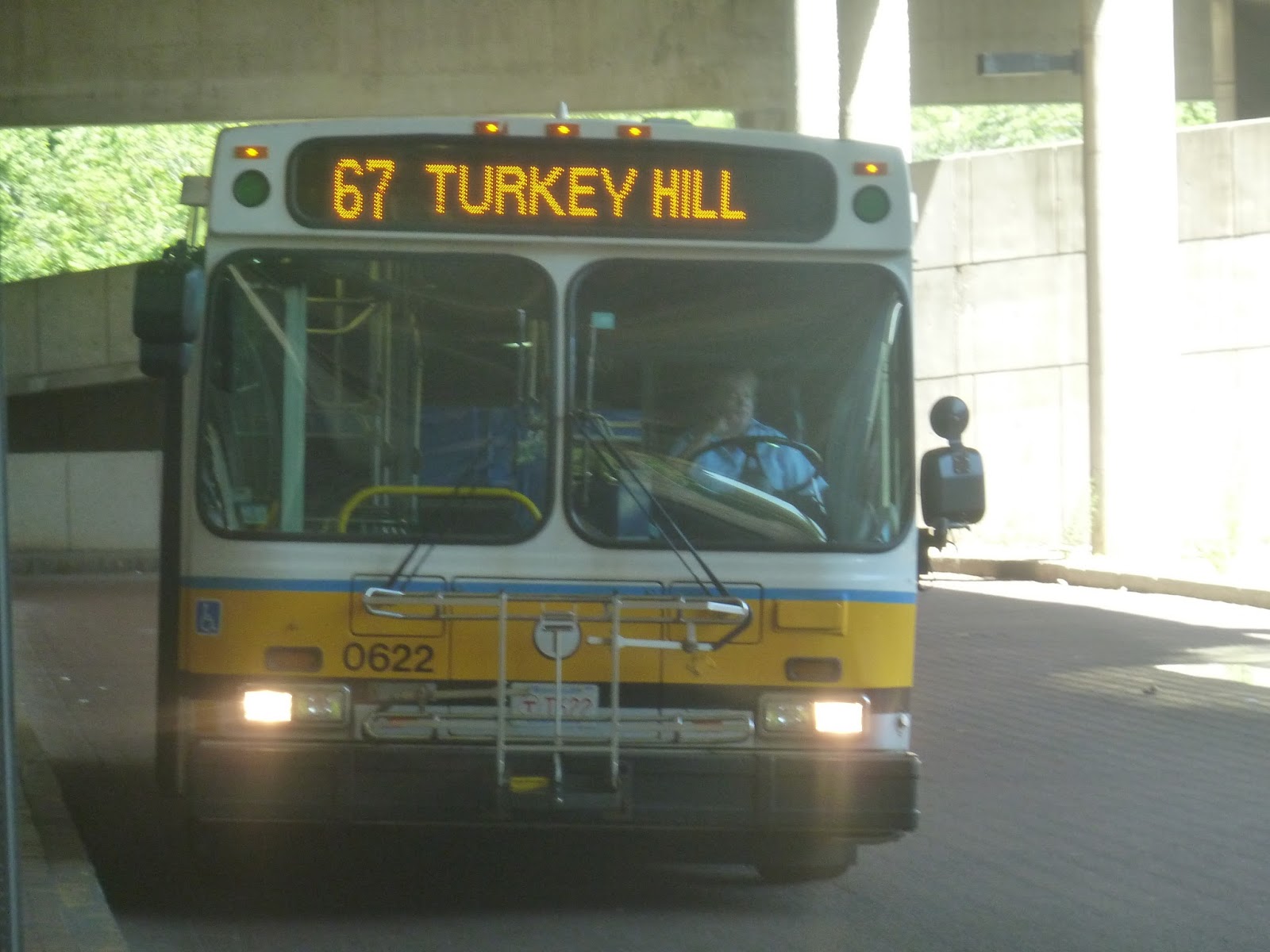
67 (Turkey Hill – Alewife Station via Arlington Center)
I have a friend who once had to use the 67 for some reason or another. He told me that the bus only had a few old people on it. After that, I was sort of interested in taking this seemingly odd little route. Well, I did, and though the people who rode it weren’t especially old, they were certainly few.
 |
| The bus at Alewife. |
We made our way to Route 2, and of course, I’m obliged to mention that we did indeed skip past the stop at the pedestrian walkway. As usual. We made the first exit, then headed back onto the highway, but at the second exit, we left the other Route 2 routes by turning onto Pleasant Street. This was a very leafy residential neighborhood, and it was quite nice. There were even some short glimpses of Spy Pond down side streets.
 |
| This, however, is Route 2. It is not especially nice. |
Eventually we reached Mass Ave, which we turned onto. We passed lots of businesses and restaurants in Arlington Center, as well as Arlington Town Hall, before turning onto Mill Street. This street was a bit industrial, but it went back to houses when we turned onto Summer Street. After passing the Arlington High School, we turned onto Symmes Road.
This is a deviation the route makes going outbound only. Going up a hill, we went by an assisted living building, then entered a development with identical houses. After looping around the development, we headed back down the hill and continued down Summer Street.
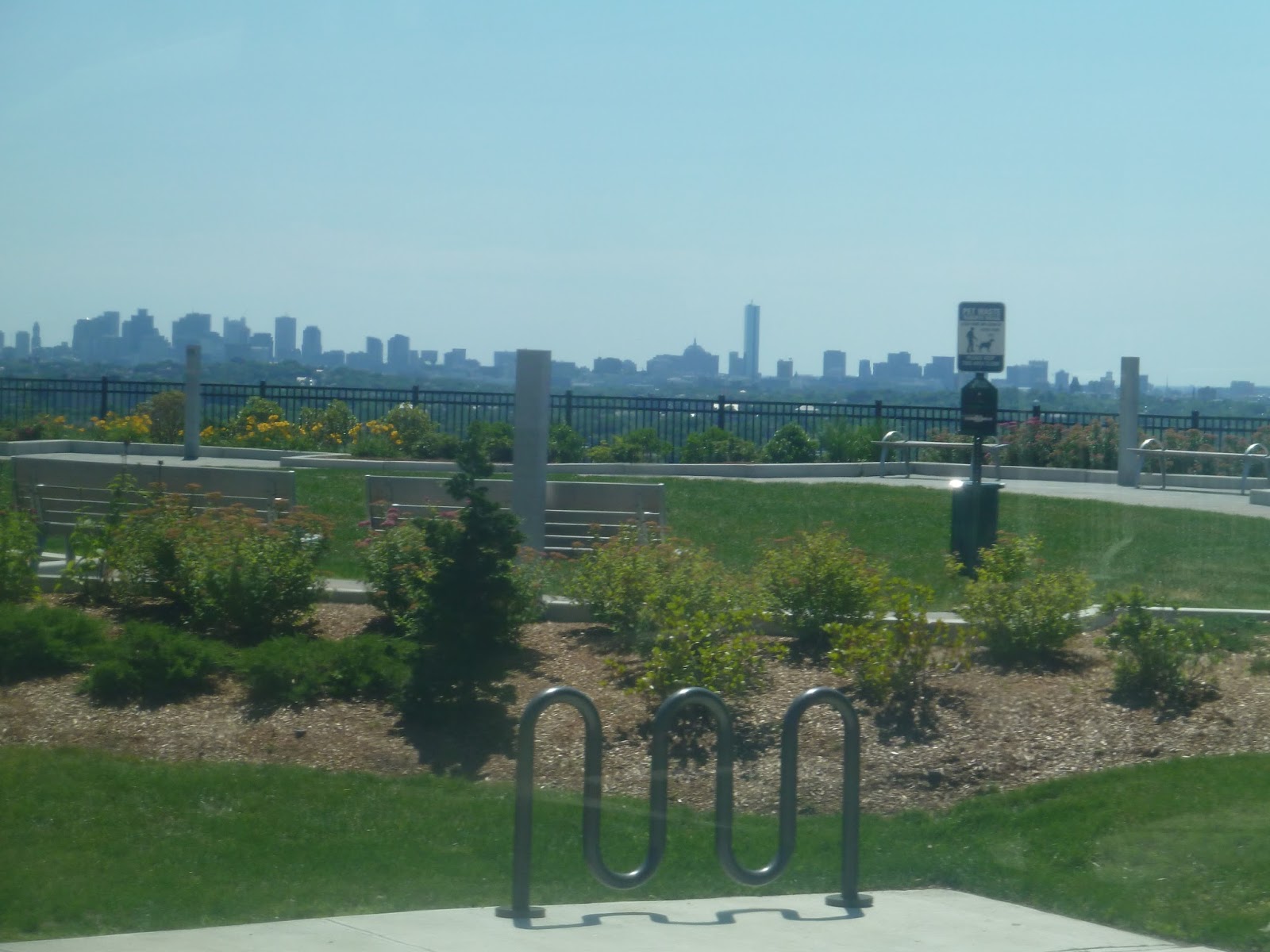 |
| A skyline view from the top of the hill! The Prudential is blocked by a sign, unfortunately. |
We then turned onto Washington Street, now back in a normal residential area. It became Clyde Terrace, and then the bus stopped. I was the only one on it, so it was really awkward when the driver turned the engine off. I tried to be as quiet as possible, hoping the driver wouldn’t notice that I was planning on going right back to Alewife. After a few minutes, luckily, we started up again. It certainly wasn’t as bad as the pen-personifying driver from the 451.
 |
| You’re looking into Winchester, my friends. |
We turned onto Forest Street, basically at the very tip of Arlington. The route doesn’t make it into Winchester, but it pretty much goes right up to the border. We headed down Forest Street, which was entirely residential, then turned back onto Summer Street. After going by some fields and an ice skating arena, we rejoined the outbound route and headed back to Alewife.
 |
| Have I ever mentioned that the Alewife busway is a dank place? Because it is. |
Route: 67 (Turkey Hill – Alewife Station via Arlington Center)
Ridership: On my ride, there was only one other person going out of Alewife, while on the way back, there were about six. Clearly not a very high ridership route in the late morning – or in general, in fact. The route only gets an average of 588 riders per weekday, which is low.
Pros: This is a north-south route that cuts right through central Arlington, and it’s pretty much the only cross-Arlington MBTA route. It also has a large chunk of northern Arlington all to itself, and even southern Winchester, if people are willing to walk.
Cons: It’s an Alewife route – thus, the schedule. The 67 runs weekdays only, every 27 minutes during rush hour and every 50 minutes during the day. I guess since it’s mostly a commuter route, the fact that it even has midday service is good, but still. Also, this is a nitpick, but the route’s map on the schedule card doesn’t show the section on Symmes Road.
Nearby and Noteworthy: I’ve mentioned Arlington Center before, so that’s out. Um…there was that ice skating rink…
Final Verdict: 6/10
Schedule-wise, the 67 reminds me of the 84, except the former gets the bonus of midday service. Infrequent midday service, sure, but midday service regardless. Also, the 67 certainly serves more, and that makes me wonder if limited Saturday service would do it well. Overall, the 67 is still pretty meh, but slightly less meh than the 84.
Latest MBTA News: Service Updates
Tomorrow the MBTA is getting rid of the “honor box” system at parking lots. Passengers will have to pay for parking with their phones now.
94 (Medford Square – Davis Square Station via West Medford and Medford Hillside)
There was one time, a while ago, when I almost took the 94. It was a Sunday, and I was at Davis, all ready to go. Then I found out that the Red Line was running shuttle buses – crap. Then I found out there was a road race going on – double crap. Then I found out that all buses were boarding on Mass Ave, five minutes away – well, there goes the 94. Now it’s time to actually ride it.
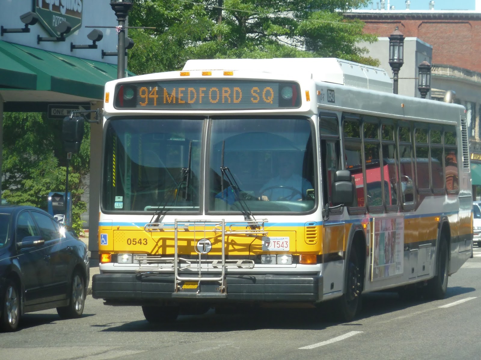 |
| The bus in Medford Square. |
Leaving Medford City Hall, where the 94 and 96 terminate, we made our way down High Street, going by the businesses of Medford Square. As the retail thinned out, we reached a rotary, where High Street curved south a bit. From there, it was mostly houses.
Eventually, we passed a school, then some more businesses near the West Medford Commuter Rail station. After crossing the tracks and going by a few more businesses, it became residential once more. We then turned onto Boston Ave, which almost went in the same direction we were coming from.
 |
| What a lovely day! |
Crossing over the Mystic River, we passed a park, then went through a short industrial section. It was residential once more from there, until the intersection with Winthrop Street, where there was a business block. From there, the surroundings were mostly Tufts University buildings, which continued as we turned onto College Ave. After navigating through Powderhouse Square, College Ave eventually led to Davis Square, where the bus terminated at a street stop.
 |
| The bus at Davis. |
Route: 94 (Medford Square – Davis Square Station via West Medford and Medford Hillside)
Ridership: I was surprised at how high it was! There were about 25 people on my trip from Medford to Davis. The 96 had less than 10! And it’s odd, because the 94 does get lower ridership than the 96 overall – an average of 1,596 riders on weekdays, 728 on Saturdays, and 544 on Sundays.
Pros: Okay, I didn’t realize this until now, but the 94 and 96 are actually coordinated. They have the exact same schedules (every 17 minutes rush hour, 35 minutes weekdays, 40 minutes nights, 50 minutes Saturdays, and 70 minutes Sundays), so technically all those headways are divided by two for Medford to Davis service. That means that coordinated, the routes have great schedules!
Cons: So you know how the MBTA sometimes puts two bus routes on the same schedule card? Can they please do that for the 94 and 96? I think that would make it a lot more clear that there are two options for getting from Davis to Medford Square. They do say “For additional service between Medford
Square and Davis Square Station please refer to
Route 94/96 schedule card” on their respective schedules, but that doesn’t really say much about how the schedules are coordinated.
Nearby and Noteworthy: Medford Square and Davis Square are interesting, but there isn’t much of note in between. Well, Tufts, I suppose.
Final Verdict: 8/10
Well, I done goofed. I criticized the 96 for having a pretty terrible schedule on its own. But now that I know it’s coordinated with the 94, they actually have a good schedule together! I just wish it was more obvious that they were coordinated. If the two routes had a combined schedule card, it would be much easier to plan trips out.
Latest MBTA News: Service Updates
I was asked by Gus Rancatore to post a map of the stations of the Green Line extension, so I figured I’d put that here. Thanks for reading, Gus!
 |
| Image source |
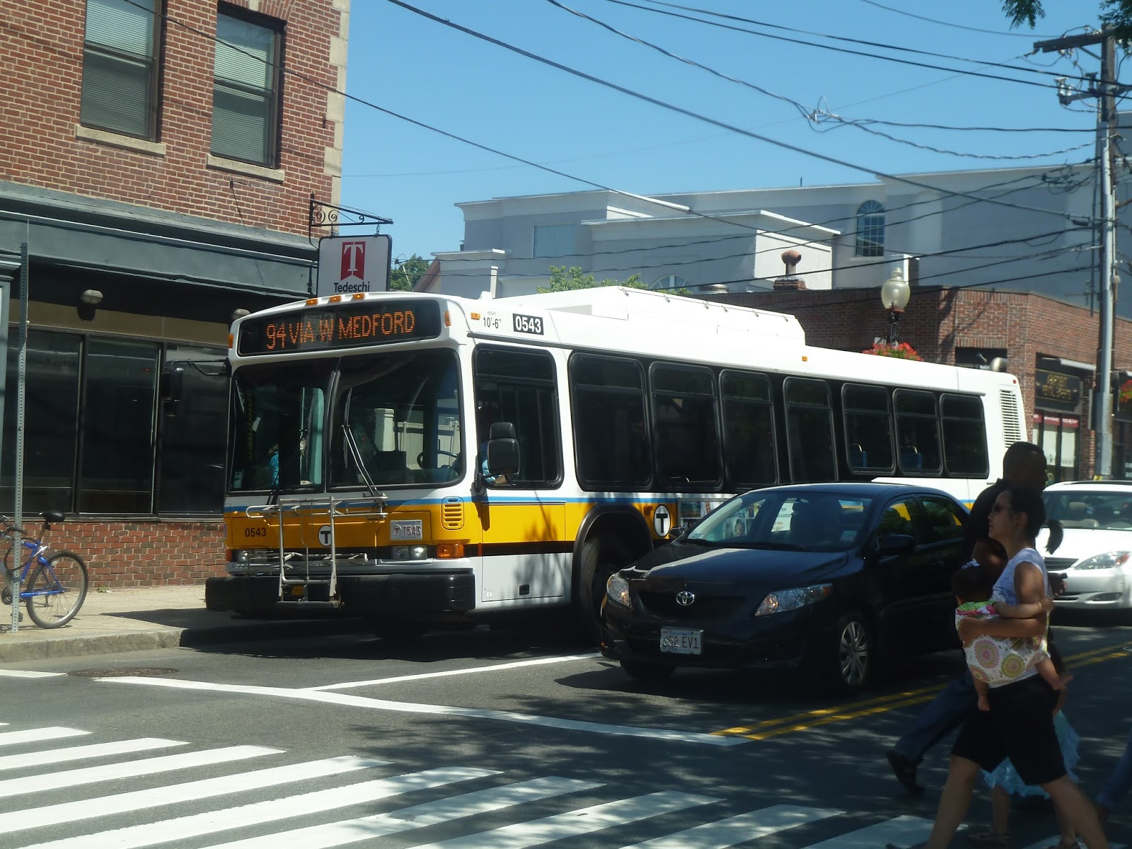
96 (Medford Square – Harvard Station via George Street and Davis Square Station)
I’ve used the 77 many times, and would consider myself quite familiar with that route. But from around Porter Square down to Harvard, there’s this other mysterious bus that shows up sometimes: the 96. It doesn’t come around too often, but it used to almost threaten me when I was younger. Whereas the 77 used those familiar New Flyers, the 96 used loud, agressive Neoplan diesels on its route. Well, it’s time to put those strange Neoplan fears to rest and finally ride…the 96.
 |
| Usually you can take any awful picture you want and pass it off as “artsy”, but I think doing that for this would be an insult to artists everywhere. |
So as I mentioned, the 96 follows the 77 for a stretch north of Harvard. Thus, we headed onto Mass Ave, going by lots of familiar businesses for me. It was a bit odd – like being on the 77, but significantly quieter. The road curved towards Porter, and soon after that, we turned onto Beech Street, leaving the familiar section behind.
Right after that, we turned onto Elm Street, joining the 87. As this was an outbound trip, we bypassed downtown Davis Square, going on side streets until we reached the Davis busway. From there, we turned onto College Ave, which was residential. There were a few businesses at Powderhouse Square, otherwise known as The Rotary Of Infinite Slowness Because It Has Traffic Lights. Seriously, a rotary with traffic lights? Come on!
After that mess, we continued up College Ave, going by a big field before passing through Tufts University. Turning onto Boston Ave, we went by more university buildings, including one that was under construction. There were some restaurants marketed toward students, then we turned onto Winthrop Street, crossing over the Commuter Rail tracks.
 |
| Crossing the Mystic River. |
This was the 96’s solo portion, and it was mostly residential. Soon, we turned onto George Street, going down that for a while. Then we turned onto Main Street, joining the 101 and passing through a short industrial area. We crossed the Mystic River, then turned onto Riverside Ave, now in Medford Square. I got off in the square, while the bus continued one stop further to its terminus at Medford City Hall.
 |
| The bus at City Hall. |
Route: 96 (Medford Square – Harvard Station via George Street and Davis Square Station)
Ridership: On my trip, there were less than 10 people that rode. This was evidently a fluke, though, as the 96 does generally get pretty good ridership. On weekdays, it gets an average of 2,192 riders; on Saturdays, it’s 1,364; and on Sundays, it’s 696. Most people on my trip used the route for the Medford portion, either for the Square or for residential neighborhoods south of it.
Pros: It’s one of two links from Davis Square to Medford Square, and it’s the more direct one. Also, it goes all the way down to Harvard, making a link from Cambridge to Medford, as well. Its weekday schedule is pretty good, running every every 17 minutes during rush hour and every 35 minutes during the day.
Cons: Unfortunately, the rest of the schedule is much worse. The 96 runs every 40 minutes at night, every 50 minutes on Saturdays, and every 70 minutes Sundays! That’s less blasphemous than the 101’s Sunday schedule, since that route gets more ridership, but it’s still horrible.
Nearby and Noteworthy: I spent a bit of time walking around Medford Square, and it seemed pretty happening. I don’t have any specific businesses, though.
Final Verdict: 6/10 8/10 (see addendum)
Briefly, I was considering giving the 96 a 7. I figured that it gets less ridership than the 101, so the bad schedule is slightly more justified here. Honestly, this route just looks bad on the 101’s part, since that has significantly more ridership yet the exact same headways on Sundays. In regards to its routing, though, the 96 is pretty good. It’s just the schedule that drags it down. Addendum: Okay, so it turns out the 96 is coordinated with the 94. This means that together, the two routes actually run quite frequently to Medford Square, so I’m raising the 96’s score to an 8.
Latest MBTA News: Service Updates
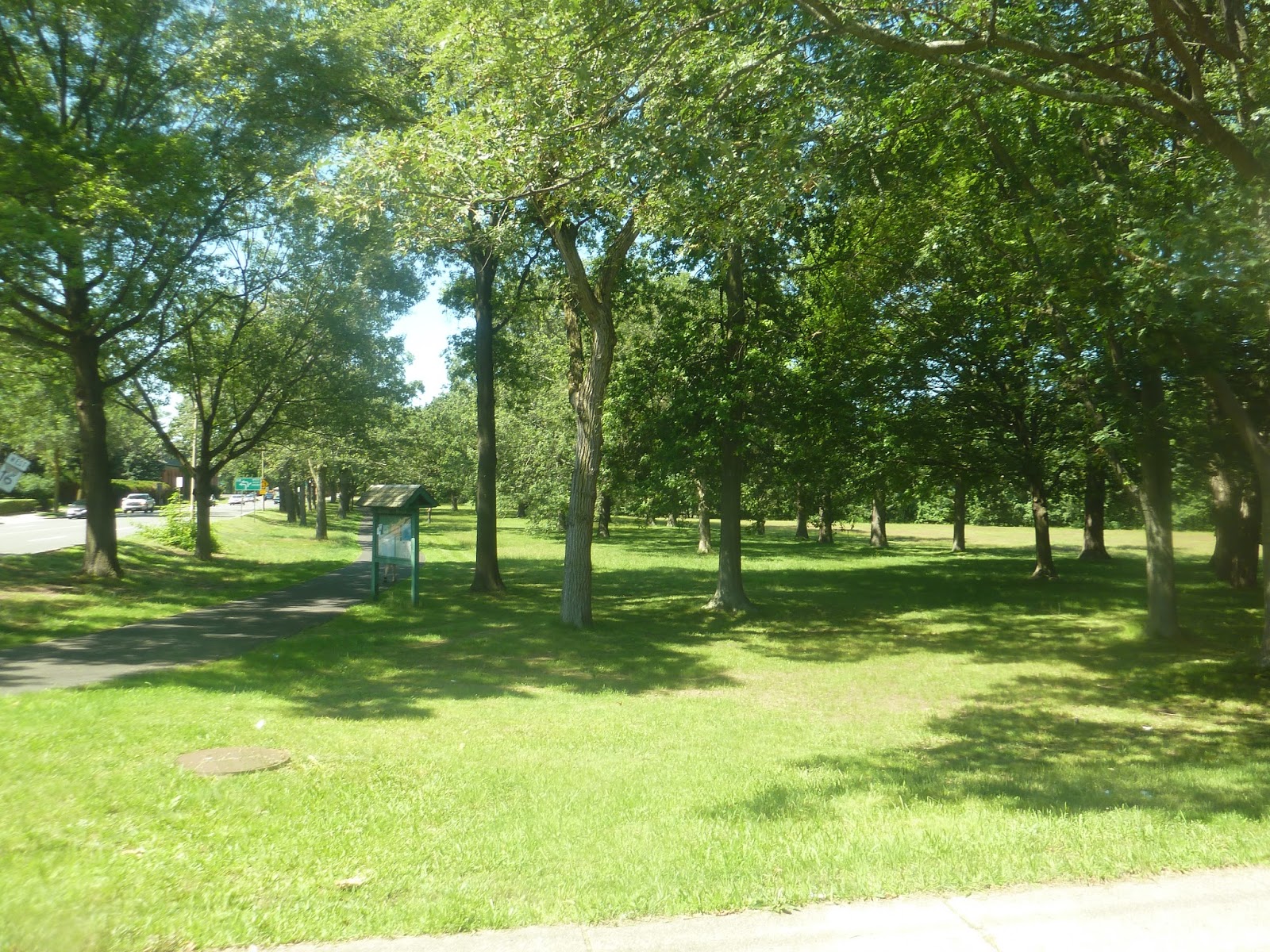
78 (Arlmont Village – Harvard Station via Park Circle)
I’ve never thought about if “Arlmont” had a meaning to it or not. It’s always just seemed like an odd name for a neighborhood to me. Then I realized that it’s actually a combination of Arlington and Belmont! Because it straddles both towns! I love that!
 |
| The bus at Arlmont. |
 |
| Zooming past a park at Arlmont. |
 |
| Oh, wow. Simply beautiful. |