Fitchburg
Welcome the MBTA’s outermost station in Massachusetts! Yes, we are truly in the wild west right here. Well…the wild west if it had multi-story buildings and a fairly busy downtown. Okay, so Fitchburg might not be a true frontier, but its gateway station is certainly a good one.
 |
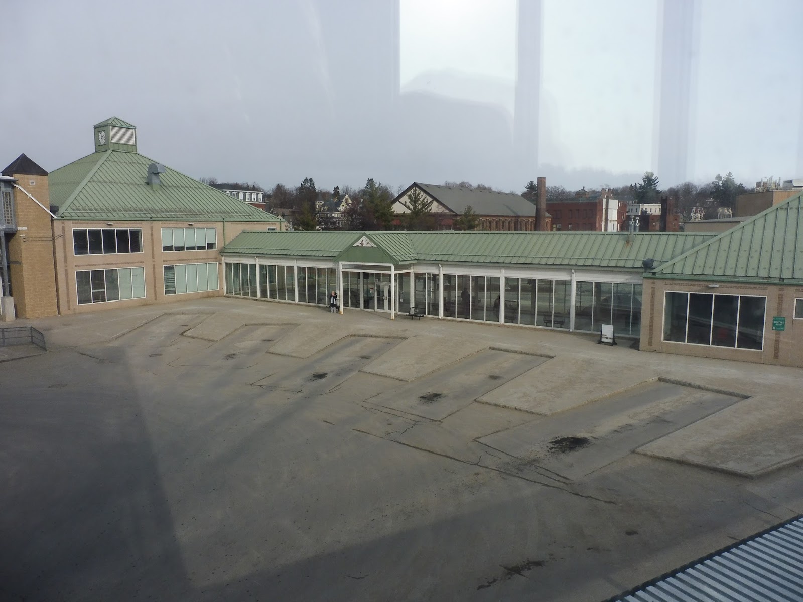
| One of the station buildings. |
Being a terminus, Fitchburg has plentiful amenities. This is the “Fitchburg Intermodal Transportation Center” after all, and thus it’s got quite a lot of “stuff”. Most of that “stuff” is housed within two connected station buildings, both of which have clock towers! Okay, they’re not very high up, but a clock tower is a clock tower.
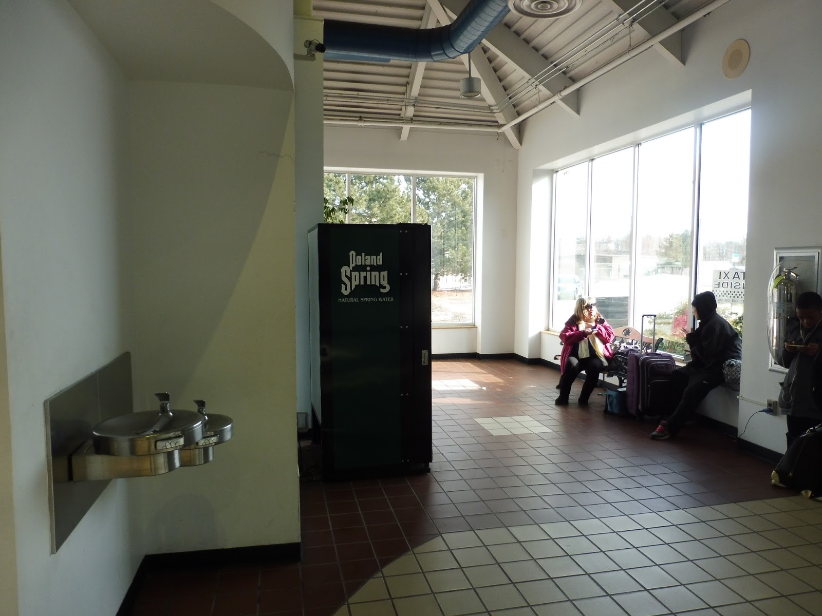 |
| A waiting area. |
Near the building’s exit to the platform, there is a convenient waiting room area so people don’t have to wait for trains out in the cold. It also has a vending machine and water fountains. There is a booth to buy tickets, which wasn’t in operation when I was there. I think something may have been out of order on that particular day, but hopefully it’s working now.
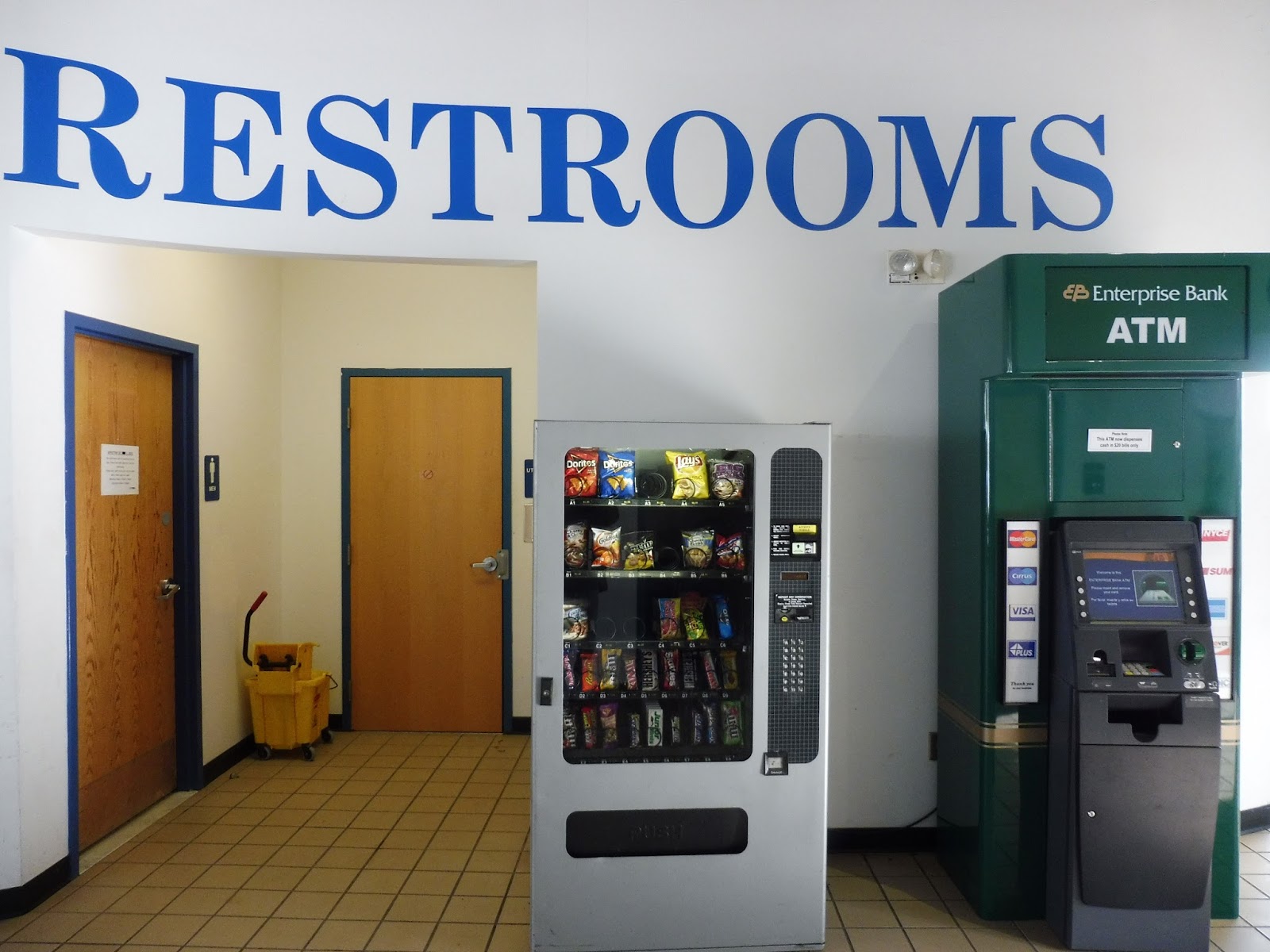 |
| Well, they certainly make it clear where the restrooms are. |
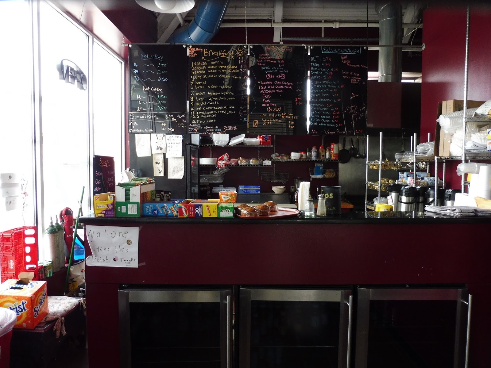 |
| A café! Well, a closed café. |
 |
| I love the natural light! |
 |
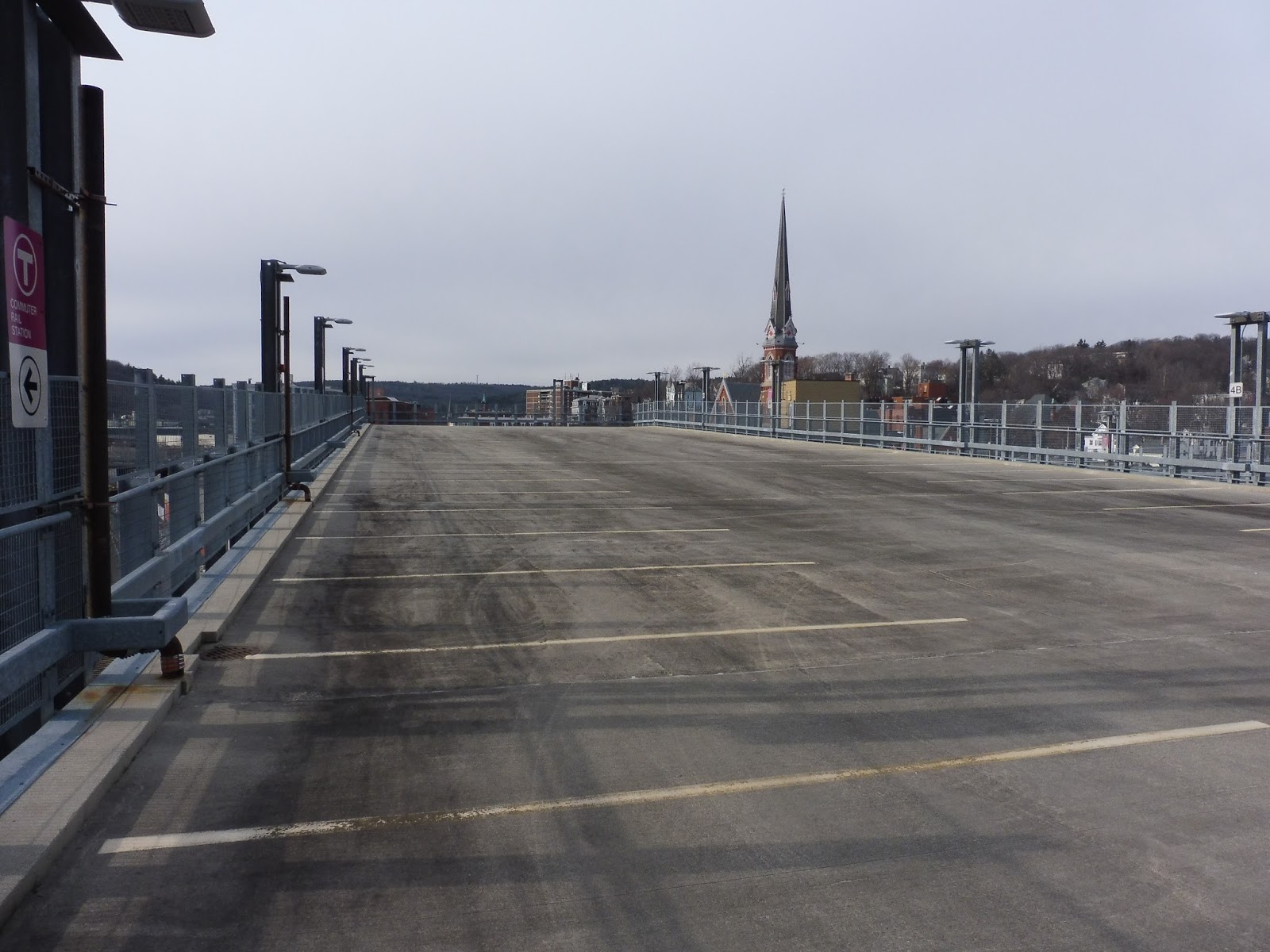
| The bus area…from above. |
 |
| The closed second building. |
 |
| Well then. |
 |
| The view of downtown Fitchburg. |
 |
| The shelter and high-level portion of the Commuter Rail platform. |
 |
| The barren part of the platform. |
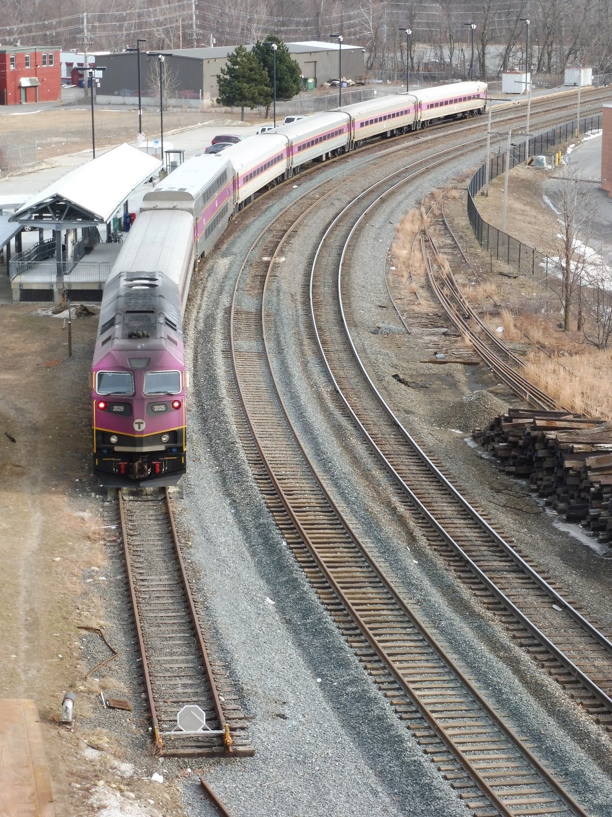 |
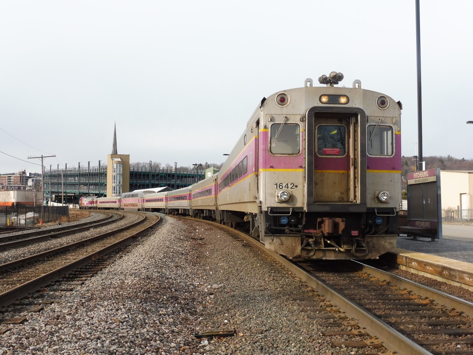
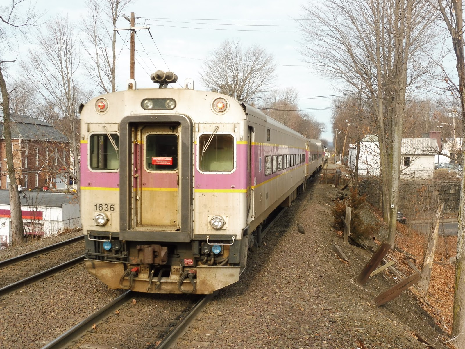
| Two shots of the same train. |
Pros: This is a great modern station with quite a few amenities. I mean, it’s got lots of parking, a fabulous bus area, a café, restrooms, ticket booths, waiting areas, and more. The platform may have a simple high-level section, but why complain about the shelter’s aesthetics when you can just wait inside the station?
Cons: Just the fact that some of the station’s features aren’t open a lot of the time. That said, though, the café probably only stays open when ridership necessitates it, while the bathrooms are under lock and key to prevent people loitering or vandalizing. But yeah…other than that, I really don’t have much.
Nearby and Noteworthy: This station is essentially right in downtown Fitchburg (or at least very close to it), and there are lots of businesses there. Also, Fitchburg State University is in walking distance.
Final Verdict: 9/10
Despite its low ridership (which may go up now that the Fitchburg Line renovations are done ), Fitchburg is a great transportation center with lots of convenient amenities. It performs well both as a Commuter Rail station and the hub of the MART. And…yeah! There isn’t much else to say, this is a pretty great station.
Latest MBTA News: Service Updates
This is the last post before I go on a school trip to Italy. The trip will be 10 days, but my hiatus may be a bit longer than that. I guess…expect a hiatus of at least 10 days? Sorry, guys.
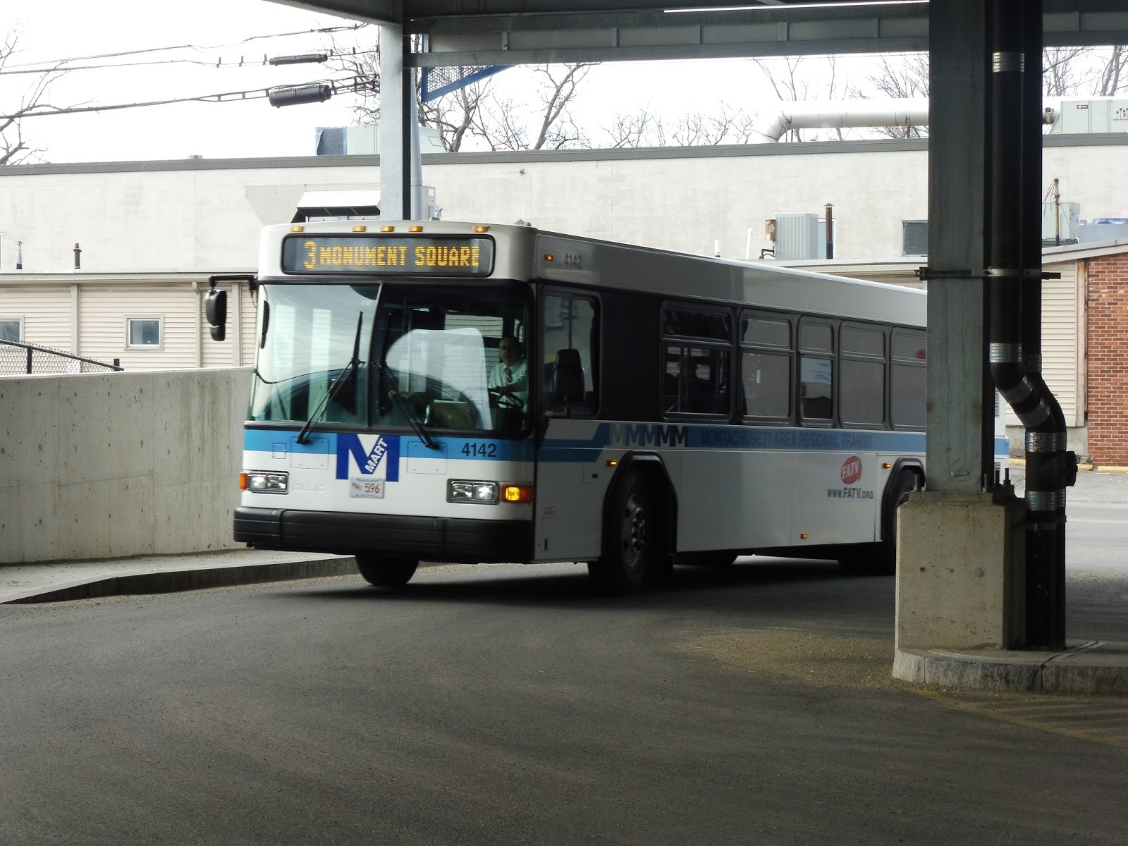
MART: 2 and 9 (Intermodal Center – Monument Square – Jytek – Walmart)
A Walmart in the middle of nowhere? Sure, what better place to start a bus? I mean, it has to be said, the Walmart stop does get ridership. And, you know, the route serves a lot between the mall and its terminus in Fitchburg. Anyway, today we’re looking at the MART’s 2 and 9 routes, which together run from the south of Leominster all the way up to Fitchburg.
 |
| I had gotten on at Monument Square, so, uh, here’s Monument Square. |
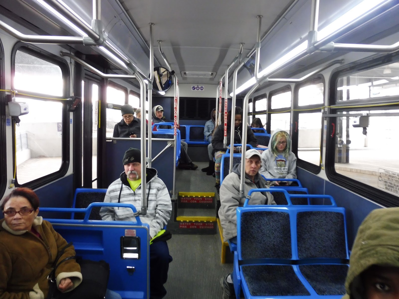
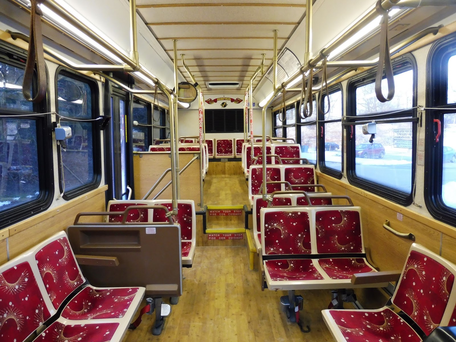
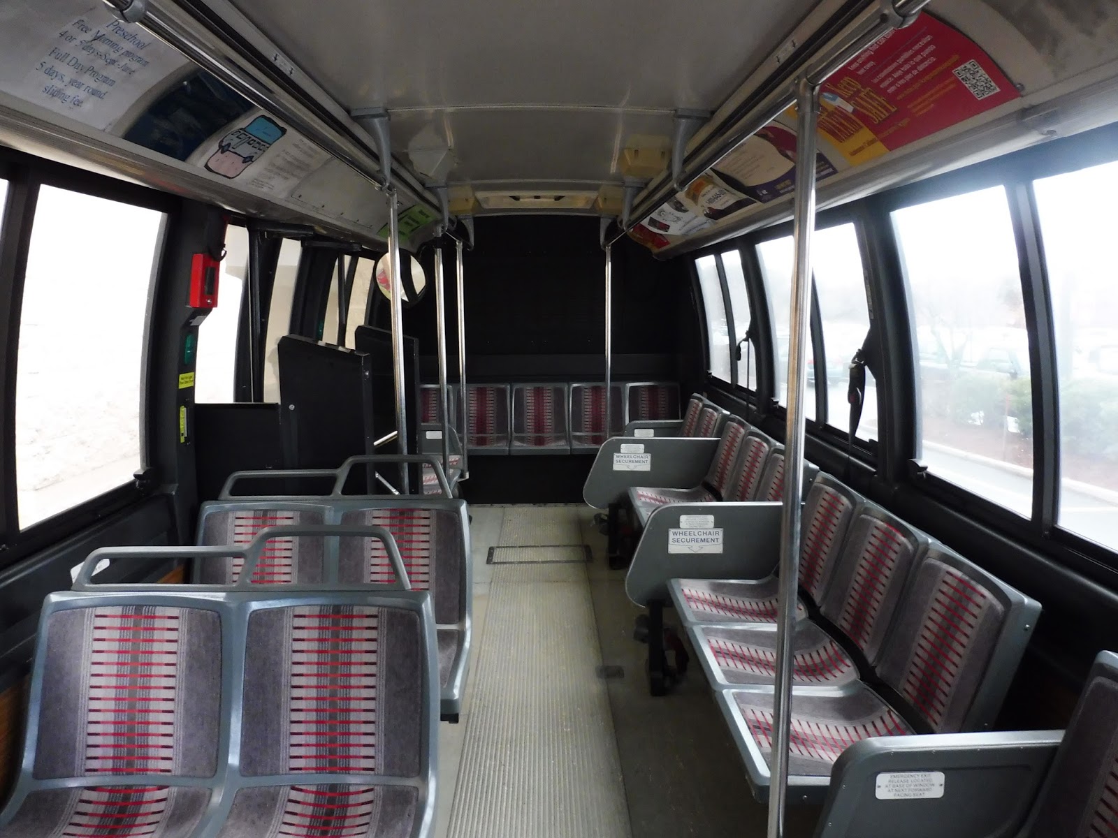
This bus was different from the last one I took, in that it was a hybrid. I think it’s more or less the same model as the MBTA’s hybrids, except that this one had a rear window! Other than that, the inside was rather fancy-looking, but functionally, it was the same as other MART buses.
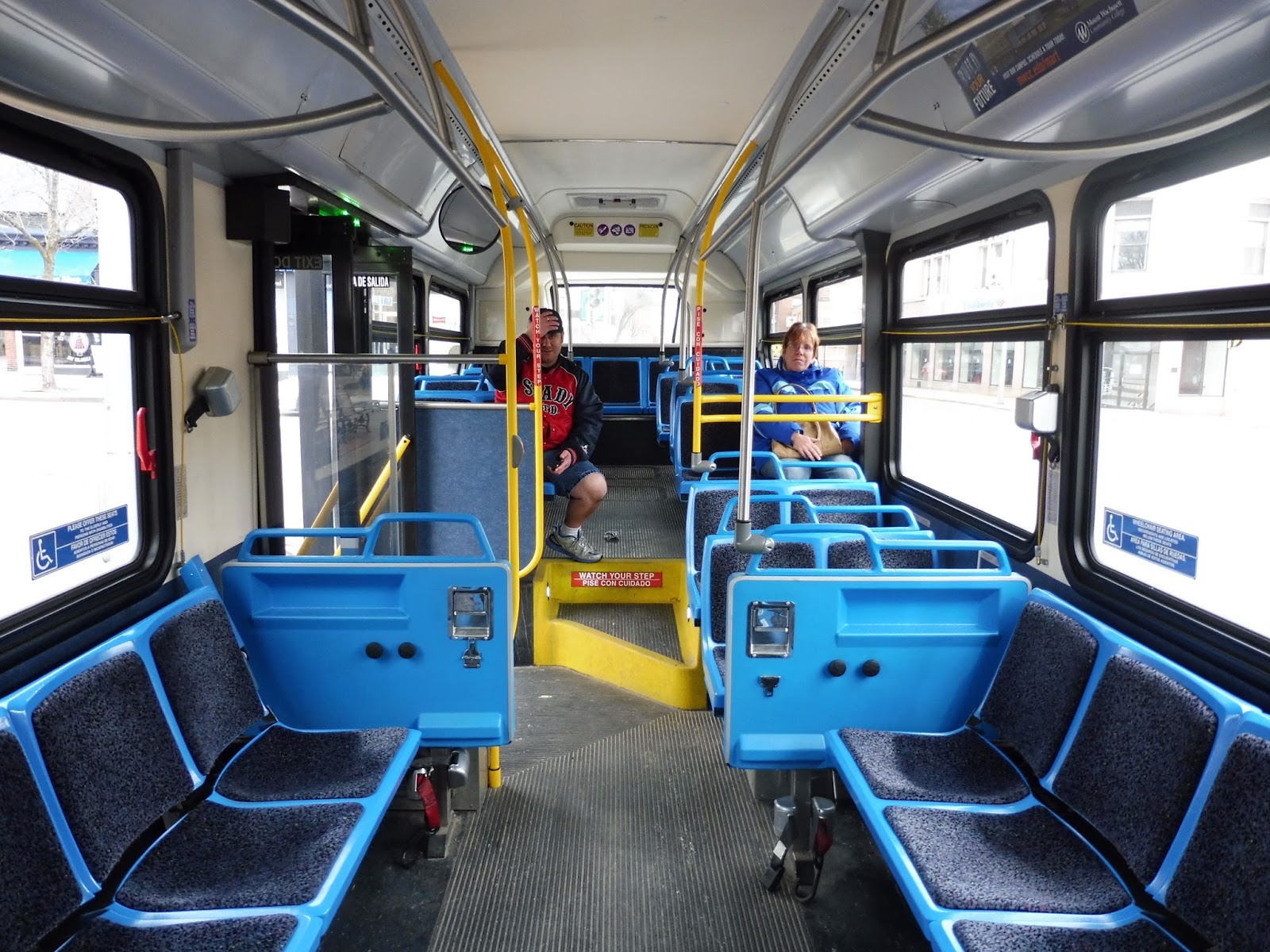 |
| I love the bright color scheme! |
I had taken the bus from Monument Square down to Walmart, but I’m gonna start the review with the trip back. So we left the Walmart parking lot and headed onto Jungle Road, but only to turn onto the wide New Lancaster Road. The big box stores got replaced by trees for a bit, and then we turned onto the narrower Willard Road.
 |
| Going over a train track on Willard Street. |
This street was a strange mix of industry and housing developments. We crossed over a train track, and then the road was more traditionally lined with houses. We then turned onto Central Street, although on weekdays some trips come from the south to serve an industrial park. As this was a Saturday, though, we headed north.
 |
| Turning onto Central Street. |
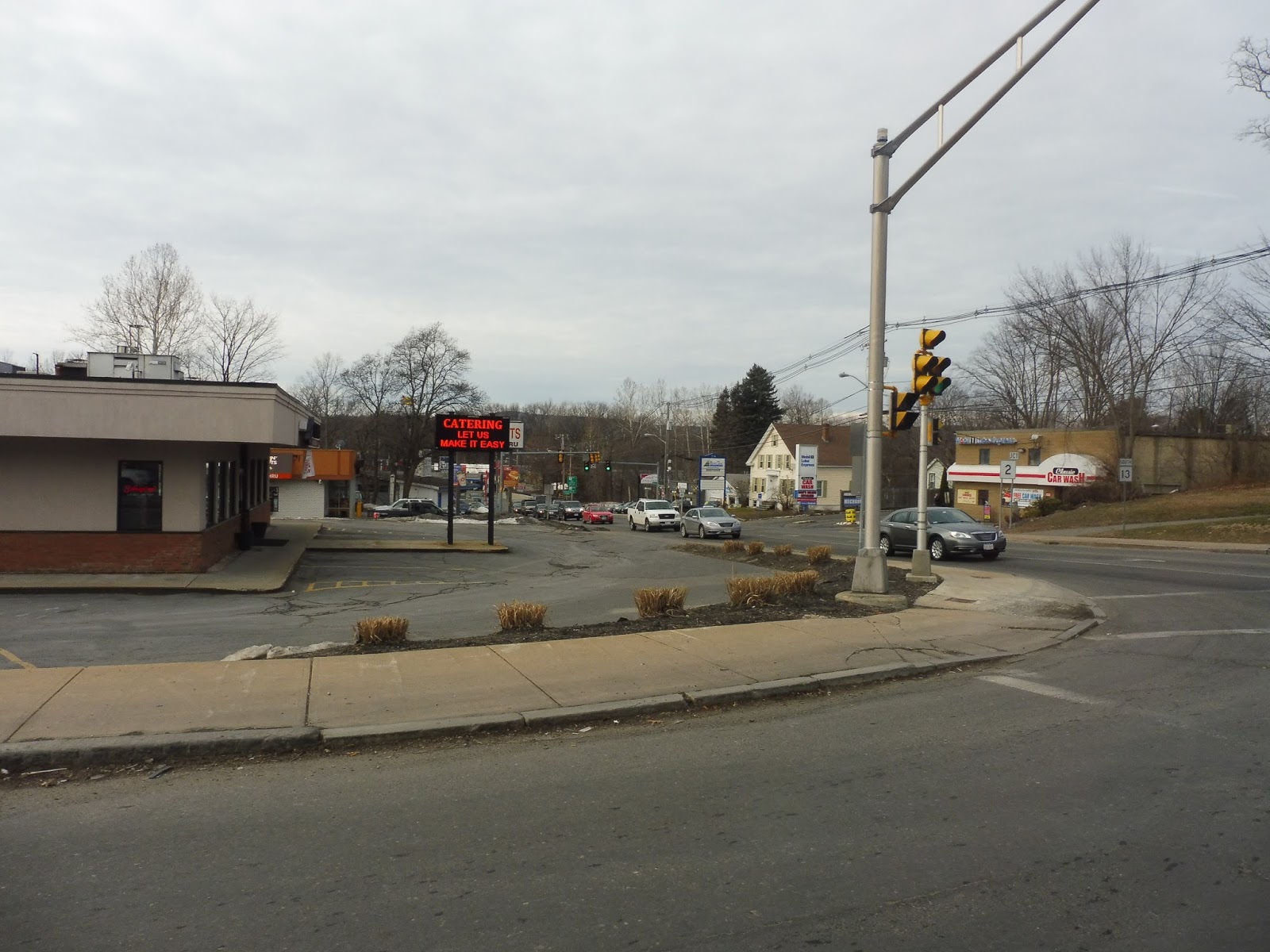
The scenery along Central Street was…repetitive. I mean, it was just a lot of businesses with big parking lots out front. Sure, there was the occasional housing development off the road, but nothing unique. Outbound trips pull off the street to enter the Johnny Appleseed Plaza (alright, Leominster, we get it), but we just sped right past.
 |
| I’m not sure what this is a picture of, but, uh, here it is. |
We passed a trailer park at one point, and there started to be a few regular houses in between the businesses. Not a lot, but at least a few. Eventually, the businesses lost their parking lots as we entered Monument Square, looping around the common and picking some more people up. Now we had become the 2 and we were headin’ for Fitchburg!
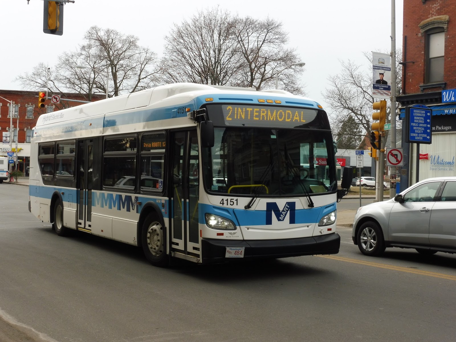 |
| An earlier picture of a different bus on the 2. |
We turned onto Main Street, the so-called “main drag” of Monument Square. To be honest, none of the businesses that lined it looked very interesting, noteworthy, or in some cases, open. We eventually passed a nice-looking park on the right, and after a few other businesses, it got residential.
 |
| The park. |
This next bit is a bit confusing, mainly because it’s being changed. Now currently on the 2, only outbound trips serve the Leominster Hospital, and since we were going inbound, we skipped it. Inbound trips serve the Water Tower Plaza, a mall, instead. However, with the elimination of the 10 on March 1st, the 2 will start serving the hospital and the Plaza in both directions. On our trip, though, we only deviated to serve Water Tower Plaza.
 |
| It has a huge parking lot! Of course. |
The street got very wide from there as we crossed over Route 2. And on the other side of that interchange? More businesses with parking lots! Woo! Most trips make a deviation onto Erdman Way to serve some offices, a hotel, and a big box store, but ours was one of the ones that didn’t.
 |
| Going over the highway. |
The businesses went on for quite a while without any breaks. The most noteworthy thing that happened was when the road changed to Water Street when we entered Fitchburg! Well, okay, I will say that after that momentous occasion, houses started to appear more frequently between the retail.
 |
| I love that bridge! And in the foreground, that’s a…”haunted mansion”. |
We went by a pretty impressive bridge, then the street became lined with houses and apartments. Eventually, we headed down a slope, crossing the Nashua River and passing a shopping plaza. The 2 doesn’t directly serve the plaza, but there’s another route, the 11, that goes into it.
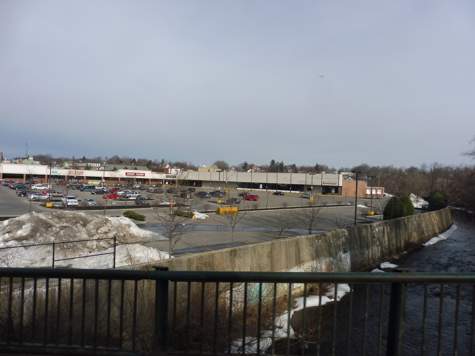 |
| The view of the river and the plaza. |
Water Street went onto another bridge, this time over the almost-Commuter Rail tracks. We then turned onto Main Street, heading away from downtown Fitchburg. Thus, we arrived at the Intermodal Center soon after, and the bus got ready to head back to Monument Square and eventually that one Walmart in Leominster.
 |
| The bus in Fitchburg. |
MART Routes: 2 and 9 (Intermodal Center – Monument Square – Jytek – Walmart)
Ridership: This is the second-busiest route combination on the MART, with the highest being a free college shuttle, so that doesn’t count. Over the course of a year, the 2 and the 9 get an average of 135,000 riders, or about 431 riders per day. My particular ride was somewhat quiet, with about 15-20 passengers in total, but that seems fine for a MART bus.
Pros: Aside from the 4, that aforementioned college shuttle, this is the most frequent route on the MART. Well, by frequent, I mean every 45 minutes, but it was deemed busy enough to run with two buses. The routes also serve a lot, with the 2 providing an important link between Fitchburg and Leominster, while the 9 heads further south into the latter city.
Cons: Like what happened with the 1 and the 3, MART’s March 1st schedule changes are basically fixing all the problems I have with this route. For example, there’s the fact that the 2 only serves either Leominster Hospital or Water Tower Plaza depending on its direction. Now it will serve both. Also, the 9 currently serves the Jytek Industrial Park all throughout weekdays, when it really only needs to go there during rush hour. That’s being fixed, too. Well-played, MART. Well-played.
Nearby and Noteworthy: Aside from serving Monument Square and downtown Fitchburg, the 2 and the 9…don’t go anywhere particularly interesting. I was interested in the Haunted Mansion thing, but apparently it’s gone bankrupt.
Final Verdict: 9/10
I mean, this has to be in the top 3 best routes on the MART, right? It’s one of the most frequent, even though clockface scheduling is sacrificed with the 45 minute headways. Still, more frequent service is more frequent service. Plus, the routes serve a lot, and most of their problems are being ironed out with the March 1st schedule changes.
Latest MBTA News: Service Updates
MART: 1 Counterclockwise and 3 Clockwise (Intermodal Center – Kmart – Monument Square – The Mall at Whitney Field – Kings Corner)
Well, that’s a long post name. Yeah, the MART likes to put every single major destination into its route names, so they can be a bit…lengthy. It doesn’t help that I’m reviewing two different routes here. But even though the particular bus I rode was the 3, it does the same loop as the 1 except in the other direction, so I figured I’d include them both. Let’s take a look.
 |
| The bus coming into the North Leominster “bus area”. |
 |
| The inside of the bus. |
Leaving North Leominster Station, we headed up Nashua Street, then turned onto Main Street. This was sort of an industrial area, but it stopped once we crossed over the Nashua River and Route 2. Right after the Route 2 crossing, we turned onto Haws Street, passing a police department and a cemetery on the other side.
 |
| The area around North Leominster Station. |
But the surroundings soon became – ech – fast food restaurants and other businesses with big parking lots. Great. We reached The Mall at Whitney Field, which certainly was a big ridership draw (a large portion of the bus got off here), but was a really long time sink for everyone else. You’ll see what I mean.
 |
| Oh, what a lovely parking lot. |
Right, so first we deviated a bit, navigating through a smaller parking lot in order to serve Market Basket. Then we had to squeeze between many cars in order to get to a road that curved south of the Market Basket. We took this road all the way to the other side of the mall to serve a nondescript stop in front of the food court. Oh, and it doesn’t end there.
 |
| *sigh* It never ends, does it? |
We headed back up the way we came, making a right turn and running alongside various mall entrances. We then turned onto Cinema Boulevard, passing a movie theater. The street curved up and there was a stop at the Leominster Reliant Medical Group, which the automatic announcement said as “Reliant Medical Group Leo”. FINALLY, we left the mall complex and turned onto Mill Street.
 |
| This was mainly to get a picture of that street sign. They. All. Have. Apples. |
Soon we merged onto Whitney Street, passing through an industrial section. The road started going by apartment buildings, which continued as we turned onto Water Street, passing over a river. This street led us to Monument Square, which had lots of businesses. We did a few twists and turns, and laid over for a few minutes at the main bus stop, next to a common.
 |
| The driver let me take a picture of the bus while we were laying over. |
From there, we headed down West Street, going by the Leominster Senior Center. It got residential from there, the street lined with houses. It continued like this for a while, and there was no break in the houses except for an assisted living center. Soon after that, we turned onto Doyle Street, a residential side street, and then Merriam Ave.
 |
| The turn onto Merriam Ave. |
This street was all residential for quite a while, right up until we crossed over Route 2. But after that, the surroundings instantly became businesses with big parking lots again. Here, we turned into the Twin City Plaza, which quite literally was on the border between Leominster and Fitchburg. Dropping someone off at the mall, we returned to what was now called Whalom Street and continued further into Fitchburg.
 |
| Another parking lot…fun. |
The businesses with parking lots continued for a while, with Whalom Street becoming South Street. Things got less dense as we went along, though, including a short stretch of forest. Eventually, though, it got residential again. And after passing a school, the houses got pretty close together.
 |
| I love that little brick building! |
Unfortunately, just as South Street was about to go down a fun-looking hill, we turned onto Pine Street instead. Now in the heart of a residential neighborhood, we next turned onto Walton Street, then Laurel Street, passing a cemetery. All of a sudden, we got a panoramic view of downtown Fitchburg across the Nashua River before crossing the river ourselves.
 |
| Nice view! |
We turned onto Water Street, going over some train tracks (technically not the Commuter Rail). But instead of going toward downtown Fitchburg, we turned right onto Main Street, opting for the Intermodal Center instead. Also housing Fitchburg’s Commuter Rail station, the Intermodal Center had a few parking spaces for buses, one of which we entered.
 |
| Not that downtown Fitchburg looks especially interesting… |
After picking some more passengers, we returned to Main Street, then turned onto Summer Street. Climbing a hill, we left downtown and entered a residential neighborhood. Following some dense houses, we went by a school, and then…sigh…more businesses with parking lots. We entered Lunenburg, going by a Commuter Rail yard, and left the town as soon as we entered.
 |
| Some houses in Fitchburg. |
Reentering Leominster, there were dense houses on both sides of the street. There were a few businesses at Kings Corner, where we turned onto Main Street, which was again residential. The houses were broken by a church, some retail, and Johnny Appleseed Elementary (boy, Leominster really nails in the whole Johnny Appleseed thing). The houses gave way to businesses once more when we got to the Commuter Rail tracks and turned onto Nashua Street, entering North Leominster Station. Thus, the loop was complete.
 |
| I actually continued a bit more to get off at Monument Square, so here we are. |
MART Routes: 1 Counterclockwise and 3 Clockwise (Intermodal Center – Kmart – Monument Square – The Mall at Whitney Field – Kings Corner)
Ridership: As I mentioned, my ride was unexpectedly crowded. Over the course of the whole loop, there were about 25-30 riders in total, with many getting off at The Mall at Whitney Field, Monument Square, or the Fitchburg Intermodal Center. The 1 and the 3 are considered one route by the MART, and together, they have the third-best ridership on the system with about 125,000 riders per year. That means about 400 passengers per day, which…well, that seems a lot lower now.
Pros: There’s nothing like a good circle line! These routes connect quite a few major transit and shopping centers around Fitchburg and Leominster, and as a bonus, they run pretty frequently! I mean, they’re both every hour, including on Saturdays. But technically that’s every half hour, and if you’re not in a rush, you could go either way around the loop to get where you’re going.
Cons: I think maybe one more weekday trip in the evening would be helpful. The last trip to the Intermodal Center is on the 1, and it gets there at 6:25. That seems pretty early to cut service. Also, some of the deviations on these routes are very lengthy, particularly The Mall at Whitney Field. It takes a full 10 minutes to navigate through that mall, which is an incredibly long deviation for people who are just passing through.
Nearby and Noteworthy: Aside from malls? Well, the routes connect downtown Fitchburg with downtown Leominster, so there’s probably something or other that’s noteworthy in those places. Oh, and they go by the Fitchburg Line Commuter Rail yard, in case you’re interested in seeing that.
Final Verdict: 8/10
Despite their slight problems, these routes do have the third-highest ridership on the MART. I mean, my main issue is with the Mall at Whitney Field deviation, but that really does serve a lot of riders. Other than that, these routes form a good circle line with relatively frequent service.
Final Verdict UPDATE: 9/10
Okay, so it turns out that MART is changing its routes fairly drastically on March 1st. Yeah, turns out I had pretty bad timing with this review. Anyway, it seems they’re adding one extra trip on weekdays, ironing out one of the issues I had with the 1 and the 3. Also, they’re changing the routing through Leominster to serve an apartment complex and enter The Mall at Whitney Field from the south. It still seems quite complicated, so that doesn’t fix that problem, but it’s a change regardless. See the full list of service changes here.
Latest MBTA News: Service Updates
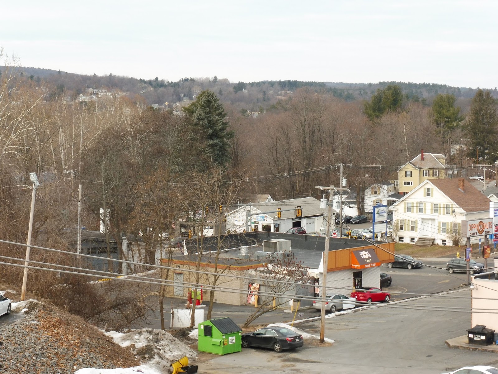
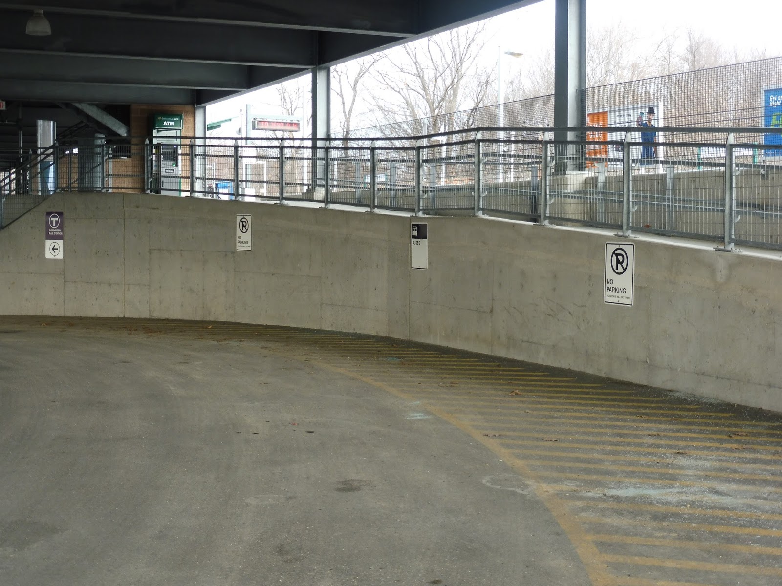
North Leominster
Usually when a station name has “north” (or any other direction) in it, you expect there to be a station in the center of town, as well. Unfortunately for Leominster, it’s stuck with this northern park-and-ride station. Luckily, North Leominster is a pretty good northern park-and-ride station, so the city doesn’t have to worry.
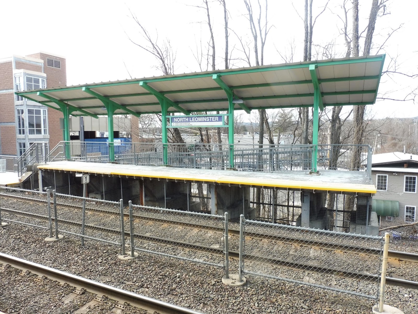 |
| The inbound boarding platform. |
 |
| The station…viewed from above. |
 |
| The platform…from ground level. Not as exciting… |
 |
| Further down the inbound platform. |
 |
| Speaking of which… |
 |
| Awesome view! |
 |
| Hoo, boy. |
 |
| A train leaving the station. |
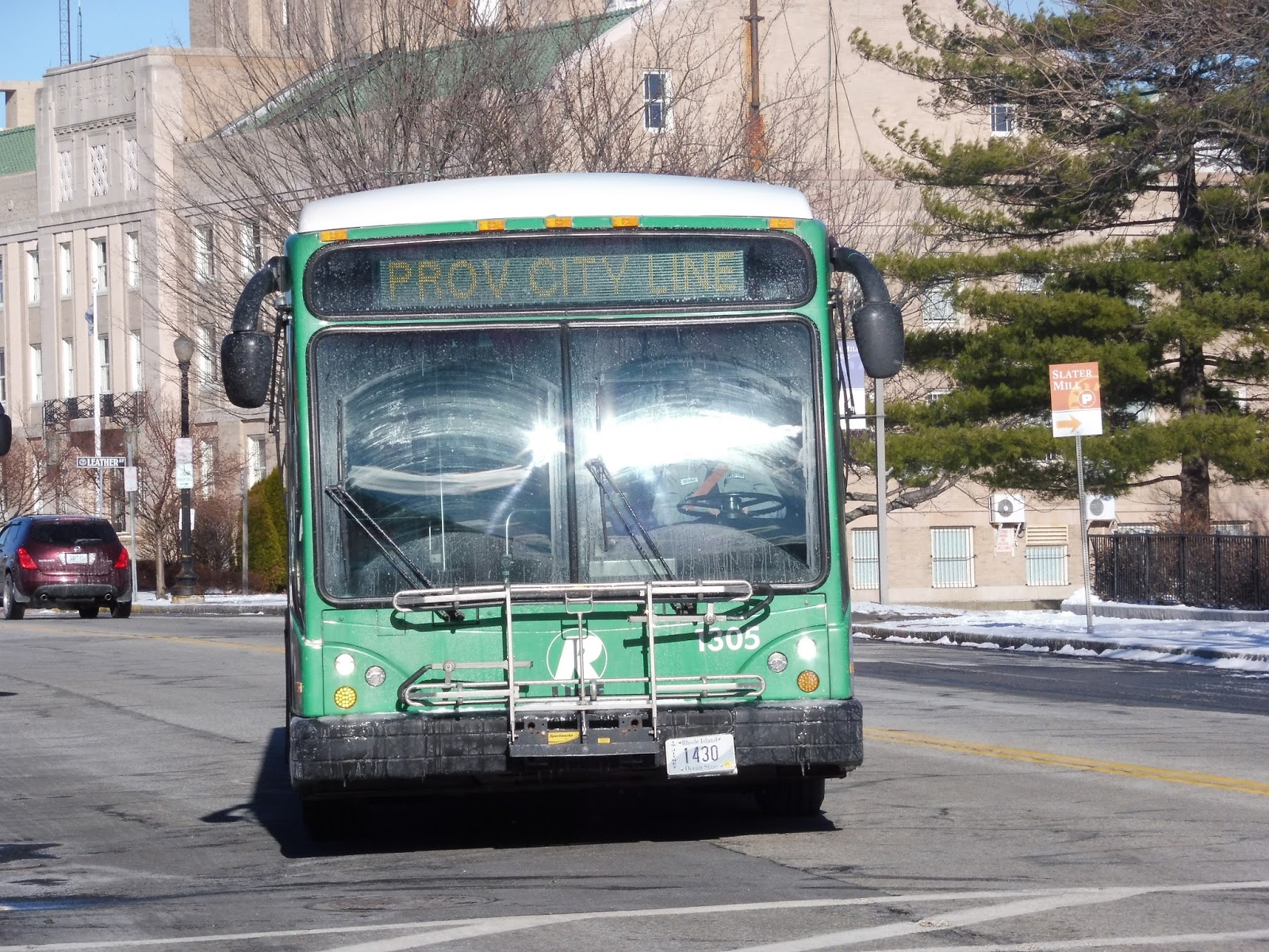
RIPTA: 6 (Prairie/Roger Williams Zoo)
Having just eaten the worst pizza ever, my friend Michael and I were trudging through the snowy Roger Williams Park. Every time the wind blew, our numb hands got even number. We were trying to get to the Roger Williams Zoo in order to pick up the 6 to get back to Providence. Suddenly, it flew by us on its way there. “Grab the camera case, Michael!” I yelled as I dropped it in the snow in a mad rush to get a picture of the elusive vehicle.
 |
| Waittttttt! |
With newfound vigor, we navigated a rotary with no sidewalks and made it to the zoo parking lot. The bus was sitting there next to a themed shelter, but its destination board was off. Looking around, it seemed that the driver was power walking around the parking lot. We decided to sit under the shelter on some rock benches (which were a nice touch) while the driver entered the zoo for some reason.
 |
| The bus sitting next to the awesome zoo shelter. |
Finally, the driver came back and asked if we were getting on. We said yes, and he let us onto the bus. We had gotten transfers from the R-Line (which would’ve honestly been a much easier way of getting back), and thus we grabbed seats and tried to warm up.
 |
| I had to crop this one a bit, since my glove got in the way. It was cold, okay? |
As you can see, this route operates using tourist trolleys. I normally hate these kinds of vehicles, but it has to be said that the interior of this bad boy was amazing. Aside from the bright red seats (which were cool in their own right), the floors and walls were made out of wood! Plus, the cords used to request stops were made out of these rough ropes. I’m not sure what “theme” they were going for here, but it was fantastic regardless.
 |
| Looking toward the back… |
 |
| …and the front. |
 |
| Also, just look at this stop request cord! Or…rope, I guess. |
Heading out of the zoo parking lot, we went around a rotary onto Hawthorne Ave. This road went right through the park, and thus lots of snowy trees were in view. Eventually, we reached Broad Street, and turning north, we crossed over I-95.
 |
| I used a photo from our walk because the bus windows were dirty. |
We then merged onto Prairie Ave, going by a middle school. After a quick industrial blip, the street became lined with dense houses. There were also some businesses in the mix, as well as a library at one point. Prairie Ave curved north, and then we made a rather long detour.
 |
| Looking down a side street. |
Right, so pay attention, because this is complicated. We first turned onto Blackstone Street, and then Staniford Street. From there, we entered a loop at the entrance of the Community College of Rhode Island, picking no one up. We returned the way we came, but instead of going all the way down Blackstone Street, we turned onto Gay Street, and then Dudley Street.
 |
| An industrial view from Gay Street. |
Finally, we returned to Prairie Ave, going to a big parking lot for the Rhode Island Hospital. It got residential after that, with an apartment building on one side and houses on the other. We turned onto Point Street, which crossed over I-95 once more, then we turned onto East Franklin Street. Paralleling the highway, there was a fantastic skyline view to the right.
 |
| Man, I love the Providence skyline! |
We turned onto Broad Street, leaving the highway behind. The road became Weybosset Street, and the surrounding buildings started to get taller as we got closer to downtown. As it started to curve around, we were suddenly in the financial district with skyscrapers everywhere. Finally, we arrived at Kennedy Plaza, and the bus went out of service.
 |
| The bus in Providence. |
RIPTA Route: 6 (Prairie/Roger Williams Zoo)
Ridership: In 2012, this route carried a measly 477 passengers per weekday, 264 per Saturday, and 100 per Sunday – and that was before this route’s schedule cuts! My ride was similarly low, with only about five people in total. Now, I’ll admit that this was Martin Luther King Day, but still, five people is tiny. I would imagine the 6 gets slightly more ridership during the summer, when people actually want to go to the zoo.
Pros: This would theoretically be a good bus for tourists. Direct service from Providence to the zoo? Awesome! And on weekdays, it satisfies that in a schedule regard, too, with every half hour service. However…
Cons: That becomes every hour on weekends – certainly not a good schedule for tourists. Okay, well, maybe it’s a good route for locals. After all, it serves the Community College of Rhode Island, as well as the Rhode Island Hospital! Well, yeah, except it does that through a really time-consuming detour. Plus, it’s within a few blocks of the R-Line for most of its trip. Talk about being overshadowed.
Nearby and Noteworthy: All I’ve seen of the Roger Williams Zoo is the parking lot, but it is one of the oldest zoos in the country and admissions are half-off through February. The 6 will take you there directly, while the R-Line is much more frequent, though it only drops you off at the entrance to the park in which the zoo is housed.
Final Verdict: 4/10
This route is kind of in a strange limbo. In order to be more of value to tourists, it would have to run more often. But since it wouldn’t be too well-used, it could probably just get flat-out eliminated. I mean, okay, ridership still comes from the Community College, that said. I like the idea of running a cut-back version during the winter that only goes as far as the CCRI, and then during the summer it goes all the way to the zoo. Plus, it could also get extended to Providence Station on the other end during seasonal service to improve tourist connections. I mean, these buses are awesome, they can’t be put to waste!
Latest MBTA News: Service Updates
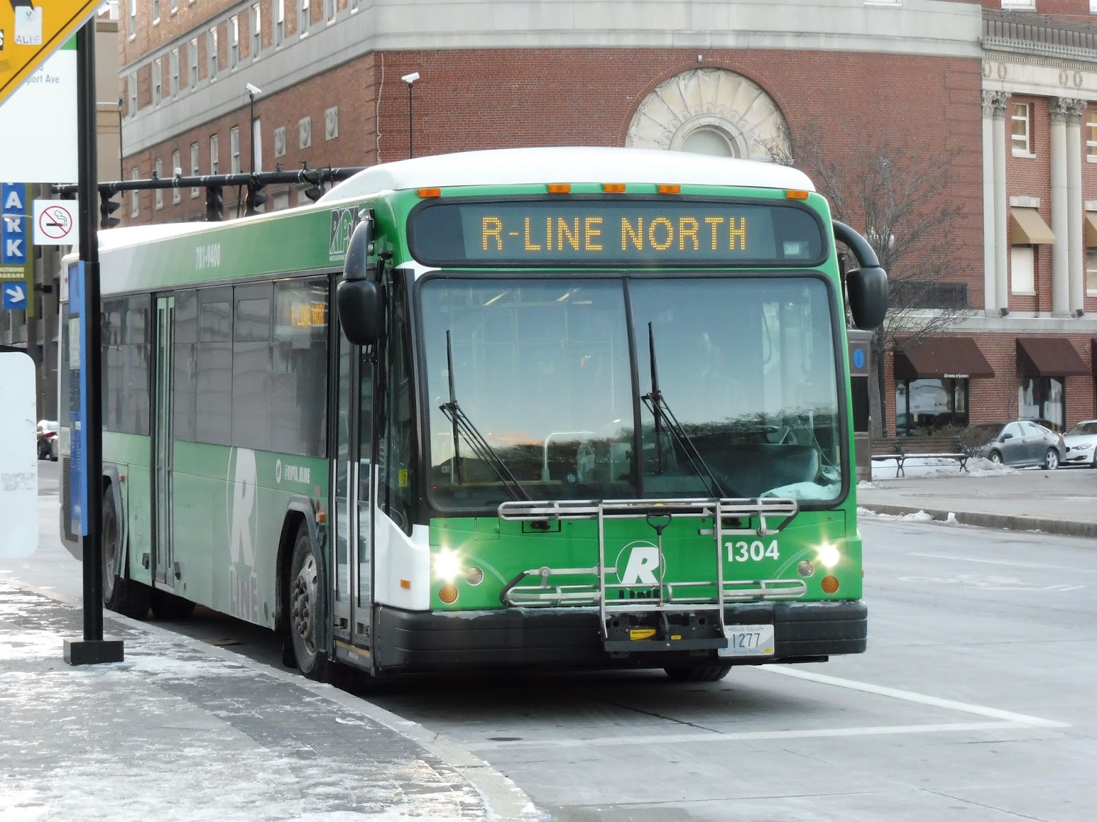
RIPTA: R-Line (Broad/North Main)
I’ve talked about a couple of RIPTA routes before under the “Service Change” moniker, but this is the first time I’ll be doing a proper review of one of their routes – and it’s a good one. The R-Line is kind of like RIPTA’s “main route”, taking its two most popular lines and combining them into one “rapid bus”. Note that it’s called a rapid bus, and not BRT, and I’ll explain why.
 |
| A straight-on view in Pawtucket. |
For one thing, the buses get a special green R-Line livery, as you can see. However, this is not BRT, as there are no bus lanes or other BRT requirements. Instead, the R-Line gets small perks, such as limited stops and the ability to make green lights longer and red lights shorter (something not even the Silver Line does). It really does speed up the route, and makes it better than a regular bus.
 |
| “STOP”! |
The R-Line also has its own livery inside, with a green ceiling and strip maps of the route on the walls. Other than that, it feels like a typical RIPTA bus, with the same seat patterns and cords to request stops. However, the R-Line does have automatic announcements for every stop, and even though the voice is a bit annoying, it’s a good feature.
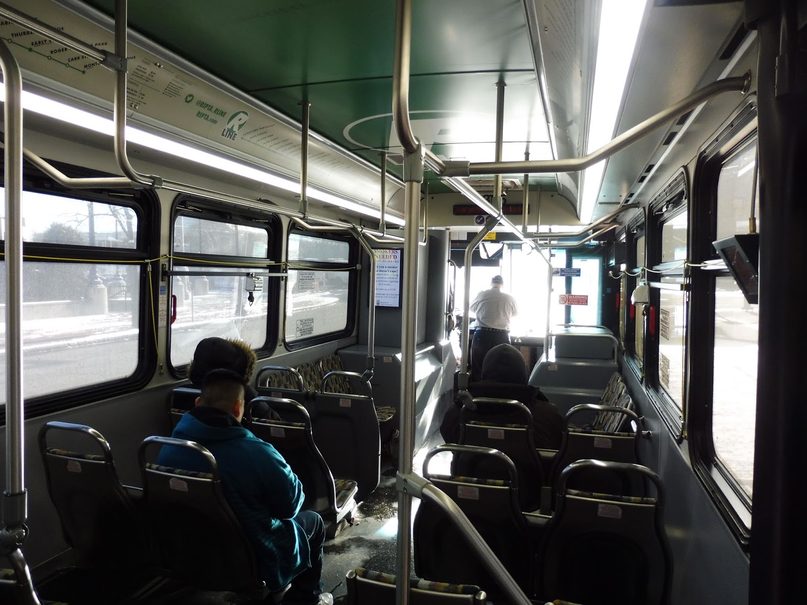 |
| The inside. |
We left the Pawtucket Transit Center heading down Roosevelt Ave, briefly travelled on Main Street, and then turned onto High Street. Brick buildings lined the road, but they weren’t occupied by much. We turned onto Exchange Street, which soon gained a median. After it became Goff Ave, the median went away and the street narrowed.
 |
| Hoo, boy. |
It got very industrial as we turned onto Pine Street, passing burnt out factories and undeveloped plots of land. We then turned onto Main Street, passing a cemetery, and then the street was lined with businesses and houses. We crossed over I-95, and the businesses/house combo continued on the other side.
 |
| Some trucks lined up. |
As Main Street made a slight curve, the surroundings became that strange mix of residential, commercial, and industrial that you can only find in northern Rhode Island. Eventually, we merged with Pawtucket Ave, and the road became North Main Street. It had a leafy median for a bit, but that soon got replaced by an asphalt strip.
Luckily, this was only for a little while, as the trees came back to the median eventually. Around this time, we passed a cemetery, which was so big there were two stops along it. There was an industrial section, and then there were apartments on one side and a shopping plaza on the other. The street started to slope down a hill and split into two one-way roads. We were on Canal Street, which paralleled the Moshassuck River.
 |
| Gotta love that blurry state house! |
We crossed over the tiny river on Park Row West, making a detour in order to serve Providence Station. We then turned onto Exchange Street, crossing another canal and turning onto Memorial Boulevard. Heading onto Kennedy Plaza, we were surrounded by the buildings of downtown Providence, arriving at the Kennedy Plaza bus station soon after. Here, almost the whole bus cleared out, but there were more passengers who got on.
 |
| A different bus at Kennedy Plaza. This was taken later in the day. |
We made our way to Washington Street, with 3-6 story buildings on either side. It was less dense by the time we turned onto Empire Street, and then Broad Street. After crossing over I-95, we passed apartments, old factories, and businesses. There was a retail block for a little bit, and when Broad Street curved southward, we passed another cemetery.
 |
| Going over I-95. |
The surroundings were now a mix of houses and businesses, though we did go by a hospital, too. There was also the occasional church to break up the scenery once in a while. But…it was basically that for a long time. Things shifted more over to businesses as we went further south, but after we crossed I-95 again, Roger Williams Park went by on the right.
It went back to the house/business mix once more from there. At the intersection of Broad Street and Eddy Street, there was a small park, and this intersection marked the end of the route. Just barely entering Cranston, we pulled into a little terminal with not much point other than turning buses around.
 |
| A different bus on its way back towards Providence and Pawtucket. |
RIPTA Route: R-Line (Broad/North Main)
Ridership: BUSY. In total, my trip had about 50 passengers (on Martin Luther King Day, no less), many of whom got on or off in Providence. Unfortunately, the R-Line is too new for RIPTA to have published ridership statistics for it, but it’s a combination of the former two busiest RIPTA lines. You can imagine that the combined ridership of the two routes coupled with more frequent service will equal a lot of ridership.
Pros: There’s not enough praise I can give to this route. Firstly, it takes a direct path, cutting from Pawtucket right through Providence down to the Cranston border. And not only does it serve a lot, but it does so frequently. We’re talking every 10 minutes weekdays, every 15 minutes weekends, and every 20 minutes at night. Keep in mind that the 11 and 99 (the routes that the R-Line replaced) ran up to every 40 minutes on weekends! And it’s because of this increased frequency that so many people use this route, since they can rely on it! It helps that it makes limited stops and has those cool little rapid bus perks to make the trip even faster.
Cons: I guess the only real con I have is that this isn’t full-on BRT, but the roads the route on which the route travels aren’t wide enough for bus lanes. They would have to get rid of parking, and no one wants that. The current “rapid bus” setup works great, anyway.
Nearby and Noteworthy: Ummm…right, so the neighborhoods this route goes through aren’t what you’d call touristy. They’re places where a lot of people use the bus, but they’re not touristy. That said, if you’re willing to walk through a park for a bit, the R-Line will get you pretty close to the Roger Williams Zoo (and it runs a lot more frequently than the 6, which directly serves the zoo, but that’s for another post). Of course, there are a bunch of attractions in Providence, too.
Final Verdict: 10/10
Oh yeah, I just did that. I mean, come on, what isn’t there to like about the R-Line? And besides, it’s arguably the best route on the RIPTA, so relative to the rest of the system, a 10/10 makes perfect sense. The route’s schedule card brags about how you don’t have to look at timetables because it runs so frequently, and that’s very true. I’m sure the R-Line gets way more ridership than what its predecessors got, simply because more frequency on an already busy corridor = more passengers. Simple as that.
Latest MBTA News: Service Updates
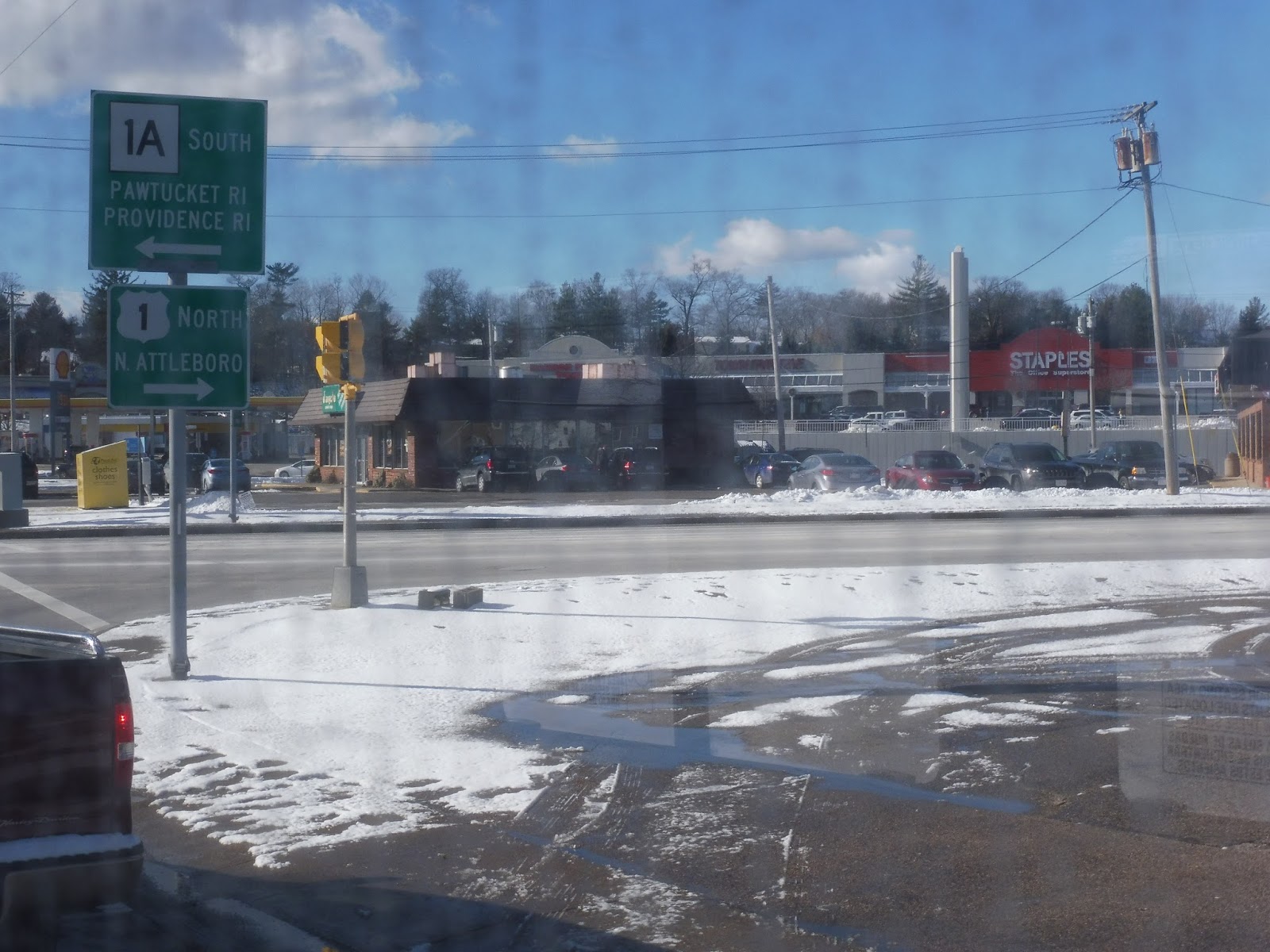
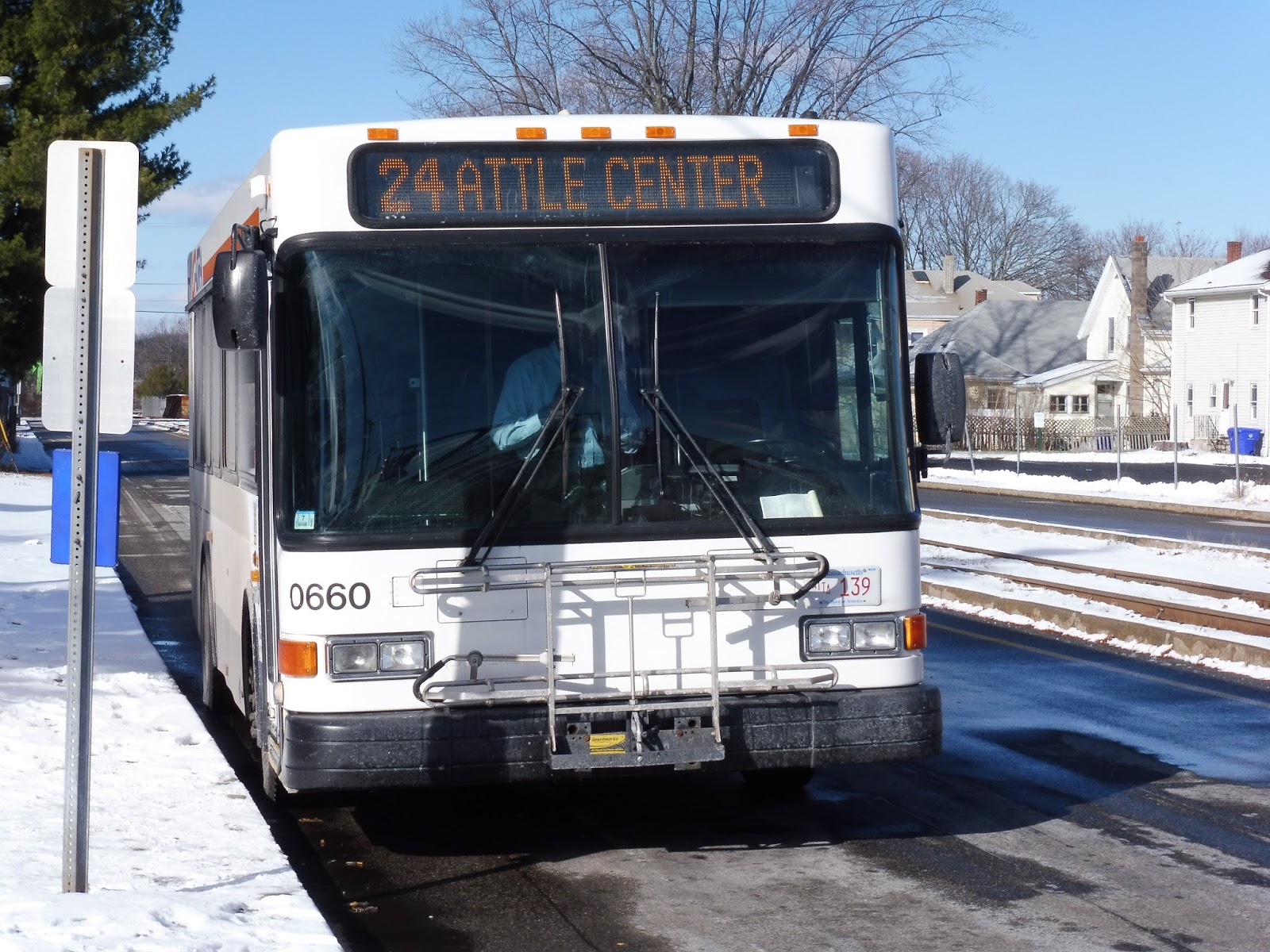
GATRA: 24 (Attleboro/Pawtucket, RI)
A bus route from Attleboro to Rhode Island? Sign me up! I’m always looking for creative ways of getting places, and being able to ride the GATRA for the first time was certainly creative enough for me. Plus, this route is weekdays-only!
 |
| The bus at Attleboro Station. |
The inside of the bus was pretty simple, with sideways-facing seats along the lower section and forward-facing seats on the upper part. Requesting stops was done by pulling cords, which lit up a sign up front. It was smaller than a regular-sized bus, but based on the ridership, that made a lot of sense.
 |
| Looking towards the back… |
 |
| …and towards the front. |
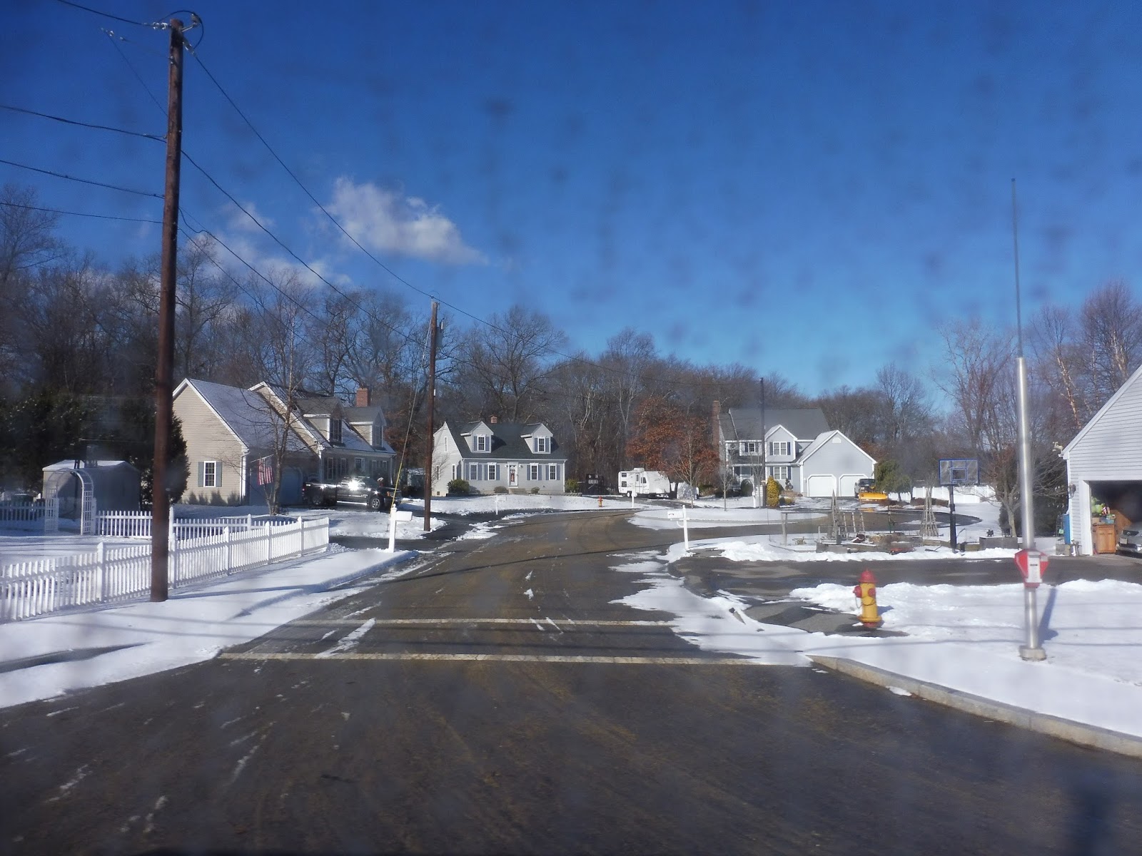
We completely bypassed downtown Attleboro, heading right out to the residential County Street. Aside from a middle school and the Capron Park Zoo, the street was entirely lined with houses houses. There was some retail at the intersection with Thacher Street, but once we turned onto it, it was residential once more.
At an intersection with a single gas station, Thacher Street curved upward, while we stayed on what was now called South Ave. We went by a few housing developments, and after another gas station, we passed through an interchange with I-95. There were a few more houses on the other side, but then the scenery started to change.
 |
| The windows were very dirty, so pardon the subpar photography. |
Now there was nothing. I mean, we were just speeding through the woods. The street didn’t even have sidewalks! The forest continued until the road became West Street and we passed a water treatment center. Here, the houses came back and the street became Newport Avenue.
 |
| Woo! Woods! |
This section was denser, with closer houses. However, the residences all went away once we reached Route 1, where malls and businesses with huge parking lots were king. Inbound trips of the route deviate to serve one of those malls, but since we were going outbound, we headed south on Route 1 instead.
 |
| Lovely. |
It wasn’t quite as mall-filled as the northern route, but there were still quite a few parking lots heading south. And they were all connected to fast food restaurants and auto shops and the like. This continued for a while until we (mercifully) turned onto Brown Street, which was narrower and entirely residential.
 |
| Some houses. |
The houses were broken only by a middle school at one point, and they continued when we turned onto Mendon Road. This street led us back to Route 1, which was…basically the same as when we left it off. Passing more auto shops, we went under I-95 once more and then crossed the Commuter Rail tracks.
 |
| A convenience store. |
As is prone to happen, it got urban all of a sudden right when we crossed the border into Rhode Island. Here, we turned onto Roosevelt Ave, and then George Bennett Highway. This street was interesting, since it had a railroad track running in its median! Not sure if that’s used anymore. The end of the road was the last stop, and the bus laid over to wait for its trip back to Attleboro.
 |
| The bus in Pawtucket. |
GATRA Route: 24 (Attleboro/Pawtucket, RI)
Ridership: Unfortunately, GATRA doesn’t publish its ridership statistics by route, instead by “service area”. And it puts Attleboro and Taunton into the same grouping, which really isn’t much help. Thus, I’m stuck talking about the ridership on just my bus, which was…four people. Okay, it was Martin Luther King Day, but wowee, that’s low.
Pros: This bus provides a direct link from Attleboro Center to Pawtucket, the only bus to properly do that. (The 16 comes close to a less dense part over to the east, but it doesn’t cross into Rhode Island.) The only other GATRA route to Pawtucket is the 11, which doesn’t go to Attleboro Center. In addition, when coordinated with the 12, the 24 provides every half hour service from Attleboro to Route 1, though it’s not that that section really needs service that frequent…
Cons: That said, weekend service would be nice. Although the 24 runs a pretty standard every hour schedule on weekdays, it doesn’t run on Saturdays, leaving all service to the Emerald Square Mall-bound 12. And that would be fine, except that Pawtucket is a busy place, too! Sure, the 11 goes there, but you would have to transfer from the 12, and that’s an extra 50 cents.
Nearby and Noteworthy: If you’re lazy, you can use this bus to get to the Capron Park Zoo, but I’ve already said that it’s in easy walking distance from the Commuter Rail station. Other than that, the 24 doesn’t really serve much of note.
Final Verdict: 6/10
Hmm…I might be influenced by GATRA’s transfer policies here more than anything. I’m sure the Saturday ridership from Attleboro Center to Pawtucket is minimal, but it’s still there. And the fact that it’s an extra 50 cents and 9-minute wait to get there on Saturdays is really annoying. I’m not saying the 24 needs to run on Saturdays, per se, but offering a free transfer specifically between the 11 and 12 would be great. But hey, the 24 is a fine route on weekdays!
Latest MBTA News: Service Updates
35 (Dedham Mall/Stimson Street – Forest Hills Station via Belgrade Ave and Center Street)
Well, as long as I reviewed the 16, I might as well cover the other route I took that day, the 35. I’m not sure why I didn’t review these two buses earlier, but…well, what’s almost months late, am I right? Pshhhh. Okay, well, here’s the 35.
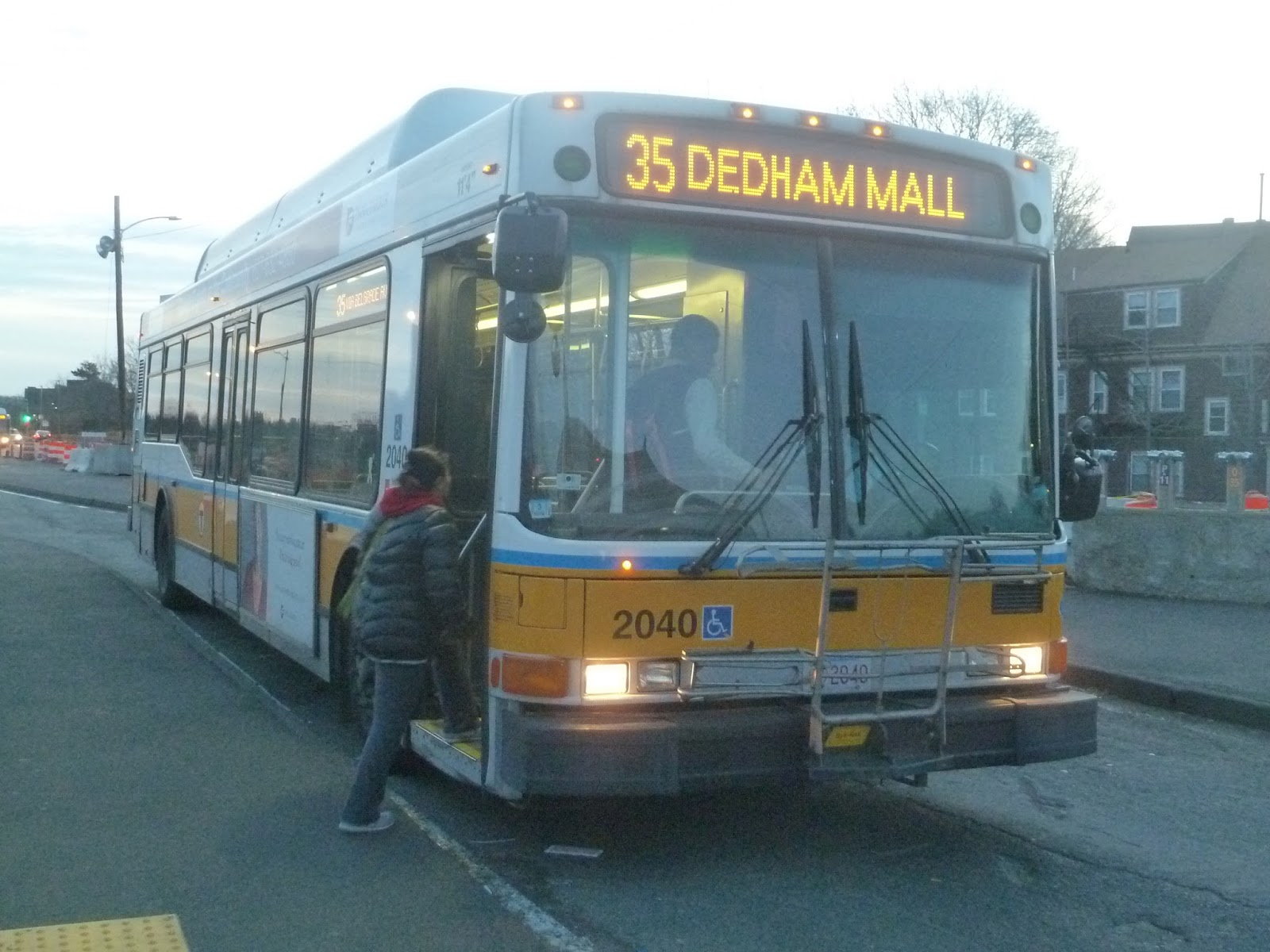 |
| The bus at the roofless Forest Hills busway. |
We headed down Washington Street after picking people up at Forest Hills, along with the eight other buses that traverse the same route. After a few businesses, there was a short industrial section, and then the street was mostly lined with apartments. Aside from the occasional corner store, we didn’t see much retail until Roslindale Square, where all of a sudden it was everywhere.
Merging onto South Street, we then curved into Belgrade Ave, passing the Roslindale Village Commuter Rail station. Running with the 36 and 37, the street was lined with apartments and houses, with a few businesses at an intersection with Walworth Street. There were some more businesses near Bellevue Station, but they were significantly less interesting than the previous retail block.
Luckily, once Belgrade Ave curved north and crossed the Commuter Rail tracks, there were some more noteworthy businesses. Here, we turned onto Centre Street, which continued to be lined with retail. This went on for a while, basically until the intersection with LaGrange Street, where the 37 left us. Soon after, we passed a church, and then the 36 turned off onto Spring Street, leaving us alone.
Centre Street was now entirely residential, but it felt really nice and suburban, with small houses lining the street. We did go by a nursing home at one point, and there was an industrial section later on where Centre Street turned right, avoiding a huge quarry. The houses continued past there, including when we turned onto the even smaller and more local Stimson Street.
But these lovely houses would end soon enough, as we reached the behemoth known as Washington Street. The wide road had a median in the middle, but after some suburban businesses with big parking lots, it too became residential. That didn’t last for too long, though, as we soon entered the huge Dedham Mall complex, letting the remaining passengers off for some late shopping.
 |
| You can see what I mean by “late” shopping. It was dark by the time we got to the mall! |
Route: 35 (Dedham Mall/Stimson Street – Forest Hills Station via Belgrade Ave and Center Street)
Ridership: In terms of the Belgrade Avenue buses, the 35 is right in the middle. It’s not as busy as the 36, but not as quiet as the 37. To be more specific, it gets 2,422 riders per weekday, 1,142 per Saturday, and a measly 471 per Sunday. It has to be said, though, that the Belgrade Ave corridor is quite busy on weekdays if you add up the ridership for all three of its routes, so I would imagine that this bus is crowded during rush hour. My particular trip had about 15 people on a Saturday, but it was in the late afternoon.
Pros: Since the Belgrade Avenue corridor is one of the busiest on the MBTA (its three routes add up to just shy of the 77’s ridership on weekdays), this route is mainly to serve that. However, it goes above and beyond its jurisdiction by also serving a bunch of houses along Centre Street, plus the huge Dedham Mall.
Cons: Unfortunately, its schedule is a bit flimsy. Rush hour service is fantastic, with every 11-15 minute service, and Saturdays are okay, with every 35 minute headways. However, on weekdays, it’s every 40 minutes, and every hour nights and Sundays (with only 10 trips each direction during the latter). Also, all trips before around 9 AM are truncated before the mall, but there should be at least one rush hour run to get mall workers to their jobs.
Nearby and Noteworthy: You guys all know my opinions on malls, so I’m just gonna keep the terminus of this route out of the equation. However, it still goes by a lot of businesses, particularly along the Centre Street section shared with the 36 and 37, as well as good ol’ Roslindale.
Final Verdict: 6/10
This may not be the fastest route to the Dedham Mall (the 34E claims that title), but people still use it to get to there. Thus, I wish the Sunday schedule was less limited, and that there was at least one rush hour trip that helped mall workers out. Other than that, this is a fine route that serves a decent amount and gets good ridership, especially during rush hour. I just wish it could run more often outside of those times.
Latest MBTA News: Service Updates
16 (Forest Hills Station – Andrew Station or UMASS via Columbia Road)
You know, I was gonna do a review of a GATRA route. But then I realized this was my 500th post, and I can’t go talkin’ about regional transportation systems for such an occasion! Thus, here’s a review of the 16. It’s been over a month since I rode it, but I never got around to posting about it, so here we go.
 |
| The bus in the dark Andrew busway. |
Although the 16 is extended to UMASS during rush hour, I was riding it on a Saturday, so it was starting from Andrew Station. Leaving the dingy busway, we headed down Southhampton Street, and after a bit of industry, we went onto a bridge over the Commuter Rail tracks. There was a view of the Commuter Rail/Amtrak yard, and then we went over I-93.
From there, we entered the South Bay Center mall, running along a huge parking lot on one side and stores on the other. When we left the mall, we came pretty close to Newmarket Station, but turned the opposite direction on Mass Ave. After some heavy industry, we turned onto the wide Columbia Road, which was lined with apartments.
 |
| Some industry on Mass Ave. |
However, we reached Uphams Corner shortly, and there there was a lot of retail, including an old theater! From there, it was residential once more, with apartments on both sides of the street. We went under the Fairmount Line tracks, then a middle school and the occasional businesses broke up the apartments.
 |
| The Strand Theater! Fancy. |
Those apartments became houses eventually, and Columbia Road started to curve westward. And after crossing Blue Hill Ave, we reached the most interesting part of the route. For it was here that we entered Franklin Park. After passing the Zoo on Franklin Park Road, the street became Circuit Drive and curved alongside a golf course.
 |
| SO many opportunities to get a picture of the sunset and this was the best I could do! Disgraceful! |
After a little while of speeding through the woods and past the golf course, we zipped by the Shattuck Hospital. Here, the street became Forest Hills Drive, and we soon reached a rotary, marking the end of the Franklin Park segment. There was a section along the Arborway, right alongside the old Forest Hills overpass, and soon we reached Forest Hills station, ending the trip.
 |
| The bus in the Forest Hills busway. |
Route: 16 (Forest Hills Station – Andrew Station or UMASS via Columbia Road)
Ridership: Oh gosh, my ride was so long ago, I don’t remember how many people rode…I want to say about 30, but don’t quote me on that. Luckily, the MBTA Blue Book is there to give the actual numbers! This actually is one of the busiest non-Key Bus Routes on the MBTA, with 5,330 riders per weekday, 2,776 per Saturday, and 1,764 per Sunday. It’s so busy, in fact, that it uses articulated buses during rush hour!
Pros: This is a direct crosstown route right through Dorchester, and a really fast link from the edge of Franklin Park down to Forest Hills. Also, the 16 runs frequently for a non-Key route: every 17-20 minutes during rush hour, every half hour during the day and on Saturdays, and every 35 minutes on Sundays.
Cons: The only weak spot in the schedule is at night, where the route only runs every 50 minutes. In addition, by not having South Bay Center service until 9:30 on weekdays, mall workers are cut off and have to find a different way of getting to work.
Nearby and Noteworthy: The Franklin Park Zoo is the closest zoo to Boston, and though the 16 might not be the most frequent way of getting there, it can be the most direct depending on where you’re coming from.
Final Verdict: 8/10
This is a solid direct link right through Dorchester, and even further down to Forest Hills, plus it serves UMASS during rush hour. It runs pretty frequently, even on Sundays (more or less), and really my only complaints involve the night schedule and not having at least one rush hour trip to serve mall workers. Besides, this route uses articulated buses at rush hour! Can’t beat that!
Latest MBTA News: Service Updates
500 posts! Wow! I mean…wow! I know I celebrated my 3rd anniversary a few weeks ago, but…500 posts..wow. Thank you all for sticking with me for this long, and here’s to 500 more posts!
Attleboro
You know, I could always just stay in Gloucester. Gloucester’s real nice. I mean, how about I review West Gloucester? Or perhaps Gloucester’s neighboring town, Rockport. I hear that’s even more beautiful! Sigh…or I could take a look at Attleboro.
 |
| That is…a lot of salt. |
As with most Providence Line stations, Attleboro is mostly low-level, but there are high platforms to allow for accessibility. The ones on the inbound and outbound sides are basically the same, with one key difference: the inbound one doesn’t have benches! I’m sorry, is that not the platform where more people will be waiting for the train?
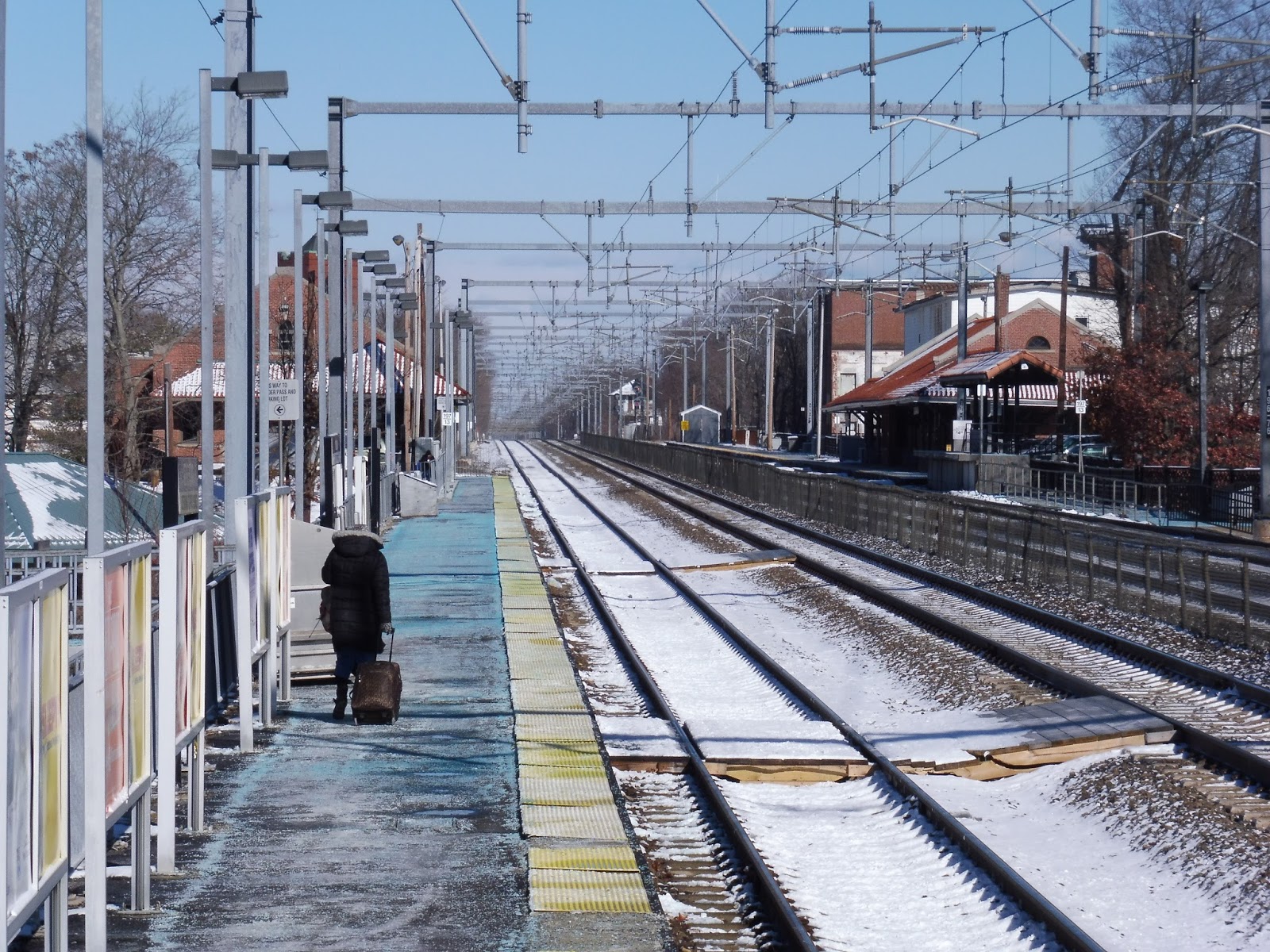 |
| Looking down the platform. |
The large majority of Attleboro’s low-level platform is basically empty. Aside from ads that line the wall, there really isn’t much to talk about. On the outbound side, there are a few exits down to the station’s parking lot, including a ramp. It’s nice that there are more than one, although again, most people will be boarding on the inbound platform, so they’ll have to go around. Still, the stairs make for convenient exits during the evening rush.
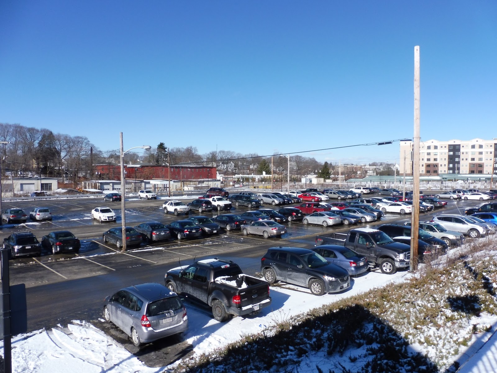 |
| The parking lot. |
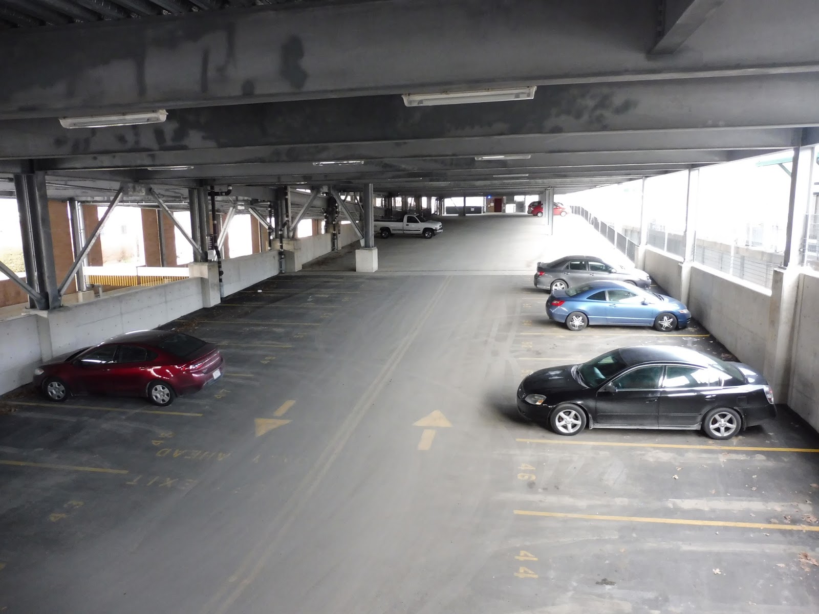
Speaking of the parking lot, it’s huge. And putting 780 spaces in just a surface lot requires a lot of space, but a lot of space they have. This is the biggest MBTA parking lot I’ve ever seen, stretching way beyond the end of the platform. It must be a pain to walk from the edge of the lot to the station, and I’m not sure if this lot gets full or not, but it certainly isn’t lacking in space.
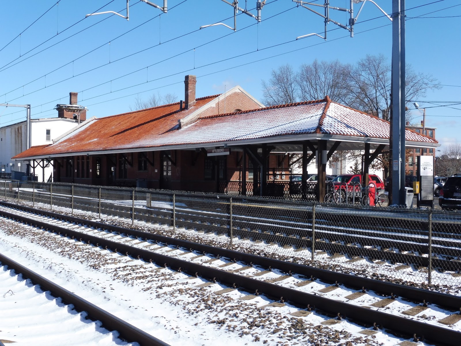 |
| Oh, how I love old station buildings! |
Yes, Attleboro has not one, but two old station buildings – one on each platform. They both offer additional shelter and seating, with a few bike spaces on the inbound side. In addition, there’s a smaller parking lot on this side. And while the outbound building has a few offices in it, the inbound one is a different story.
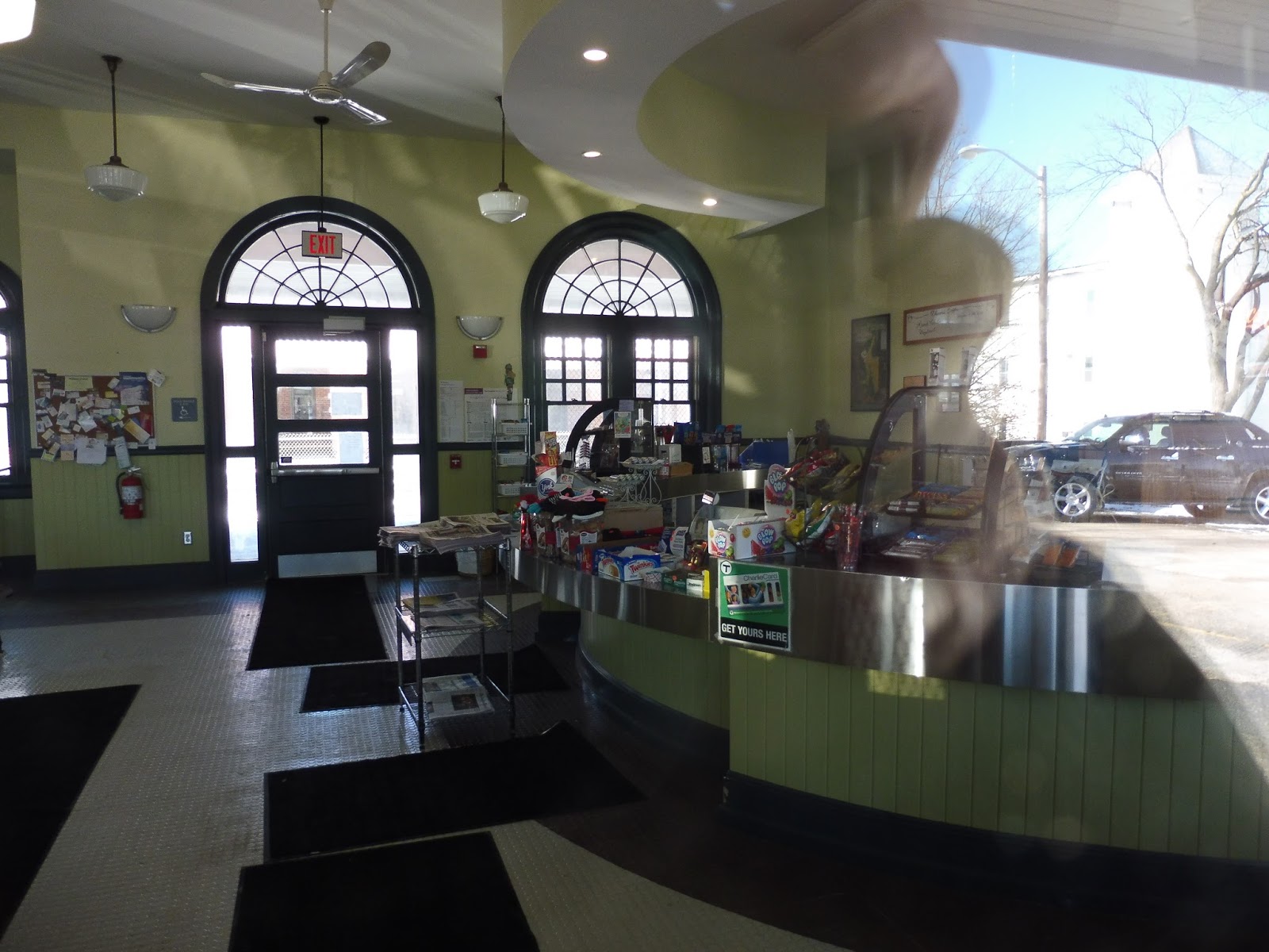 |
| A café! |
The inbound building has a little shop meant for commuters inside! It includes a café (where you can buy tickets), as well as lots of indoor benches at which to wait! So this is where the inbound seating is. Only problem is that the shop is only open during the morning rush, so I’m still faulting the inbound platform for not having outdoor seating on its high-level platform.
 |
| An exit on the inbound side. |
The station has a few other exits that lead to Mill or South Main Streets. Mill Street is exclusive to the inbound platform (pictured above), with a staircase leading up to the station. South Main Street, meanwhile, gets exits from both platforms, and can act as an easy crossover. Plus, South Main is where the inbound side’s ramp is, so it’s accessible.
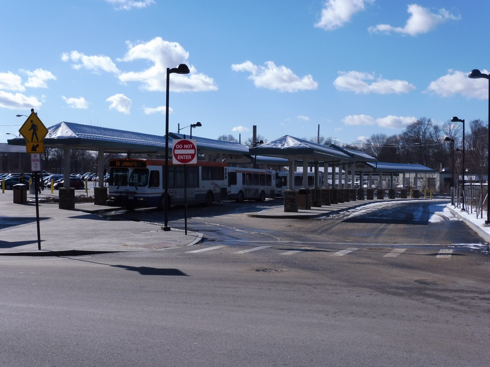 |
| Some GATRA buses at the bus terminal. |
Of course, I’d be remiss not to talk about the fact that this station also houses the hub of the GATRA’s Attleboro routes. The “Attleboro Intermodal Transit Center” was opened in late 2013, and it features two lanes for buses. Although there’s no outdoor seating, the lanes are sheltered.
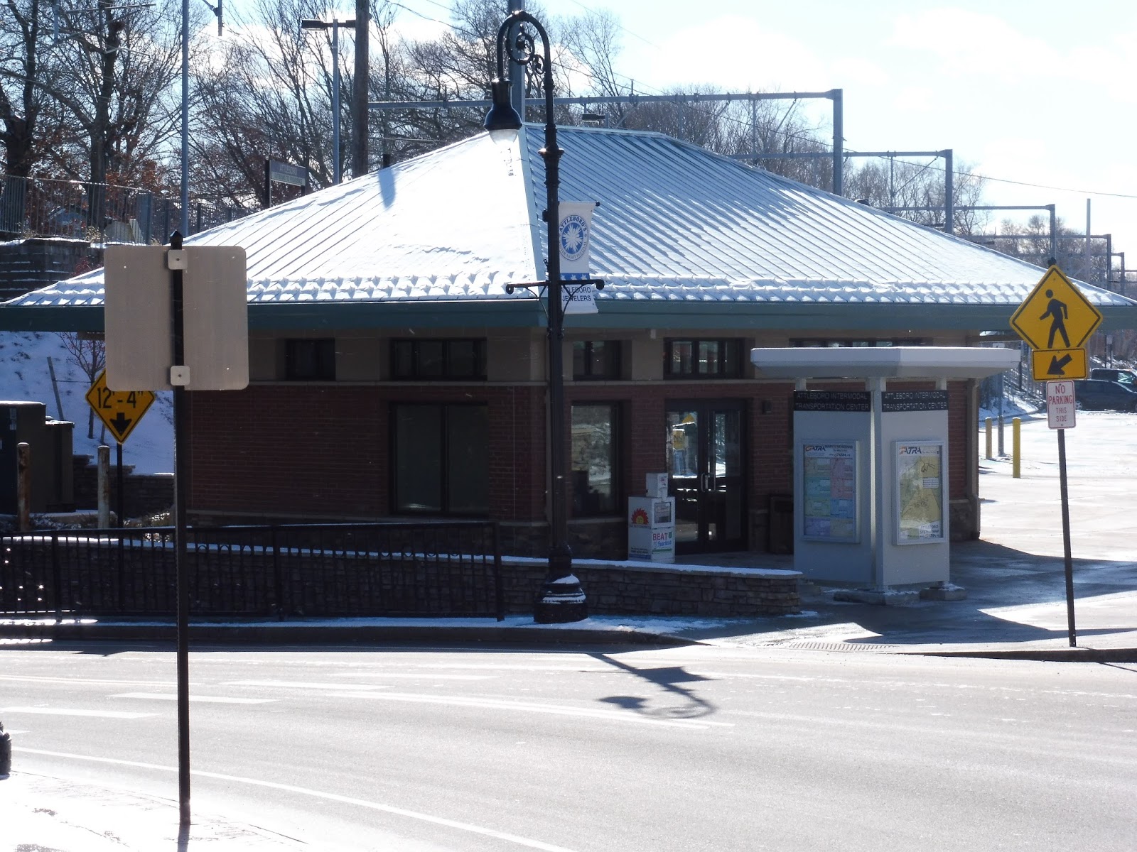 |
| The station building. |
Plus, the facility has indoor seating! Yes, a small station building houses a few benches, as well as a ticket machine where you can buy passes. It’s not much, but it’s cozy. Other amenities at the GATRA terminal include a newspaper box, wastebaskets, and a board with bus schedules and a system map.
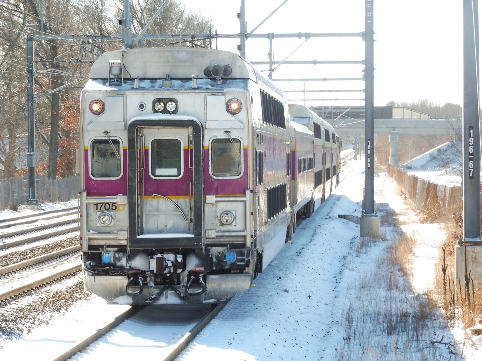 |
| The train left the station verrryyyyy slowwwwllllllyyyyy… |
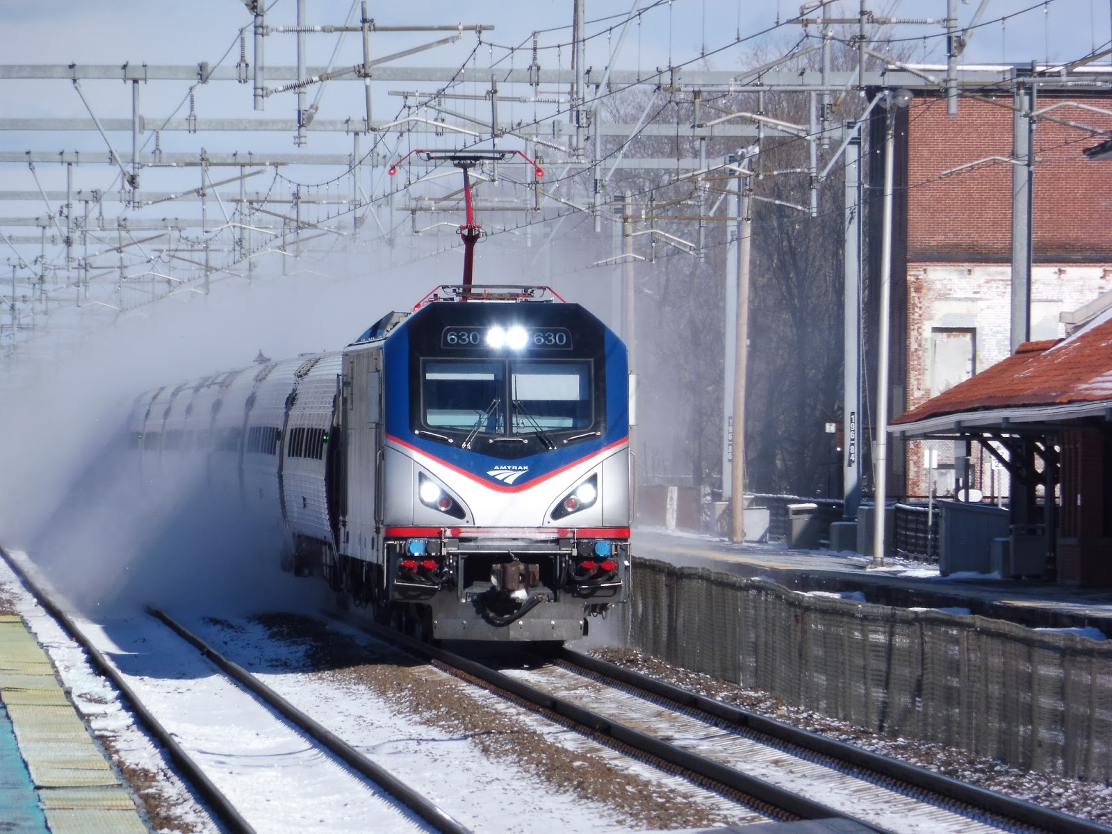 |
| Probably because it was waiting for this to pass. It wouldn’t be a Providence Line review without a surprise Amtrak! |
Station: Attleboro
Ridership: Oh, yes, this is a very busy one indeed. With 1,665 inbound riders per weekday, Attleboro is the third-busiest station on the Providence Line and the sixth-busiest Commuter Rail station overall! And considering that only a very small fraction of that amount takes the GATRA in, I would imagine that a lot of people drive, justifying the huge parking lot.
Pros: The old buildings! The old buildings! The old buildings! Yes, I’m a sucker for vintage station buildings, and these ones are no exception. Having a waiting room and café on the inbound side is great, but too bad it’s not open all the time. Additionally, the parking lot is gigantic and the GATRA facility is quite nice.
Cons: The boarding platforms are barebones and kinda ugly, and why aren’t there benches on the inbound side? Okay, I get it, the waiting room is there for rush hour, but what about all other times? You can sit under the building, but you still have to walk to the boarding platform.
Nearby and Noteworthy: Nothing against Attleboro, but it doesn’t seem like the most interesting of towns. Some of the architecture in the nearby downtown is oldish, but there aren’t any noteworthy businesses in the buildings. The best attraction is probably the Capron Park Zoo, a small local zoo about 15 minutes’ walk away from the station.
Final Verdict: 7/10
Okay, this lower score might be based on the fact that I’m not a huge fan of Attleboro as a city. But that said, the whole bench issue is rather annoying, since the café is only open during the morning rush. Of course, the rest of the station is pretty good, especially the old buildings. Plus, the GATRA terminal is fantastic, considering how small GATRA’s Attleboro system is.
Latest MBTA News: Service Updates
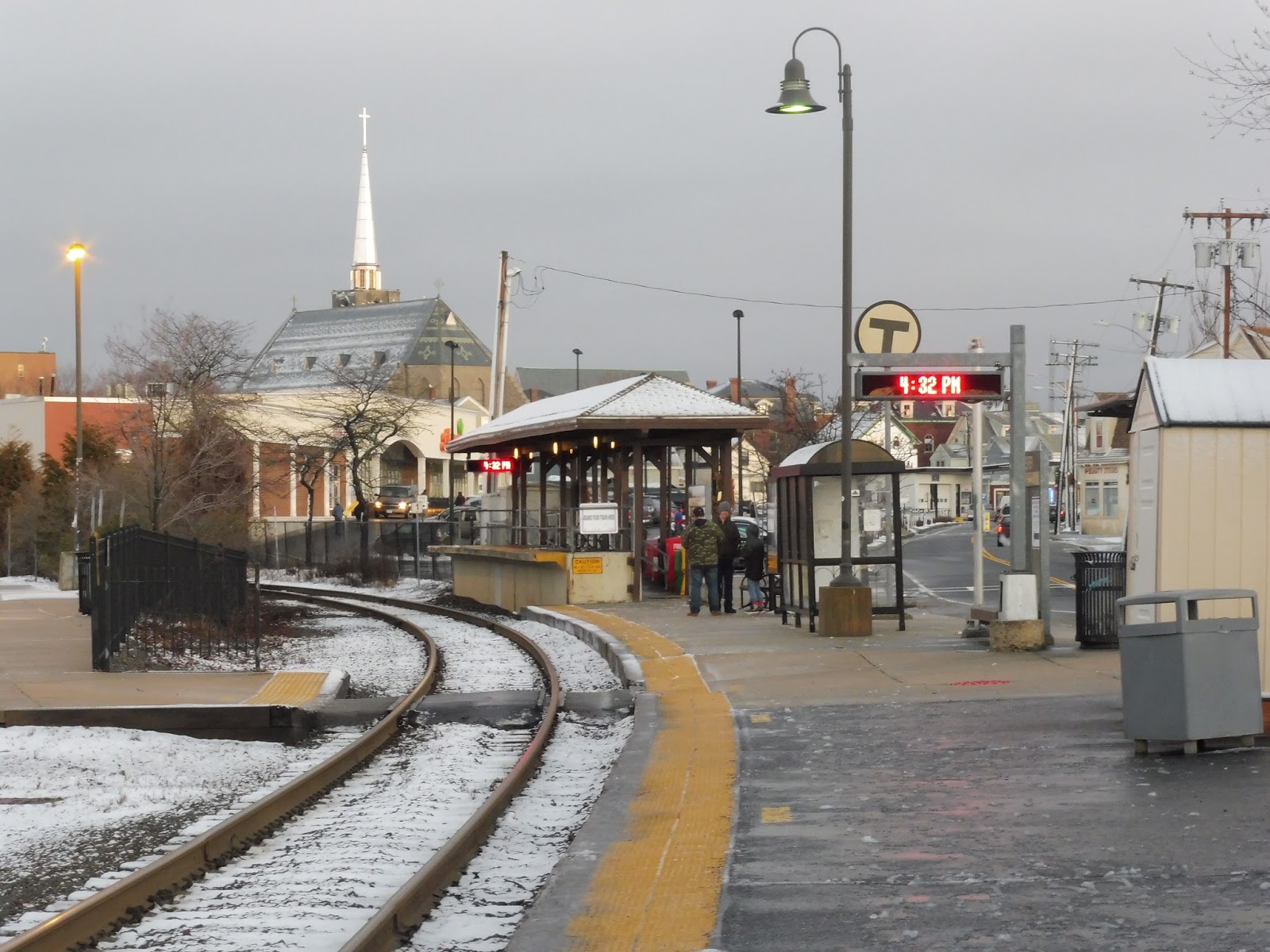
Gloucester
Yes! It’s been way too long since I’ve reviewed a Commuter Rail station with some character! Serving throngs of beachgoers in the summer and hardy commuters in the winter, Gloucester Station is right where the action is (almost) in a beautiful North Shore city. Don’t delay, let’s take a look!
 |
| Gosh, this town is beautiful. |
The directions I got to this station from a local were pretty lackluster. The way I was told to go involved trespassing through a McDonald’s parking lot, sloshing through ankle-deep slush, and finally cutting into the station via its 100-space parking lot. There was also a small plaza on this side with a few bike spaces, a bench for a kiss-and-ride area, and a wastebasket. A level crossing led me across the single track to the platform.
 |
| Looking at the station from Railroad Ave. |
Honestly, it would’ve been more efficient for me to have used the entrance from the aptly-named Railroad Ave. This side also has some benches to allow people to wait for pick-ups, as well as a few spaces for taxis. In addition, a multitude of newspaper boxes line the shelter.
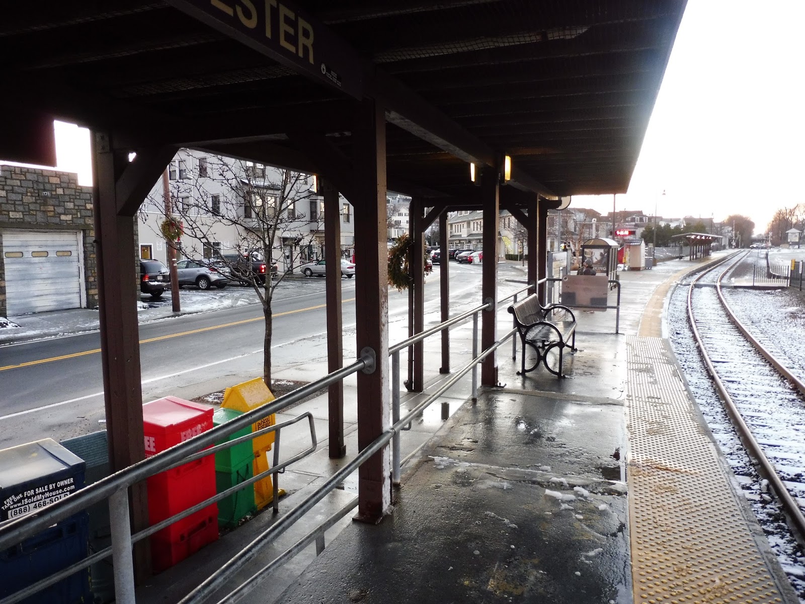 |
| Atop the high-level boarding platform. |
Most of the platform is low-level, but there is also a high-level boarding area for those with disabilities. Well, okay, it’s for everyone, since you’re not allowed to board the train anywhere else barring the morning rush, but you know what I mean. It’s a nice wooden shelter with a ramp leading up to it. Alas, there’s only one bench, but…I guess people can lean against the metal barrier?
 |
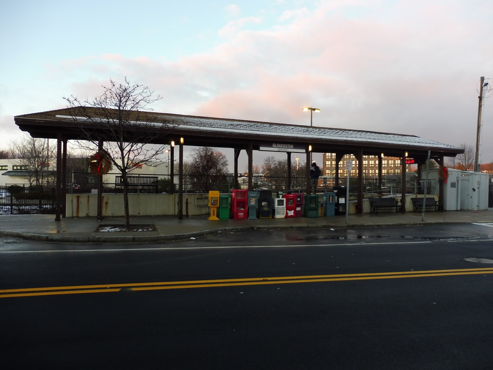
| The CATA bus shelter. |
Further down the platform, there’s an LED screen, a bench, and a wastebasket. Also, the CATA has a shelter here, since a few of its routes serve the station. Although the shelter is benchless, I find it interesting that they could only afford one shelter, since the hub of the whole system in downtown Gloucester doesn’t have one! In addition, there’s a map over here to let tourists know how to get around town.
 |
| Another shelter further down the platform. |
Near the station’s level crossing on Washington Street, there’s another shelter. Like the high-level platform, this one is wooden, but unlike the high-level platform, this one is completely useless. I mean, it has a bench and a few wastebaskets, which is nice, of course, but since everyone has to board at the high-level area, it doesn’t matter much. That said, the two are much closer at this station than at others, so the walk from the low shelter to the high one isn’t so bad.
 |
| It was significantly darker when the train finally came. |
Station: Gloucester
Ridership: It’s the busiest station on the Rockport Branch! I mean, it has to be said that past the ridership behemoths of Salem and Beverly, ridership thins out, but still…Gloucester’s 590 riders per weekday is pretty good. And of course, I’d imagine that amount gets much higher during the summer.
Pros: As I mentioned, this station is no slacker in the character department. The wooden shelters are great, plus it’s accessible! In addition, the station’s parking lot is definitely big enough, with a 77% availability rate on weekdays. Bike spaces, a taxi stand, and the CATA shelter round out the amenities.
Cons: Having a map at the station so tourists know where to go is great, but how about signage to the station? And yes, I know there are signs that point in its direction, but I followed one and then the signs just stopped and I got lost…that’s all I’m gonna say. Also, I think a second bench on the boarding platform could be nice, since it probably gets crowded during rush hour. Oh, and while we’re at it, put a bench under the CATA shelter!
Nearby and Noteworthy: I was only there for a couple hours, but based on that short time, I’ve decided that I love Gloucester. Seriously, this is such a beautiful seaside town (or city, I guess). With lots of businesses downtown, as well as historical sights and beaches further out, this is a great place to go in the summer. In the winter? Well…it’s rather cold. But still beautiful.
 |
| I mean, just look at Main Street! |
Final Verdict: 8/10
I might be slightly influenced by Gloucester itself here, but still, this station holds its own. I love its shelters, and it has lots of amenities for all different methods of arriving here. The only main problem I have with the station is the whole signage thing, and I might’ve just misread one of the signs and got lost. It would be nice to put a few extra benches here, though, especially under the CATA shelter, but other than that, this is a fantastic station in a fantastic town that I heartily recommend you visit.
Latest MBTA News: Service Updates
CATA: Yellow Line (Gloucester – Danvers – Peabody)
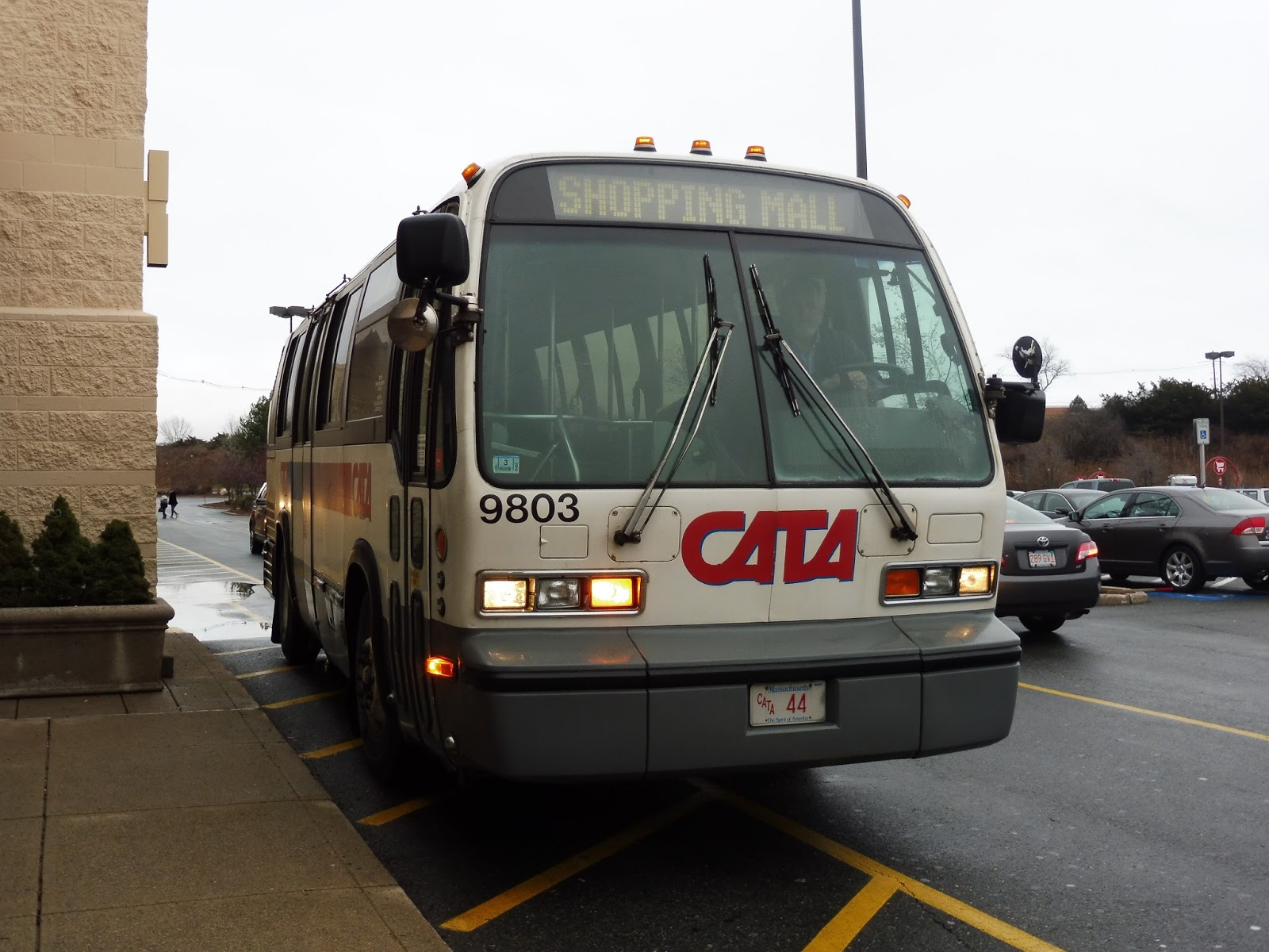
As you may know, the blog’s jurisdiction has expanded to non-MBTA systems, which I will now be doing proper reviews of! And what better way to start doing this than with a review of a Saturday-only express bus from Danvers to Gloucester? Okay, there are probably better ways, but we’re looking at CATA’s Yellow Line regardless.
 |
| The bus arriving at the mall. |
I just want to point out that CATA has three routes under the “Yellow Line” umbrella, and they’re all completely different. This one runs express from the Liberty Tree and Northshore Malls up to Gloucester, and it has to be noted that it stops at different places than the MBTA routes serving those malls. I have no idea why this is, but it’s really annoying, especially since there’s no signage for the stops.
 |
| The bus at its unsigned Liberty Tree Mall stop. |
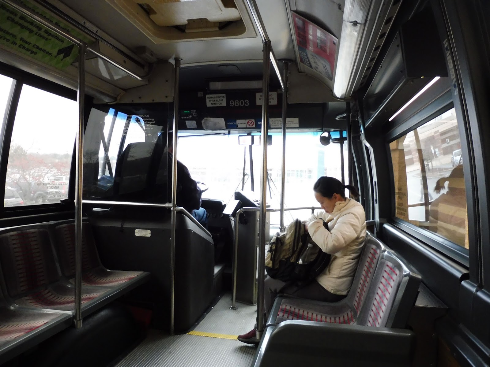
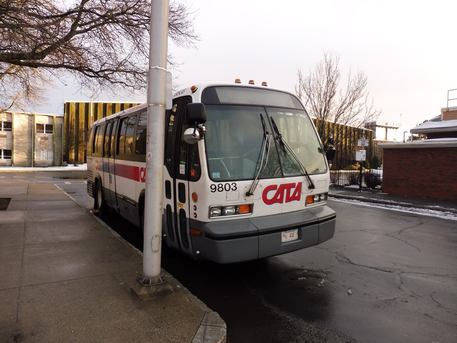
I was quite excited to see that the bus was an old one, quite possibly one of CATA’s oldest. Based on its number (9803), I would guess it’s from 1998, but I’m not sure if CATA numbers its buses like that. Anyway, the inside of the RTS bus was pretty retro, with some interesting designs on the seats. There were strips to request stops, and a vintage-looking sign up front that lit up when the strips were pushed.
 |
| Looking toward the back… |
 |
| …and toward the front. |
We left the Liberty Tree Mall and navigated through the parking lot, passing the MBTA stop for the same mall. We took the more direct route to the Northshore Mall (compared to the 435), which consisted of short sections on Independence Way, Endicott Street, Sylvan Street, and Andover Street. The whole time, the surroundings consisted of mostly parking lots and trashy businesses to go along with them.
 |
| Unfortunately, since it was an old bus, the windows were rather dirty. Don’t expect very good pictures. |
 |
| Horses! Okay, that’s a nice touch. |
The CATA’s stop at the Northshore Mall is outside of JCPenney, the complete opposite side of the building from where the MBTA buses stop! And again, there was no signage! Are they trying to make sure no one knows the route exists? Anyway, we left the mall, crossed under Route 128, and turned onto Northshore Road. Eventually, this led to an interchange with the highway, and thus we started the express portion on 128.
 |
| Northshore Road paralleled the highway for a bit, as seen in this totally not-blurry picture. |
 |
| A marsh with an office park in the background. |
 |
| A local street. |
 |
| The rest stop. |
 |
| The blurry, snowy woods. |
 |
| Gosh, imagine how great this view must be when not viewed through a dirty window. |
 |
| The sunset! |
 |
| Okay, I’ll admit, this would be a hard view to capture even without the dirt, since it’s through a fence. |
 |
| Crossing over the single Commuter Rail track. |
 |
| This was the only reasonably non-blurry picture I could get of the Rogers Street scenery. |
 |
| The bus laying over. |
 |
| Welcome to the grand hub of the CATA! |
435 (Liberty Tree Mall – Central Square, Lynn via Peabody Square)
Okay, I really wish I was doing a review of the 431 right now. When the 435 reaches Lynn, it does a tiny separate loop route, the 431, and then returns outbound. I was planning to take the 431, do the loop, and then take the 435 up to the mall. Unfortunately, things didn’t exactly turn out that way, as you’ve probably read here. Thus, we’re just looking at the 435 today.
 |
| The bus in Lynn. |
Leaving the Lynn Commuter Rail Station, we headed up Union Street, then turned onto Central Square. The multi-story buildings of downtown Lynn lined the street, but they thinned out when we merged onto Washington Street. There was a block of pseudo-industry, then there were dense houses on either side, with the occasional business.
 |
| Downtown Lynn. |
We eventually reached a Stop and Shop and a gas station, and here we turned right onto Boston Street. I would like to point out that two rush hour trips in each direction turn left here instead, taking an alternate route through a different neighborhood. Along the main route, though, Boston Street had a forest on one side and businesses with big parking lots on the other.
 |
| The intersection of Washington Street and Boston Street. |
We soon turned onto Chestnut Street, getting a nice view of Flax Pond (on the opposite side of the bus from me, unfortunately, so I couldn’t get a picture). We left the big parking lots behind, but it wouldn’t be the last time we would be seeing them along this route. Chestnut Street was lined with dense houses and businesses, then we turned onto Maple Street, which was mostly residential.
The road became Euclid Ave, and it went right up to Flax Pond, which was again on the left side of the bus. It’s too bad, too, because this view was great. This curvy road still had dense houses along it, and they lasted all the way up to when we turned onto Broadway, where we rejoined the rush hour deviation.
There was a bit of retail at the intersection, but Broadway was also lined with houses for the most part. We went through a cemetery, and soon after, we entered Peabody, the street becoming Lynn Street. And then there was another left-side pond view that I couldn’t get a picture of! Come on, 435! Let the people sitting on the right have some views, too!
The street passed under some pylons, and now the houses were getting slightly more spread out. We went by a church, and later on there was a bit of retail, but residences were the predominant surroundings. Soon Lynn Street and Lynnfield Street merged, becoming Washington Street, and there was heavy industry and a whole bunch of open land on the left side of the bus (meaning no pictures – again).
 |
| Well, at least I have a picture of a church and a side street! |
The industry continued for a little bit, then the houses got a lot closer together. Also, the dividing line between the two sides of the street was colored red, white, and blue, which is always a nice touch. It also usually signifies a downtown, and sure enough, we soon reached Peabody Square!
 |
| Mmm. Gotta love the blurry photo looking in the opposite direction of the square itself. |
We turned onto Main Street here, which was lined with lovely two-to-three story brick buildings with businesses on the ground floors. There were also some historical buildings, like the Peabody Institute Library, and some modern ones, like the brutalist (admittedly pretty ugly) Peabody District Court. We turned onto Central Street, crossing a seemingly unused train track, and soon left Peabody Square behind.
 |
| A side street in Peabody Square. |
The road was residential once more, up until the intersection with Endicott Street. Here, there were a few retail blocks. The street we were on became Andover Street, and it was once again all houses. However, that all changed once we went on a bridge over Route 128. Things would never be the same again beyond that bridge…
 |
| Abandon all hope ye who cross this highway… |
On the other side of the bridge, we entered a massive parking lot. And when I say massive, that does not even properly convey how big this parking lot was. Slowly navigating between the cars, we arrived at the Northshore Mall bus stop. A lot of the passengers cleared out here, and then it was back to more navigating through parking lots. Fun!
 |
| Boy, I love malls. The previous sentence had a sarcasm level of 57 million. |
Eventually we made our way to Essex Center Drive, which curved right. We went by the Lahey Clinic, then a “postal center” and the back of a Toys ‘R’ Us. There were also a few more large retailers, as well as some office buildings, and of course, the ever-present parking lots. Turning onto Prospect Street, there were a few developments in view where all the houses are the same…okay, seriously. Malls, housing developments…am I in Florida again? Because I’m pretty sure I finished those posts already.
 |
| Three fast food restaurants all next to each other fight for supremacy…who will come out the victor? Well, certainly not their customers experiencing all the health problems that come with eating at fast food restaurants. |
We soon turned back onto the wide Andover Street, passing more businesses with parking lots. We then merged onto Sylvan Street, and Endicott Street soon after. From there, it was time to play “Navigate Through the Mall” once more! This time it was the Liberty Tree Mall, and we pulled up to a sheltered stop to let the remaining passengers off.
 |
| The bus getting ready to go back to Lynn. |
Route: 435 (Liberty Tree Mall – Central Square, Lynn via Peabody Square)
Ridership: Well, I can certainly say that MY ride was quite busy. There were about 40 people in total, which is great for a Lynn bus on a Saturday afternoon. Almost all of these riders got off at either the Northshore or Liberty Tree Malls, so clearly this a route for shoppers. I think my ride might’ve been some form of fluke, though, because the 435 gets pretty low ridership overall: an average of 912 riders on weekdays, 744 on Saturdays, and 385 on Sundays.
Pros: This route serves a lot of local areas in Lynn, and a huge part of Peabody. Considering this is one of only three consistent routes serving the latter (not counting you, 434), and the only one that runs on Sundays, it’s pretty important. But certainly the most important places the 435 serves are the two malls. Like it or not, they generate most of the route’s ridership, especially on weekends. Now, I’m of two minds about the schedule, but considering it’s a long suburban route (especially weeknights, where it gets extended to Danvers Square), I guess it makes sense – about every 70 minutes all day weekdays and Saturdays, every hour at night, and every 110 minutes on Sundays. Okay, that last one is pretty terrible.
Cons: Of course, I also have a lot of problems with this route. Firstly, the schedule can certainly be prohibiting to people who might want to take the bus to the mall, since it’s very infrequent, especially on Sundays. It makes sense economically, but passengers won’t like it. Secondly, the route itself can be really twisty at certain points. The Lynn section is all over the place, while it takes up to 12 minutes to get between the Northshore Mall and the Liberty Tree Mall. I guess the former is to serve local neighborhoods and the latter is to serve the Lahey Clinic, but the route could be a lot more efficient. Finally, there’s the issue with the 431. I can’t tell if this short loop is an efficient way of taking up layover time, or a hindrance that prevents the 435 from running more frequently. I’ll look at this more in depth once I ride the 431.
Nearby and Noteworthy: As one who’s not a fan of malls, I would instead recommend Peabody Square. It looks very pedestrian friendly with some great historic buildings and businesses. But I suppose I’m obligated to talk about the malls, too. Personally, I think the Liberty Tree Mall looks better than the Northshore Mall for the sole reason that the former has a movie theater and even a Skyzone! Best mall ever.
Final Verdict: 7/10
It has to be said, a lot of the issues I have with the 435 have reasons to them. The schedule is sensible considering how long the route is, the twists and turns are to serve certain places, and the 431 is…something. Also, this is the only route that runs through Peabody on Sundays, which definitely counts for something. It could certainly run more often and stand to be straightened out a bit, but the 435 ultimately serves a lot and is an important route for those places.
Latest MBTA News: Service Updates
Thank you all for the response on my Transit Tales post! The Retweets and Facebook comments helped immensely to get attention to the MBTA about what happened, so thank you so much for that.
Transit Tales: A Rant About Photos, Fun, and Deportation
I was originally going to use this as an intro to my upcoming review of the 435, but no. This needs its own post, because this is ridiculous. So I was in the Lynn Busway, taking pictures of a 431 (previously 435) bus coming in. The driver beckoned me in and started yelling. He presented several arguments.
The first one was as follows: “What if other people think you’re taking pictures of them?” Okay, I guess that’s a somewhat reasonable point. “You know what celebrities do to the paparazzi? Punch ’em in the face, throw their cameras down, and smash ’em!” Um…I mean…does that really happen to harmless bus photographers? The paparazzi gets all up in celebrities’ faces, but I was just standing in the busway casually snapping a few pictures of a bus. Hardly anything to get so worked up about.
“Where you from?” Um…what? I responded with Cambridge. “No, I mean nationality!” Woah, I’m sorry, what?! This just got personal. I told him a few places from which I’m descended, and he interrupted me. “How would you like to get deported?” UMMMM… “How would you like it if I took a picture of you and deported you across the ocean?” WHAT THE HECK ARE YOU SAYING RIGHT NOW? YOU’RE NOT MAKING COHESIVE SENSE.
Not to mention this whole time there was an old lady standing behind us who kept going, “Yeah, I saw him taking pictures of your bus, too!” She was agreeing with everything the driver said by just repeating it – well, at least the arguments that were somewhat sane. It was rather annoying to not have a jury of my peers, but she didn’t add anything to the conversation, so it didn’t matter much.
Eventually, the driver realized he had been yelling at me for so long that he was late. “I gotta go,” he said. I replied “Okay,” and tapped my card. “Wait, wait, wait,” the driver suddenly yelled again. “Where are you going?” I explained that I was going to do the 431 loop and then head up to the Liberty Tree Mall when it became the 435.
“I’m not running a joyride here! I’m trying to take people places!” (the bus was empty) “You can’t just ride buses for fun!” I told him that I enjoy it, to which he responded with “Fun isn’t reality! People are out here trying to make a living, and you’re here…having fun!” Okay, look, I understand that many people who use the bus may be lower income, but why does that prevent people from riding the bus for fun? There are lots of bus enthusiasts who do this kind of thing.
Not to mention I had already paid my fare! And now the driver was just going to kick me off? Granted, I have a monthly pass, but the principal of it is atrocious! I had just given money to the company that pays the driver’s salary, and now he was going to deny me a ride? That’s just being an awful employee!
Now, I just want to say that this driver certainly is an outlier. MBTA drivers are typically quite nice about people taking photos of the buses, or if not, will soften once they find out about the photo policy (I tried to bring it up with the 431 driver, but he completely ignored it). I did not get the employee ID of the 431 driver, but just use this story as a cautionary tale of how irrational some MBTA workers can be about taking photos. Thank you.
 |
| After taking this picture, my camera got smashed by Justin Bieber and the FBI deported me out of the country. |
Service Change: Florida, Part 5 – The Tri-Rail
The last time I took the Tri-Rail was going south from Delray Beach, all the way down to Fort Lauderdale. This time I took it the other way, as we were using it to get to the West Palm Beach Airport. I’ve talked about Delray Beach Station in the previous Tri-Rail post, so I’m going to go straight to the ride.
 |
| The train coming in. |
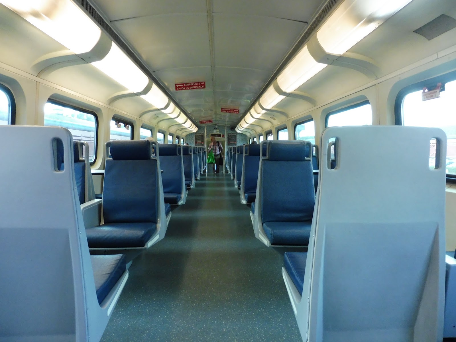 |
| The inside (of the top deck, of course). |
 |
| Okay, that’s kind of cool. |
 |
| Not as cool. |
 |
| A river crossing. |
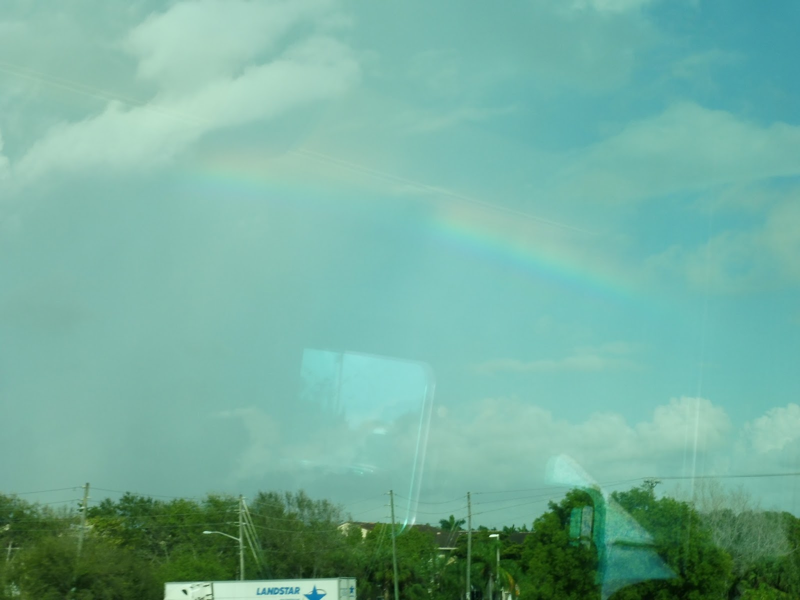 |
| Okay, okay, this rainbow was fantastic. |
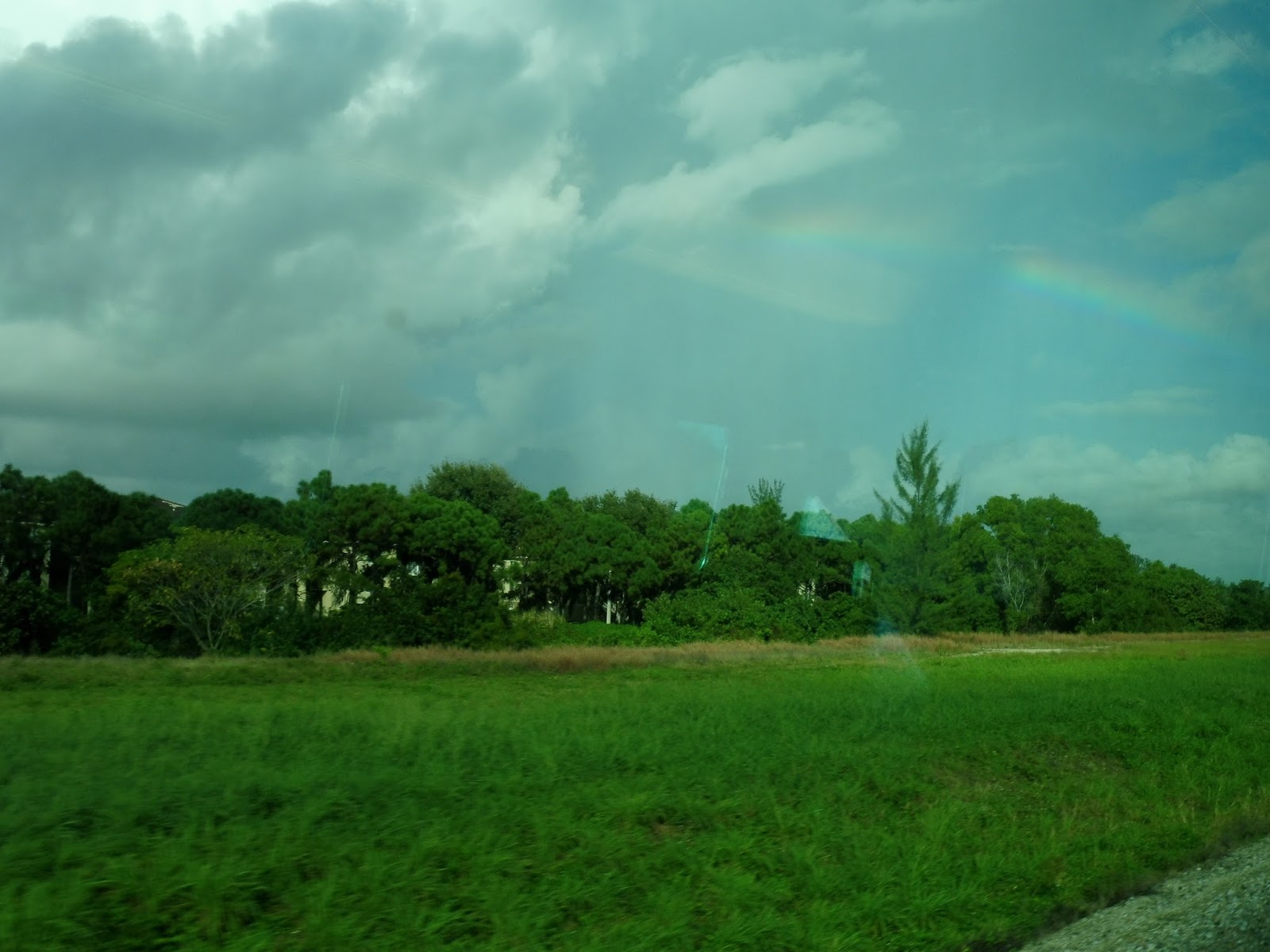 |
| A field with the rainbow over it. |
 |
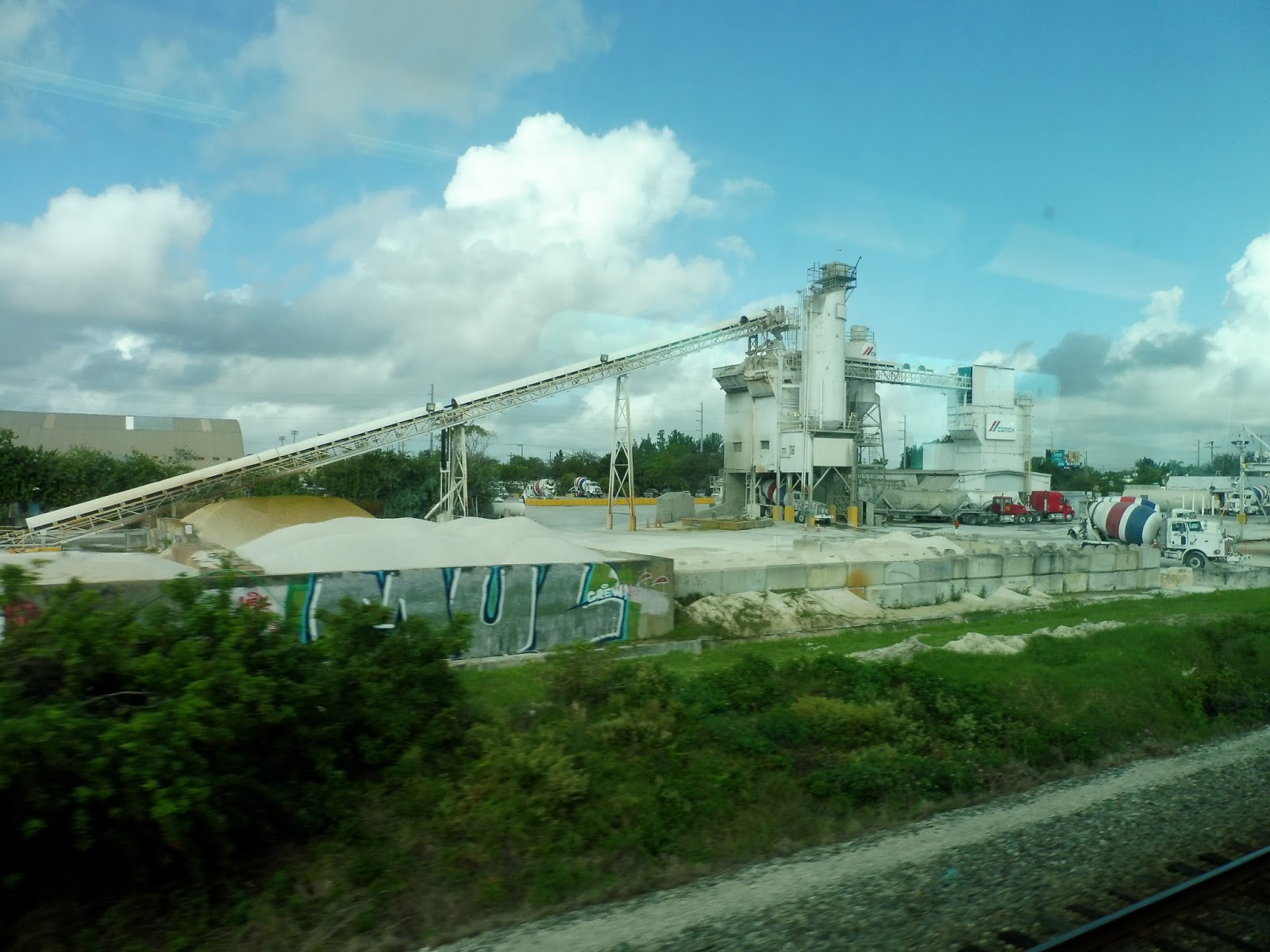
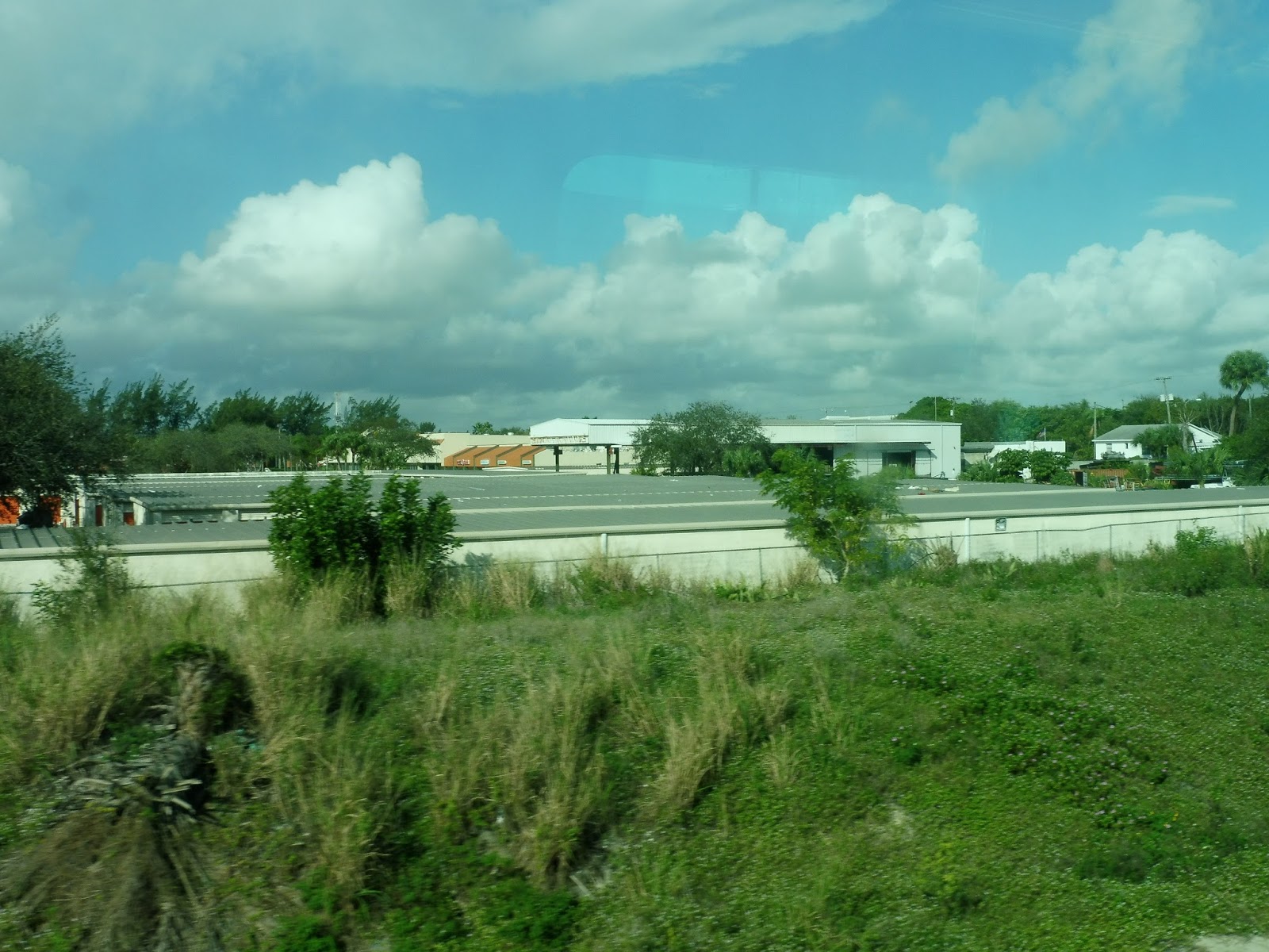
| More industry. |
 |
| Some shrubbery. |
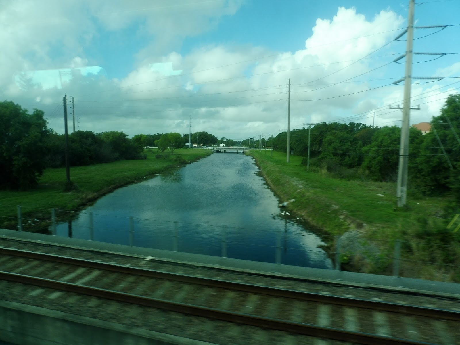
North of Boynton Beach, it tipped more over to the residential side, with the train going by the backs of many houses. But after Lake Worth Station, the surroundings were once again industrial. The houses came back for a bit, and then we ran alongside a canal, which was interesting.
 |
| An office park! That’s…variety… |
 |
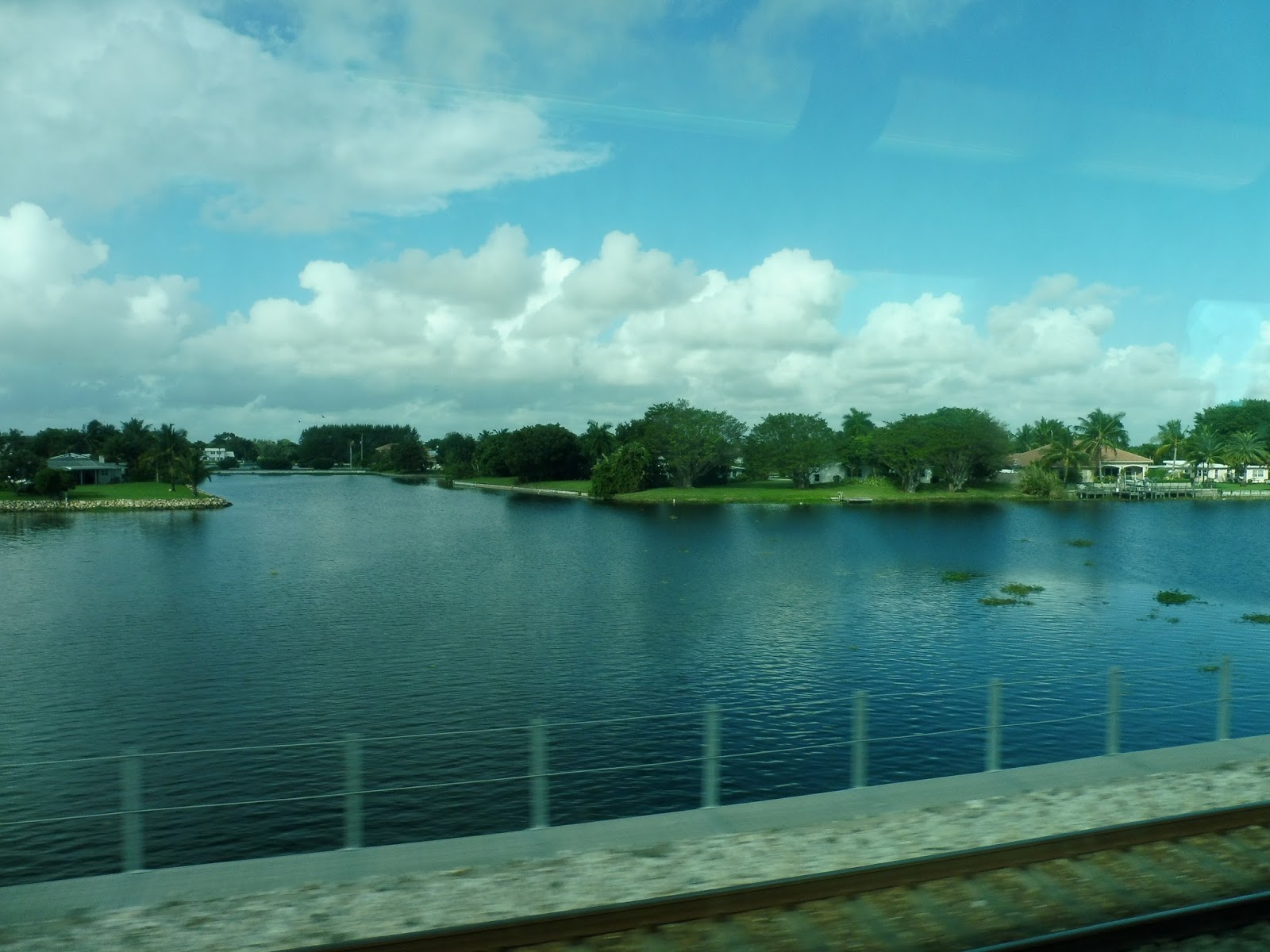
| Another open space. |
 |
| Man, this level crossing really caused a traffic jam! |
 |
| The top of a warehouse or something. |
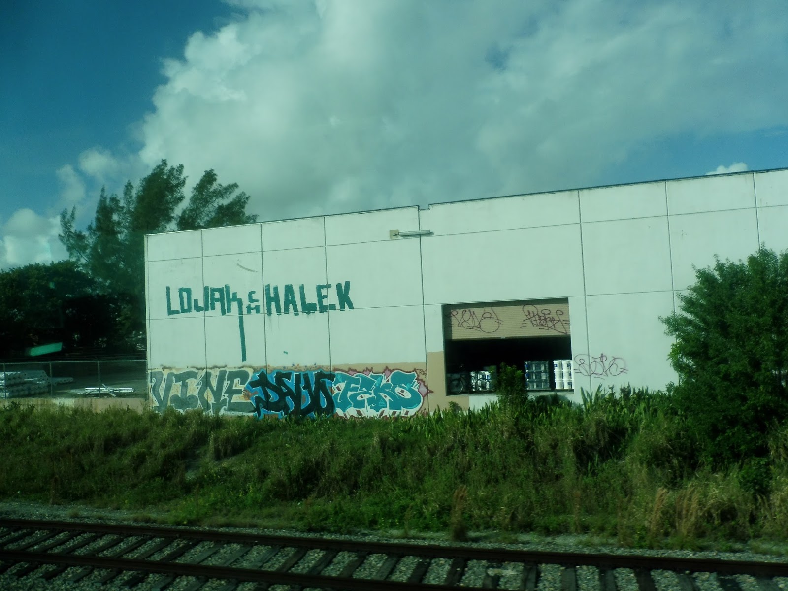 |
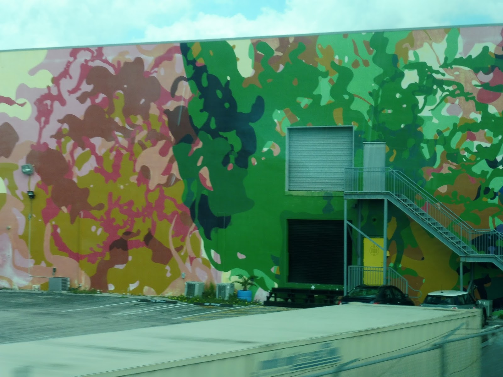
| Interesting graffiti… |
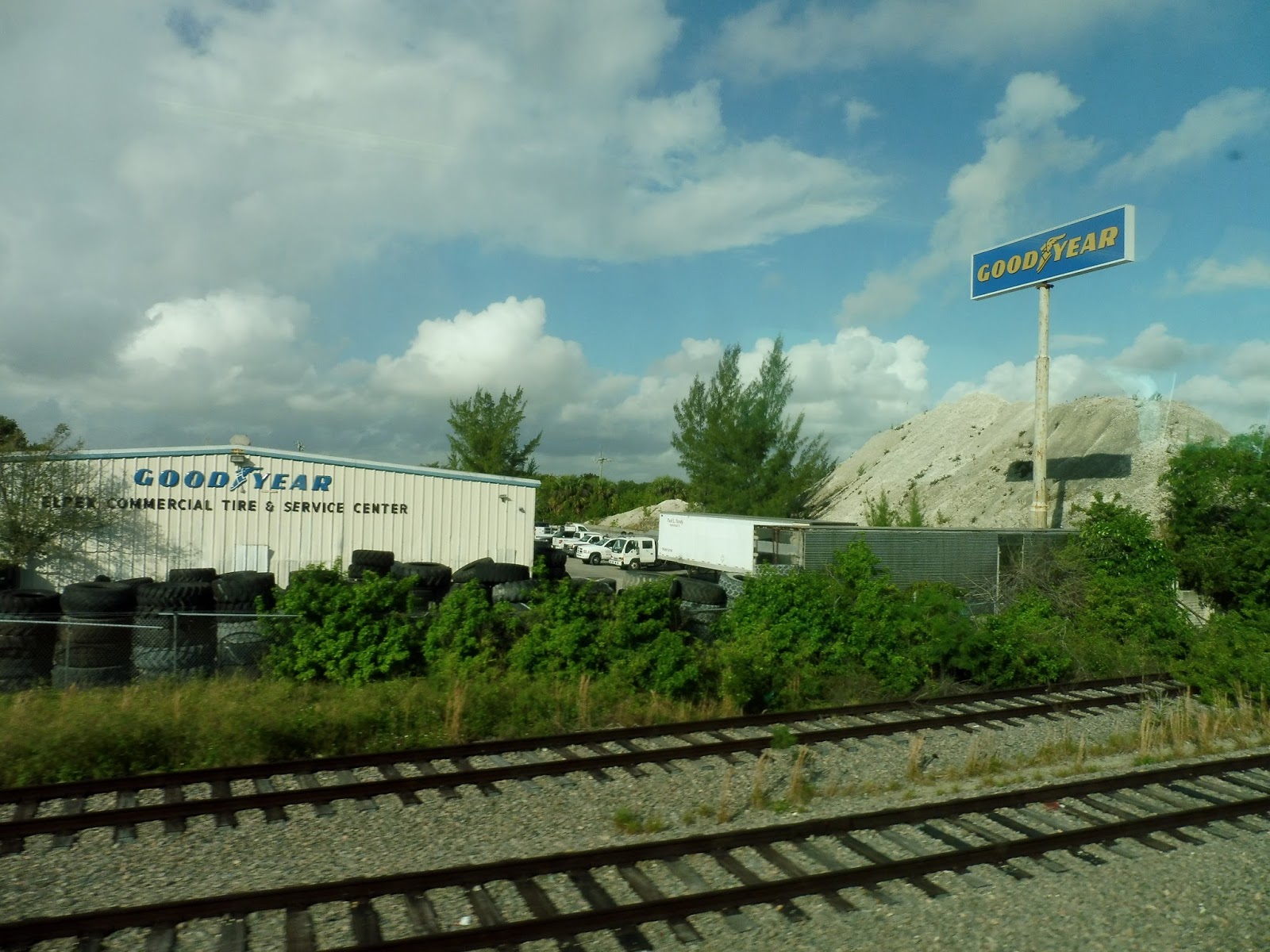 |
| A tire company. |
 |
| Looks like there’s some mining going on. |
 |
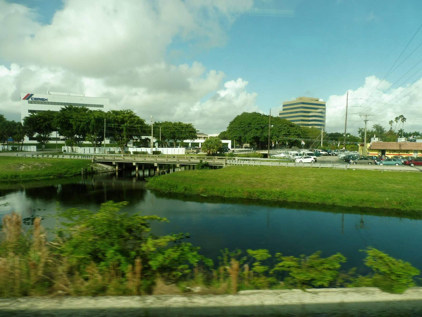
| Okay, this is pretty nice. |
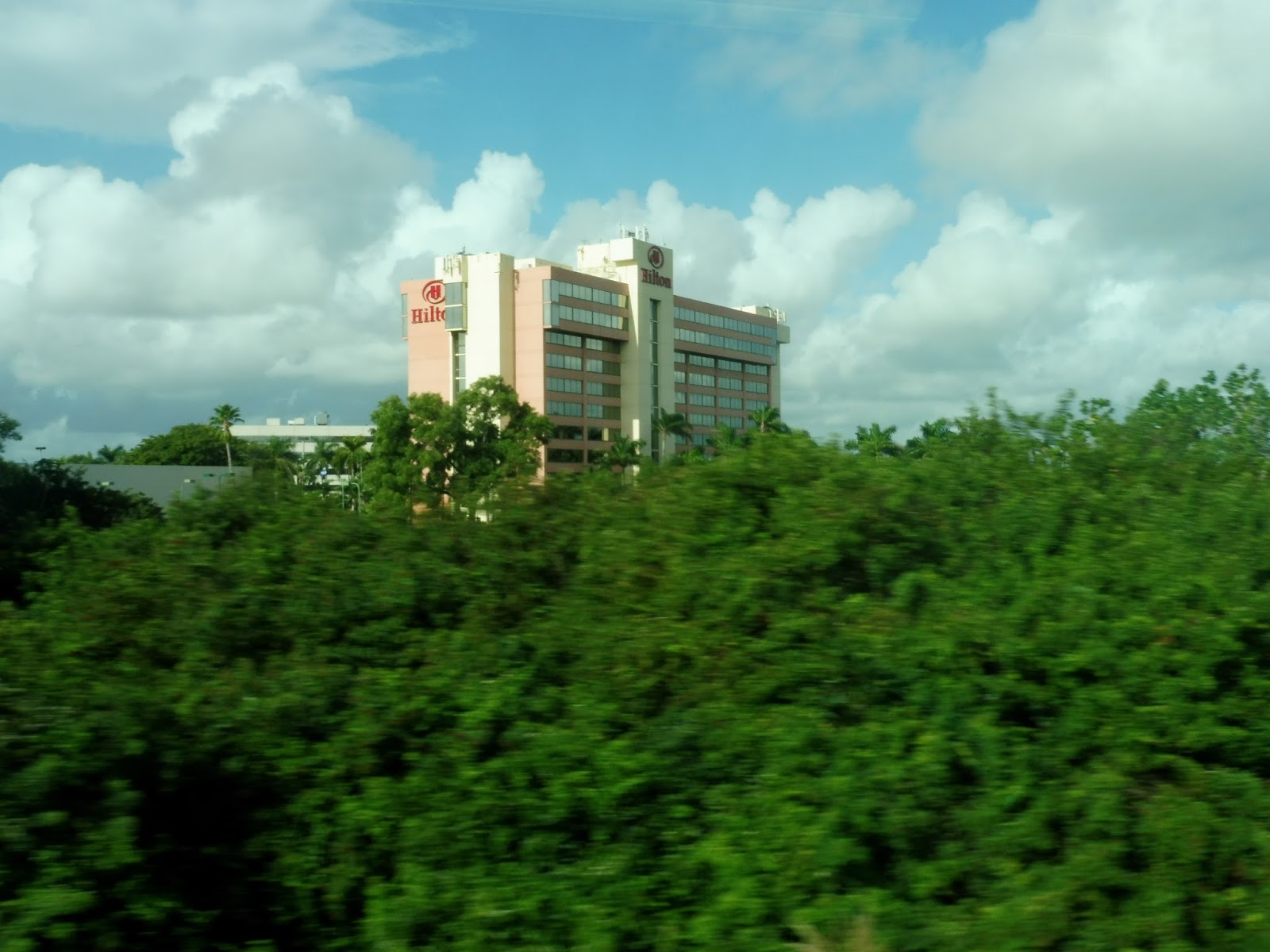 |
| A hotel popping out of the trees! |
 |
| Nice view! |
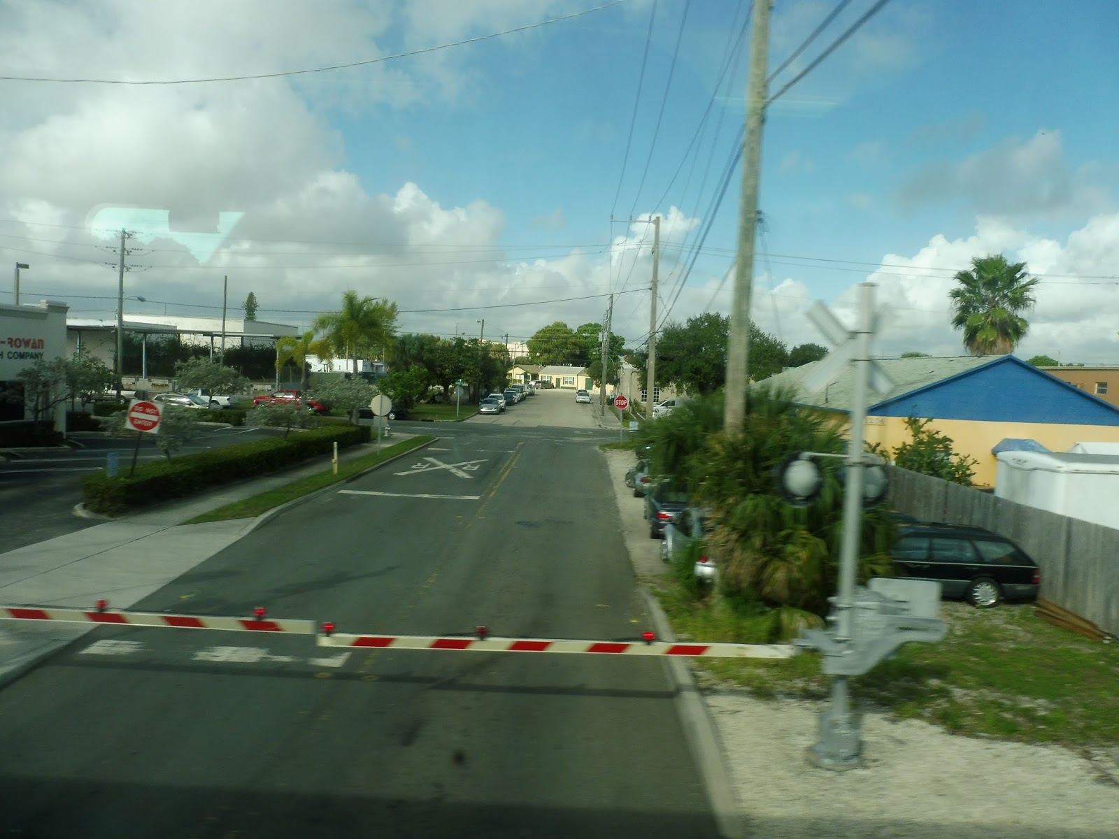 |
| A smaller level crossing. |
 |
| An intriguingly-colored building. |
 |
| Some distant high-rises. |
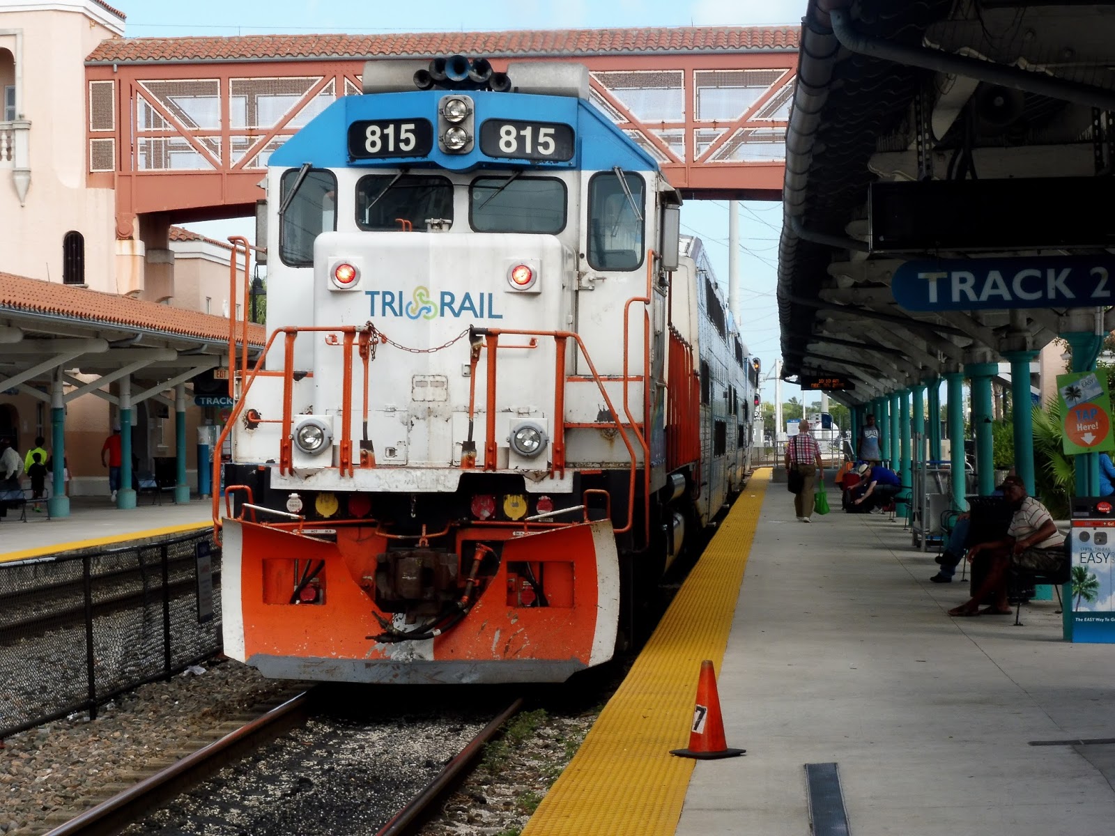 |
| The train leaving West Palm Beach. |
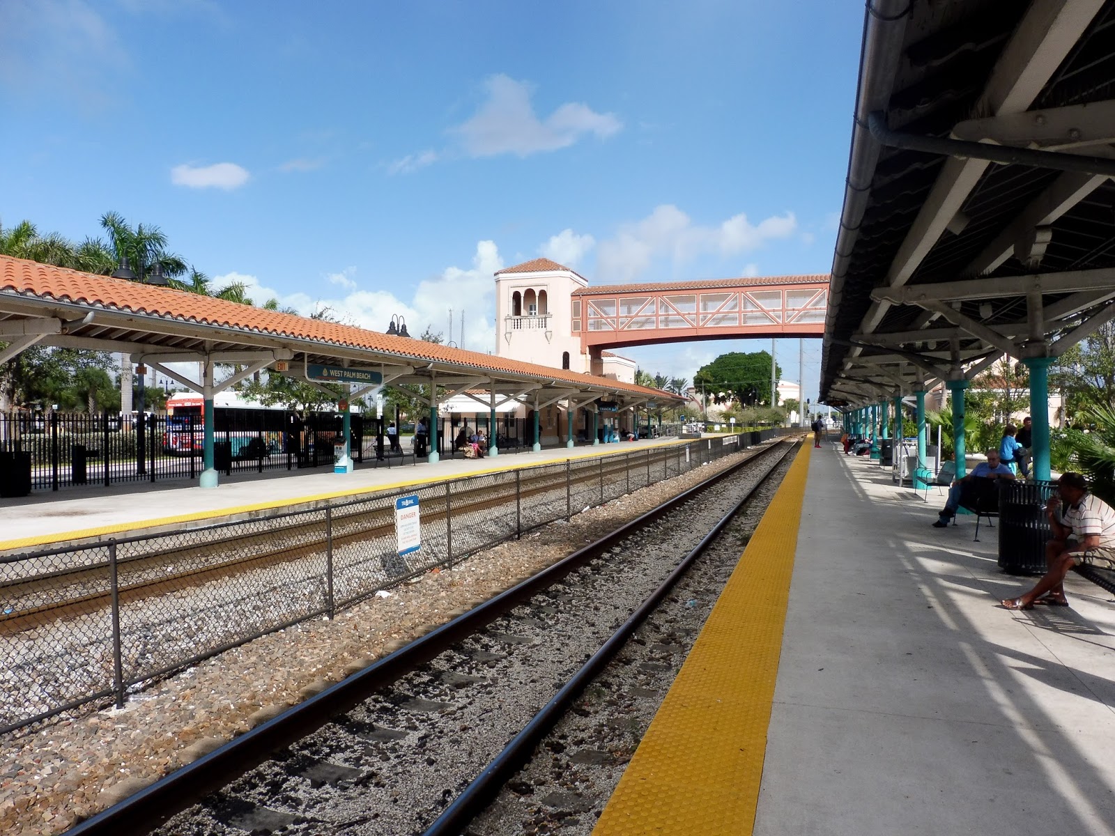 |
| Looking down the station. |