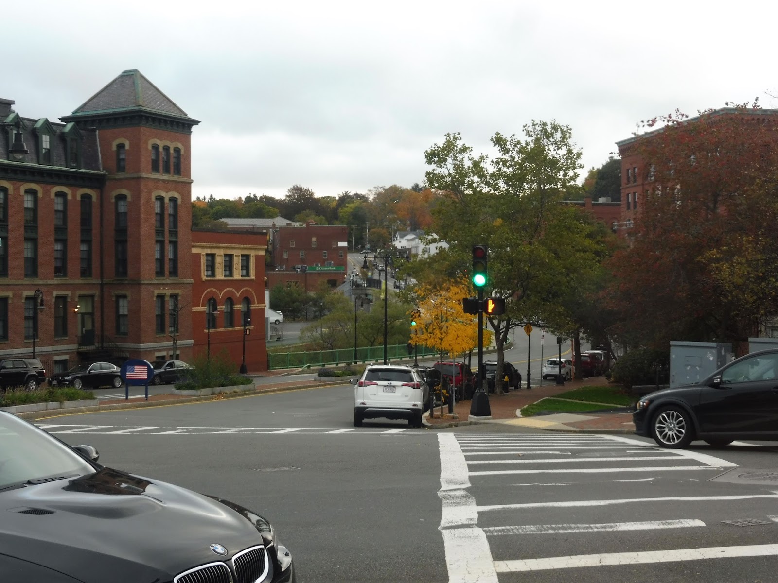
GUEST POST: Canton Center
Here’s the second of Eric Sanford’s two Commuter Rail posts. Thanks again, Eric!
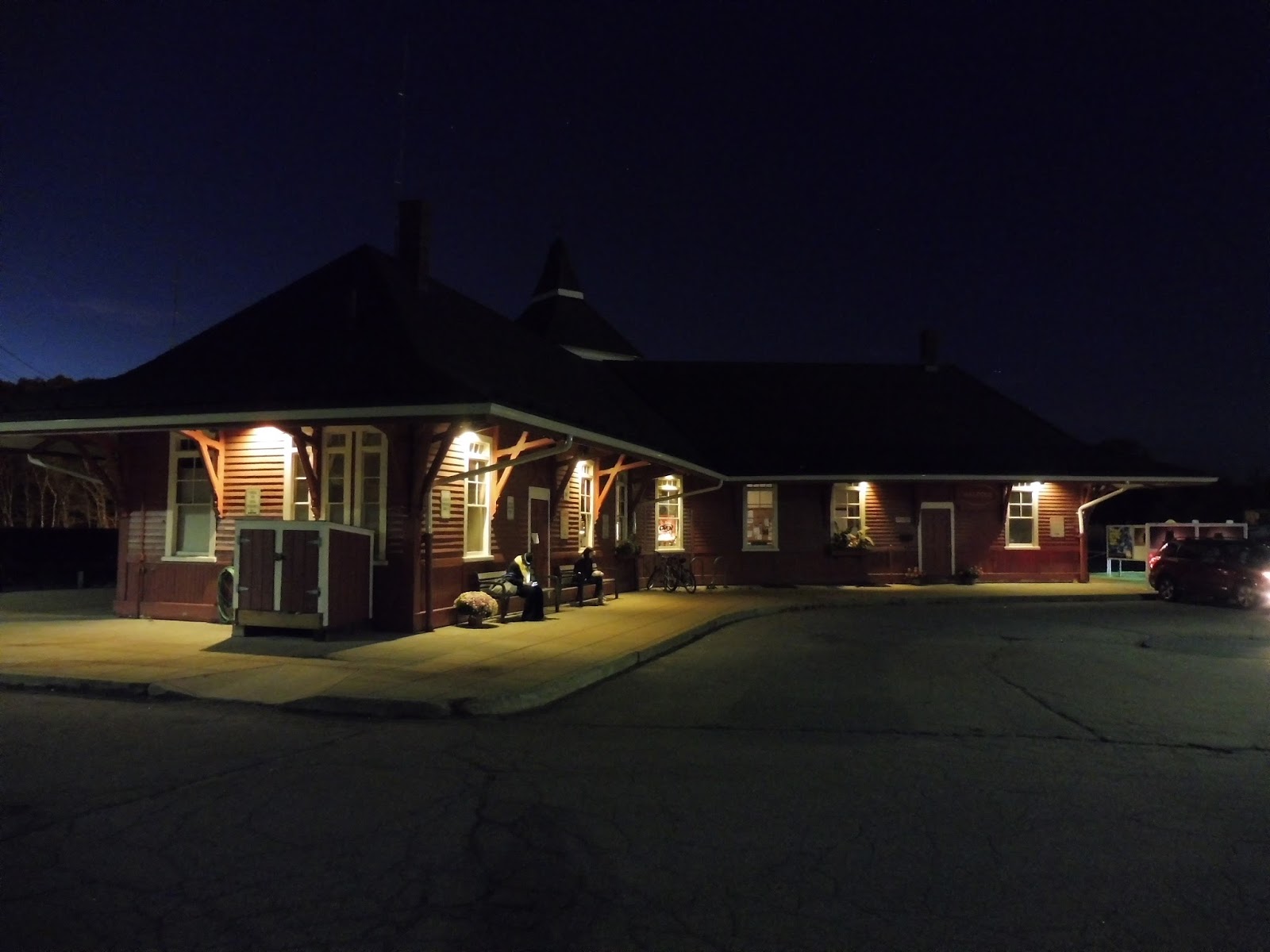
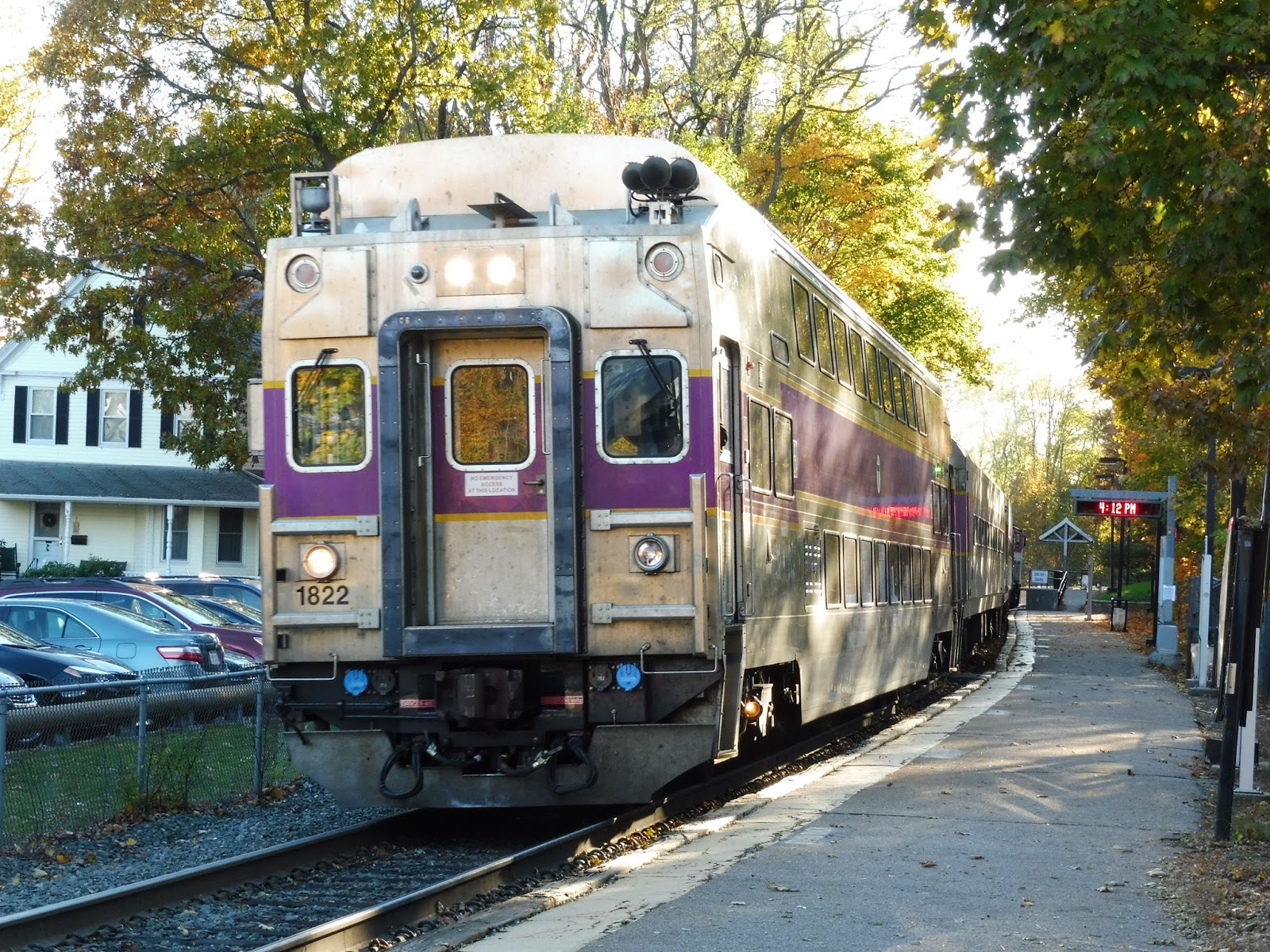
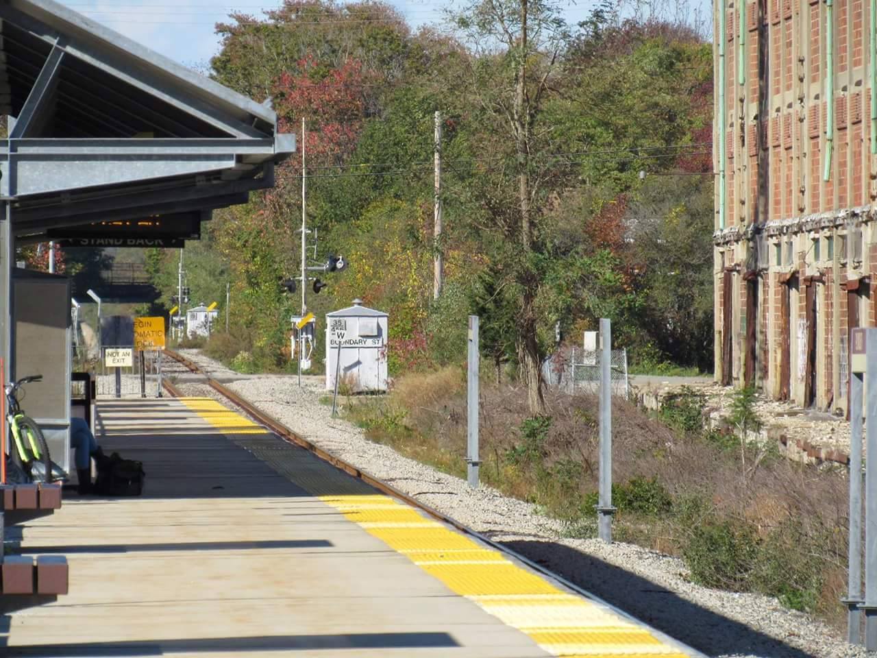
Welcome to Canton Center, an average Stoughton Line Commuter Rail station. This station is right smack in the middle of Canton Center. You could even walk right out into the center from here. Ok, lets march our way into specifics.
 |
| A view of the station. |
Here at Canton Center, there is a low platform and a mini-high platform, just like any typical Commuter Rail station. It contains the minimum necessities to run a station: newspaper stands, wastebaskets, benches, etc….. It even has a bike rack to hold up to 10 bikes.
 |
| A close-up view of the bike rack and newspaper stands. |
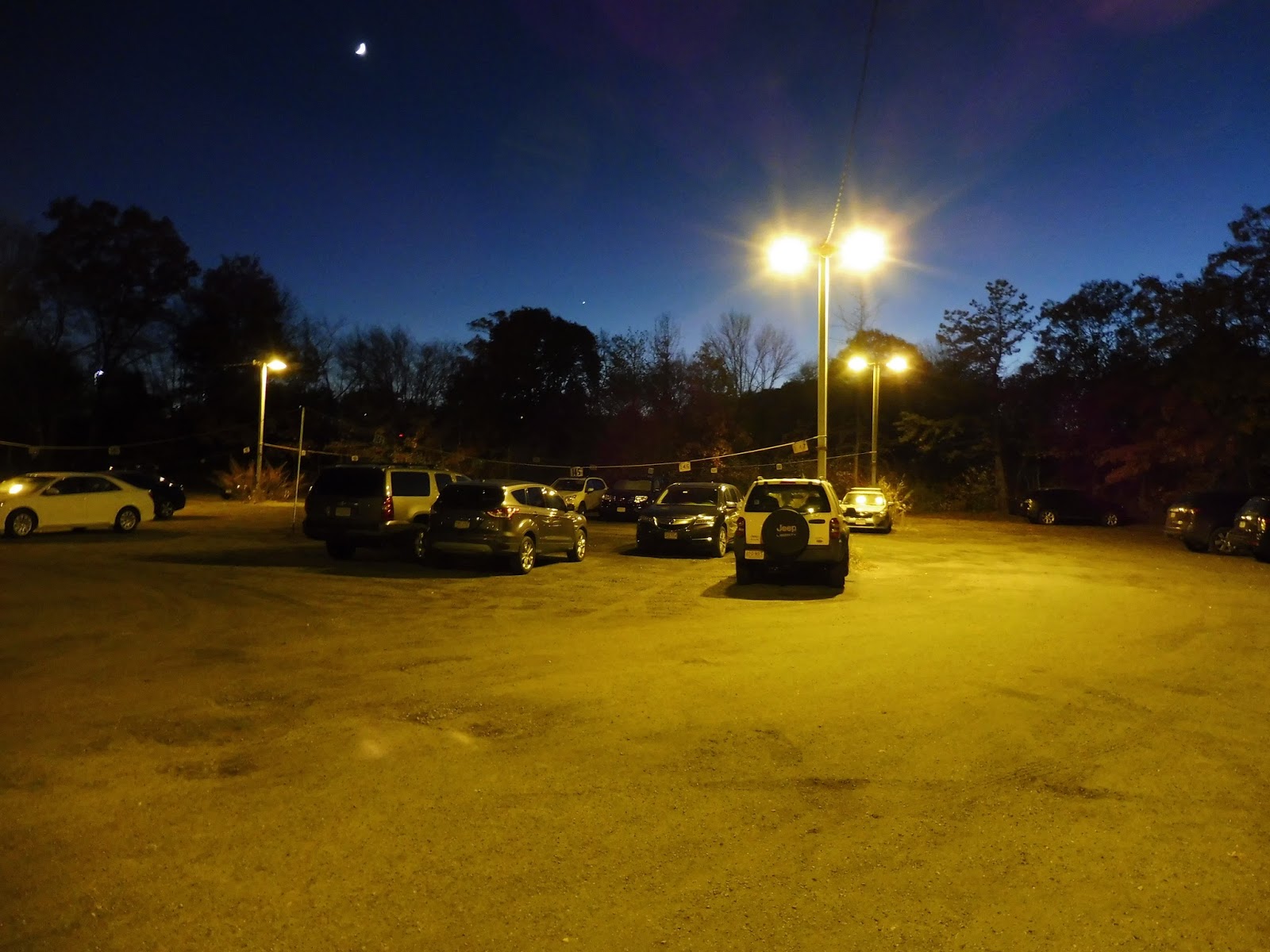
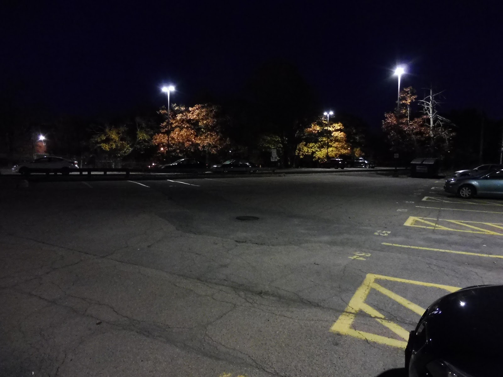
In terms of parking, there are 215 spaces total including handicapped spaces – don’t worry, the station does serve the handicapped. That’s a lot of spaces, considering that it’s in the center of Canton. That’s why the station is named “Canton Center”, after all. During a weekday, parking gets to capacity. On an average weekday, the station gets an average of a whopping 1,113 passengers per day. What a busy station that’s deteriorating!!!
 |
| Wow, parking lot abundance! |
 |
| On the other hand, the high platform looks terrible along with the rest of the platform… |
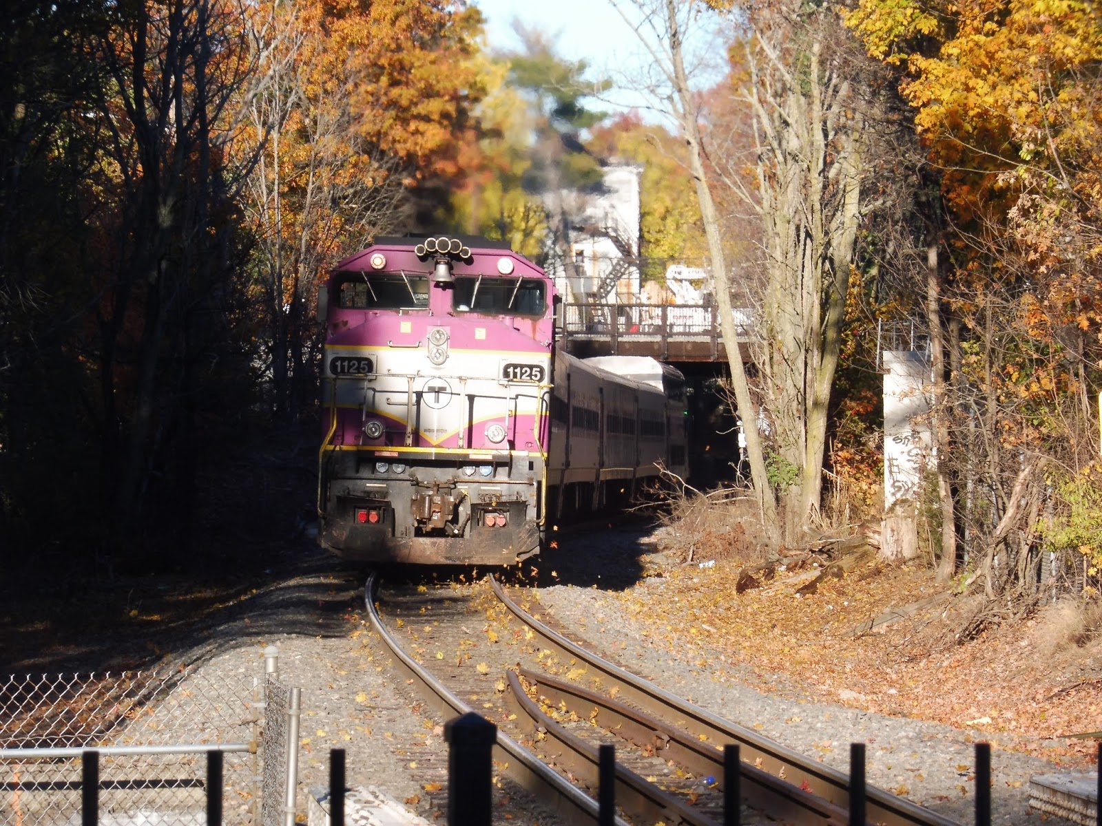
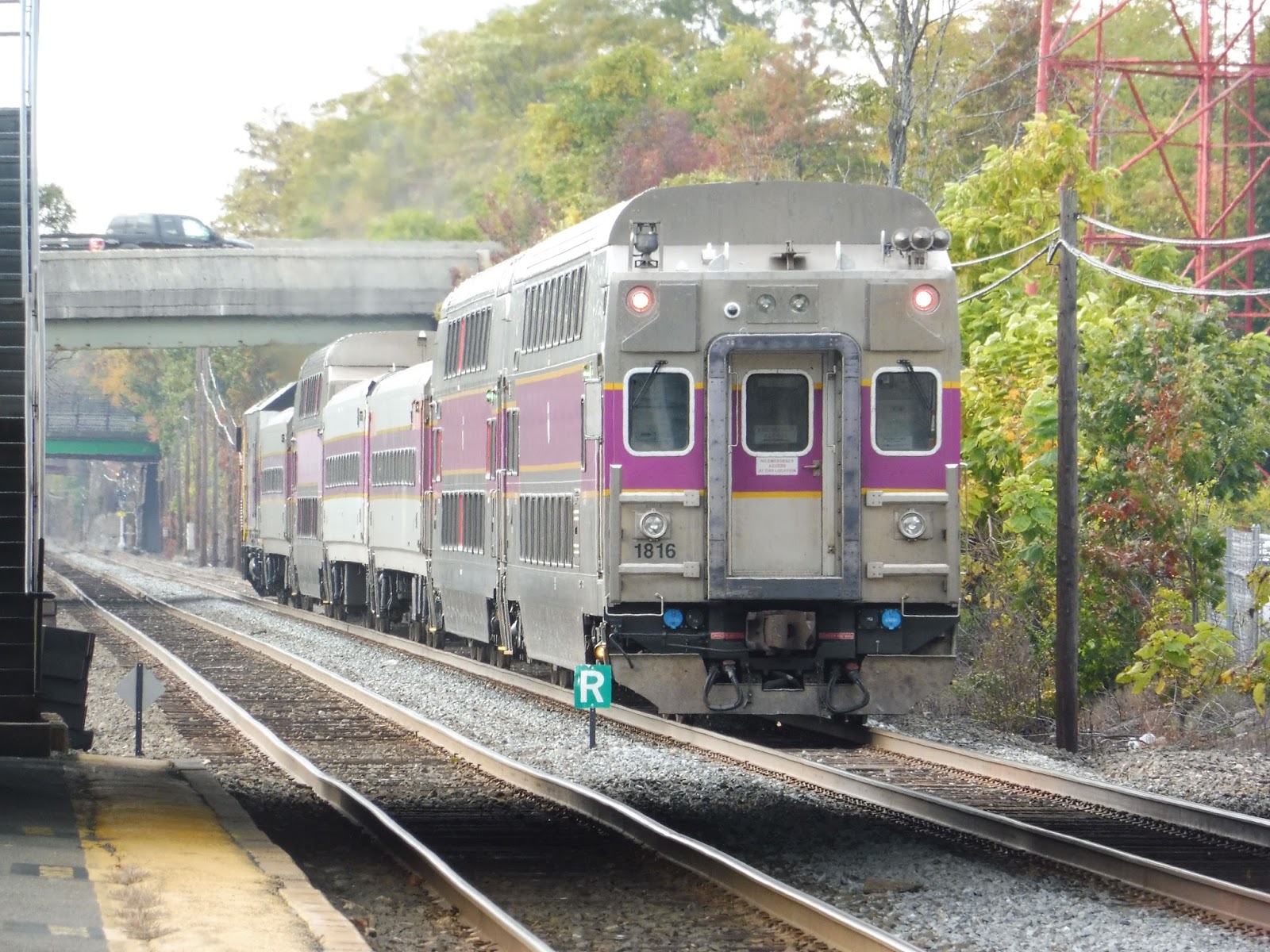
 |
| Geometry train passing thru! |
 |
| Hi, Canton Junction. Lovely foliage! |
Station: Canton Center
Pros: Yes, yes I know that the station is in deteriorating conditions, but it is used by lots of locals that live around here. It has the basic needs to run a station just like Norwood Depot does. The abundant parking spaces for vehicular passengers is excellent!!! It receives a total of 4-5 peak rush hour trains per day along with midday and late evening trains too. Plus stores and restaurants are in walking distance from the station.
Cons: Ok this station has a couple of obvious problems. One is that the mini-high platform is not sheltered and has no benches. The other thing that really bugs me is that the platforms are disgusting. Just look at the high platform picture, it looks like no one has ever thought about refurbishing them to make it look more presentable and well maintained!! Most MBTA stations are like that anyways!!
Final verdict: 7/10
Yes, the station has the basic needs. Fixing the deteriorating platforms and adding a shelter over the high platform would benefit passengers, especially during inclement weather. On the other hand, people can always wait in their vehicles until the train approaches. Oh well, at least passengers use it, the primary goal of having a station.
GUEST POST: Norwood Depot
Eric Sanford sent me a few Commuter Rail reviews for the blog – here’s the first one, Norwood Depot. Thanks, Eric!
Welcome to Norwood Depot, a station along the Franklin Line. It’s not the nicest station on the line, but at least it is used. Ok, let’s get down to specifics.

 |
| Oh look, a bike rack! The station features a bike rack right next to the inbound mini-high platform, which is convenient. |


 |
| Yay, more parking! |
 |
| The Patriots Train passing thru Norwood! |
 |
| Hey, you can even see Norwood Central down the tracks from here! |
Final Verdict: 8/10
Yes, the station has its basic needs to run as a proper station. On the ugly side, it could use some more maintenance and proper care to keep it presentable and well maintained. Other than the tiny flaws it plagues, it does the job!!
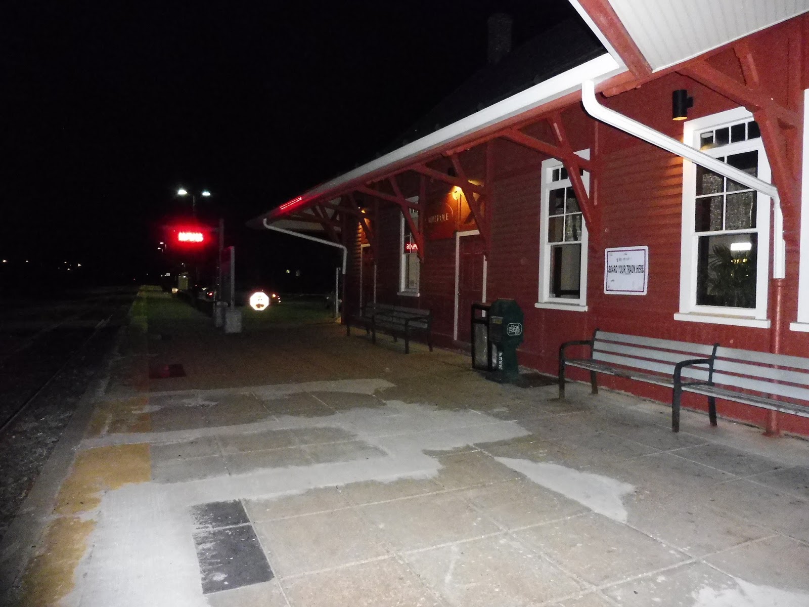
Walpole
What a strange, unique station this is. And being here at night just made it even weirder! Today we’re looking at Walpole, and continuing with the Franklin Line tradition of most stations being completely distinct, Walpole is situated in the middle of a crazy industrial railroad junction. Intrigued? So am I.
 |
| What the heck is this parking lot??? |
Let’s start off with the first of many weird things about Walpole: the Elm Street parking lots. The one pictured above seems to be more of an overflow lot than anything, as it’s not paved – however, it has an old honor box at its entrance, so I assume it’s MBTA. It’s also one of the strangest MBTA lots I’ve ever seen, what with the ropes hanging from the lights with (presumably) the space numbers on them.
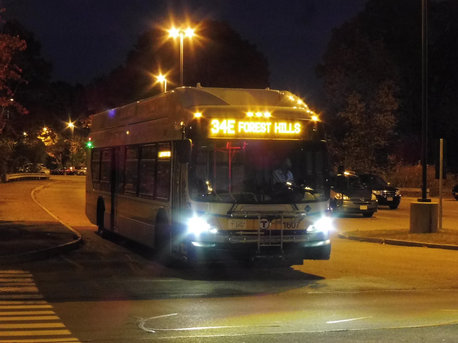 |
| A new 1600 bus on the 34E exiting the station! |
But then there’s the actual paved lot, which is just as weird. Firstly, there’s a fairly small section right next to the street, which also includes the 34E stop. (Imagine that you can ride the bus from here to Forest Hills for 2 bucks!) The bus stop is pretty bad, but other than that, it seems like a normal lot…until you notice the road that leads further into the woods.
 |
| The desolate Elm Street Lot proper. |
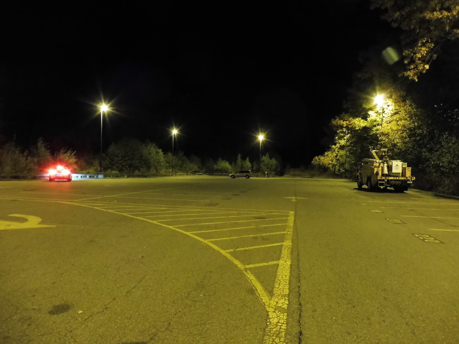
The road goes over the Neponset River and past a few more parking spaces (sans sidewalks, I must add), before opening up into…another lot? Yes, there’s an Elm Street Lot part 2! Or 3, I guess, if you include the overflow one. It’s a fine lot, I guess, but it’s just so far from the station itself! And like I mentioned, there are no sidewalks on the connector road.
 |
| That is…dark. |
 |
| Well, well, well. |
Who wants to talk about more parking lots? Yes, Walpole has one final lot, and it’s a complicated one. See, the station is located within a rather complicated four-way railroad junction, and one of the tracks goes right through the lot. This requires a level crossing and some interestingly-placed spaces. Overall, the station has 343 in total, which doesn’t seem like that much considering how many darn lots it has! It’s enough, though – they get about 2/3 full on the average weekday.
 |
| The station building. |
Walpole’s red building is really charming. It kinda looks like a fancy house! Also interesting is the way it’s situated in the corner of the railroad intersection. Along the parking lot, there are some sheltered benches where people can wait to be picked up (as seen above), as well as potted plants, which add a nice touch of charm to an already charming building.
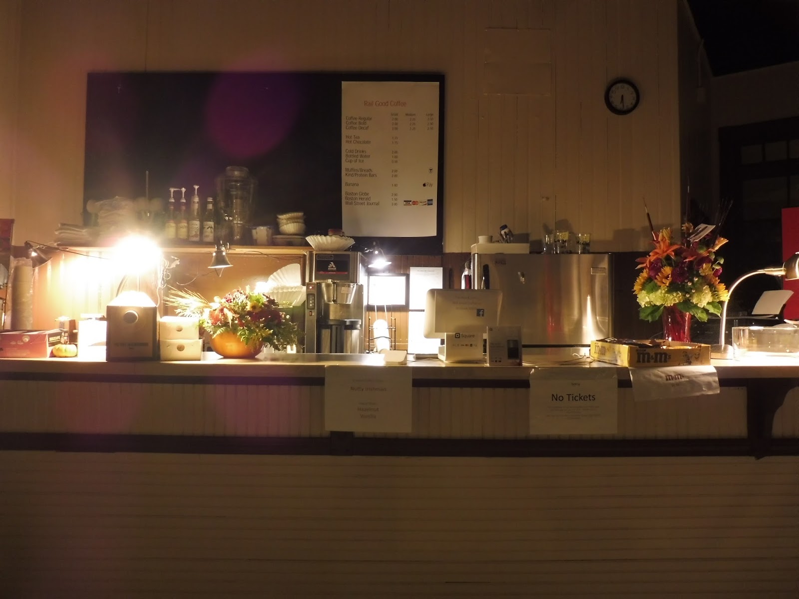 |
| Looking inside the building. |
Ahhhh, but the building has an inside, too, and it’s a good one! Unfortunately, it’s only open during the morning rush, but man, it must be a nice place to wait. The main attraction is the amusingly-titled “Rail Good Coffee”, which offers drinks and pastries for rather cheap prices.
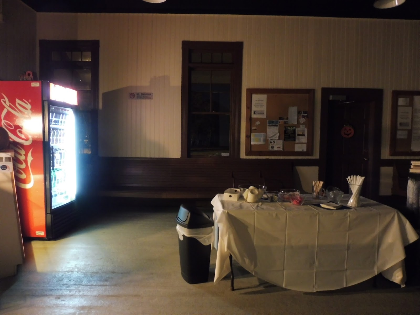 |
| Kinda eerie, isn’t it? |
What else does the inside have to offer? Well, you’ve got some benches, a community board, a wastebasket, and a table with a bunch of stuff on it! Okay, I think it’s just boring stuff like straws and sugar, from what I can see. But still, this building is fantastic!
 |
| The platform. |
Walpole’s platform definitely has its good points and its bad points. For the good, there are benches underneath the shelter of the building, along with a few wastebaskets and newspaper boxes. On the bad side, the platform cement isn’t in the best shape, and the whole thing is low-level – no accessibility here.
 |
| This is a strange thing to see… |
So, remember how I mentioned that this station is in the middle of a huge railroad intersection? Well, one of the strangest parts about it is right at the end of the platform: a diamond crossing! Yes, the Commuter Rail track crosses right over a freight track here, and it’s…weird. You just don’t expect to find this kind of thing at a station!
 |
| Oh! Hey there, CSX. |
Another side effect of Walpole being in the middle of a railroad intersection is that there’s all this industrial stuff visible from the platform. It seems to be a popular place for freight trains – a CSX locomotive was hanging out on one of the curves, while another train was further down the intersecting track. It was strangely pleasant to wait here with the CSX loco growling in the background.
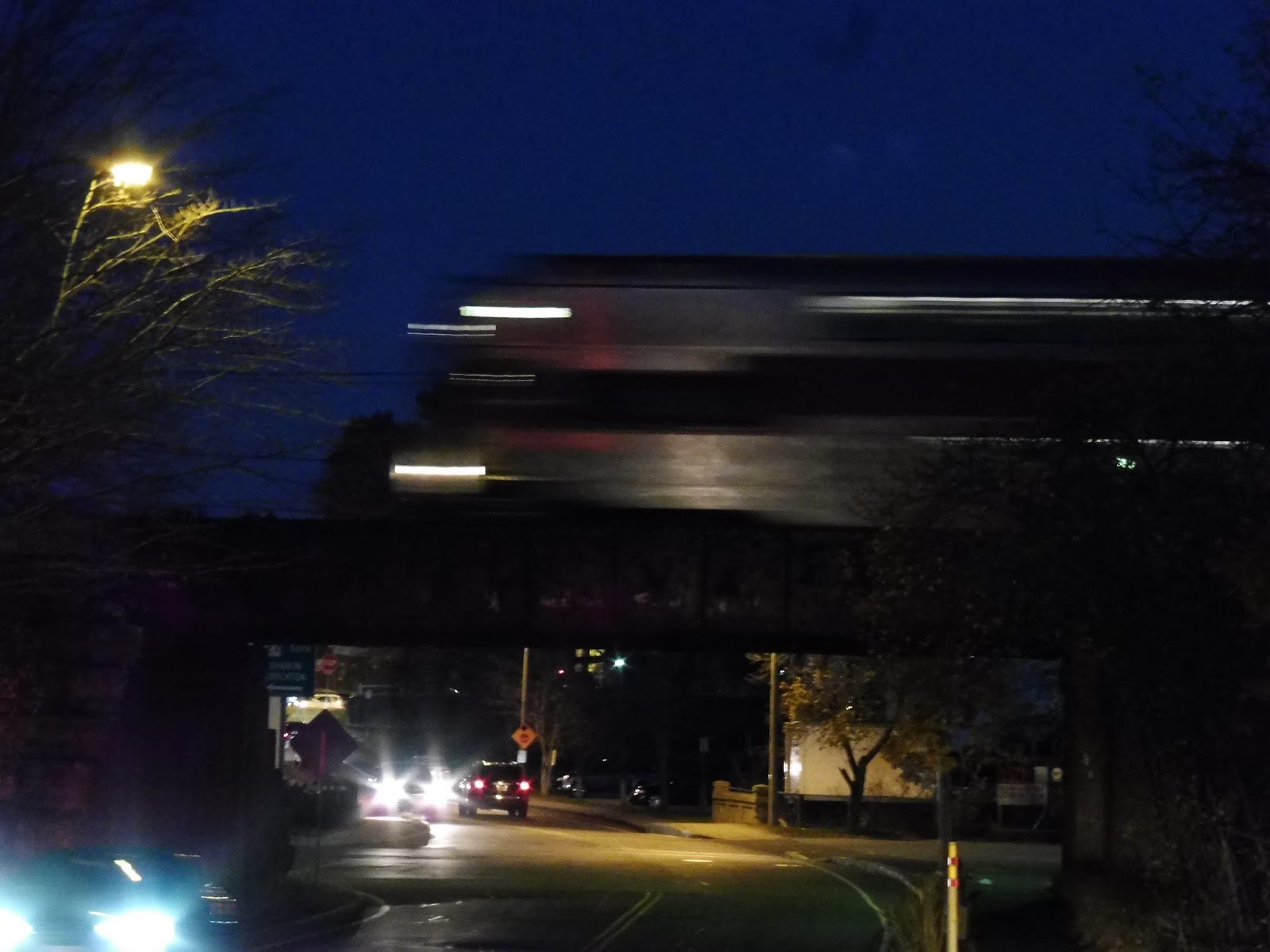 |
| A train zooming over the Elm Street overpass. |
But I can’t end this review before talking about the crazy experience Sam and I had here. You see, there were some…problems on the Franklin Line that night. That meant we had to wait on the desolate platform for about an hour longer than we had hoped. We even had a run-in with a rather questionable person, but eventually the train came – a double-draft, too, with two sets stuck together! The conductor didn’t even collect fares, which just seemed to emphasize the craziness of the Franklin Line that night.
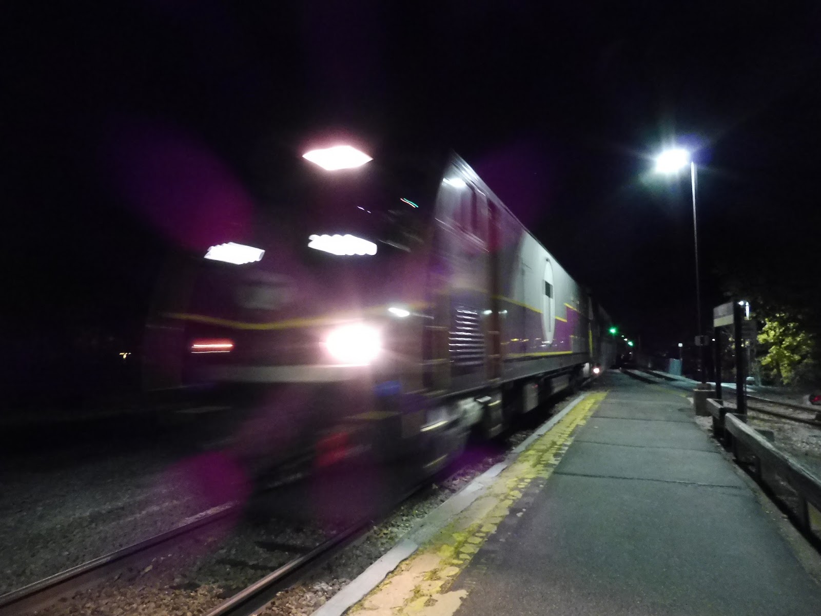 |
| There are many blurry train pictures in this review… |
Station: Walpole
Ridership: Lots! As the second-busiest station on the Franklin Line after Norwood Central, Walpole gets 945 inbound riders per weekday. and it’s one of those stations that gets way more people than parked cars – that always makes me happy.
Pros: It’s just a really quirky place! The diamond crossing, the industrial yard, the weird out-of-the-way parking lots…this is definitely a unique station. Also, the building is quite charming, and seems to be of great use to rush hour commuters in the morning.
Cons: Big thing: it’s not accessible. Considering how well-used this station is (I believe it’s the second-busiest inaccessible Commuter Rail station after Natick Center), some sort of mini-high platform would be great. Also, the Elm Street lot is really inconvenient for passengers, as they have to walk quite a distance to get to the station itself. How about a random solution? The 34E runs to the back of the lot to turn around…what if a stop was added back there and people could use the bus as a free shuttle to get to the front of it? It’s a bit crazy, but certainly not difficult to implement!
Nearby and Noteworthy: You’ve got Walpole Center right nearby, with a good amount of stores and restaurants to keep you busy, if you so desire.
Final Verdict: 7/10
I would feel bad giving an inaccessible station anything higher than a 7 – although of course, I’m sure some diligent reader will point out a multitude of times in which I’ve done that, but I like to think I’ve followed some sort of moral standard for the past four years! Seriously, though, Walpole is a super interesting station, and if you have any interest in freight trains or just quirky Commuter Rail stations, it’s a cool place to check out.
Latest MBTA News: Service Updates
West Roxbury
Alright, let’s finish up the Needham Line! Let’s do it! WOOOOOOOOOOOO! WEST ROXBURY IN DA HOUSEEEEEEEEEE!
 |
| The station parking lot. |
There’s a nice little road that leads up to the West Roxbury parking lot from Lagrange Street. The lot has 62 spaces, and that’s a good amount for a small neighborhood station like this. For pedestrians, meanwhile, stairs lead up onto both sides of the track crossing over Lagrange. There was bridge construction when Sam and I were here, so it made it a bit harder to get around.
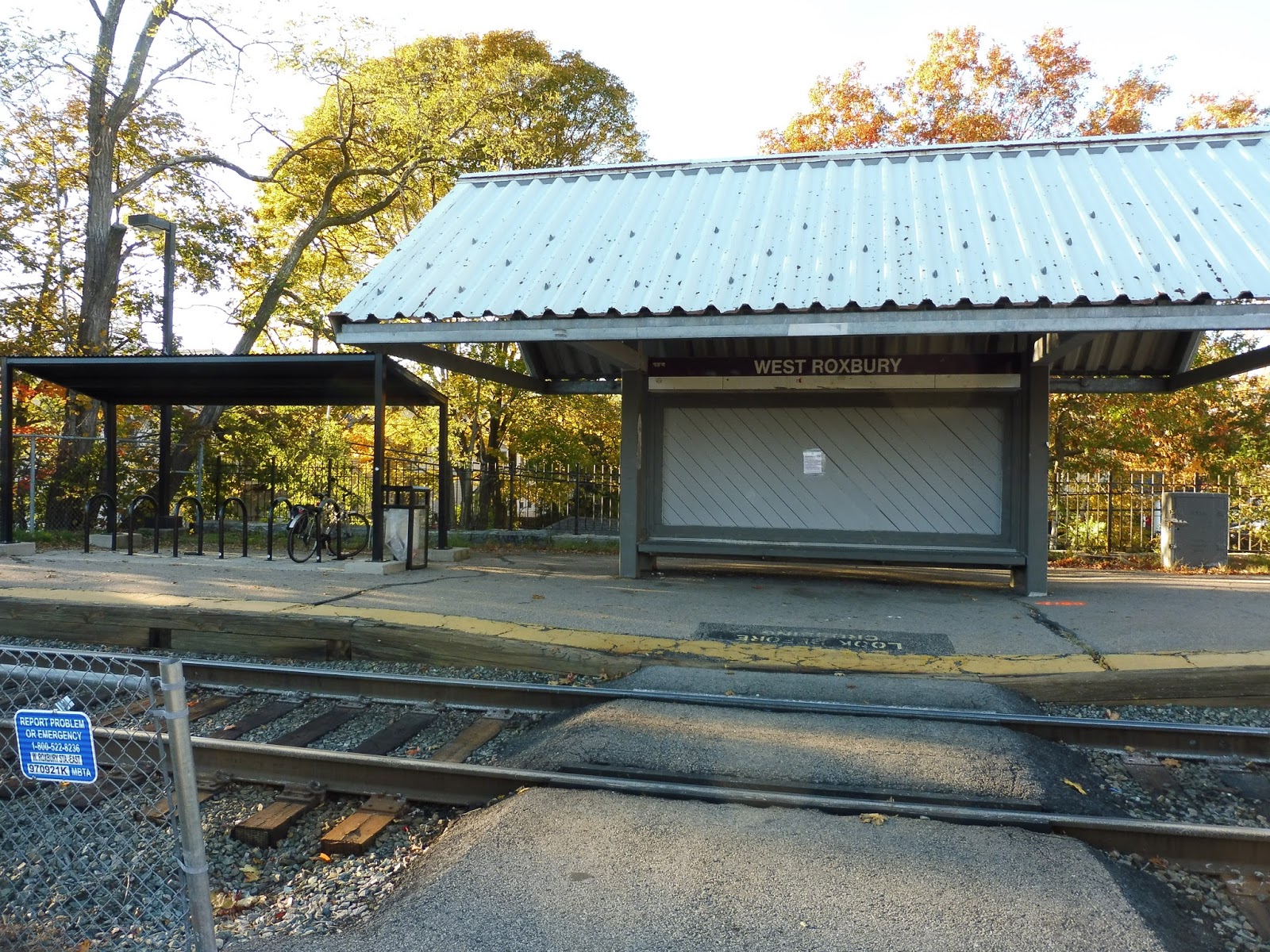 |
| The station shelter. |
West Roxbury’s shelter is veryyyyy typical for the Needham Line. Is it newer? Check. Is it in ugly shape, despite being newer? Check. There’s a bench underneath it, as well as a wastebasket, but what’s interesting is the presence of a separate bike shelter right on the platform. That’s a nice touch!
 |
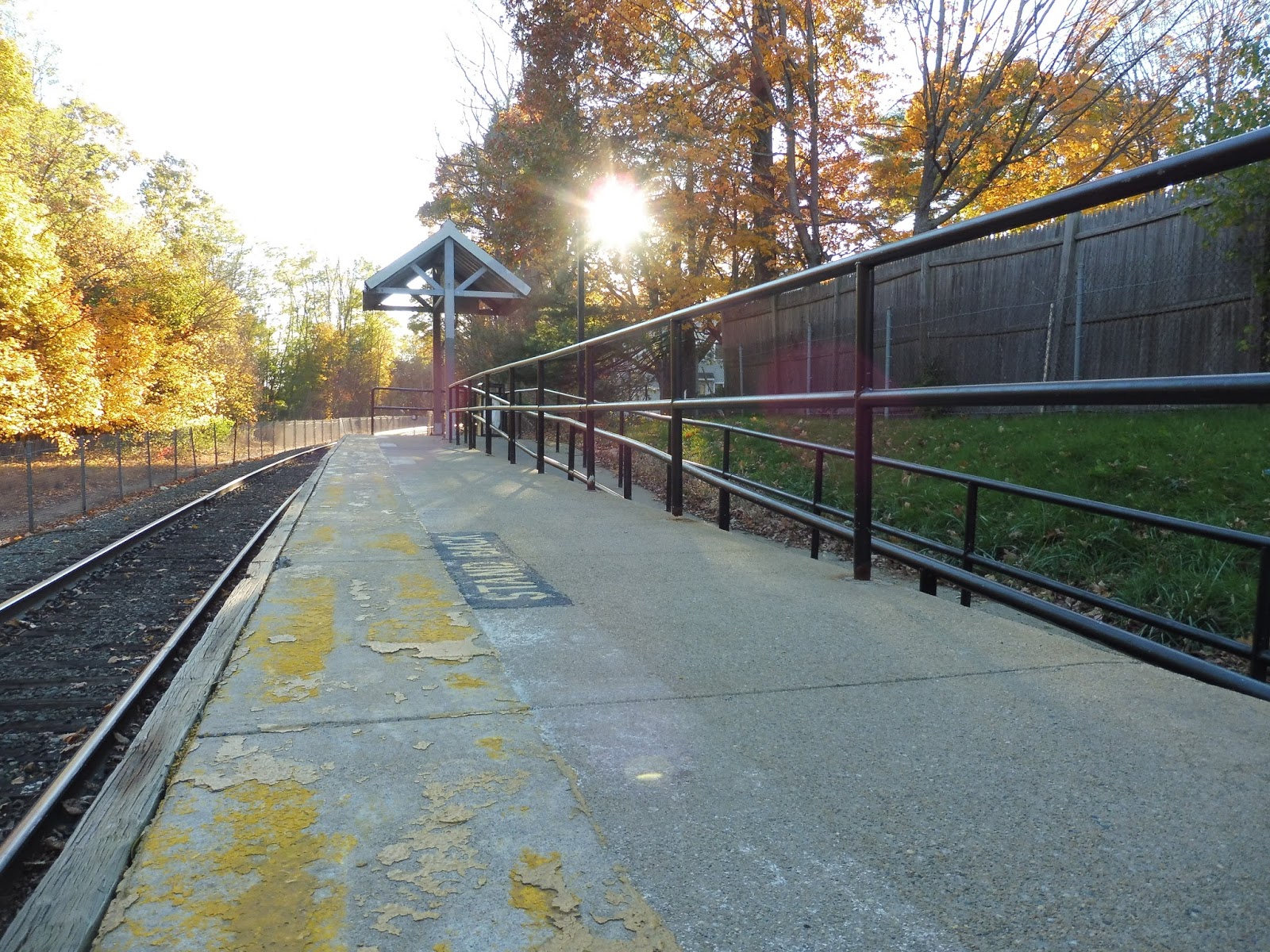
| Wow, this platform is beautiful! |
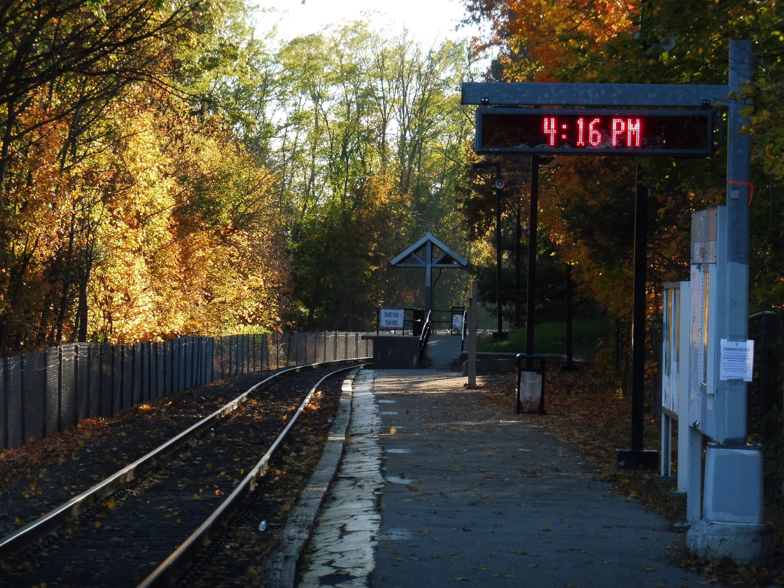
Heading down the single platform, you pass an old “honor box”, a few wastebaskets, a map, a screen, and some ads. Also, you see some beautiful trees – this station has some gorgeous foliage. Finally, there are two more entrances by the end of the parking lot. One is a path that runs alongside the lot to the south, while the other is a staircase that leads to a side street on the other side.
 |
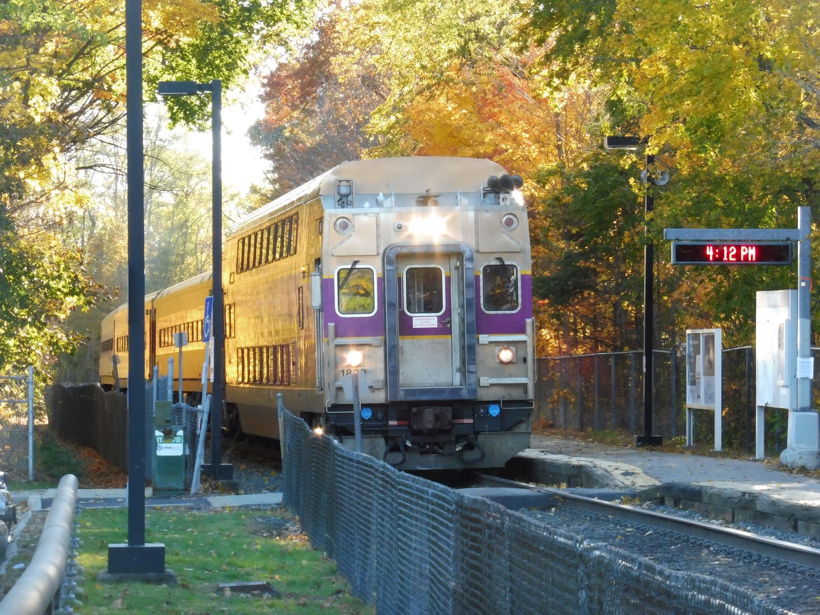
| The sun pokes through the trees onto this rather terrible mini-high. |
Oh yeah…I forgot that all the Needham Line mini-high platforms are horrible. Typical to the rest of the line, the one at West Roxbury is only a tiny shelter at the very end. There’s no bench – only a single wastebasket. What’s more, it’s a long walk from the station’s proper shelter to the high platform, so you might as well stand at the latter, since that’s where you have to board!
 |
| Man, this is a great place to take pictures of trains! |
Station: West Roxbury
Ridership: West Roxbury’s ridership is about average for the Needham Line as a whole, with 409 inbound riders per weekday. This is still pretty good, though, considering that there are three frequent bus alternatives from here, and that the station is really close to Highland.
Pros: Maybe it’s because I came here on a fall day, but this station’s foliage is just beautiful! Other than that, it performs all the expected functions of a Needham Line station, including a good amount of car and bike spaces.
Cons: As usual, it’s a ridiculously long walk to the high-level platform, and that platform has a lot to be desired. Come on, Needham Line! All your stations have this problem!
Nearby and Noteworthy: You can find some small businesses from here by making the short walk to Centre Street, West Roxbury’s main drag.
Final Verdict: 8/10
Well, I gave Highland an 8, and West Roxbury is pretty similar. Although Highland’s mini-high walk isn’t as bad as the one here, West Roxbury strikes back in the beauty department. Don’t get me wrong, both stations are lovely, but West Roxbury is at least equally tranquil to Highland. Plus, this station gets more riders!
Latest MBTA News: Service Updates
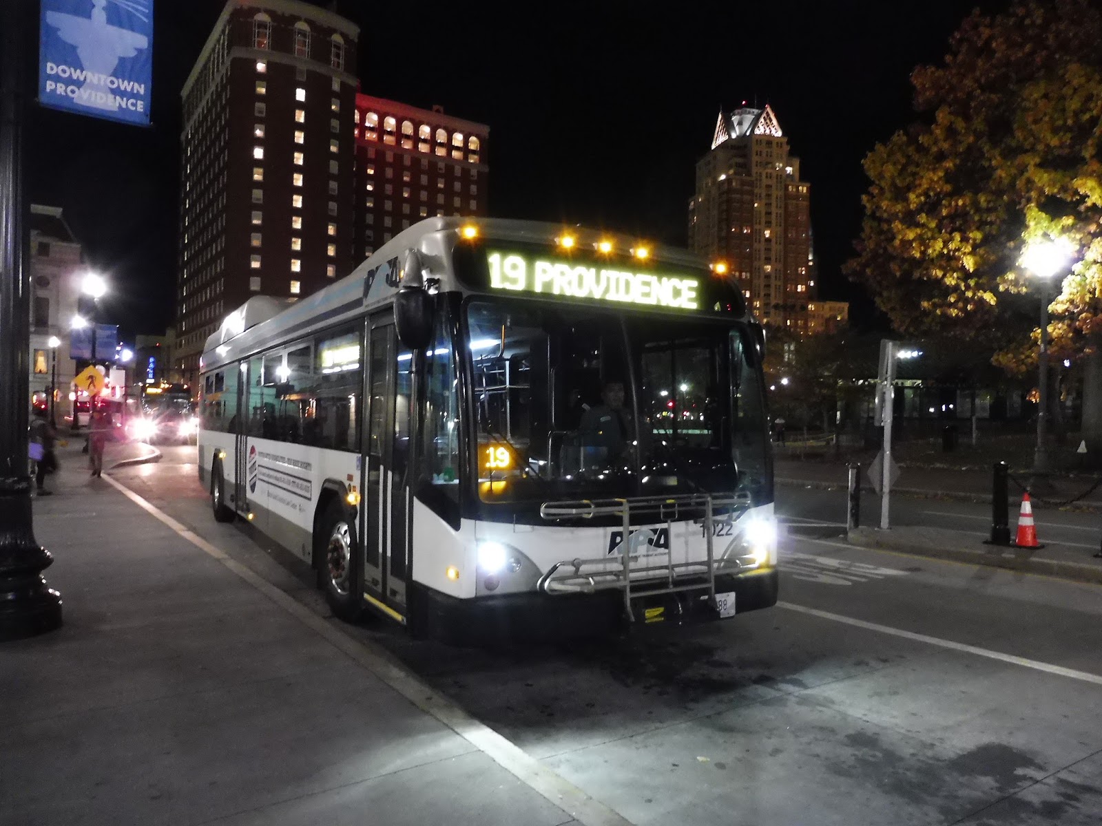
RIPTA: 19 (Plainfield/Westminster)
Okay…I know Walmart contributed to the destruction of American cities and brought everyone out to the suburbs and represents everything wrong with American consumerism and whatnot…but man, they really have everything, don’t they? And for such low prices! The Walmart in Cranston, RI was the first one I had ever been in, and…wow, what an experience! But then I remembered what Walmart did to America and went right back to hating it. Anyway, did you know that there’s also a bus that goes to the Walmart in Cranston, RI? Let’s talk about that.
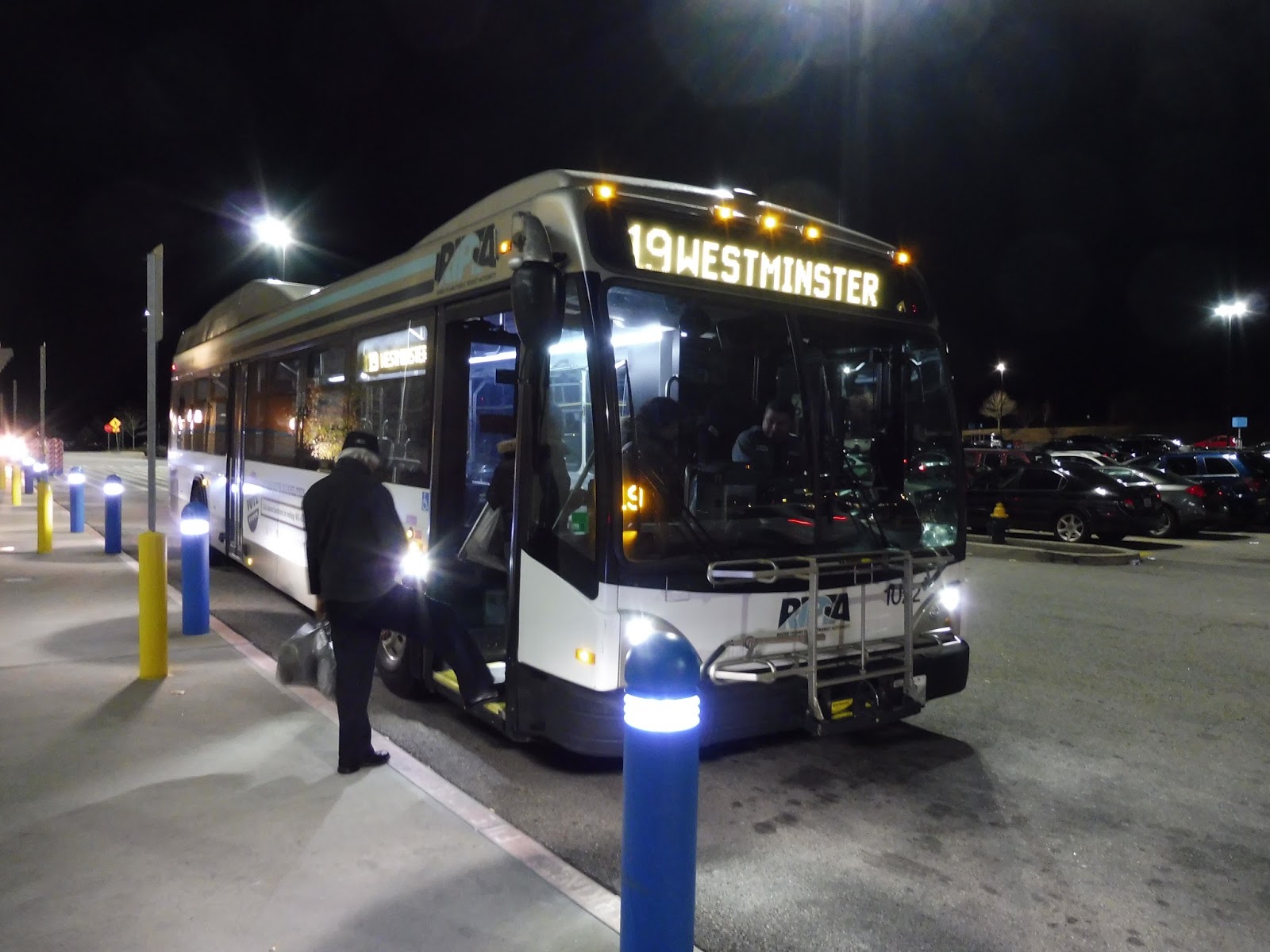 |
| Yes, it’s the 19! Also, don’t ask what my friend Michael and I were doing in Cranston at 6:00 at night. |
This route is basically as simple as running from this Walmart in Cranston back to Providence. So yeah – we headed out of the parking lot and turned onto Plainfield Pike. The road went downhill, playing host to both houses and suburban businesses with parking lots. There was a brief residential neighborhood before we got to the intersection with Atwood Ave, where there was retail on all sides.
 |
| An earlier trip speeding along Plainfield Pike. |
Past that intersection, the road became just Plainfield Street, and it had a bit of an industrial feel. I mean, there were houses and businesses, too, but it just wasn’t a very nice neighborhood. It became entirely residential soon, but it was all broken by a storage place – a clear sign that we were in the suburbs. Unfortunately, it was also the start of another semi-industrial section.
 |
| Beautiful. |
Once again, though, it became houses after a little while. Eventually, we reached a park. where we turned onto…Plainfield Street. Okay, I guess the street decided to take a right, too. Now it was dense, with a lot of houses along the road, interspersed with sketchy-looking restaurants.
 |
| Oh dear, that is not a nice intersection… |
Pocasset Ave merged into Plainfield Street near an apartment building, and we headed under an overpass for Route 6. This took us into Olneyville Square, where we merged into Westminster Street. There were businesses along the road as we headed through the square, then we crossed over the Commuter Rail tracks and under Route 10 in quick succession.
 |
| A few businesses. |
The street was a close mix between houses and random businesses. It continued like that for a good while, actually, before we merged with Cranston Street – now there was a high school and an apartment building on one side, and multistoried brick buildings on the other. We crossed over I-95, then made our way onto Washington Street. We were most definitely in downtown Providence now, with multistoried buildings on all sides. This street led us right into Kennedy Plaza, where the bus let everyone off.
 |
| Those buildings make for a rather pleasant background. |
RIPTA Route: 19 (Plainfield/Westminster)
Ridership: In 2012, the 19 got pretty good ridership, with 1,541 riders per weekday, 980 per Saturday, and 754 per Sunday. Most of these came from the denser part of the route, but a lot of people got on at Walmart, too. This held true for my trip, which only got about 10-15 people, but it was an inbound trip on a Saturday night, so that makes sense.
Pros: This bus serves a lot. The Walmart out in Cranston seems to be a big ridership draw, and a few rush hour trips are extended to the Cranston Industrial Park, so the route definitely has reverse commuting opportunities.
Cons: Aside from the weekday schedule (every half hour), I think the 19 could stand to run a little more often. On Saturdays, it’s every 50 minutes and on Sundays, it’s every 70 minutes. That said, the route is coordinated pretty well with the 17 to provide frequent service along Westminster Street to Olneyville Square, so there’s that.
Nearby and Noteworthy: When I told my band teacher (who’s from Rhode Island) that I took the bus through Olneyville Square, he went “Oh my gosh, that’s the most dangerous neighborhood in Rhode Island! You don’t want to be hanging around there!” So, uh…don’t go to Olneyville Square, I guess. But hey, there’ll always be Walmart!
Final Verdict: 7/10
I was originally going to give this one a 6, but the coordination with the 17 brings it up for me. Most of the 19’s ridership is concentrated on the inner section, and a lot of it is shared with the 17 anyway, so service is more frequent than it looks. That’s not to say that people don’t take the route further, and I would love to see more frequent service in the outer section, but it would just result in less-crowded buses.
Latest MBTA News: Service Updates
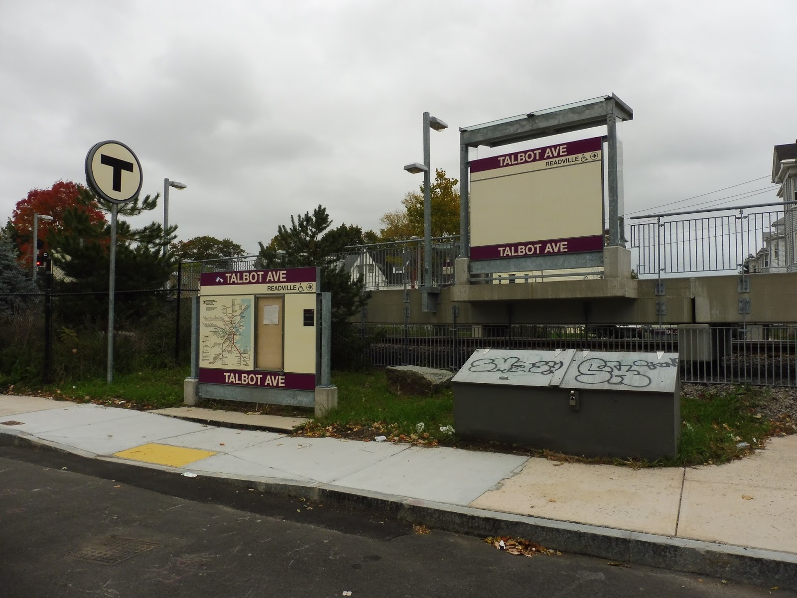
Talbot Ave
When the MBTA was upgrading the Fairmount Line, Talbot Ave was the first new station to open, in late 2012. And, uh, I realized that I’ve been really harsh on the Fairmount Line stations I’ve reviewed so far. Yes, the line itself isn’t the greatest, but the stations really aren’t quite as bad as I’ve say they are. So, with that in mind, let’s look at Talbot Ave.
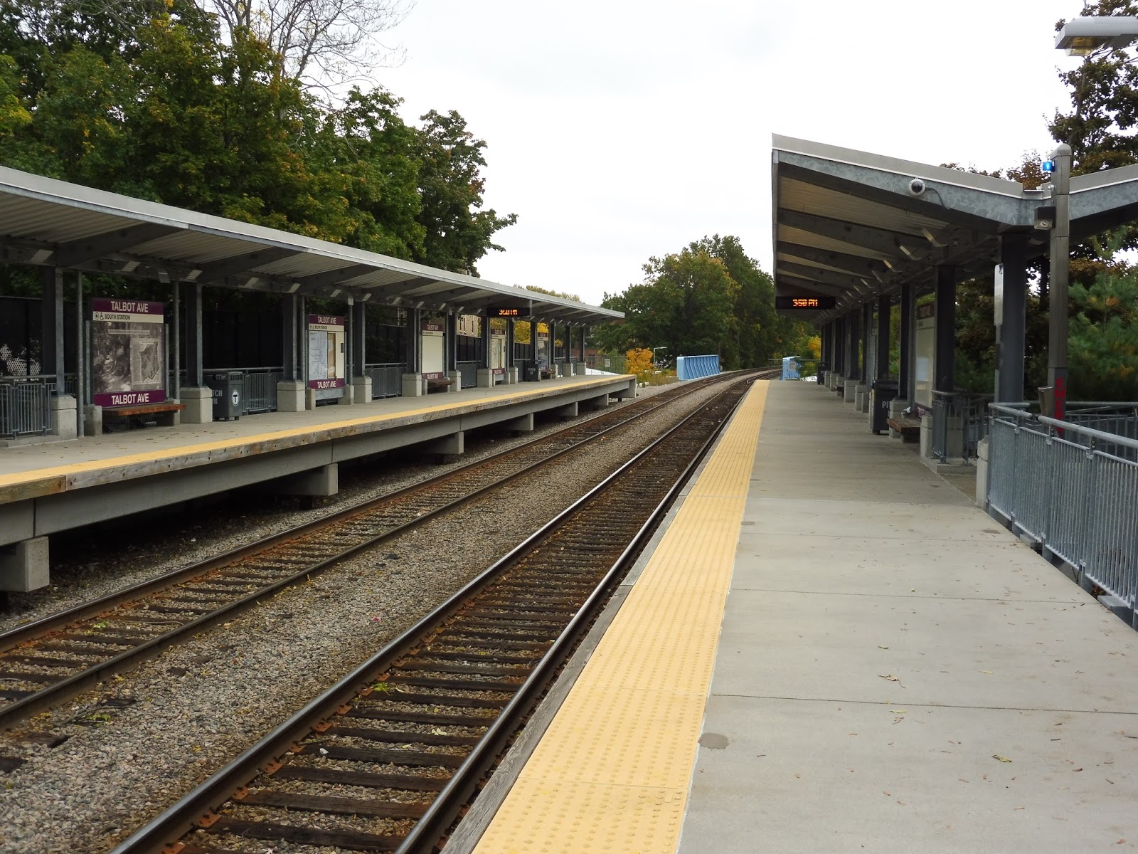 |
| The station platform. |
The main part of Talbot Ave’s platform is pretty standard Fairmount Line fare, but I like it. There’s a large shelter that runs along the southern part of the station, and underneath it, you’ve got benches and wastebaskets. Plus, many of the station signs have cool historical pictures of the area.
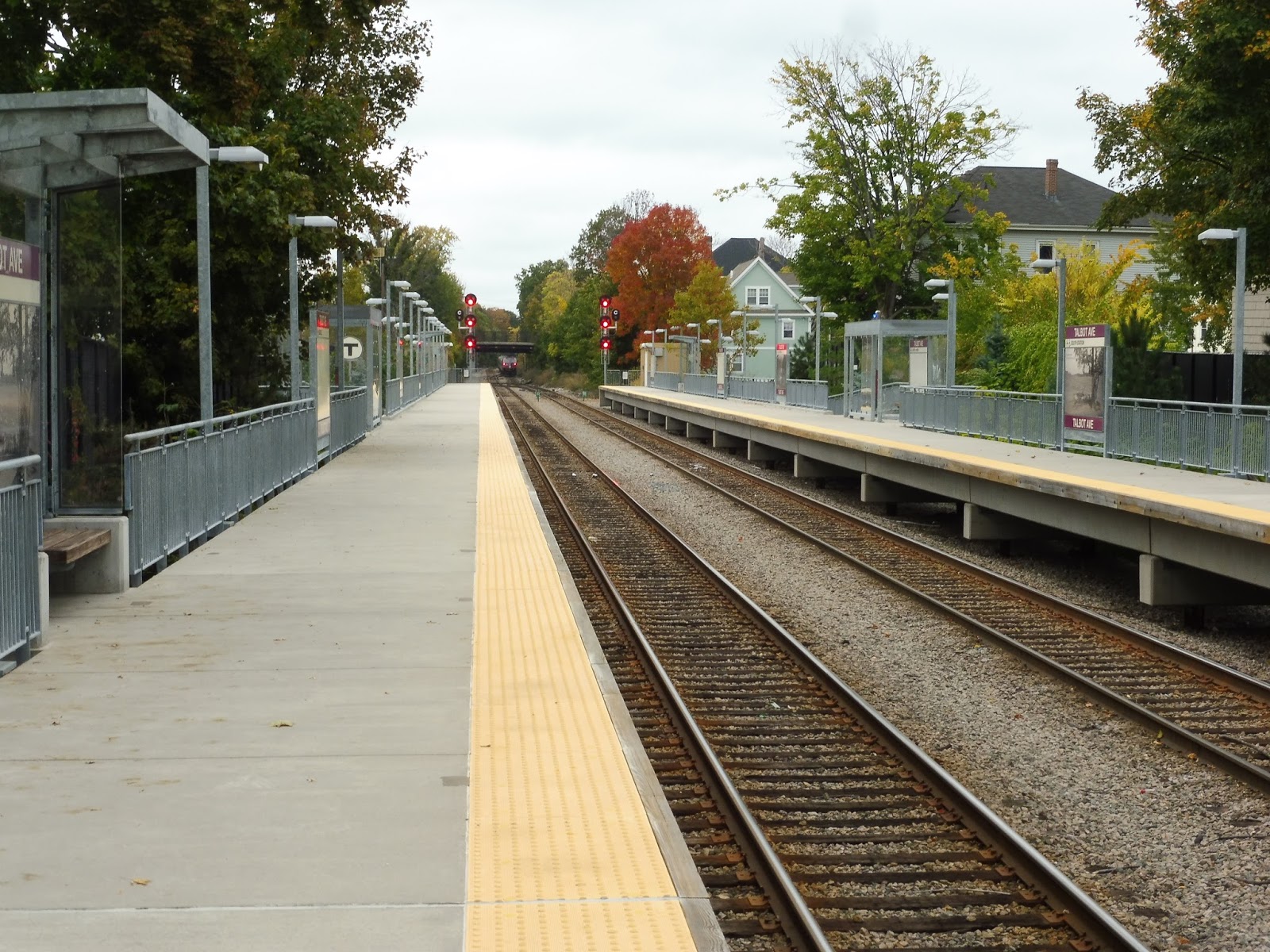 |
| The other end of the platform, as well as a train in the background! |
However, unlike most Commuter Rail stations, the rest of Talbot Ave’s platform is not bare! It has a few shelters along the whole thing, which is pretty nice and makes the station seem more hospitable. Indeed, the whole place is rather tranquil…until you see the broken glass in the shelters and remember what kind of neighborhood you’re in.
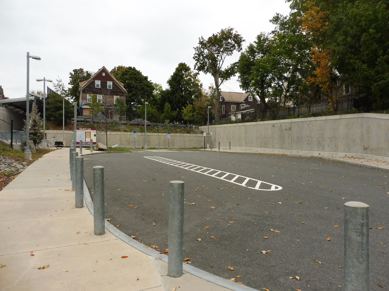 |
| The station drop-off area. |
One of my favorite parts of Talbot Ave is at the entrance to the inbound platform along its namesake street. That’s right, the station actually has a drop-off area and a parking lot! Okay, so “parking lot” means two spaces that are for people with disabilities only, but it’s still really nice to see in the middle of such a dense area. There are also some bike racks here, and then a long but mostly sheltered ramp up to the platform.
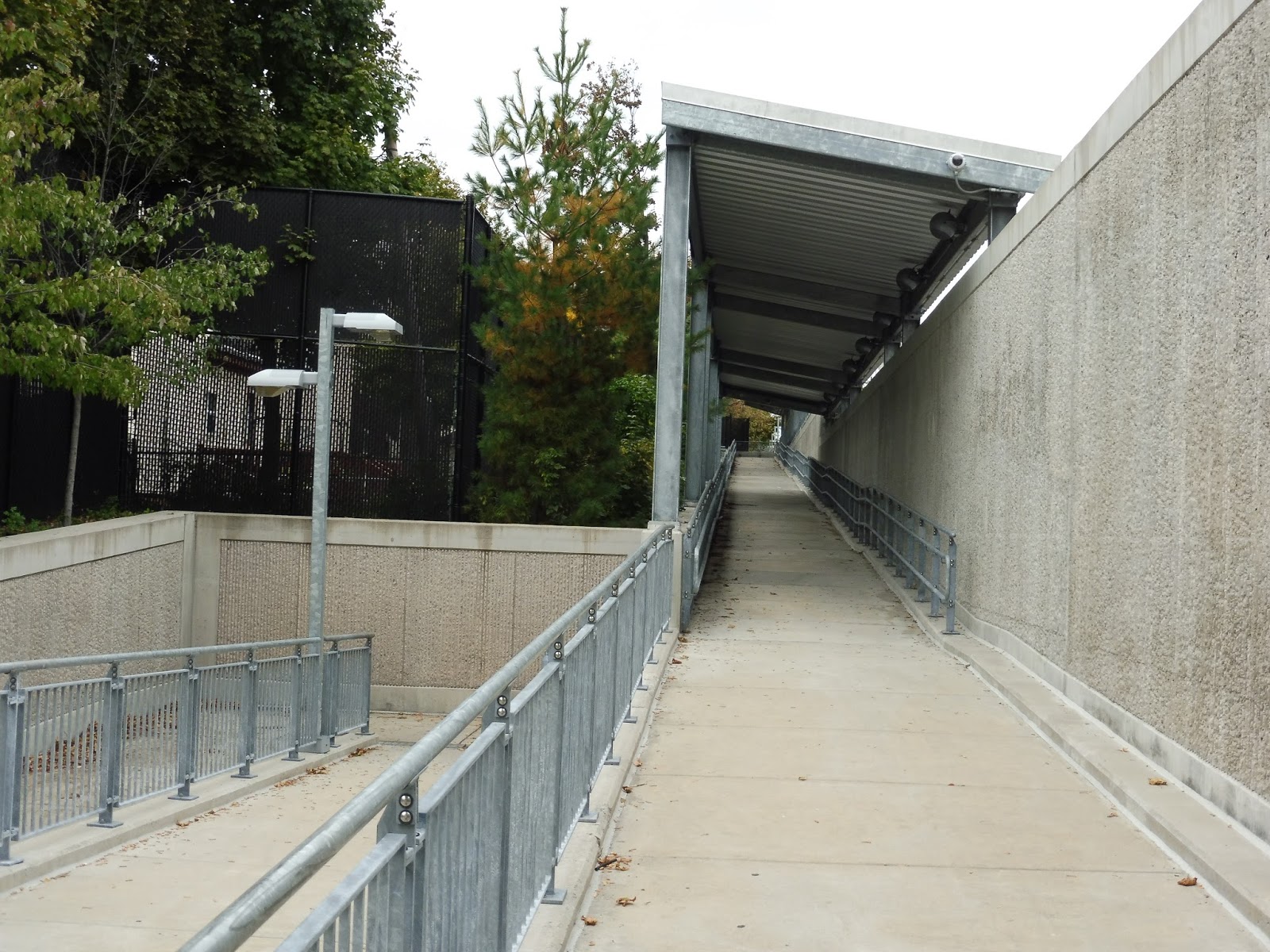 |
| Well, this is convoluted… |
Meanwhile, the outbound side has another crazy ramp that twists and turns on itself a few times before finally making it up to the platform. Like other Fairmount Line stations, I really wish there was a convenient set of stairs, too. Talbot Ave (the street, that is) is where this station’s bus connection is – the 22 gets a shelter on the inbound direction and a bench heading outbound.
 |
| The Standish Street entrance, featuring some graffiti. |
Finally, Talbot Ave has two additional entrances on its northern side, one on each platform, that lead to quieter residential neighborhoods. They’re both pretty simple, with T logos and signs at each one. plus some more bike racks on the Norwell Street side. However, there’s no way to cross between platforms here, so you have to go around the whole station if you’re trying to get a train in the other direction.
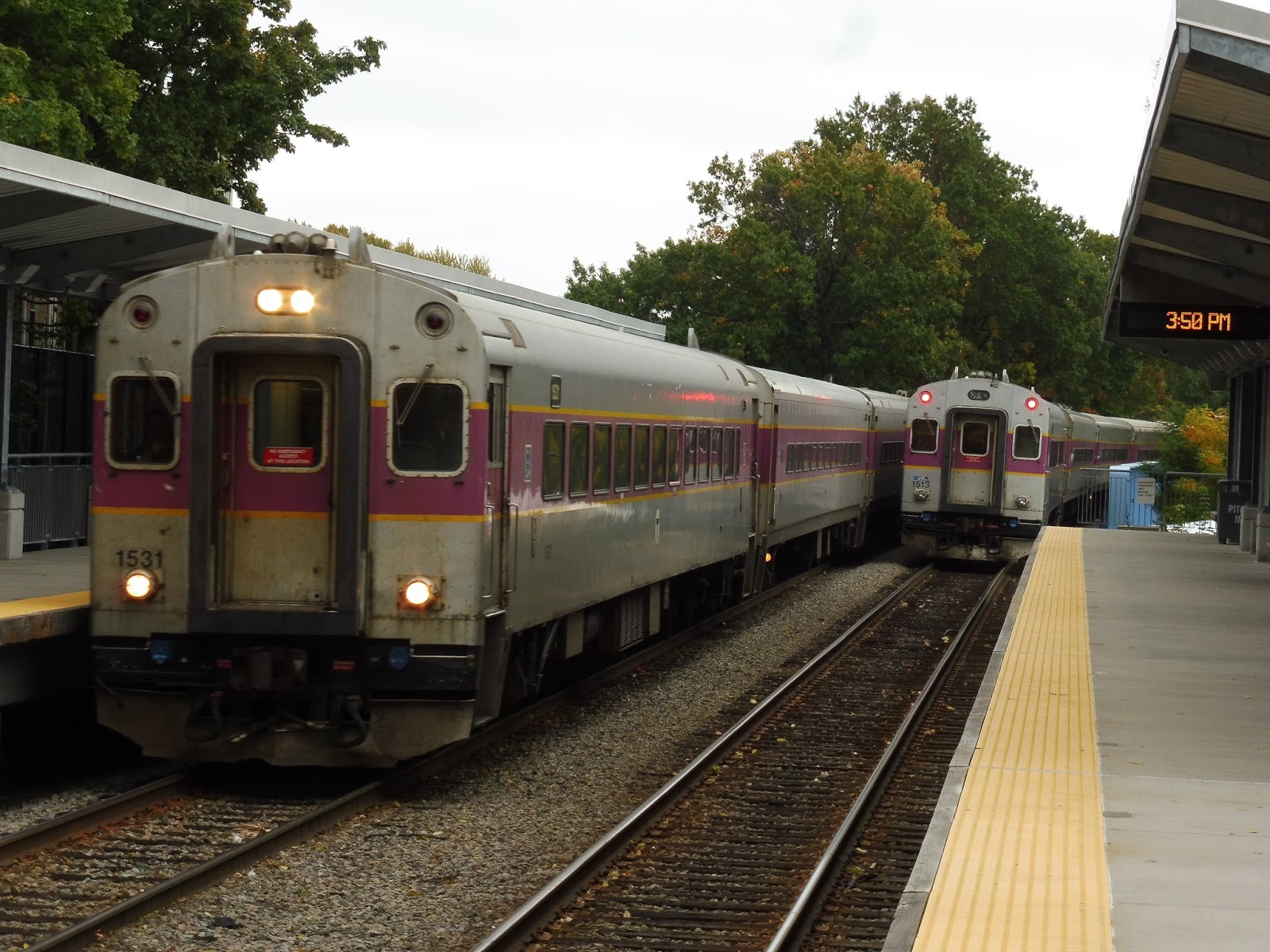 |
| Two trains meeting! |
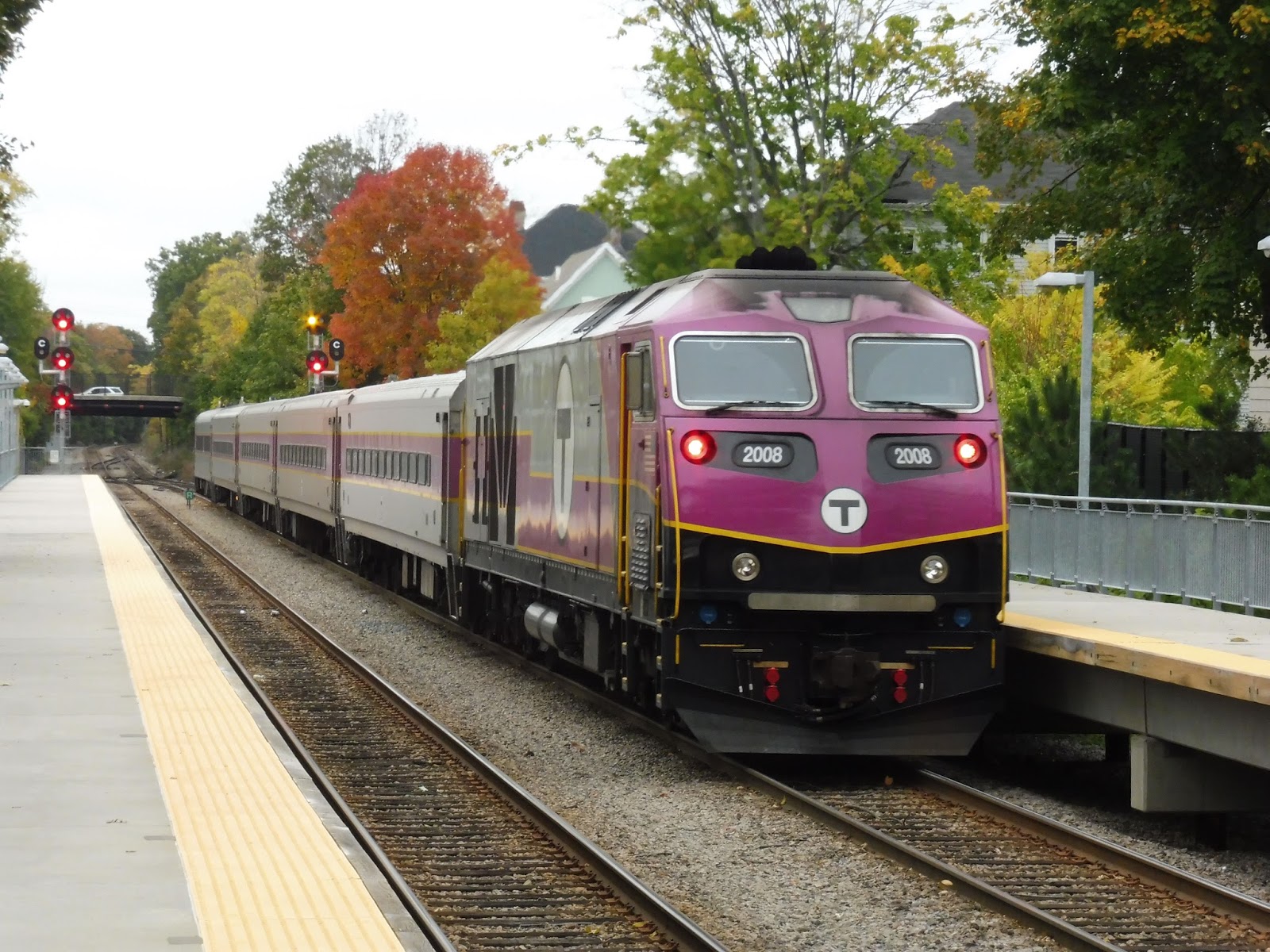
 |
| Heading towards Boston. |
Ridership: Well, in 2013, this station got an average of only 82 inbound riders per weekday, but I do hope that number’s gone up since then. I mean…it’s the Fairmount Line, so it’s hard to have high ridership expectations.
Pros: The station certainly tries to look and feel pleasant, and for the most part it succeeds. It’s weird that it manages to be as tranquil as it is, considering it’s not in the safest neighborhood. Also, Talbot Ave has a good amount of bike spaces, and even a few automobile spaces, which is a great inclusion. Finally, the platform offers shelter and seating the whole way down.
Cons: The broken glass all over the place is definitely an indication of what kind of area the station is located in. Aside from that, it would be great if there was a way to connect between the two northern entrances. Perhaps a pedestrian tunnel? Although I imagine that would be more expensive than it’s worth. Finally, the ramps down to Talbot Ave itself are really long…stair alternatives would be nice, although again, cost could be an issue there.
Nearby and Noteworthy: The surroundings of this station are mostly residential, so there isn’t much to see. It’s not the best neighborhood, anyway…
Final Verdict: 6/10
Okay, in terms of the station itself, the only problems are the ramps and the lack of a connection between the northern entrances. So what lowers it down to a 6? Well, the broken glass is ugly, dangerous, and could put people waiting on edge. Plus, there’s the fact that Talbot Ave just deserves to have rapid transit service, as does the rest of the Fairmount Line. I wish I was reviewing an “Indigo Line” station right now!
Latest MBTA News: Service Updates
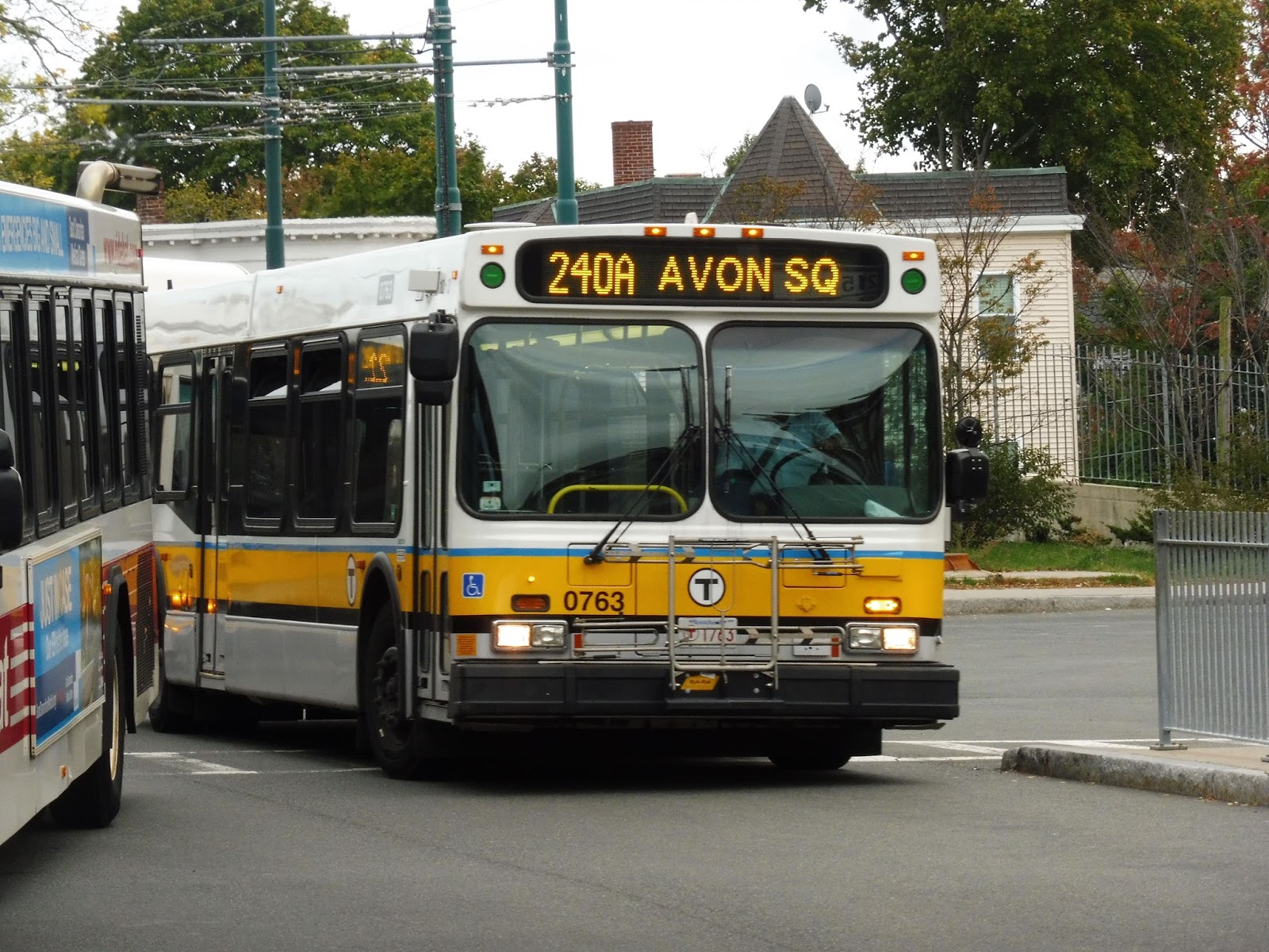
240 (Avon Square or Holbrook/Randolph Commuter Rail Station – Ashmont Station via Crawford Square, Randolph)
So many MBTA bus riders demand that their routes get more service, whether they’re deserving of it or not. Well, here’s a route where those complaints are definitely justified. It seems like the 240 is always packed, no matter what time of day it is. Why could that be? There’s only one way to find out…
 |
| The 240 inching its way past the BAT. |
After the huge crowd at Ashmont boarded the bus (and believe me, it took a while), we left the busway and headed down Dorchester Ave. It was lined with houses for a bit until we passed Carney Hospital, and later on there were businesses as we entered the Lower Mills neighborhood. There was a nice view of some repurposed factories as we turned onto River Street.
 |
| Lower Mills is such a cool neighborhood! |
River Street had some houses and some businesses, but we didn’t stay on it for long. Soon, we turned onto Central Ave, crossing the Neponset River and connecting with the Mattapan Line. Beyond there, the street became all residential, aside from a very fleeting view of a nice little pond.
 |
| The pond is just around that house. |
Outside of a middle school, we merged onto Reedsdale Road, now joined by the 245. It was still lined with houses, but there were points of interest unseen from the road: a fire station, Milton’s town hall, and a hospital were all located on side streets. Next to a church, the 245 headed its own way while we turned onto Randolph Ave.
 |
| A side street. |
Houses were still the principal buildings, but they were a lot further apart, and the woods basically dominated the east side of the road. We passed a golf course, and then houses lined the street again for a time. However, soon after going by a few farms, that was it – we were heading through the Blue Hills Reservation in Quincy with trees on both sides.
 |
| What a pretty driveway! |
There wasn’t much of note for a while, but once we made it past a traffic snag, the bus was going fast! We went through a gigantic cloverleaf interchange with I-93, and beyond there, we were in Randolph. The street was called North Main Street now, and we were back in civilization.
 |
| A shopping plaza. |
There were a few gross parking lots and hotels immediately past the interchange, but it was houses again beyond there. This became retail pretty soon after – indeed, the street was lined with businesses. A little later it became more of a mix, with housing developments or just plain ol’ houses coming between the businesses.
 |
| Well! It’s a man on a key! Okay! |
Eventually, we reached another shopping plaza. And then another. And one more! Yes, we were in Crawford Square, and shopping plazas with parking lots seemed to be popular, though there were also some normal businesses lined up along the street. On weekends, this is where many trips terminate, while on weekdays, some trips follow the 238 down Union Street to Holbrook/Randolph Station. However, we were on the full route to Avon, so instead we merged onto South Main Street.
 |
| A side street in Crawford Square. |
We went by a few municipal buildings and businesses before it became mostly residential again. Some telephone wires crossed over the road and we passed a tennis court, and later on, we went through a brief industrial section. Soon after that, we entered Avon, and arrived at our terminus pretty quickly from there, The driver pulled into the front drive of a church and let us off at a BAT shelter. It was a weird place to end, for sure…
 |
| The bus pulling away toward Ashmont. |
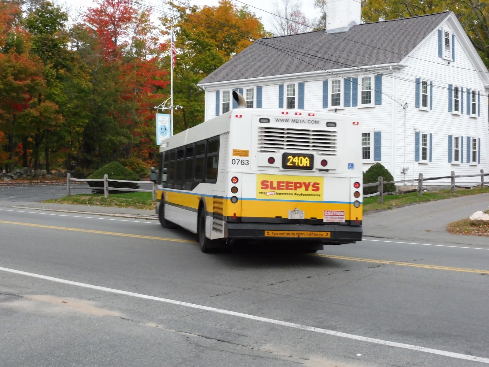
Ah, but you thought that was it, didn’t you? Nope – the 240 has another trick up its sleeve. You see, it has a total of eight trips (seven on weekdays and one on Saturdays), inbound only, that run express to Quincy Center. Yup, you heard me right! So Nathan, Sam, and I waited in Avon to catch one of these strange runs, and indeed, the only one that starts in Avon – the others are from Crawford Square.
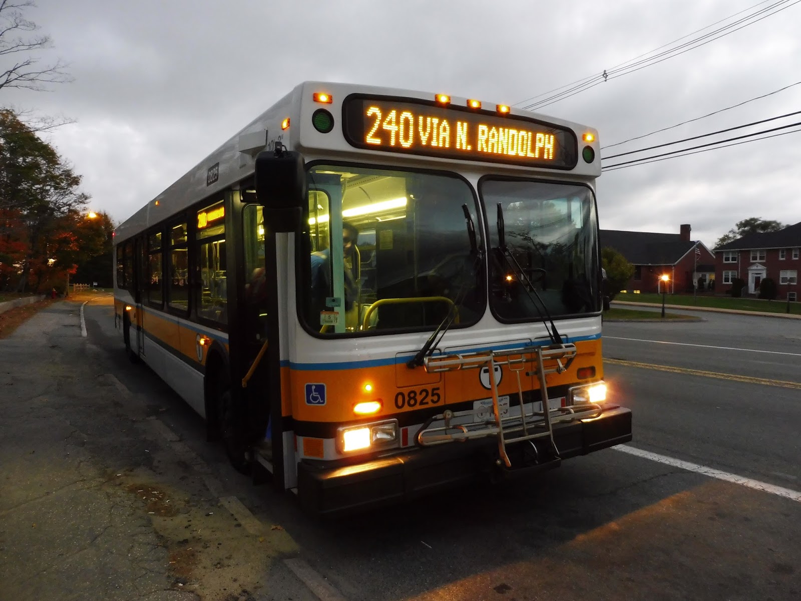 |
| “VIA N. RANDOLPH”??? No, I missed “Quincy Center”! ARGHHHHHH! |
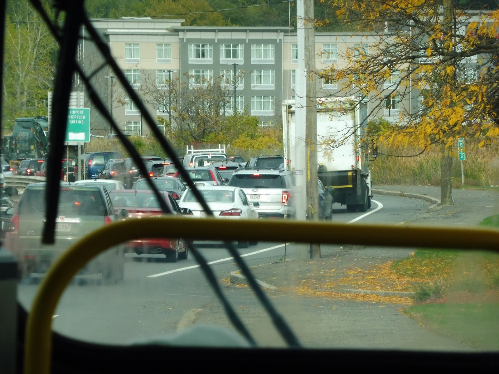
It was the same scenery as before, up until North Randolph, back at that huge highway interchange with I-93. Instead of passing through it, we took that exit and merged right into…traffic. Okay, there was a bit of an accident on the highway, but eventually we passed it and started actually running quickly.
 |
| At least traffic allows for somewhat non-blurry pictures. |
So, what kind of amazing things were there to see? Not much at first – the highway was just running through woods. However, there was still a really cool novelty factor of being on an MBTA bus travelling down southern I-93! Eventually, we got to see some office parks, which was…not particularly exciting.
 |
| A building (after we left the highway). |
We arrived at the Braintree Split, taking the exit and going on Route 3 for just a tiny bit before merging off. We ended up on Thomas E. Burgin Parkway, going right past Quincy Adams, actually! The Parkway became its own little “express” road soon after that, travelling next to the Red Line tracks without any intersections.
 |
| What a beautiful parking lot. |
We rose up to ground level again and passed a few shopping centers. After that, we only had to pass a few houses before we got to Quincy Center – the drop-off busway to the west of the station. And with that, the bus headed off to go back home to Quincy Garage.
 |
| Not in service, unfortunately…I was hoping to get a picture of it signed as the 240. |
Route: 240 (Avon Square or Holbrook/Randolph Commuter Rail Station – Ashmont Station via Crawford Square, Randolph)
Ridership: Very, very high. The route gets 2,912 riders per weekday, 1,640 per Saturday, and 912 per Sunday. Those numbers may not seem too large for the T, but since the 240 doesn’t run as often as other routes, it’s very often packed. My rush-hour trip squeezed about 50-60 people on board, and the route is frequent at rush hour!
Pros: The 240 serves a lot. A lot. The North Main Street corridor in Randolph is huge, and it’s where most of the ridership goes. Also, I understand that the schedule tries its best to alleviate crowding for the most part – the route is anywhere from every 10-20 minutes during rush hour, and every half hour during the day and on Saturdays.
Cons: But the route is always so crowded. It doesn’t help that it runs every 70 minutes at night and every 75 minutes on Sundays. There are also some problems with schedule intervals – on Saturdays, for example, inbound buses at Crawford Square depart on the :00 and on the :20. That means there’s a 20 minute gap in service, then a 40 minute gap. I understand that this discrepancy is because the route is interlined with the 238, but it would be great if the intervals were more consistent.
Nearby and Noteworthy: Mayyyyyyybe Crawford Square, but even that doesn’t seem to be too interesting. Avon Square has a historical building, I think.
Final Verdict: 6/10
The 240 tries its best, it really does – it just can’t seem to satiate its crowds. Also, it doesn’t try at all at night. Or on Sundays. But anyway, this is a lifeline route to Randolph, and seeing how many people use it, it would really benefit from more service, if possible. A good start would just be to even out headways on Saturday inbound service, as well as midday outbound service. Oh, and also, those Quincy express trips are fun if you ever get the chance to take one.
Latest MBTA News: Service Updates
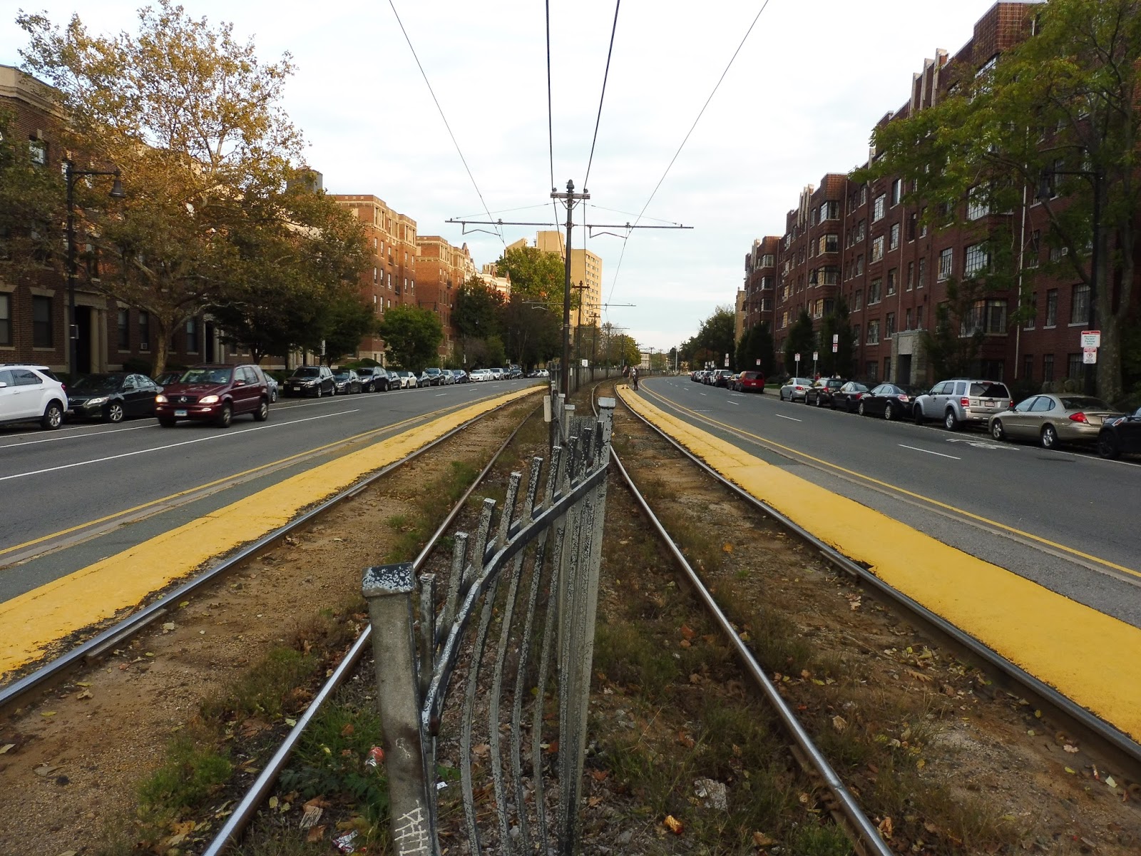
Swampscott
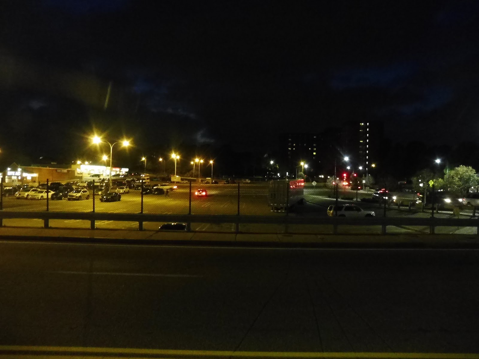
Ahhhhh, Swampscott: a town known for its seaside location and tranquility. Does that mean that its Commuter Rail station has beautiful seaside views and charming houses nearby? No? Why not? Ohhhh, okay…when they say “Swampscott”, they really mean “Yeah, the station is technically in Swampscott, but it’s literally right next to the Lynn border.” So…this place may not be as nice as I thought it would be…
 |
| One of the station’s parking lots. |
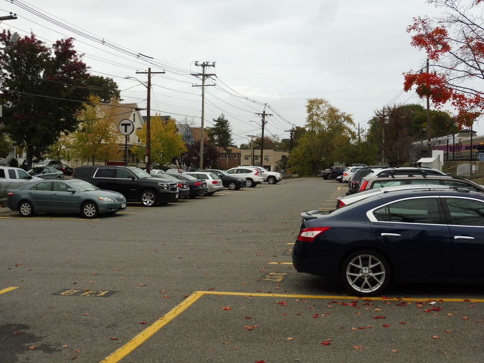
Considering that Swampscott Station is in the middle of a dense residential area, it has a pretty impressive amount of parking. There are lots on both the north and south sides of the tracks, adding up to 133 spaces, which get about two-thirds filled on weekdays. The south side of the station features a few bike spaces, as well as some newspaper boxes.
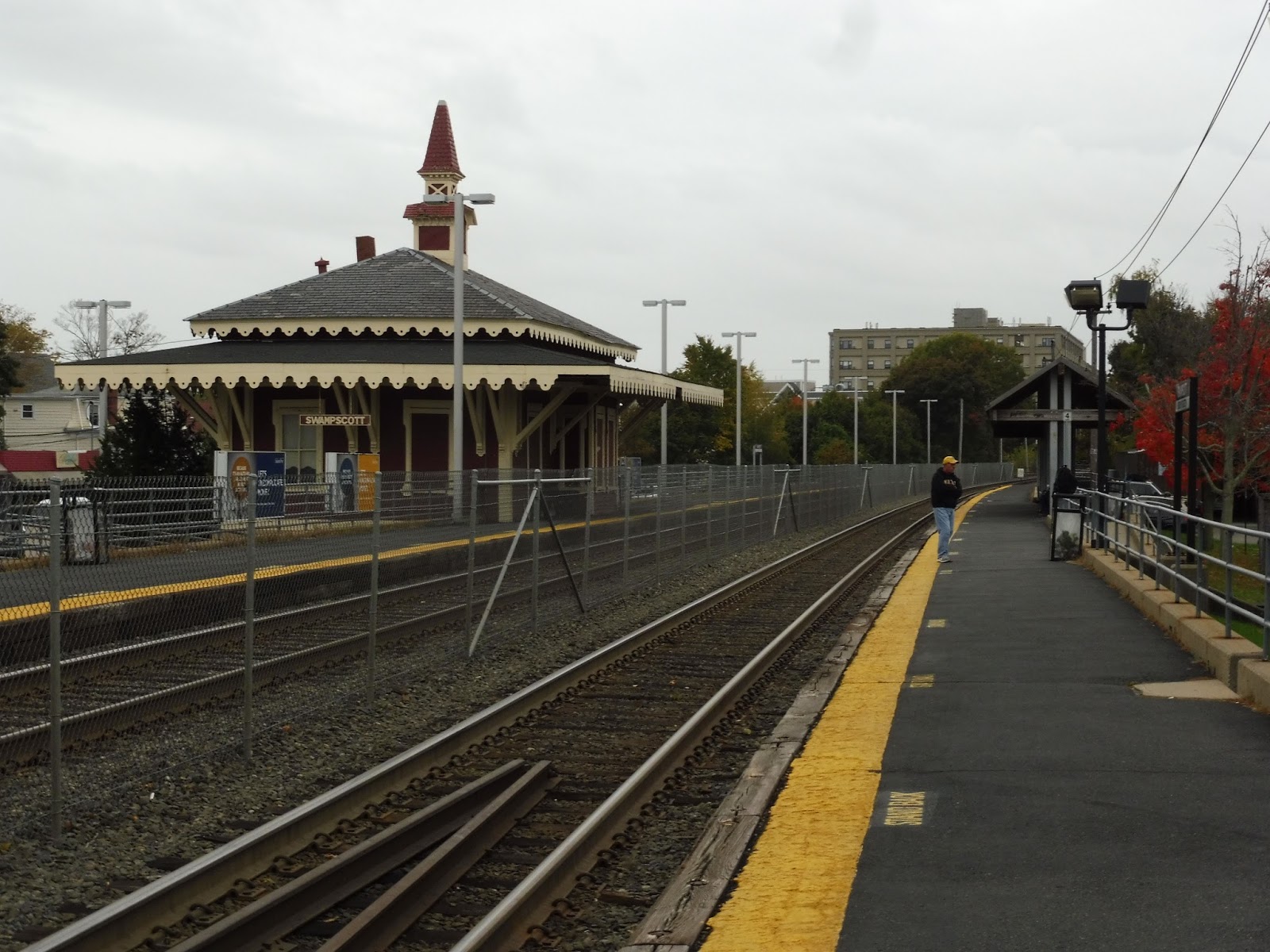 |
| Looking down the platform. |
The station itself is…kinda terrible, actually. First, I’ll address the building, which is somewhat charming, but the rest of the surroundings just drag it down. I mean, the platform is really bare with ugly metal barriers and a gross chain link fence across the tracks (which makes it unnecessarily hard to get to the other side of the station, for the record). There are no benches on the outbound side, while the inbound side has some under a generic Commuter Rail shelter.
 |
| Oh gosh… |
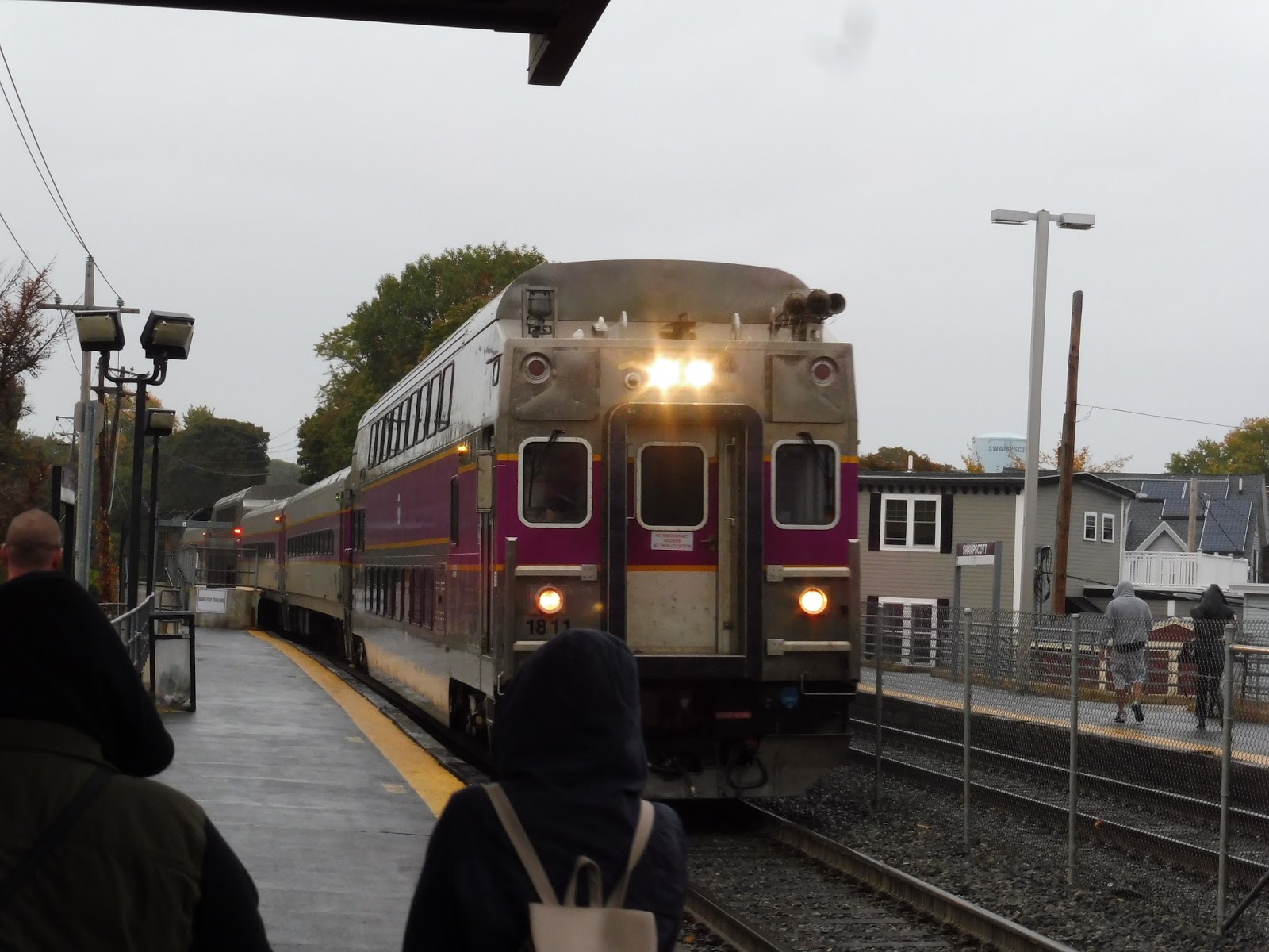
And then we get to the mini-highs. Hooooo boy, the mini-highs. They are completely bare. Absolutely nothing. This presented problems with my train, and presumably many others: it was raining outside, so of course all the passengers were waiting under the shelter way down the platform. Once the train came, everyone had to walk to the mini-highs, which held everything up by at least a minute! The mini-highs are long – there’s plenty of room for shelter and a bench!
 |
| An express train speeding through. |
 |
| The local coming in. |
Ridership: Well, you can’t say Swampscott doesn’t get high ridership! On the average weekday, it gets 884 riders, making it the 26th-busiest station on the Commuter Rail. It’s interesting to note how few of those people drive here – it’s a dense neighborhood!
Pros: I know the station is called “Swampscott”, but it’s in a good location to also (and perhaps mainly) serve transit-dependent East Lynn. It offers a good amount of parking for the area, and I like the fact that it has a building, despite the fact that it doesn’t serve much of a purpose.
Cons: Swampscott is uglyyyyyyyyy. Oh, don’t get me wrong, parts of the town are very pretty indeed, but the station is not one of those places. From the concrete of the station embankments to the metal barriers to the chain link fences everywhere, waiting here isn’t a pleasant experience. Of course, it’s made even less pleasant by the fact that the mini-highs are both completely bare and far from the shelter.
Nearby and Noteworthy: Nothing much, to be honest. However, the ocean (not the beach, though) is about a 10 minute walk away, so maybe you’ll find some stuff down there.
Final Verdict: 4/10
Swampscott serves a lot, but it sure ain’t pretty or even functional whilst doing it. Bare mini-highs are a big MBTA pet peeve of mine, especially ones that are far from the station shelters, so Swampscott needs to get it together in that regard. Give your high-level platforms some shelter! As for the aesthetics, it’s unlikely they’ll get an upgrade anytime soon, so we’re unfortunately stuck with them.
Latest MBTA News: Service Updates
424 (Eastern Ave and Essex Street – Wonderland Station via Highland Ave)
This is probably one of the strangest Lynn express routes, partly because it’s only an express in the evening! That’s right, the 424 only runs from downtown during the evening rush; in the morning rush, it gets cut back to Wonderland as the 424W. I took the full evening rush route, so we have a long trip ahead of us!
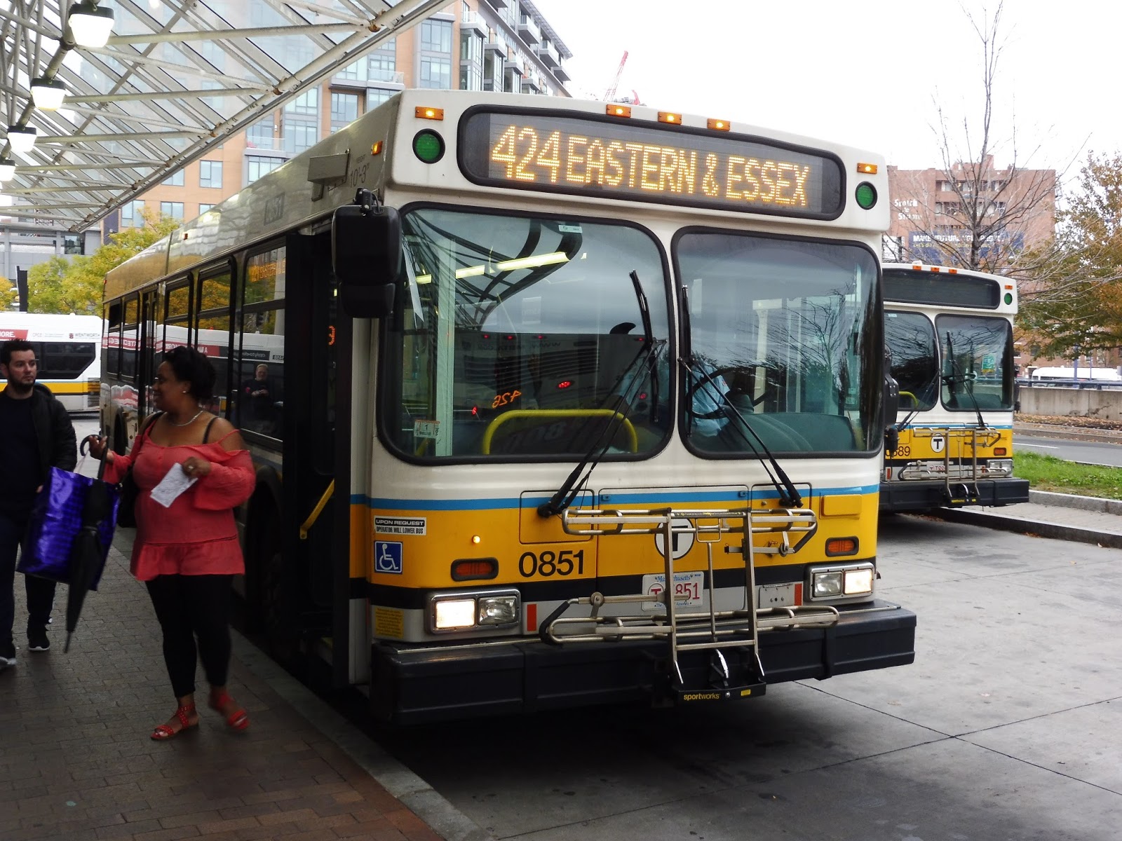 |
| The bus at Haymarket. |
We left the Haymarket busway and did the whole loop-the-loop shazam to get around onto I-93, then we took the exit into the Callahan Tunnel. I’ve always liked the Callahan and Sumner Tunnels, if only because they don’t have that typical Big Dig-style tiling on the walls. We came out of the tunnel in East Boston, curving around up onto an elevated structure.
 |
| Wow, what a…great view… |
After going by Airport Station on the highway, the view got a lot more industrial. Also, the road stopped being a “highway” pretty soon after that, and we started passing stops. However, the nice thing about the 424 is that it doesn’t make the weird stops out here that the other express routes make, so that’s a small plus (although I imagine very few people use the stops to begin with).
 |
| Oh nooooooooo… |
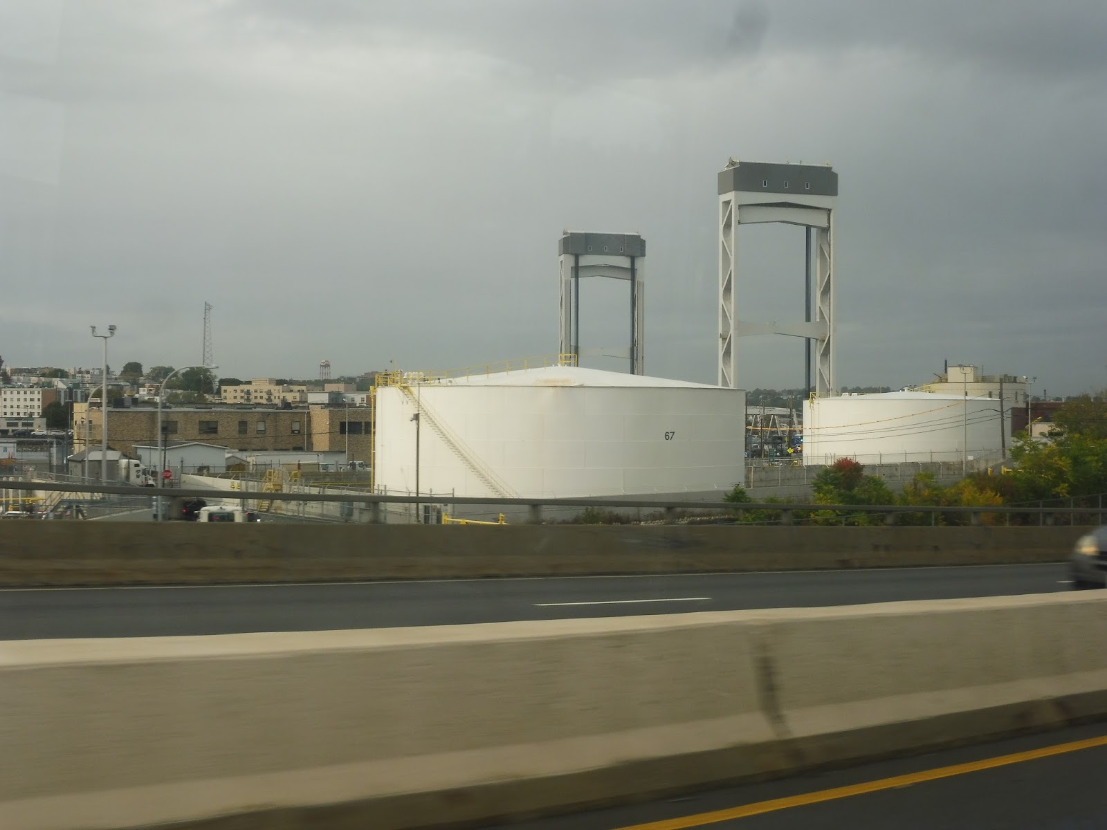
We passed that point where the 120 joins the express routes for a block on its Waldemar loop, and then we went through more industrial wasteland (in heavy rush-hour traffic, of course). Mixed in with the huge random vats were some sketchy airport-related businesses. Next, the highway curved its way into Bell Circle, which is where we started making stops along with the other routes.
 |
| This area is so pretty and scenic, isn’t it? NO. |
The road entered some form of residential neighborhood, although the nature of the road certainly didn’t make the area feel like a “neighborhood”. Also, as we curved west, it got industrial once more before we merged onto Salem Turnpike at a rotary. This is always the best part of any Lynn express trip, where the bus gets to just zoom through open marshland at top speed!
 |
| Oh hey, it’s a building! |
The marshland was broken by a gigantic factory, then we crossed over a river into Lynn. The area was entirely industrial for a bit, including the MBTA West Lynn Garage, but eventually, the road (now called Western Ave) became lined with houses and businesses. Near a fire station, at the intersection with Market Square, a few routes turned off to serve Central Square, but we just stayed on Western Ave, whose scenery was still pretty similar.
 |
| Going by Lynn Garage. |
We passed a Super Stop & Shop, and after that the surroundings became more residential. We did go by a baseball field at one point, and there were retail and industrial buildings at certain intersections, but it was houses for the most part. Finally, we reached Eastern Ave and turned onto it, breaking away from the 450 at last. Was it a unique section? No, we were running with the 456 now, but it was nice to have a change of scenery.
 |
| A side street from Eastern Ave. |
Of course, “change of scenery” is a moot point, since the surroundings were essentially the same. We were still going by mostly houses, with the occasional businesses at some intersections. The difference was that it was a narrower, quieter street, and the bus was basically empty by this point. And then, at a random street stop…that was it. Last stop! Okay…
 |
| Welp…see ya. |
Route: 424 (Eastern Ave and Essex Street – Wonderland Station via Highland Ave)
Ridership: Although the route only gets an average of 258 riders per day, you have to keep in mind that since it’s rush hour only, the ridership per trip is much higher. My ride had about 25 people on board, most of whom got off along the shared section with the 450.
Pros: I don’t have too much to say here, actually. Its role as a supplement to the 450 is good, as is the commuter-oriented schedule – five trips in the morning and four in the evening, spaced about half an hour apart.
Cons: Why the heck doesn’t the route go downtown in the morning? Or conversely, why the heck doesn’t the route start at Wonderland in the evening? Bottom line: BE CONSISTENT. My main gripe in this regard is if you have a commuter that relies on the 424W, perhaps for the lower fares. Well, what are they supposed to do in the evening? They have to pay the inner express fare on the 424 from downtown (which is kind of a joke anyway, considering the route is barely “express” once across the harbor), or take the 455 from Wonderland and change buses. Now isn’t that a pain??
Nearby and Noteworthy: Do you like sketchy Lynn businesses? Great! There are plenty along here.
Final Verdict: 4/10
I like the 424’s concept: it provides extra supplementary service to the 450. Great. However, its inconsistency between the morning and the evening rushes drives me crazy! Here’s my proposal: just run all 424 buses to Wonderland. This would allow for a low-cost alternative for commuters who live along the 450 route, plus the shorter route could free up a few buses for the other packed Lynn routes. Win-win, I say!
UPDATE 9/1/19: Now every 424 does go to Wonderland! Hooray! As far as commuter routes go, I would call this a solid 7 now.
Latest MBTA News: Service Updates
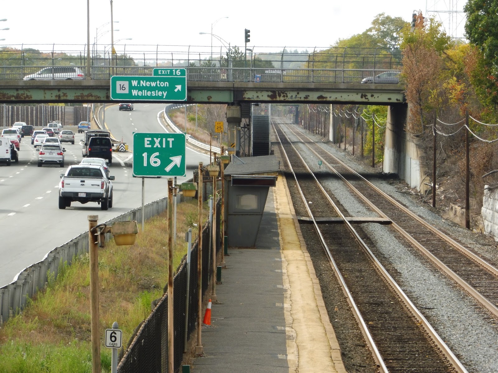
West Newton
Welp, we’ve finished the B Line, which had some truly horrible stations. As long as we’re on this high (or low, I guess), we might as well complete another set of terrible stops: the Worcester Line Newton stations. I’ve done Newtonville and Auburndale, so now it’s time to tackle the rotten meat of this disgusting sandwich, West Newton.
 |
| Oh nooooooo… |
Yup, this being a Newton station, it’s right next to the highway! The loud, noisy, fuming highway! Excellent. And guess what? It only has one platform! And since they were doing track work the day I came here, we had to get off on the wrong track, crossing to the platform via a boardwalk! We’re off to a great start, aren’t we?
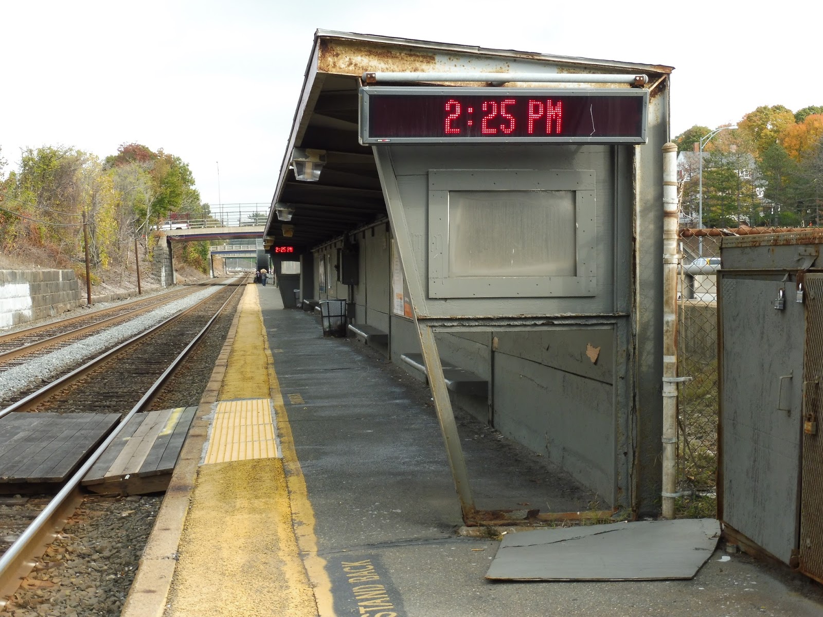 |
| This shelter is in fantastic shape, isn’t it? |
The shelter is a rotting, dilapidated mess. So basically, it’s what you would expect from a Worcester Line Newton station! Yes, it’s the classic I-90 shelter, with a few benches and a wastebasket underneath its rusting roof. There are some ads and torn-up schedules to see, as well.
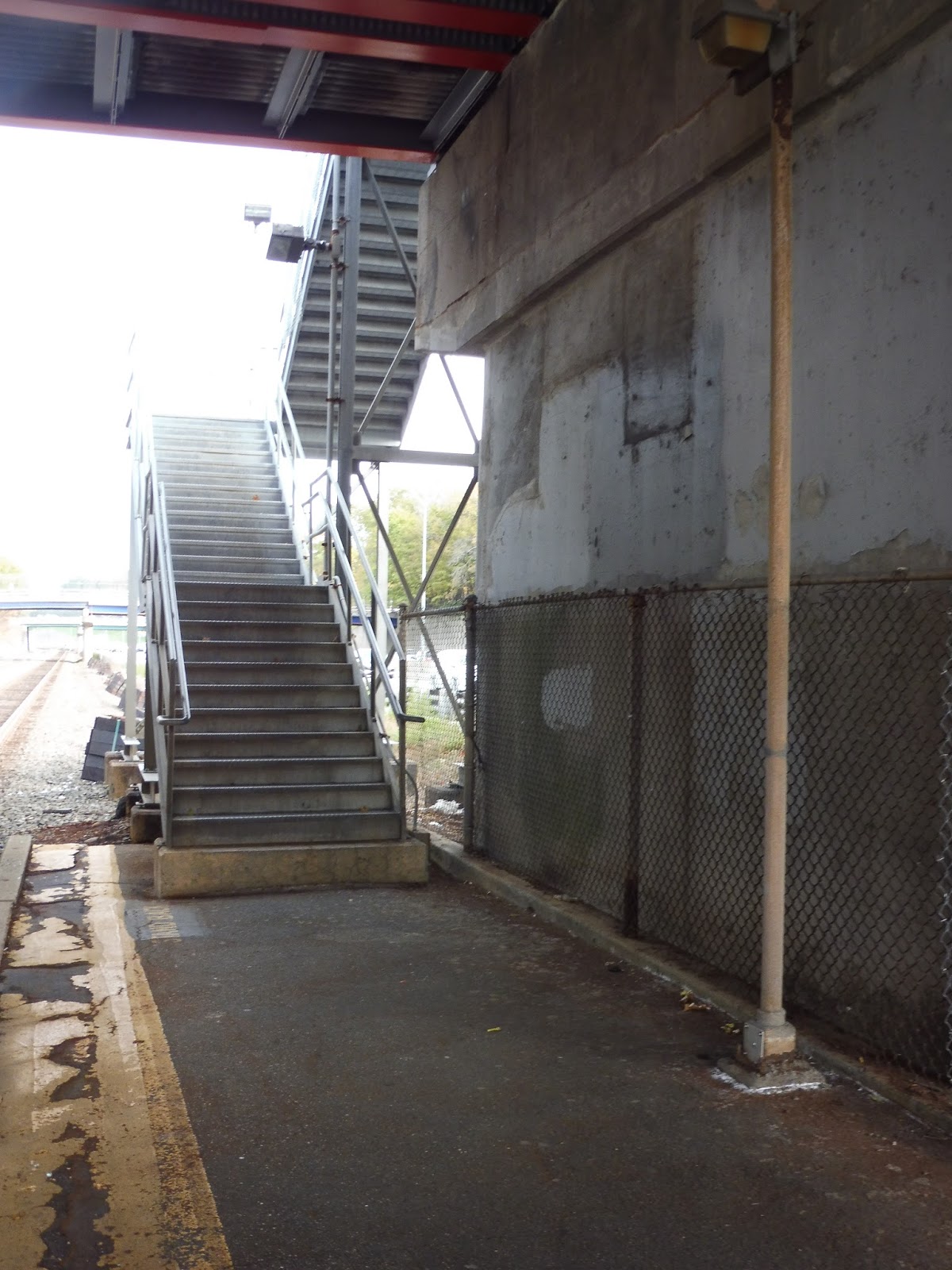 |
| One of the staircases leading out of the station. |
The rest of the platform is basically bare, aside from a few more wastebaskets. So now, let’s talk about the exits, which for some reason go underneath the dingy overpasses and then curve around back up! What is preventing the staircases from just rising up from before the bridges? What’s more, they’re the kind of staircases that you can see through as you climb! I’m just gonna quote my Auburndale review here: “Hope you’re not afraid of heights!”
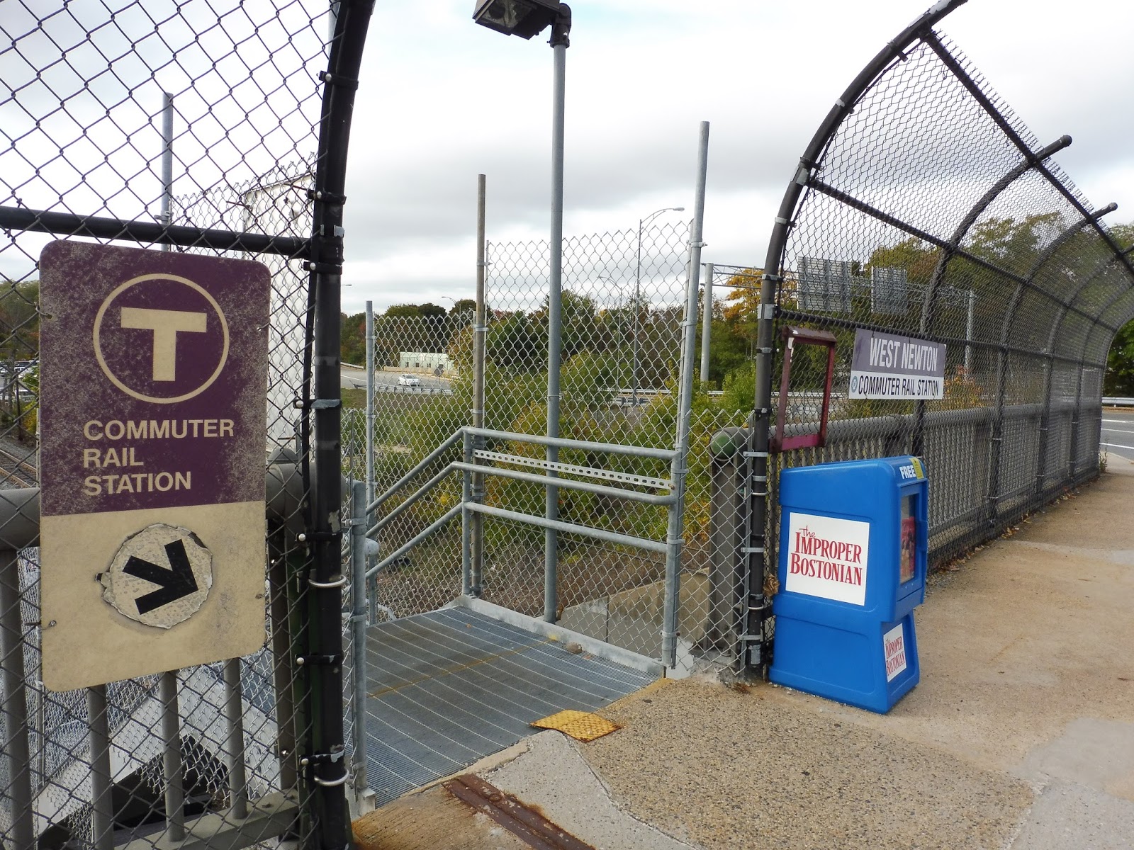 |
| Ewwww… |
Both entrances to the station offer the same…*ahem*…”amenities”. That means a “Commuter Rail Station” sign, a station name sign, and in the case of the western one, a lone newspaper box. However, one thing this station does excel at is parking. It’s got a total of 213 spaces, located in two…unsigned lots. And one of them is across a busy street from a station entrance. But hey, at least there’s good parking!
 |
| A standard Commuter Rail train… |
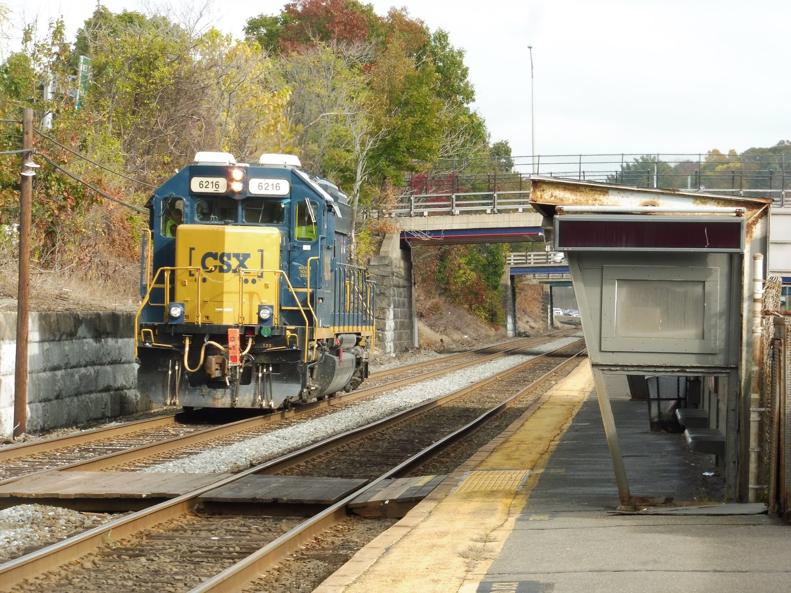
 |
| …and a little CSX locomotive passing through! |
Ridership: This is the least-used Newton station, and actually the least-used station on the entire Worcester Line – it only gets 284 inbound riders per weekday. Strange, considering that it’s the Newton station with the most parking.
Pros: Actually, yeah, the parking. And that’s about it.
Cons: West Newton has all your typical I-90 station cons. It only has one platform, the shelter on that platform is horrible, and the noise of the highway is constant. I also hate how the staircases go from the other side of the bridges and loop around – that’s so stupid! It’s dingy under those bridges, man!
Nearby and Noteworthy: Nearby Washington Street has plenty of businesses and restaurants, including a local cinema!
Final Verdict: 2/10
Overall, much like the arrangement of the stations themselves, I would slot West Newton in between Auburndale and Newtonville. It has a decent fence, unlike Auburndale, but it still has horrible staircases, unlike Newtonville. The decent amount of parking is ultimately what brings this up to a 2 for me, since it’s hard to find parking in such a dense area, anyway.
Latest MBTA News: Service Updates
GUEST POST: Plymouth and Kingston/Route 3
Adam sent in this guest post reviewing the two termini of the Kingston/Plymouth Line. Thanks, Adam!
Today’s review takes us to the two terminus stations of MBTA Commuter Rail’s Plymouth/Kingston Line which are Plymouth Station and Kingston/Route 3 Station. I recently got to visit both Stations and wrote this review to tell you guys what I thought about them!
 |
| The train at Plymouth. |
 |
| The parking lot at Plymouth. |
 |
| The platform at Plymouth (looking inbound). |
 |
| Dead end! |
 |
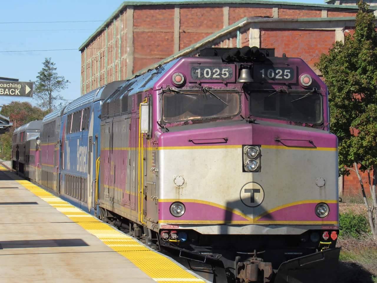
| The train at Kingston. |
 |
| A railroad crossing right before the station. |
 |
| Interesting to see this set of F40PH locomotives together in the layover yard. |
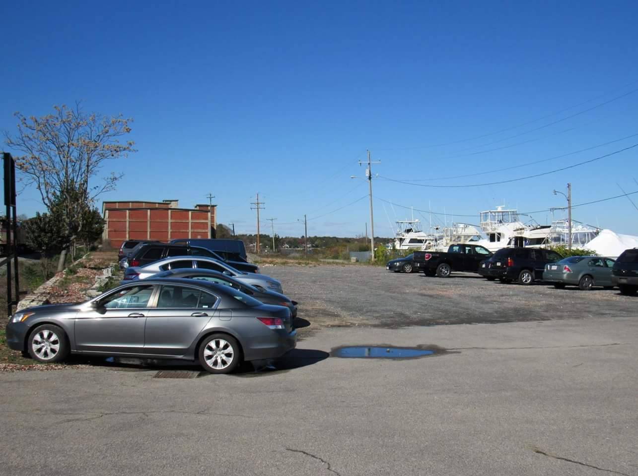
The last time I visited Kingston/Route 3 Station, I saw a huge parking lot with lots of cars in it, and it’s much bigger than the one at Plymouth Station, with 1,039 parking spaces, to be exact. Although the view wasn’t as great as it was at Plymouth Station, I still enjoyed my visit there and would recommend it to other railfans!
 |
| The parking lot at Kingston. |
Stations: Plymouth and Kingston/Route 3
Ridership: Both stations have low ridership. Kingston/Route 3 usually draws an average of 683 passengers per weekday while Plymouth Station only draws 30 passengers per weekday. Both stations are in the middle of nowhere, though, which probably explains it!
Pros: Both stations are great to visit and are always quiet, with a great sight seeing view on an awesome line.
Cons: Only four weekday outbound trains (061, 063, 065 and 067) serve Plymouth Station per day, which means it’s limited service.
Nearby and Noteworthy: Both stations are in the middle of nowhere. Therefore there are no stores or mini malls around, but Kingston does have a soda machine and a place to buy breakfast items and tickets, but that’s only open during the morning rush. On the Plymouth side, the only thing nearby is a bunch of houses, but there is GATRA that services both stations and can take you to Plimouth Plantation and Plymouth Rock.
Final Verdict: 5/10
I just wish Plymouth had a vending machine to get snacks and drinks from in between trips and that there was some sort of shopping center that was at least 15 minutes max worth of walking distance from each station, but overall I just love going to the South Shore to railfan!
The B Line: Exposed (FULL MOVIE!)
“The B Line: Exposed” is finally here! Watch as Sam, Nathan, Jordan, and I traverse the most hated line in Boston to review every one of its stops, descending into insanity as we go! It’s quite an adventure, filled with humor, anger, and lots of craziness…
Boston College
Oh my gosh, we’ve made it! We’ve finally made it! We’re at the end of this HORRIBLE line! Okay, so this is the “grand terminus” of the B, and it’s way better than most other stations on it. And by “way better”, I mean that it’s…somewhat decent. Boston College, everybody!
 |
| Looking at the station’s yard. |
The drop-off system at Boston College is interesting, to say the least. Normally, trains let out along a platform within the station complex that stretches around a building for MBTA employees. Simple enough, right? But SOMETIMES – ostensibly when three-car trains are operating – trains will let out at an in-median platform on Commonwealth Ave! Now isn’t that just a wee bit confusing?
 |
| The crazy boarding platform! |
Boston College has a really weird boarding platform, as well. It’s basically a bunch of staircases and ramps going all over the place! Well, we’ll start with the “entrance”, which features some newspaper boxes, a staircase, and a ramp leading in the…general direction of the platform, I guess? It’s more complicated than it looks.
 |
| What is this insanity?! |
Of course, despite the weirdness of the platform itself, this station has some actual amenities! Huzzah! There are benches and wastebaskets and a proper ADA platform, and best of all: shelters with benches under them! The B has finally figured it out! Too bad the platform can only board one car of a train. Yeah, that’s a pretty big design flaw, isn’t it?
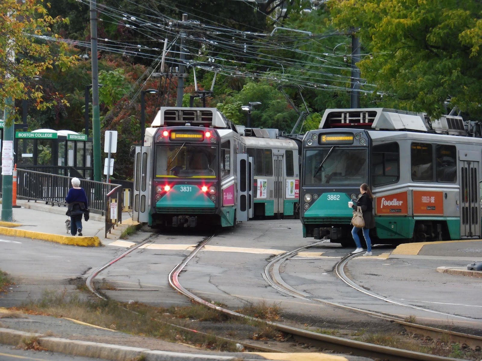 |
| Some trains in the station. |
Station: Boston College
Ridership: Sadly, this is not a particularly well-used stop, with only 1,136 riders per weekday, slotting it at sixth-worst for the B. So…why is this the stop that gets all the amenities?
Pros: Yes, as I mentioned, there are proper amenities here, and Boston College feels like an actual, true station. It actually has benches under shelters!
Cons: There are three main problems with this station: the deboarding process is inconsistent, with two separate platforms; the multileveled inbound platform feels more complicated than it needs to be; and it can only board one car.
Nearby and Noteworthy: There’s a little business block next to the station with restaurants, and of course, it’s right near the sprawling Boston College campus.
Final Verdict: 6/10
And thus, we’ve reached the unsatisfying end of a rather unsatisfying adventure. The B Line is…terrible. And most of its stations are terrible. There’s definitely a lot of work that needs to be done to make this line wheelchair accessible, let alone…y’know, good. So hopefully, improvements are in the future for the most hated line in Boston. Stay tuned for “The B Line: Exposed“, coming out tomorrow!
Latest MBTA News: Service Updates
Sutherland Road, Chiswick Road, Chestnut Hill Ave, and South Street
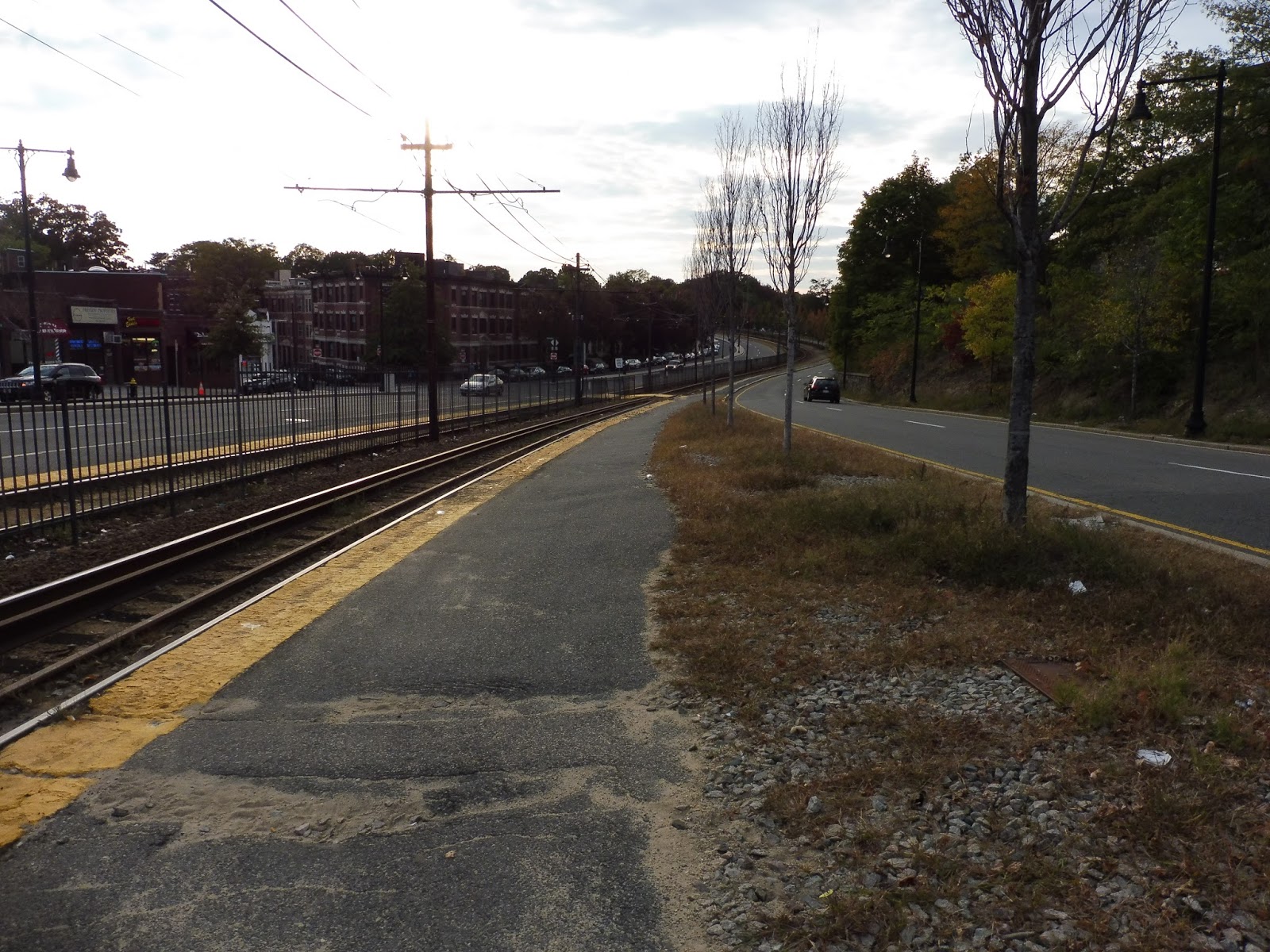
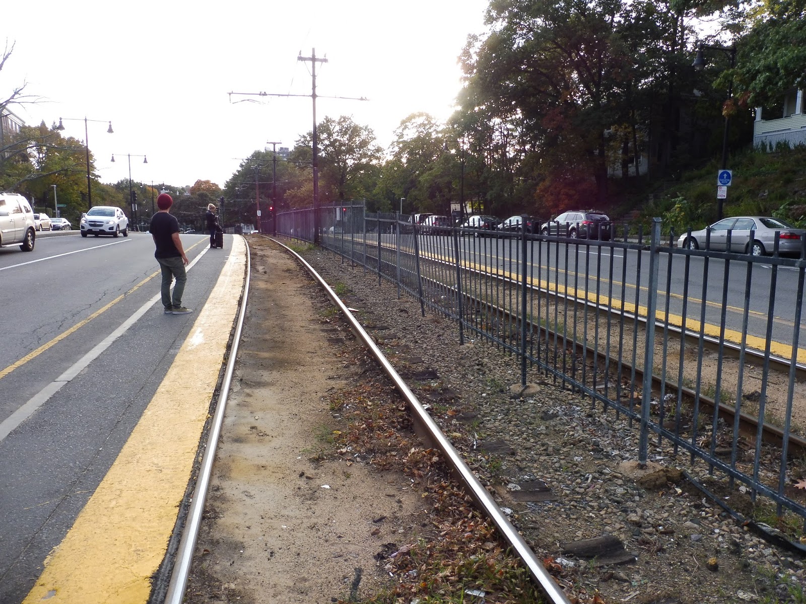
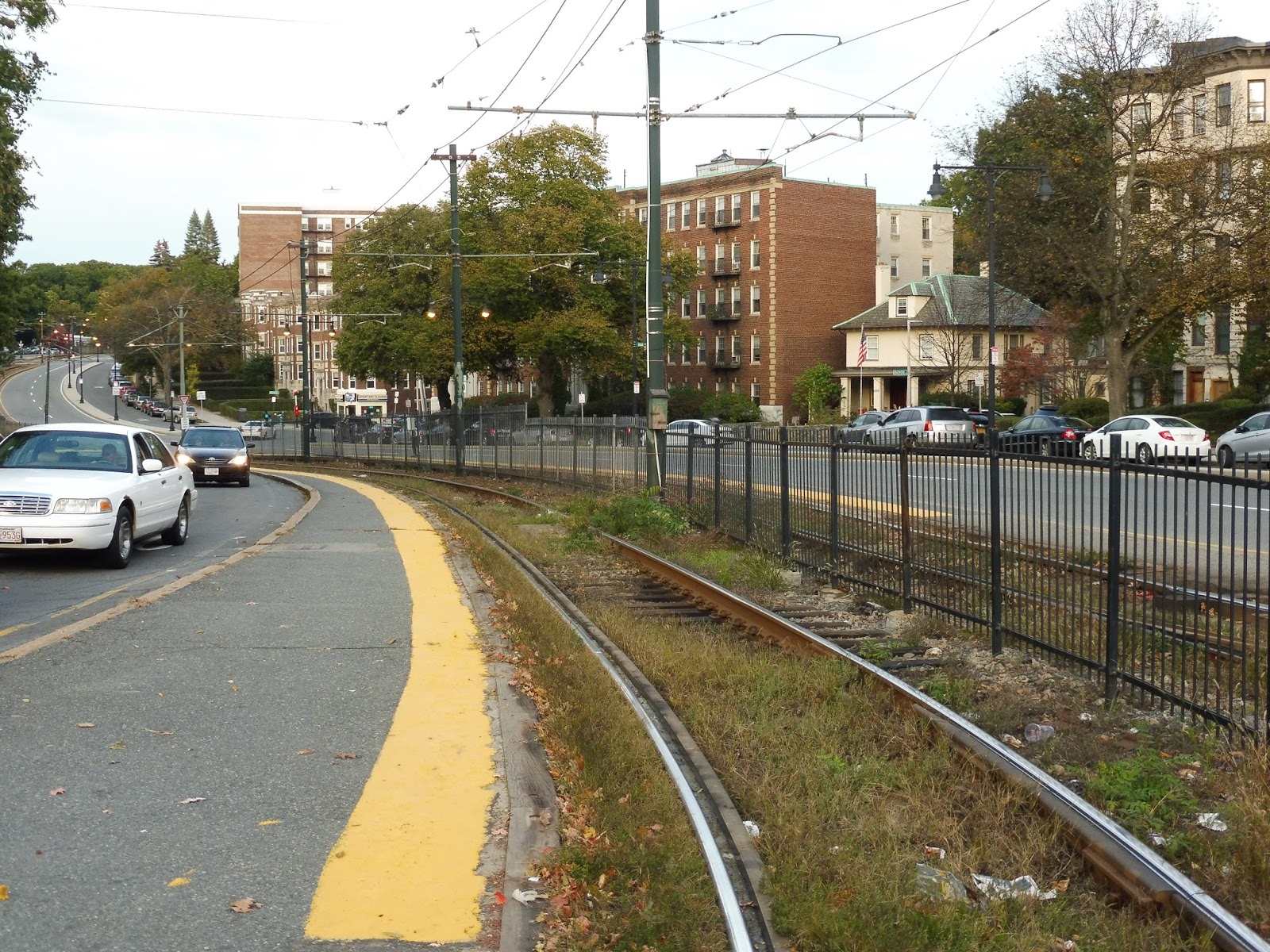
Well…it doesn’t get worse than this. We’ve hit the bottom of the barrel, people. I’m…I’m not even sure to begin with these stations. Let’s just head down the line.
 |
| The platform at Sutherland Road. |
Okay, I have four stations to talk about, except none of them have anything! So…yeah, I have no idea how I’ll be able to write this review. But yeah, these four stations literally have nothing. Just…asphalt. Sutherland Road has some nice trees on the outbound platform, I guess.
 |
| Chiswick Road. |
And Chiswick Road is more of the same. I would say that they should put benches on the inbound platforms, but you can’t, because they’re so narrow! There’s no room! When a train goes by, it feels like it could graze you!
 |
| The platform at Chestnut Hill Ave. |
Okay, here’s Chestnut Hill Ave – looks identical to the other ones, right? WRONG. This station has the most narrow platforms I’ve ever seen at a train station. The picture is pretty deceiving of this, since the outbound side gets wider by the intersection, but as you go further down, the platform is just the yellow line. Now isn’t that funny? Passengers aren’t supposed to stand on the yellow line, yet here, there’s nowhere else to stand!
 |
| Moving on to South Street. |
Anddddd…yeah, South Street is basically the same as the other ones. So, what else is there to say about these horrible stations? Uh…well, a few of them still have service alerts hanging up from 2012! Great to see that the B is up-to-date! Finally, I figured I’d mention the track connection between Chestnut Hill Ave and Cleveland Circle/Reservoir – it’s always cool to see trains running down there.

 |
| Alright, one train per station. And yeah, I know I used the first one in Washington Street, too… |
Stations: Sutherland Road, Chiswick Road, Chestnut Hill Ave, and South Street
Ridership: These are some of the lowest-ridership stops on the B: Sutherland Road gets 856 riders per day, Chiswick Road gets 615, Chestnut Hill Ave gets 626, and South Street gets 214 (the least-used station on the B and the fourth least-used on the whole MBTA).
Pros: NOPE.
Cons: Can these even be considered “stations”? I mean, the MBTA website does, but THAT SEEMS PRETTY DUBIOUS TO ME. They literally have nothing at all. I’m basically reviewing strips of asphalt here! Wonderful!
Nearby and Noteworthy: It’s mostly apartments out here, but you’ll find a bit of retail in little pockets along Comm Ave.
Final Verdict: 1/10
These are definitely the WORST stations on the Green Line. Yes, the E Line street-running stops are bad, but at least they have T symbols, and some have shelters! Plus, they’re on wide sidewalks! I mean, with these stations, if you take a step backward a car will run you over, and if you take a step forward a train will run you over! Yeah, these stations are most definitely deserving of their bottom-of-the-barrel scores.
Latest MBTA News: Service Updates
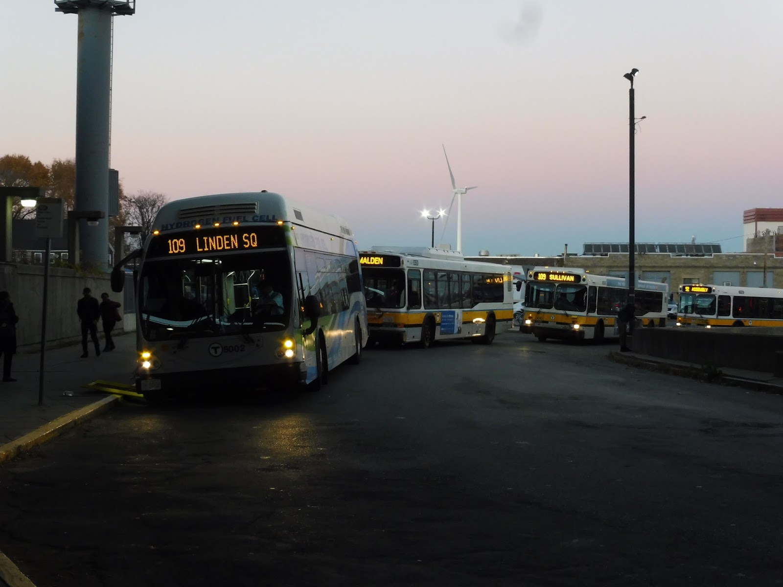
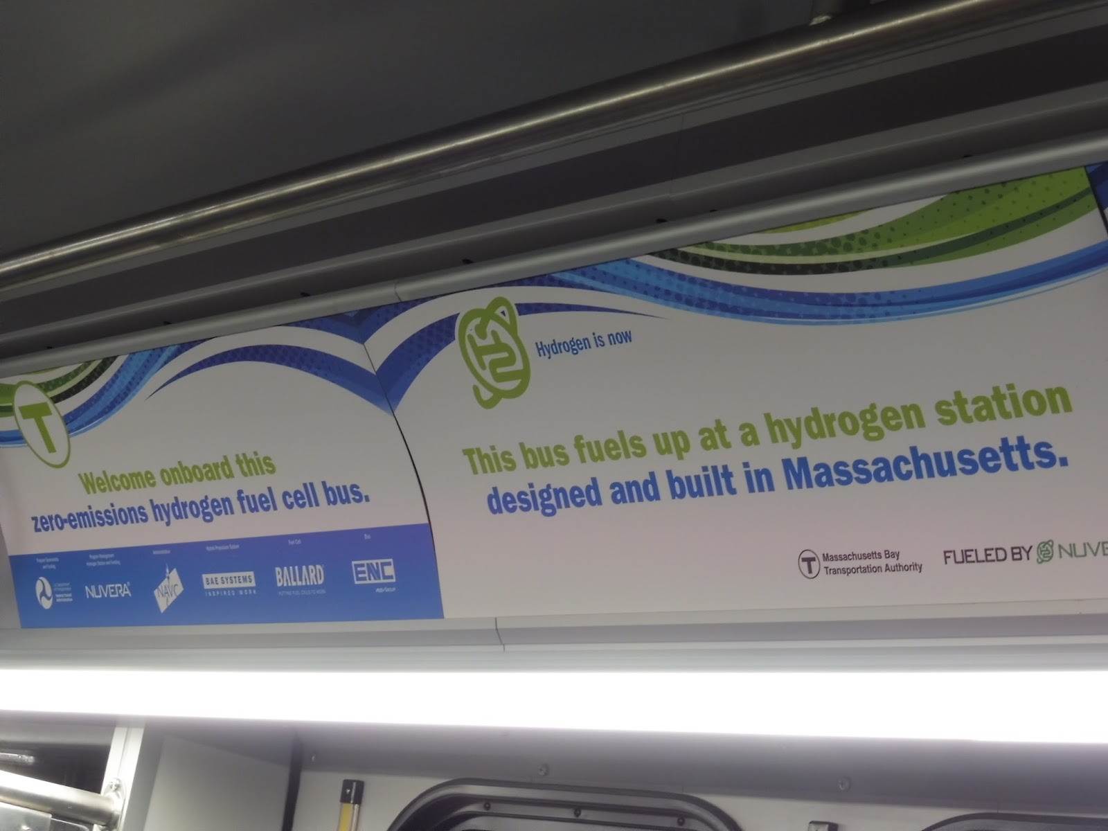
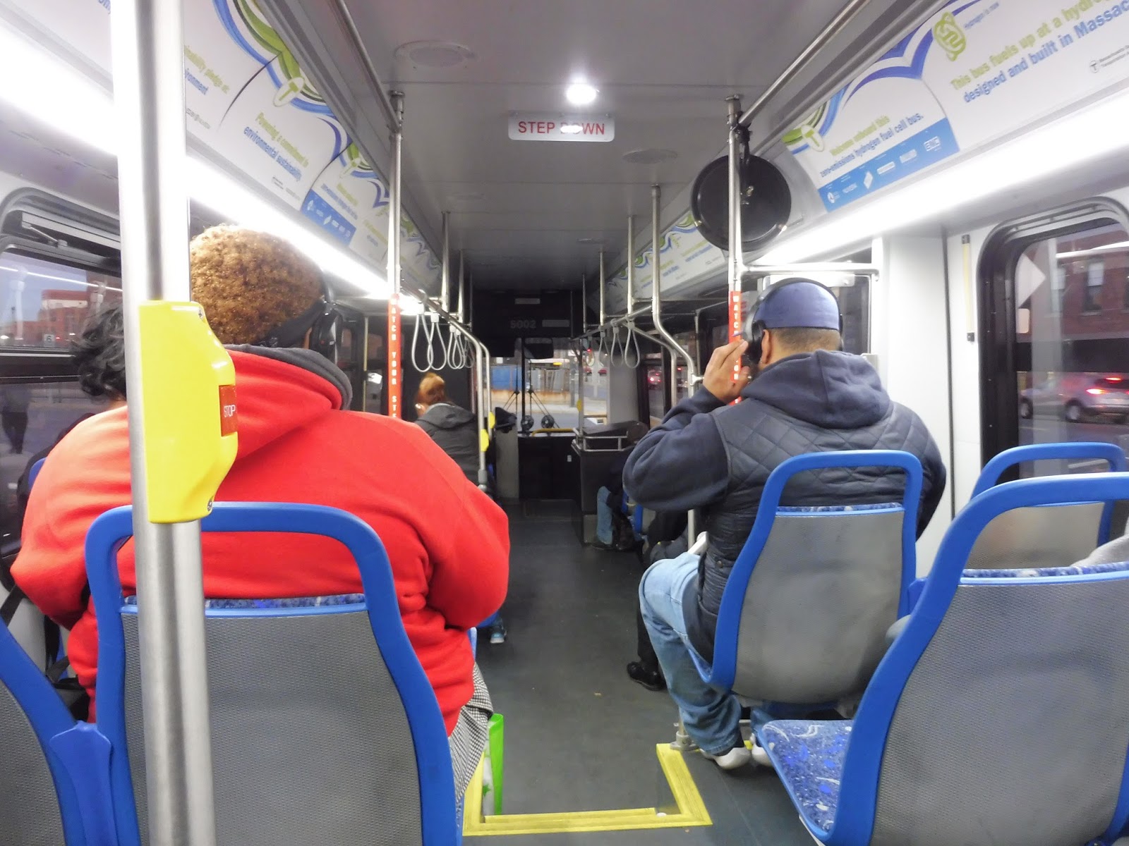
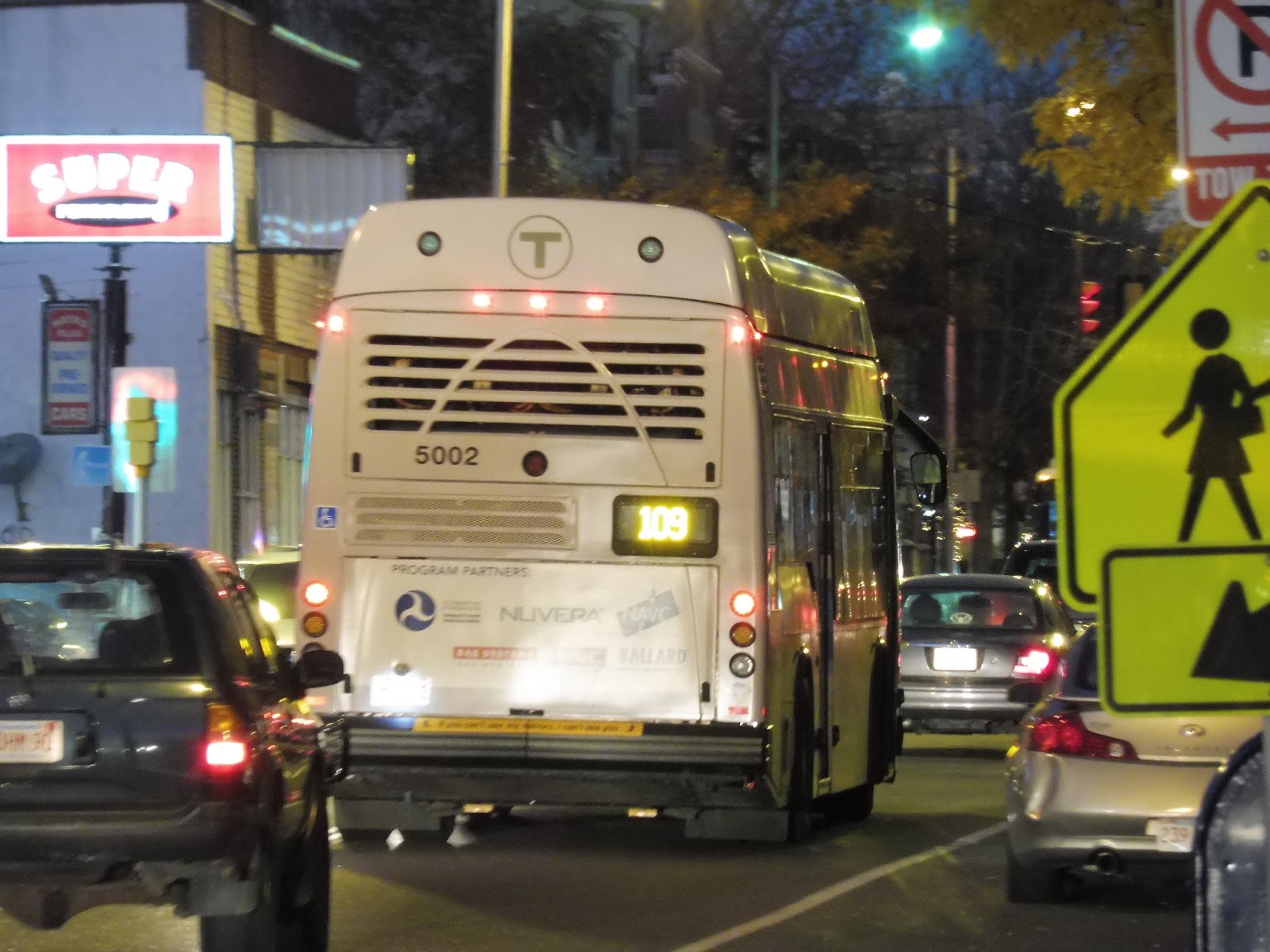
The MBTA’s New Hydrogen-Powered Bus!
We’ve been seeing a lot of new buses lately, but this one definitely takes the cake. The MBTA has a pilot bus that runs on hydrogen that just entered service! Sam and I caught it at Sullivan on the 109, and after a passenger tried to “arrest” us for taking photos, we stepped inside. And…oh my gosh, it is absolutely amazing. It looks and sounds nothing like any other bus on the MBTA, with facts about the bus in lieu of ads, and some simply wonderful sounds as it accelerates and decelerates. Take a look at these pictures!
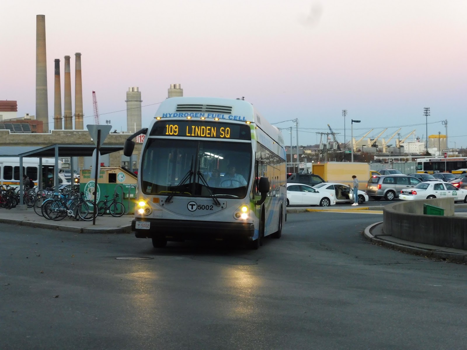 |
| The bus coming into Sullivan. |
 |
| Wow, that’s quite a lineup! |
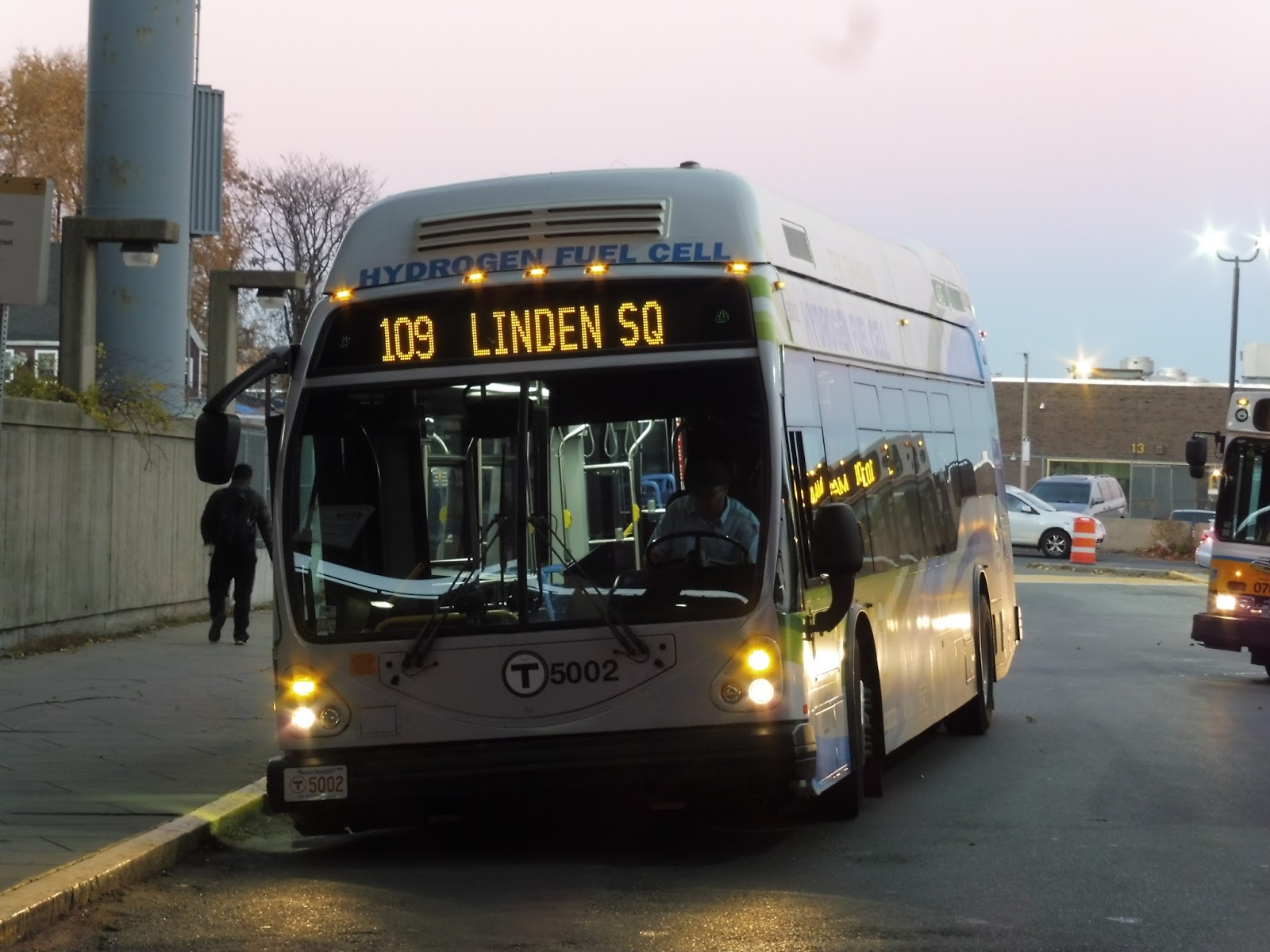 |
| A solo shot. |
 |
| The awesome interior! |
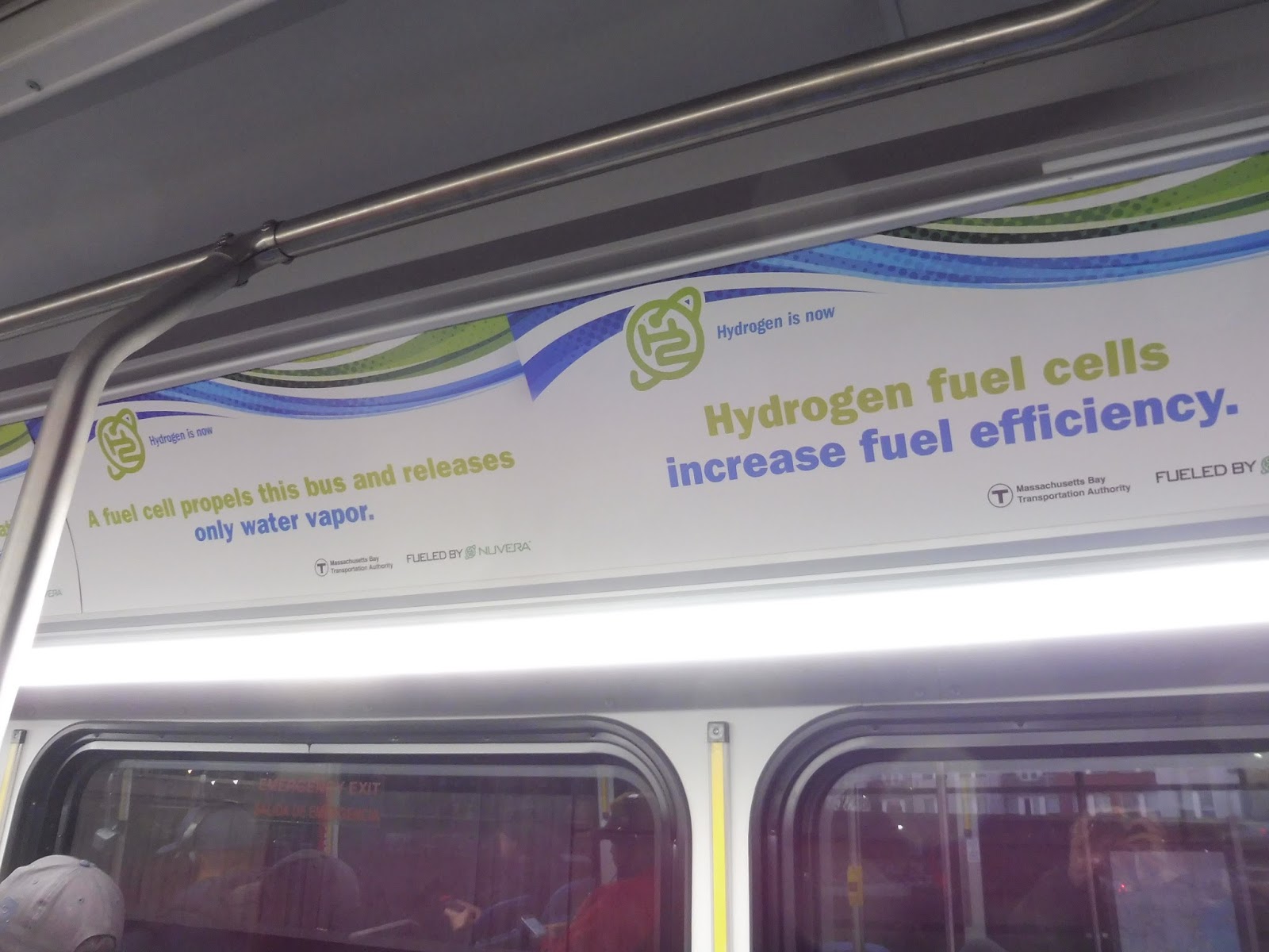 |
| Some of the “ads” in the bus. |
 |
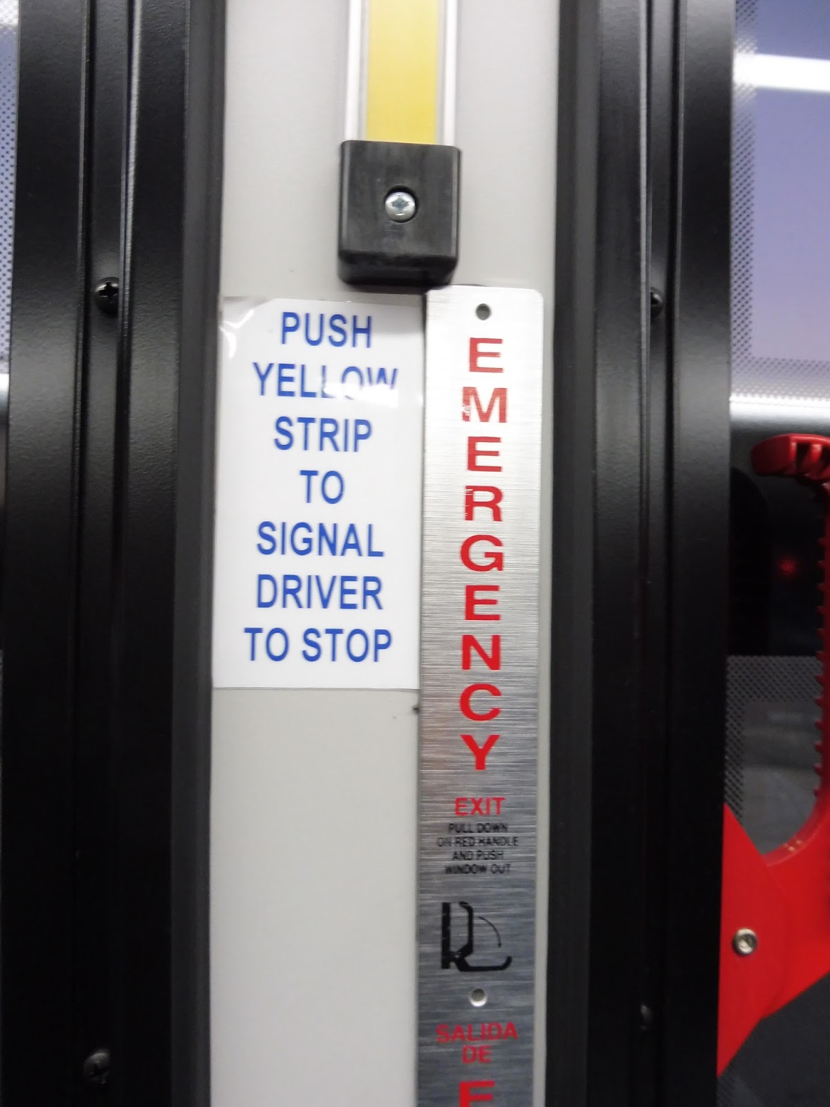
| I’m not the biggest fan of the “stop request” font, but that’s unimportant… |
 |
| Looking towards the front. |
 |
| The bus in Everett. It looks so cool! |
 |
| Goodbye! |