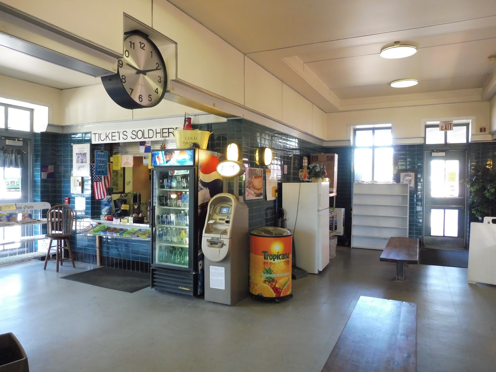
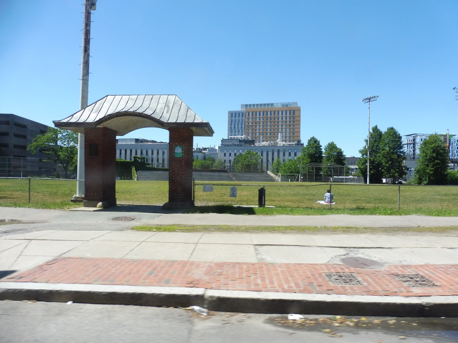
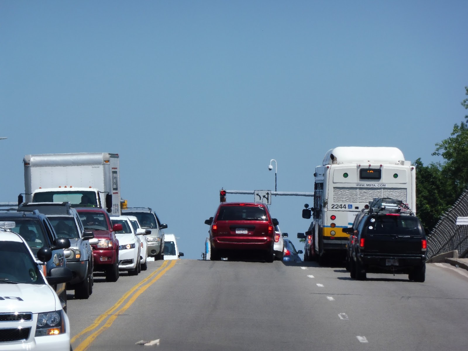
37 (Baker and Vermont Streets – Forest Hills Station via Belgrade Ave and Center Street)
Being on an almost-empty bus during rush hour is an interesting experience. However, this seems to happen a lot with the Belgrade Ave routes from Forest Hills. Since the crowds for them are timed with train arrivals, the buses operate on a first-come, first-serve basis. The 37 happened to come after a few other Belgrade routes that came after a train arrival, so as you can imagine, it was rather quiet inside.
 |
| “Via” Baker and Vermont? What madness is this? |
But I wasn’t satisfied with taking a regular 37 trip. No, I had to do one of the rare, six-times-per-day weekday runs that gets extended to Corey and LaGrange! What madness awaited at the end of the route? My pal Nathan and I had to find out! But, uh, first we had to travel down Washington Street like every other Upper Busway route from Forest Hills…
 |
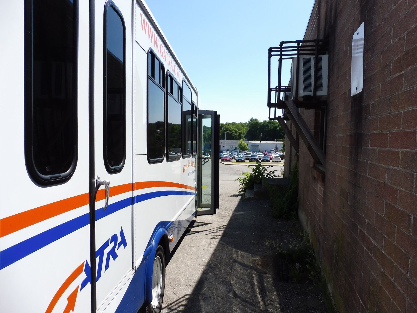
| I had forgotten my camera SD card on my trip, so most pictures had to be taken with Nathan’s phone. This is one such picture, taken of the practically empty bus. |
You know the drill here. It was a industrial for a bit, but then the street became lined with apartments and the occasional business. We went by a field, and then there was retail everywhere, for we had arrived at Roslindale Village. Turning onto South Street and then Belgrade Ave, we went by the Roslindale Village Commuter Rail station.
 |
| Gotta love them auto shops. This is another phone picture |
The street was mostly residential, aside from businesses at major intersections. There was a particularly noteworthy retail block at Bellevue Station, and it continued as we turned onto Center Street. The street was lined with businesses as we went by Highland Station, and they went on all the way until when we turned onto LaGrange Street, starting the independent section.
 |
| Another phone picture of a stop outside of a CVS. |
We went under West Roxbury Station, and LaGrange Street was all residential from there. Eventually, we turned onto Vermont Street. There were a few businesses at the end, where we turned onto Baker Street, joining the 52 for a bit. However, we turned onto Lasell Street soon after, which was once again lined with houses.
 |
| The intersection of Lagrange and Vermont (and Addington), taken from Nathan’s phone. |
But now it was time for the extended portion of the route! Instead of looping back around, we turned north on Lagrange, crossing VFW Parkway. From there, the street had a cemetery on one side and houses on the other. And then, uh…then it became woods. Like, just woods. And then we reached the intersection of Corey and LaGrange, where the bus made this really sharp curve onto Corey Street – it was practically a u-turn! And just like that, we were at the final stop, and the bus took off.
 |
| Wait…where the heck are we? |
This stop…this stop was essentially the middle of nowhere. I mean, it was on this little scrap of sidewalk in the middle of the woods, with some random substation buzzing away behind it. And while Nathan and I were walking back to Highland Station, a caterpillar landed on my bag and got stuck! I mean, clearly we were way out in the boondocks. But anyway…stay tuned for Highland!
 |
| What the heck is this stop?! (picture courtesy of Nathan’s phone) |
Route: 37 (Baker and Vermont Streets – Forest Hills Station via Belgrade Ave and Center Street)
Ridership: The 37 has the lowest ridership of the Belgrade Ave routes, probably due to its short independent section. It gets 1,593 riders per weekday and exactly 1,000 riders per Saturday, both of which are about average for the MBTA. Of course, my ride had a total of four people, including me and Nathan. This was at rush hour, people!
Pros: The best thing I can say about the 37 is that it provides extra service to Belgrade Ave. Its schedule is inconsistent in the morning (about every 20 minutes or so), but in the evening, it’s a solid 15 minute headway, which is great. As for the rest of the schedule, it makes sense based on the ridership, with the route running every 40 minutes midday and every 35 minutes Saturdays, with no Sunday service.
Cons: The problem is that the route doesn’t have much to offer on its own. I mean, the 35 offers a sizeable independent section, while the 36 has reverse commuters going to the Rivermoor Industrial Park. The 37, on the other hand? I mean, it’s got a little residential loop and that’s it. Also, the Corey and LaGrange extension seems pretty pointless. No one went out there, and it only runs six trips per day, anyway.
Nearby and Noteworthy: On the independent section, all you’ll find is houses. I mean…yeah, that’s about it.
Final Verdict: 4/10
Yes, the 37 definitely serves its purpose along Belgrade Ave, and if a trip is timed right, it can get a bunch of people. But how many of them actually go to the route’s independent section? Let’s face it, most of the 37’s ridership is purely for the Belgrade Ave section and nothing else. And the Corey and LaGrange trips? I mean, they’re basically the middle of nowhere! I think they’re meant to serve a few housing developments that are sort of nearby, but if no one uses the trips, then there’s not much point in running them.
Latest MBTA News: Service Updates
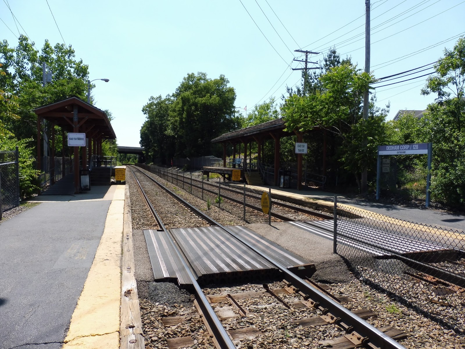
Dedham Corporate Center
I feel like being stuck at any Commuter Rail station for an hour will make you dislike it. This was unfortunately the case with Dedham Corporate Center, and I was in a pretty bad mood during my long wait here. Um…I’ll try to be objective here, okay?
 |
| Or maybe this station is actually awful and I was right all along! |
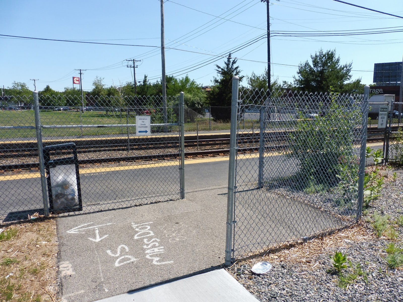
I came into the station from Rustcraft Road, which is where the Dedham Local Bus runs (no signage, for the record). There’s a small kiss-and-ride drop-off area here, and it was built in 2014. It’s just a stretch of road with a sidewalk – no benches, no wastebaskets, nothing. Also strange is the fact that you have to walk a ways back to get to this odd chain link fence entrance to actually get into the station.
 |
| The station’s grand main entrance. |
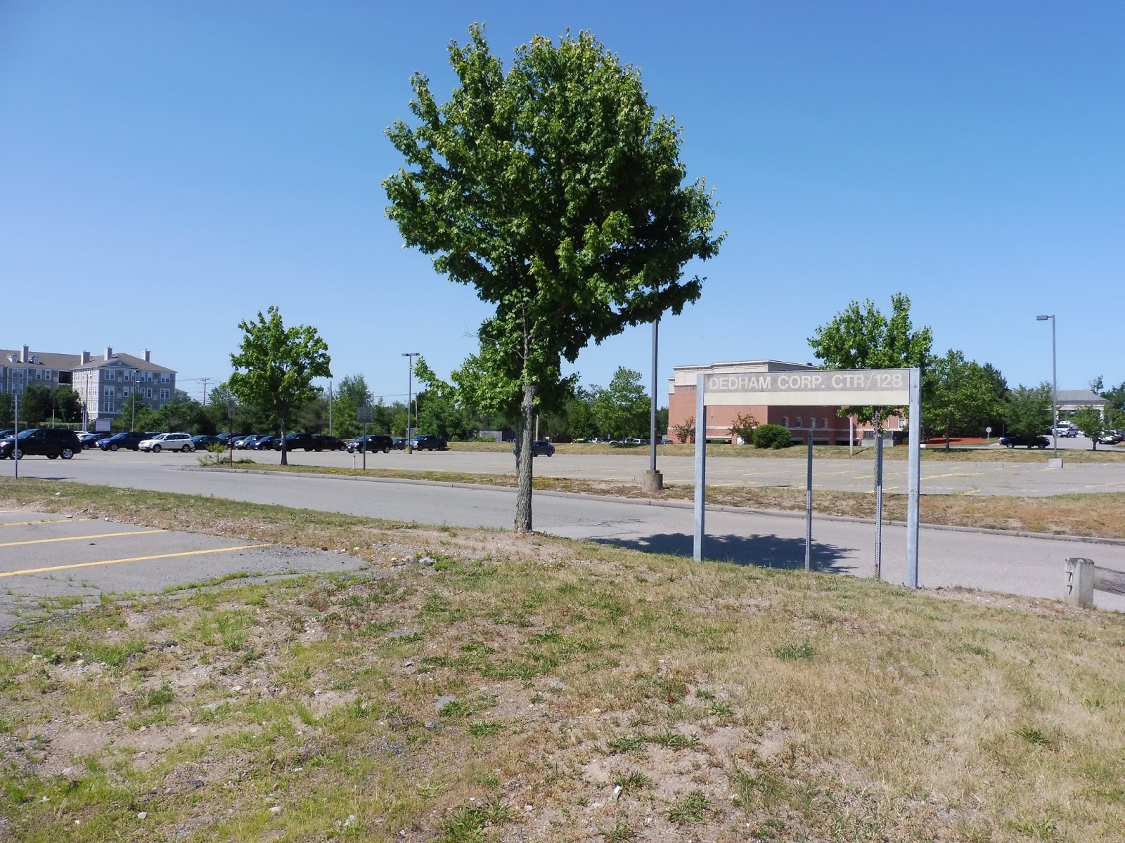
Meanwhile, the main entrance of the station is on the other side, and it leads into the parking lot. Dedham Corporate Center is primarily meant for park-and-ride trips, and thus it has a big lot with 497 spaces. The station is in very close proximity to Exit 14 off of I-95, so that helps it a lot in terms of convenience for drivers.
 |
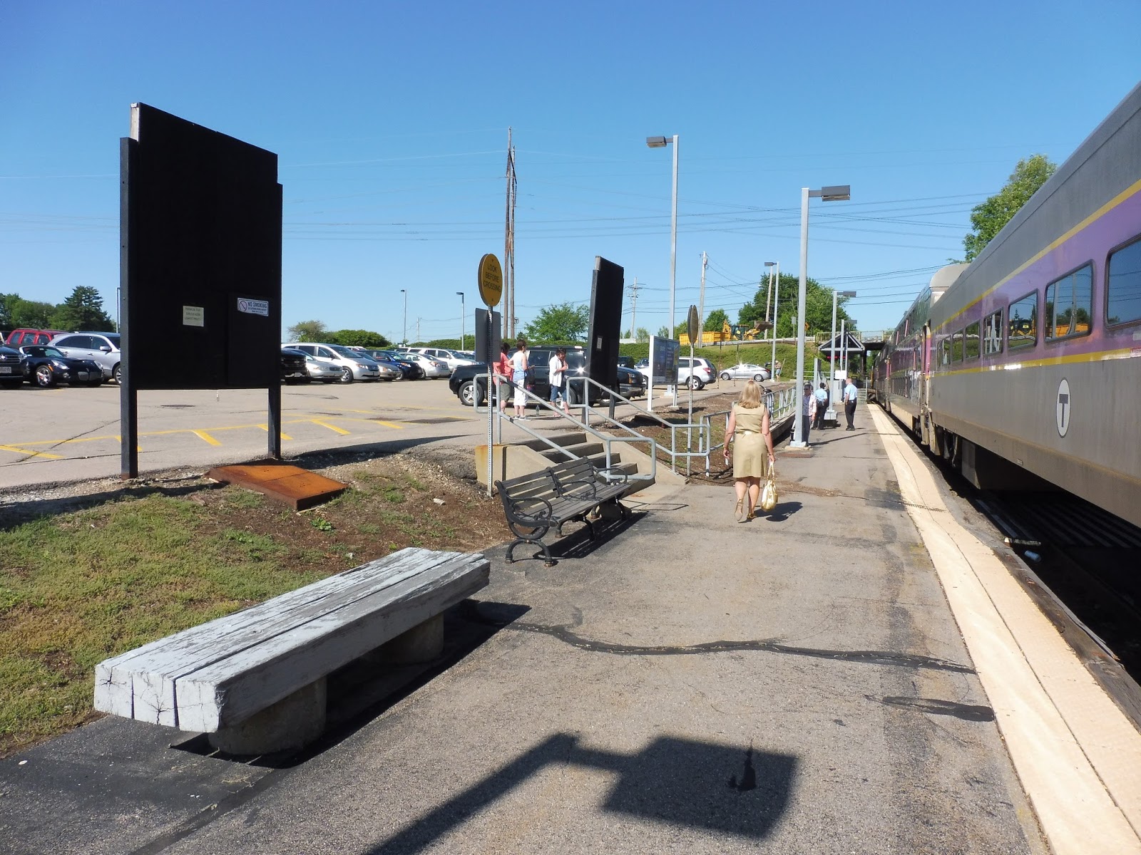
| Looking down the platform. |
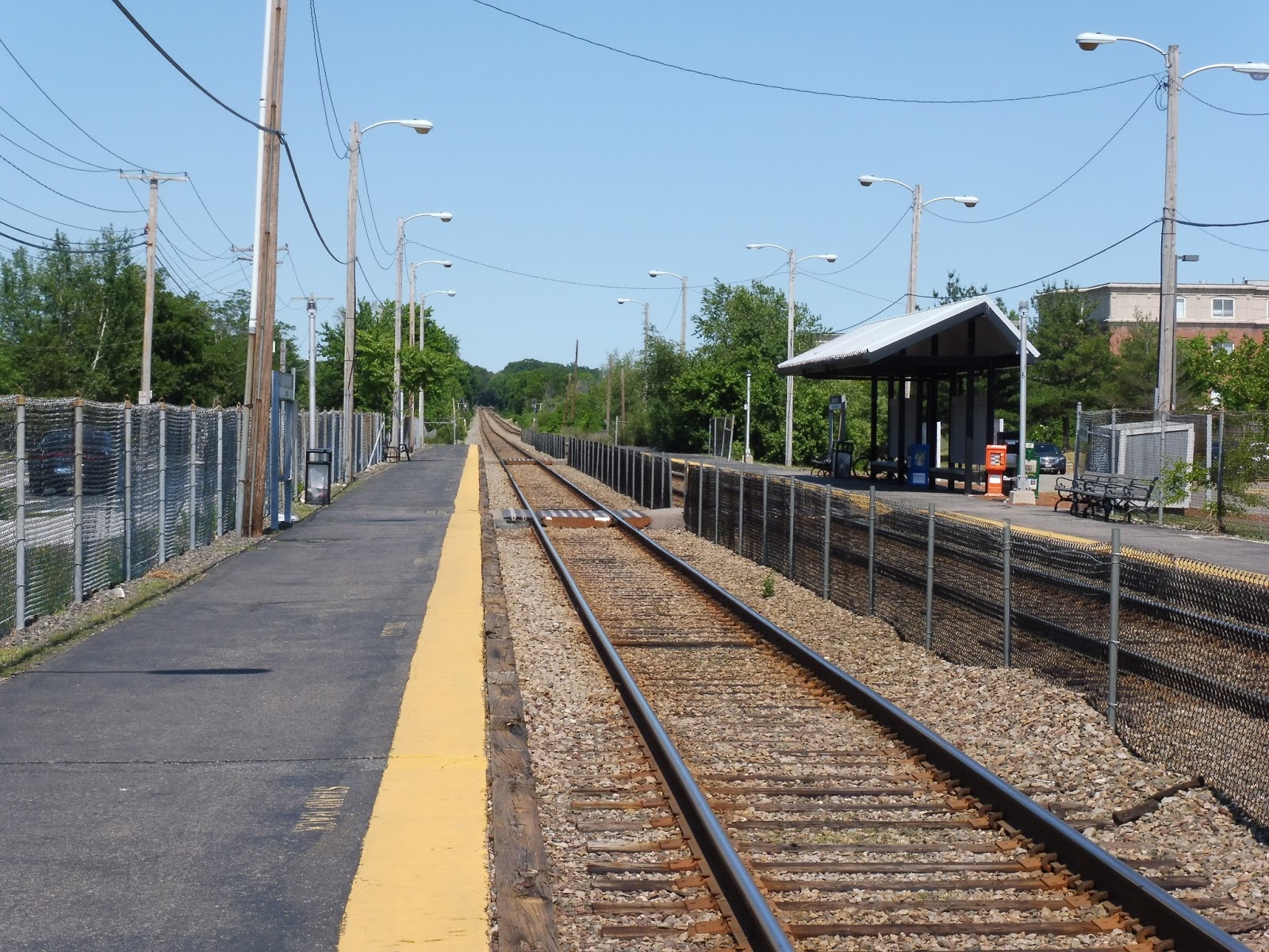
As expected, much of the platforms are bare, with only a few wastebaskets and benches on either side. I’ll talk about the shelter on the inbound side in a minute, but can I just say how ugly this station is? I mean, the chain link fences make you feel, um, fenced-in, while telephone wires string every which way! It certainly doesn’t have the tranquility that its next store neighbor stations have.
 |
| The shelter and other attractions. |
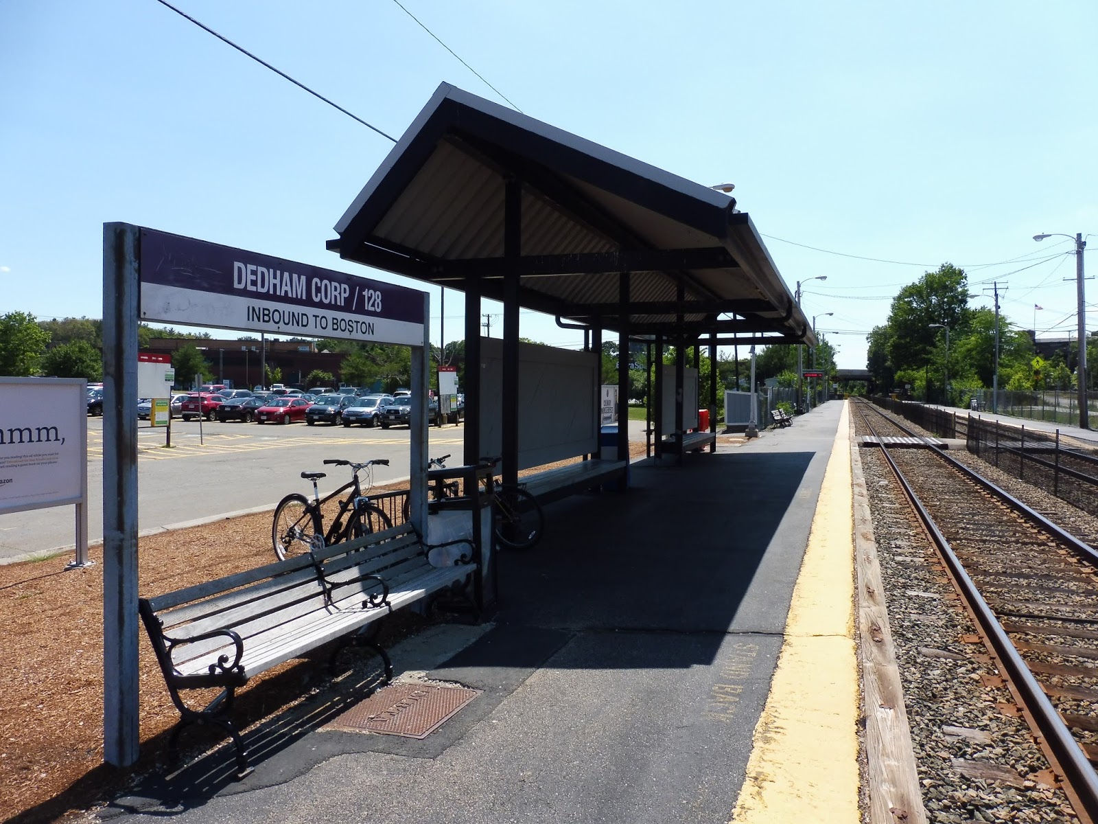
The inbound platform has a surprising amount of amenities near the parking lot. Aside from the generic boring shelter riddled with bird poop, there’s another bench, a bike rack, a wastebasket, and even some newspaper boxes. In fact, why didn’t I think to take something from one of them to have reading material during my wait? Shoot…
 |
| The station mini-highs. |
Okay, I will say that the station’s mini-high platforms are pretty nice. They’re both wooden, and they each have a single bench on them. The bench on the inbound side is different from the one on the outbound side, which is a bit weird, but as long as I have a place to sit, I’m happy. Even if I have to sit there for an hour…
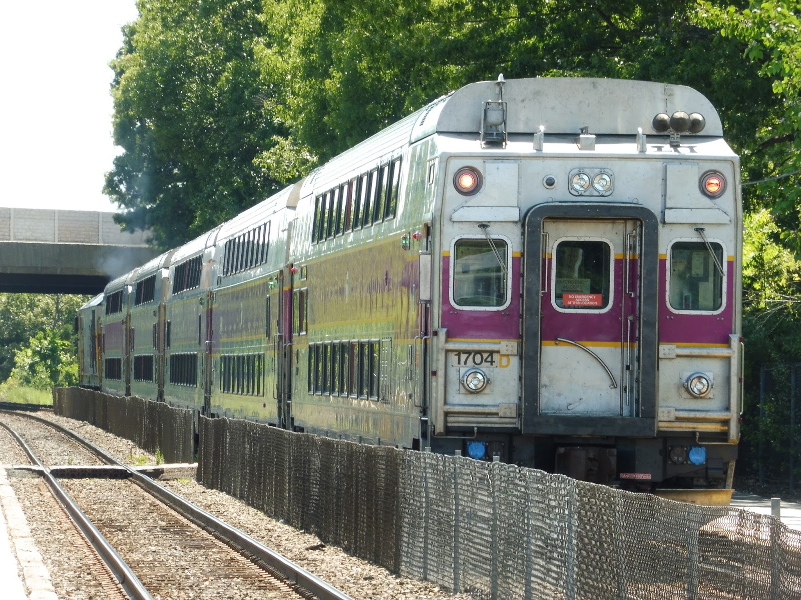 |
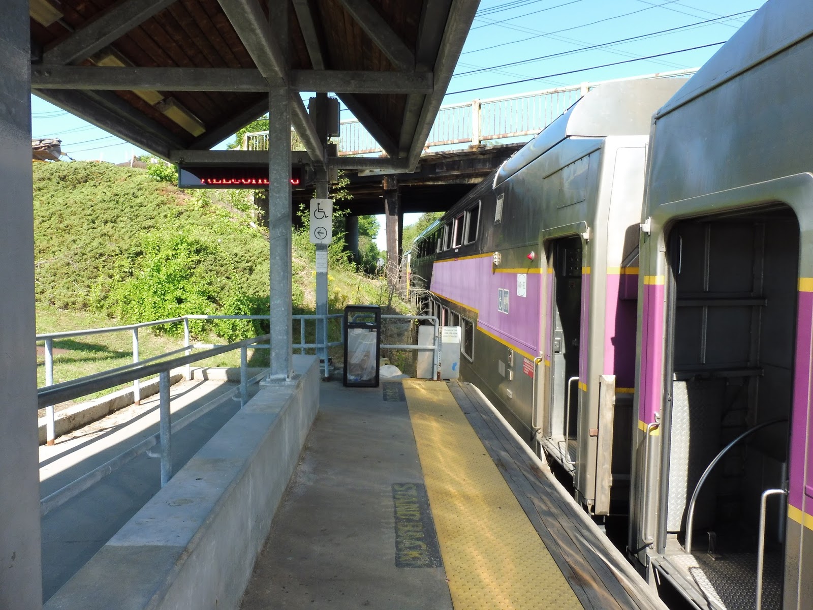
| The train was going the wrong way! |
Station: Dedham Corporate Center
Ridership: Surprisingly, this is the 5th busiest station on the Franklin Line. It certainly didn’t seem that busy when I was here, with most people just using it to get from one side of the tracks to the other. I’m not sure where the station’s 806 average weekday riders come from, but, uh, that’s how many people use this place. Aside from people driving into the station’s parking lot to go into the city, I’ll bet this station gets its fair share of reverse commuters due to a few nearby office parks.
Pros: This station is accessible, which gives it the edge over both of its neighbors, Endicott and Islington. Also, this station offers lots of parking for both cars and bikes, although only 25% of the automobile lot gets occupied on weekdays.
Cons: Oh man, it’s just such an ugly station! I really hate the chain link fences everywhere, and they’re not even necessary! All they do is inconvenience people trying to get from one side of the tracks to the other (which apparently a lot of people do). Also, the shelter on the inbound side really needs to be cleaned up; there is way too much bird feces on that bench.
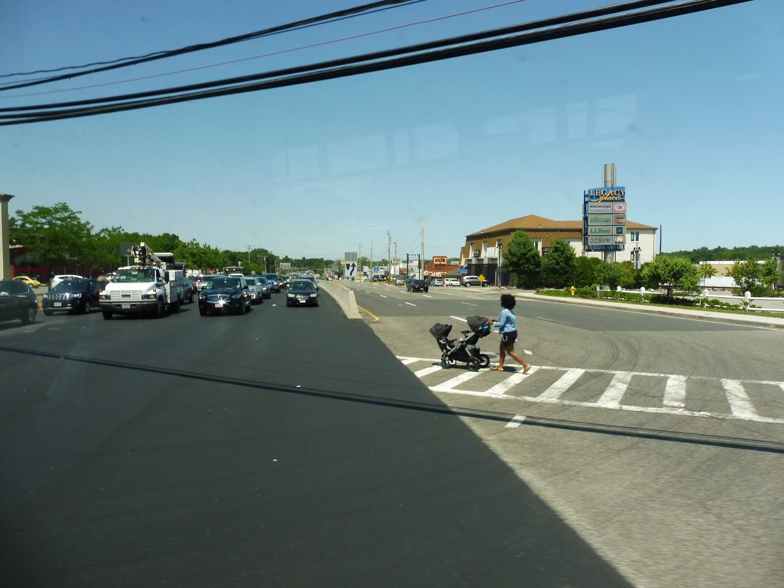
Nearby and Noteworthy: Aside from Legacy Place, to which this station is surprisingly close, a Cummins plant is right next to the station. What is the Cummins plant, you ask? Take a look:
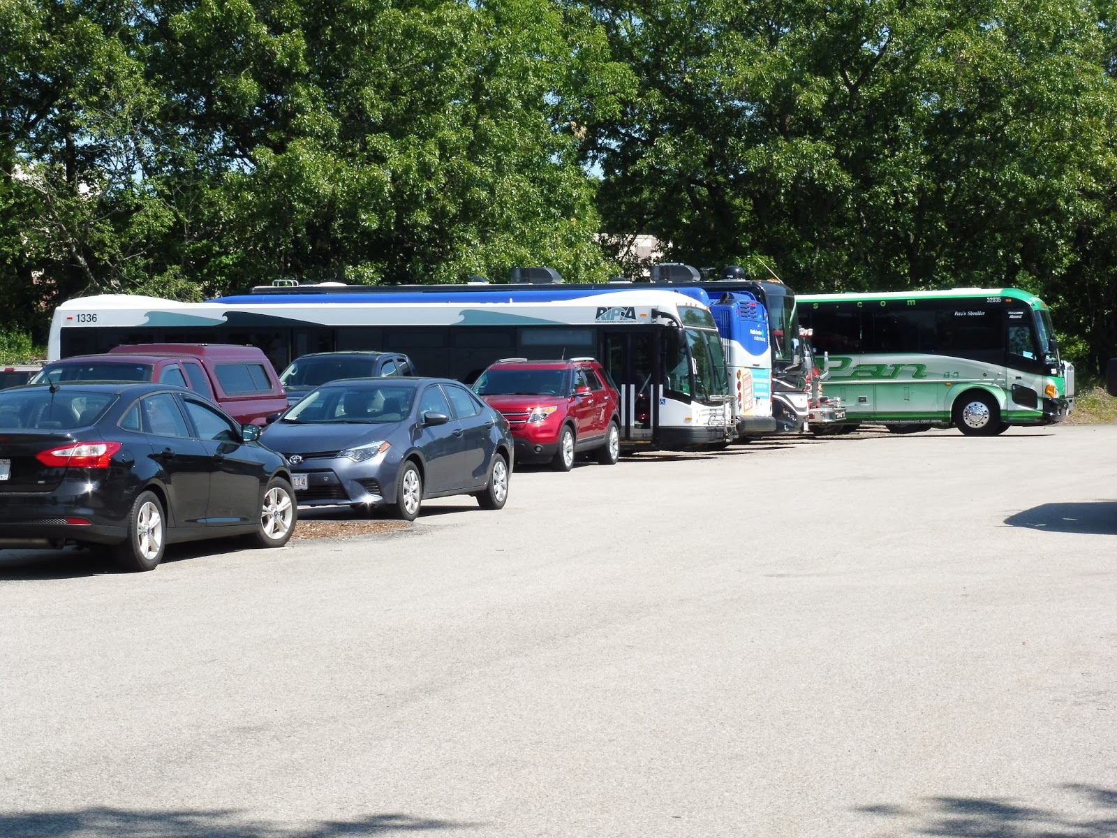 |
| A RIPTA bus, a Longwood shuttle, and a Peter Pan bus walked into a bar… |
You’ll always find a few interesting buses here, so it’s definitely worth a look if you’re into transit. I mean, a RIPTA bus in Dedham? What the heck?
Final Verdict: 6/10
If only Dedham Corporate Center wasn’t accessible so I could give it a proper low score. However, it is accessible, so I have to raise its verdict a bit. Yeah, I’m really not a fan of this one. Maybe it’s because I was stuck here for an hour, but I’m not the only one who thinks the place is ugly, am I?
Latest MBTA News: Service Updates
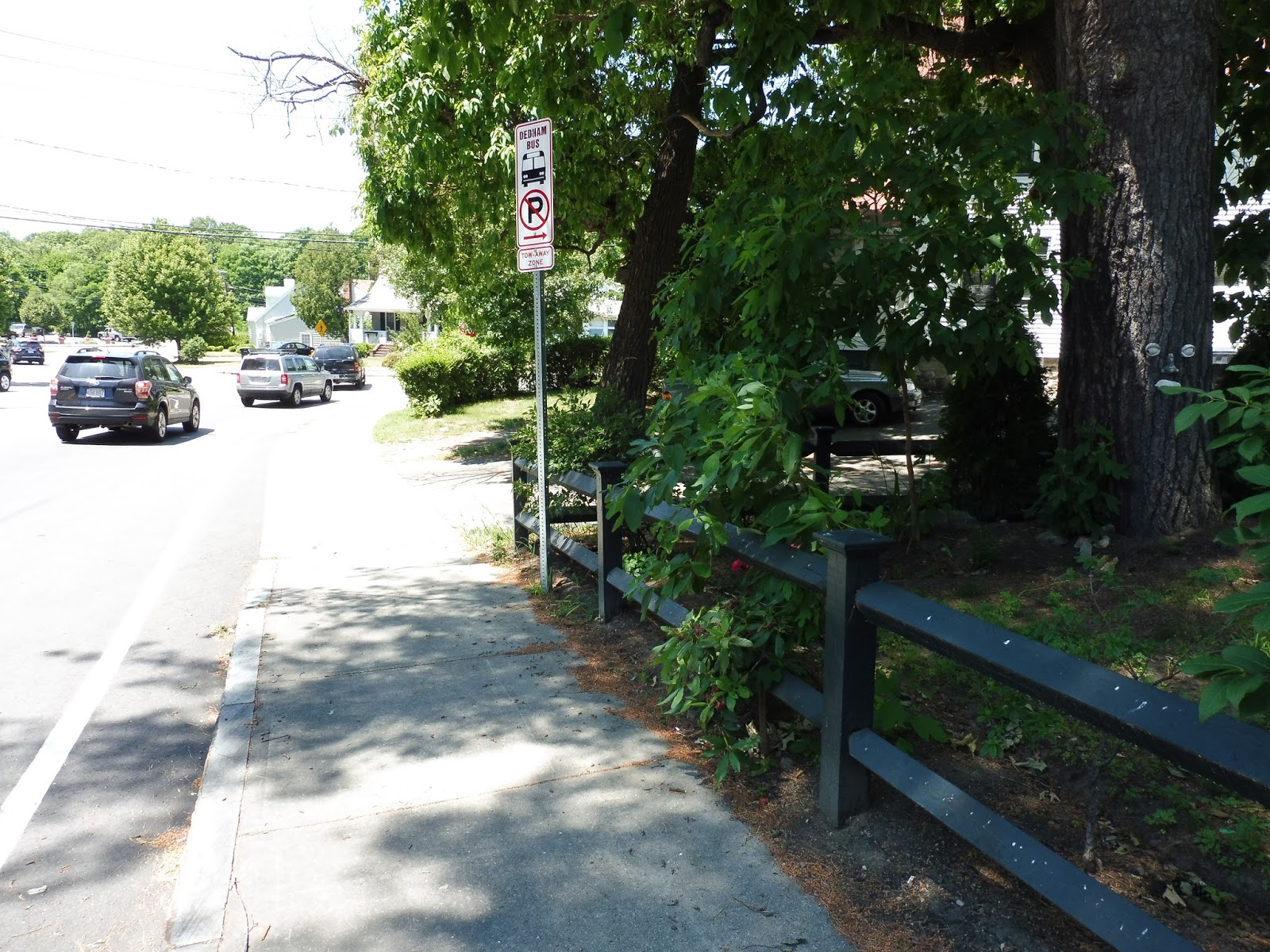
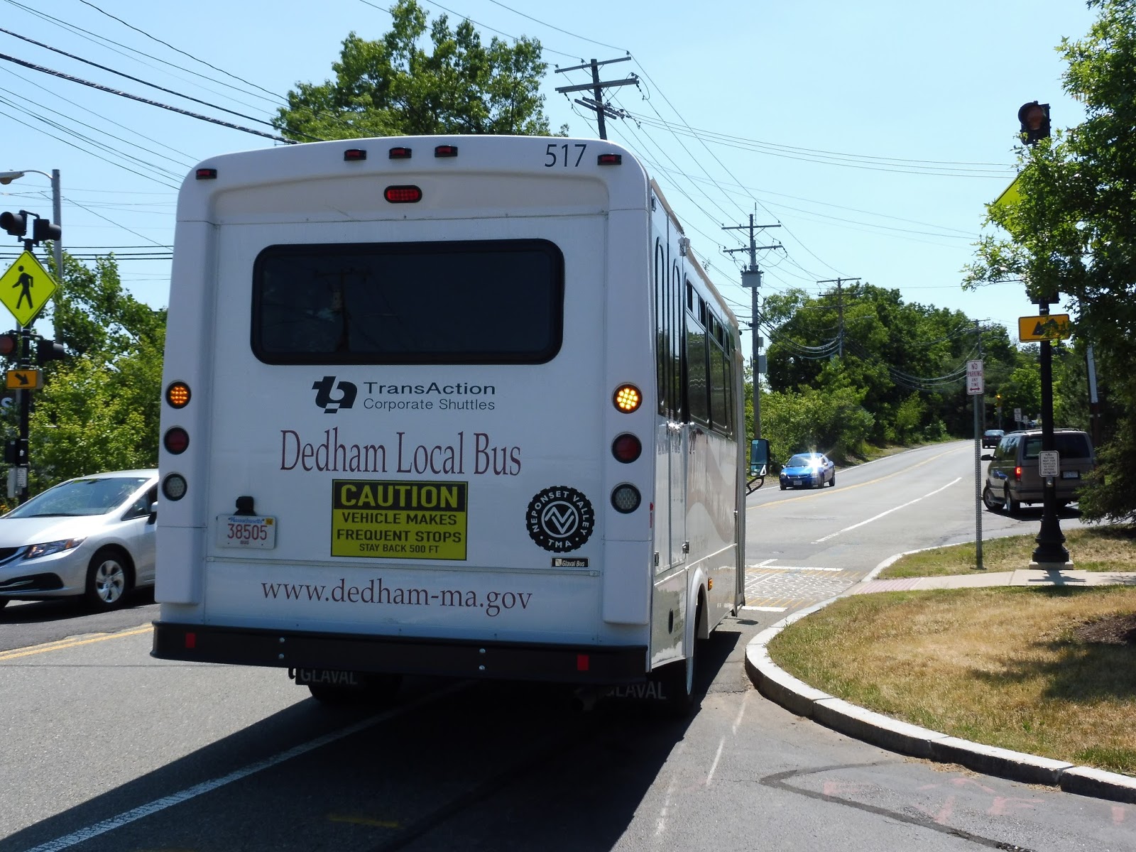
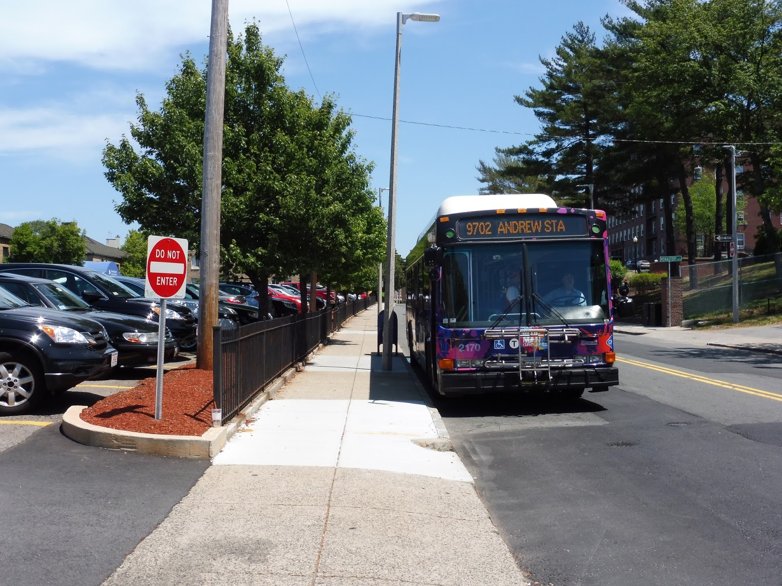
Dedham Local Bus
This bus is a mess. You may have seen these MBTA paper schedules of the Dedham Local Bus. Looks simple enough, right? Well, they’ve changed the route since then. Now, it’s this:
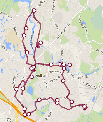 |
| What is this madness??? |
Now do you see what I mean by “mess”? Okay, let’s take a closer look at this insane route. My friend Zach and I got on the bus at the “32 Sprague Street” stop, which is literally the address of someone’s house. Oh well, at least it was an actual stop.
 |
| Not bad. |
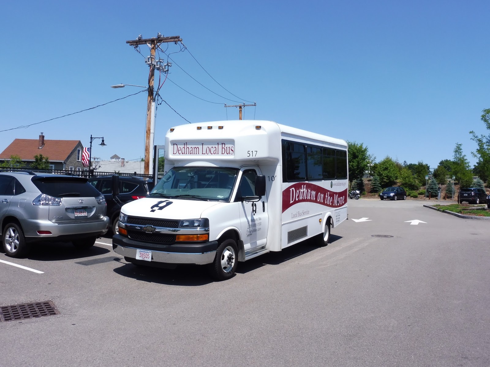
The Dedham Local Bus is also advanced enough to have a tracker, which was useful for seeing where the bus was on Zach’s smartphone. It was slightly late, and boy, that minibus was a beauty. Gotta love that boring serifed font…mmm-hmm.
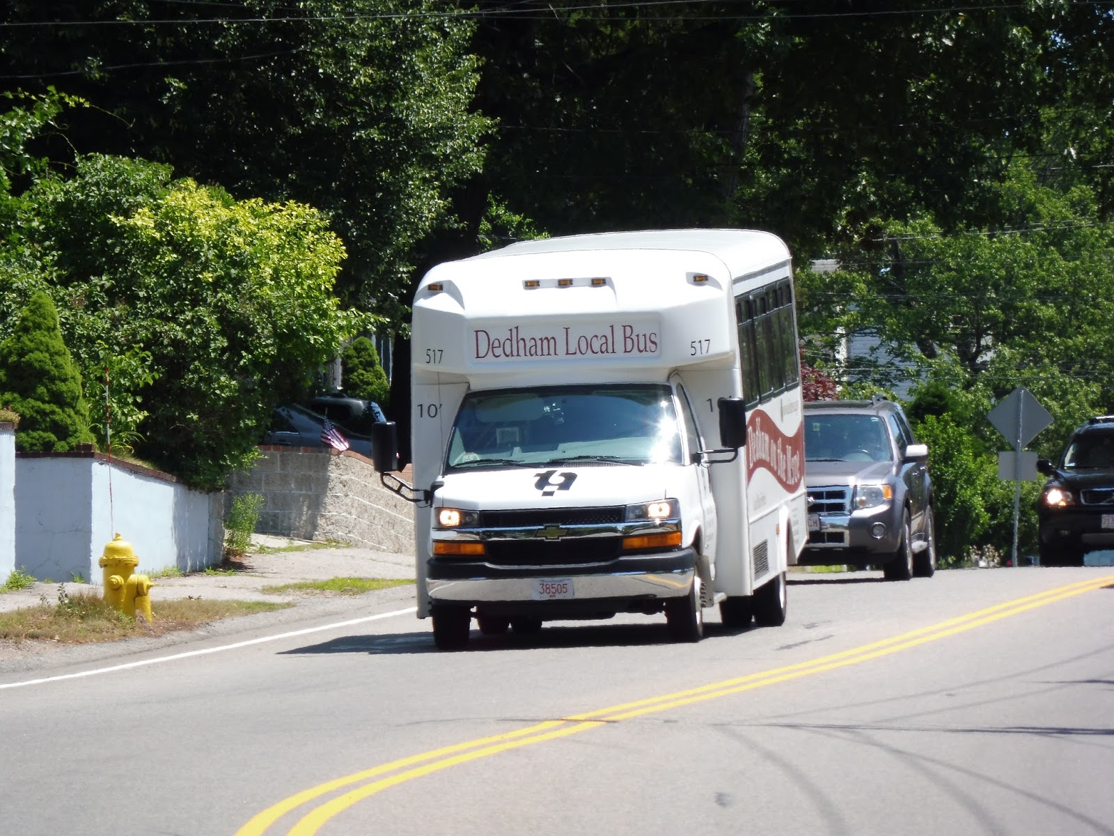 |
| Ah! Gorgeous! |
And on the inside? Well, it was the quintessential minibus experience. Let’s see, the driver was blasting inane pop music over the radio, there was a jiggly wheelchair lift in the back. and the lack of stop request buttons meant one had to yell out when they wanted to get off. The fares for the route, incidentally, are $1.50 for adults and $1.00 for students and seniors.
 |
| What a lovely interior. |
From the 32 Sprague Street stop, we went around a rotary and headed up East Street, going under the Commuter Rail tracks. This was a residential neighborhood, and the houses continued as we turned onto Rustcraft Road. We passed through a short forest section, went by a field, and then the street curved around next to the Commuter Rail tracks.
 |
| An intersection near Endicott. |
We passed Dedham Corporate Center Station, as well as some apartment developments across the street. The street then became Elm Street and curved north, where we made the first of many deviations of the route, pulling into a backlot at the Legacy Place Mall. And yeah, it’s great that the route directly serves Legacy Place, but how about putting up some signage there? Geez!
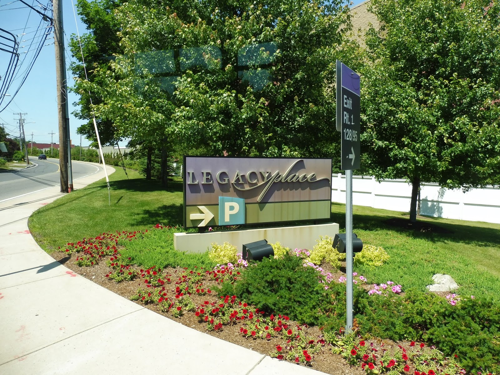 |
| My camera was acting up inside the mall, so, uh, here’s the sign! |
Now back on Elm Street, we travelled along the back side of Legacy Place, then crossed over the wide Providence Highway. Next, we turned onto Washington Street, joining the 34E. After some houses, we unexpectedly pulled into the Dedham Plaza, but then went around the side of the building to do a loop around the main lot along the Providence Highway. And guess what? No signage.
 |
| Crossing the Providence Highway. |
We now returned to Washington Street (diverting from the mapped route, I might add) and continued through a residential neighborhood. Eventually, though, we turned onto Bryant Street, passing by a few offices. This led to the Dedham Square Municipal Parking Lot, which is considered the start point of the route. We pulled in and laid over for a bit before setting off again.
 |
| Hmm…seems like a logical place for a bus stop. I hope none of those cars want to leave their parking spaces! |
We pulled out and headed down High Street, going by the many businesses of Dedham Square. After some fancy municipal buildings, we turned onto Ames Street, which crossed over the Charles River. There were lots of houses along the road now, continuing as we merged onto Bridge Street. There was a bit of an industrial stretch, then we deviated through a housing development on the narrow and slow Doggett Circle.
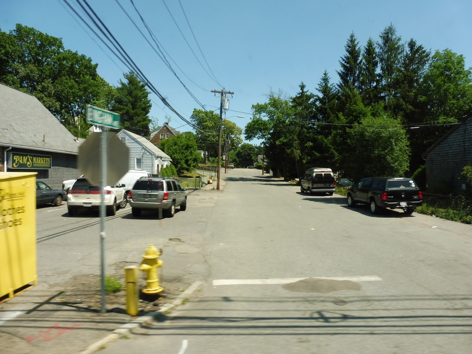 |
| A side street. |
We passed a mini golf course back on Bridge Street, as well as a small regular golf course. After some offices and industry, we crossed over the Charles again, entering Boston. Here, we pulled into the Charles River Loop, where the 36 terminates. There was some traffic getting back onto Spring Street, and then we had to make a left turn onto VFW Parkway, but we made it eventually.
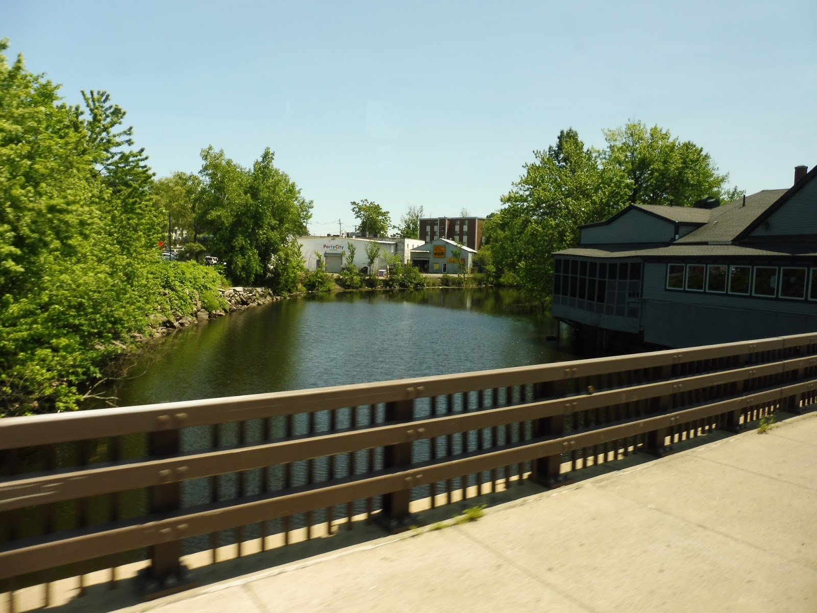 |
| Going over the Charles. |
VFW Parkway was wide, fast, and very ugly. We passed lots of auto dealerships and industrial buildings and the like before finally arriving at the Dedham Mall, where we served the Stop and Shop side. What, too lazy to make a deviation to serve the rest of the mall? The route makes so many unnecessary deviations already, why not have one more?
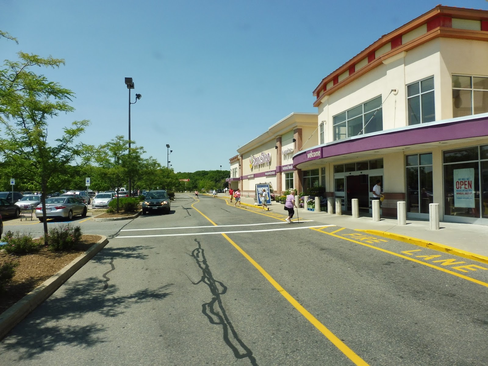 |
| Oh, and did I mention that there’s no Dedham Bus sign? |
Zach got off here to get a 34E, and now it was just me as we headed back onto VFW Parkway. This took us back to Dedham Square, where we pulled into the lot again and laid over for for a bit more. When we were ready to leave, we went down High Street (the other way this time), which soon became residential.
 |
| A parking lot. |
We made yet another deviation into a housing development, this time on O’Neil Drive. It took forever to slowly loop through the complex, but eventually we made it back onto High Street, passing a school. We went by a few more developments (not directly serving them, luckily), then crossed over a small pond.
 |
| More housing developments! WOOOOOOO! |
However, it turned out this pond crossing was only to serve yet another housing development. And thus, after making a quick loop, we went right back the way we came. I’d like to point out that the route is supposed to make a second deviation in this area to serve the Motherbrook Community Center, but we didn’t do that on our trip, for some reason.
 |
| Nice view! |
We turned onto Walnut Street, which was mostly residential. We then merged onto Oakdale Ave, which led to a square of the same name; there were a few cute business blocks there. Now on Cedar Street, the surroundings were all houses once again.
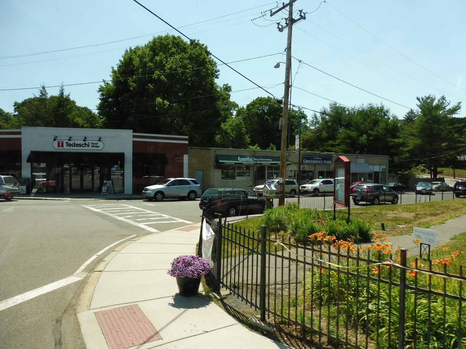 |
| A few businesses in Oakdale Square. |
After a while on Cedar Street, we crossed over the Franklin Line tracks, then turned onto Turner Court. There were more houses, which continued as we turned onto Sprague Street. But was it Sprague Street in the direction of Endicott Station? Nope! We were making another stupid deviation!
 |
| Some houses. |
Luckily, this deviation actually served a purpose. I mean, it was a pretty annoying one, since it involved a full u-turn on the smallish Louise Road, but in the end…we got a rider! HOORAY! So now, with another person on board, we headed back down Sprague Street, and this time we stayed on it all the way back to Endicott. WOW, that was a long loop.
 |
| I took the bus a bit further to Dedham Corporate Center, so here it is there. |
Route: Dedham Local Bus
Ridership: Oooh, this one’s a hoot. The route got 9,784 riders in 2014, which equates to an entire 39 riders per day it ran. Wow! Such high ridership! But that was back when the route was more linear. Has ridership increased since they made it a confusing loop with too many deviations? Welp, if the one other passenger on my ride is to judge…no!
Pros: Look, the idea of a shuttle in Dedham is a great idea. It really is. There are big chunks of the town not served by the MBTA, so a bus to cover those service gaps is fantastic. In theory.
Cons: Here, I’ll be nice and start with a complaint not regarding the route itself: the schedule. The clockface every hour service is sensible, but there are two major problems with the scheduling. Number one is the service gap from 12 to 1. I think it’s meant for the driver’s lunch break or something, but why not just do a driver switch? Can they really only afford one driver? Number two is the fact that the route has no rush hour trips – service runs from 8 AM to 5 PM. Wouldn’t it be great to extend it by one trip on either end in order to bring people from local neighborhoods to the Commuter Rail or MBTA buses for their commute? That seems like it could be useful. Wow…look how much I’ve written without talking about the crazy route. So anyway, about the route: why is it so insane? It’s like the planners were playing a game of trying to put in as many unnecessary deviations as possible! And sure, some of them make sense, like Legacy Place or the Dedham Mall, but they get no ridership because they don’t have signage! Either add signage to every single one of your stupid deviations, or simplify the dang route. This is ridiculous.
Nearby and Noteworthy: I mean…you can basically get anywhere in Dedham with this crazy route. Will you get there quickly? Nope. But you’ll get there eventually!
Final Verdict: 3/10
Is Dedham really suburban enough to justify an insane loop that makes detours to serve every housing development and mall in its path? I mean, sure, it does serve a lot, but most of those detours get no riders, anyway! This route needs signage at all of its stops, and its route needs to be simplified. Do ridership counts! Iron out the detours that don’t typically get people! Oh, and add some commuter trips to the schedule! The basis for a good route is here, but it has way too many problems to be considered adequate right now.
Latest MBTA News: Service Updates
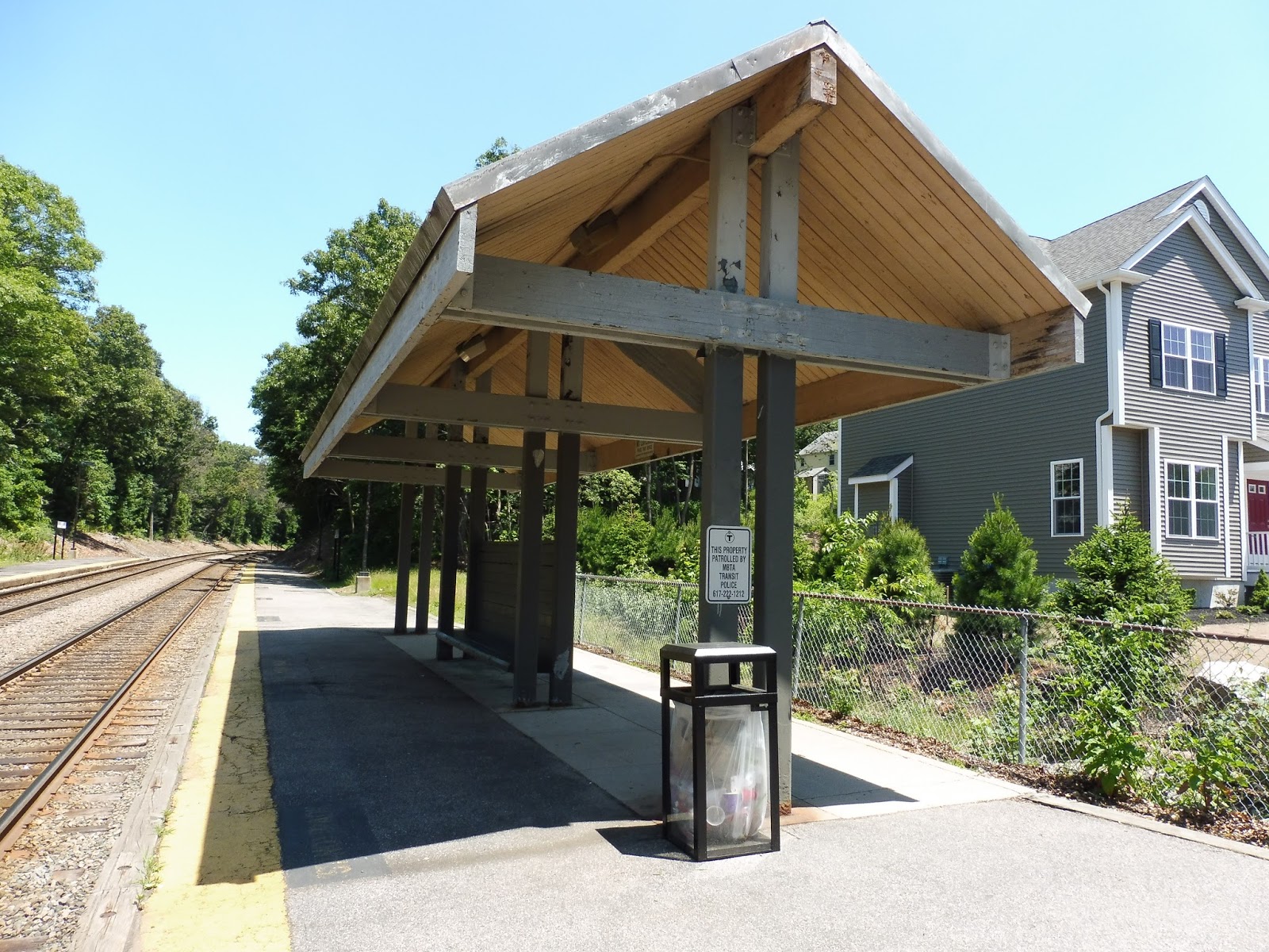
Endicott
One of the things I don’t like about the Franklin Line is that it just has too many dang stops. Endicott is three minutes away from both of its neighboring stations (Dedham Corporate Center and Readville), and has a very local kind of feel. It’s also not very interesting…
 |
| What a generic shelter. |
Endicott is a pretty tiny station to begin with, so there isn’t much platform room for amenities. The inbound side gets a shelter, at least, and it’s of the “boring wooden” variety. This side also features such amazing attractions as…a bench! A wastebasket! Okay, that’s the end of the attractions.
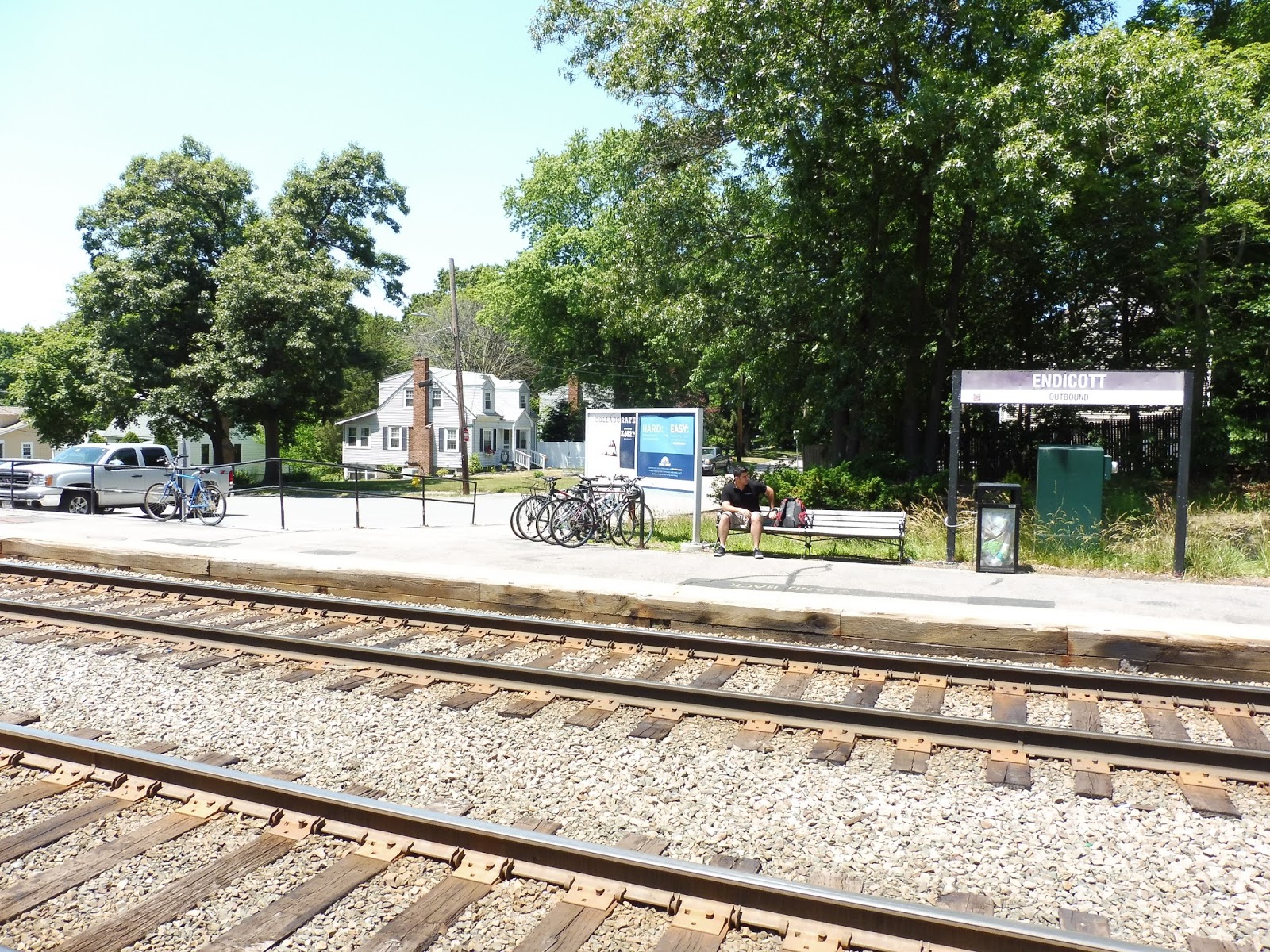 |
| The outbound side. |
Well, hey, it’s better than the outbound platform! All that side has is a bench and a wastebasket locked up to a station sign. The small parking lot is also accessible from here, with 45 spaces. That doesn’t seem like much, but this station is right in a suburban residential neighborhood, so I don’t think too many people would drive here. This side also has a decently-sized bike rack.
 |
| The other exit. |
Meanwhile, the station’s other exit used to be a cute pedestrian path, according to Google Maps Street View. However, it appears that they built a new road just to build a single house, and now the character of the entrance is gone. Oh well, at least there’s more bike parking here. I appreciate a station with lots of bike spaces.
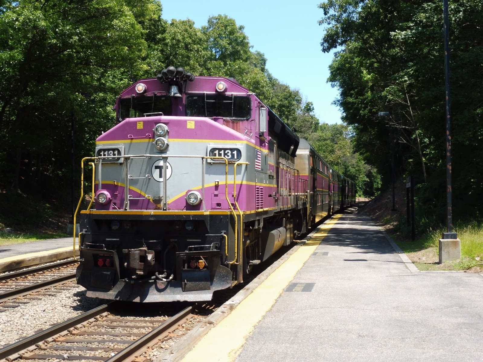 |
| A train leaving the station. |
Station: Endicott
Ridership: Barring Plymptonville, which only gets one train per day, this is the least-used station on the Franklin Line – Endicott only gets an average of 350 riders per weekday. I’m not entirely sure why so few people use this station, but maybe it’s because it’s so close to Boston that riders don’t want to pay $6.25 (soon to be $6.75) to get into the city. I’m only guessing – I really have no idea.
Pros: The station has basic amenities like shelter and benches, and it feels pretty quiet and tranquil. The presence of a parking lot, no matter how small, is a good thing, and there’s a good amount of bike space here.
Cons: It’s not accessible for one thing, and for another…do trains really need to stop here? I mean, don’t get me wrong, some people use this place. But I almost wonder if more trains should skip through. It’s incredibly close to Dedham Corporate Center and Readville (both of which have excess space in their parking lots), and having some trains skip Endicott would speed up the line slightly.
Nearby and Noteworthy: Aside from a tiny business block at the end of Greenwood Ave, the surroundings of this station are entirely residential.
Final Verdict: 4/10
What if they made it a flag stop? At least make it a flag stop! Come on, it just seems pointless to have every train stop here. Is there really someone waiting here every time a train comes through? Making a station a flag stop really doesn’t impact anyone, and would speed up the Franklin Line just a little bit to be able to skip by if no one’s waiting. Oh, and the station itself? It’s…it’s a station. A boring station.
Latest MBTA News: Service Updates
Hey, it’s been a while since I’ve updated this! As I alluded to earlier, the dreaded fare increase begins on July 1st, so check to see what the increased rates are.
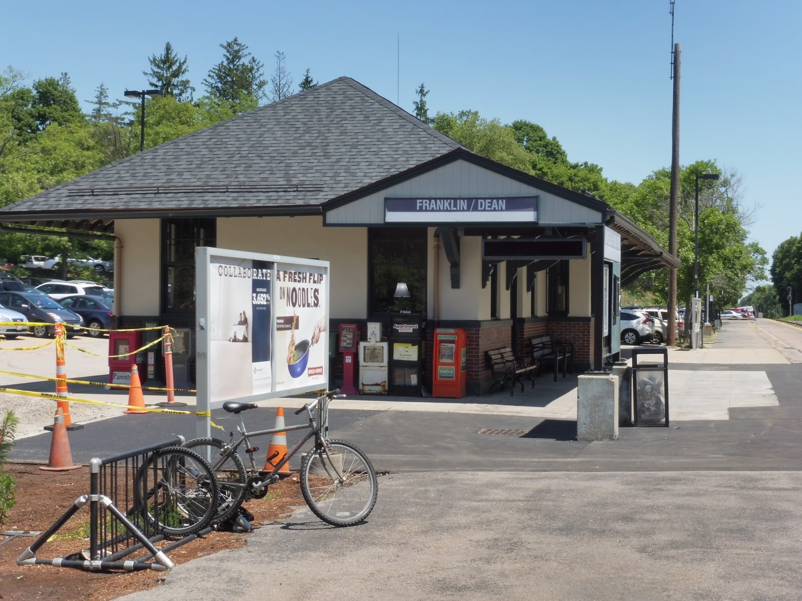
Franklin/Dean College
It’s the namesake of the Franklin Line! And having been stuck in the downtown for over an hour, I’m quite familiar with it and all of its attractions (or lack thereof). Still, despite how boring the town may be, I’m reviewing the station, not its surroundings. Thus, let’s take a look at Franklin/Dean College (or the other way around, as the station signs put it).
 |
| The station…from above. |
The main pedestrian entrance is from Main Street, which has a bridge over the single track lined with flowers (and bees). It’s well-marked with a T symbol, and is a simple flight of stairs leading down to the station. Also, Main Street is apparently where the GATRA Franklin Area Bus boards, despite the fact that there’s no signage (as usual).
 |
| Gotta love that parking. |
The other way of getting into the station is much more car-friendly, as it’s via the parking lot. Franklin has a smaller lot than either of its neighboring stations with 173 spaces, but with a 16% availability rate on weekdays, it’s just enough. There are also a few bike spaces near the parking lot entrance, which is a great option in this case – the station is located in a pretty dense area.
 |
| Oooh, that’s a nice building! |
Franklin’s low-level platform is basically dominated by its building, which is a beauty. Built in 1912, it has a few benches and lots of newspaper boxes under its shelter. There’s honestly not much else along the rest of the platform, aside from a few wastebaskets, benches, and some more bike spaces. Oh, and there’s also a great “FRANKLIN” sign spelled out by white stones in the dirt on the other side of the track.
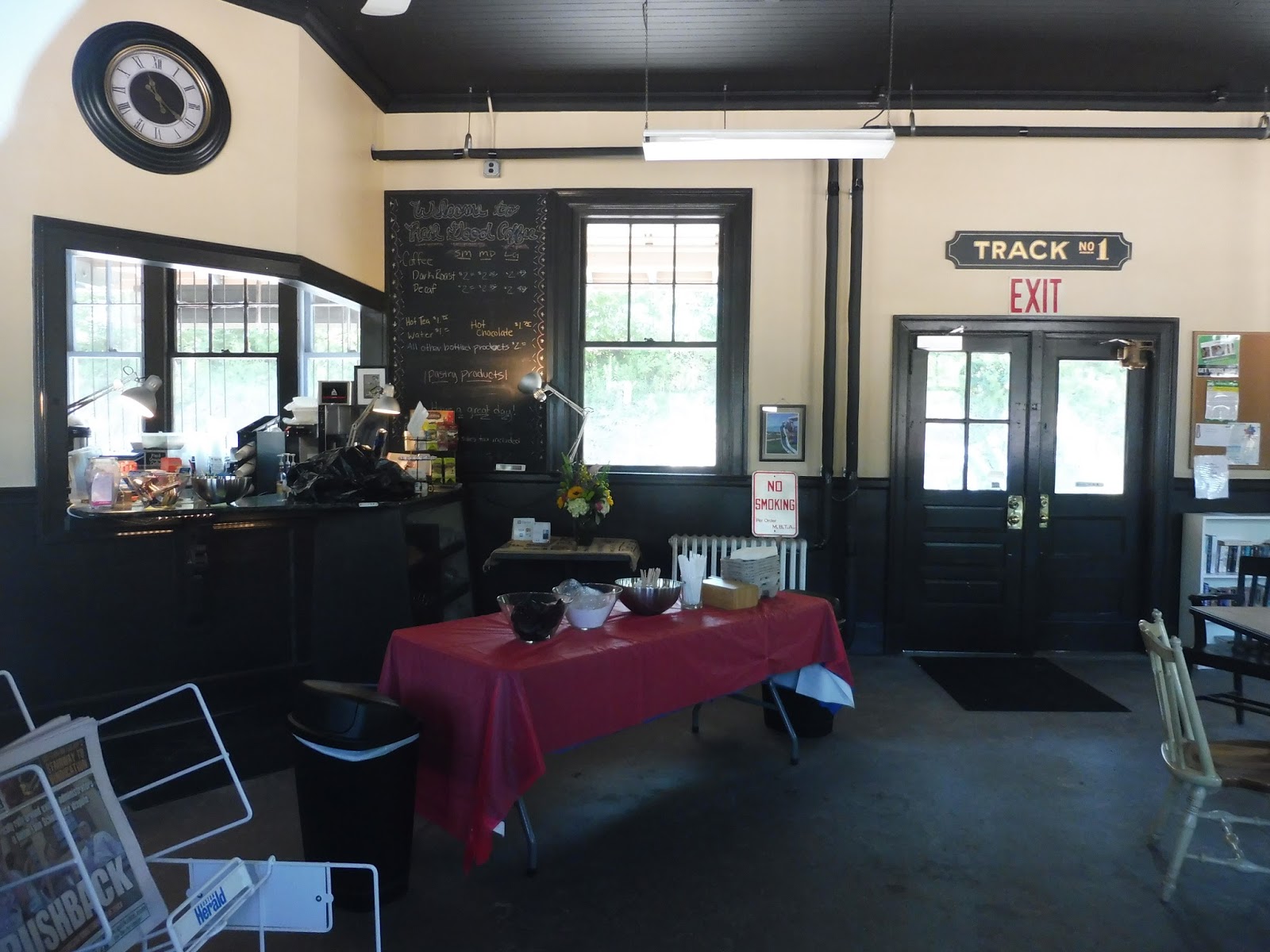 |
| The inside of the building. |
Unfortunately, as a piece of paper says in a comic sans-esque font, the building is only open on weekdays until 9:30 AM – it’s for morning commuters. However, it has an amazing interior, from what I could see through the doors. Aside from a café offering coffee, as well as other drinks and pastries, there is seating, newspapers, some old signs and photos, and so much more. There even appears to be a library! The character just oozes out of this place, and I really wish I could’ve visited during the morning rush to be able to go inside.
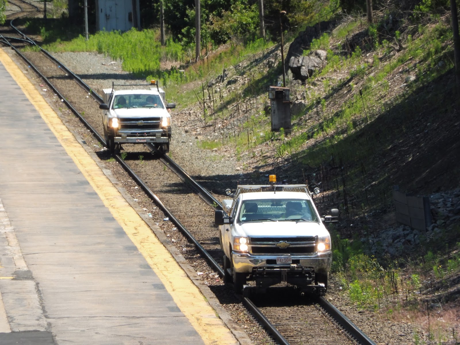 |
| Some hi-rails going toward Forge Park…from above. |
 |
| A train coming into the station. |
Station: Franklin/Dean College
Ridership: Despite being the Franklin Line’s namesake station, it’s only the third-busiest station on the line. Still, 876 riders per weekday is great ridership for the Commuter Rail. It’s also interesting to note that since the parking lot only has 173 spaces, many riders must commute in by means other than driving. The station must get lots of student riders for sure, as Dean College is very close by.
Pros: Oh man, this station has so much character. The place feels very serene, with the “FRANKLIN” spelled out of rocks being a nice touch. And the building…I mean, this has to be one of the nicest buildings I’ve seen on the Commuter Rail thus far. The inside just has so many details to give an old-timey train station feel.
Cons: The lack of accessibility is really the only problem, but it’s a big one. The selfish part of me worries that a mini-high or high level platform would spoil the character, but accessibility is probably more important.
Nearby and Noteworthy: Okay, I’m sure Franklin isn’t that boring of a town, but being stuck there for an hour isn’t the greatest. I guess it’s more of a restaurant-based downtown than a store-based downtown, so there are plenty of places to eat, but if you’re looking for shopping, you won’t find much.
Final Verdict: 8/10
Accessibility or character? Accessibility or character? Ahh, who am I kidding? I love this station so much. If it had a nice wooden mini-high with a bench on it, the score would go up to a 9, or maybe even a 10. However, at the moment, it’s stuck being inaccessible, which is definitely an issue. But hey, that building is great, isn’t it?
Latest MBTA News: Service Updates
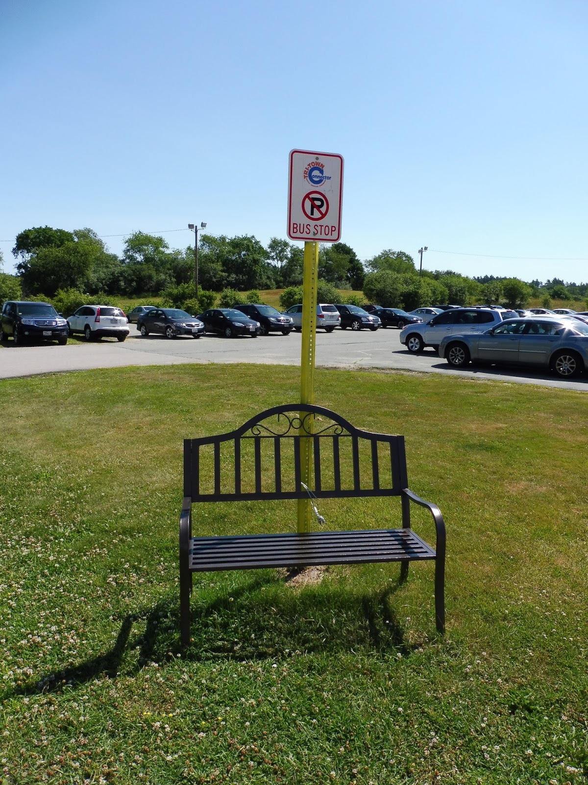
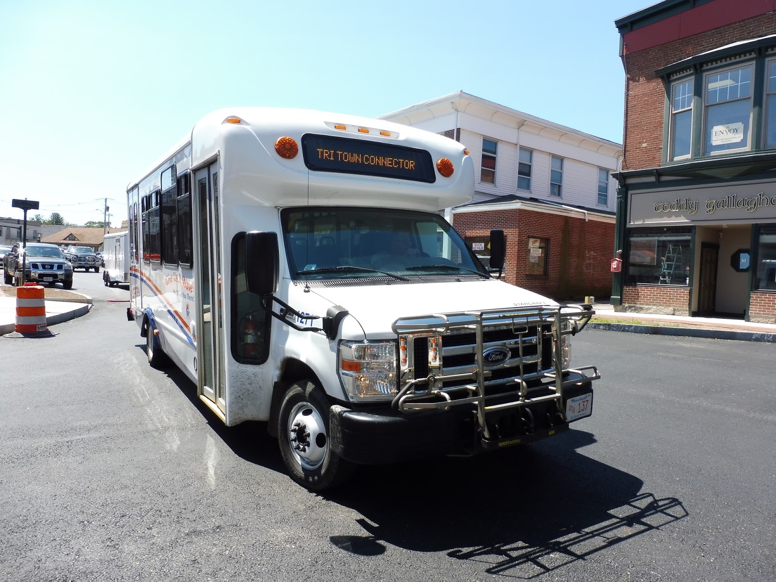
GATRA: Tri-Town Connector
The layout of the GATRA baffles me. The authority runs many different “systems” that are completely disconnected from each other, and many of them are seemingly unknown. For example, the Tri-Town Connector, which runs from Norfolk Station to a Big Y supermarket in Franklin (via Wrentham and Foxboro) has barely any signage, no advertising, and essentially no indication that it exists. Well…it exists!
 |
| The bus coming into “downtown” Norfolk. |
My friends Harry and Zach and I just figured we would wait around to see where the bus would go, since we had no idea where the stop was. The bus was early, luckily, and we saw it go into the station lot located across Rockwood Road. We ran over and found it in the most awkward stop ever:
 |
| Oh, of course the weed-ridden industrial building was the stop! Duh! |
What the heck kind of stop is this?! How is anyone supposed to know that the bus stops here? GATRA has this annoying habit of running decent routes with empty buses because no one knows they exist because there’s no signage! Well, at least we made it onto the bus, and began the route.
 |
| This is such a weird stop… |
Leaving the station, we headed around a rotary and went onto Main Street. This was a straight road with spaced-out houses and no side streets. We went by a church at one point, and a cemetery at another, but eventually we reached the main reason for this deviation: a…um…prison.
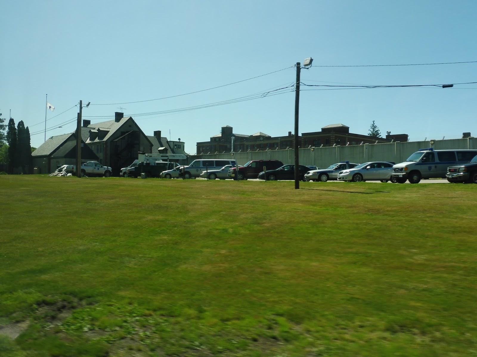 |
| Um…that is a prison. We are serving a prison right now. |
Yes, the route deviates specifically to serve a prison. Apparently on visiting days, there are a few people that actually use the bus to get here. It has to be said, too, that this is the only stop on the whole route that actually gets a sign. Why here? That’s so random!
 |
| Look, they even have a nice little bench and a logo on the sign! THIS ROUTE HAS POTENTIAL, GATRA! |
From the prison parking lot, we took a very tiny road out to get onto Main Street again. We headed back the way we came and deviated into the Norfolk Station lot once more just to see if anyone was waiting. There was no one there, so now we proceeded onto the actual route.
 |
| A bridge near the prison. |
We headed onto North Street, which was very woodsy and lined with the occasional house. On occasion, there was even a side street! But once the road became Pond Street, it was full-on forest with nothing else. We soon passed the Pond Street Recreational Facility, though, which is considered a “major” stop. The driver said no one ever gets on there, though.
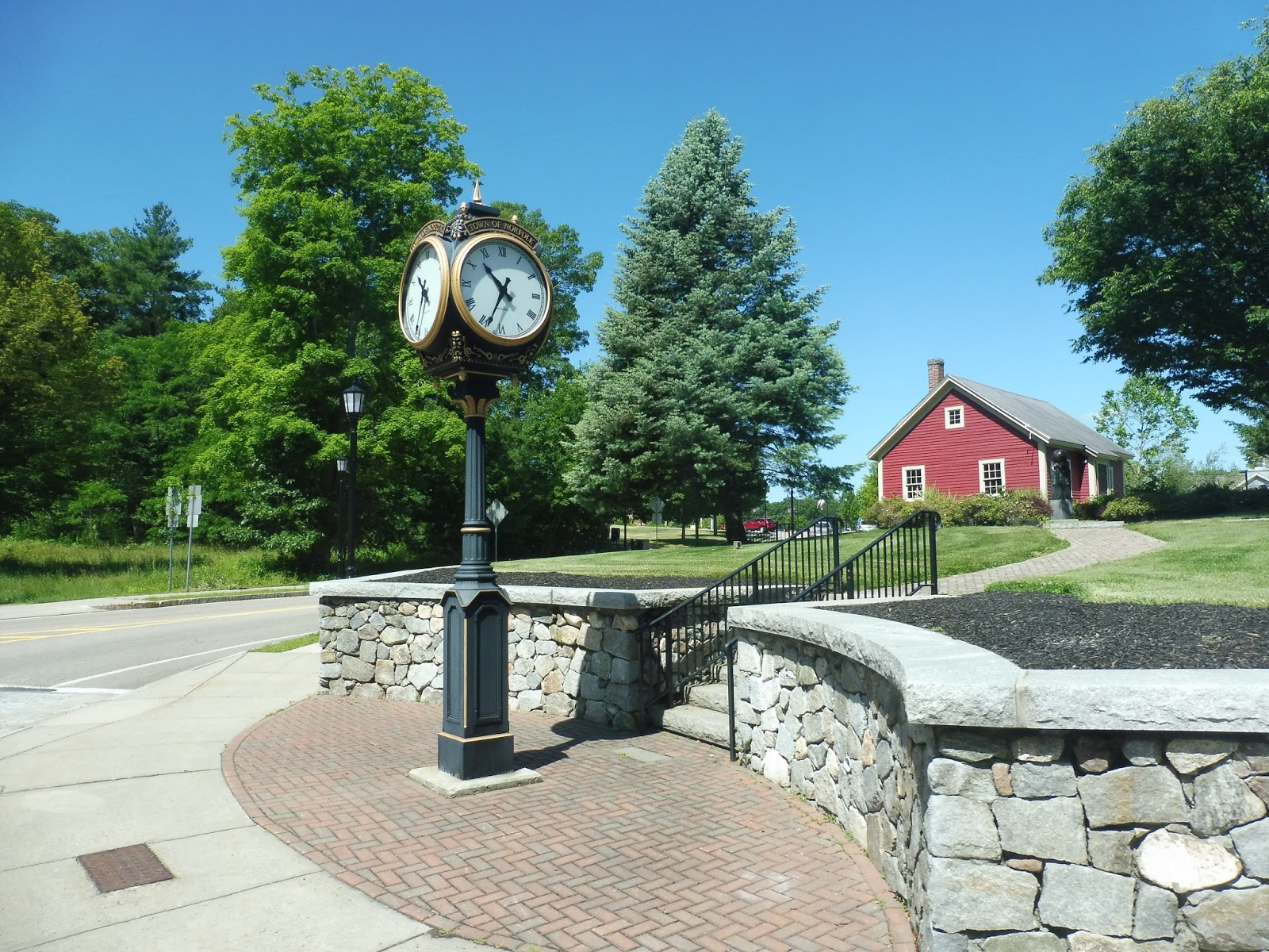 |
| A clock in downtown Norfolk. |
After more woods, we all of a sudden hit development. There was an industrial section before a few restaurants at the intersection with Route 1A. Here, the street became Pine Street, and after a bit more industry, it became residential once more.
 |
| Ew… |
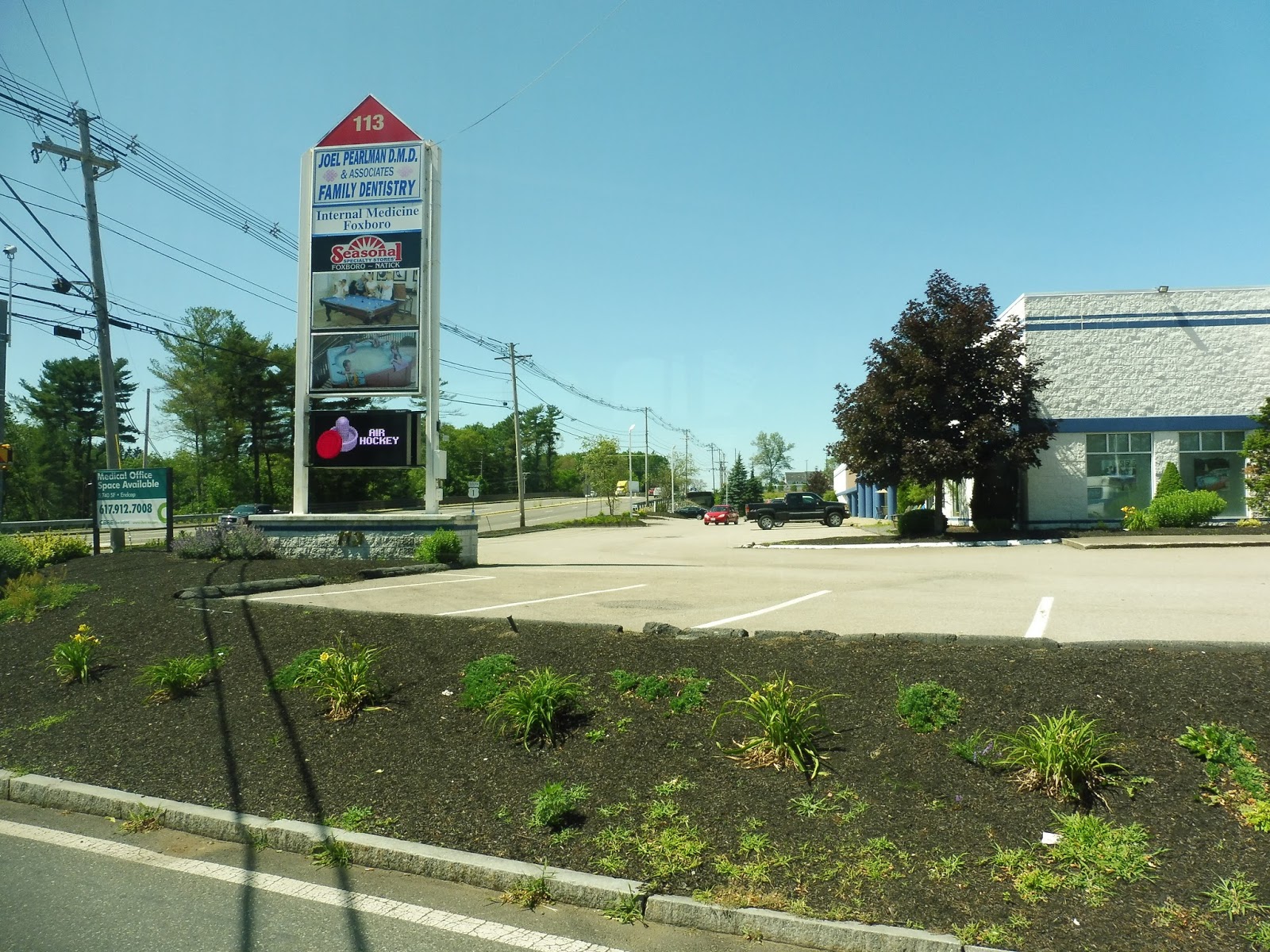
However, we eventually turned onto the dreaded Route 1, which seems to bring pittiness wherever it goes. It wasn’t as bad as Saugus, but there were still some pretty ugly businesses and motels along here. As the street grew wider, we turned off to serve Patriot Place. Yes, we were at Gillette Stadium!
 |
| The mall, with the stadium in the background |
I guess the concept of Patriot Place is that it’s an outdoor mall, and I support that. Making a mall seem like an actual town is a good idea, and it’s great that this route serves it. If only it had a proper sign or stop so people knew it existed! Well, anyway, we navigated through the mall and worked our way back around, passing the stadium on the way out.
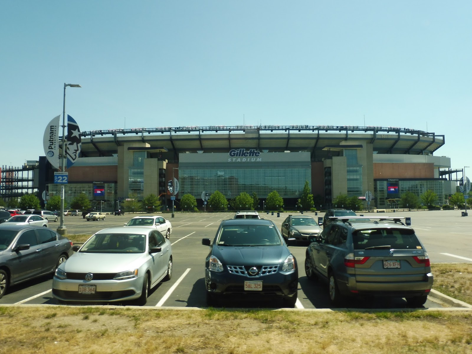 |
| This was actually my first time seeing Gillette, and it’s a beauty! |
Next, we had to serve another mall. This one was just a generic strip mall, and once again there was no signage whatsoever. From there, we had to go through some weird toll gates before heading back out onto Route 1. Normally the bus would make its way back onto Pine Street and then onto Dedham Street, but the driver decided to take a shortcut, so we used East Street instead.
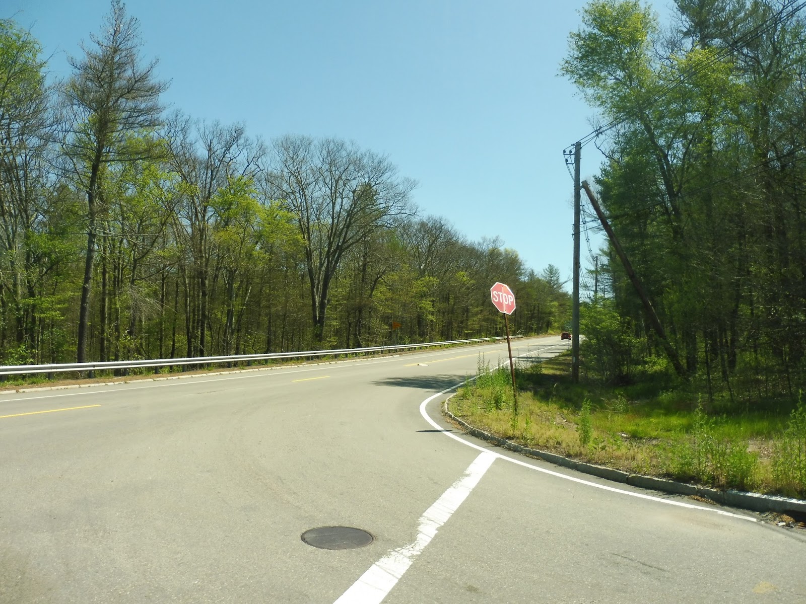 |
| A woodsy intersection. |
East Street had a pretty rural feel overall, with random spurts of housing. They eventually became more consistent, and we even passed a small apartment development. Soon, we went by Wrentham Common on one side and pulled into a parking lot in Wrentham Center. This is where our driver left and a new one got on board, who was just as nice as the last one.
 |
| A restaurant in Wrentham. |
 |
| The apartment…thing. |
 |
| Some random office. |
 |
| The Tri-Town Connector in downtown Franklin is a unique occurrence indeed. |
Norfolk
I met someone from Norfolk once. It was at an awful camp at the Museum of Science, and this kid would commute there every day from Norfolk Station. I specifically remember him pronouncing it “Norfork” and saying I wasn’t “allowed” to pronounce it that way because I wasn’t from there. What was the point of that story? I don’t know…but let’s take a look at Norfolk.
 |
| The shelter. |
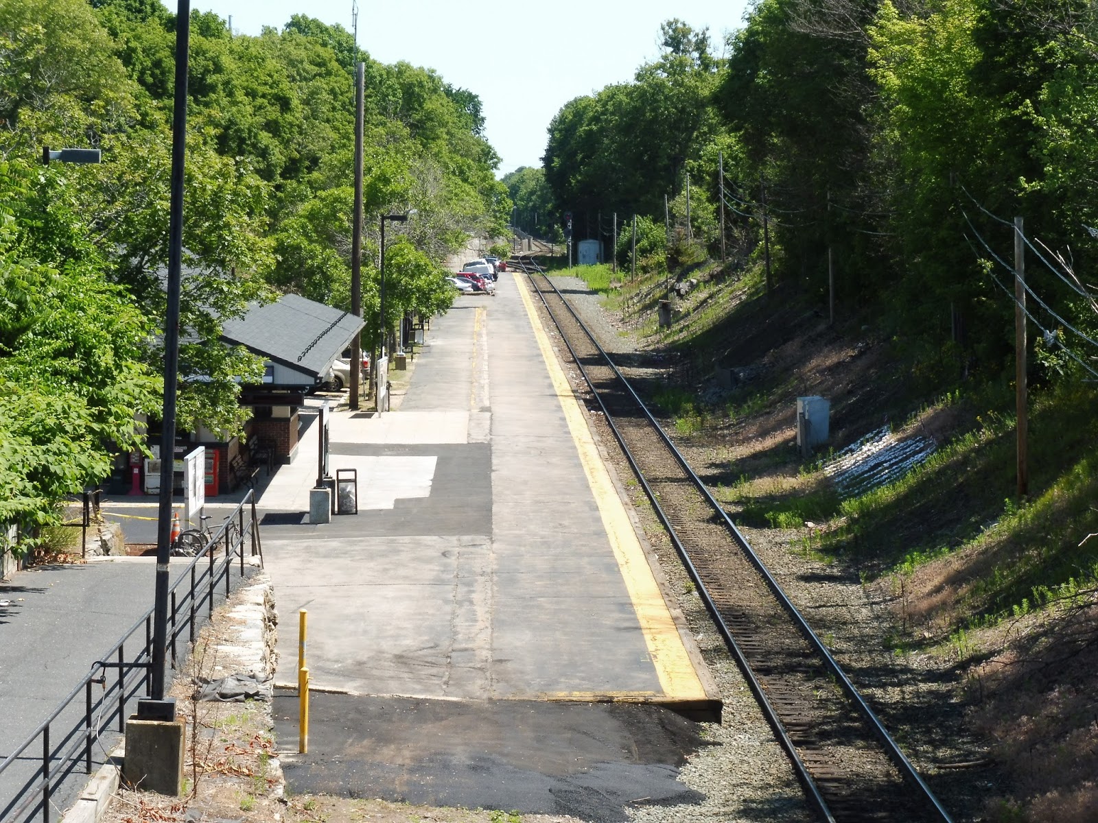
 |
| Looking down the platform, with parking on the side. |
 |
| The mini-high. |
 |
| Stairs to more parking. |
 |
| SO MUCH PARKING! |
 |
| Goodbye, train! |
Station: Norfolk
Ridership: With 748 riders per weekday, Norfolk has just one more rider per day than Forge Park. Of course, since this station is in an actual, you know, town, it’s slightly easier to bike or even walk here. However, the amount of parking shows that many people still drive in.
Pros: There’s a bench on the mini-high this time, and the station also offers plenty of extra seating. There is also a lot of parking here, especially for a “town center” station like this one. That said, as we’ll see in “Nearby and Noteworthy”, there isn’t much of a town here…
Cons: I’m not a fan of how far away the outer lots are. One of them is inconvenient for cars (although the staircase to the station is simple enough), while another is inconvenient for pedestrians, since you have to cross a street. And though the station has a pretty peaceful feel, it’s lacking a bit in terms of character…maybe it’s the bland shelters.
Nearby and Noteworthy: Hmm…Dunks, anyone? Yeah, there isn’t really much in Norfolk Center, and what’s there is rather car-oriented, with big parking lots out front. The aforementioned Dunkin’ Donuts has a drive-through, for heaven’s sake!
Final Verdict: 7/10
I like this station alright, and in some ways, it’s even better than Forge Park. Certainly in terms of the overall feel of it – Norfolk is a lot more tranquil because of its woodsy setting. But the parking is just all over the place, and the shelters are so bland! Plus, this station gets very slightly more ridership than Forge Park, but only the latter gets a building. Poor Norfolk!
Latest MBTA News: Service Updates
Forge Park/Route 495
So, I rode the Franklin Line for the first time! My friends Harry and Zach and I took it all the way to the end, and it was a pretty nice ride. Personally, I enjoyed seeing the varied stations along the line – there’s a lot of variety, and each one seems to have its own quirks. Forge Park/Route 495 is definitely the most Old Colony-esque station on the line, with quite a lot of parking. Perhaps the “park” in “Forge Park” has a deeper meaning…
 |
| The mini-high platform. |
To be honest, I was expecting a full high-level platform, given the fact that this station is a lot newer than the rest of the Franklin Line. However, I guess 1988 was too early to start building full high platforms, so instead the station has a rather small mini-high. It’s very generic, and has only a wastebasket. Well…I guess you could sit on that concrete…thing.
 |
| Further down the platform. |
Luckily, the low-level section of the platform has a lot of seating. This does present the age-old Commuter Rail problem of having to walk over to the mini-high from where you’re sitting, but I guess that can’t be solved. Wait, yeah, it can – put a bench on the stupid mini-high!
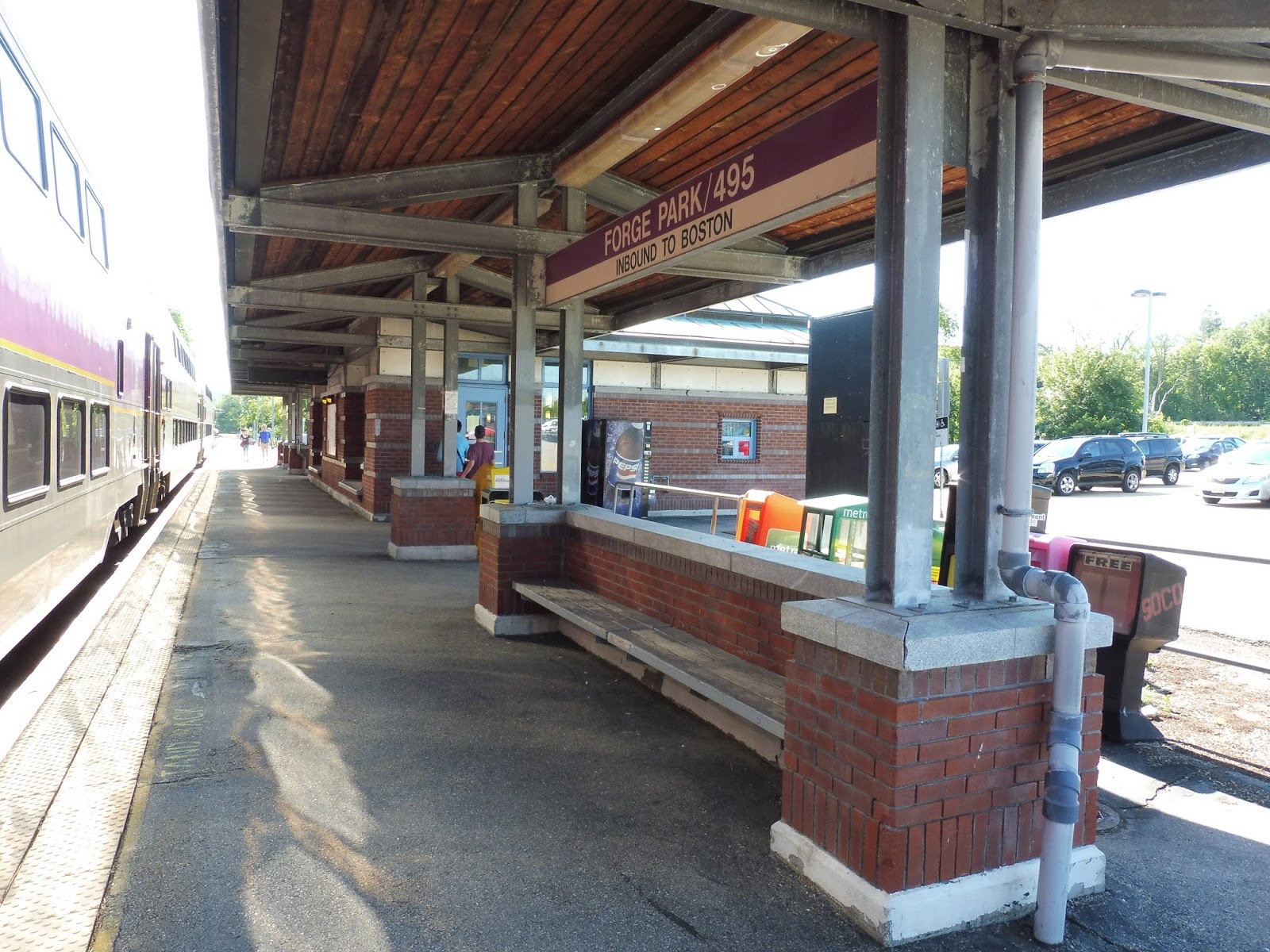 |
| Shelter! |
Shelter is also available under the awnings of the station building, with more benches that are admittedly even further from the mini-high. This part of the station also has some newspaper boxes and a vending machine. As for the shelter, it’s a mix between metal, wood, and bricks – certainly not a true bland modern Commuter Rail shelter.
 |
| Oooh, fancy! |
It was still considered the morning peak when we got to Forge Park, so the station building was still open! It had a lot of great amenities inside, most notably a small café where people can buy coffee for their commutes. The café is also where you buy tickets, so as not to incur a surcharge on the train – however, the person behind the counter didn’t entirely know how things work. When I said I wanted a ticket to Norfolk and showed her my M7 pass, she said “I have no idea what that is.” Oh well, I still got the half-fare in the end.
 |
| Look how crooked this is! What idiot took this photo? |
The building features seating inside, and is probably the most comfortable place to wait for the train (a fan was keeping things cool inside). There is also some very outdated train information in here – train schedules from 2003, anyone? Keep in mind, however, that the building closes once the 9:22 AM train leaves Forge Park, and all day on weekends.
 |
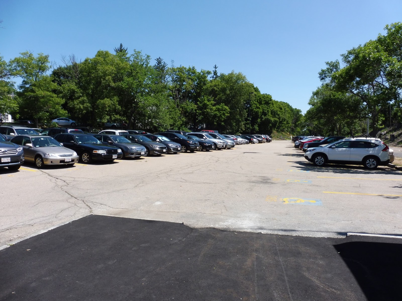
| Parking! |
Oh, yes, parking – Forge Park has quite a lot of that. Since the station is practically in the middle of nowhere (aside from a bunch of highway development and a tiny residential neighborhood), driving is essentially the only way of getting here. The station’s 716 spaces cover its needs quite nicely, and it even has an additional 14 bike spaces (which were empty when I was here).
 |
| More parking! |
What, you thought it was over? Nope! The station has two lots and two platforms! There isn’t much on the other side, admittedly, with another basic lot and a platform simply meant for quick boarding. It doesn’t even have benches. There are a few track crossings to get to the platform with more amenities, but the train in the station was blocking them, so it had doors open on both sides. That works, I guess.
 |
| The train ready to go back to Boston. |
Station: Forge Park/Route 495
Ridership: The Franklin Line is a busy one, so despite Forge Park’s ridership being about average for the line, it’s still pretty high. The station gets 747 riders per weekday, and I’m sure almost all of them are commuters driving in from further away. There could even be a few reverse commuters heading to office parks around the area, but that’s less likely.
Pros: This is a great park-and-ride station, with lots o’ parking and a bunch of amenities in the building for morning commuters. It’s also accessible, unlike the other station in Franklin (just called Franklin). Finally, GATRA runs a few shuttles from here for commuters, which is useful for people who don’t want to drive.
Cons: There really isn’t much, but I do wish the mini-high had a bench on it – at least one. It can be annoying to walk over there to board.
Nearby and Noteworthy: Umm…there’s a BJ’s nearby. Who doesn’t love big box stores?
Final Verdict: 8/10
Forge Park is a great park-and-ride station. The building makes it a heck of a lot more hospitable for morning commuters, and generally gives the station a bit of character. Sure, the mini-high could use a bench, but that’s an easy fix. A FIX THAT SHOULD BE FIXED IMMEDIATELY. Sorry…
Latest MBTA News: Service Updates
9703 (Brighton High School – Jackson Square Station via Mass Pike)
Okay, last one! I feel like I’ve spent my whole life waiting at the corner of Cambridge and Warren for the 9700 buses to arrive at the Brighton High School. I’ve seen enough 57s pass by to last a lifetime. So let’s finish these school trip anomalies up with a look at the 9703.
 |
| The 9701 was right in front of the 9703, so the angle is a bit awkward. |
Right, so from Warren Street, we turned onto Cambridge Street and headed to Union Square. After that we went up over I-90, and past some industry, apartments, and a closed freight yard, we headed onto the ramp to the highway. This is all familiar territory if you’ve read the other 9700 reviews, so I’m going pretty quickly.
 |
| Another shot of the bus. |
After the bridge section of I-90, we went below ground level, passing B.U. buildings and apartments. We soon entered the Copley Square tunnel and took the exit, then turned onto Dartmouth Street. We turned onto Columbus Ave soon after, directly following the 9701 route. (Although it turns out that both the 9701 and 9703 are supposed to take Huntington Ave instead of Columbus…more route discrepancies!)
 |
| Lots o’ ridership. |
Columbus Ave was lined with apartments (mostly brownstones) and the occasional business. Eventually, we went by a park and passed some modern Northeastern University buildings, then turned into the Ruggles busway. This seemed a bit odd, since the day before when I took the 9701, the 9703 in front of us had just turned onto Melnea Cass Boulevard to head towards Jackson, bypassing the busway. One of those buses was doing something wrong…
 |
| What a great parking lot. |
After leaving the busway, we turned onto Ruggles Street, then the wide Tremont Street. We went by the Boston Police Headquarters, as well as Roxbury Community College and Roxbury Crossing Station. The street was now called Columbus Ave (the same Columbus Ave from before?), with scenery consisting of parking lots on one side and the Southwest Corridor on the other. Finally, we turned off the road and headed into the Jackson Square busway, where the bus went out of service.
 |
| A wastebasket, a post, and a building…nice! |
Route: 9703 (Brighton High School – Jackson Square Station via Mass Pike)
Ridership: This time, it really was just me. I’m not sure what the deal was at Brighton High School that day, but yeah, it was an empty bus. I’m sure it would have been crowded had it been a proper school day!
Pros: This is yet another fast trip from Brighton High School, this time going a little further into Roxbury. Good stuff.
Cons: Yet again, the route has no morning trip, which continues to be an annoyance. Also, I thought it was weird that on my ride, the driver served the Ruggles busway. That may have been an error on the driver’s part, but the route probably doesn’t need to serve Ruggles in general – the two 9701 trips take care of that.
Nearby and Noteworthy: You’re not a student, are you? No need to take this bus! If you really want to ride a 9700 route, stick with the 9702 – it’s the most interesting one.
Final Verdict: 6/10
The 9703 is basically the middle of the three 9700 routes in terms of quality. Sure, it serves more than the 9701, but why did the driver serve the Ruggles busway? It’s pretty much a waste of time, and the fact that the 9703 skipped the busway the previous day just showcased the loose attitude of these school routes. Also, they need morning trips! Please!
Latest MBTA News: Service Updates
9701 (Brighton High School – Ruggles Station via Mass Pike)
Another early release day, another 9700 route. Today we’re looking at the 9701, which is the shortest and arguably most boring of the three 9700s. That said, it does run along a street down which no regular routes go, so it does offer something unique!
 |
| The bus across the street from the Brighton High School. |
It turns out that all the 9700 routes do depart from that makeshift stop across from the Brighton High School. The 9701 has the most “frequent” service out of any of them, with departures at 2:05 and 2:10. Mine left at 2:07, so I’m not really sure which of the two it was, but we headed out onto Cambridge Street anyway.
 |
| Union Square. |
After some houses, we passed through Union Square, where the street was lined with businesses. There was an industrial section after that before we crossed over I-90 and the Worcester Commuter Rail tracks. Cambridge Street was wider on the other side, going by an abandoned parking lot for the closed CSX yard. We soon reached the ramp for I-90 and headed onto the highway.
 |
| That’s the 9703 in front of us. |
I-90 went up onto its bridge over B.U., then we sunk back down below Commonwealth Ave. After passing more B.U. buildings and apartments, we went by Fenway Park and entered the Copley Square tunnel soon after. We then took the Back Bay exit, coming out of the tunnel and turning onto Dartmouth Street.
 |
| Stupid dirty windows… |
Someone got out at Back Bay, but then the driver ran into a bit of a problem: the door was stuck open. His solution? Just keep on drivin’ with the door wide open! He did fix it at a red light eventually, but it wasn’t for a little while and it was very strange driving around with an open door.
 |
| Um…is this safe? |
 |
| The bus became a 22 at Ruggles, ruining any photo ops, so here’s a look across a field. |
Route: 9701 (Brighton High School – Ruggles Station via Mass Pike)
Ridership: Slightly more crowded than the 9702, but the trip still only got about 10 students (who were blasting awful rap music the whole time). There would definitely be more people on a regular school day, though.
Pros: The 9701 is a quick route from Brighton High School to Ruggles, and it seems to be the busiest 9700 route based on its schedule: two trips per day instead of one.
Cons: Still, though, it lacks a morning trip like the other 9700s. This isn’t as big of a problem with Ruggles, since one could walk to Roxbury Crossing and grab a 66 to get pretty close to Brighton High, but a direct trip would still be great.
Nearby and Noteworthy: This route is for students, not for visitors! Also, it’s the most boring one of the bunch, since the 9703 is basically just a slightly longer version of this one.
Final Verdict: 7/10
This is probably the best of the 9700 routes due to its quickness, its consistency, and the fact that it gets two trips instead of one. Also, the morning hinderance for students really isn’t as large as the one for 9702 riders. Still, though, a morning trip would be much appreciated.
Latest MBTA News: Service Updates
9702 (Brighton High School – Andrew Station via Mass Pike)
970-whaaaaat? Since when are there four-digit bus numbers on the MBTA? Well, there are a few – 9701, 9702, and 9703 – and they’re all school trips from Brighton High School to Ruggles, Andrew, and Jackson Square, respectively. I never thought I would take these routes, but since my school had an early release day, I figured I’d take a ride on one of them! The 9702 was waiting there when I got to Brighton at around 1:45, so I hopped on.
 |
| The bus at its makeshift stop. |
I spent a little while looking for the stop around Brighton High School, and it turned out to not even be a stop. The route’s supposed to leave from Cambridge Street @ Warren Street, but the 9702 was parked up further down Warren Street, just across the street from the school. I’m not sure if it always does this or not, but it was certainly unexpected.
 |
| I will say that the shelter at Cambridge @ Warren is lovely! |
Leaving the stop on Warren Street, we curved around onto Cambridge Street. It was residential for a bit, but we soon arrived at Union Square, where there were some retail blocks. It got industrial after that, due to the proximity of I-90, which we crossed over.
 |
| A front view of Union Square! |
We continued down Cambridge Street for just a little while longer, with apartments on one side and a seemingly abandoned parking lot on the other. Soon, however, we took a highway ramp, passed through a toll, and got onto I-90 heading toward Boston. By this point, the highway was about to get onto its bridge, and onto the bridge we went, soaring past B.U. buildings.
 |
| Hey, it’s Boston! Blurry Boston! |
The highway soon got down to below ground level, still going by more B.U. buildings. Eventually, we passed Yawkey Station and Fenway Park, then entered the Copley Square tunnel. We took the Back Bay exit, curving around for a while until we finally popped up onto Stuart Street.
 |
| A highway view through the front of the bus! |
We then turned onto Dartmouth Street, joining the 10. We passed Back Bay Station and after that, the street became lined with beautiful brownstone apartments. Once we crossed over Tremont Street, the road became West Dedham Street, and the surroundings got less old-looking, with a huge apartment tower and more modern townhouses on either side.
 |
| Some apartments at the intersection with Washington Street. |
Outside of a school, we turned onto Washington Street, joining the Silver Line. We passed a few parks, then the street became lined with businesses and apartments, housed in 4-6 story buildings. Next, we turned onto Mass Ave, passing through the B.U. Medical Center. It got industrial from there as the street entered Newmarket.
 |
| Some scenery on Washington Street. |
We reached Newmarket Station, where we turned onto Newmarket Square. We passed a bunch of factories and warehouses and the like before turning onto Southampton Street. After going by the Southampton bus yard, the street rose up onto a bridge over I-93, the South Bay Center, and the Old Colony Line tracks. On the other side of the bridge, we pulled up into the Andrew busway, where the bus turned into a 16 and laid over for a little while.
 |
| The bus was signed as a 16 by the time we got to Andrew, so here’s a front shot on Southampton Street. |
Route: 9702 (Brighton High School – Andrew Station)
Ridership: I think Brighton High had an early release day like I did, because there were only two other people on board – students, of course – who had probably stuck around after school for a bit. On normal school days, though, the 9702 is as crowded as any normal school trip, with a full seated load or more.
Pros: Clearly there’s a large group of students who go to Brighton High from Southie, and this bus gives ’em a fast way of getting there. Or…well, getting back, at least. Hang on a sec.
Cons: Yeah, this and the other Brighton High routes are all one-way. So basically, you’ve got the 2:05 outbound trip and that’s it. The commute from Southie to Brighton is long without a direct route, so it’s annoying how the 9702 only runs outbound. Also, the 9702 is a special case in that the route it’s supposed to take is different from the route that the drivers are told to do! The bus is supposed to get out at South Station and take some route involving Broadway before getting to Andrew, but it “officially” travels via Back Bay and goes directly to Andrew. Then there’s the fact that my trip was apparently a completely different route from either of those, which makes things even more confusing.
Nearby and Noteworthy: Are you a student? No? Then you really shouldn’t have any need to take this route unless you’re looking for an interesting, unique ride.
Final Verdict: 4/10
Two very simple changes can bring the 9702 up to at least an 8. Number 1: Add a morning trip. This one applies to all the supplemental routes, but with this one in particular, the ride from Andrew to Brighton is long if you use regular routes. Number 2: Standardize the route! Apparently whenever a new driver is on the 9702, students have to tell them to take the South Station routing instead of the official one. So…MAKE THE SOUTH STATION ROUTING THE OFFICIAL ONE! It’s not that hard!
Latest MBTA News: Service Updates
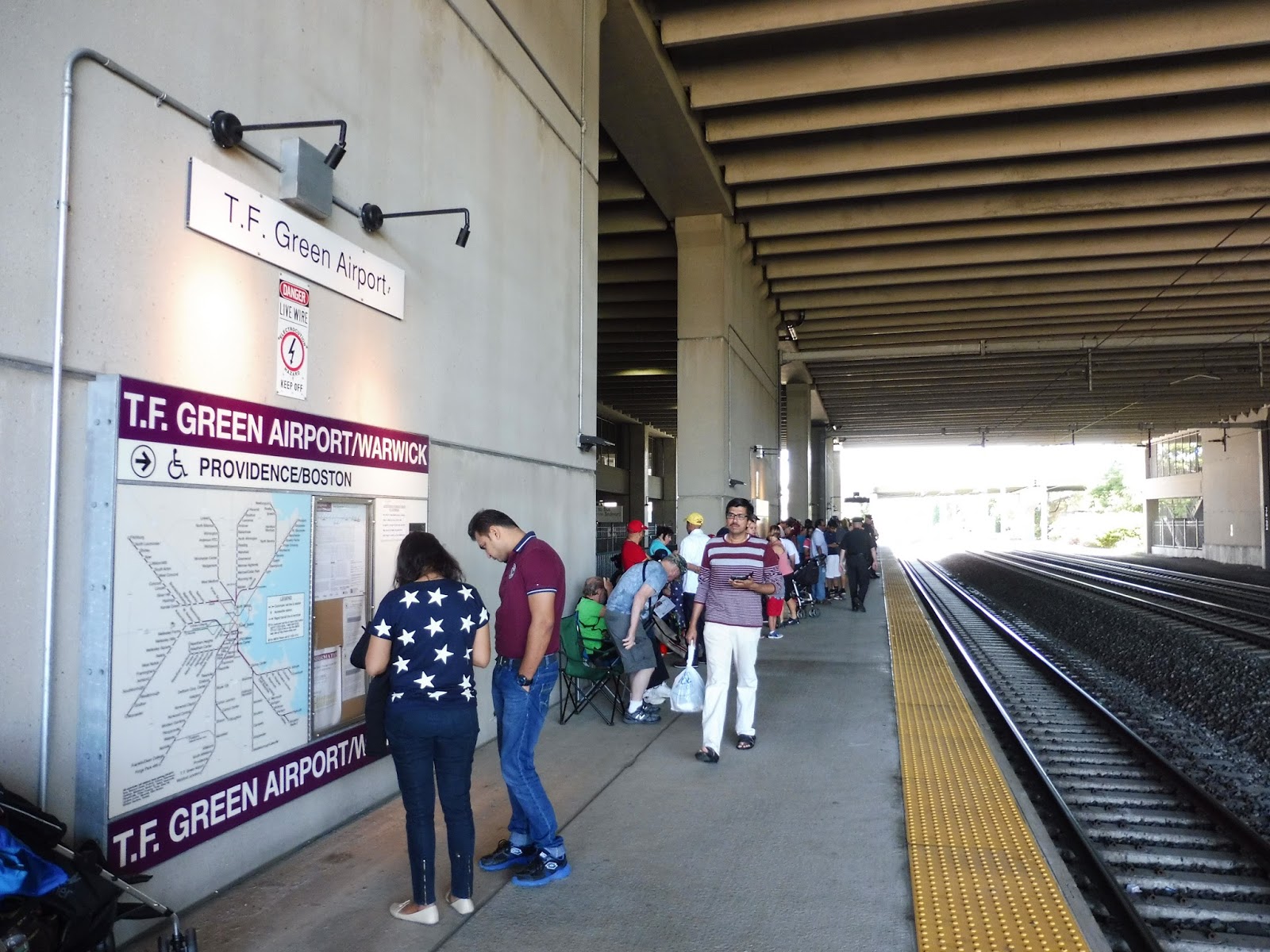
T.F. Green Airport
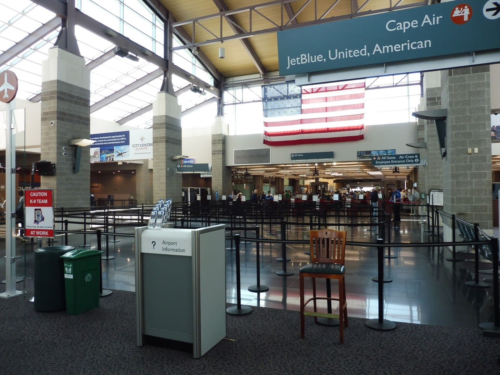
When I say T.F. Green Airport, I of course mean the Commuter Rail station that corresponds to the airport itself. However, since I took pictures of the amazing modern terminal, I will also talk about as much of the airport as we were able to explore! This is gonna be a big one, so let’s do it!
 |
| The airport “busway.” |
I honestly can’t tell if the busway doubles as an “arrivals” area or if it’s just for buses. Regardless, it’s suited for bus connections, with beautiful shelters, lots of benches, and great signage to each of the services to the airport. Three RIPTA routes service the busway: the 1 to Pawtucket, the 20 to Providence, and the 14 to Providence or points south.
 |
| Now that’s an arrival area! Or at least a taxi area. |
I do know that the road next to the busway is most certainly for arrivals. It doesn’t feel as nice as the busway, since its architecture is mostly concrete, but I guess it gets the job done. There are also taxi berths out here.
 |
| This is pretty generic. |
The first thing you see when you step into the terminal is the baggage claim area, which is the lamest part of the airport. It has low ceilings and really dated architecture. Still, as a baggage claim area, it gets the job done fine, and there are lots of benches around, too. The wall-to-wall carpeting is abysmal, though.
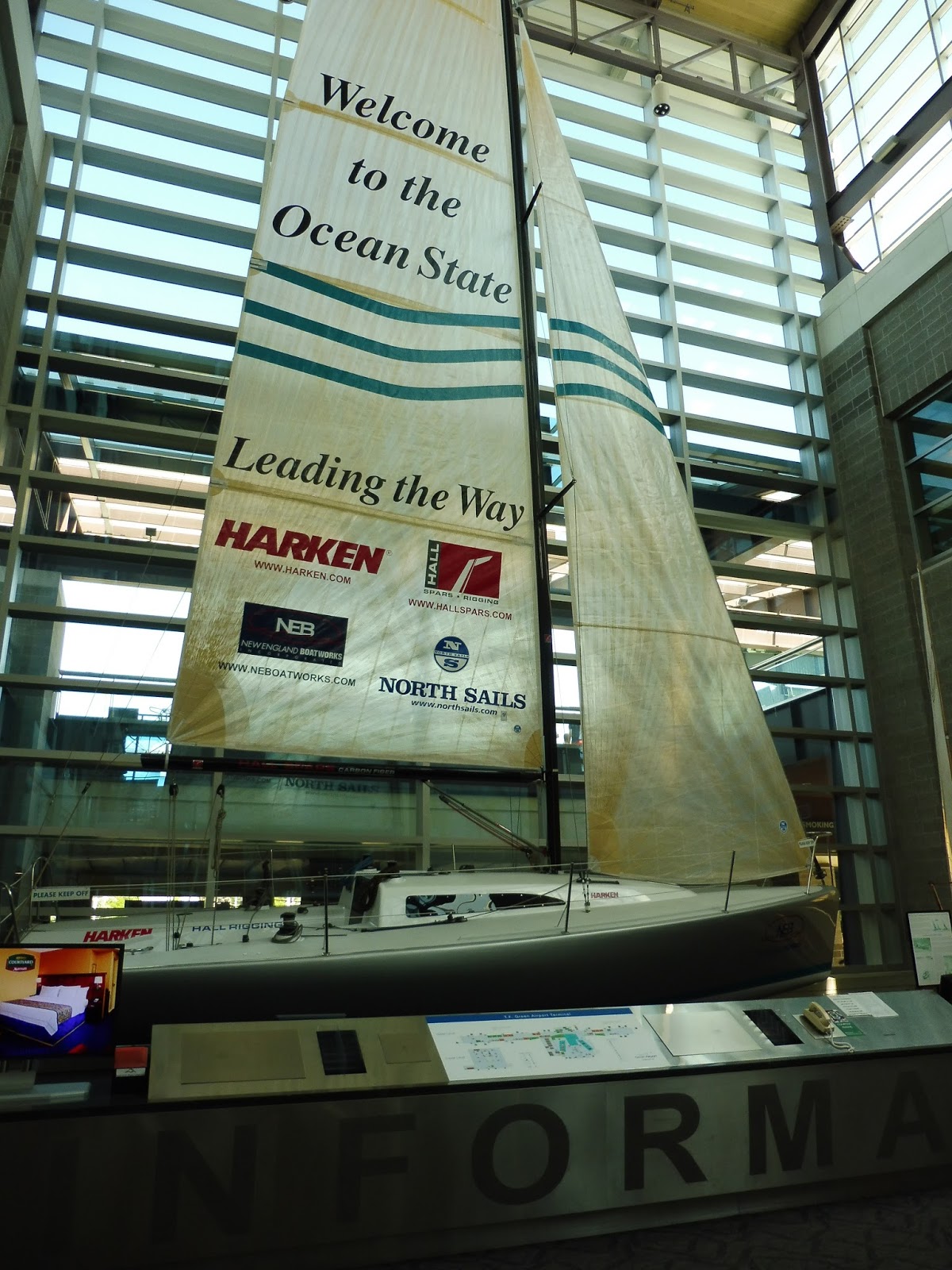 |
| Now that’s what I call an information booth! |
Information booths at airports are usually pretty boring, but T.F. Green has an amazing one with a huge sailboat welcoming tourists to Rhode Island. I mean, I wonder how many tourists actually use this airport, but it’s still pretty cool. The information given is just generic stuff for visitors like locations of hotels and attractions.
| I do need a ride! Thank you for asking! |
The information booth also has really well set-up “transportation corner.” It features a rack of schedules for all the RIPTA routes that serve the airport, as well as an updated Commuter Rail schedule. Strangely, though, the latter still says “MBCR” at the top, despite the conversion to Keolis happening two years ago. There are also some pamphlets and cards for various other shuttles here.
 |
| Aww, yeah! |
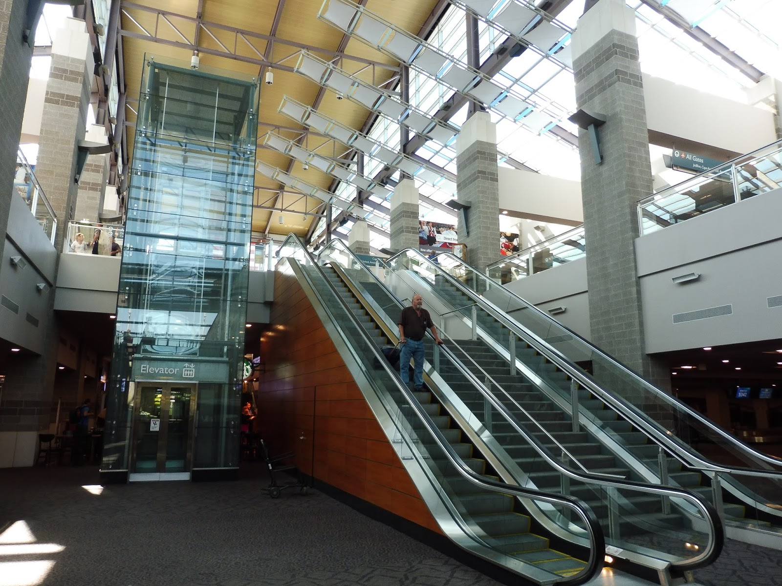
Now we’re talking! The main terminal at T.F. Green Airport is very modern, and so it requires a very modern way of getting up there. You’ve got a beautiful glass elevator, a staircase, and two escalators! They weren’t skimping out when it came to ascending floors at this airport.
 |
| The main terminal. |
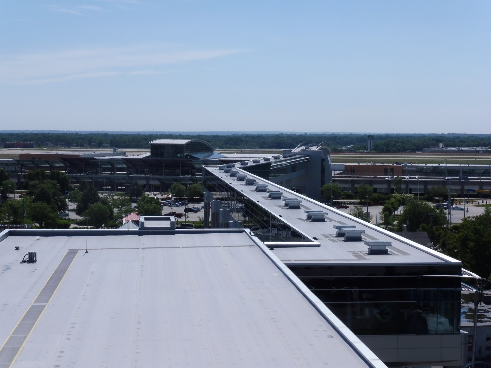
We weren’t able to get too far into the main terminal, but what we saw was amazing. It had huge high ceilings with lots of natural light coming in from the many windows. Everything was very modern and clean, and there was a lot of space set up for lines at security. It was still smaller than any Logan Airport terminal, but this is a much smaller airport.
 |
| Such interesting destinations… |
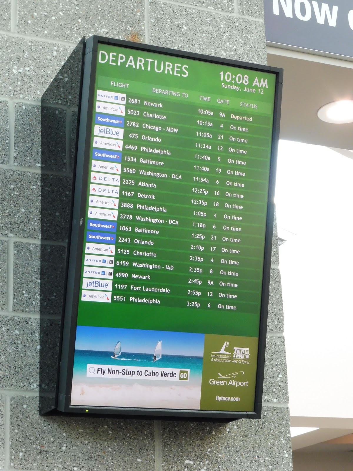
A quick glance at the departure board showed that only domestic flights were leaving on a Sunday. However, according to Wikipedia (and this timetable), international service has been announced for the airport, including a direct flight to Frankfurt! Will anyone use these flights? I guess time will tell.
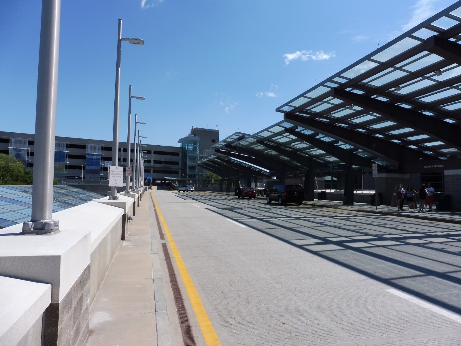 |
| The departure level. |
The departure level for drop-offs is pretty similar to the busway, with the same kind of modern glass shelter. Thus, it’s great! The airport also offers a bunch of parking in five different lots. I can’t give you an exact amount of spaces, but it’s most definitely a large number.
 |
| Oh yeah…the Commuter Rail comes here, too. |
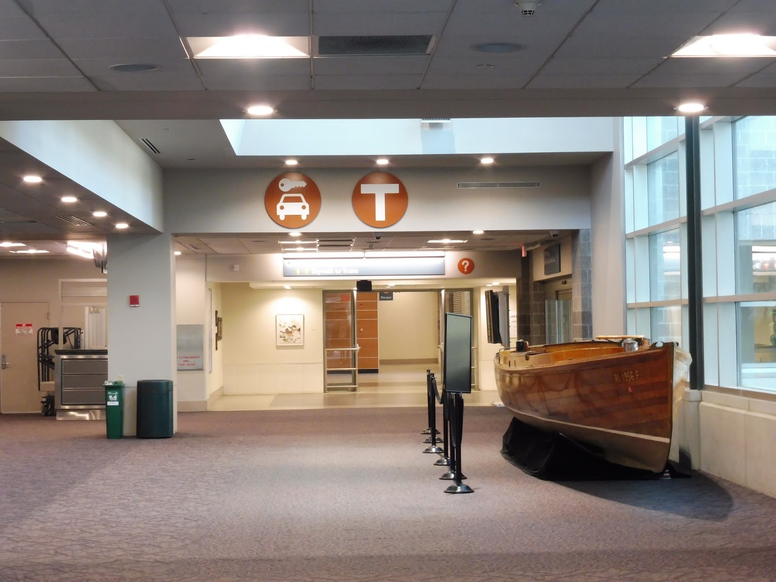
Heading back down to the lower level, it’s time to finally visit the Commuter Rail station! In order to get there, though, you have to use…the skywalk. But in order to get to the skywalk from the first floor, you have to go through the baggage claim area again and toward a nice T sign. You also go by a canoe in the process, which…sure, that’s cool!
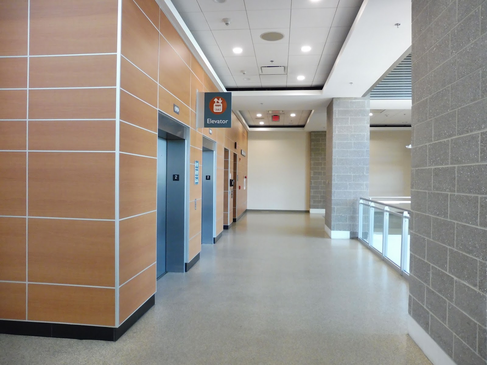 |
| The elevators up to the skywalk. |
Doesn’t the name “skywalk” just send tingles down your spine? I was so excited to get to it that I didn’t take any good pictures of its entrance area, which features an up escalator and a down escalator (no stairs). The room also has some interesting paintings on the walls.
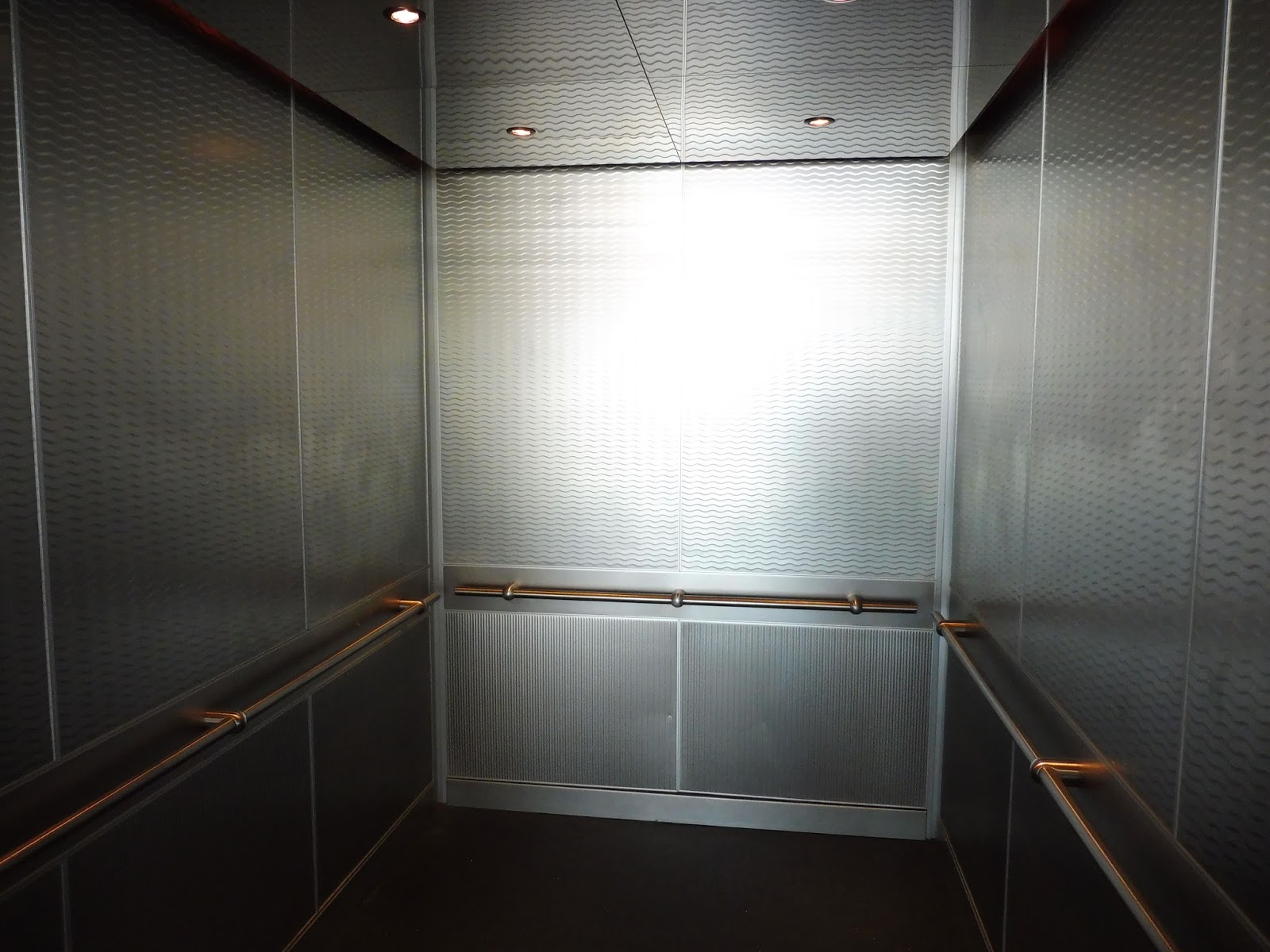 |
| The elevator was fancier than it looks! |
The elevators here are definitely worth a mention. Strangely, they had the exact same smell and feel as the newer Rotem Commuter Rail cars! Or, to put it in other terms, they were nice and modern and didn’t smell like urine. That’s what matters for a great elevator, right?
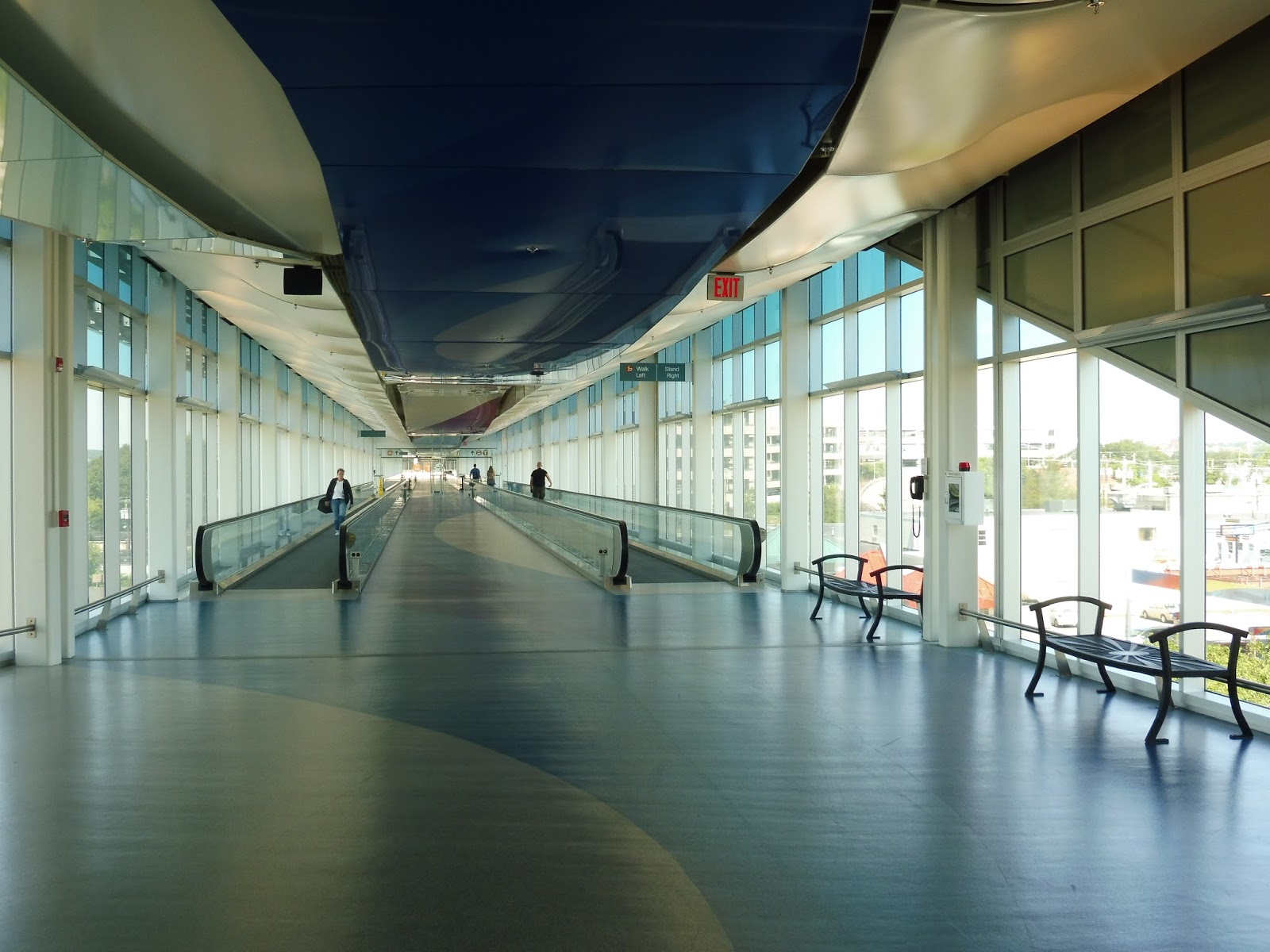 |
| Welcome to…the skywalk. |
The skywalk is pretty amazing. It has windows along its entire sides, and sweeping patterns along the floors and ceilings. There are a few benches sporadically placed in case people need a break, while moving sidewalks offer a faster way of getting through the long walkway.
 |
| The entire cart fleet of the skywalk. |
There is also a cart system that runs along the skywalk. I really wanted to ride one, but it was decided that it would be kind of embarrassing. Plus, the operator was quite busy, um, sitting there doing something on his phone. Sounds productive. The service is meant for people with baggage or disabilities, and can be called for whenever you want.
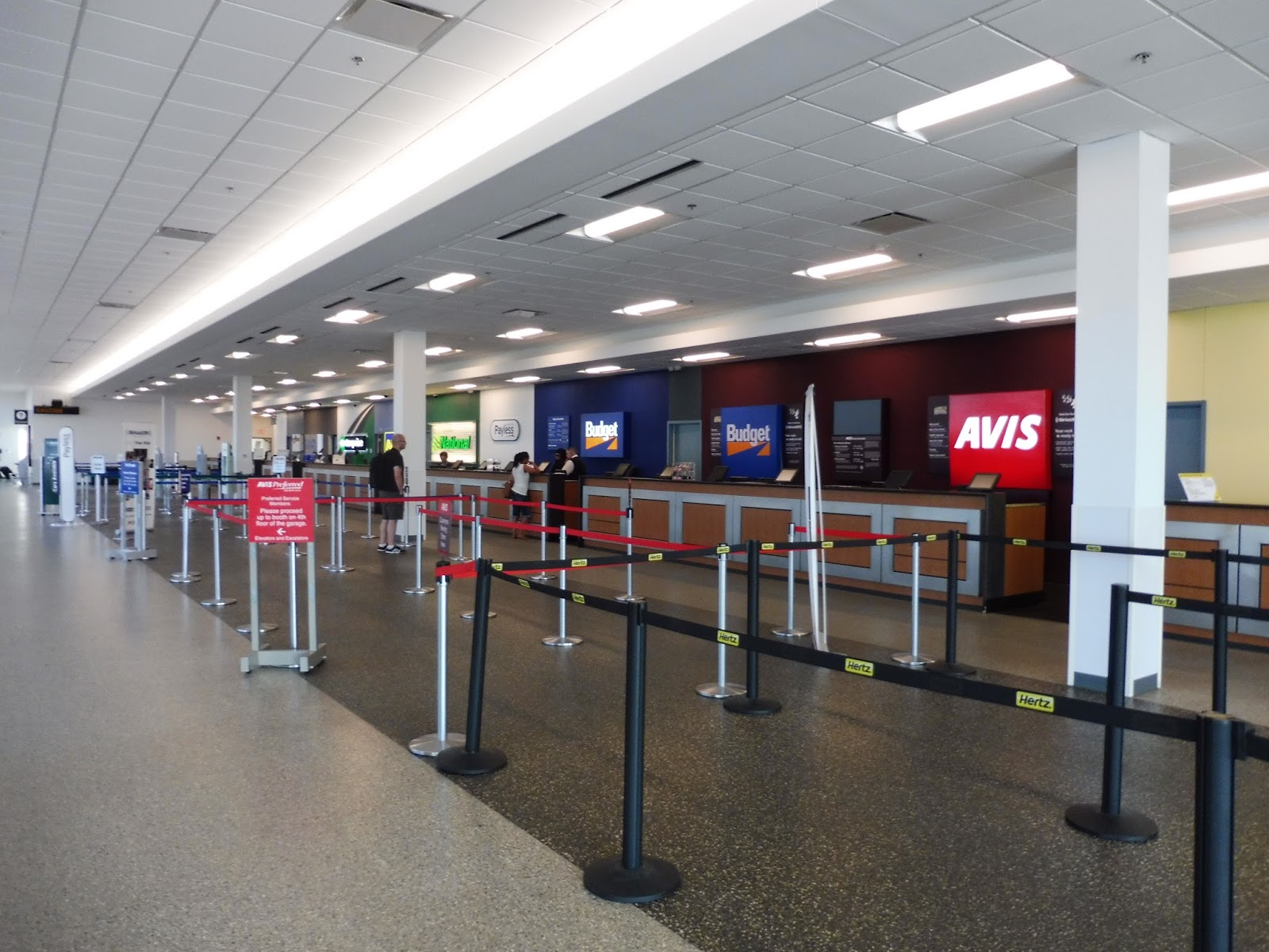 |
| Rental cars, anyone? |
Before the Commuter Rail station, you first reach the rental car area. It was pretty quiet when I was here, presumably because no planes had arrived yet, but the low-ceilinged, generic room seemed to be suited for a good amount of people. I’m not sure if it’s considered a “good” amount or not, but lots of rental car companies serve the airport.
 |
| EW EW EW. |
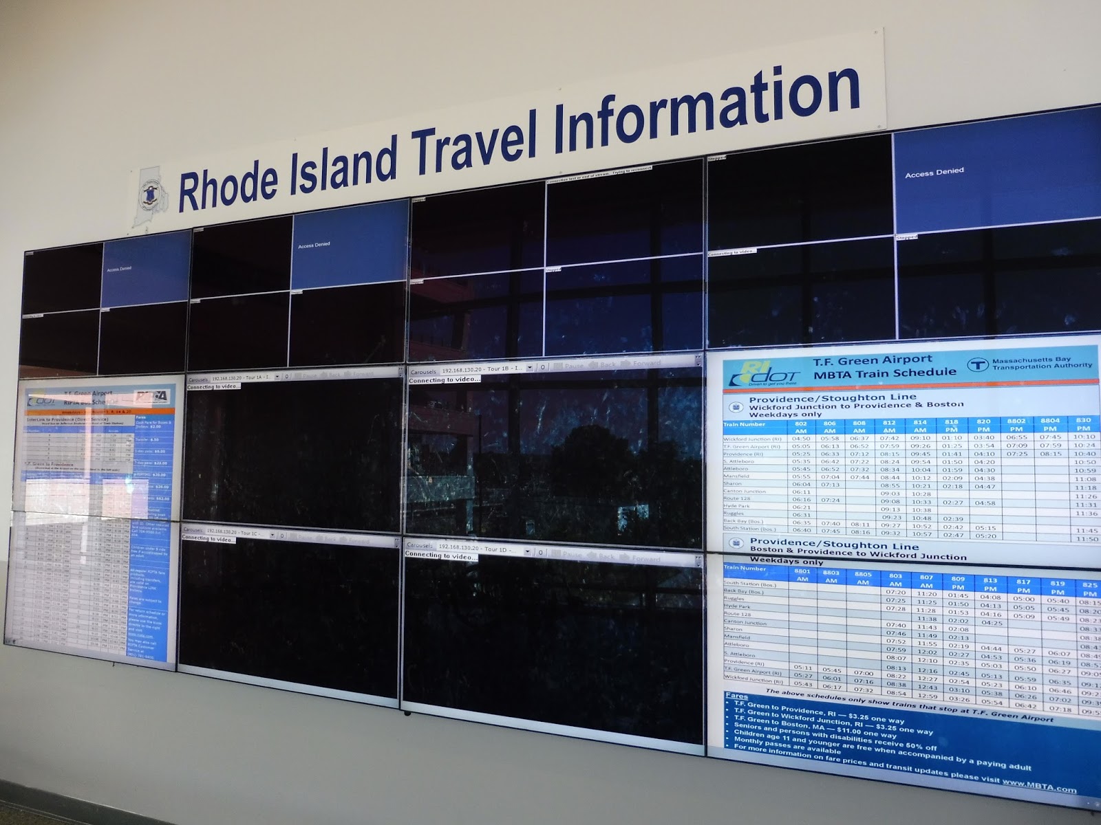
ALRIGHT, rant time! Heading along toward the Commuter Rail platform, we have this abysmal mess of a “travel information” area. Let’s see, well, the majority of the screens are blank and malfunctioning, so I guess we’ll skip past those! Alright, we’ve got times for all the RIPTA routes that serve TF Green…that would be nice, if they weren’t all outdated and incorrect! And a Commuter Rail schedule? Great! That’s also outdated! WOOOOOOHOOOOOWOWWOOOOOOO
 |
| Ahh, look at all the rental cars! |
Much of the big Interlink garage is dedicated to rental car parking, but there is also commuter parking here for MBTA passengers. In total, there are 650 spaces for commuters, but they come with a rather large fee of $6.50 per day (or $5.00 per day according to the T.F. Green website – not sure which one to trust). The garage does have an electric car charging station on the first floor, though, which is great!
 |
| Looking back toward the airport. |
 |
| Nice view! |
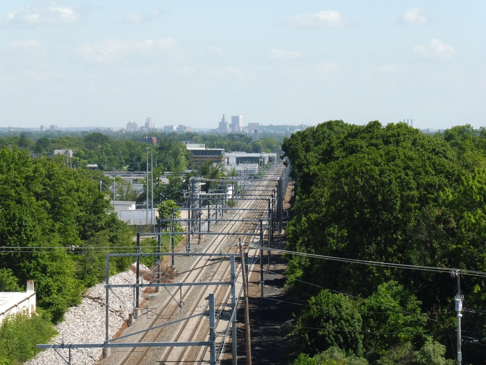
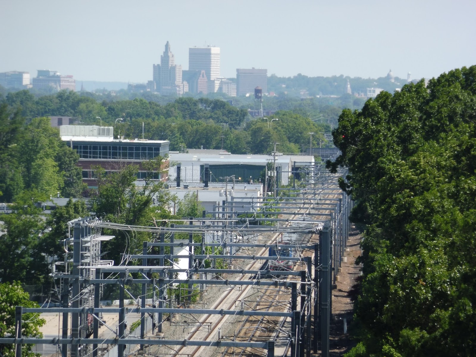
Gotta get those rooftop photos! The view from the roof of this parking lot is great, particularly looking along the tracks toward Providence. You can see the skyline from here, and it’s a little skyline I’ve always been a big fan of.
 |
| Hmm…a bit dank. |
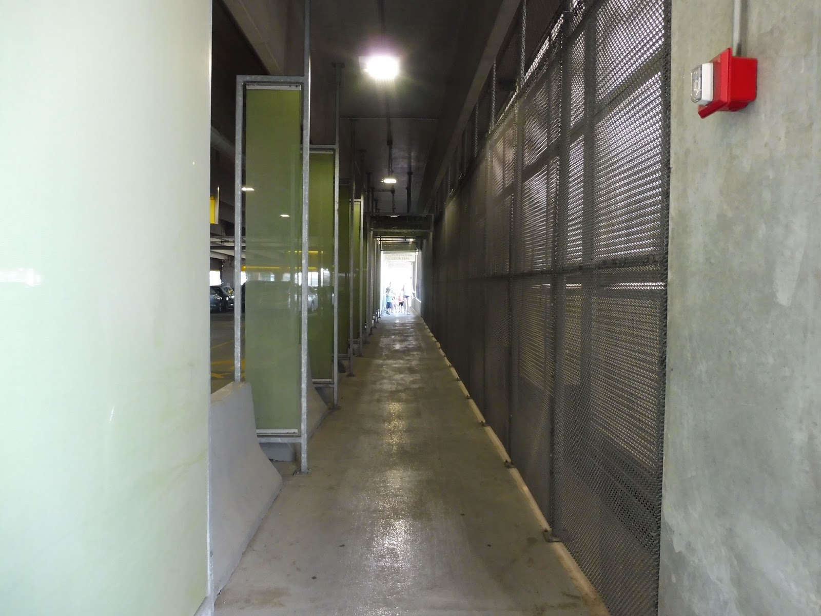
To get from the skywalk to the station, you have to pass through the parking lot. Luckily, a segregated pedestrian area is set up, but it’s a bit…gross. I mean, it’s quite dark and narrow. It’s certainly better than having to go through the lot, but the aesthetics of the walkway could be much nicer. The parking lot also has an alternative exit onto Jefferson Boulevard.
 |
| The crowded platform. |
The station platform is…underwhelming. Sure, it’s sheltered, but it’s sheltered by a generic boring parking lot roof. This station is a fan of concrete, and it doesn’t lend itself to the most modern look. There are plenty of benches at which to sit, at least. However, one major problem is the white sign visible in the above picture. Why is the station name in Helvetica? That’s such a bad font choice for a sign! (For the record, I know this whole blog is written in Arial, but for some reason it shows up as Times New Roman in the post editor and I didn’t realize the whole thing was Arial until it was too late.) UPDATE: Dunno what I was thinking then – every MBTA sign is in Helvetica. It’s more that it’s in lowercase, unbolded Helvetica! Also, the blog is no longer in Arial. Anyway…
 |
| The platform…from above. |
The outdoor section of the platform features a good amount of amenities. Closest to the part under the parking lot, there’s a interesting purple shelter, the likes of which don’t appear anywhere else on the Commuter Rail (to my knowledge). Meanwhile, if you go way far down, a generic modern Commuter Rail shelter awaits!
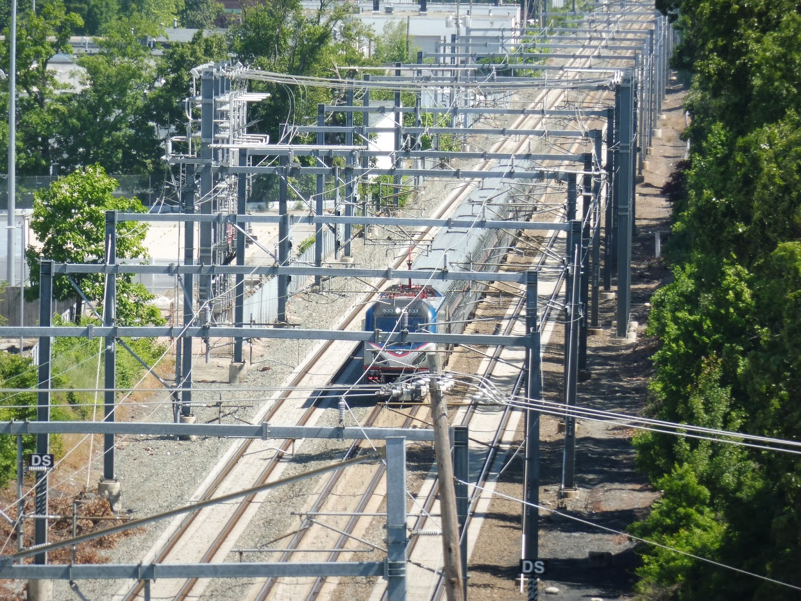 |
| An Amtrak train rushing past the station…from above. |
Station: T.F. Green Airport
Ridership: Although Providence is the busiest Commuter Rail station outside of Boston, T.F. Green Airport gets much much much lower ridership. On the average weekday, it only gets 227 riders, most of whom probably commute to Providence. That said, on the day I was here, there were huge crowds going to Quonset, but that was a special case.
Pros: For the record, I’m considering the “station” to be the skybridge and beyond. And if that’s the case, the skybridge is the best part of T.F. Green Airport by far. Not only does it give a direct pedestrian connection to the airport, but it also looks amazing! Other than that, the station offers a lot of parking (more than its ridership), and most of the platform is sheltered. As an aside, that airport terminal is great, isn’t it?
Cons: Once you get past the skybridge, everything is rather bland aesthetically. Additionally, if the MBTA website is to judge, the parking is pretty expensive for the Commuter Rail. Also, the fact that this station is only served by limited weekday trains means that hardly anyone takes the train to actually catch a flight at the airport. Finally, why is all the schedule information here so outdated? You guys have computer monitors, just update them!
Nearby and Noteworthy: Well…T.F. Green Airport, I guess. The rest of the surrounding area is industrial, so that’s nothing interesting.
Final Verdict: 7/10 (9/10 for the terminal)
Man, without that awesome skybridge, this station would be quite meh. I mean, it’s just a boring concrete Commuter Rail station. But hey, the skybridge makes it. Also, for the record, I really enjoyed reviewing an airport terminal! Maybe I could do the ones at Logan and call them “Silver Line stop reviews.” Hmm…
Latest MBTA News: Service Updates
Silver Line “Rant”
In English class, we had a short end-of-the-year assignment to write a “rant,” and I decided to make mine about the Silver Line Waterfront and its inefficiencies. It wasn’t supposed to be an evidence-based piece, so I don’t really back up my complaints, but I figured it would be fun to put up here. Enjoy!
My family had just gotten back from a week-long trip to Portugal. All we wanted to do was go home.
But the Silver Line had other ideas.
We always prefer using public transportation to get to the airport, mainly because it’s cheap. But the Silver Line, branded as a fast rapid transit service, is little more than a glorified bus with many problems. It seemed great when it was brand-new, but Boston soon realized that its fancy new line was just a phony.
At the cold, miserable Terminal E stop, the clock said the next bus was arriving in one minute—great! But that minute came and went. A crowd was starting to form with no sign of the bus. Finally, after ten minutes, the vehicle arrived, and it was packed.
We squeezed on with the other sardines, and our can started to head onto the highway. The crowded, trafficked highway. Did I mention it was the evening rush?
So after twenty minutes of crawling through the dark musty Ted Williams Tunnel, we finally managed to escape into the outside world. At least now it would be a smooth ride to South Station. Oh wait, we had to double back on ourselves first with the most inefficient loop ever. “Congress Street @ World Trade Center Station,” anyone?
At Silver Line Way, one poor rider struggled to escape the soul-crushing crowd to get out of the bus, then the bus failed to make the conversion to electric power (of course). After the driver got out to fix the problem, we were finally able to head to South Station at a heart-pounding 10 miles per hour. And what was that passing our sardine can on the left? Why, it was an SL2 to the Design Center, completely empty! Every 15 minute service to an industrial wasteland—great use of resources.
A few people were waiting at each of the overblown underground stations, but they were denied entry onto our bus because it was so crowded. I guess they would have to wait for the next empty SL2 to arrive. After several aching minutes of crawling through the bus tunnel, we finally pulled into the South Station bus stop, with a massive exodus of people leaving the bus to get to the Red Line. I’m sure the vehicle’s return run to the airport would be just as insane as our trip.
This is the state of the “rapid transit” Silver Line Waterfront.
Fix it.
RIPTA: 20 (Elmwood Ave)
You know it’s a smaller city when a bus route considered to be a “key corridor” runs every 45 minutes on weekends. Still, Nathan, Sam, and I had to get to T.F. Green Airport somehow on our way to Quonset, and the 20 was timed perfectly for our needs. Is the route interesting aside from its timeliness on a certain Sunday to help three people get to an air show? No, not really, but we’re looking at it anyway!
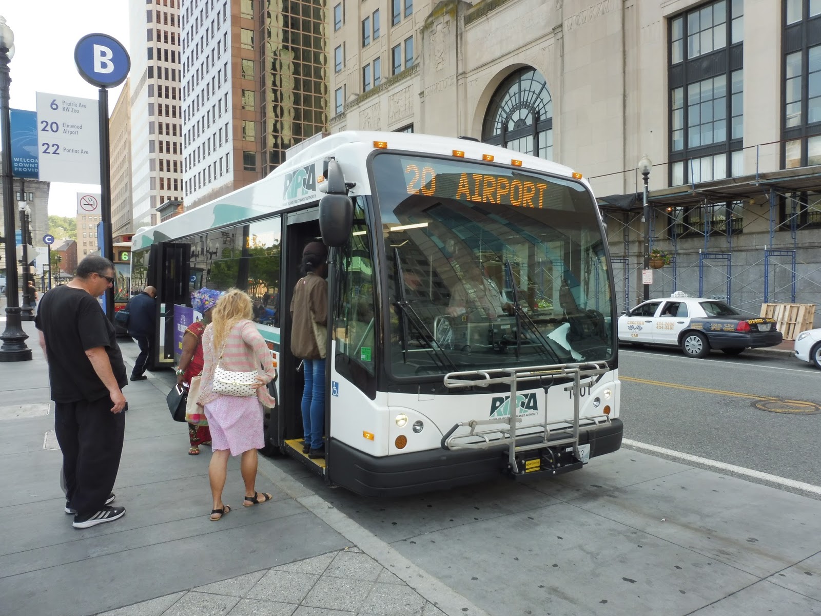 |
| The bus at Kennedy Plaza. |
Leaving Kennedy Plaza in downtown Providence, we headed down Washington Street, which was lined with cute three-story buildings. Outside of a theater, we turned onto the wider Empire Street. After passing some offices, we turned again onto Broad Street, going over I-95 and running along with the R-Line and the 22.
 |
| Going over I-95. |
We went by a field and a high school, then there were a few businesses at Trinity Square. The street widened with a nice median for a bit as the R-Line continued down Broad Street; meanwhile, us and the 22 headed down Elmwood Ave. After a cemetery, the street became pretty industrial, but there were houses in view down the side streets.
 |
| This doesn’t seem to be the liveliest of areas. |
From there, it became a mix of houses, businesses, and industry, plus churches and a library. We passed another cemetery, and at nearby Columbus Square (basically just a plaza in the middle of an intersection), the 22 broke off onto Reservoir Ave. We were now on the 20’s independent section, running along the wide Elmwood Ave.
 |
| A bad picture of RIPTA’s main office! Woah, I’m freaking out!!! |
One of the more interesting aspects of this route is that it goes past RIPTA’s main office and yard. Unfortunately, I was sitting on the “office” side, so I didn’t get to see the buses stored on the other side of the street, but it was still pretty cool. It was industrial past there until we crossed I-95 again, going under the highway this time.
 |
| Beautiful scenery… |
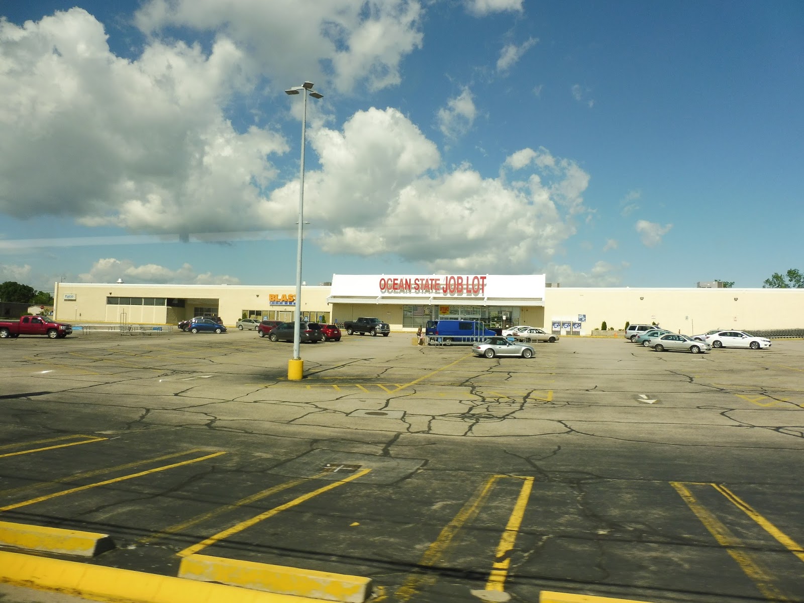
We got a nice little break after the highway crossing, passing through a nice park. After we went under another highway, though (Huntington Expressway), the scenery became a mix of dense houses and industry. Around this time, we entered Cranston, and reached the big parking lot of an Ocean State Job Lot. On weekdays, every other trip terminates here.
 |
| Not the most official of terminals… |
It was quite industrial from there, including some pretty big factories. We crossed over the Pawtuxet River, and the scenery went from factories to just plain warehouses and offices. Eventually, Elmwood Ave reached its end point and we turned onto Post Road, which was…also industrial! Wooooo!
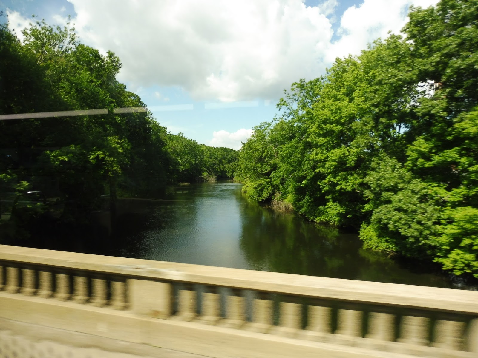 |
| Going over the river. |
Businesses with huge parking lots started to appear, which is an improvement, I guess. We went through another highway interchange, then passed a really deserted-looking mall. After another shopping plaza, airport-related businesses and hotels started popping up, and we merged onto T.F. Green Airport Connector Road. This took us up to the airport busway, where the bus went out of service.
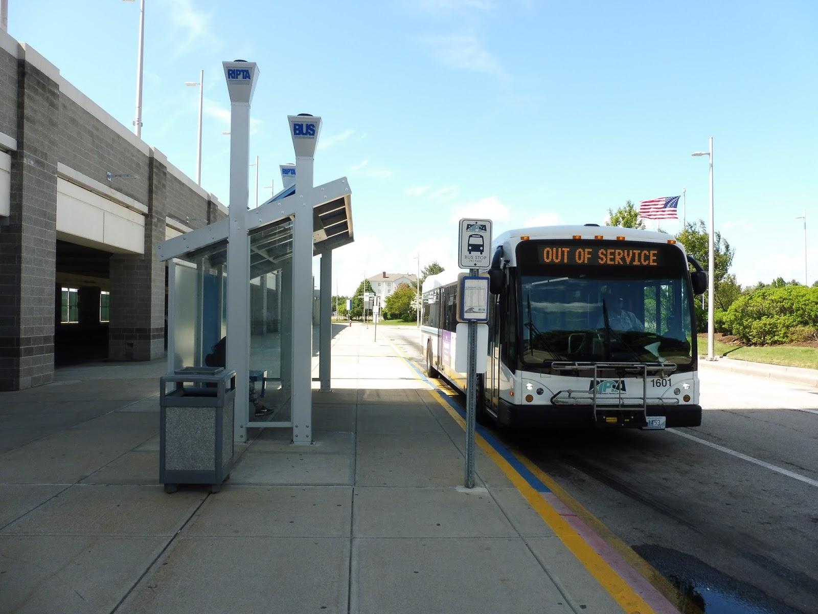 |
| The bus at the airport. |
RIPTA Route: 20 (Elmwood Ave)
Ridership: For a Sunday morning, my ride was surprisingly busy, with about 20 passengers in total. What’s more, 40% of those passengers got on at stops other than Kennedy Plaza, which shows that there’s good local ridership for the route as well. Overall, the 20 is RIPTA’s 5th-highest ridership route, with 2,464 passengers per weekday, 1,213 per Saturday, and 796 per Sunday.
Pros: This is a direct route that serves a lot of neighborhoods. It’s also very frequent on weekdays, running every 15 minutes with every other trip terminating at Ocean State Job Lot. And yes, I did ridicule the bus for its 45 minute weekend schedule, but 20 riders seems like the perfect amount for a Sunday morning, so the headways are fine as they are.
Cons: Nothing much, although some of the stops can be ridiculously close together. Also, and this is exclusive for my trip, the driver drove the bus at the same speed as the route number! It was torturously slow!
Nearby and Noteworthy: Unfortunately, the 20 doesn’t serve any areas that would be of note to visitors. The RIPTA bus garage is interesting, I guess.
Final Verdict: 9/10
This is definitely one of the best routes on the RIPTA! The 20 serves a lot along its run, and its schedule is perfect for the amount of ridership it gets. I like how every other trip terminates at Ocean State Job Lot on weekdays, since the outer section is quieter anyway. Plus, since the trunk route is every 15 minutes, that’s still every half hour service to T.F. Green!
Latest MBTA News: Service Updates
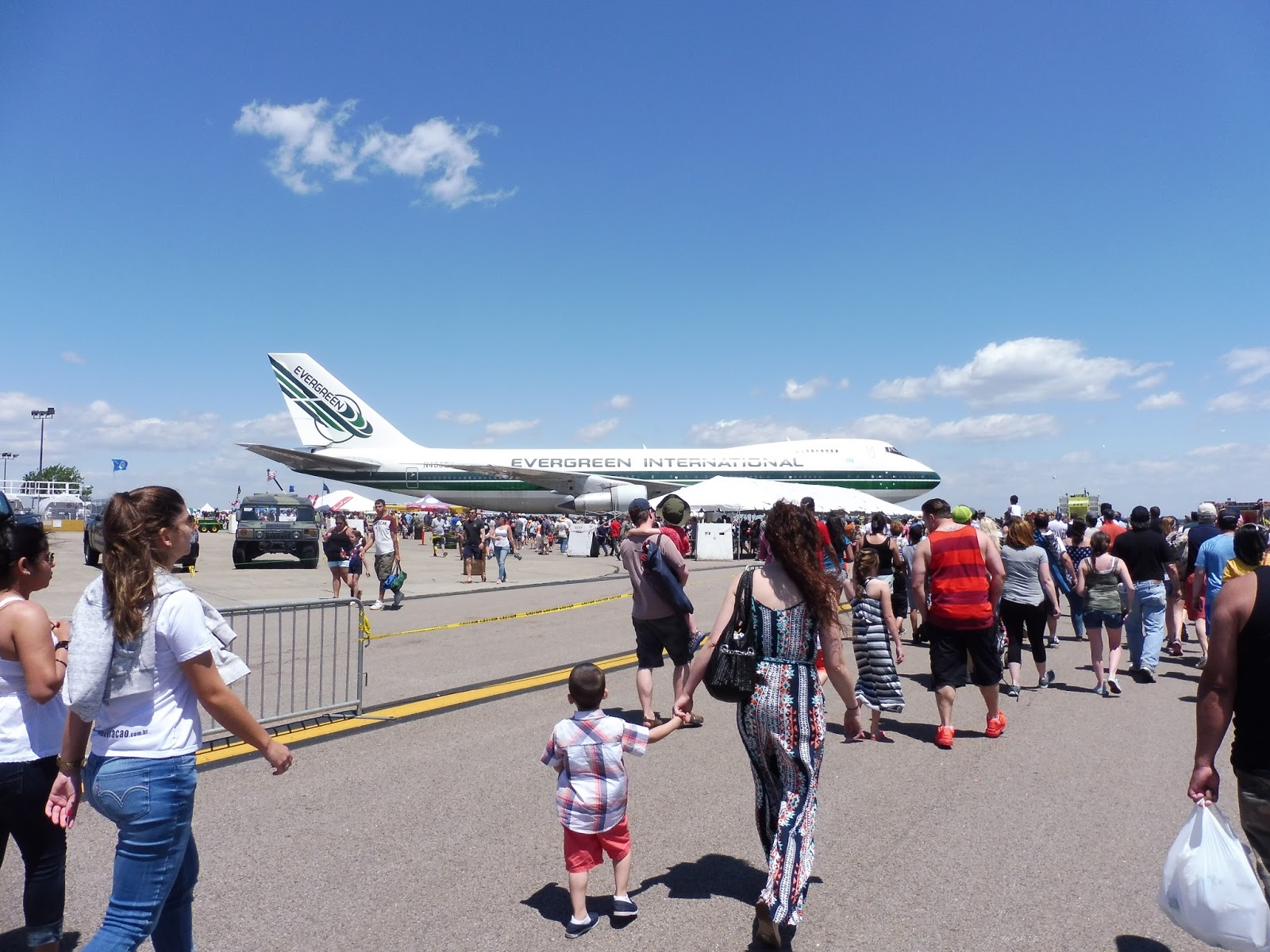
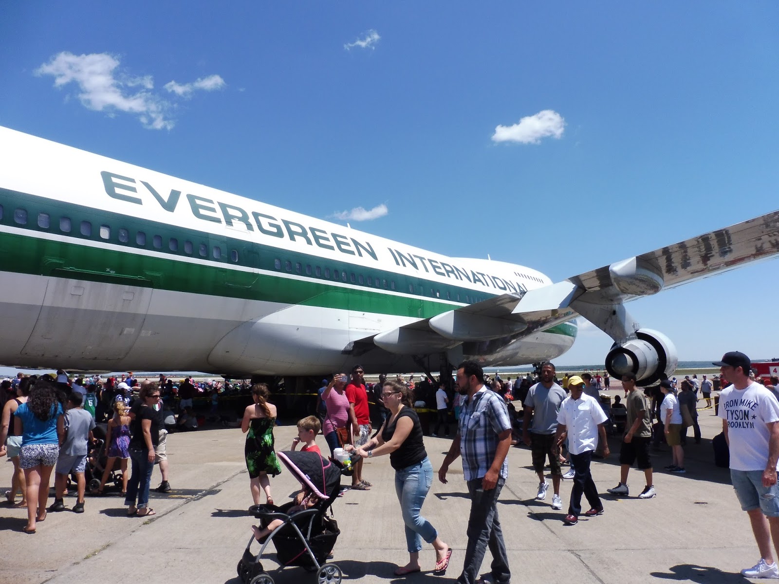
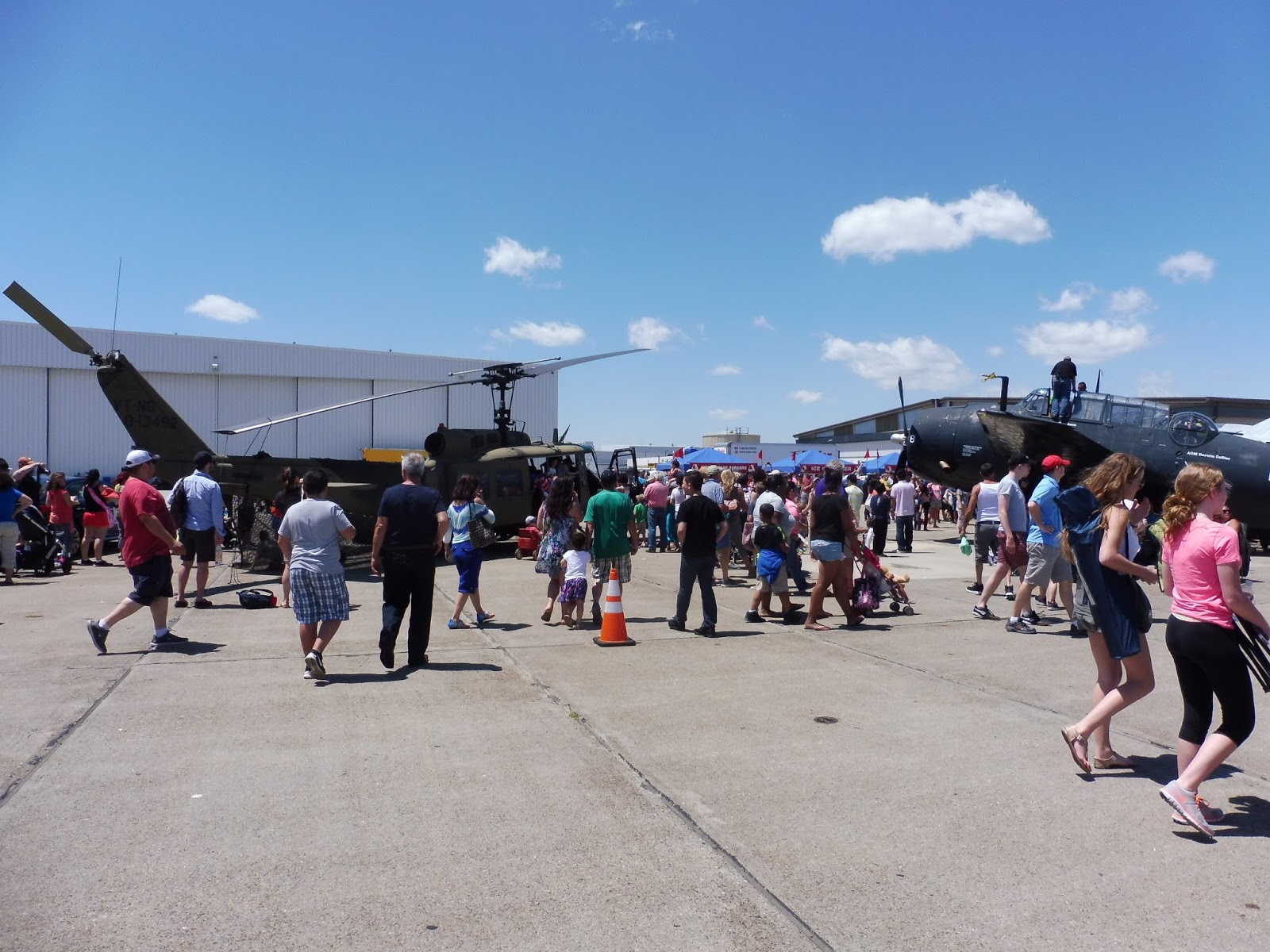
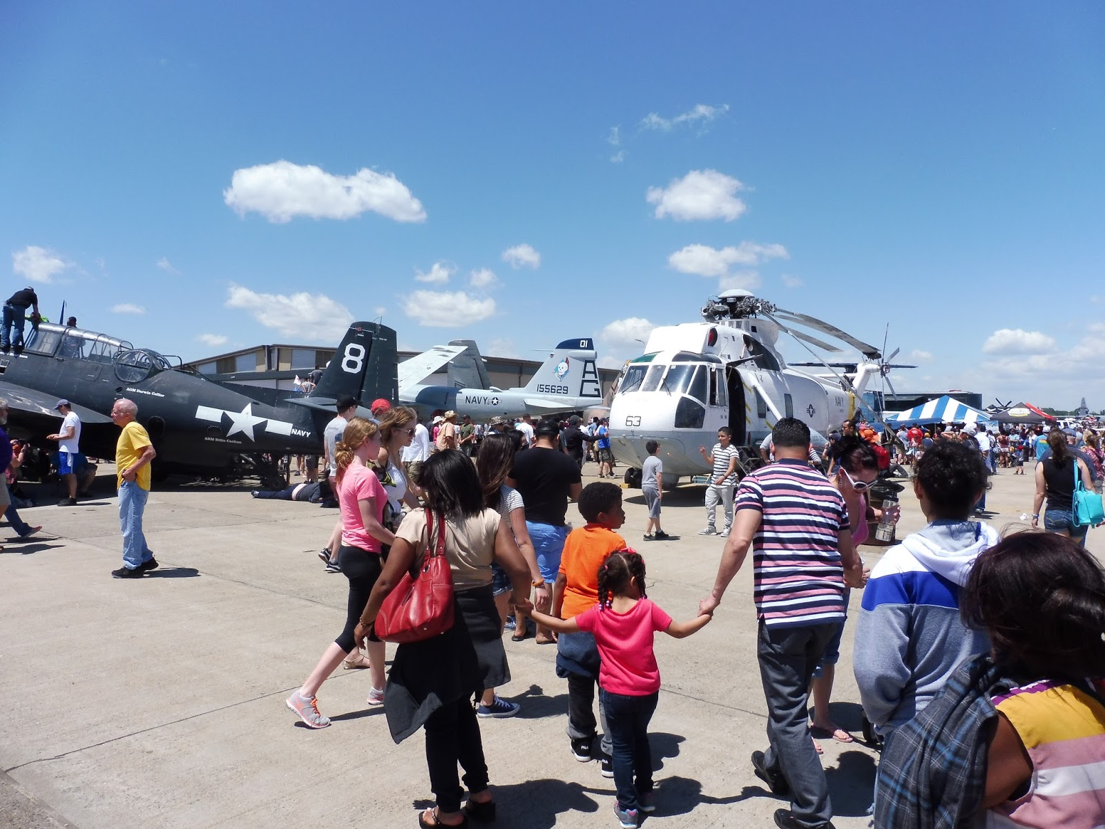
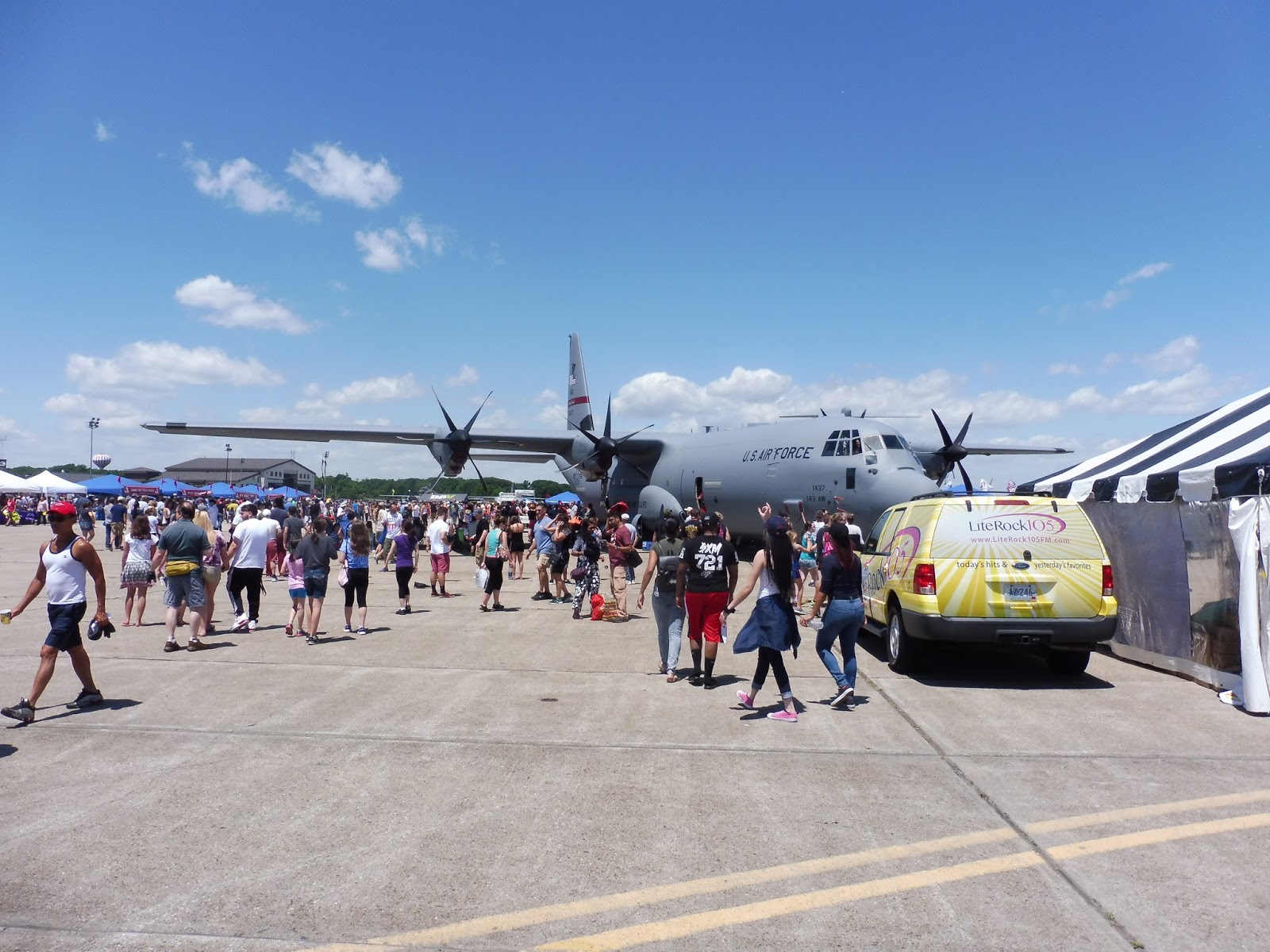
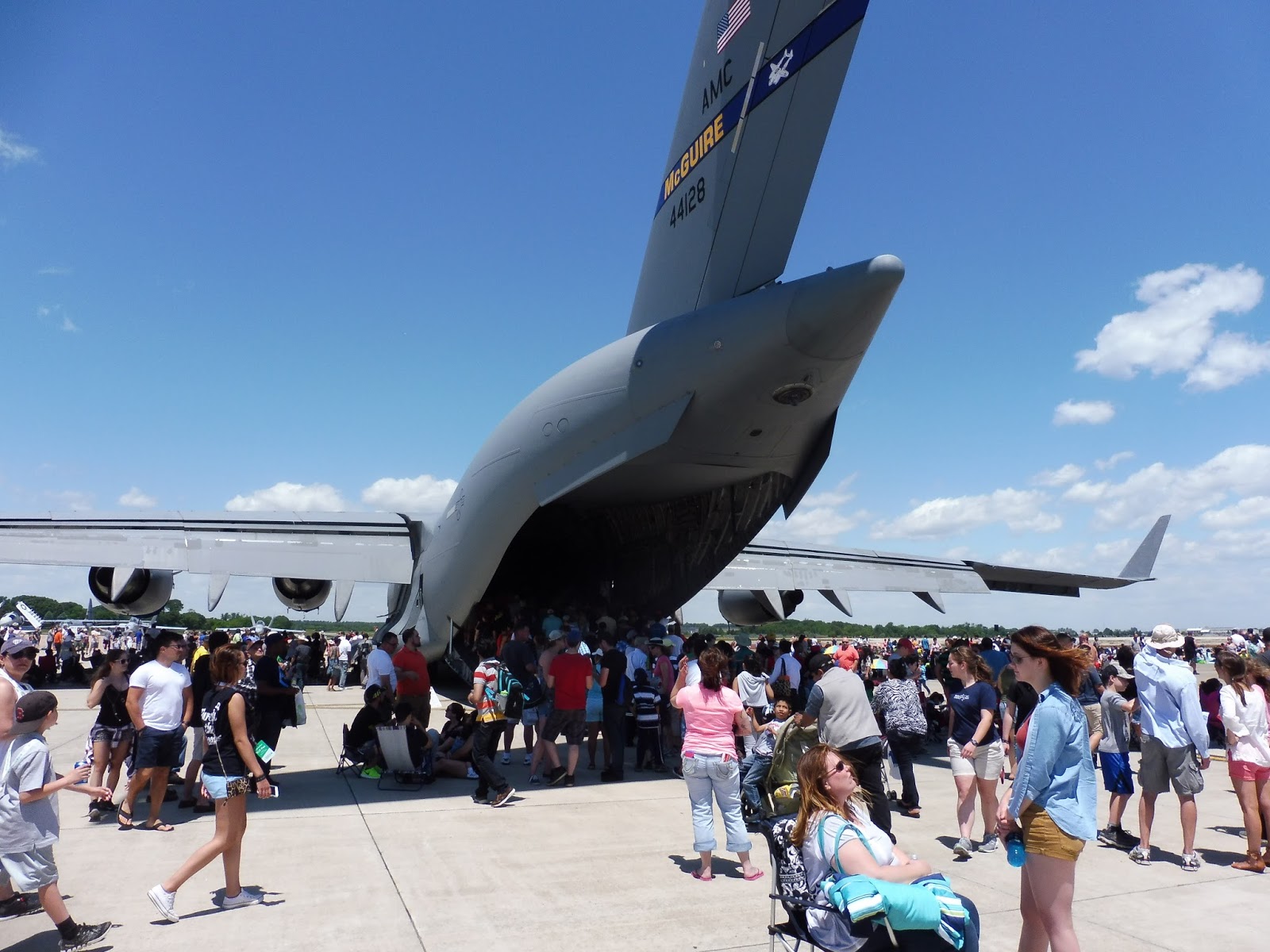
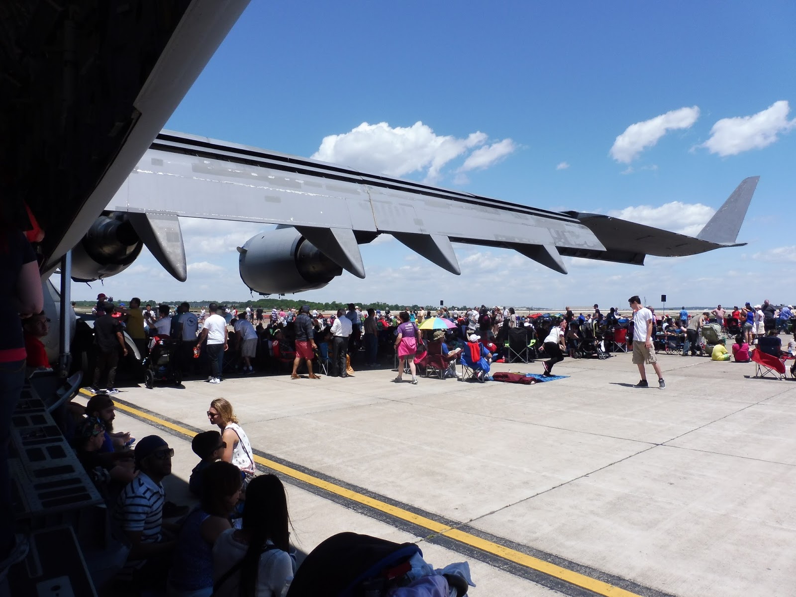
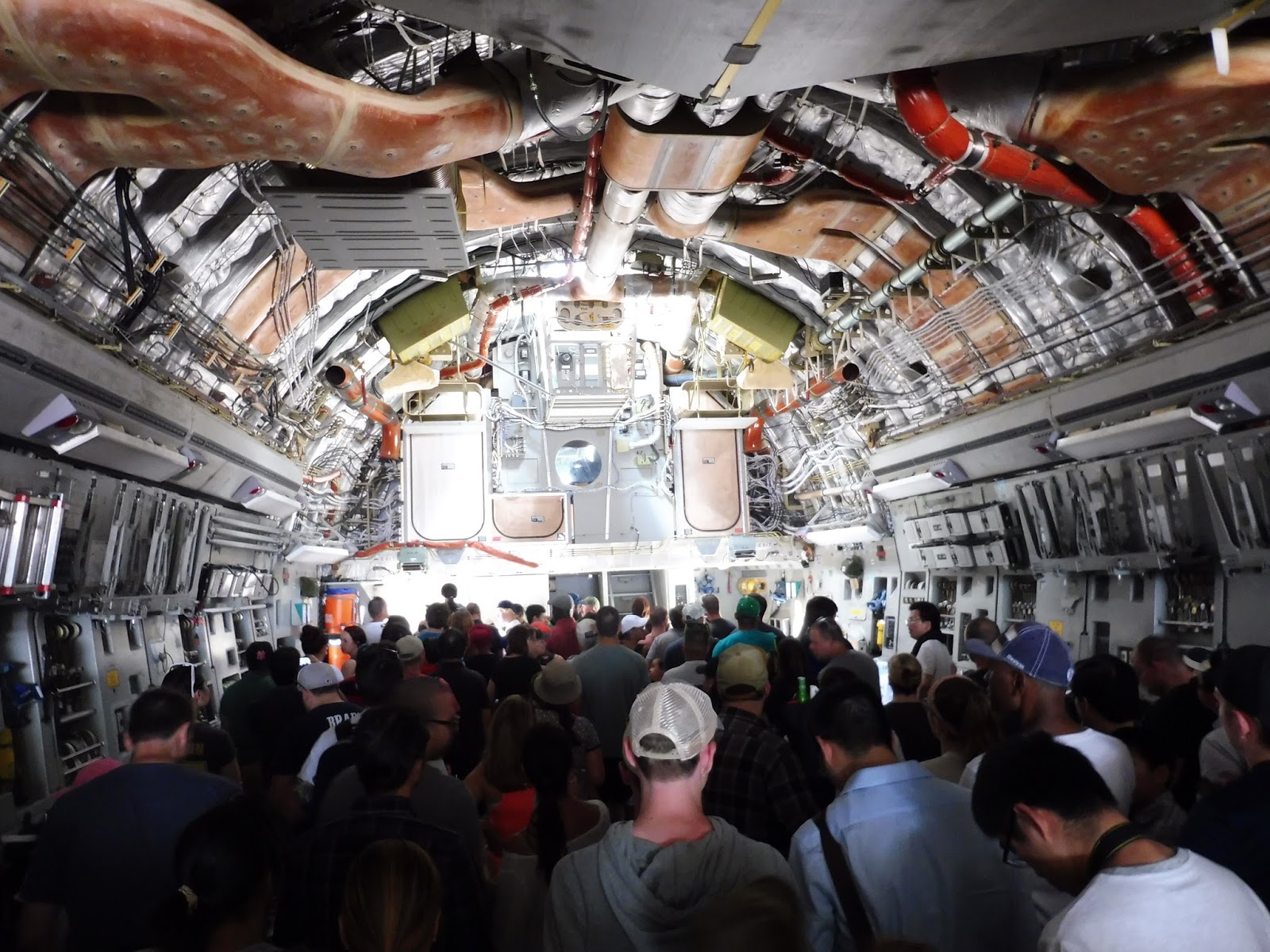
Random Photos: Quonset Air Show!
Here are a few shots from the Quonset Air Show, in case you’re interested.