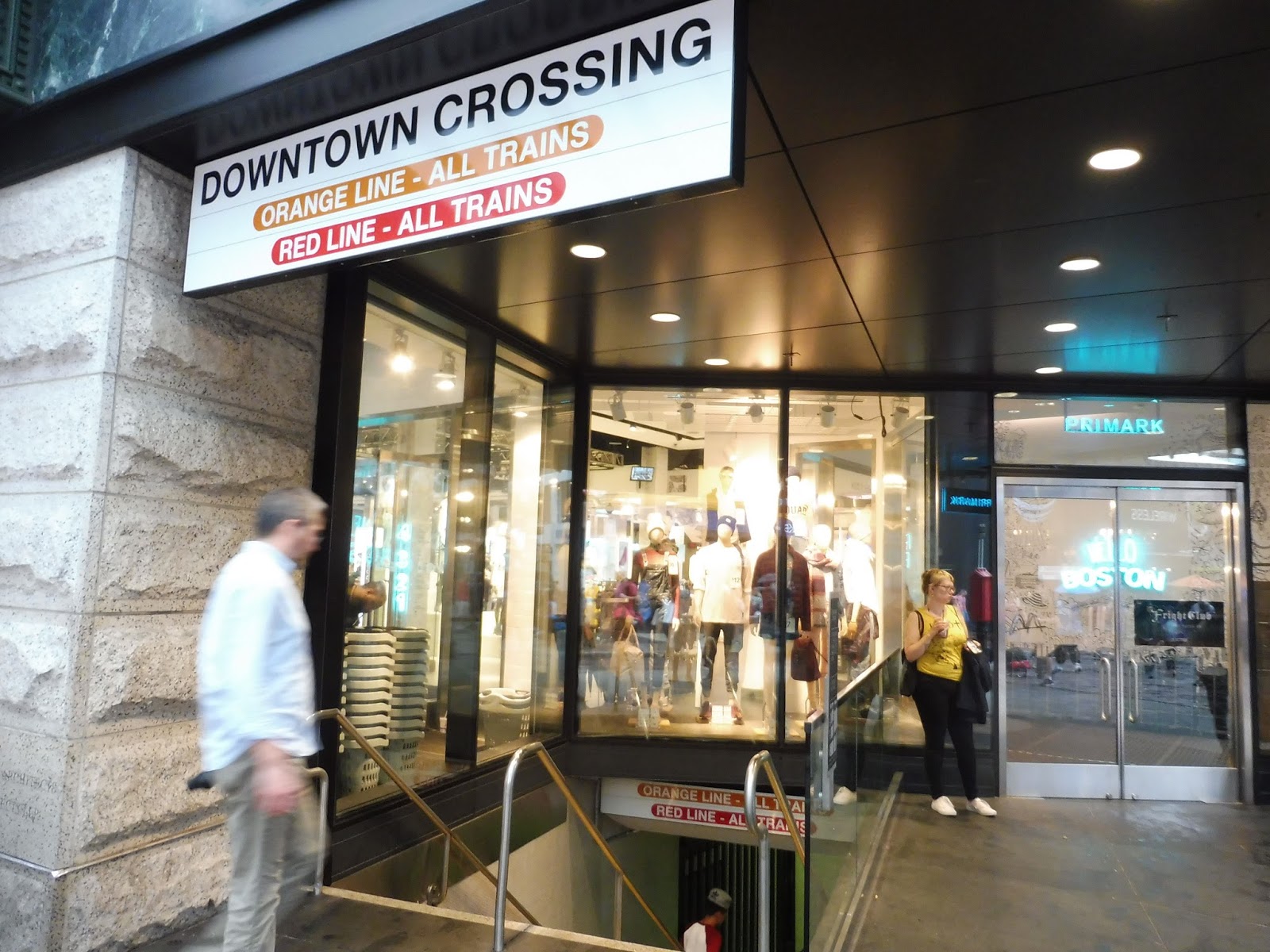
Downtown Crossing is a labyrinth. I mean, we’ve all used this station before, either to transfer or to get to Downtown Boston. But seriously…does anyone know just how many entrances and exits this place has? My friends and I walked around reviewing this hub for an hour and I’m sure I still forgot something somewhere! Oh well…we’re going to take quite possibly the most comprehensive look this station has ever gotten, and it’s going to take forever. Strap in!!
 |
| Continuing where we left off. |
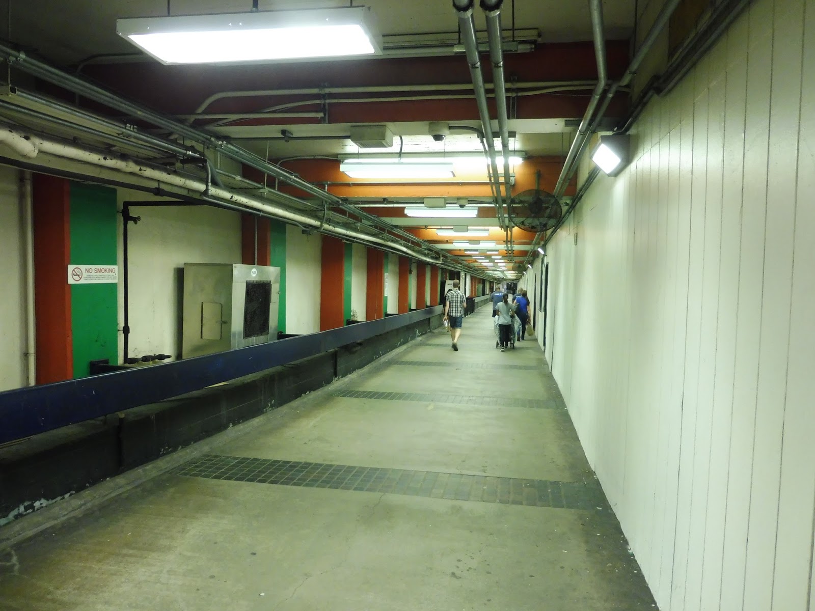
I ended my
Park Street review with the Winter Street Concourse, but I cut it off before actually talking about it. That’s because the concourse arguably has Downtown Crossing’s aesthetic, including chipping paint, a certain degree of claustrophobia, and lots and lots of random pipes. As unsightly as the hallway is, though, its connection between the two stations is vital.
 |
| Mamma mia! |
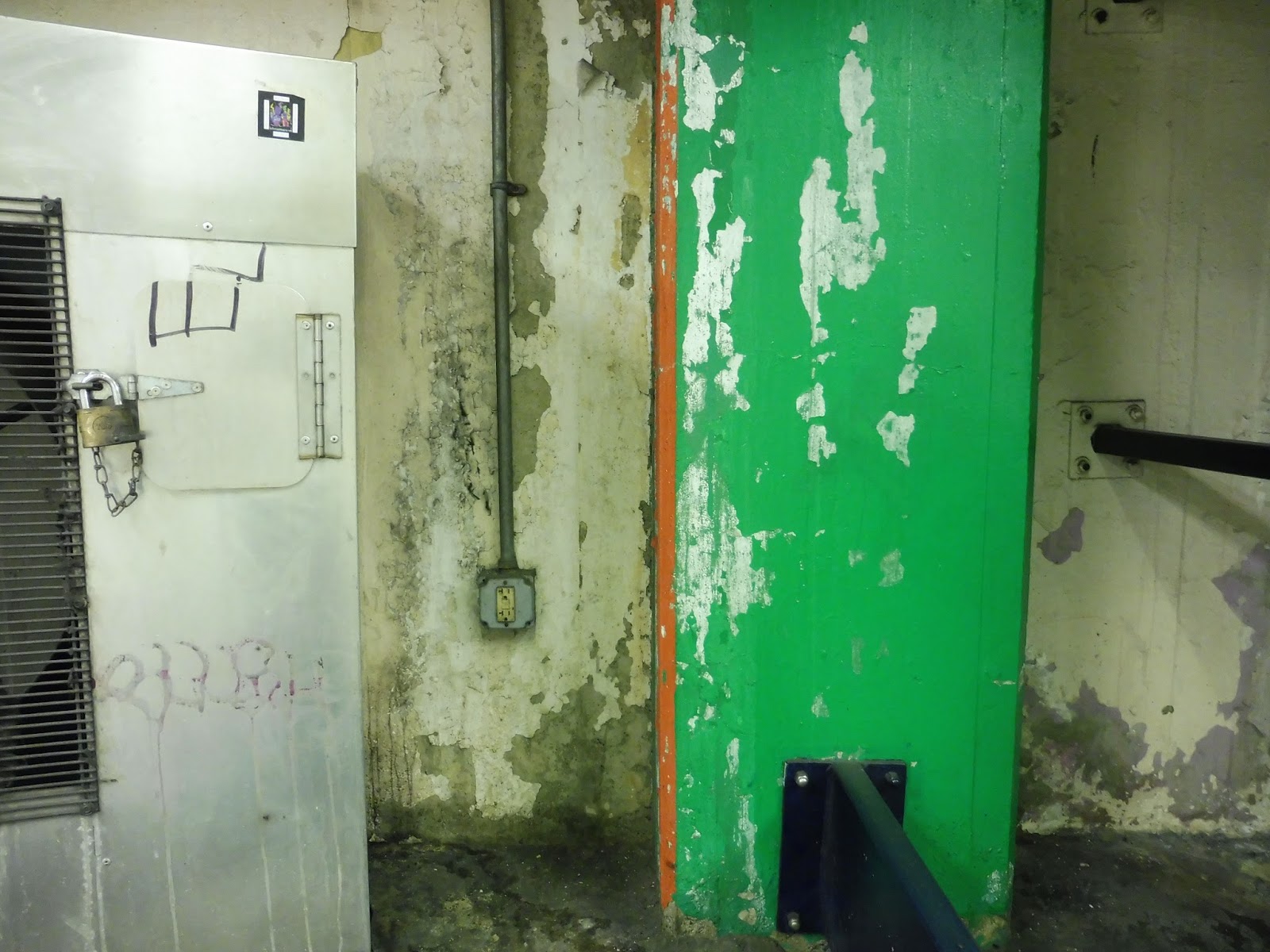
There are a few more oddities with the concourse. For example, it’s only half as wide as it’s supposed to be – the other half is completely occupied by random construction equipment, separated by a “temporary” wall with occasional doors in it. There’s also the cool map halfway down the concourse that shows the actual track layouts of subway lines downtown. Finally, have you noticed that the columns are painted orange when going toward Downtown Crossing and green when going toward Park Street? That is an awesome touch.
 |
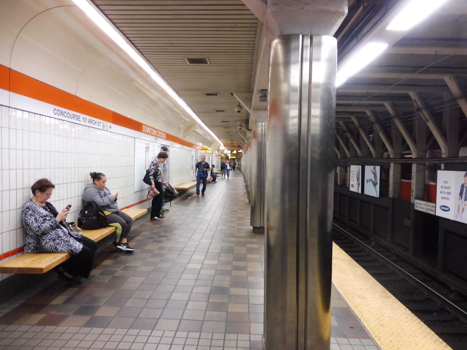
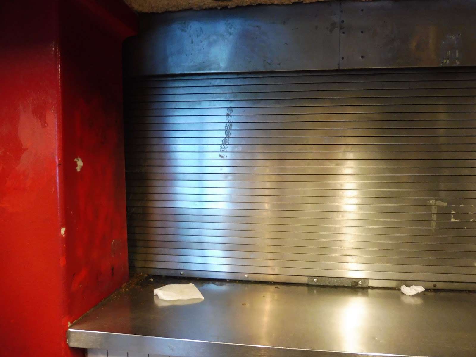
| Coming toward the Orange Line platform. |
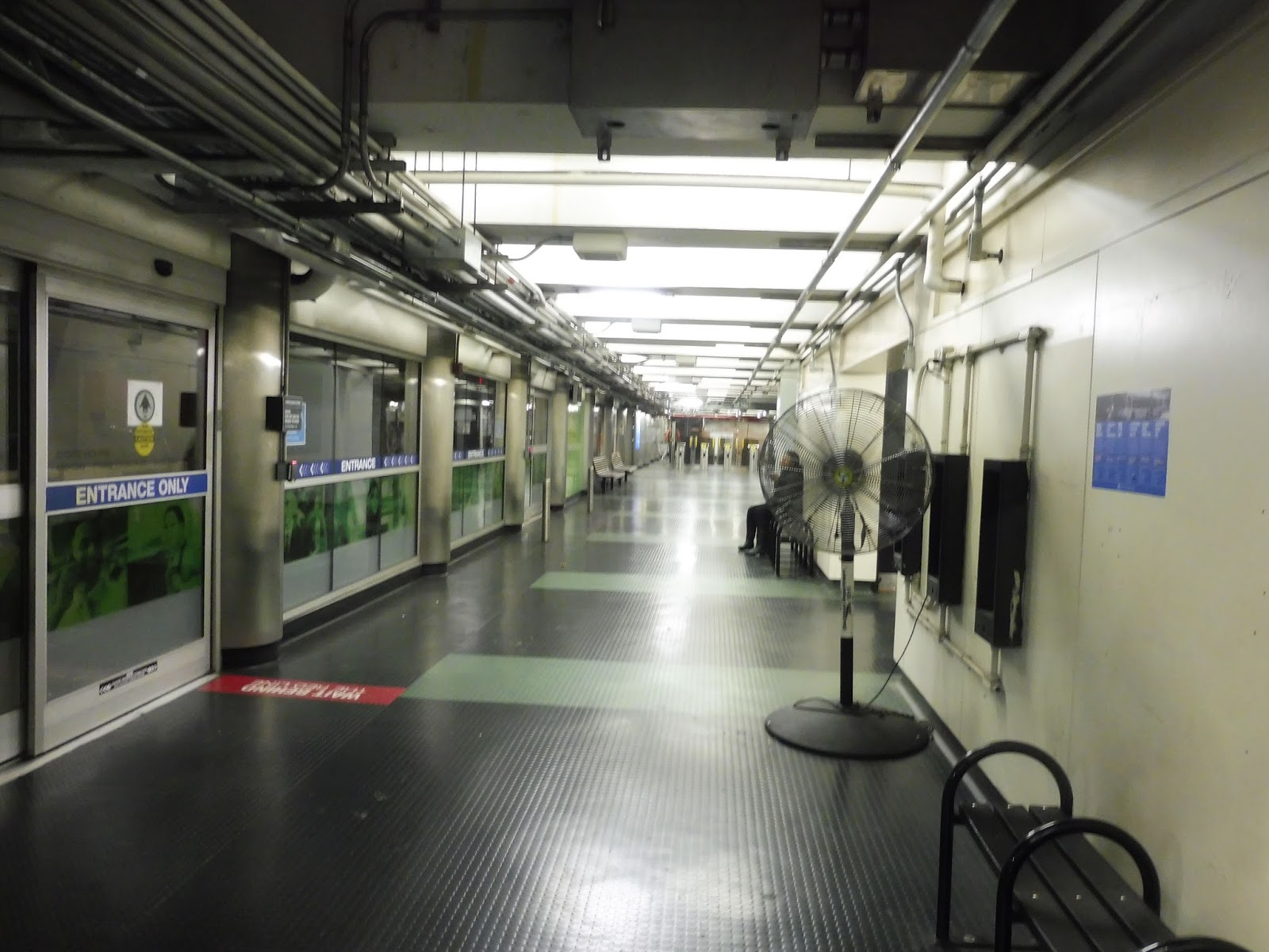
Once you exit the Winter Street Concourse, you enter a large-ish area in front of the Forest Hills platform. It features a bunch of payphones, as well as a food and drink vendor. Aside from Downtown Crossing’s characteristically low ceilings, boiling temperatures, and pungent odor (seriously, it’s everywhere), this is a fine area. However, the quality of the loudspeaker here is so bad that it always makes me laugh whenever I hear it.
 |
| The Forest Hills platform. |
Huh…you know, for Orange Line standards, this platform is…pretty decent, actually. For the most part, it works functionally, with a reasonably wide platform, lots of benches lined up against the wall, and a good amount of wastebaskets scattered around. There are technically random pipes, but they’re mostly over the area of the platform with the yellow line, so they’re out of passengers’ lines of sight for the most part. Top it all off with some cool historical newspaper clippings and you’ve got yourself a pretty good platform!
 |
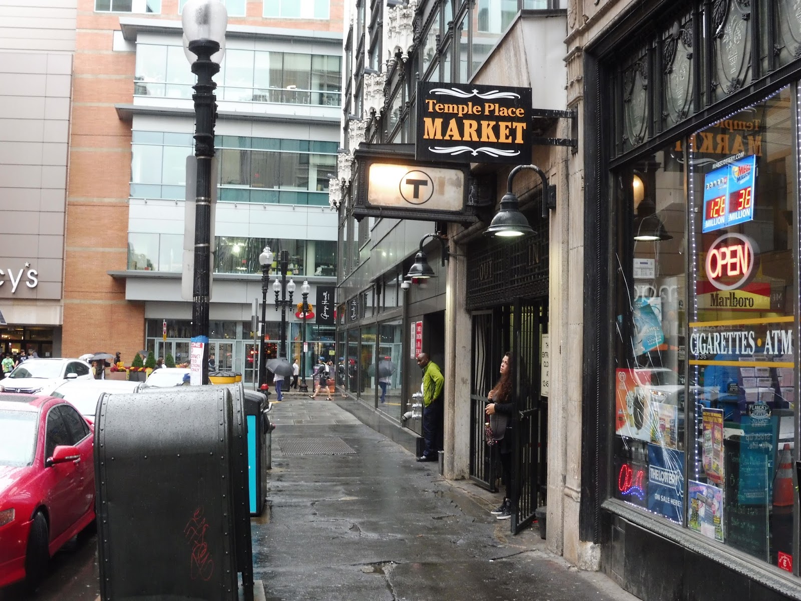
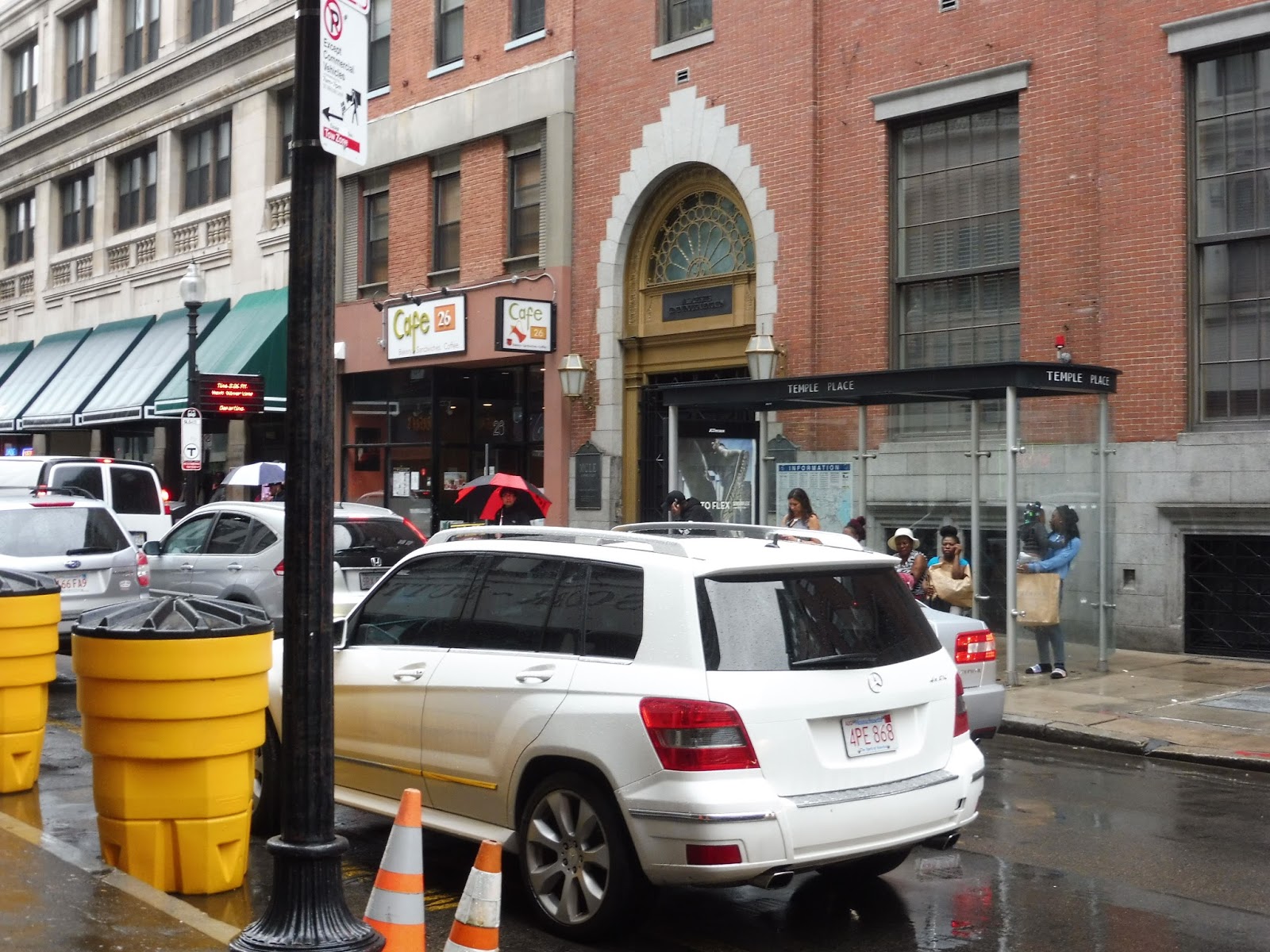
| The exit to Temple Place. |
On the far end of the Forest Hills platform, we’ve got the unusually wide Temple Place exit. It only has two fare machines and two fare gates, yet the whole thing is big enough for two huge exit-only doors, plus a gigantic mezzanine with a whole lot of empty space. It’s honestly a little bizarre, especially since this is one of the closet entrances to Park Street, so I doubt it gets that many passengers.
 |
| Okay, that’s awesome. |
Once you take the stairs up from that mezzanine, though, you’re greeted by one of the T’s most unique entrances. This is the most old-fashioned T building I’ve seen since
Shawmut, and it adds a lot of character to Temple Place. This has to have been one of the original entrances from 1908!
 |
| I put about as much effort into this picture as the T put into building this stop. |
The Red and Orange Lines aren’t the only “rapid transit” routes to serve Downtown Crossing. The “fast” and “reliable” Silver Line also serves the station with a shelter on Temple Place. I’ve always just used Park Street to get to this thing since most of the time it’s way easier, but the T considers it part of Downtown Crossing, so we’re reviewing it here. It’s just a shelter and an unreliable countdown clock. And lots of traffic. Seriously, imagine how much faster the SL5 could be if Temple Place had a bus lane!
 |
| A terrible picture of the Otis and Summer Street stop from my 448 ride. |
It’s slightly dubious about whether the Otis and Summer Street bus stop counts as “Downtown Crossing” or not, but the bus announcements seem to think it is, so we’ll talk about it. It’s not much of a stop, with two unsheltered benches and a wastebasket, but it’s not used very much outside of rush hour, either. You’ve got one local bus connection (the 7) or two if you want to count the 11 at Bedford and Chauncy Streets, and then a myriad of express routes, most of which have very limited schedules. On Saturdays, Otis and Summer only has the 7 and the 504, while it’s completely dead on Sundays.
 |
| Just gonna ignore that product placement… |
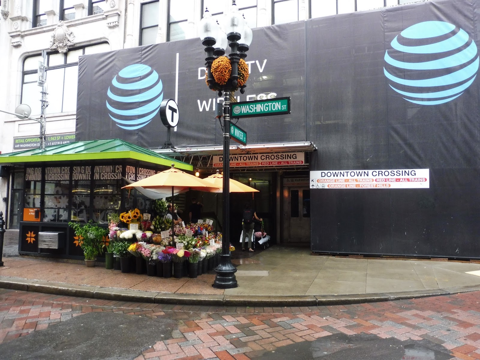
Our next station entrance comes on the corner of Washington and Winter Streets, featuring a flower stand and an facade without any advertising whatsoever. The staircase entrance has a neat art piece as you descend into the station: it’s a series of black-and-white sketches featuring everyday people doing various activities.
 |
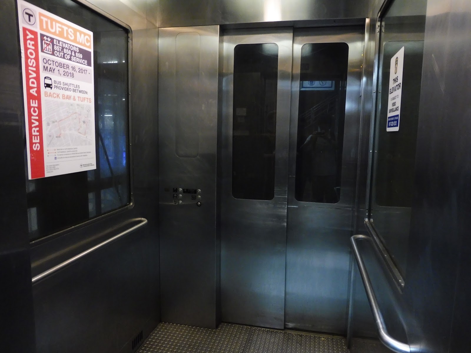
| Inside the first of many elevators. |
The word I would use to describe the elevator for this entrance is “funky.” I mean, seriously, check out that aesthetic! It’s cool! Of course, like any Downtown Crossing elevator, the smells inside are horrible. Also, it has super annoying inconsistent buttons: one side refers to the upper floor as “Street,” while the other calls it “L” for Lobby. Well…what is it???
 |
| A weird slice of the mezzanine. |
The mezzanine for this entrance makes pretty good use of a small space. It has a few different fare gates, some of which feed closer to the Orange Line platform and some of which feed closer to the Winter Street Concourse. There are fare machines scattered strategically around to make it easy to get into the station. Finally, there are a few transit police security screens, because why not (I’ve never really understood the point of them)? However, as evidenced from the photo above, parts of this area experience a lot of water damage and general…grossness.
 |
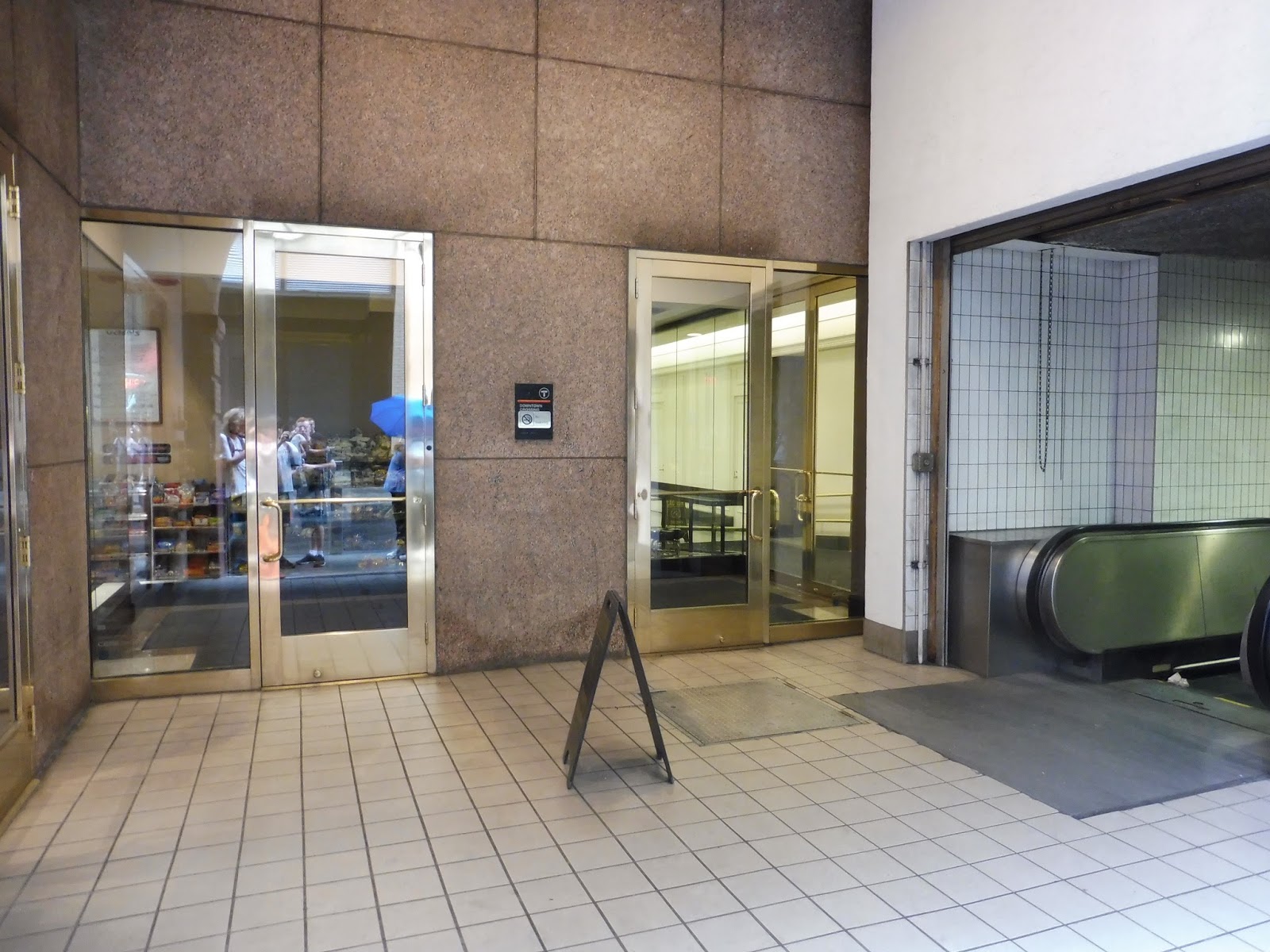
| A newer entrance. |
Next up, we’ve got a few entrances outside of “not actually Filene’s anymore but everyone still calls it Filene’s.” There’s not much to them – it’s basically just two modern entrances with staircases that lead to the same mezzanine. Once you step into the station, of course, it becomes anything but modern, but at least there’s a nice street presence.
 |
| The end of the station concourse. |
This entrance feeds into one end of Downtown Crossing’s main concourse. This is a long hallway that always kinda baffles my mind as to how it works until I see an overall map of the station. This end of it has some fare gates, machines, a rack with every MBTA bus schedule, and an ATM.
 |
| This blew my mind when I discovered it. |
Did you know that from this concourse, there’s a direct exit into Macy’s?? Seriously, this might be common knowledge, but I could not believe it when I discovered it. It’s really simple – just a set of stairs and a ramp leading into the basement of the store – but that is just so convenient! Signage within the store to the station is pretty minimal, though. Better signs could benefit shoppers heading for the train.
 |
| Now that’s signage! |
There’s also a direct entrance from the concourse to the Roche Brothers supermarket, and this one is a lot better. Within the supermarket, there’s a great MBTA graphic outside the station entrance, which features a staircase, as well as an elevator. Keep in mind that this one is pretty hard to use to leave the station, since you have to buy something at the supermarket to get to its exit.
 |
| Continuing down the concourse. |
With those special entrances out of the way, it’s time to return to the main concourse. Honestly, a lot of it just feels wide and empty, like something should be there and it’s not. I mean, look what we have in the picture above: some random historical photos, one of which is falling off the wall; a whole half of the concourse dedicated to construction; and an ugly aesthetic, including lots of random pipes. Granted, not too many people walk down this thing to begin with (relative to the rest of the station), but imagine how much better it would be with more retailers and vendors.
 |
| Further down the concourse. |
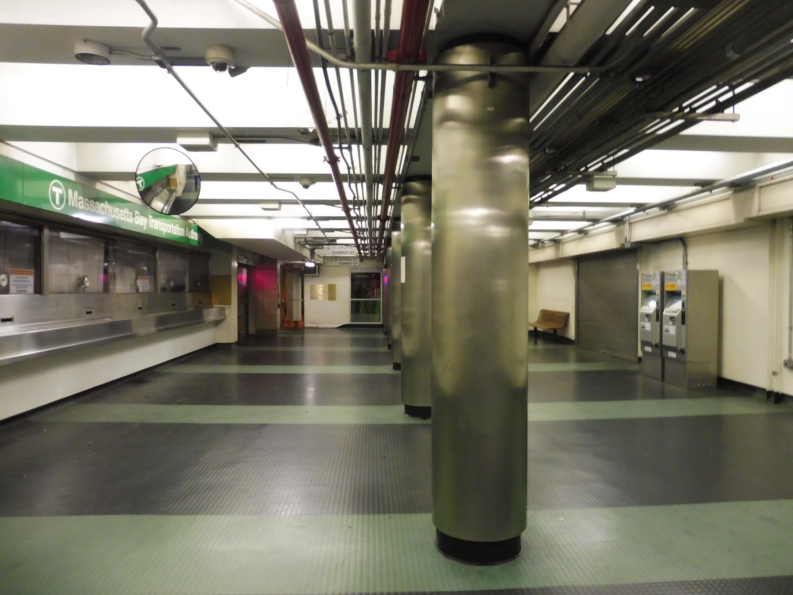
The fun continues as we reach the old abandoned “CharlieCard Store,” so to speak. It was mainly just a ticket counter that performed the same functions as the current CharlieCard Store, which we’ll get to later. The closed location is begging for something new to take its place. This area also has two cashless fare machines (for some reason), a random bench, and “Downtown Crossing Shoe Repairs Leather Repairs While You Wait Keys Made Zippers Bags”, etc. Yes, the one retailer down in the concourse does…uh…all that stuff.
 |
| Woah, this is a change. |
Also accessible from this part of the concourse is my absolute favorite Downtown Crossing secret: the 101 Arch Street exit. I don’t even know what the heck 101 Arch Street is (it looks like an office building), but this entrance is just awesome. A triad of golden glass doors leads to a majestic basement that’s actually clean! And it’s not insanely hot! And it doesn’t smell!
 |
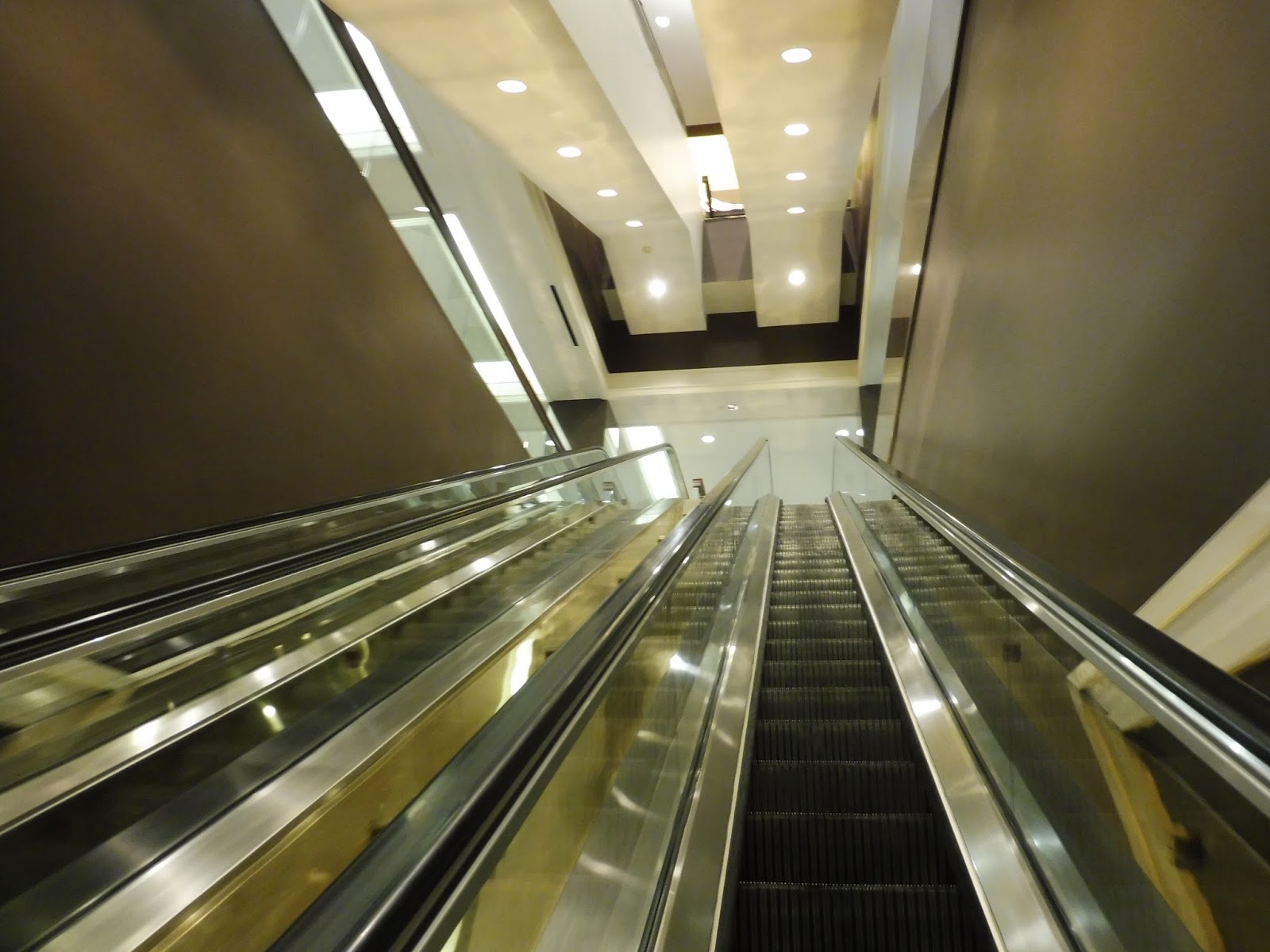
| The golden escalators! |
From this basement, you can use the majestic golden escalators to reach the exit, which in itself is a rarity, since this station doesn’t have all that many escalators relative to entrances. However, even better is the beautiful wooden elevator, accessed from behind a pair of golden doors. It is unequivocally the cleanest and nicest elevator on the T. Period.
 |
| Oh…we’re back here? |
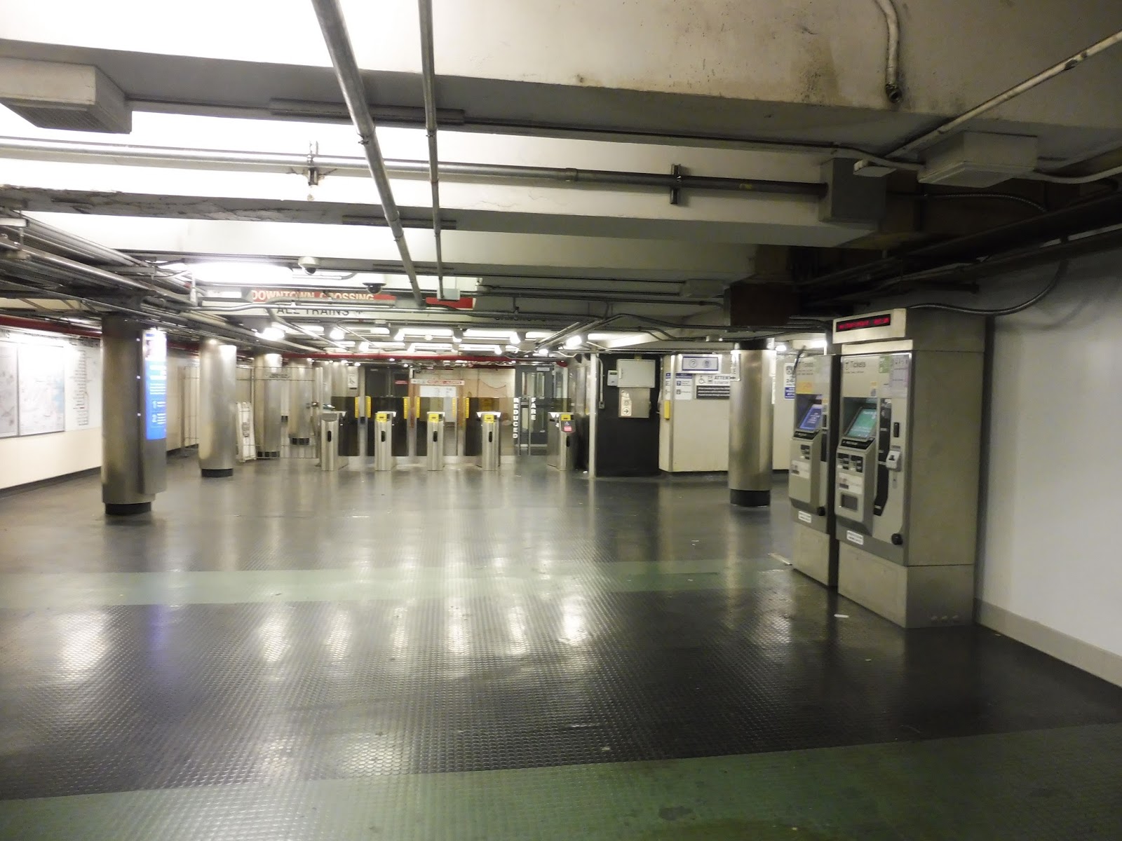
Alright, time to go back to the hot smelly station again. Next up in the concourse we’ve got the CharlieCard Store, a hotbed for long wait times and general chaos. Good luck getting your senior and disabled passes there! Across from the store, there are a few benches and some former pay phones that have been taken out of their perches to who knows where.
 |
| The other end of the concourse. |
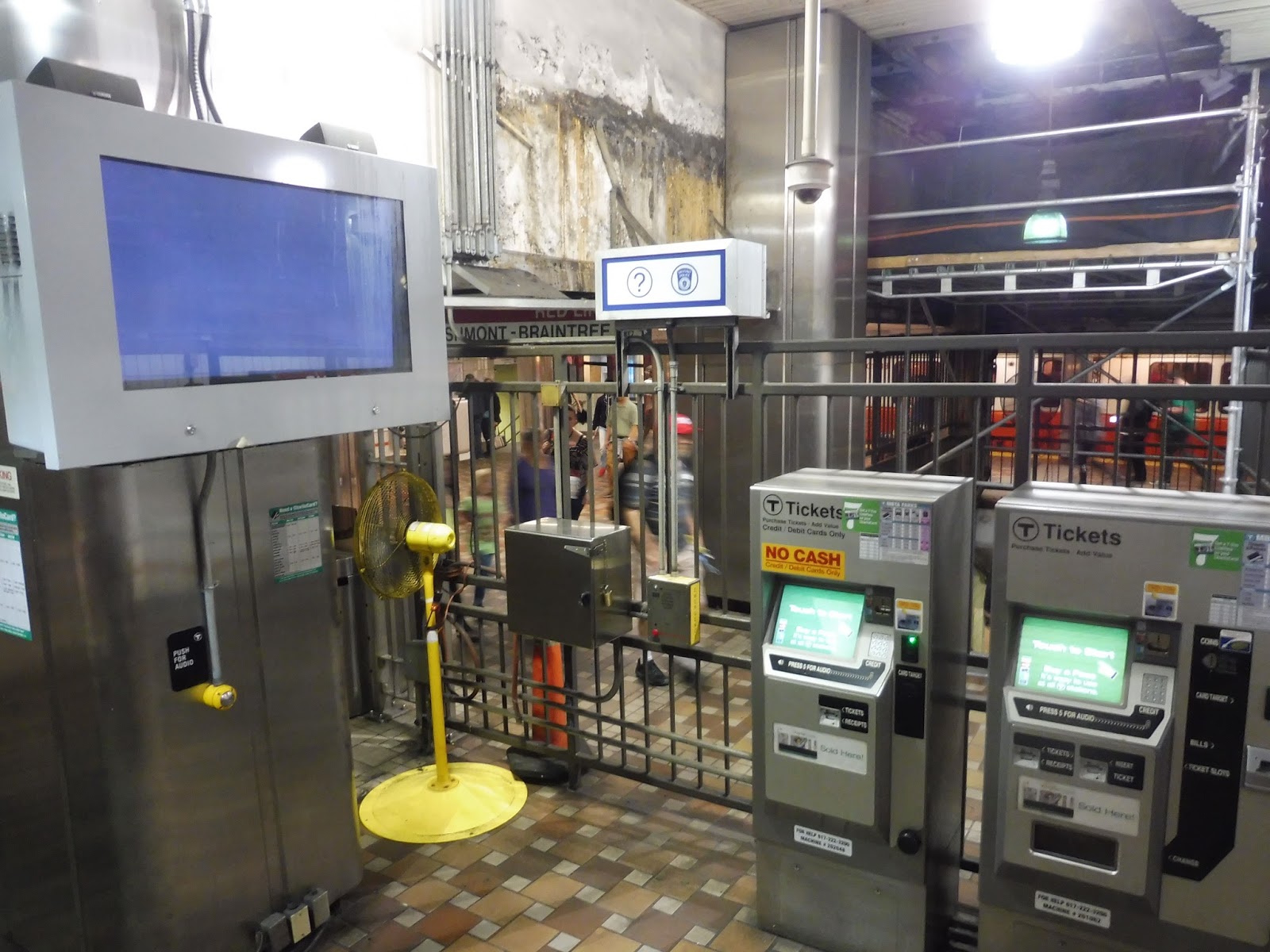
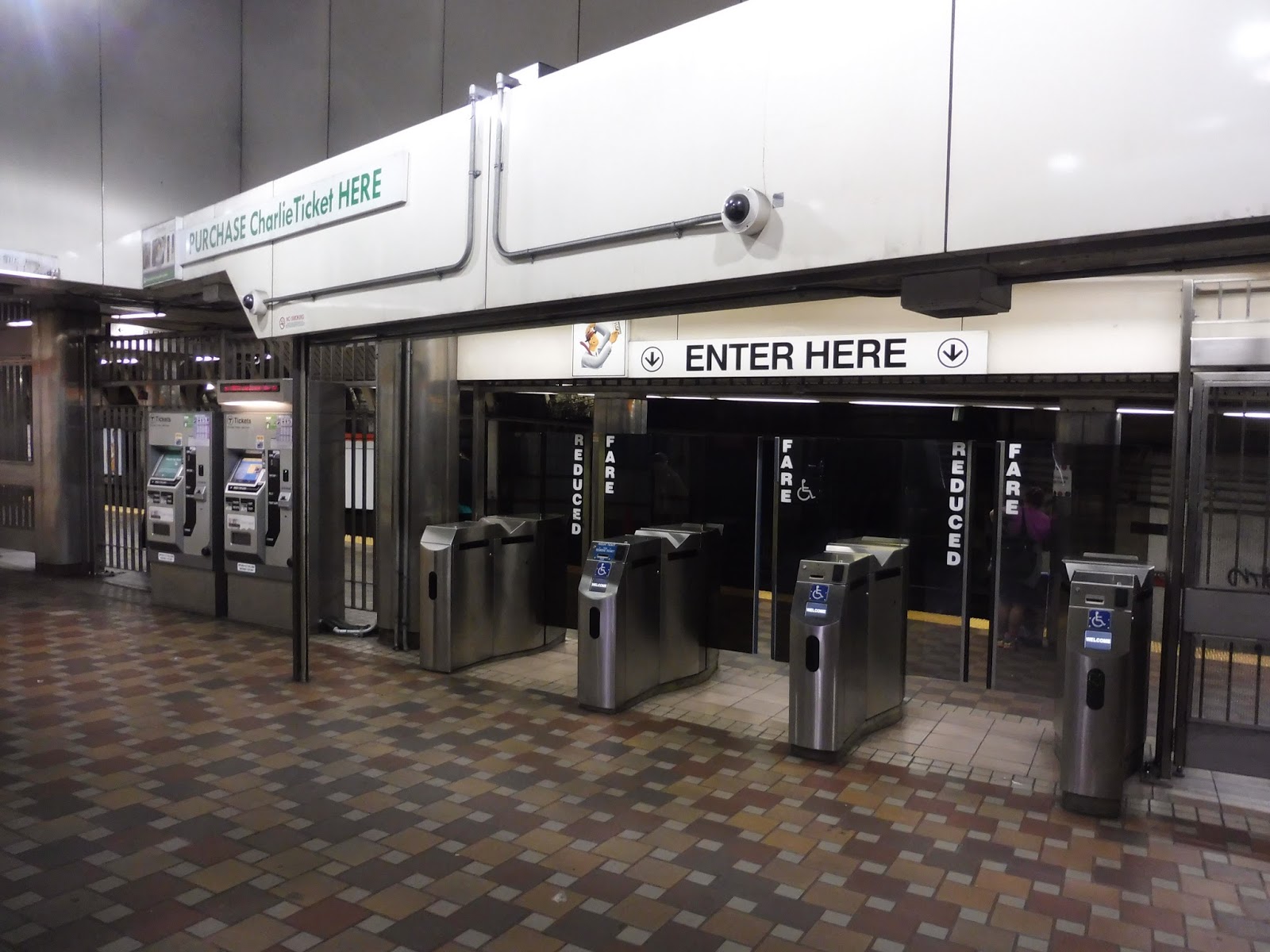
It always confuses me that the concourse has station entrances on both sides of it, but like I said at the beginning of this post, Downtown Crossing is truly a labyrinth. This mezzanine has a strange ratio of fare technology, with four fare gates but only two fare machines (one of which is cashless). Come on, you’ve got this huge space with nothing in it – is there no room for another machine that accepts cash? Also, you gotta love the Downtown Crossing sign that’s blocked by the various ceiling bumps and random pipes.
 |
| How many exits are in this station?? |
The exit out from this part of the concourse is one of the most claustrophobic ones in a station full of claustrophobic areas. That popcorn ceiling looms ever-low as you ascend the winding steps past a sign saying “DOWNTOWN CROSSING SHOE REPAIR KEYS MADE,” advertising that store down in the concourse. It leads out to a doorway in the shadow of the Macy’s building.
 |
| The exit only…exit. |
I don’t even know where this exit-only escalator leads from, but it’s here on Hawley Street. This was just a random picture I had and it took forever to find where it actually was on Google Maps. Wait…is that unmarked glass doorway an entrance? Did I miss something? Crap…I hope it wasn’t that noteworthy of an entrance, if it is one.
UPDATE: James Rock on Facebook has let me know that the exit is from the Red Line Alewife platform. Thanks, James!
 |
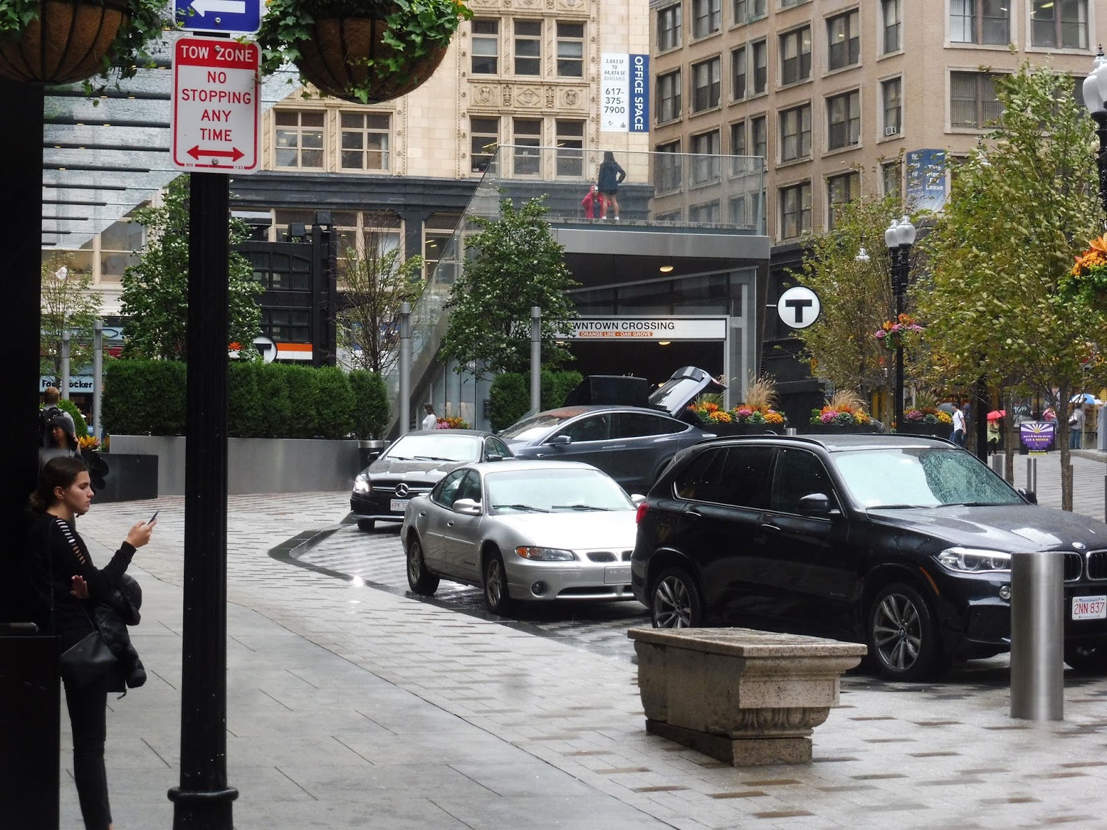
| The modern entrance! |
Ah, how I love this entrance of Downtown Crossing. Just look at it, it’s amazing! This was part of the Millennium Tower construction, and it includes this fancy plaza, complete with a drop-off area. For a downtown station, that’s a really nice amenity, even though it doesn’t make a whole lot of sense when you think about it.
 |
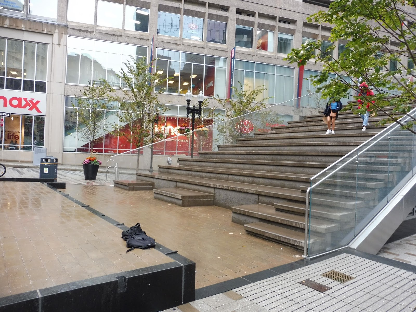
| Wow! |
The entrance made a very good use of limited downtown space. The builders took its triangular slab coming out of the ground and converted the upper section into seats for a makeshift amphitheatre! Who knows if anyone actually uses it for that purpose, but it’s a nice touch regardless. Another nice touch is the ornate street clock alongside Washington Street.
 |
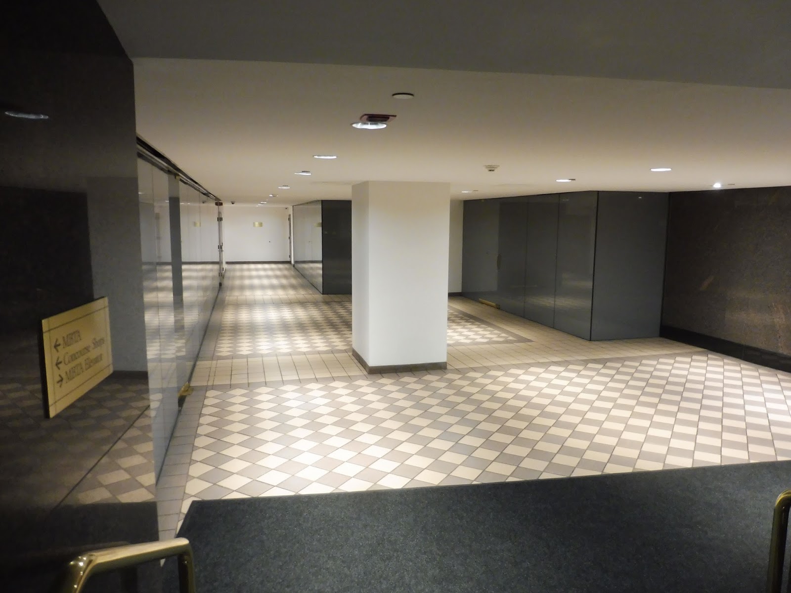
| The “modern entrance”‘s mezzanine. |
The minute you step down the stairs, though, that horrible smell and burst of heat come rushing back and you know you’ve returned to Downtown Crossing. This mezzanine has three fare gates and two fare machines, making pretty good use of space for once. A long bland hallway with lots of secret doors to who-knows-where leads to the elevator back up to the surface, as well as a pay phone.
 |
| The Oak Grove platform with a train going by on the other side. |
The Oak Grove platform is basically the same thing as the Forest Hills platform, although it is worth noting that it’s located diagonally across the tracks from its counterpart. This is the last time I’ll get to rant about this, so: why the heck did they build the Orange Line stations this way?? ((
UPDATE: Okay, I know Washington Street is narrow and it was difficult to tunnel under it in the first place, but the layout is still a pain to work with!)) Other points of interest include a random telephone over the tracks and the fact that some of the orange panels are a
slightly different shade of orange, and that’s very annoying!
 |
| Lots of construction. |
The end of the Oak Grove platform seems like it’s been under construction for a really long time. My good friend Wikipedia says that the T is installing elevators from the southbound Orange Line platform to the Red Line platforms…except that this construction is happening on the northbound platform! Sigh…who knows? One of you readers will let me know, I’m sure!
 |
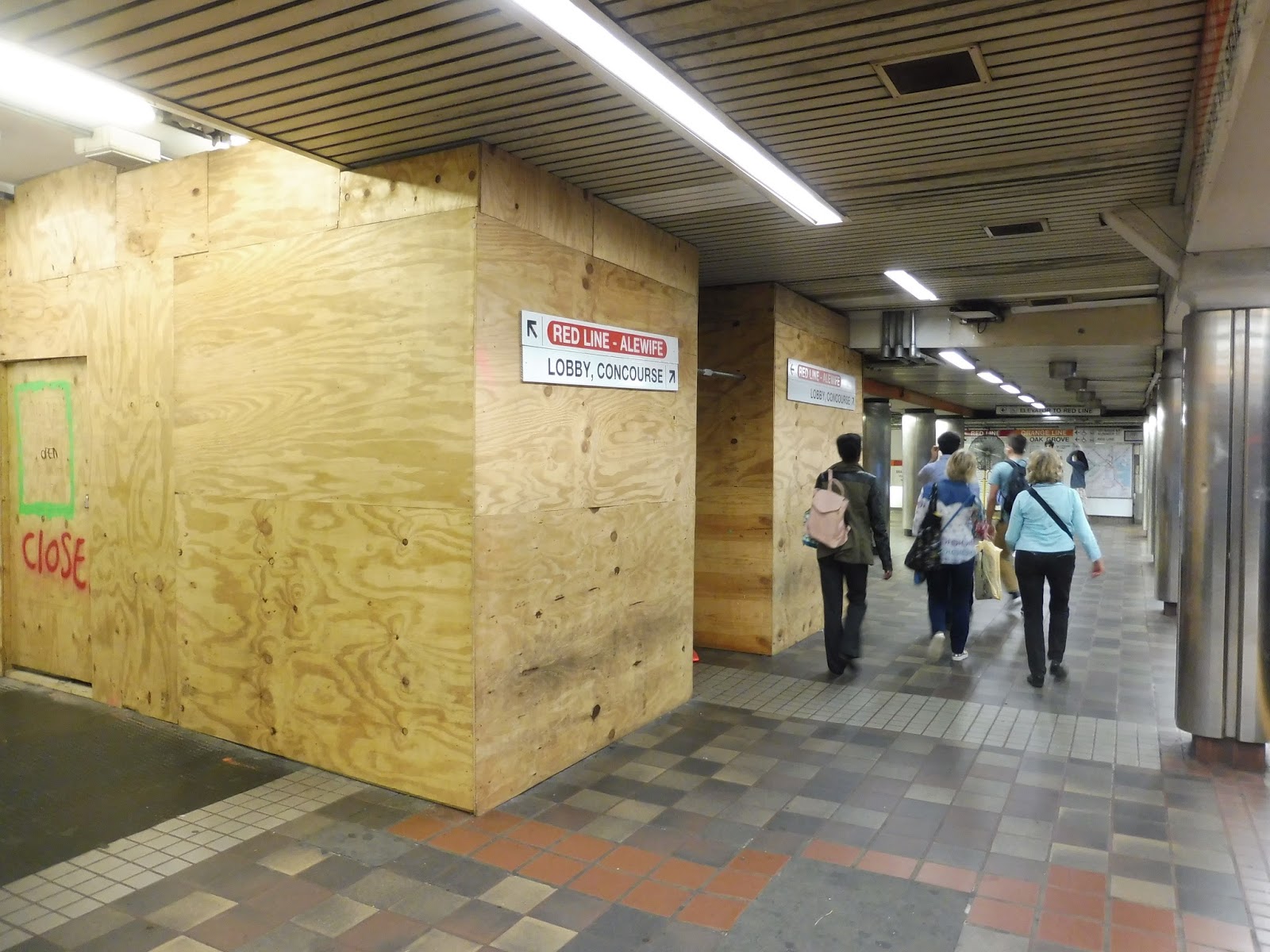
| Deep in the bowels of the Transfer of Death. |
Alright, I’m not even gonna try to figure out how the transfers work here. It’s just a huge mess of long, ugly, low-ceilinged hallways that somehow connect two Orange Line platforms to two Red Line platforms. Some transfers are easier than others, some hallways are nicer-looking than others, but I seriously can never decipher this mess.
 |
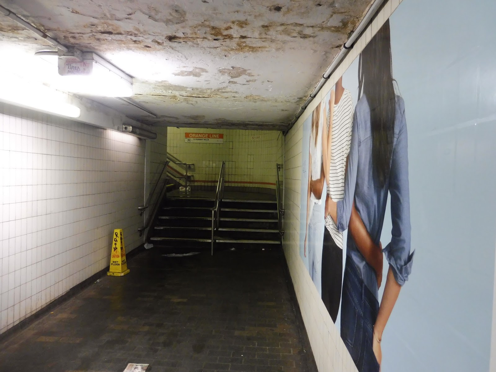
| EW! |
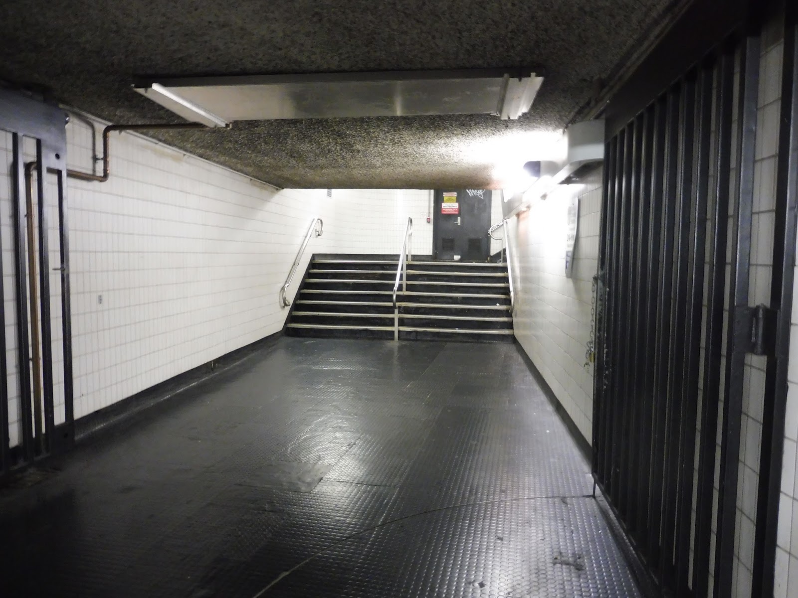
I’m not going to pretend I remember where this hallway leads from (I’m 95% sure it’s from the Red Line Alewife platform), but no discussion about Downtown Crossing is complete without talking about the Perpetual Liquid Staircase. A long, narrow, tight white hallway with a rotting ceiling leads to a staircase up to the Forest Hills platform that always has some sort of liquid trickling down it. Anyone who’s had to use this staircase will know that it is disgusting.
 |
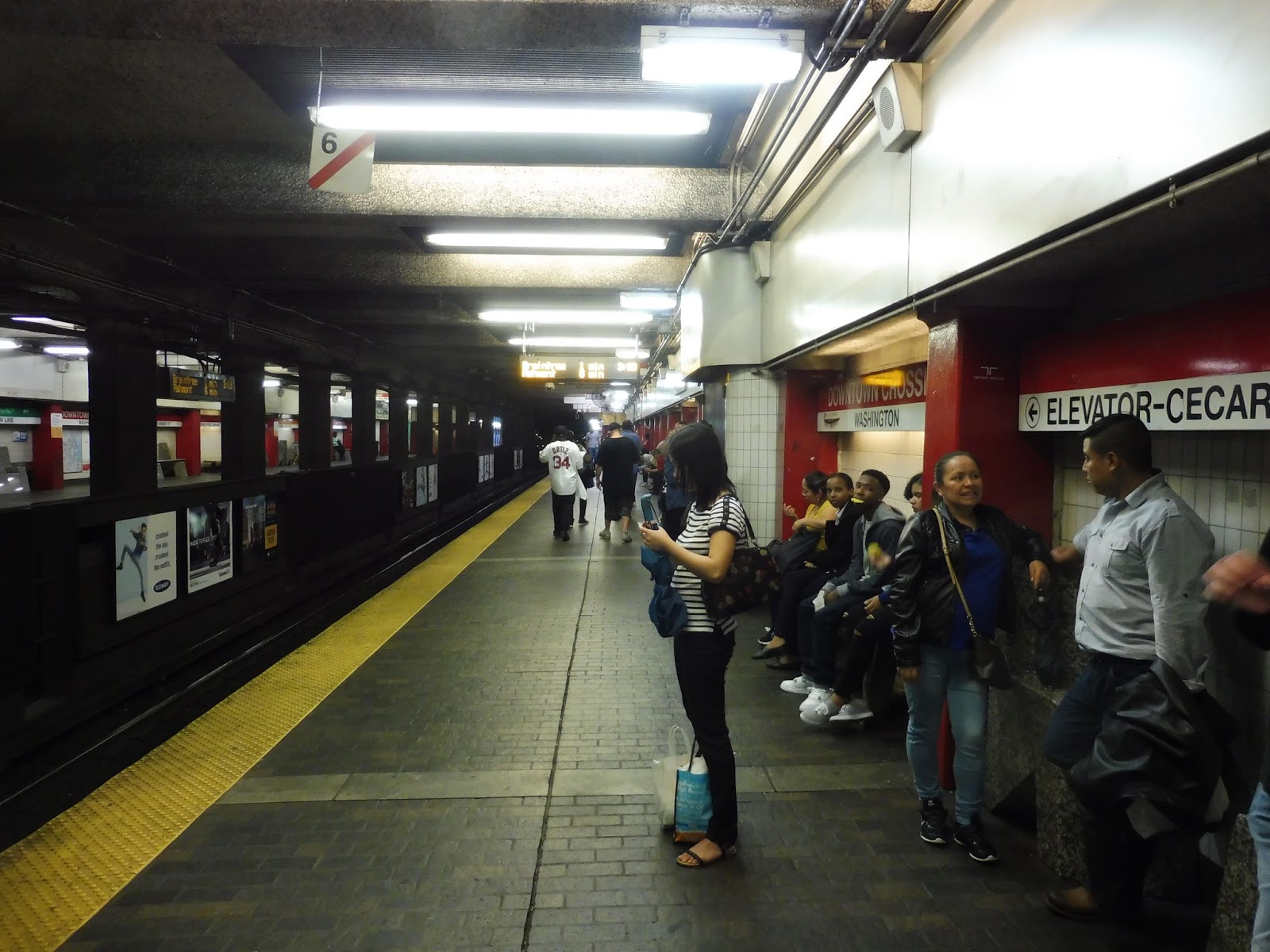
| The busy Red Line southbound platform. |
The Red Line platforms are right next to each other and are basically the same, so I’ll talk about them at the same time. This is a pretty typical T subway station, with wide platforms, some random pipes, and dark popcorn ceilings. It’s almost constantly busy no matter what the time is…well, unless there hasn’t been an Orange Line train in a while.
 |
| Aw man, it’s closed… |
There are a few other points of interest along the platform. For example, there is a vendor right on the platform that sells various food products and seems to only be open whenever it wants to be. Also interesting is the signage for the Green Line via the Winter Street Concourse – I would completely understand if it was on the Orange Line platforms (it’s not), but the Red Line has Park Street one stop away! I guess it’s useful if the next train isn’t for a while.
 |
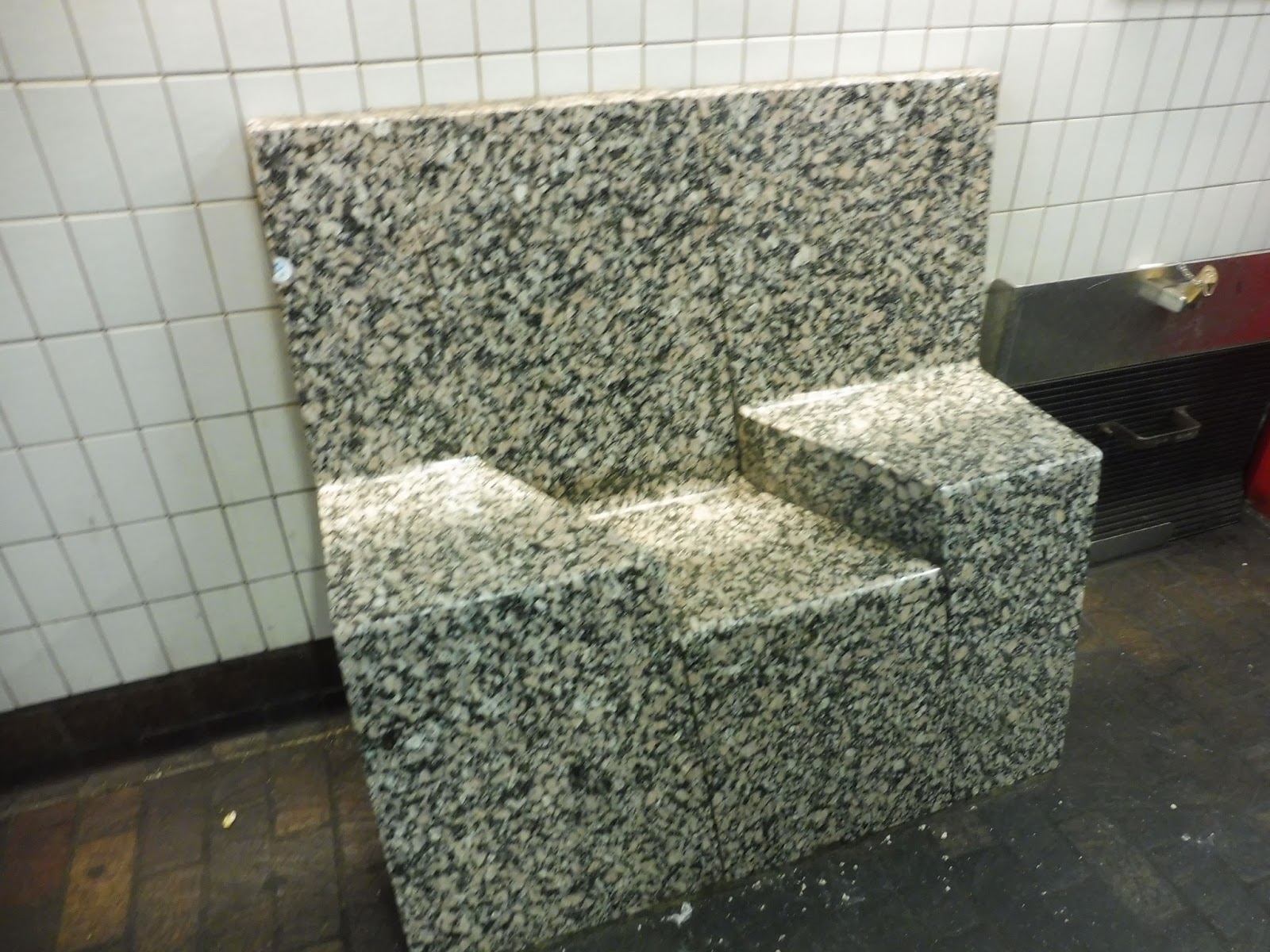
| YOU!!!!!! |
Please observe the bench in the above photo. Tell me if that looks comfortable to sit in. If your answer is “No,” then congratulations, you have an iota of common sense. Seriously, there are way too many benches on the Red Line platform that are like this. I understand that artwork in a station makes it unique and interesting, but this is artwork getting in the way of functionality. It’s stupid! And I know this is a really sour and specific note to end on, but I could not get this review done without my bench rant. Ridiculous.
 |
| A “Silver Line” “rapid transit” vehicle at Temple Place. |
 |
| One thing I’ll say about the Orange Line platforms’ weird staggered layout is that it allows for cool pictures like this! |
 |
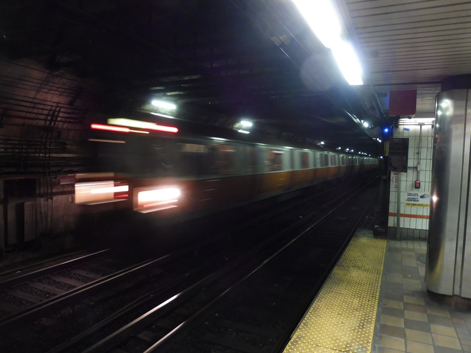
| A Red Line train flying into the station. |
Station: Downtown Crossing
Ridership: Psh, practically no one. No, of course I’m kidding – this is the second-busiest station on the system in terms of fare gate entrances (after South Station), getting 23,478 people per weekday. Slightly more of those folks use the Orange Line over the Red Line, while a hardy 404 riders enter here and walk to the Green Line via Winter Street. The real ridership at Downtown Crossing comes from transfers, though – about 25,000 people transfer between lines in each direction every weekday, adding up to around 50,000 transfer passengers! Oh right, and the SL5 gets a little over 2,500 riders here on weekdays. Kind of an inconsequential number compared to everything else…
Pros: As confusing as they are, Downtown Crossing’s many entrances mean that there are many different places where its hoards of passengers can feed from. That allows for a better distribution of crowds. The train platforms are generally pretty good (the Orange Line ones are among the line’s most aesthetically-pleasing, at least in its downtown section), while the direct retail entrances are a huge convenience for shoppers. Overall, given the complex platform layouts the station designers had to work with, the place is somewhat functional.
Cons: There are a lot of very specific complaints about very specific aspects littered throughout the review, but I want to focus on three main problems with Downtown Crossing: the layout, the looks, and the “experience.” First, there’s the fact that this place is just a labyrinth, and that’s a fact. It is near-impossible to figure out the mess of hallways, passages, and entrances here, and while I said that the design is somewhat functional, that’s only because there was no other way to do it given the stupid layout of the Orange Line platforms. Once the Red Line came in, the only possible solution was a Transfer of Death. The MBTA should absolutely produce maps of this madness and dot them around the station – that would make navigation ten times easier. There are already some maps around elevators, but they need to be more widespread.
Next, we have the looks of this place: it’s ugly. See, while Park Street also has some areas of questionable appearance, it’s clear that Park Street is trying to look nice. Downtown Crossing, on the other hand, is not trying at all. You’ll find bland white walls, chipping paint, unsightly popcorn ceilings, and hoards of random pipes in almost all of the station passageways. It’s not the biggest problem with the station, but it only adds to the feeling of being trapped underground that permeates through the whole complex.
And finally, the experience. That sounds vague, but I’m talking about the overall combination of the space, the heat, and the smell, that really come together to make using this place horrible. This station is downright cramped a lot of the time, particularly with its low ceilings, and it can feel very claustrophobic. It doesn’t help that the whole place is boiling – you have no idea how nice it was to get out of here into some fresh air after reviewing it for an hour. And finally, the smell. Anyone who’s used this station surely knows the “Downtown Crossing smell.” It’s hard to describe in print, but let’s just say that it is not pleasant. At all.
Nearby and Noteworthy: All of the stations are so close together in the city that it’s hard to pinpoint what places are closest to Downtown Crossing specifically, but there’s a huge variety of retail and activity around here! These are not the most vibrant attractions by any means, but if you happen to be going to Macy’s or Roche Brothers, you can utilize the direct entrances from the concourse for a more streamlined shopping experience. Fancy.
Final Verdict: 4/10
I absolutely despise using Downtown Crossing. In fact, I actively try to avoid using it if I can help it, preferring to use buses to connect between the Red and Orange Lines outside of downtown. That being said, for all of its flaws (and there are many, many flaws), the station still succeeds in its biggest goal of somehow harnessing tens of thousands of people who want to board trains. And yeah, this is absolutely the worst of the MBTA transfer stations, and it has way too many quirks and problems to count (just look how long this review is), but functionality still counts for something.
Latest MBTA News: Service Updates
143 stations down…1 to go.


Only 1 station left. But seriously,take your time ,south station is the largest station you'll ever have reviewed ,so I understand if it takes a while
Excellent as always, Miles.
Yes, a station map would be a blessing. In theory, the red and orange lines are both accessible, which ought to mean a wheelchair-accessible/no-stairs transfer. In practice, if my knees hurt I either connect above-ground and hope I can make sense of the street-label signs at the elevators, walk to Park Street, or find some weirder workaround (like saying the hell with it and taking the green line to Lechmere, and the 88 bus to Somerville).
The next time I'm headed that way, I will consult this review and look up the map of the tracks. That's not as practical as a station map, but it's interesting.
Miles,
Great information, as always! Any chance you snapped a photo of the station map that you say is by the elevator(s)? I have never used the elevators myself, but a friend was asking recently how you get from the Red Line to the Orange Line. One answer is get off at Park Street and come down the Winter Street concourse to the southbound Orange Line (where I think there is also an elevator to the street level at the corner of Winter and Washington).
Chris
DOWNTOWN crossing more like the shit hole of boston every fucking crack head in the world sleeps down there and they smoke crack next to the tracks this is why trump is in office make boston sober again fucking wankers
The winter street concourse looks a lot better now, they opened the other half and repainted it an it looks sort of nice ish… it’s still downtown crossing though.
True, I do like the new Winter Street Concourse.
Here’s a fun fact you left out about Downtown Crossing Station. It once had not one, not two, but THREE names. It was called Summer Street Station on the northbound side of the present day Orange Line (the lines were not assigned colors until 1965). It was called Winter Street Station on the southbound side of the present day Orange Line. And it was called Washington Street Station on both platforms of the present day Red Line. The platforms offset on the Orange Line, but this was the case for all four Orange Line Stations underneath Washington Street.
When the Washington Street stations were built in 1908, they were treated as separate stations as a compromise to merchants and store owners who were concerned about losing money. The now Red Line was not extended there until 1915. It wasn’t until 1967, three years after the Massachusetts Bay Transportation Authority (MBTA) was formed that the Washington Street stations all were simplified to have one name. Between 1967 and 1987, Downtown Crossing would be known as Washington Street Station. It didn’t receive its current name until 1987.
I thought I was tripping when I as a tourist emerged from downtown crossing into a department store at like 1 in the morning, I was like how on earth can a subway station exit in to the backroom of a department store and it be normal?! Only after using downtown crossing more did it seem rational to me.
The first time I tried transferring from Orange to Red here, I accidentally ended up in the tunnel to park street and got on the red line there. I was so confused when the train stopped at Downtown crossing, since I thought that is where I got on.