Um…I went to Andrew once before. I didn’t review it then, but since I went again, I’ll review it now. Yup. Okay, it’s a bad sign when a station’s so boring I can’t think of an intro for it! Let’s just get into the review.
 |
| Oh, come on, sun, why do you have to get in the way? |
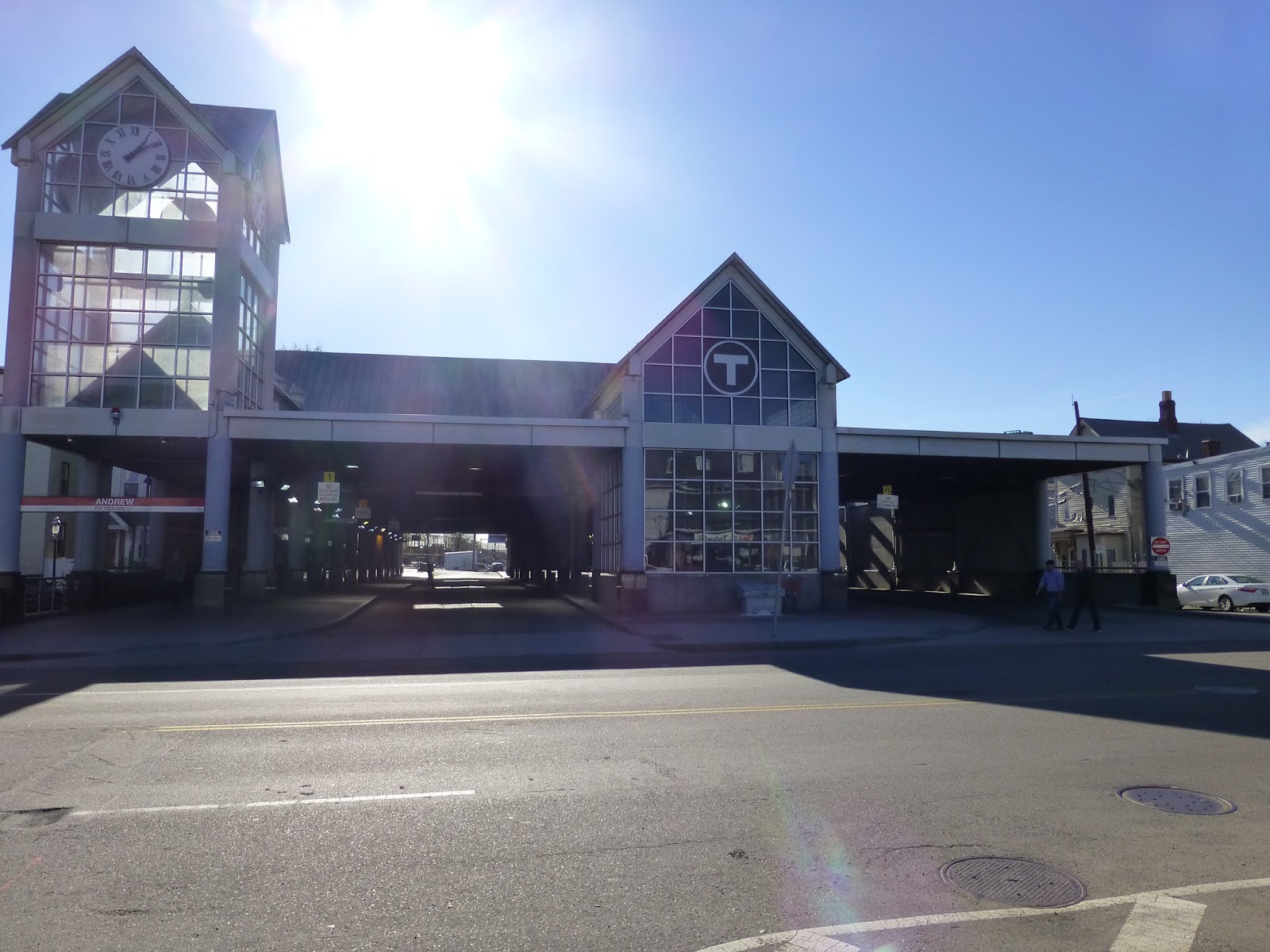
Well, I will say that Andrew’s station building is pretty cool. It’s got a lot of glass, plus that essential T symbol to let you know what the entrance leads to. Not to mention that Andrew has a four-sided clock tower! It’s not as impressive as the one at Forest Hills, but it’s a respectable tower.
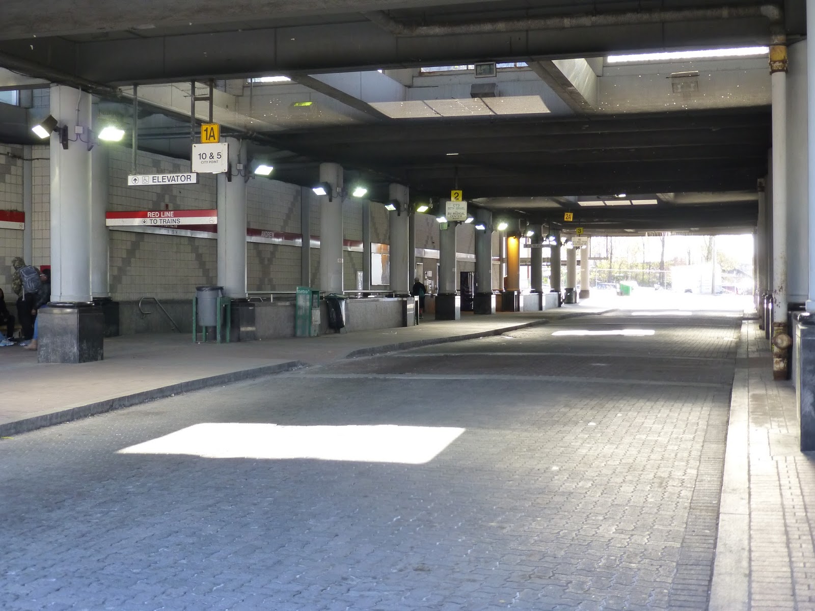 |
| The busway. |
Andrew’s busway is completely sheltered, which is great. But although skylights try to make things better, the busway is still dark. Yeah, it may look bright in the picture above, and certain parts are, but yeah, a lot of it is dark and dingy.
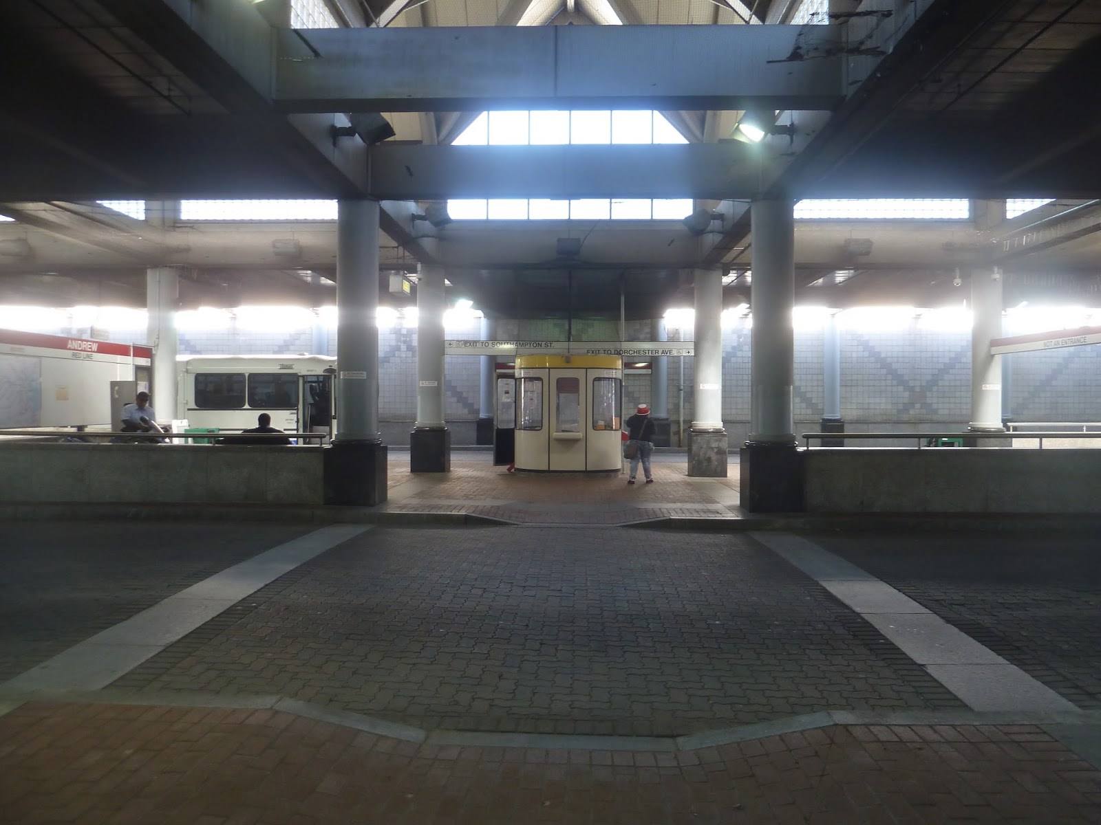 |
| Looking down the middle. |
Andrew is served by seven bus routes, but one of them (the 171) only has two trips per day, in the early morning. Okay, so that’s basically six routes. And personally, I think this busway is a bit complicated for just six routes. I mean, it’s not that hard to find the bus you want, but it seems like it could be a lot easier.
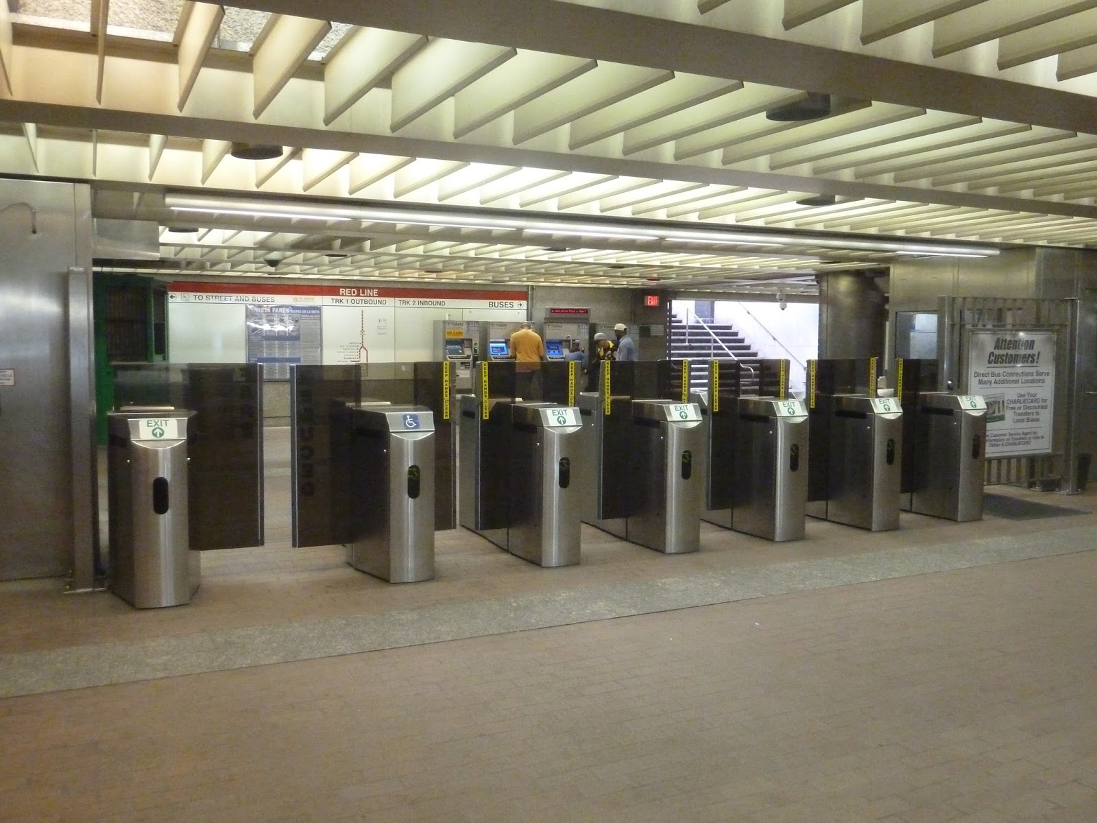 |
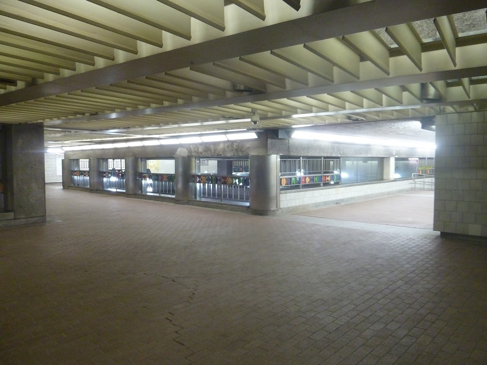
| The mezzanine is visible beyond the fare gates. |
So…the mezzanine. I’m not a fan. I mean, it’s straightforward, I guess, but it goes downhill from there. Aside from an old pre-CharlieCard ticket booth, which is pretty cool, the mezzanine is just bland. The ceiling is low and the walls are mostly boring, though for some reason there’s a random section of the latter made of marble. Of course, there’s another section of the latter that’s completely deteriorating, which is significantly less fancy than marble.
 |
| Another mezzanine. |
Past the fare gates, there’s another mezzanine over the platforms. It consists of wide, low-ceilinged hallways that go over the tracks so you can cross between sides. I’m glad this mezzanine exists, and it’s nice that they put some colorful shapes on the railings, but…popcorn ceilings? I mean, really?!
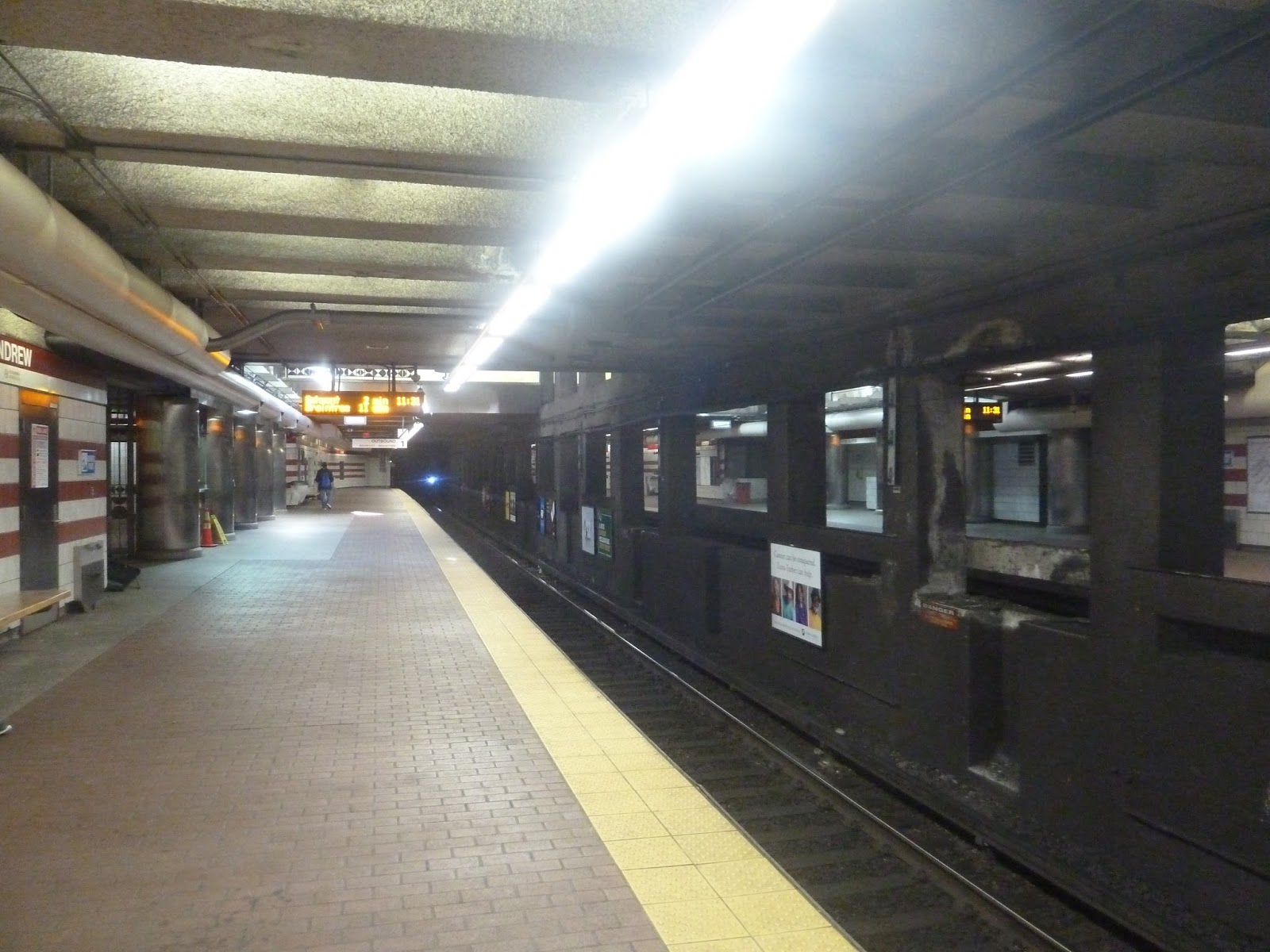 |
| Believe me, it was very hard to get a decent picture of the platform. |
The platform is a rather dark and dingy affair, despite the fact that it has a skylight. And I’ll admit, the skylight is great, with artwork hanging down from the top. But the rest? Well, it’s dark, the ceiling is low and has random pipes, and the wall between the two tracks is disgusting. So yeah, the skylight tries its best, but is powerless against everything else.
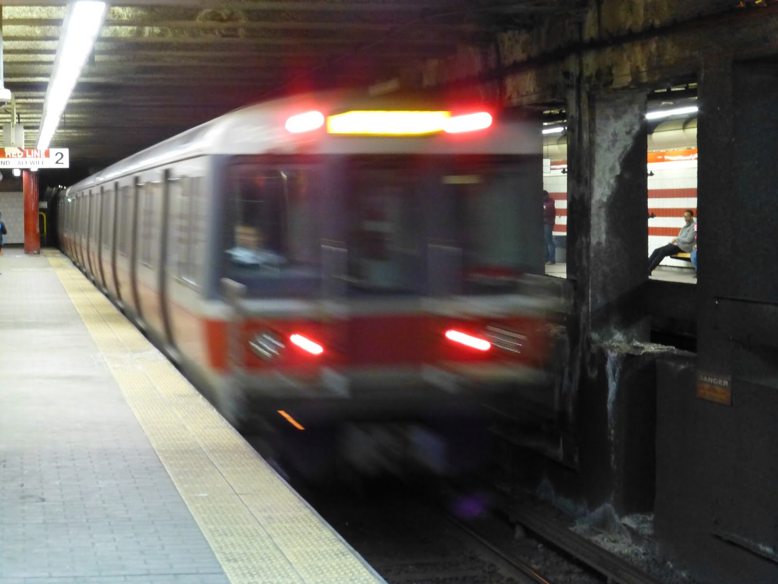 |
| A blurry train. |
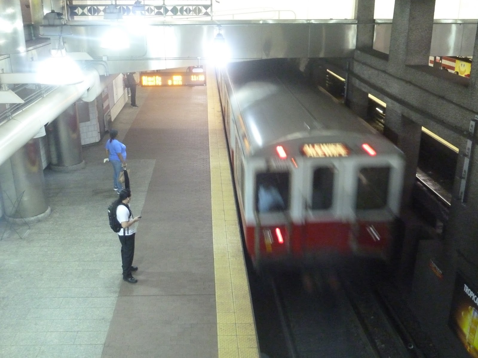 |
| Another blurry train…from above. |
Station: Andrew
Ridership: Like its neighbor to the north, Broadway, Andrew doesn’t get too much ridership – only about 6,425 riders per weekday. Similarly to Broadway, Andrew’s surroundings are industrial, though this station also serves some residential neighborhoods. The nearby South Bay Center probably contributes some ridership from shoppers, as well.
Pros: Fully-sheltered busways are always a plus, and Andrew has decent bus connections in general. It’s also straightforward, and I like how the exits from the platform are symmetrical (nothing like some good ol’ symmetry).
Cons: The aesthetics, of course. Aside from the outside building, I find this station to be generally dark and dingy. I mean, the mezzanine has a deteriorating wall, for heaven’s sake! Oh, also, there are the popcorn ceilings. I mean, come on – Andrew was renovated in 1994, not 1963!
Nearby and Noteworthy: Are you looking for a massive suburban shopping mall right in Boston? Then make the not-at-all pedestrian friendly walk to the South Bay Center and get all your shopping needs fulfilled!
Final Verdict: 6/10
There are a lot of stations that would get significantly higher scores if I didn’t take aesthetics into account. But I believe that commuters’ overall experience should not only be easy, but also look nice. Andrew does not look nice. It is dark, dingy, and dirty. Thus…6/10.
Latest MBTA News: Service Updates
Hey, you know that elusive Green Line extension? Yeah, it’s been pushed back again.
I took the train there on Monday. It really is a sad sight. Take the next stop over on the Red Line to Broadway. It's super close and near a more interesting part of the neighborhood.
I think both stations are more like gateways to Southie – you gotta walk a bit to see the really interesting stuff.
One time, I came here to catch a 10 to City Point. The earth was so far away that we missed our bus:( Good think the driver let us on at a red light…
I mean BEARTH not earth