Here’s something I’ve realized during my explorations of RTAs: transit websites are often terrible and I love to rant about them. Then I realized that instead of ranting to friends, why not rant about them on the blog? Welcome to Miles on the Internet, where we’ll be reviewing various transit websites! Now, it has to be said that not all transit websites are awful – for example, the one we’ll be looking at today, the MBTA website!
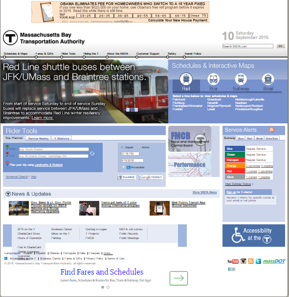 |
| I’m sure almost all of you will recognize this home page! |
There’s a lot of information packed into the MBTA’s homepage, and for a newcomer, it can seem pretty overwhelming. Having used the website so many times, I have it down pat and know where to go, but I can definitely see someone getting confused here. Still, there’s a lot of important stuff in here – you can find any schedule, plan a trip, and get service updates, all within the same page.
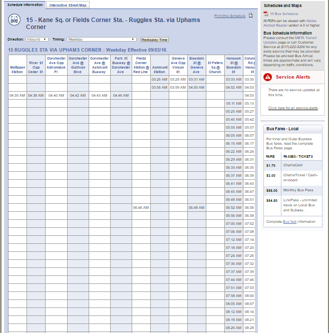 |
| What the heck?? |
Don’t get me wrong, I like the overall structure of the MBTA’s schedule pages. While subway pages will only give you line diagrams (and basic headways if you click on the PDFs), the other ones display a full schedule with links to PDF files and service updates for the route on the right. There are annoying quirks with these pages, though: for one thing, they set to weekday by default, even if it’s a weekend; for another, bus routes with extended early morning or late night variants end up looking like the schedule above. You have to scroll way over to the right to get any proper information, and I usually end up just clicking on the PDF. The “Interactive Street Maps” of the routes are also functional, although for some reason they default to early morning variants of certain buses, which is very misleading.
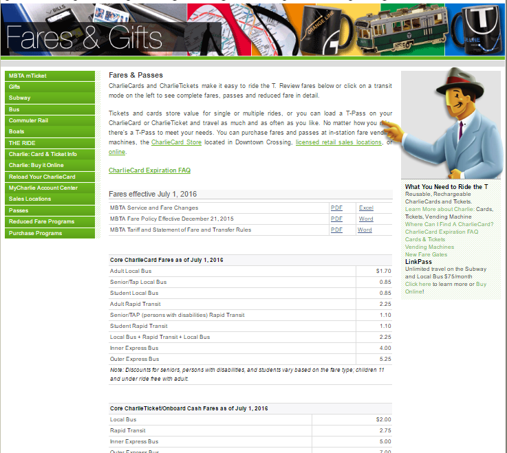 |
| The fares page. |
Clicking on the “Fares and Gifts” section gives you a rather daunting page of every possible MBTA fare. For the record, it’s a heck of a lot easier just to click on an individual mode to narrow down your search. Also…uh, Charlie? Could you move your finger a bit? You’re, uh, blocking a few words…Charlie? Oh, never mind…
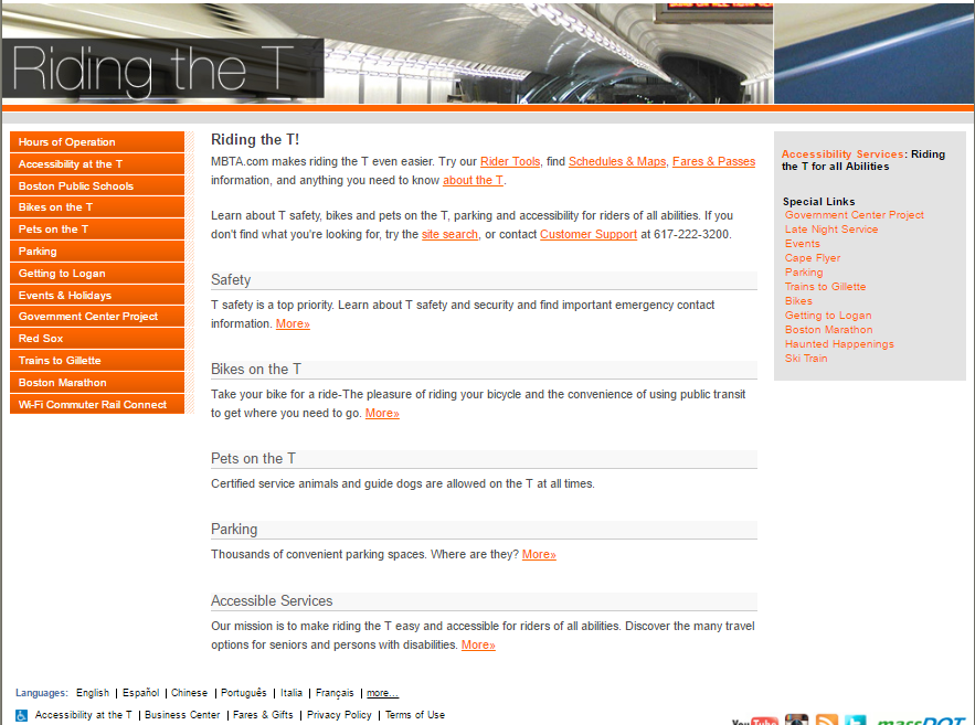 |
| The “Riding the T” section. |
The “Riding the T” part of the website is basically the place to go for miscellaneous rider information. It has pages about rules for bikes and pets, information on accessibility and parking, and directions to Logan Airport. The presence of a “Government Center Project” page is pretty outdated, though – the station’s been open for quite a while now!
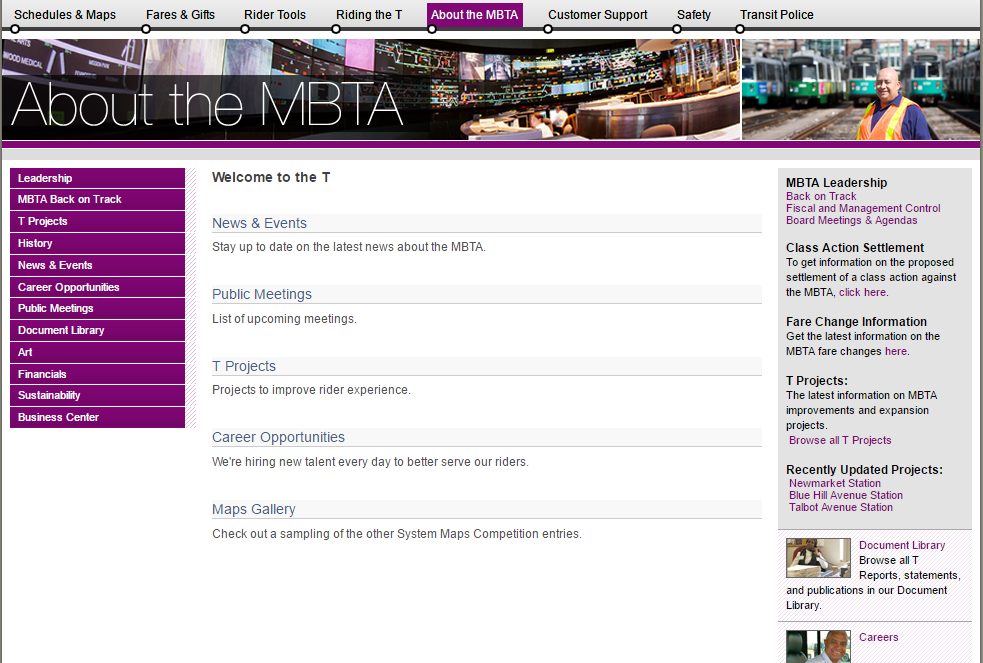 |
| “Welcome to the T”! |
“About the MBTA” essentially covers the “behind the scenes” aspects of the system. It includes pages about the MassDOT Board, the T’s history, MBTA news, and a rather scary-looking page about finances. Their “T Projects” page could use a bit of updating, though – isn’t everyone excited for the Salem Station upgrade, currently in “planning”? Try “it’s been open for two years”!
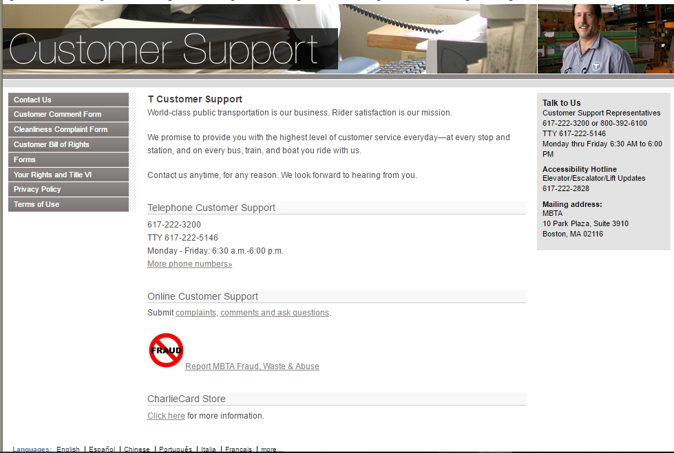 |
| In case you’re in need of support. |
The last three tabs on the website aren’t particularly interesting or useful to the average rider. “Customer Support” mostly covers complaints, as well as a heck of a lot of forms. “Safety” is what you would expect, and it’s only noteworthy for including the wonderfully bad “Safety Bounce” video, which I implore you to watch if you haven’t seen it already. Finally, the “Transit Police” page is all about fighting crime on the system.
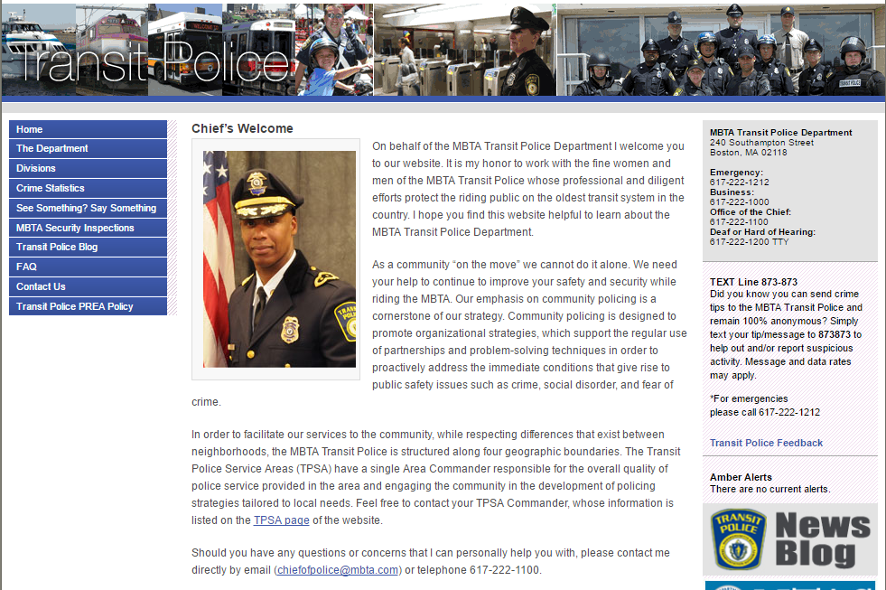 |
| The Transit Police page. |
Time for the LRTA website. Haha.
Oh, there are MUCH worse websites than the LRTA, my friend! (although that is a pretty bad one)
Can you do the new one?
Bring this back!